The people who support Krita pulled off another amazing Kickstarter this year. And in a way, they are allowing everyone to contribute on an artistic level as well. This is where my next illustration comes in.
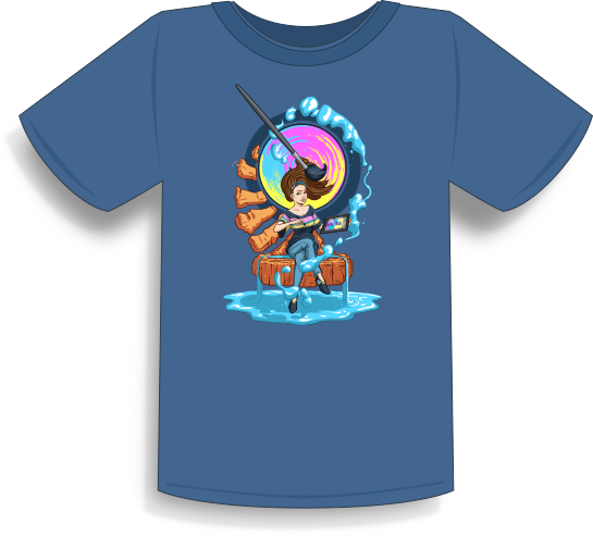
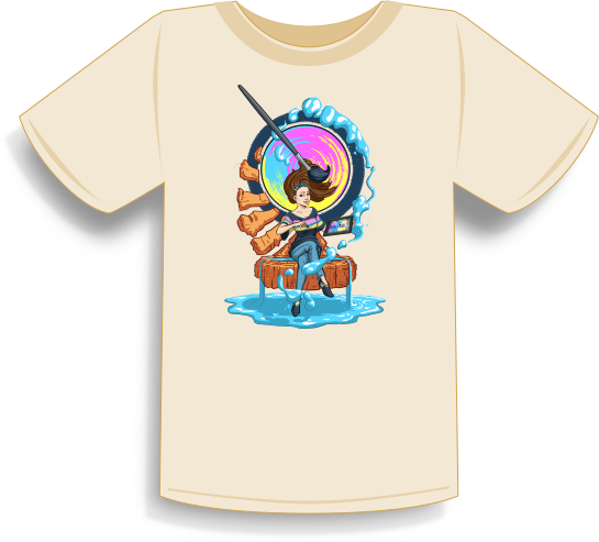
This year, along with new features for the next version of Krita, the group behind Krita is producing a book filled with art from various artists that use Krita. They are taking submissions currently, but this is for a future post. This post is about the T-Shirt design challenge on the Krita forum. This is something that I could not simply pass up.
With this much freedom I wasn’t sure how to start.
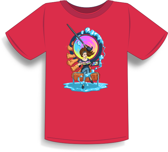
The topic was “Flow”, and nothing else. With this much freedom I wasn’t sure how to start. So taking to the great library that is Google, I started doing searches for the word “Flow”. Synonyms, images, music, etc… all to draw inspiration from. I eventually started thinking about my home here in Utah, and challenged myself to think of the things that are generally attractive that could relate to “Flow”. This led me to the most unlikely of places when someone things of the word “Flow. Southern Utah, a dry desert, and almost the exact antithesis of the word “Flow”.
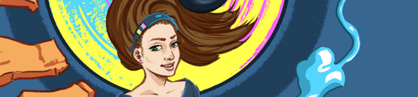
The reason why I was brought to this place was the color of the rocks. For those of you who aren’t familiar with Southern Utah, the rock can be very red in places. This went well with some of the other notes I had written down at this point for the painting, which included the colors from Krita’s logo. The red of the rocks of Southern Utah would provide a good and attractive contrast to the blue floating paint I already had in mind before I had put pencil to paper.
…I realized that message wasn’t in the detail of the rock, but instead in the very nature of the rocks
But this was the catalysis to a greater idea, and one that I think is what brought the painting together in it’s last stages. If you watch the time lapse video, you will see this in action, but I first draw the rocks with detail, and symmetrically. This looked “Okay” but it didn’t seem to fit, but soon after spending a while drawing detail into these rocks, I realized
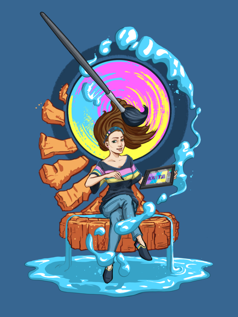
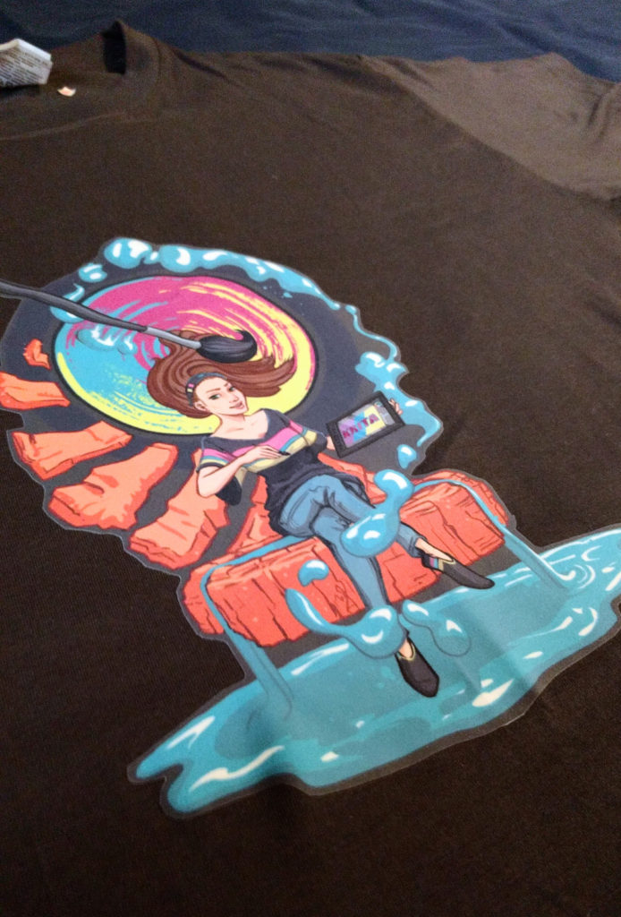
that message wasn’t in the detail of the rock, but instead in the very nature of the rocks. The juxtaposition of the rock against the flowing nature of paint was the key, as I discovered a way to include the rocks in a more harmonious way than before. By focusing on the silhouette and the visual movement of the rock, instead of the rocks themselves.
So now the flow of the paint, and the flow of the rock, mirror each other, matching the “S” curve of the woman, and just tying everything together in a neat little package.