
Krita | Bringing Balance | IIllustration
At the end of my vacation week in San Diego California, I have had plenty of time to paint. Here is what I have been able to put together this last week.
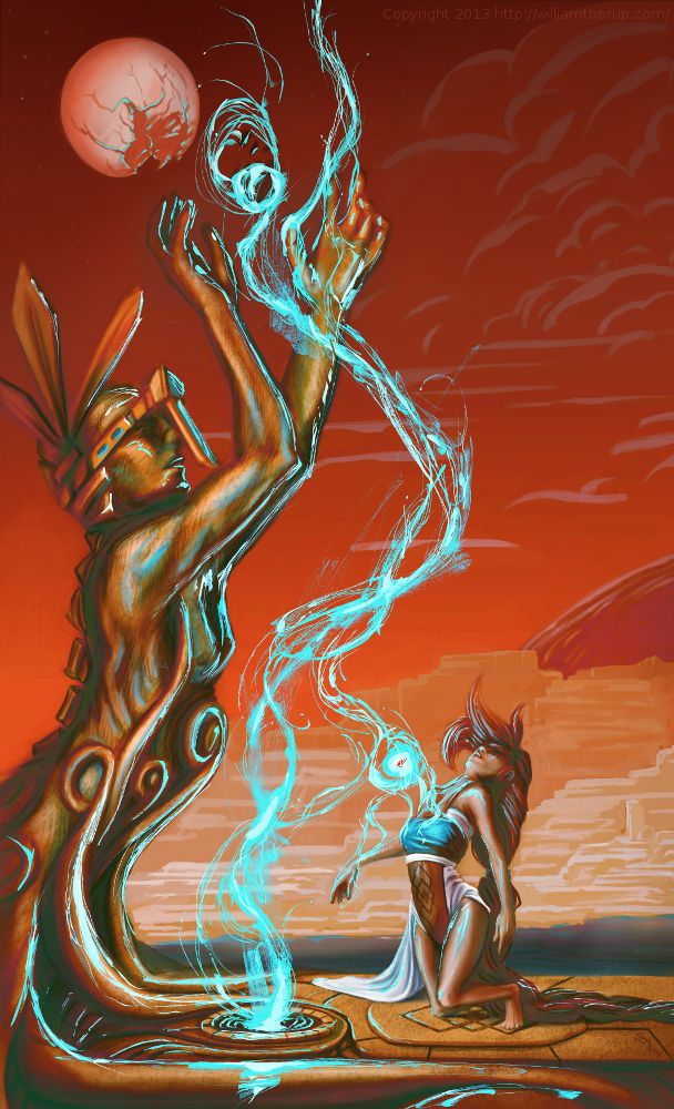
I recently went to a seminar about cinematography, which talked about composition in film, among other things, and the speaker talked about color schemes a little bit, and he pointed out something very interesting. Apparently Hollywood is really into teal and orange color schemes. He showed examples of posters from Tron, Transformers, Ender’s Game, etc. and his point was really well established. He showed video clips from movies that used this color scheme all over the place, and what’s cool about it, is that it is a very appealing color scheme. People really like it, and I decided to give it a try, with a twist.
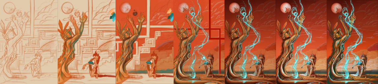
I didn’t stick to that exact color scheme in this piece, but I did have it in mind. What I was leaning towards was something more like what Pascal Blanché produces. I Love his color schemes, to me they come across as a distinct dark sci-fi/fantasy feel that is hard to achieve any other way. So with that style and a more orange and teal/orange color scheme, I think a came up with a good result. It isn’t as refined as Blanché’s technique, but it still produced a good result with my current skill level.