Krita & Gimp Illustration | Zelda
I don’t do allot of fan art, in fact, this piece originally didn’t start out as fan art. I was watching an episode of from the first season of Robotech, and sketching at the same time on my Lenovo tablet, when I did the initial sketch. (The costume is somewhat Robotech inspired). The one you see at the beginning of the time lapse video. It wasn’t until after I started refining the sketch in Krita, did I decide to turn it into fan art.
Don’t get me wrong, I think fan art is awesome, and an awesome way to express you appreciation for something (Isn’t that what art is kind of about?). And I wish I would take more time to do some fan art. But I tend to avoid it, because I have the feeling that I won’t be able to do it justice. So, I put off most of the fan art I would like to do for a later day and time.
This time around, though, I feel I did a fairly good job, and feel comfortable in posting and receive feedback for this piece of fan art.
But enough of that, lets go over some stuff that I think is worth talking about, and might be a bit educational. I am just going to start at the beginning of the video and mention a few interesting things I noticed in my process.
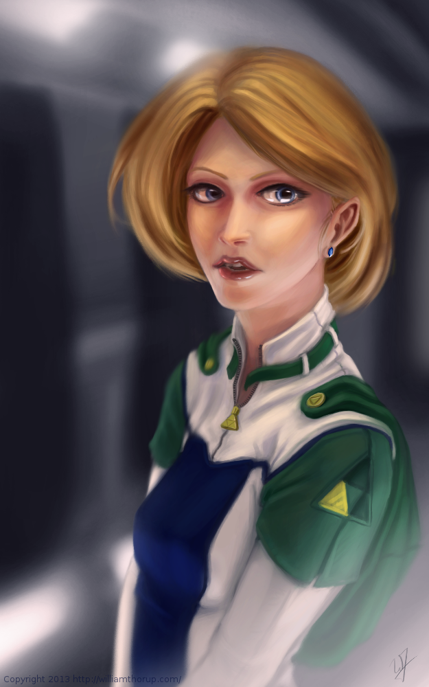
First, a bit of an explanation on content and style. This is a re-imagining of the character Princess Zelda, from the Legend of Zelda video game series. When I decided that this was going to be a fan art piece, I wanted to stick to the poofy hair and a somewhat military uniform as seen with many of the characters in the first season of Robotech, but with a bit of Zelda seasoning. There are actually only a handful of things that tie this piece into the Zelda universe.
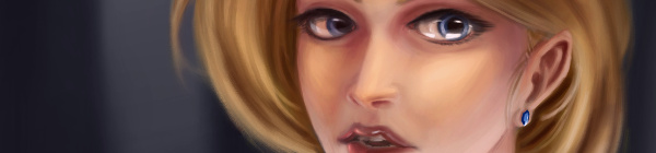
The most obvious things are probably the colors. The blue rupee, green hood and shoulders, and the golden triforce all point to the Legend of Zelda. But there is also the character herself. Zelda is often portrayed as someone beautiful, with a sense of innocence, which is something I stuck to here. But the costume was chosen to depict the strong side of her character as well. A less obvious sign of her character is that her mouth is open, as if she were speaking to you. Zelda is often used in the Zelda series as a mentor character, and if she lived in a more futuristic or sci-fi world, I see her playing more of the mentor character than royalty.
There are a few other things I could mention, content wise, but for the sake of keeping things short, I will let you jump on the Zelda Wiki to figure some of the other imagery out.
As for my processes. Most of my planning was done in the line art. At this point I didn’t have a really good sense of the lighting, until I sat back and thought about it later, but I had a good idea of what I wanted the subject to look like.
I decided to skip doing a value painting, and go straight into color and value. I try to avoid this nowadays, and stick to a value painting before I ever jump into color, but in this case, I wanted to try something new.
I wanted to try to create a simple color palette to lay the foundation for my colors and values. I don’t include this step in the video, but it is something that I learned from a post by Nasan Hardcastle. A great digital artist, that I suggest that you all follow. But having a simple palette like this can help keep your colors and values organized in the foundation of the painting.
Something unique in this painting, that I have never done before, is the light setup. If you include ambient light, I have a total of 4 different light sources in this painting. This was one of my stretch goals for this painting, to use that many light sources without loosing the form of the subject, and adding appeal to the painting overall.
But not all was fine with this painting. I messed up on the proportion of the nose, and had to readjust that half way through. Not too difficult, but I feel it’s something that I shouldn’t have to deal with and definitely need to practice more on. Also, another proportion problem was the width of the head, which I eventually had to fix.
But with the good and bad of this painting aside, there is one tip I would like to share. Color Grading. One of the huge advantages to digital art.
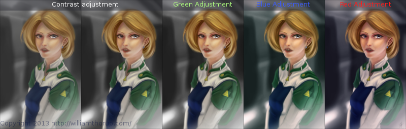
I have never been good with color, this is probably because I don’t have a solid base in traditional painting. But, “color curves” an “levels” make up with this shortcoming with ease. Using some reference images that I wanted to match color with, I did several stages of color correction, as depicted above, using both “color curves” and “levels“, and selection the specific color channel I wanted to modify.
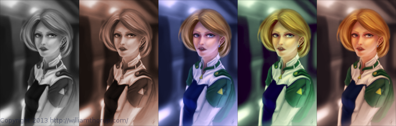
These two options can also be used to quickly change the feel of a painting. A good way to explain this is how a sepia toned image and a black and white image create very different feelings, even though content may be the same. This is pretty basic stuff, especially if your into photography, but it is fun to take an image you created from scratch and see how it transfers to these different color schemes.
I have a few more paintings coming down the line, we should be starting a new app project soon, and a Weekly Sketch Review is just around the corner. Stay tuned.
ghevan
Nice, thanks for sharing your thoughts on this. The color adjustments to change look and feel is a nice thing I will definitively try on my paintings in the future to.