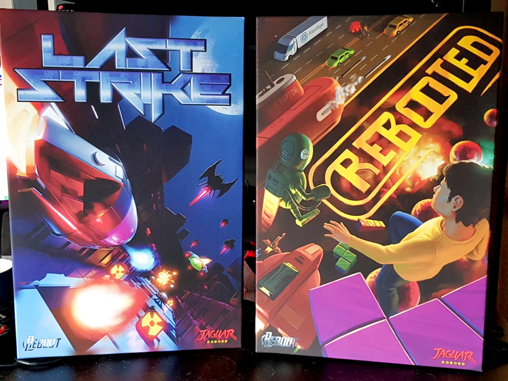
Atari Jaguar – Cover Art & Packaging for Last Strike
With customers on the verge of finally getting their copies of Last Strike, I thought I would do a post on a bit of the background on how the packaging for this great piece of Atari Jaguar homebrew came together.
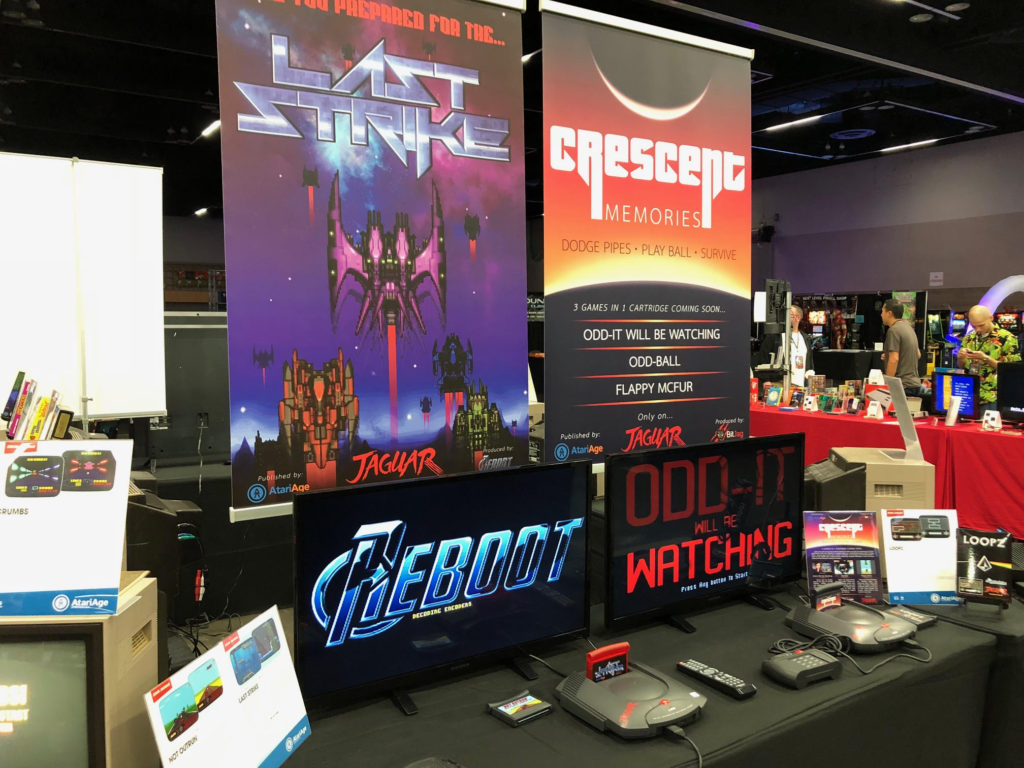
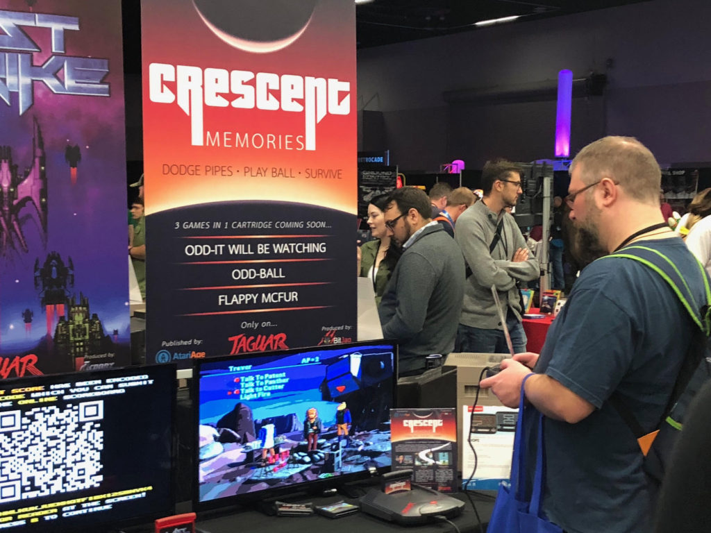
Digging through 3 years of emails, it’s interesting to see how much you tend to forget on these long term projects. My involvement with Last Strike started with helping Albert at AtariAge in 2018 with some banner artwork for his booth for Portland Retro Gaming expo.
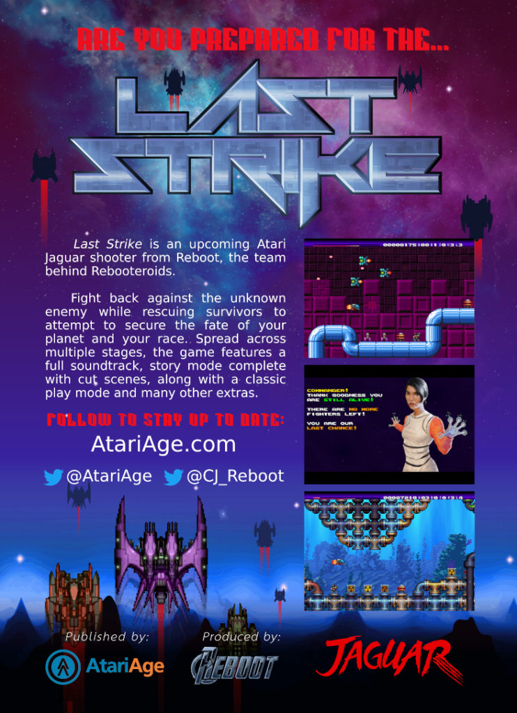
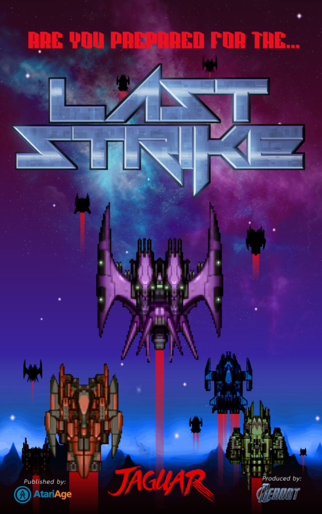
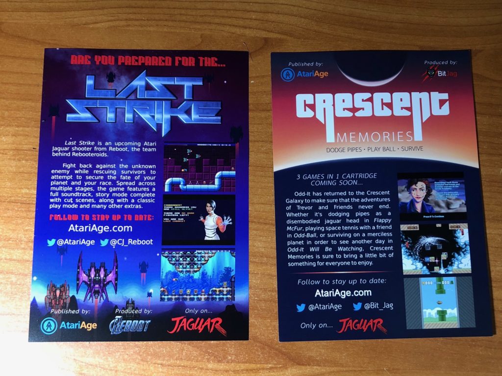
I have actually never see these booths in person, and with the lockdowns, that chance may not come any time soon. Based on pictures posted by AtariAge though, it’s an honor to have some of this quick graphic design work show up at conventions where thousands of people get to see it. Along with the banner, I had put together a flyer that was available for pick up by potential AtariAge customers. Last Strike was printed back-to-back with the flyer for BitJag’s Crescent Memories game. The sprite artwork for the spaceships is from https://opengameart.org/.
After the convention wrapped up, along with the holidays, work started on the cover art for Last Strike. April 2019 is when the emails started, along my usually first step for work like this. Thumbnail sketches.
I decided to bypass pencil sketches and go directly to color sketches. A couple reasons for this. Reboot didn’t have much in regards to direction except for pointing me towards previous content generated for marketing and assets for the game. This makes picking a color palette fairly easy. Just stick to what is used in the game and the banners/flyers that were used for Portland Retro Gaming Expo.
For the content and composition of the boxart, I decided to take inspiration from other shooters. One in particular was used as inspiration, and that was the cover art for Raiden on the Atari Jaguar.
Raiden’s box art takes a very simple but effective approach of extreme perspective to create a good sense of depth and movement. With the nose of the aircraft pointed towards the obstacles that the player must face in the game they are about play, we are given a good tone for the game without needed to plug and play.
With these thumbnail sketches I decided to take the compositional ideas and translate them into something new for Last Strike. I also decided to play with a few different camera angles to see if the client might want something not quite on the beaten path.
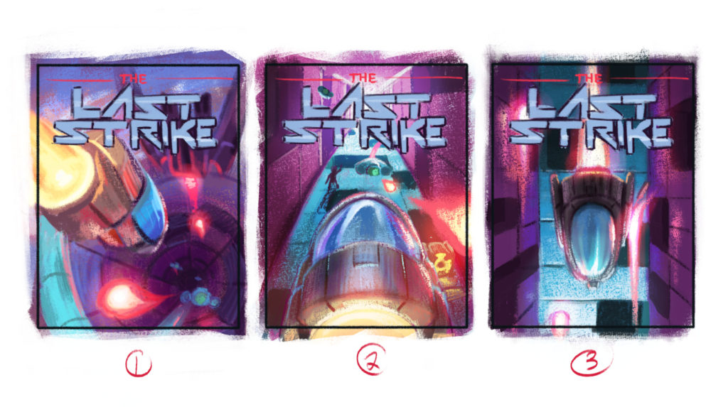
After a few suggestions for changes the first thumbnail was the direction chosen. Before moving onto the final illustration, and because of the feedback, I decided to do a one more thumbnail sketch. Working in the adjustments and to refined the composition accordingly.
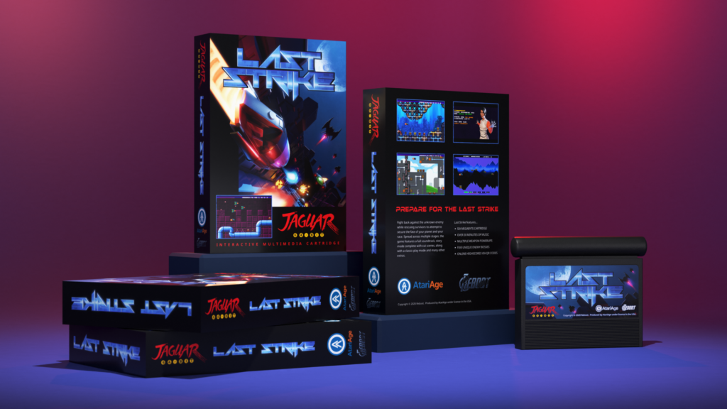
Along with this new sketch, I was also needed to look forward to how this might look on actual product packaging. I had developed some templated 3D renders for testing artwork on for previous projects I have done for Jaguar games. I felt that we were far enough along with this final sketch to get a good feeling of what the final cover art and overall package would be like.
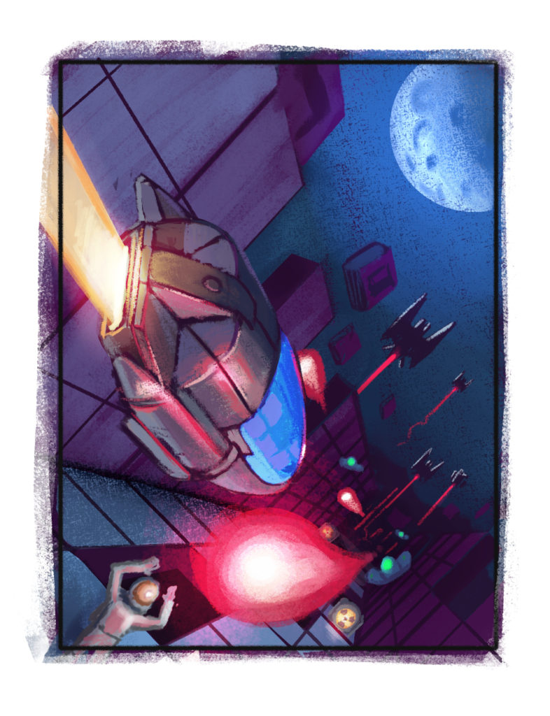
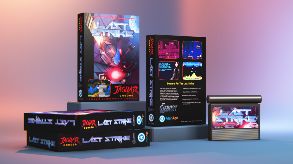
With a go ahead for the artwork and confidence that the cover art would work well for box, manual, and cartridge label, I moved forward to the final illustration.
I decided not to go with a strictly painted process and instead decided to use Blender to generate a pre-rendered base to work from. Building the models for the ships, the corridor, and other objects ended up taking up as much time as it would have taken just to paint them from scratch in Krita. But I believed that starting with a very clean and synthetic base to paint from would lend itself to the sci-fi feel of the game, while still giving me the freedom to add more organic edges here and there. Organic things like the people, blasts of energy, and the moon, contrast in form and silhouette with the more refined edges of the walls, floor, and ships. Creating a nice tension that plays well with the action of the scene.
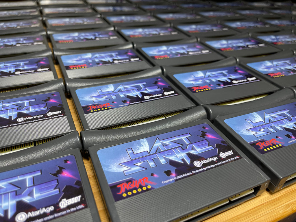
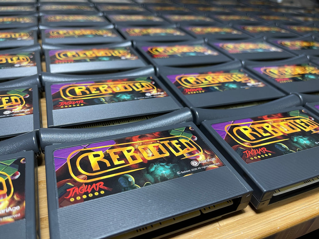
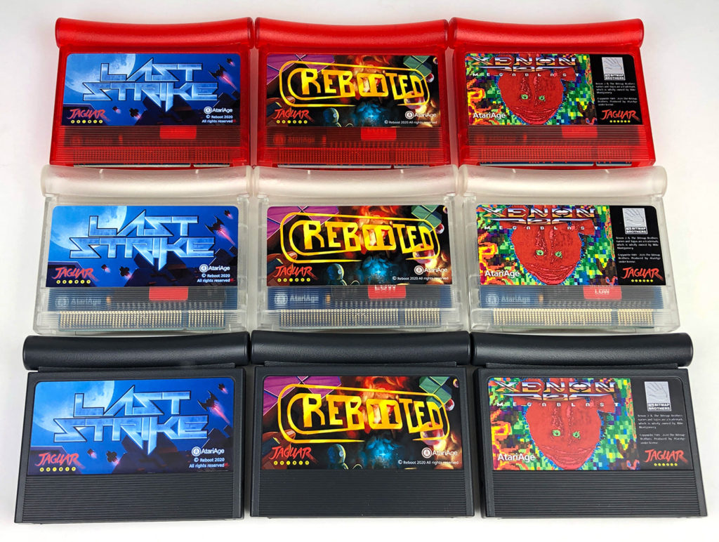
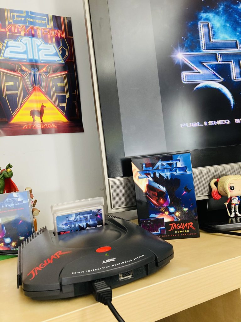
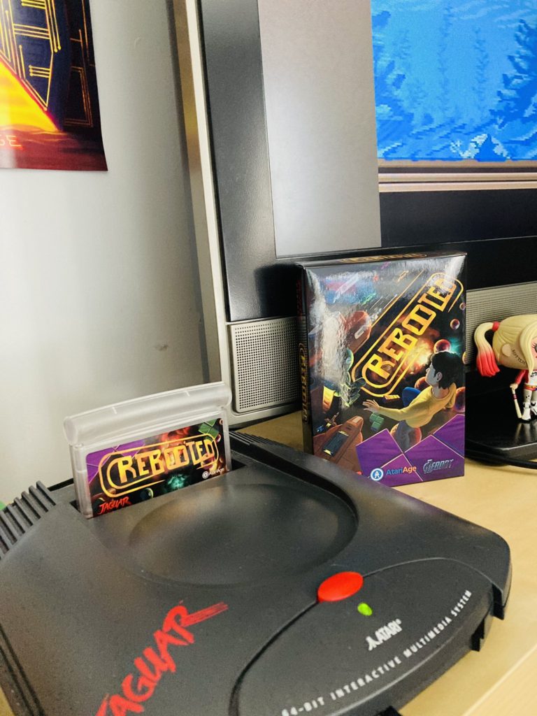
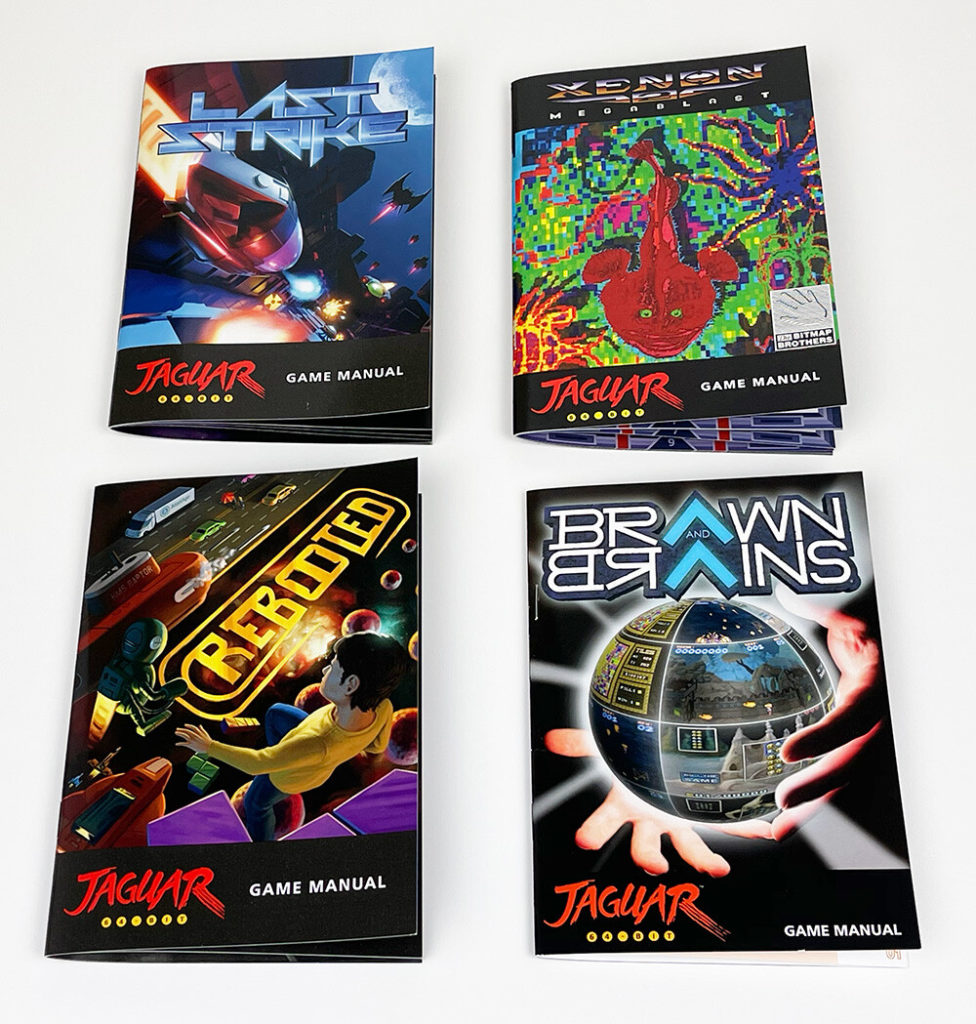
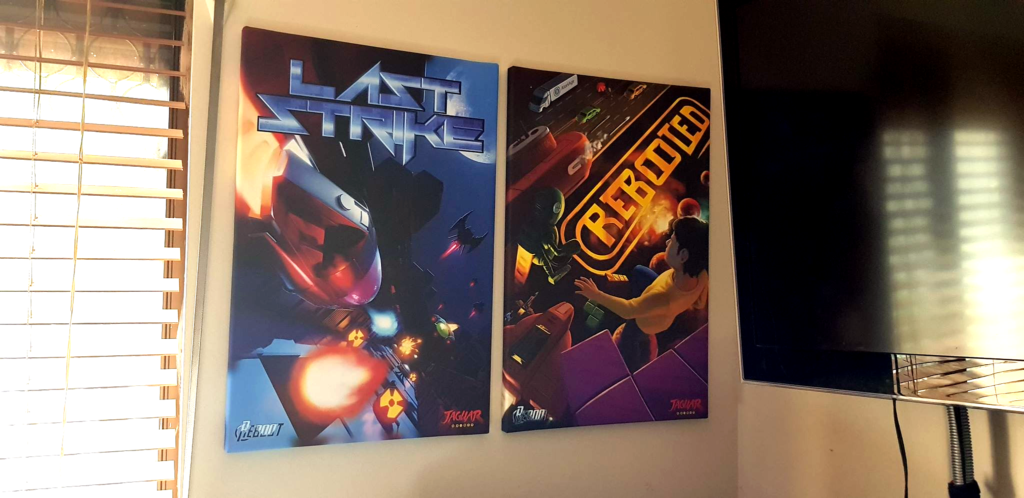
I want to avoid posting final artwork here, but here is a render of that same 3D template that was used in previous steps of this process along with a time lapse of the process after the final thumbnail sketch was produced. Along with the box and cartridge label, I also assembled the manual for the game along with some basic cover art for the CD soundtrack. Also below are some pictures taken by Albert of AtariAge, Lawrence from Reboot, and a few people on Twitter who have already received copies of the game.
I did have the opportunity to play the game during play testing. I want to avoid doing a lengthy review, since I am sure the game has gone through some changes since then, and my unavoidable bias due to my involvement. I do highly recommend the game if you like shooters though. In regards to variety it is much better than Raiden, but it is not quite as serious in tone. Having a fun edge to it, along with some good boss fights, it’s definitely worth adding to the collection. It gave me strong vibes of Blood Money for the Atari ST, one my childhood favorite games. Reboot knows how to make fun, high quality release, and it was great to be a part of that.

