William Thorup

Illustrator, Motion Graphics Designer, Animator, and VFX Artist

Author: William

  • Play Books & Times Square with Overstock.com

    Play Books & Times Square with Overstock.com

    Over the last few months Overstock.com has given me the opportunity to work on a few 15 second broadcast motion graphic spots/commercials for Overstock.com. These covered three separate sales that aired on national television between March and July of 2015.

    I first want to thank the branding team at Overstock.com for their help in putting this together with me. They usually have me come into their office to work, in order to speed things up. These spots are as good as they are because of their input and critique. Thanks guys!

    Mega March Markdown | 15sec broadcast commercial – Based heavily on the in-house design teams playbook, with addtional consulting from Trevor Rimmasch. Thanks Trev!

    Most of the work done on these was in After Effects, due to time constraints (all of these were put together withing 2-3 days!). I would have rather had done these in Blender, as I would have had more options available to me. Overall the experience was good working on these commercials, and the highlight was to see some of the designers faces light up when they first say their work animated in a final commercial.

    Generic Summer Sale Spot | 15sec broadcast commercial – Again, based on an in-house Play Book. The title card is one of the first photo maps I have done. Cutting out pieces of a photo and placing them within 3D space to give the illusion of parallax and depth.

    Something that made these so different from previous work I have done, is the inclusion of a “Play Book” or “Style Guide” put together by their in-house designers and artists, for their web departments. These guides are awesome in that they reduce the amount of questions needed to be answered when approaching the commercial, and debate is brought to a minimum as well. If there is a question about what something should look like, color to use, typeface, etc… no guess work, just look at the Play Book. A huge help when working as a team on something.

    Once in a Blue June Sale | 15sec broadcast commercial – There wasn’t much of a Play Book for this one, but it was still based on the designs of an in-house designer, with additional input by Aaron Syrett and Trevor Rimmasch.

    jewelry_sale_gtron_1jewelry_sale_gtron_3jewelry_sale_gtron_2blue_june_gtron_2blue_june_gtron_1

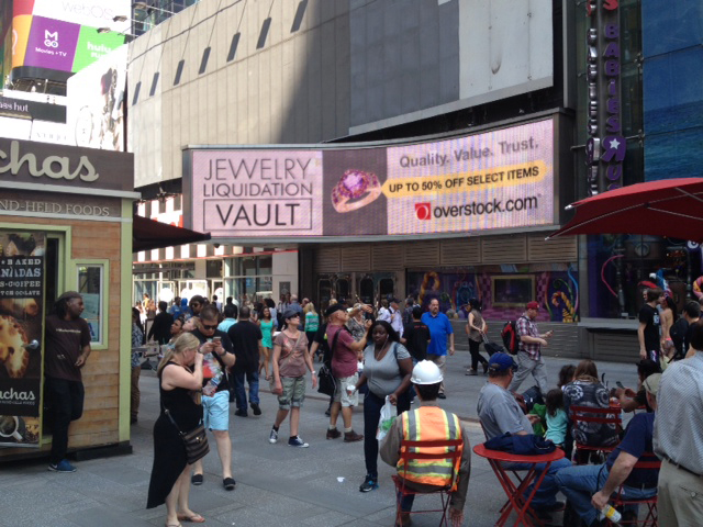
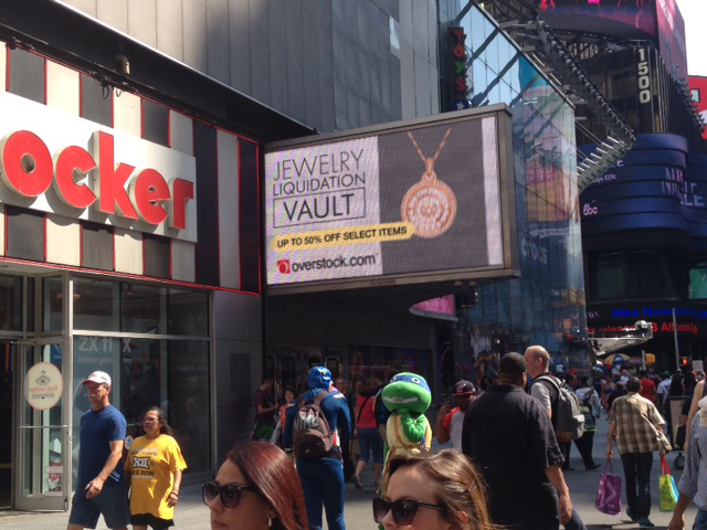
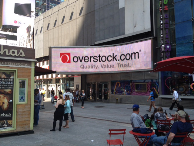
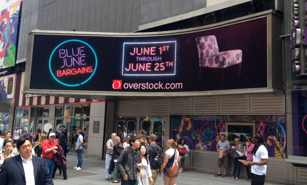
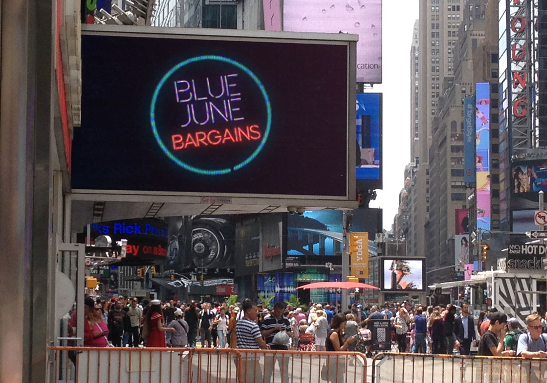
    And to top it all off, I also had to edit down the Once in a Blue June spot, and an additional Jewelry Sale Spot, for the Geoffrey Tron at Time’s Square in New York City. It is an awesome feeling knowing that some of my work is getting exposure in Time’s Square.

  • Club O Remix

    Club O Remix

    Club O, the membership/rewards program portion of Overstock.com, did a rebrand. Different colors and designs, and they asked if we would take the old version of their Club O introduction video and revise it to fit the new branding.

    At first glance, this seemed like something fairly easy to pull off, but once we began discussing more about what they wanted, what the new script entailed, and additional shots of the dog were needed, turned out to be allot more work than expected.

    It was interesting to revisit green screen keys we did over two years ago. There were quite a few things I didn’t quite understand about keying, and it is amazing that we were able to get the key as good as we did back then. Time was spent cleaning up these old keys, and also keying additional shots of the dog. This was made more difficult since they didn’t want to have any shots of the dog with the red cap. Shots without the red cap were limited, as at the time it seemed like the cap was the way to go. So, there just wasn’t a whole lot of the capless dog to chose from.

    Most of the video was composited in After Effects. The 3D percentages were originally done in After Effects, but because of file path issues with Elements 3D working between a Windows and Mac machine, I ended up doing the percentages in Blender. Another portion done in Blender were the shipping boxes. This was a last minute addition suggested by Trevor Rimmasch. The boxes help fill and anchor some of the shots, as well as create a consistent visual thread throughout the video.

    club_O_before_after

    Some of the issues when approaching an older project and “re branding” it that the foundation of the original is based off of key components. Such as music, colors, and script. The original expectation when I was asked to do this was that there was going to be some timing adjustments, along with some color changes. As we dug into it though, because some of the key components changed, it was almost more economical to start from scratch. The end product could have been rethought and something better could have been produced, and it felt like some of the elements were just bandages to keep the video together (the shipping boxes).

    As it stands, it is a good video, and certainly nothing that I am ashamed of. But the lesson learned was when you change key components of a production, like color, music, and script, exception to make major changes throughout.

  • Charged Vanity | Bolt Construction Logo

    Charged Vanity | Bolt Construction Logo

    Neil Bryce of Bryce Media has been keeping me busy the past while with jobs here and there. Bryce is an awesome person to work with, and is always concerned with getting things right, if you are in the Salt Lake City area, I highly suggest getting in touch with him, definitely someone you want to know if you are involved with video in the Salt Lake area.

    This vanity logo for Bolt Construction had a really quick turn around (about a day) and the creative is simple but effective. This video features a stone wall background with wood shingles in the upper third, but a few more versions were rendered out without the background, with a blue background, and one without movement.

    The background assets used were from a website that hosts public domain photography, vectors, and other graphics, called Pixabay. Definitely a site you want to add to your bookmarks in case you need some quick assets on a budget. There is no guarantee that all the content is public domain, as there are no actor/actress release forms. But images without people should be fairly safe.


    For those who are interested, here is a screen capture of the my Blender compositor. A fairly easy setup. Background, logo, a couple of particle effects, and lighting.

    vBC_vanity_logo_blend_composite

  • Exploding Polygons | Certified Educators Conference Intro Video

    Exploding Polygons | Certified Educators Conference Intro Video

    With only about a week and half, Neil Bryce asked me to get a creative together based solely based on a website and a few suggestions on what it should feel like. Not much to go on. With this in mind, and with that much freedom, I decided to put a bit more effort in this one by prepping a storyboard. Allowing the client to get a clear picture of what I had in mind, in order to make the most out of the coming week. (If you have 4k, be sure to change the YouTube settings.)

    Very simple creative based primarily off the website for the conference. The first day I put a simple style guide together along with a storyboard for the video. The storyboard was quickly accepted by the client, and I was able to move into picking out music that I could mock something up to.

    The music was the first and only bump in the road during the week long production. They had chosen one song, and I had begun to mock something up, and about 3 days into production, we all decided that the song needed to change. This forced us to have to re-time things, and make some other small adjustments to movement. Other than that though, the video flew together, and result that everyone was happy with was born. I am not sure if the 4k version was actually used at the conference, but it is still pretty awesome to see it playing on a 4k monitor.

    Putting together a storyboard was the best part of the project. Because the creative was wide open for whatever, I had allot of freedom in what the final result would look like. It is an awesome feeling when people just trust you as an artist to make something cool.

    CED_stylesheetCED_storyboard_1CED_storyboard_2CED_storyboard_3

    The storyboards and style guide below were assembled in Inkscape for the sake of speed and clarity.

    I used Blender to put the entire video together, and final encoding with FFMpeg. Because of the simplicity of the content, editing in 4k and rendering out previews was smooth. Compositing was simple, with everything essentially on one layer. But there was a final glow added to the music drop on the end, this was done in the Blender Video Sequence Editor before the final render.

    The blue polygon, or what I like to call the “host”, was a simple particle system, with a blend texture applied to the particle size to make the particles come in and out of existence smoothly. The host was added to help create a consistency to the video, or a thread that binds it all together, but to also add energy and urgency to the video with the seemingly erratic movement and the natural corners of the polygon.

  • Atari Lynx | 3D Printed Lynx Cartridge Shell

    Atari Lynx | 3D Printed Lynx Cartridge Shell

    A little side project. I was digging through patents for old Atari stuff and noticed that the original cartridge shell’s patent was never renewed. No big surprise really, but I thought I would take advantage of the situation, and try my hand at some 3D printing.

    I dissected a California Games cart and did all the measurements I needed with a pair of calipers. After double checking my measurements, and making some slight adjustments to the original design to accommodate thicker walls that the 3D printing process required (and adding our BitJag logo in place of the Atari logo), I modeled it in Blender, and sent it off to the printers. Below are the results, and if you would like to purchase some, I have made them available on Shapeways for the cost of printing. I hope this might help others to replace damaged shells, and maybe even use them for a future Atari Lynx homebrew release. Enjoy!

    BUY HERE

    black_back_1black_front_1red_back_1red_front_1shapeways_lynx_cart_01shapeways_lynx_cart_02shapeways_lynx_cart_03shapeways_lynx_cart_04shapeways_lynx_cart_05shapeways_lynx_cart_06shapeways_lynx_cart_07shapeways_lynx_cart_08

  • Time Keeper | Outcast Odyssey Master Card Challange

    Time Keeper | Outcast Odyssey Master Card Challange

    5/5/2015 – Update – The “Time Keeper” time lapse video was featured along with many other talented artists on Krita’s 2015 Kickstarter campaign. Awesome!

    Unfortunately I spotted this little challenge a bit too late on Google+. I decided to take a crack at it anyways to see what I would come up with, and to produce some more content for the YouTube Channel.

    You can see the list of entries that made it on time here, and there is some very very impressive work on there. I am pretty sure I didn’t have much of a chance even if I did start and then submit in time, but it always fun to see what others come up with, and varying skill levels involved.


    TimeKeeper_final_web

    Love and Hate

    This piece for me had a very love hate relation ship. I like the composition, I hated the composition, I like the colors, I hated the colors. This doesn’t happen to me very often, and usually if a painting/drawing isn’t working for me, I scrap it, or it just doesn’t ever make it to the public. Don’t get me wrong, I don’t believe it is the worst thing I have ever produced, I just feel indifferent about the final image. I believe it was a combination of elements which I will now attempt to distill here in hopes to avoid this in future situations.

    Composition

    There were some repetitive elements that I wanted to make sure were included. The most obvious one was circles. From the staff to the clocks and watches, to the background rocks of the cave, this was implemented from the start of the painting, and all seemed very clear in my mind before I started. But throughout the entire process it felt like it wasn’t quite working. Besides changing the entire theme of the image, I never figured out how to make myself feel better about this. Maybe it wasn’t enough to tie the image together with the story I was trying to tell.

    Story

    This one started out simple. A magic user, maybe a witch or sorceress, capable of manipulate time locally to kill her opponents, or bring them back from the dead as her servants. This is one of the elements that I feel was communicated well enough. The man in the foreground to the right could have been used a bit more to show her power to defeat, but decided to remove emphisis from that section of the painting because I felt it hindered where I wanted the viewers eyes to go.

    Color

    I am starting to feel that I just need to start out with color from now on. After working on the grey scale image for so long, I found myself getting too attached to it, finding it hard to move on into the coloring stage. The next painting I do, there may be some rough grey scale work, but I am going to make sure that I push into color far earlier than this one. For those who are interested, I used and online pallet generator to get my colors.


    Close Ups

    time_keeper_close_up_1time_keeper_close_up_3time_keeper_close_up_2


    Again, overall I feel that this piece isn’t bad, but there are just a few unknowns that bug me about it, and some things in my processes that need to be changed.

  • Atari Jaguar | Mcfur and Friend 2

    Atari Jaguar | Mcfur and Friend 2

    Went on a vacation to California, and had allot of time to do some thumbnails for a variety of things. I got a few together for Flappy McFur as well, and I am planning on taking those thumbs to finished pieces.

    Flappy and friend 2_web

    Not much different with this one. I approached it in a similar fashion as the first McFur and Friend. I really like the playful look of colored pencils. I wanted to do a similar background as the first one, with pipes and everything, but I was having a difficult time getting the composition to work. So, my inner designer kicked in and decided to simplify it. Taking a more abstract approach to the background, I decided just to show a sliver of the McFur’s world, as the focus should be mostly on McFur and his friend. Because I still wanted the pipes in there as well, I did a simple stencil shape of a pipe, and used that to balance the composition a bit. I really like the stencil idea, and I will probably be using it in the future illustrations.

    This is a new step in my artistic progress. As this is the first time that I have planned out a series of illustrations for a project, and carried it out. I wish to do at least a couple more illustrations for this project, to round out this series. It has been an awesome experience, planning out design elements, colors, a bit of character design. There are a couple other personal projects that I will eventually approach and hope to approach in a similar manner.

  • Atari Jaguar | McFur and Friend 1

    Atari Jaguar | McFur and Friend 1

    So, during my long hiatus from posting, many projects, many new pieces of art, have been brought into existence, through the sacrifice of time. By myself and others. Unfortunately, this includes the time that is spent putting together videos and posting on my blog. If you are consistent to my blog, or my YouTube Channel, thank you, and sorry for not being more consistent. But enough of the excuses, lets get on to the good stuff.

    bird_and_girl_web_3

    This time around more Jaguar projects, and this will be the first of a few posts. As you already know, my brother and I are involved in homebrew development for the Atari Jaguar. One of the projects we are working on is a Flappy Bird clone called Flappy McFur. There is more information on the project page, if your interested. In a nutshell, we are about halfway through development, and I am in the process of getting some art together for packaging and inserts, while my brother closes in on our end goals for the game. This is the first piece of official artwork for Flappy McFur.

    Before I get started though, just a thank you to everyone in the Thor Media office for feedback on the piece. It is always great to get feedback on my work, when I am too blind to see the mistakes.

    Because of the light nature of the game, certain design choices for maintaining a consistency across the artwork became apparent. First, match the saturation of game. Simple enough, yellows, greens, and reds are saturated, while everything else not so much (I guess that leaves my blues…) Which medium to use was a simple choice for me as well, colored pencils. I love working in colored pencil, probably the first medium I truly dove into and experimented with. Because of it’s affinity to the the look of crayons, but still maintaining the ability to create the detail I want in my drawings, I feel that it will match the mood of the game well. Also, Krita simulates pencils pretty darn well, and it feels almost as good as the real thing.


    With these few design choices, I believe the next 3 or 4 pieces will maintain a consistent feel.

    Speaking of the next pieces. I want to go with a cute and sometimes funny theme for each. Where McFur and his friend are in a playful mood. We might be incorporating McFur’s friend in the game some how. I like her design so far, but it may need a few tweaks for the game. I am hoping to put together a small comic for the game manual as well, but we we’ll see what happens there. Stay nearby, I will have a few more of theses over the next few weeks.

  • Loaded | Illustration

    Loaded | Illustration

    I have been meaning to write about this one for a while. I put this one together about a month ago, and it has been posted in my portfolio and other galleries. No time lapse video, but I was able to put together a small snapshot video with the different revisions I had saved. Also, before we continue, I have to thank Michael Buhler for his input on color, lighting, anatomy, and proportions.

    bubble and lion_web

    There were a few things I wanted to focus on for this one. First, color was priority. I wanted to keep my color pallet very specific. At first, I was trying to go for something a bit more abstract, overall blue line art with pinks and reds. I was struggling to get it to work, so, I decided to revert to something a bit more comfortable, and realistic. And, I decided to focus on the overall message I wish to portray in the piece, making sure that the composition, pose, lighting and color, all tell the story well.

    From a skill building perspective, I focused on rendering various materials. There is the bubble, obviously, but also the rock, clothing, hair, and skin were focused on to create the subtle differences each material has. While still maintaining my current style, I believe that I pulled this off fairly well, but there is still room for improvement.


    As for the story I was trying to tell. I wanted to make a something political, focused on China’s booming economy, and how every bubble eventually pops. The characters on the left basically say that, and the characters on the right hand side of the piece are a Chinese idiom for someone who is loaded. The use a bubble gum not only covers the idea of a bubble growing, and establish anticipation with the inevitable pop, but gum tends to be something that is sweet and enjoyable. All good things must come to an end, right? The girl is dressed in very casual, and somewhat immodest clothing, to represent the adoption of many western trends. But as things are with transitions like this, she still holds on to whats familiar in traditional Chinese culture, shown by her gripping the lion towering over her.

  • Wendigo of Terror | Illustration/Concept Art

    Wendigo of Terror | Illustration/Concept Art

    Here is another piece for your eyes, a treat. You may be thinking to yourself that this isn’t the kind of work I usually do. You would be right in thinking that, this is definitely off the beaten path for me, and here is why.


    wendigo_colored_web


    Wedingo_Terror_thumbs_webwendigo_of_terror_poster_ideawendigo_2_tone_front_flattened


    We have been in some minor communication with someone who works at Arrowstorm Entertainment. A movie studio here in Northern Utah that focuses on fantasy and science fiction films. This person asked if I could put together a concept piece for a possible B horror film monster. A Wendigo creature that originates from the Great Lakes area of the United States, and is usually centered around myths that deal with the, pseudo, adverse effects of cannibalism. The content isn’t my favorite, but the job paid good, and it gave me a change to stretch out of my usual bubble.

    I did quite a few thumbnails for this piece (20+) and actually did three complete paintings, before we found what the client liked most. The process was very enlightening, and had allot of momentum. Really, the momentum is what made this painting fun. The client was in constant communication with me, and gave feedback when I needed it.

    Overall, I spent too much time on the painting though. I was trying to keep my total work hours under 6, but ended up going over 9. This was for a few reasons. First, and foremost, when I was first presented the job, I should have asked a bit more about the production and where it was currently at. This leads to the second problem. The project had hardly been refined, and the story, background, and other details about the creature, where watery. This is why so much time was put into thumbs and other paintings.


    I should have stepped back, asked the client to refine their ideas a bit more, and then approach the painting after a bit more forethought was applied.

    I am happy with the end result, and the client was as well. I hope to have a bit more work with them in the future, and hopefully work on some of their movie posters and other concept work.