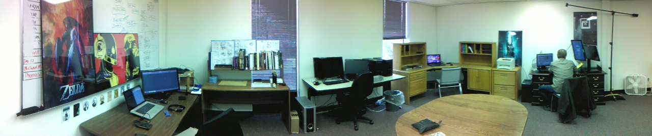
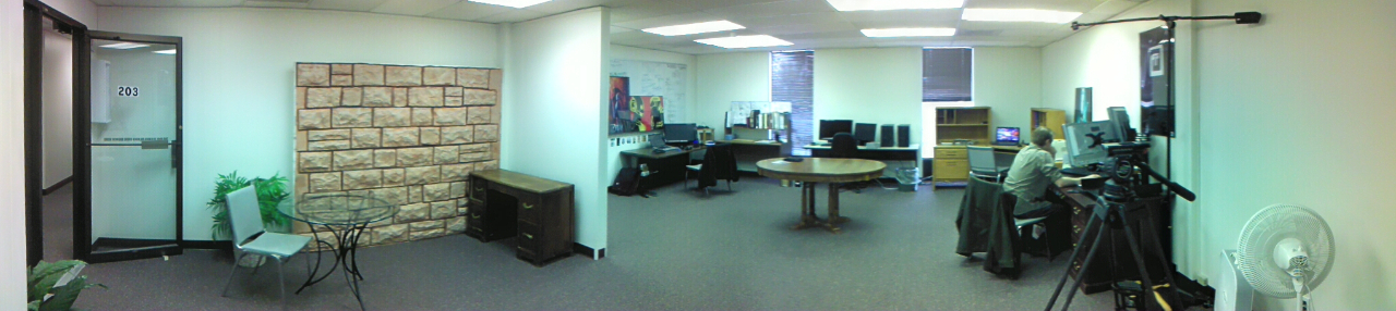
This is a quick post just to show off Thor Media’s new office. Nothing special, but it should help bring a new focus to our work and help us make better plans for the future.
Illustrator, Motion Graphics Designer, Animator, and VFX Artist

This is a quick post just to show off Thor Media’s new office. Nothing special, but it should help bring a new focus to our work and help us make better plans for the future.
These weekly sketch review posts are a bit easier to put together, simply because they don’t take as much time. I have a few long term paintings in the works, that I hope I can get published here on the blog soon. With time lapse videos and every thing. But, there just isn’t enough time in the day to get that stuff done sooner. Too many other projects and jobs to work on.
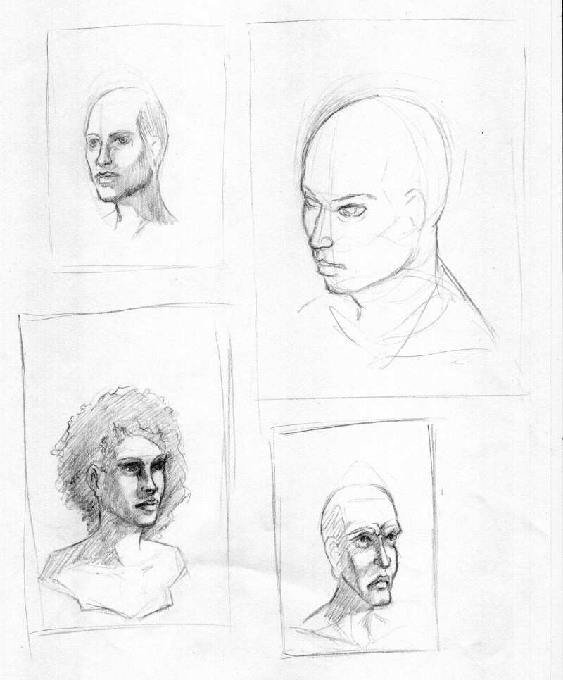
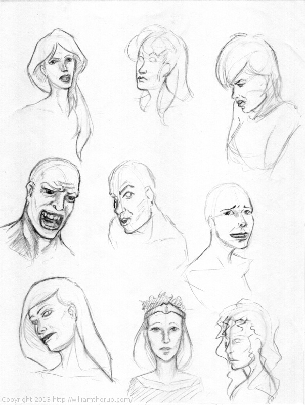
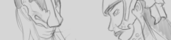
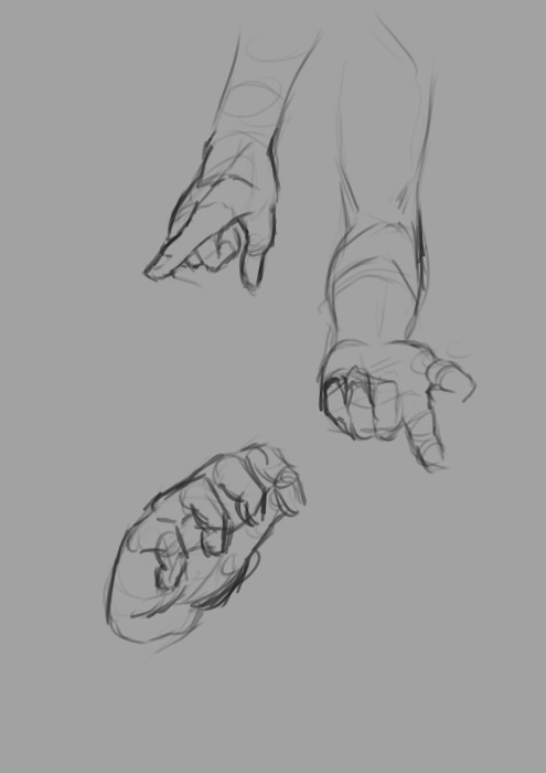
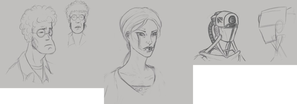
I have been focusing on the face this last week, with a bit of an emphasis on facial expression. Working with expression forces you to have a better understanding of the structure underneath the skin. This is really good, as I do still struggle with heads and faces, so working with expression should help me get to that next level.
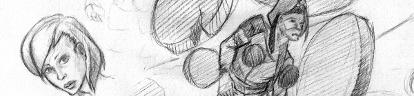
The image below, is just a sheet I was doodling on during other work. I have actually taken the center image and reworked it for a larger painting that I hope to post in the future.
Concerning projects though. I believe I have mentioned Thor Media’s next app project in previous posts, so, here is a little peak into that project.
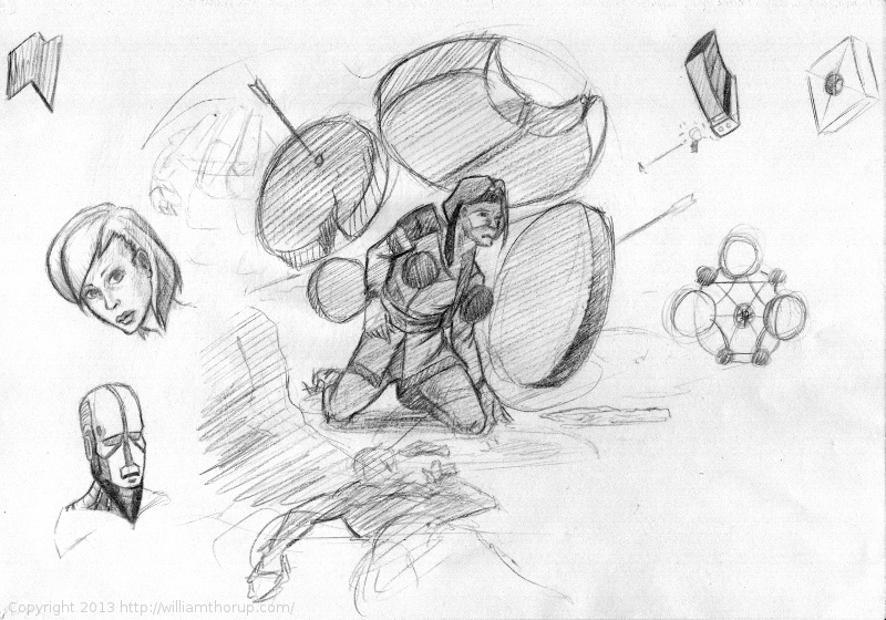
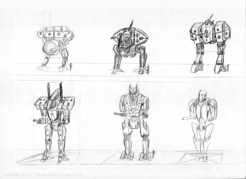
I have been spending allot of time putting together flow charts for our programmer. Mainly menu and game mechanics. But, I have also had some time to sketch some mech’s, something that I have never really done before. These sketches are nothing to write home about, but considering it is my real first attempt at drawing mech’s, I think I did pretty well.
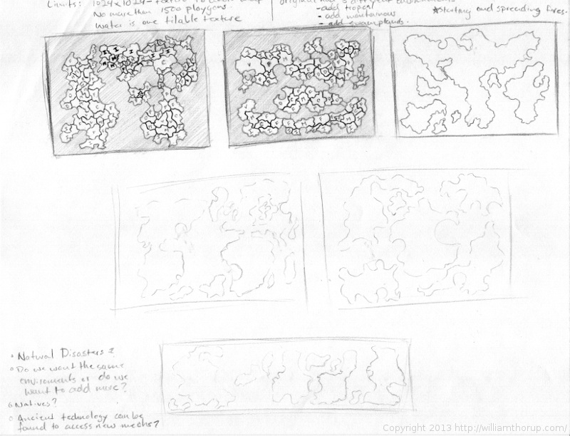
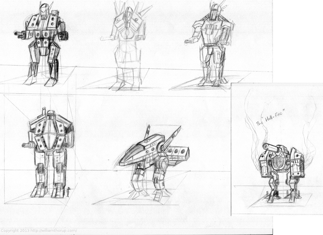
And along with some mech design, I have spend a bit of time just drawing random maps and thinking about layout and balanced level design. Something else I have never really done before, but it is fun to think about, and stretch a bit. It turned out to be a good way to get thinking about additional game mechanics and possible story scenarios as well.
This last week was really weird. Topping off stuff with Josh the Whale, and doing rush work for Overstock.com, it has been a busy week. But enough of my excuses for not posting more often.
But between the confusion and stress, I was able to enter the serene fields of sketch and study. This time around there isn’t much to talk about, just some random stuff. Kind of all over the place. So enjoy the time lapse, and any comments are welcome.
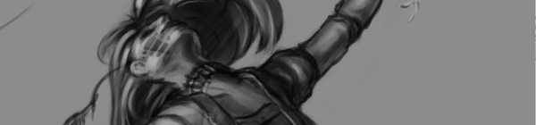
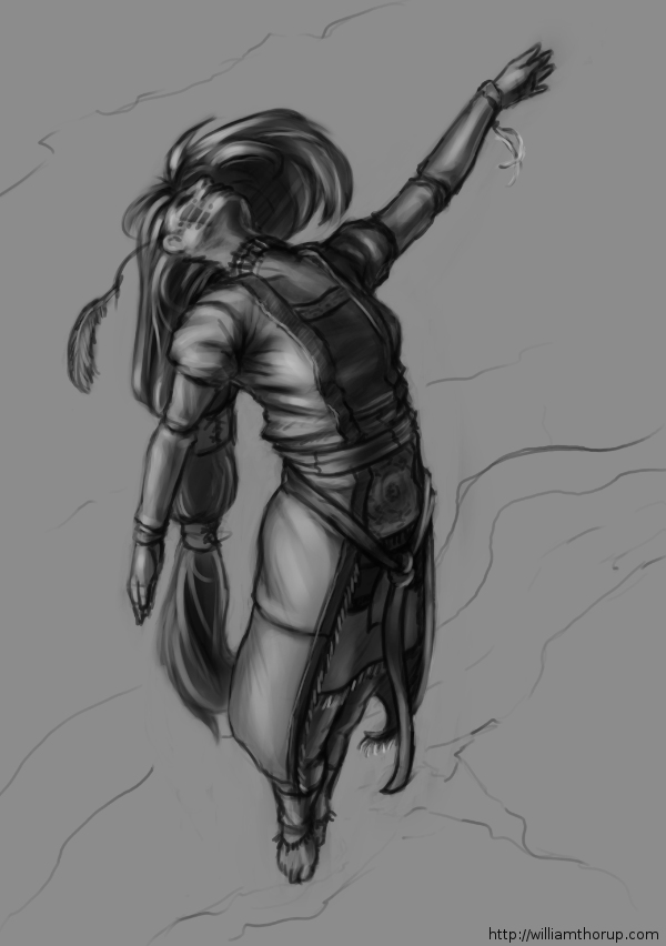
I don’t do allot of fan art, in fact, this piece originally didn’t start out as fan art. I was watching an episode of from the first season of Robotech, and sketching at the same time on my Lenovo tablet, when I did the initial sketch. (The costume is somewhat Robotech inspired). The one you see at the beginning of the time lapse video. It wasn’t until after I started refining the sketch in Krita, did I decide to turn it into fan art.
Don’t get me wrong, I think fan art is awesome, and an awesome way to express you appreciation for something (Isn’t that what art is kind of about?). And I wish I would take more time to do some fan art. But I tend to avoid it, because I have the feeling that I won’t be able to do it justice. So, I put off most of the fan art I would like to do for a later day and time.
This time around, though, I feel I did a fairly good job, and feel comfortable in posting and receive feedback for this piece of fan art.
But enough of that, lets go over some stuff that I think is worth talking about, and might be a bit educational. I am just going to start at the beginning of the video and mention a few interesting things I noticed in my process.
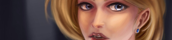
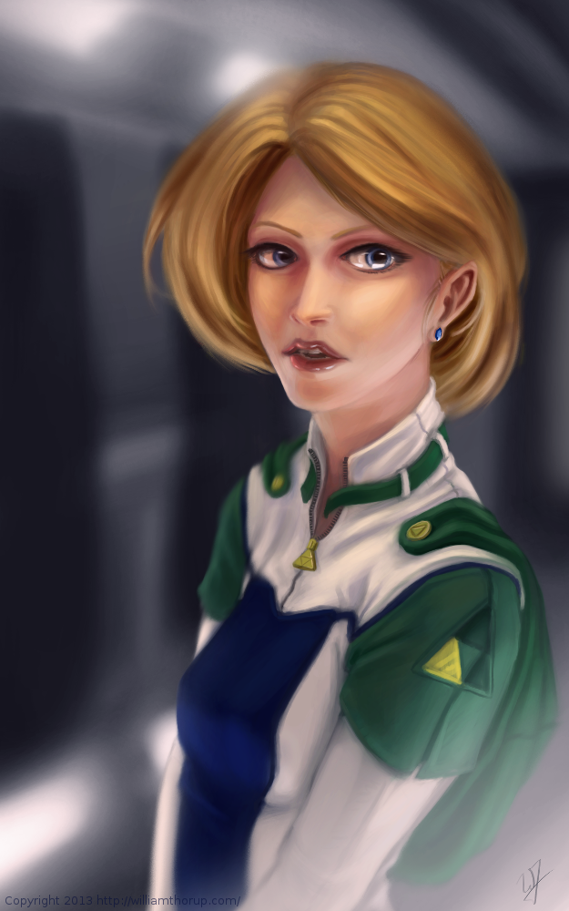
First, a bit of an explanation on content and style. This is a re-imagining of the character Princess Zelda, from the Legend of Zelda video game series. When I decided that this was going to be a fan art piece, I wanted to stick to the poofy hair and a somewhat military uniform as seen with many of the characters in the first season of Robotech, but with a bit of Zelda seasoning. There are actually only a handful of things that tie this piece into the Zelda universe.
The most obvious things are probably the colors. The blue rupee, green hood and shoulders, and the golden triforce all point to the Legend of Zelda. But there is also the character herself. Zelda is often portrayed as someone beautiful, with a sense of innocence, which is something I stuck to here. But the costume was chosen to depict the strong side of her character as well. A less obvious sign of her character is that her mouth is open, as if she were speaking to you. Zelda is often used in the Zelda series as a mentor character, and if she lived in a more futuristic or sci-fi world, I see her playing more of the mentor character than royalty.
There are a few other things I could mention, content wise, but for the sake of keeping things short, I will let you jump on the Zelda Wiki to figure some of the other imagery out.
As for my processes. Most of my planning was done in the line art. At this point I didn’t have a really good sense of the lighting, until I sat back and thought about it later, but I had a good idea of what I wanted the subject to look like.
I decided to skip doing a value painting, and go straight into color and value. I try to avoid this nowadays, and stick to a value painting before I ever jump into color, but in this case, I wanted to try something new.
I wanted to try to create a simple color palette to lay the foundation for my colors and values. I don’t include this step in the video, but it is something that I learned from a post by Nasan Hardcastle. A great digital artist, that I suggest that you all follow. But having a simple palette like this can help keep your colors and values organized in the foundation of the painting.
Something unique in this painting, that I have never done before, is the light setup. If you include ambient light, I have a total of 4 different light sources in this painting. This was one of my stretch goals for this painting, to use that many light sources without loosing the form of the subject, and adding appeal to the painting overall.
But not all was fine with this painting. I messed up on the proportion of the nose, and had to readjust that half way through. Not too difficult, but I feel it’s something that I shouldn’t have to deal with and definitely need to practice more on. Also, another proportion problem was the width of the head, which I eventually had to fix.
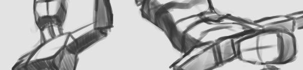
But with the good and bad of this painting aside, there is one tip I would like to share. Color Grading. One of the huge advantages to digital art.
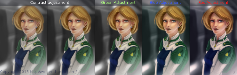
I have never been good with color, this is probably because I don’t have a solid base in traditional painting. But, “color curves” an “levels” make up with this shortcoming with ease. Using some reference images that I wanted to match color with, I did several stages of color correction, as depicted above, using both “color curves” and “levels“, and selection the specific color channel I wanted to modify.
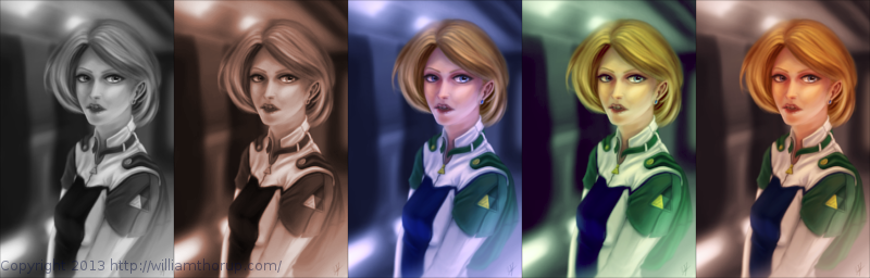
These two options can also be used to quickly change the feel of a painting. A good way to explain this is how a sepia toned image and a black and white image create very different feelings, even though content may be the same. This is pretty basic stuff, especially if your into photography, but it is fun to take an image you created from scratch and see how it transfers to these different color schemes.
I have a few more paintings coming down the line, we should be starting a new app project soon, and a Weekly Sketch Review is just around the corner. Stay tuned.

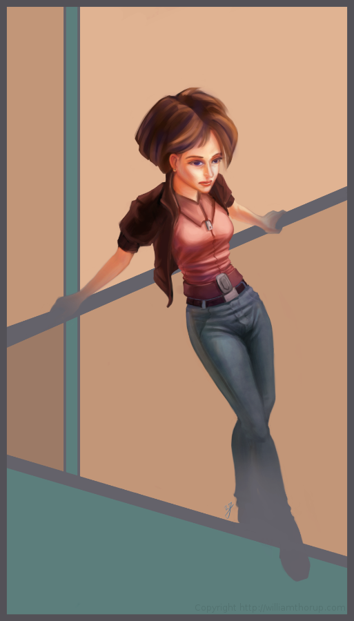
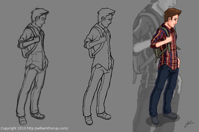
The last few weeks I have been trying to reach outside of my box a little. Been reading allot about visual style, and developing a visual style as an artist.
The 16-bit portrait I did earlier, and this piece have been practice in what I am reading. and it has been fun so far.
I was just sketching when this one came out to me. I liked the pose, and the silhouette that it makes was really strong. I decided to carry it to a finished piece. The outfit she is wearing is really random, and for me, kind of weird. Feels a bit western. But, in the end, I think it feels good with the rest of the image, and it definitely helps the silhouette as well. I stuck with a split-complementary color scheme to keep things simple. and wanted to focus on basic skin tones to present a warm feeling in the painting overall.
As for what I struggled with in this painting. The background was killing me. At first I was leaning towards a style that fit the character. Something that fits the perspective and shaded similar the woman. Going over this in my head, I couldn’t really think of an environment that would work with the subject to create a stronger piece. So, in the end, I decided to do something abstract, and focus on composition and color. Something that would strengthen the main subject, but at the same time wouldn’t be distracting.
Again, overall, it was and interesting piece to work on. Definitely not in my usually ball field, but it was good to stretch a little. Its also good to feel like shading is becoming second nature. I am doing better with drawing hands, but still have a long way to go. I struggled with the face a bit, so we’ll seem more faces in my Weekly Sketch Reviews for sure. Speaking of, one of those should pop up soon.
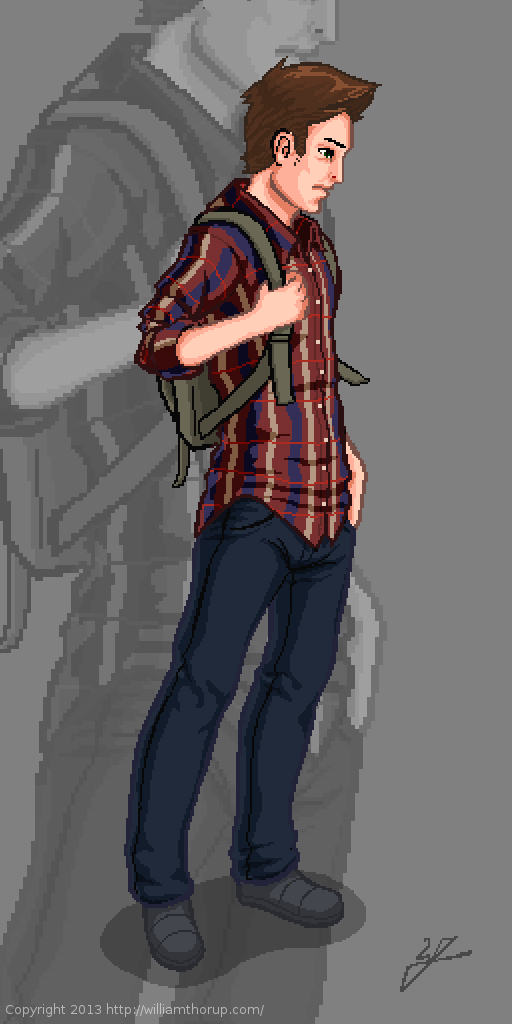
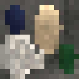
Got thinking about the Atari Jaguar again, 8/16-bit stuff, and nostalgia hit. So, to help feed the hunger for the good-old-days, I thought I would do a some 16-bit graphics myself.
I didn’t want to come up with a character concept, or anything, so a self portrait seemed like a good choice. As for style, I was thinking of King of Fighters, or Samurai Showdown. Great fighting games, in the same realm as Street Fighter. Sticking closer to the cel shaded style over the smoother more realistic styles that come from some of those games.
Doing 16-bit art changes the way I think about things. I started out with a sketch, just like any other piece, but when I began moving into the line art, things began to change. Similar to paying attention to the shapes of your lines when inking, when doing low-resolution outlining you have to pay special attention to your lines. The limited resolution forces you to figure out how to make lines go from thick, thin, then to nothing.
Also, another problem that is introduced lines that curve, don’t curve very well. Because pixels are generally square, it gets harder and harder the smaller resolution you have to make a decent circle or curve.
But there are pros as well. With the limited resolution, there is less detail to worry about. This is one of the reasons why games have gotten shorter over the years. The more resolution you have, the more detail you need to fill that empty space, and the more the costs go up to fill that space. Therefore a shorter game. But, my point is, less detail to worry about.
This piece was originally done at 256 x 512 pixels, with a palette of about 30 colors. I did it at that resolution to test out larger graphics on the Jaguar for the future. My brother and I have been playing around with coding our own Jaguar stuff, and would like to move into a game eventually.
But that is way in the future, and I consider this more about practice than actually putting together a game. I have enjoyed doing this small piece. Simple, stylized, and looking forward to doing more in the future. And I wish my hair actually looked like that sometimes.

This has been a long one in the making. I guess I shouldn’t put it that way, though. It took only a week or so to actually finish the work. I have just been waiting for the release of the actual short film, to get permission to post about it.
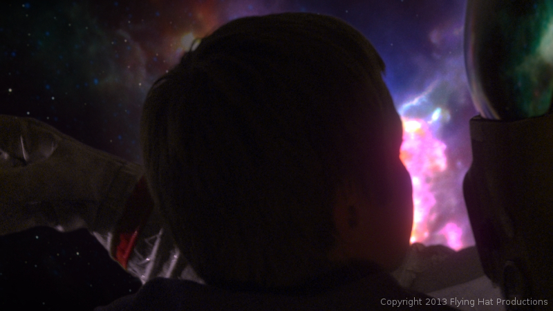
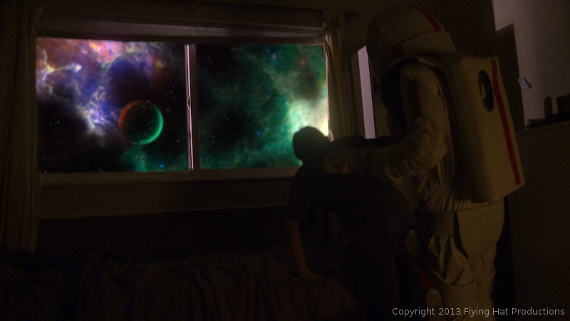
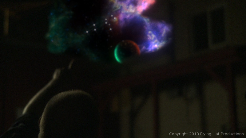
Over the last year and a half, I have had allot of opportunity to work with the Blender compositor, and it has given me the chance to learn, in detail some of the things needed, to pull off some simple effects. One of these projects was “Spaceman“. A short film by producer Holly Tuckett and writer/director Jaron Kent Hermansen. Their short film required some visual effects work, and they asked Thor Media to step in and do the job. Here is a short breakdown video of a few of the shots that I worked with.
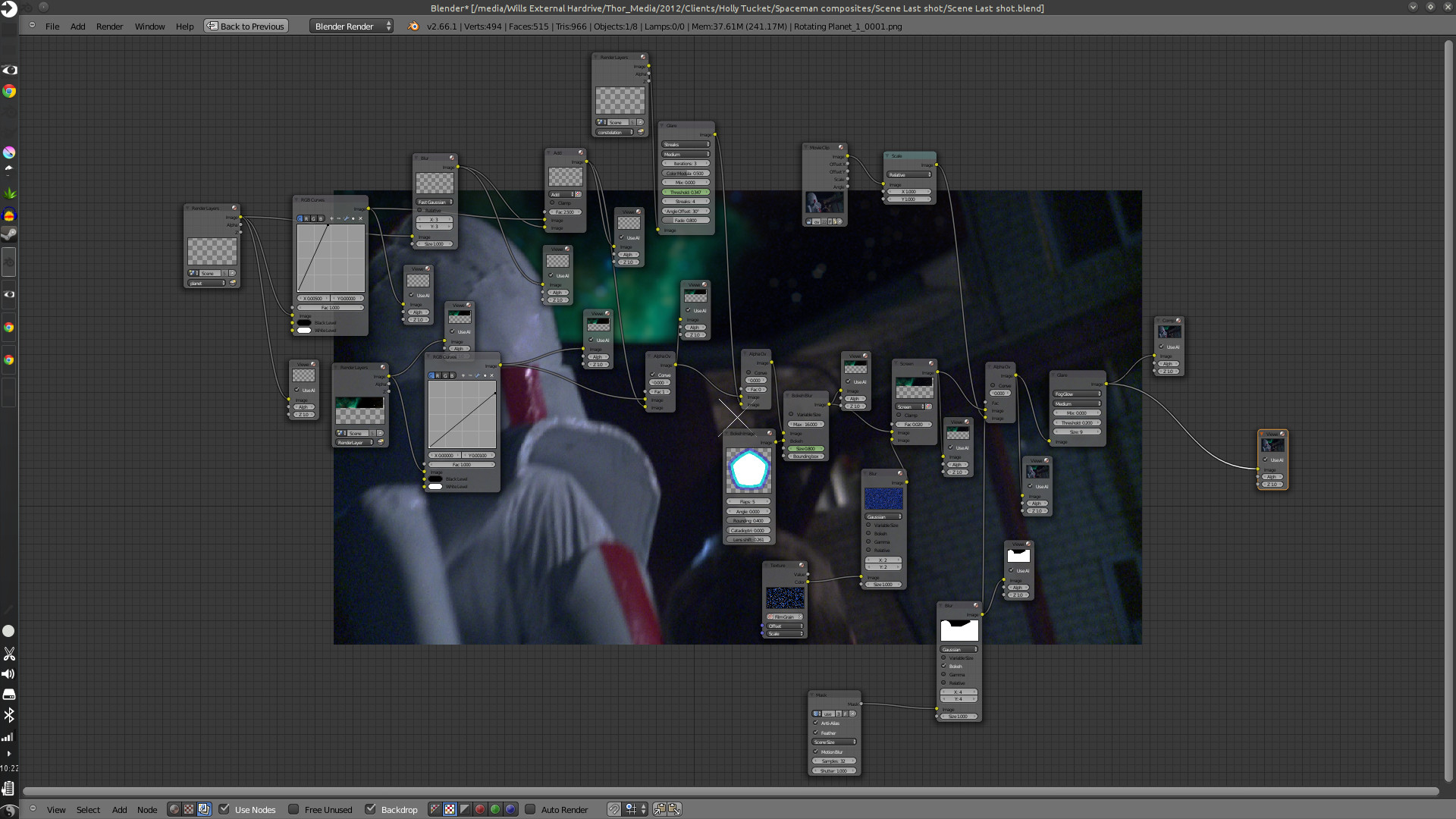
Here are some of the compositing trees. It looks allot more complicated than it actually is. And to put in new backgrounds only takes a few steps.
First thing is to track the footage, whether the camera is moving or not. The camera is always moving, whether its the wind blowing, or the heartbeat of the camera man, the image will always move. Next is keying the green screen, and creating any masks that are needed to maintain what you want out of the original footage. And attaching those masks to the camera tracking data.
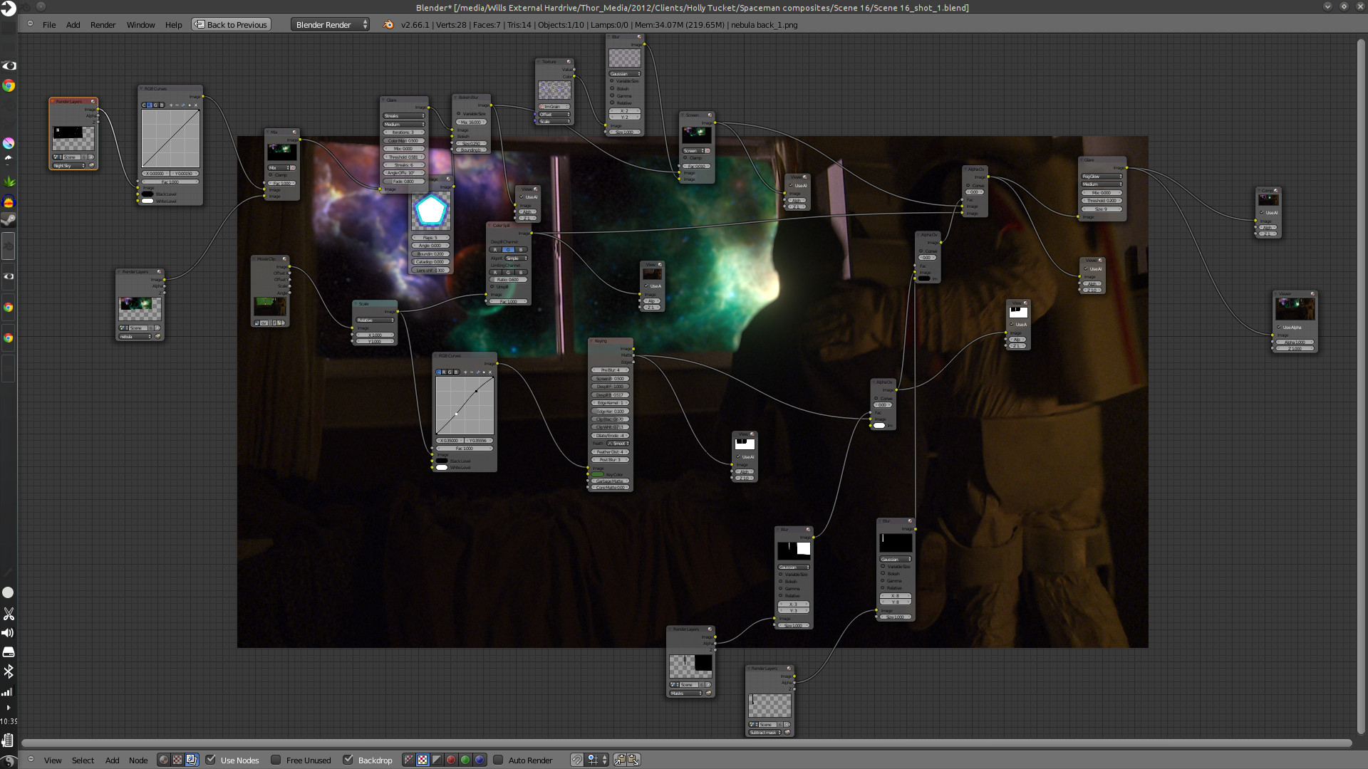
After which you build your background and attach it to your camera tracking data, and adjust to make the movement look good. Then comes any color correction, adding other effects like glows or motion blur, adding film grain, and then the final composite.
The hard part is getting the new, digitally created elements to look good with the real stuff, speaking of style and lighting. This takes allot of patience, critique from other people, and just playing around with the options that are at your disposal.
This was especially hard with this project, because most of the visual effects take place in the boy’s dream, and are meant to be exaggerated a bit. But at the same time, I had to get a look that fit with the mood and style of the story, without making it feel like the visual effects were making light of the situation.
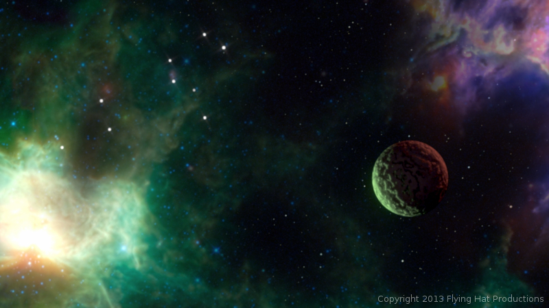
Overall it was a very fun project to work on. Jaron and Holly at Flying Hat Productions, are great people to work with, and gave me good feedback and direction on the project. And, also, my brothers Jacob and Bryce gave great feedback and critique. I hope there are similar job like this in the future for Thor Media. Free, fun and creative.
The short film hasn’t had an official release yet, but they have trailers and all sorts of content on the film’s blog. Click on this link, http://spacemanthemovie.blogspot.com/, to learn more about the short film and it’s creators. They did a great job putting it together, and would love to see your support.
If you have been following my blog for a while, you know that I have mentioned my Lenovo Thinkpad Tablet a few times. And you know that I have said I would put together a video of me using it, several times now, and I haven’t come clean yet. I know…
I still want to get around to doing that, but in the mean time, here are a few sketches done on the Lenovo Thinkpad Tablet.
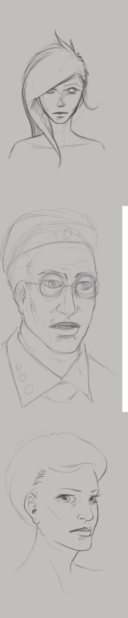
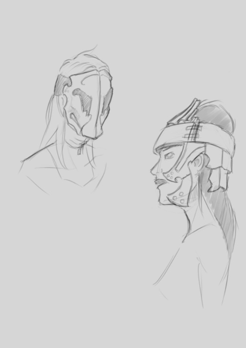
At the top of this post, I was practicing portriats and some character design. The guy with the glasses, on the left, I really enjoy. He comes off as a computer programmer, that just wants to come to work, do his job, and then leave. Doesn’t care much for the social life, and would rather avoid it all together.
The woman in the middle. I was really just playing around with the tattoo on the face, and possible character design for a game my brother and I are working on.
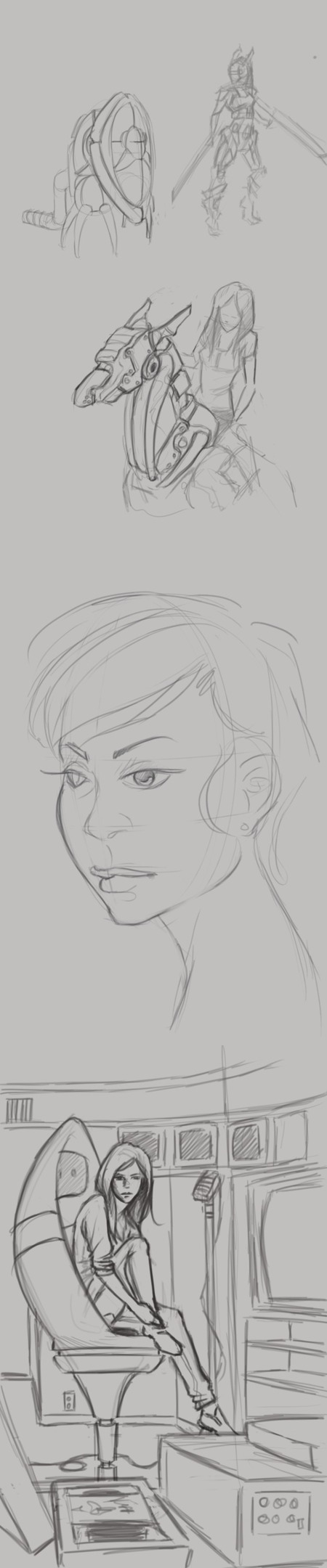
Then, the one on the right is actually a sketch from Draw Night. I think we were talking about Mass Effect or something, and that sketch is what came out of it. I don’t draw robots very often and I like how the sketch came out.
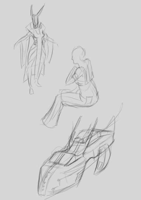
Now the sketches to the left, I have a few portraits in there. Just playing with styles while studying different head shapes and hairdos. But again, there are a few random robot sketches.
The sketch in the bottom right is a concept for a future illustration, perhaps. I was thinking about video editing and VHS tapes and thought that might make a decent idea for an illustration.
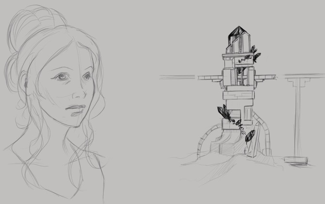
Another portrait study on the left, but also some architectual design on the right. You might recognize the tower on the right. It was actually the concept for this piece HERE orginaly.
If your interested in the app I am using, it is Autodesk Sketchbook Pro. It has a huge selection of tools, and it has allot of pressure sensitivity options. Unfortunately this is something that Photoshop Touch lacks, but it is a photo manipulation program, it isn’t really meant for illustration.
Besides a normal sketch book, the Lenovo Thinkpad Tablet has been one of the most useful artistic tools I have. I am usually carrying it around in my back, and it usually is less of a hassle to deal with than running out of paper or a broken pencil. I can just sit down, turn it on, and I have every color in the rainbow at my disposal, with full pressure sensitivity (something that most tablets don’t have), and the ability to transfer those sketches to my desktop to turn them into more finished works.
It does have it’s cons though. A normal Sketch book doesn’t have a battery, so you don’t have to worry about charging, and drawing digitally never quite feels like the real thing unfortunately. But with these aside, it does make sketching funner and more inviting, when I can pull up reference for anything through the browser on the same device.
If your interested in getting a tablet for art, I would suggest the Lenovo tablet or the Samsung Galaxy Note 10.1 tablet. The Samsung tablet is newer and faster, and instead of 512 levels of pressure sensitivity, it has the full 1024, like most drawing tablets. Has a better battery life, and speakers, but is an additional $200 to purchase. So, if you have the extra cash lying around, it is definitely worth the purchase. I’m thinking about getting myself one soon.
We had a good draw night yesterday evening. Good to see friends and draw a few things as well.
During the few hours I was there, I worked on a sketch that I had started the day before, that I enjoyed, and I thought I would push it into a value painting. And, as I was recording my desktop, I thought that it would be good to not only have the time lapse, but also include a few tips and things that go through my mind while I paint. For my benefit and for yours.
The video is fairly short and to the point, and I hope it helps. And if it doesn’t help, I also recorded myself through the webcam. So, at least you can laugh at me, as I get ridiculously close the screen and perform all sorts of weird expressions.
If you are interested in joining us for draw night and live in the greater Salt Lake City Utah area, drop by our Facebook page and let us know. The location sometimes changes, so keeping tabs on the Facebook page will keep you up to date on the location.
I have been waiting on a job this last week, and we have had a bit of down time with Josh the Whale. So, in the mean time, and considering that I didn’t do a Sketch Review last week, I thought some drawing was in order.
It is amazing how fast you can get out of the groove of drawing what you like. One week… I say again – One Week of not drawing, I felt like I was playing catch up with myself from from two weeks ago. Its how fast the knife can go dull if you don’t keep sharpening it.
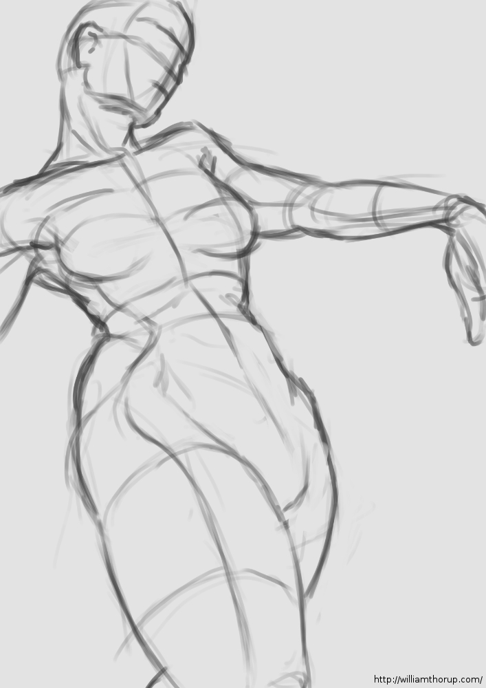
With that being said, I had no real focus with my sketches this last week. I have had some stories running through my head, so I did some character design. I felt like I was struggling with perspective in my figure drawing, so I did a little of that as well. Anyways, let me walk you through some of these drawings.
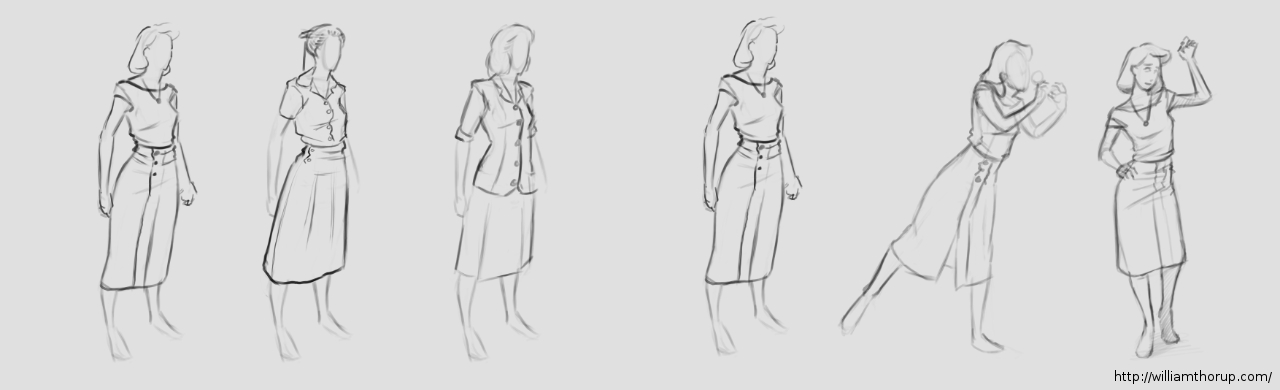
At the beginning of the week I was kind of all over the place. The drawing above, and the one to the right I was doing a bit of character design along with fashion practice (I guess you could put it that way).
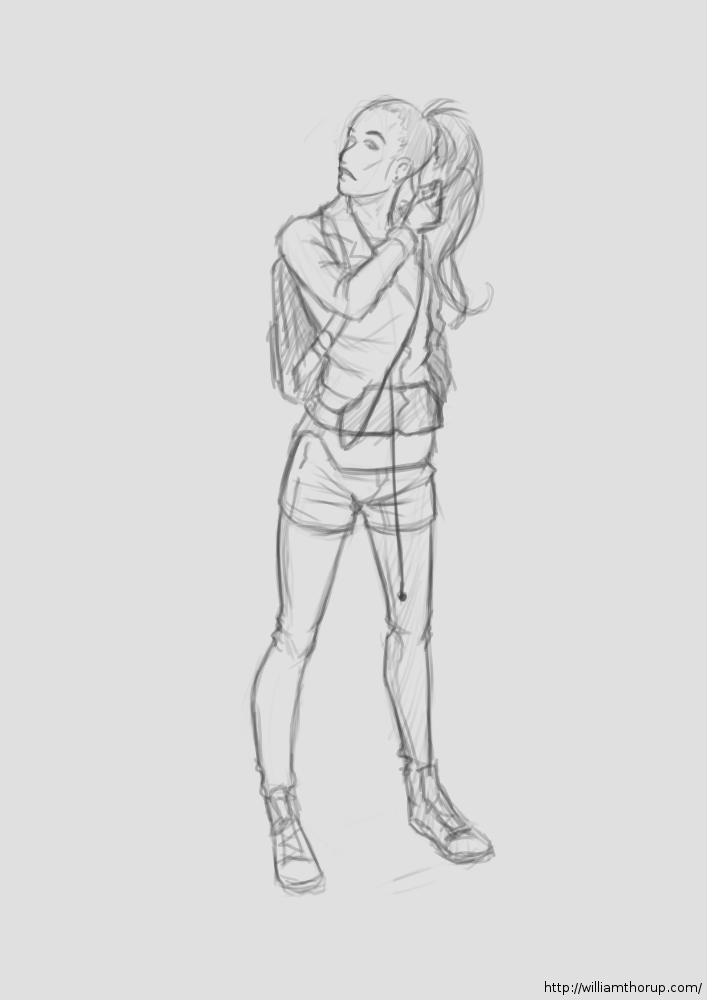
The one above being a female character, in her early 20’s, highly intelligent, not beautiful but cute, and is from the 1940’s. For her apparel, I wanted something that seemed a bit formal, but not over the top, something she would go in the park in. As for personality, I never got that far. But I did a few poses that give you the inkling that she is curious, maybe an explorer or scientist with a thirst for discovery.
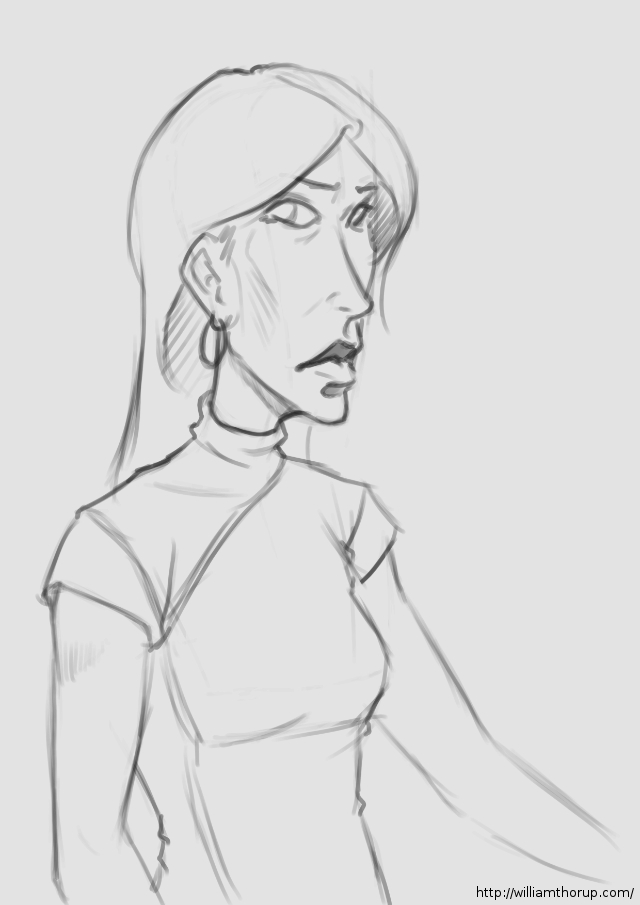
Now the one on the right is more of a study in fashion then character. Though I think her slight expression may give you the impression of someone who is willing to listen, but you have to make the first move to get her to respond. I really enjoyed how this one came out though. I might end up doing a completely rendered version in the near future.
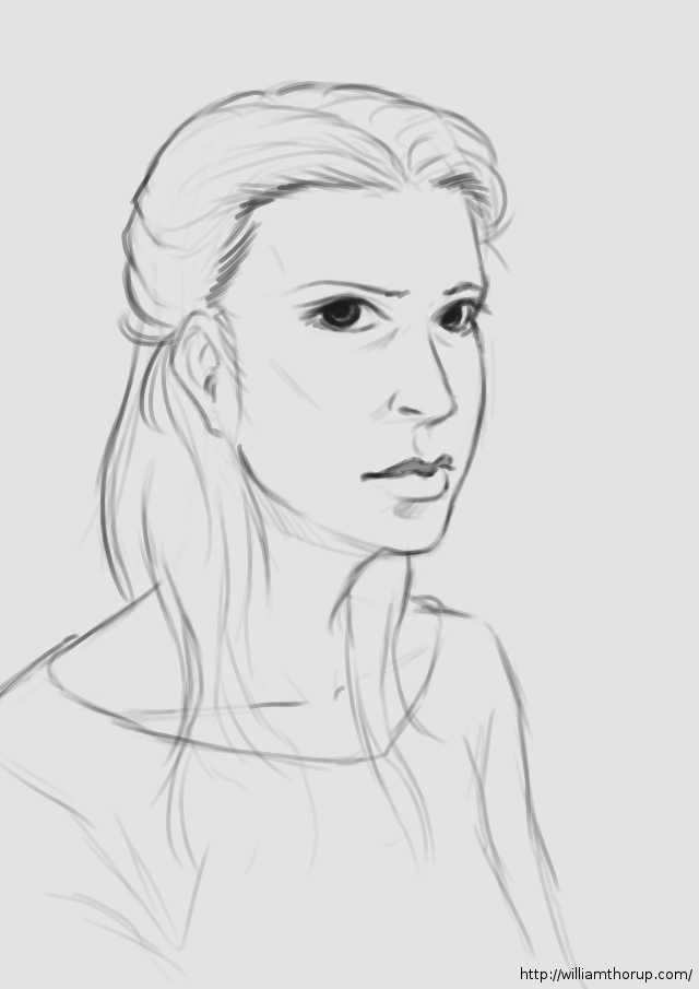
The middle of my week. A caricature and a hair study.
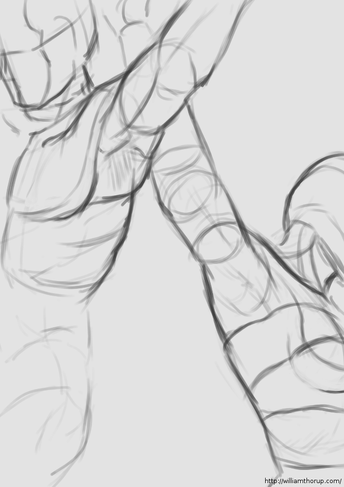
The last part of the week, I spent time practicing perspective with my figure drawing. I believe the style of figure drawing is called “Analytical Figure Drawing”. Basically taking the simplified shapes of the human form and applying them to perspective. I know Andrew Loomis stresses this form of drawing when approaching the human figure, and I can see why.
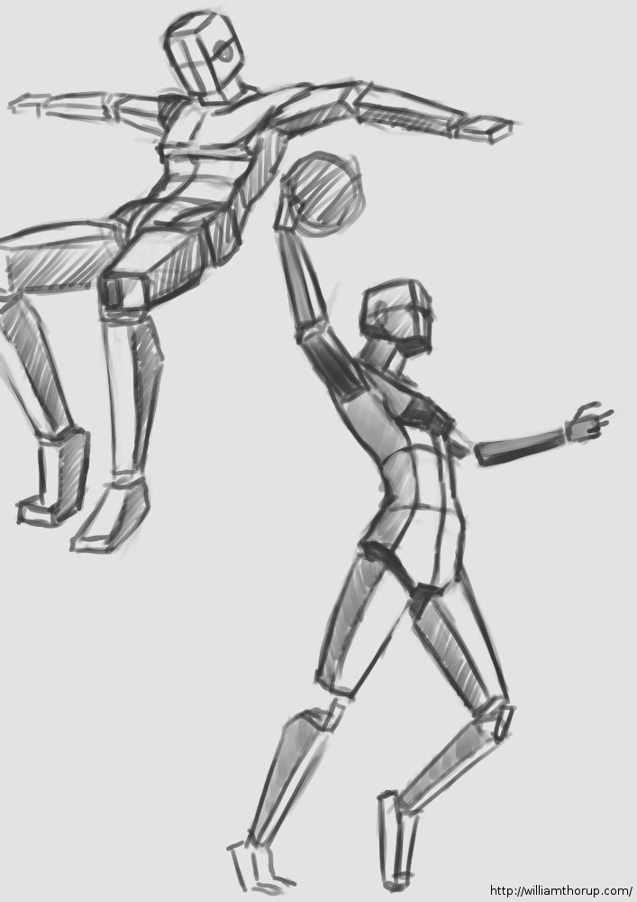
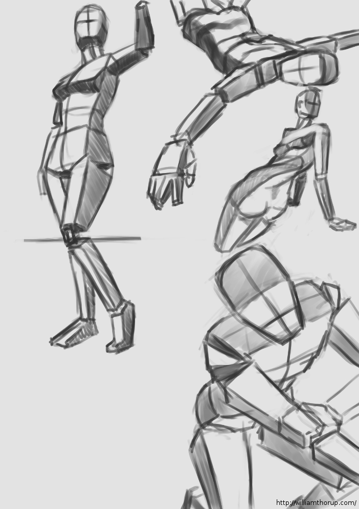
It not only helps with drawing things in perspective, but because it asks you to start with simple forms this kind of turns it into a practice of sculpture. Because, allot like sculpting, you start with the basic shapes of the figure, and then you start molding or carving away, searching for the correct anatomy and curves in the figure. I could easily take anyone of these sketches and render it into a finished drawing.
This is a technique I would suggest to anyone who is struggling with the male or female figure. And if you need some examples that easily surpass me, HERE and the book by Andrew Loomis “Figure Drawing for All its Worth” are awesome resources. Most of Andrew Loomis’s books are in the public domain, free to download, and one of the best artistic resources out there.