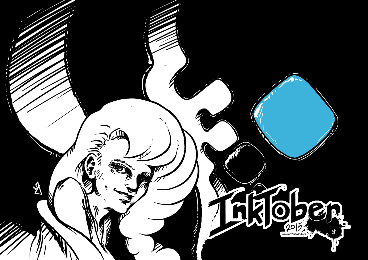
Here we go. Time to give it a try. Inktober. I have been wanting to do this for the last few years, after my friend Michael Buhler first introduced me to the event. Be sure to check out his blog, as he is currently inking away as well. I think I final have myself worked up enough to carry through the end of the month.
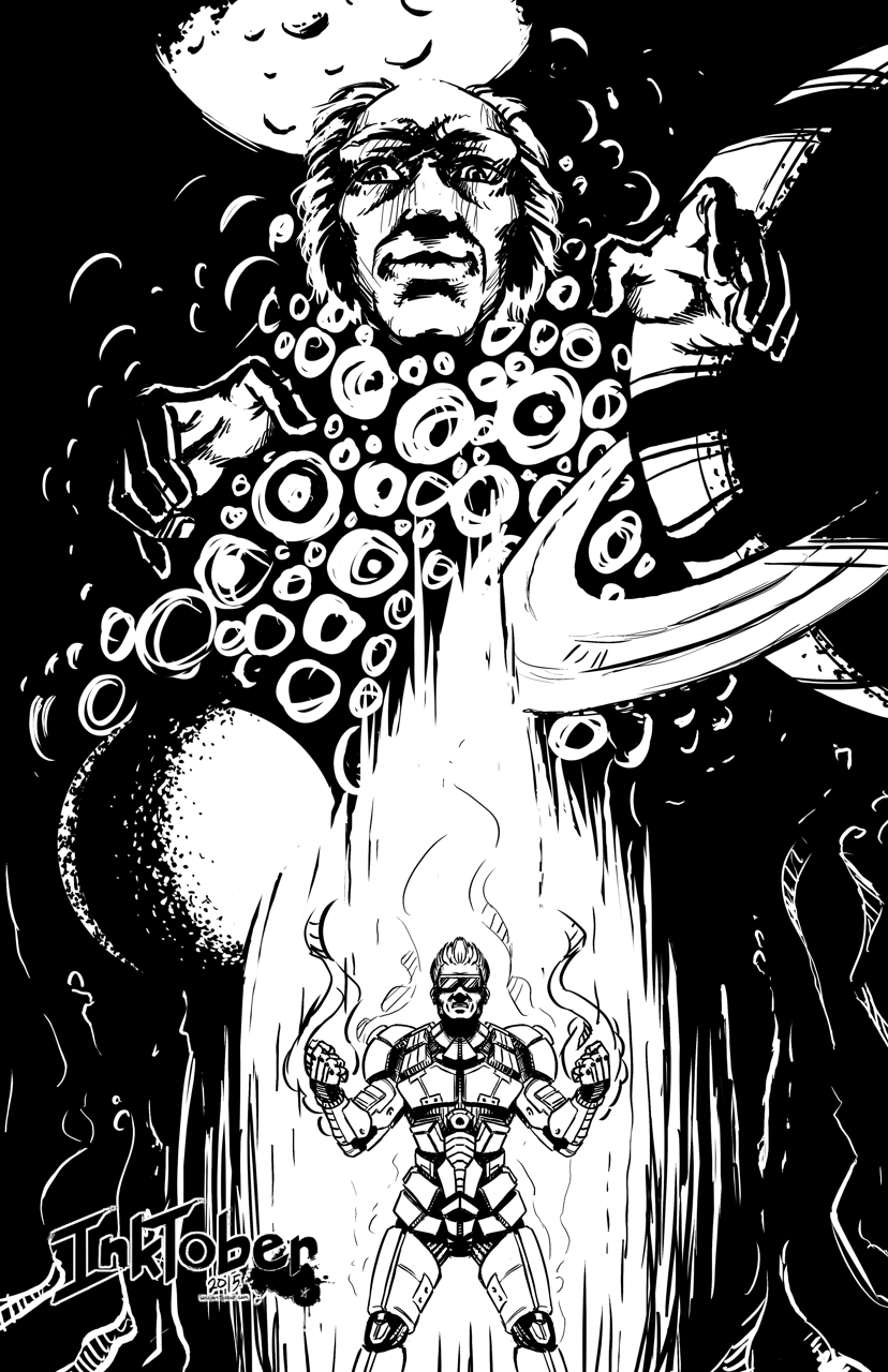
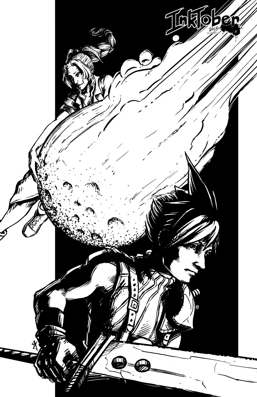
![]()
Goals
I think that the only way I am going to see this through is if I set a few goals to help generate ideas, but keep it basic to avoid being too ridged. I want to keep it fun as well. For the sake of keeping my blog clean as well, I will be posting everything in this post, and I will also be sharing out to the Facebook Draw Night group, Google+, Deviant Art and to my Instagram.
Goal #1 is to produce 10 larger, 11×17 vertical illustrations, for my top 10 video games. I won’t list that here now, don’t want to spoil the surprises to come.
Goal #2 is 21 other small scale pieces. This can include inked sketches, smaller, and quicker to finish.
Quick Link List
A list of what is done, and linked for quick navigation.
11×17 Fanart Illustrations
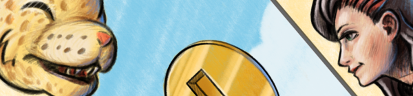
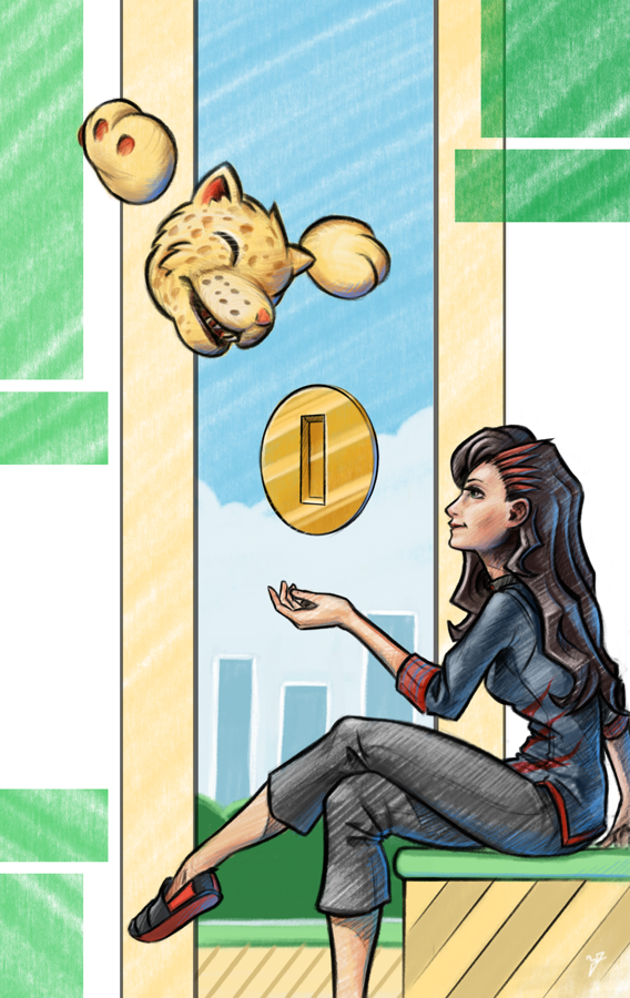
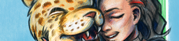
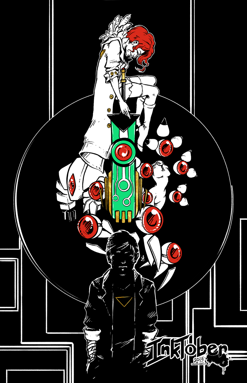
Day 4 – Transistor
Day 11 – Phantom Dust
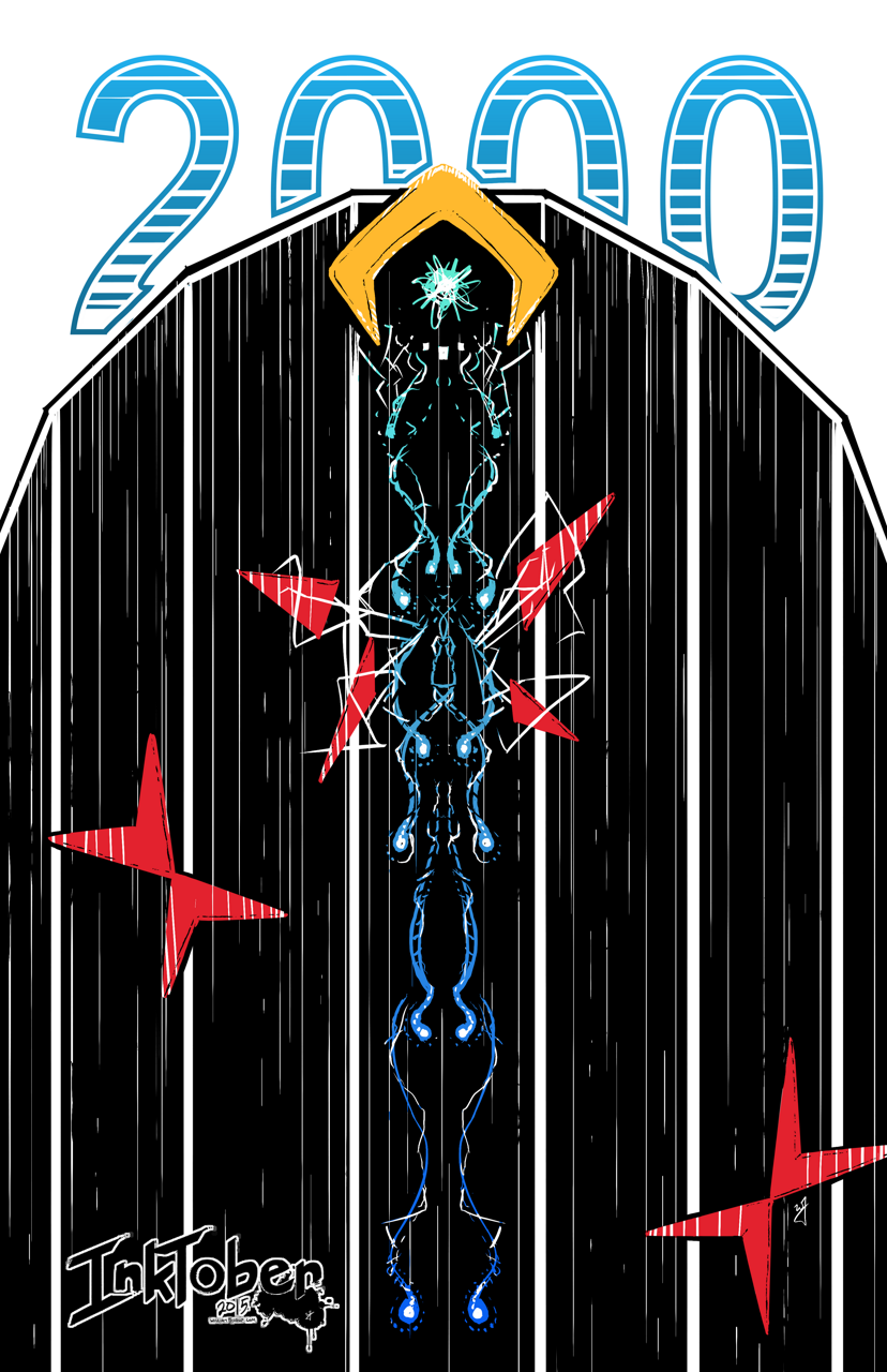
Day 16 – Tempest 2000
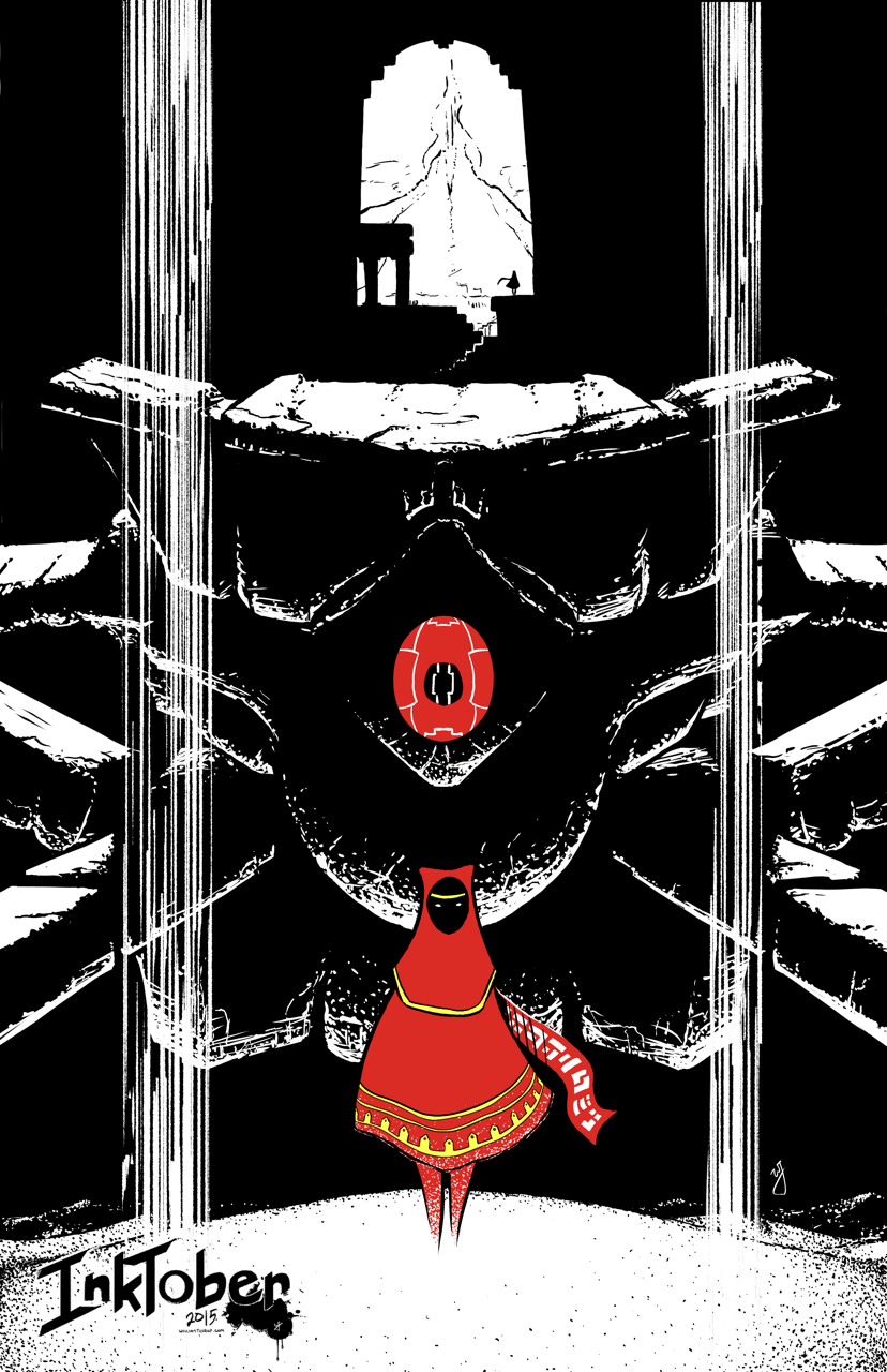
Day 17 – Journey
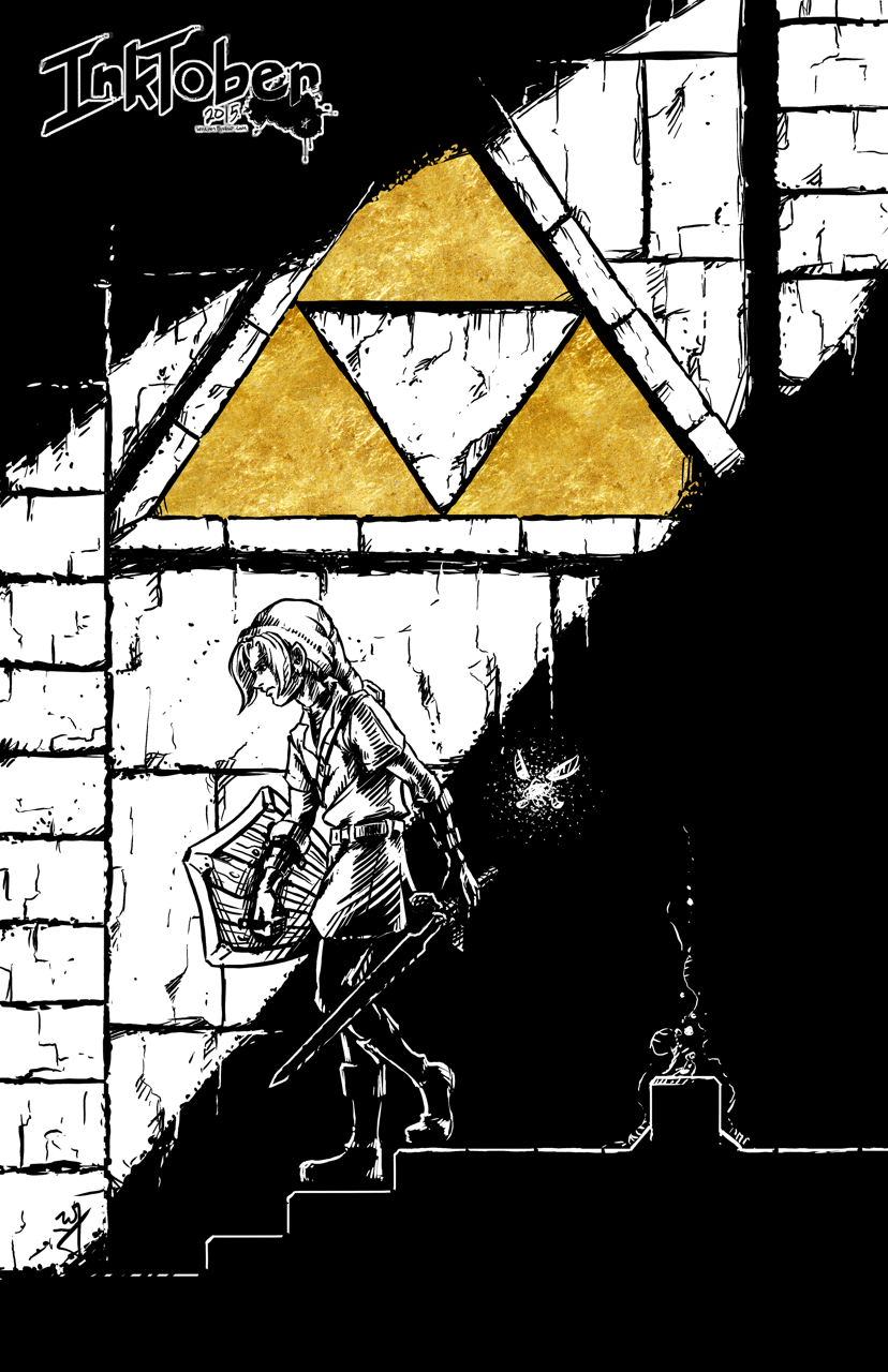
Day 18 – Adventure of Link
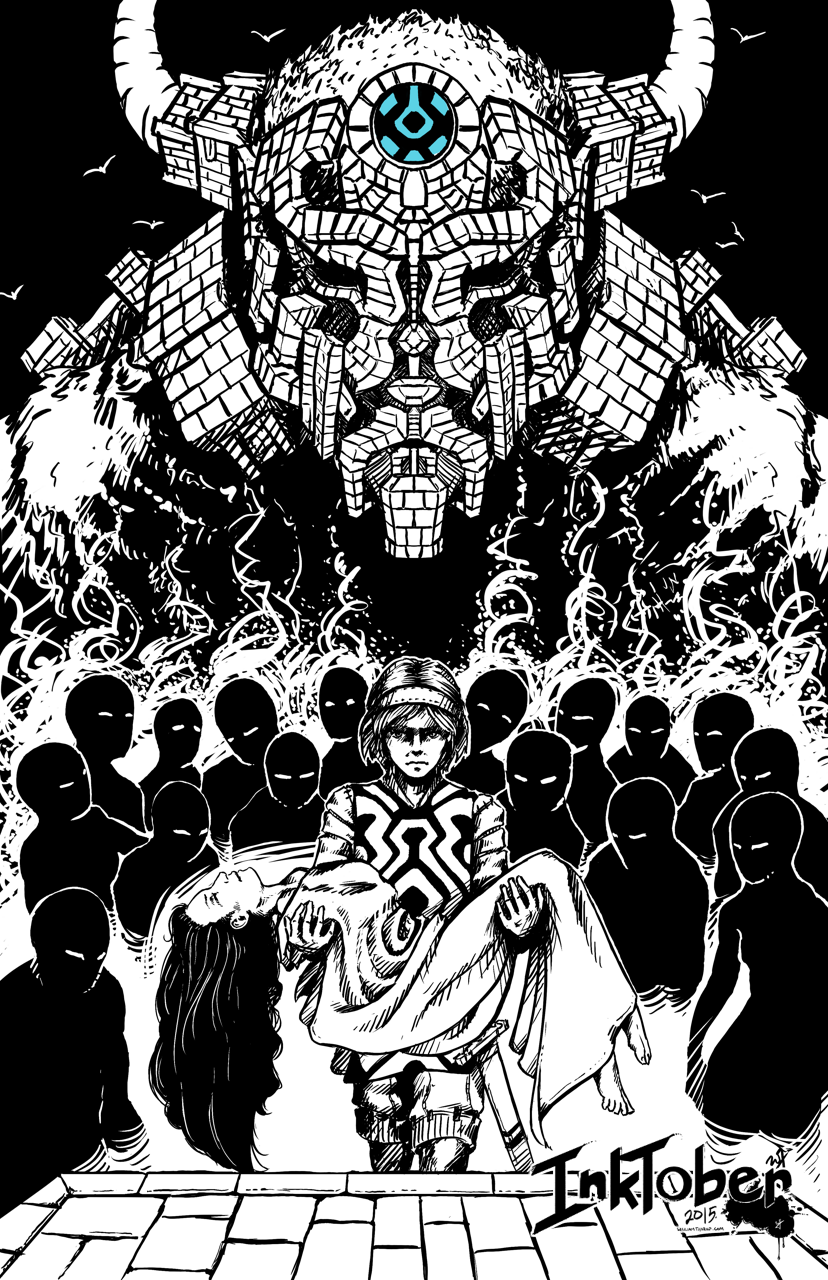
Day 19 – Shadow of the Colossus
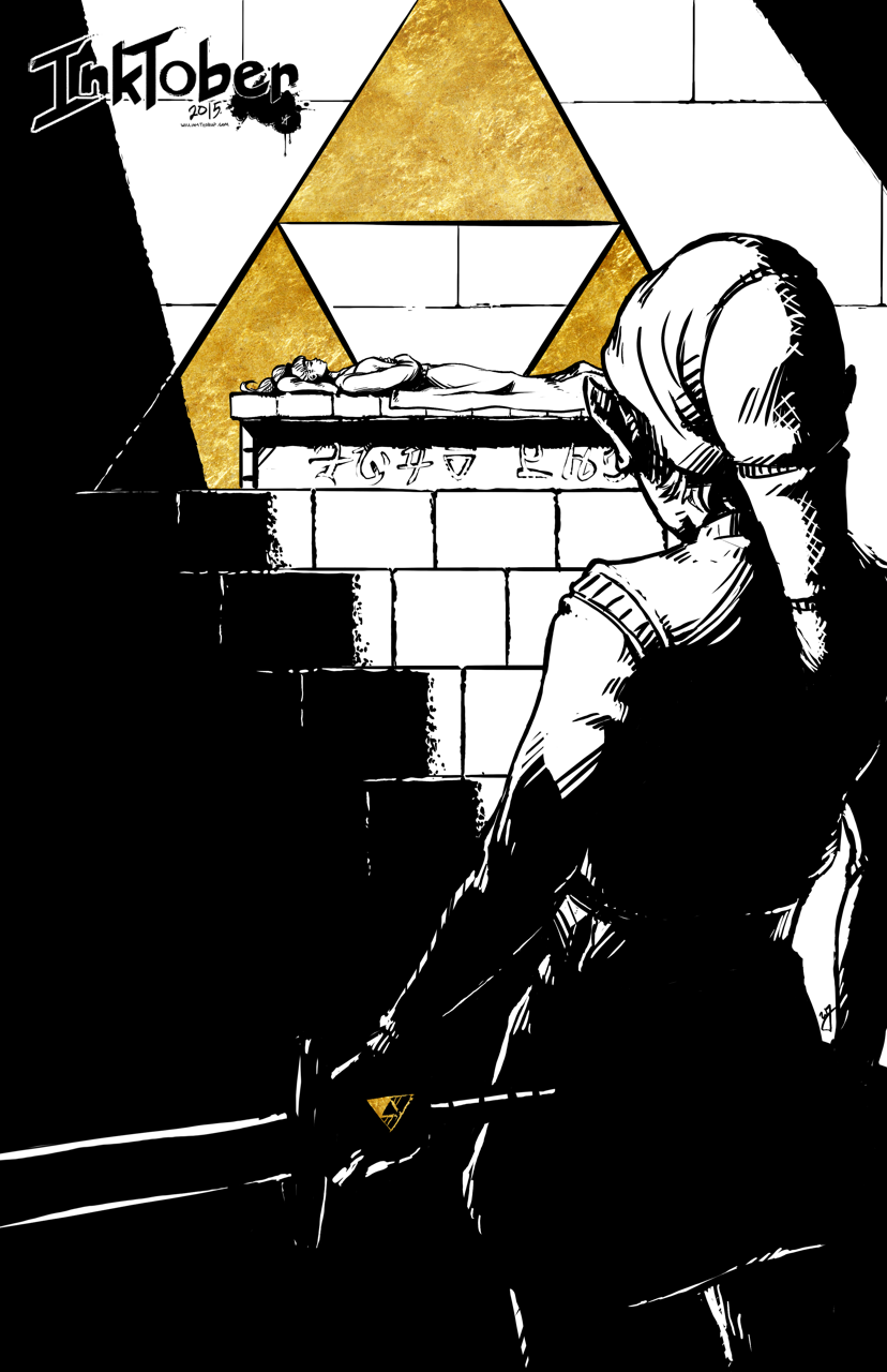
Day 21 – Ocarina of Time
Day 29 – Link’s Awakening
Day 30 – Final Fantasy VII
Day 31 – Street Fighter 2010
Other Inks
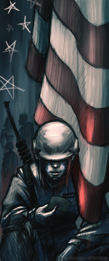
Day 1 – “Play the Beast”
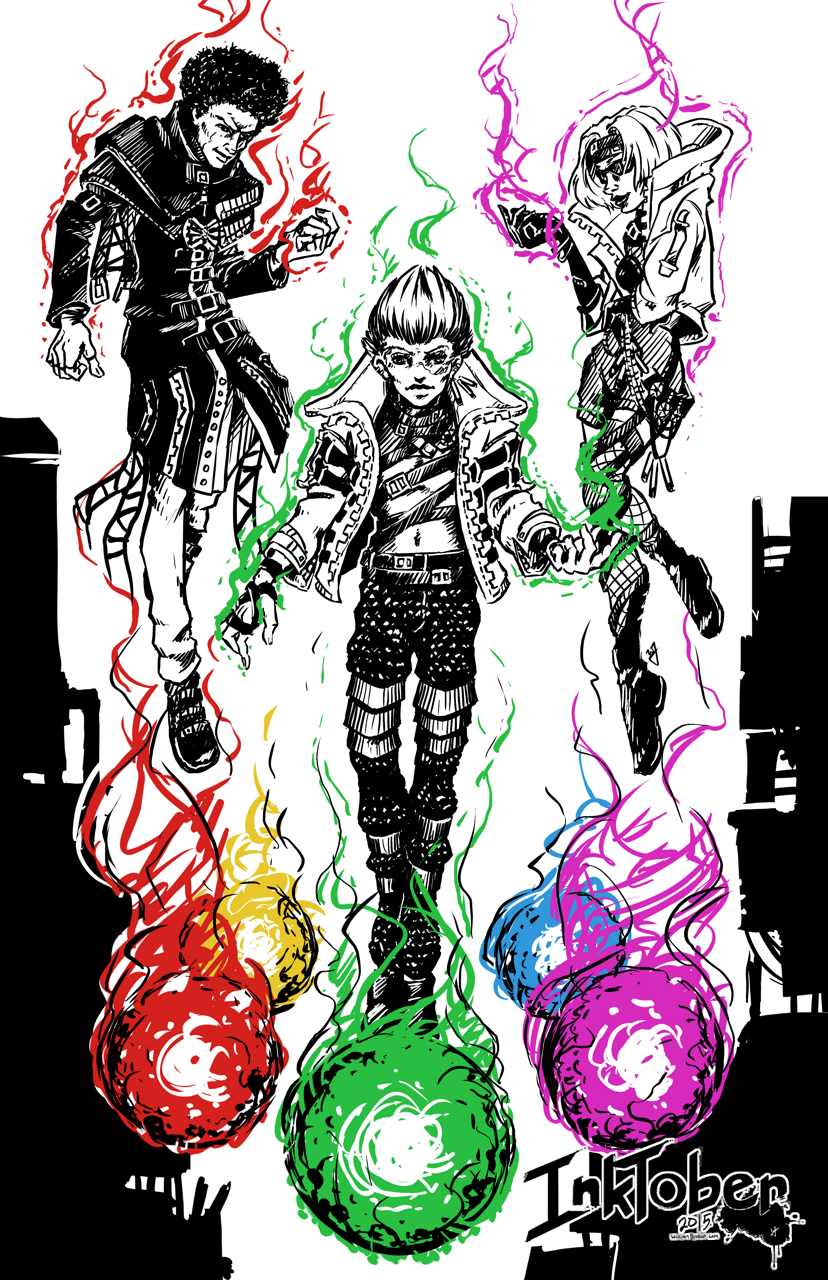
Day 2 – “Another Bullet”
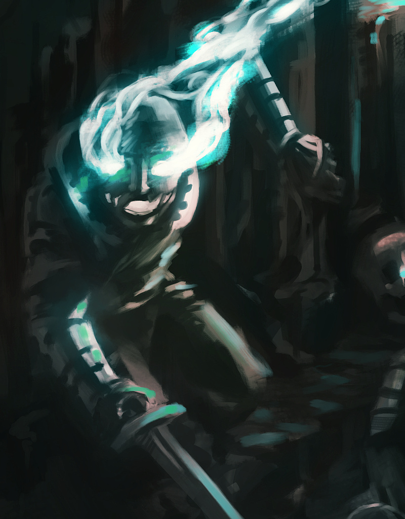
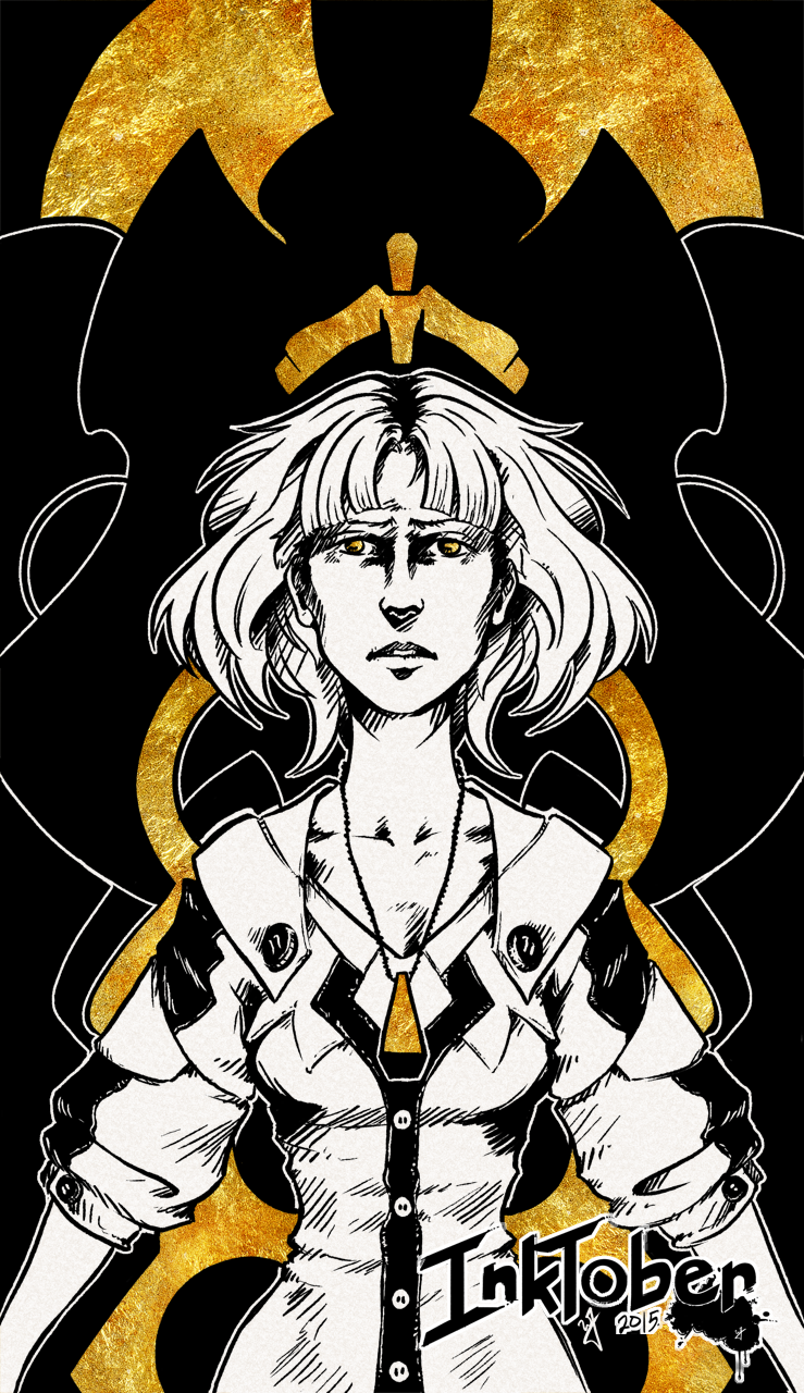
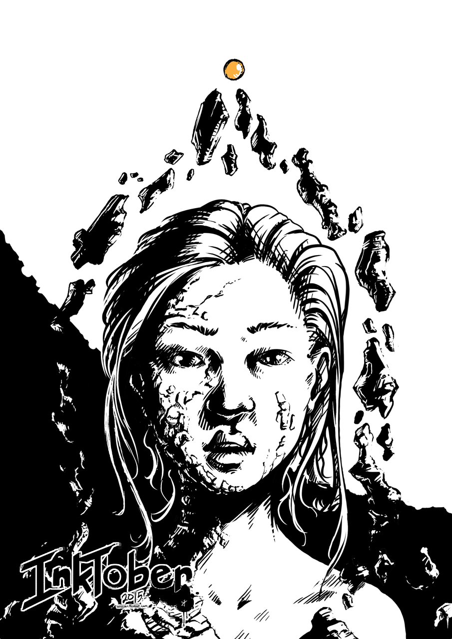
Day 3 – “On the Throne”
Day 5 – “Gate Keeper”
Day 6 – “Forgotten Trophies”
Day 7 – “Fighter”
Day 8 – “Push the Button”
Day 9 – “Just a Few Notes”
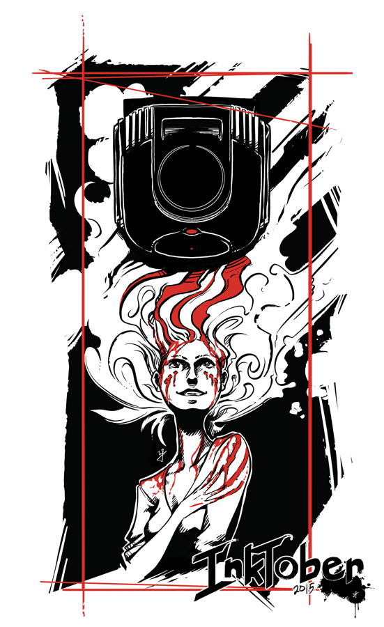
Day 10 – “Distilled”
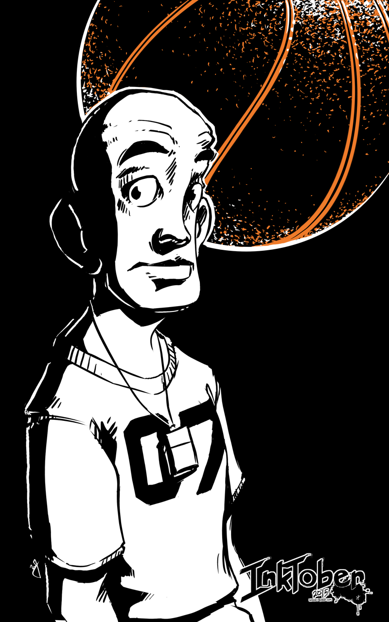
Day 12 – “Potential Baller”
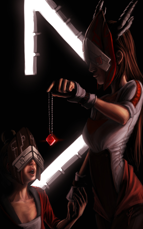
Day 13 – “Navigator”
Day 14 – “Hybrid CI”
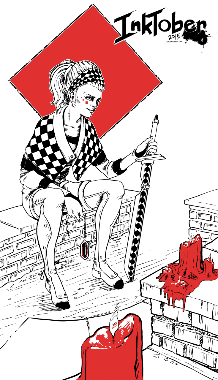
Day 15 – “Checkers”
Day 20 – “Ambassador”
Day 22 – “Lighter”
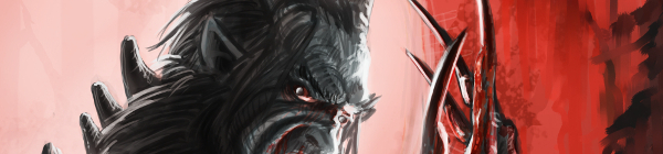
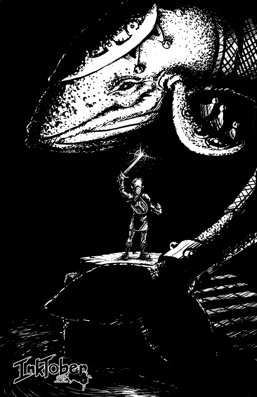
Day 23 – “From the Depths”
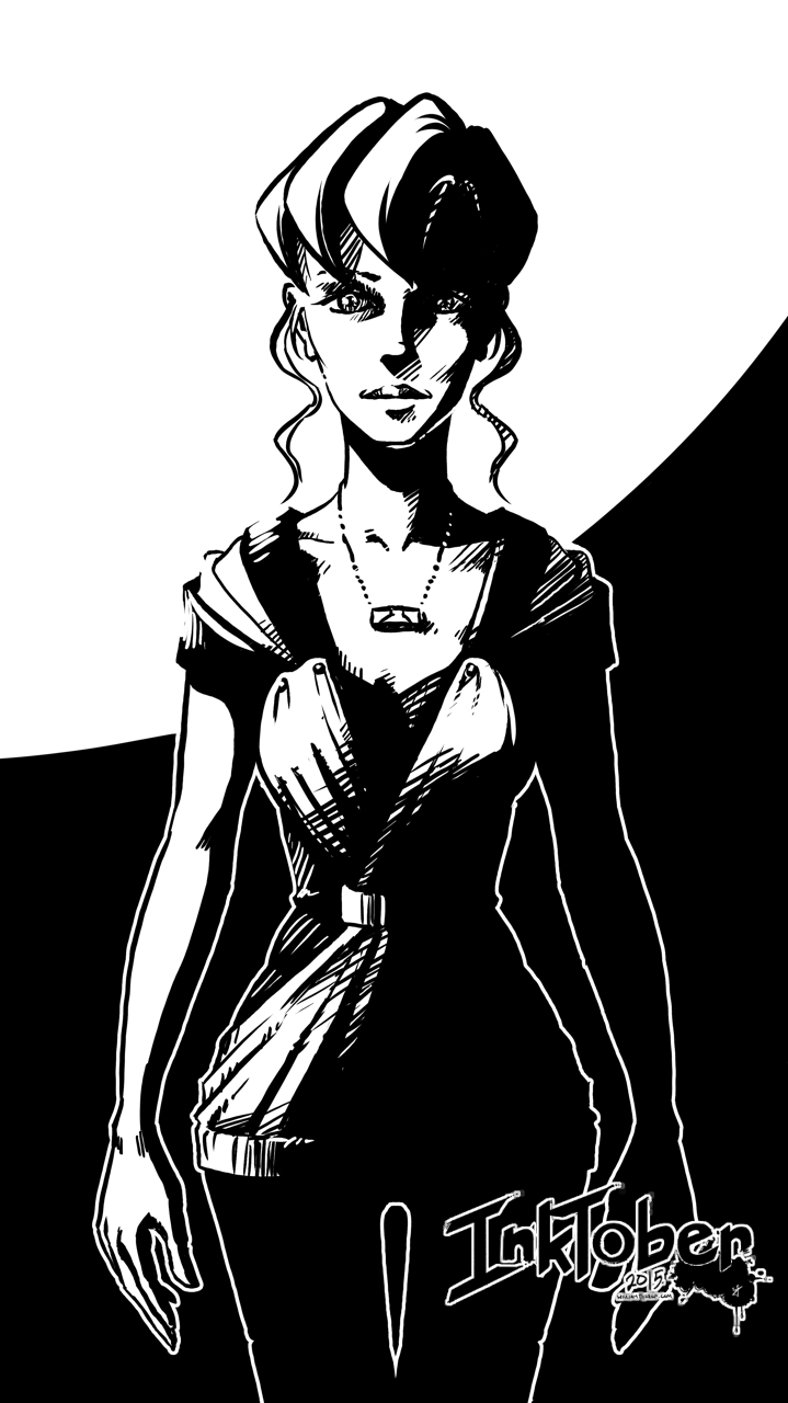
Day 24 – “Suzzie”
Day 25 – “Time to Fly”
Day 26 – “Unwavering”
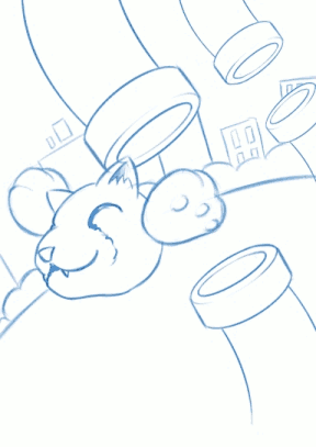
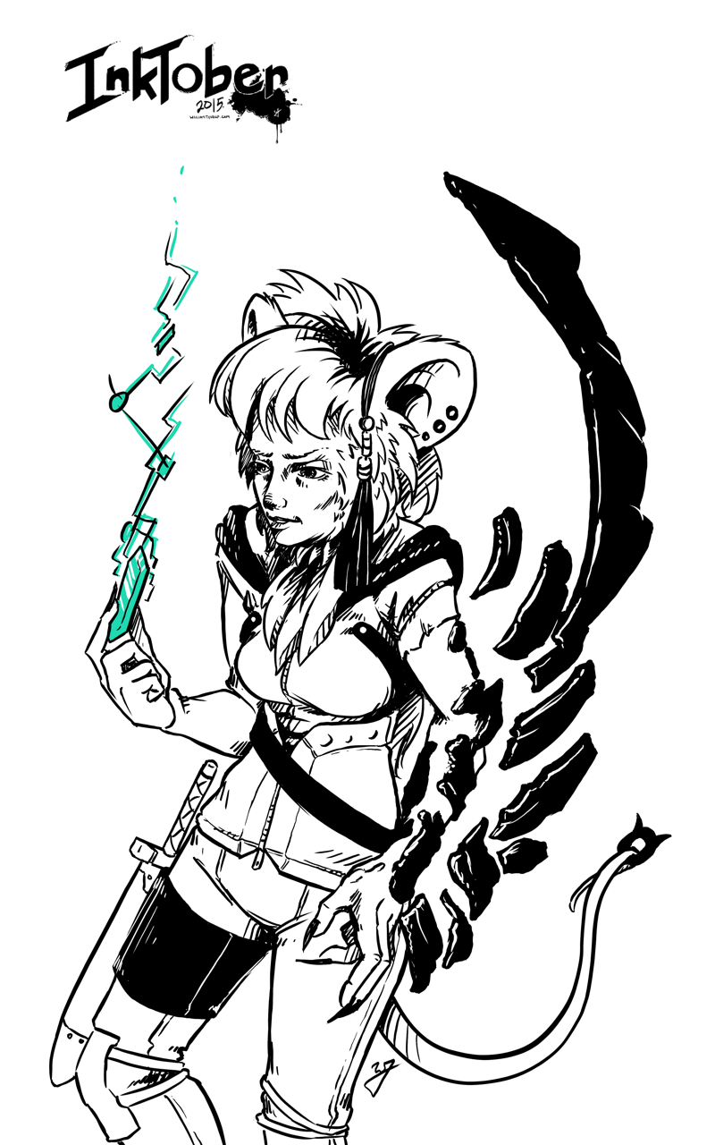
Day 27 – “Mouse Thief”
Day 28 – “Minmei”
Weekly Time Lapse Video
Play the Beast
Another Bullet
On the Throne
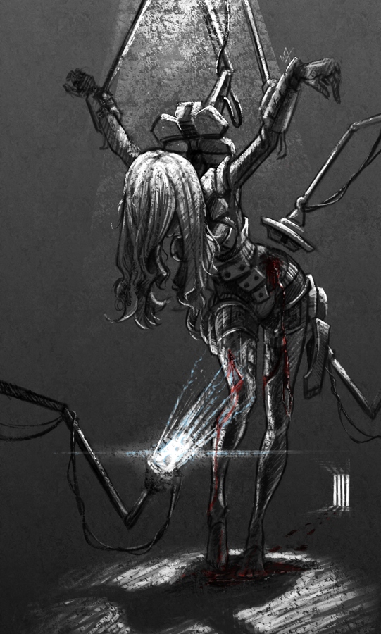
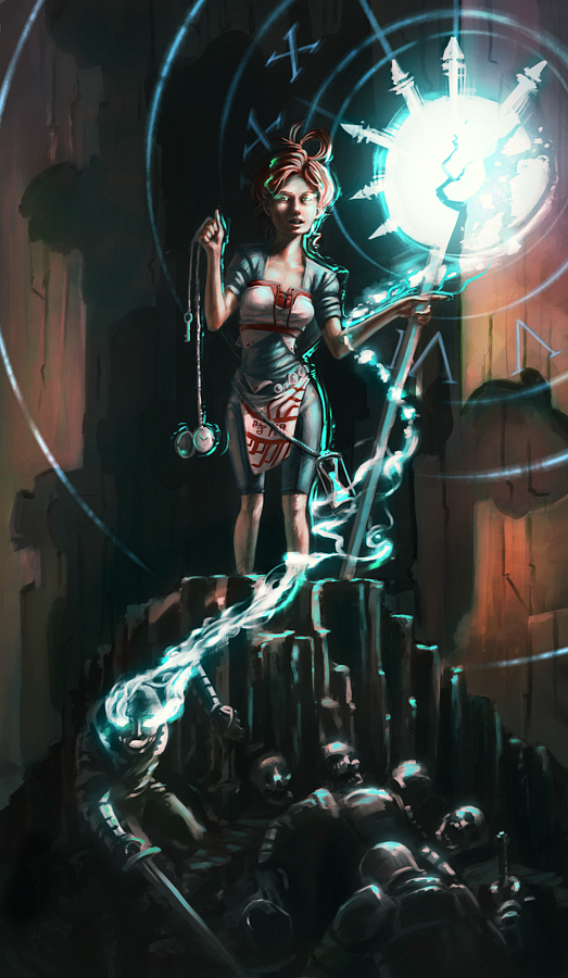
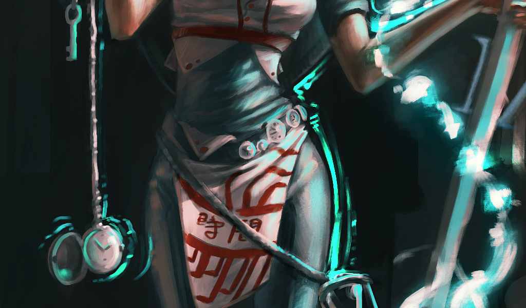
Transistor
Gate Keeper

Forgotten Trophies
Fighter
Inktober – Week 1 – Time Lapse
Push the Button
Just a Few Notes

Distilled
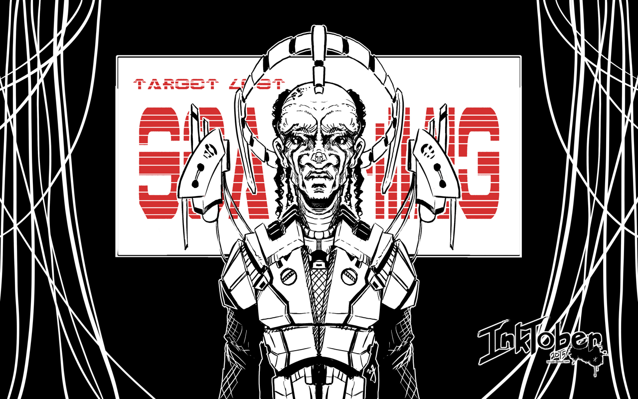
Phantom Dust
Potential Baller
Navigator
Hybrid CI

Inktober – Week 2 – Time Lapse
Checkers
Tempest 2000
Journey
Adventure of Link
Shadow of the Colossus
Ambassador

Ocarina of Time
Inktober – Week 3 – Time Lapse
Lighter
From the Depths

Suzzies
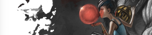
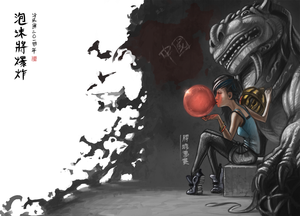
Time to Fly
Unwavering

Mouse Thief
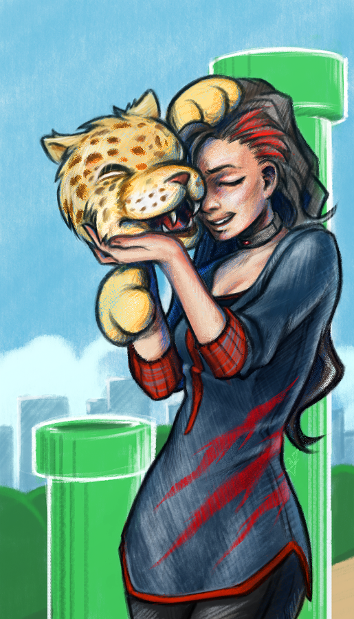
Minmei

Link’s Awakening
Final Fantasy VII
Street Fighter 2010