William Thorup

Illustrator, Motion Graphics Designer, Animator, and VFX Artist

Category: Sketch

  • Atari Jaguar | Flappy McFur | Box Art Illustration

    Atari Jaguar | Flappy McFur | Box Art Illustration

    This one has been a long time coming. I have always intended to update the original box art, done in Inkscape, with a nicer looking illustration. I just thought I would have gotten to it sooner.

    cd cover illustrated_2_final_web

    I keeping with the overall design of the original box art, I maintained the perspective, composition, and other key elements of the original, with only a few changes. The biggest change, and naturally the most obvious is that it isn’t vector art anymore. To compensate for the lack of scalability, I doubled my usual working resolution in Krita. I usually work at an A4-300dpi (2430x3508px). This time I basically doubled that resolution (4400x6218px), to help future proof the piece, in case we wish to do posters or banners.

    The other obvious change was the inclusion of the second character in our game, Cutter, McFur’s lovely companion turned human. Currently, Cutter’s part in the game is purely aesthetic, but there are plans in having her be a larger part in all the flapping the player will be doing. Something like dropping bonus coins or removing pipes for McFur every once in a while.

    flappy_mcfur_boxart_sample_1flappy_mcfur_boxart_sample_2flappy_mcfur_boxart_sample_3

    Now compared to the first and second illustrations done for this game, I decided to take the rough colored pencil and crayon look further, and I really liked the final result. I used two pastel brushes primarily, but I also used a couple of pencil and standard brushes when I needed a bit more detail in places. I am not worried about reworking the previous illustrations, because I feel they feel great for what they are, but finishing this piece makes me feel like doing one or two more new illustrations following this pattern. We’ll see.


    boxart_process_animation


    Enjoy the time lapse video I put together, a few close ups of detail, and have fun commenting on the differences between the old and new box art. I am also thinking about doing an extended cut of the time lapse that is about an hour long, so those of you who like to see more of my process in detail, you may have the opportunity soon.

  • Time Keeper | Outcast Odyssey Master Card Challange

    Time Keeper | Outcast Odyssey Master Card Challange

    5/5/2015 – Update – The “Time Keeper” time lapse video was featured along with many other talented artists on Krita’s 2015 Kickstarter campaign. Awesome!

    Unfortunately I spotted this little challenge a bit too late on Google+. I decided to take a crack at it anyways to see what I would come up with, and to produce some more content for the YouTube Channel.

    You can see the list of entries that made it on time here, and there is some very very impressive work on there. I am pretty sure I didn’t have much of a chance even if I did start and then submit in time, but it always fun to see what others come up with, and varying skill levels involved.


    TimeKeeper_final_web

    Love and Hate

    This piece for me had a very love hate relation ship. I like the composition, I hated the composition, I like the colors, I hated the colors. This doesn’t happen to me very often, and usually if a painting/drawing isn’t working for me, I scrap it, or it just doesn’t ever make it to the public. Don’t get me wrong, I don’t believe it is the worst thing I have ever produced, I just feel indifferent about the final image. I believe it was a combination of elements which I will now attempt to distill here in hopes to avoid this in future situations.

    Composition

    There were some repetitive elements that I wanted to make sure were included. The most obvious one was circles. From the staff to the clocks and watches, to the background rocks of the cave, this was implemented from the start of the painting, and all seemed very clear in my mind before I started. But throughout the entire process it felt like it wasn’t quite working. Besides changing the entire theme of the image, I never figured out how to make myself feel better about this. Maybe it wasn’t enough to tie the image together with the story I was trying to tell.

    Story

    This one started out simple. A magic user, maybe a witch or sorceress, capable of manipulate time locally to kill her opponents, or bring them back from the dead as her servants. This is one of the elements that I feel was communicated well enough. The man in the foreground to the right could have been used a bit more to show her power to defeat, but decided to remove emphisis from that section of the painting because I felt it hindered where I wanted the viewers eyes to go.

    Color

    I am starting to feel that I just need to start out with color from now on. After working on the grey scale image for so long, I found myself getting too attached to it, finding it hard to move on into the coloring stage. The next painting I do, there may be some rough grey scale work, but I am going to make sure that I push into color far earlier than this one. For those who are interested, I used and online pallet generator to get my colors.


    Close Ups

    time_keeper_close_up_1time_keeper_close_up_3time_keeper_close_up_2


    Again, overall I feel that this piece isn’t bad, but there are just a few unknowns that bug me about it, and some things in my processes that need to be changed.

  • Atari Jaguar | Mcfur and Friend 2

    Atari Jaguar | Mcfur and Friend 2

    Went on a vacation to California, and had allot of time to do some thumbnails for a variety of things. I got a few together for Flappy McFur as well, and I am planning on taking those thumbs to finished pieces.

    Flappy and friend 2_web

    Not much different with this one. I approached it in a similar fashion as the first McFur and Friend. I really like the playful look of colored pencils. I wanted to do a similar background as the first one, with pipes and everything, but I was having a difficult time getting the composition to work. So, my inner designer kicked in and decided to simplify it. Taking a more abstract approach to the background, I decided just to show a sliver of the McFur’s world, as the focus should be mostly on McFur and his friend. Because I still wanted the pipes in there as well, I did a simple stencil shape of a pipe, and used that to balance the composition a bit. I really like the stencil idea, and I will probably be using it in the future illustrations.

    This is a new step in my artistic progress. As this is the first time that I have planned out a series of illustrations for a project, and carried it out. I wish to do at least a couple more illustrations for this project, to round out this series. It has been an awesome experience, planning out design elements, colors, a bit of character design. There are a couple other personal projects that I will eventually approach and hope to approach in a similar manner.

  • Loaded | Illustration

    Loaded | Illustration

    I have been meaning to write about this one for a while. I put this one together about a month ago, and it has been posted in my portfolio and other galleries. No time lapse video, but I was able to put together a small snapshot video with the different revisions I had saved. Also, before we continue, I have to thank Michael Buhler for his input on color, lighting, anatomy, and proportions.

    bubble and lion_web

    There were a few things I wanted to focus on for this one. First, color was priority. I wanted to keep my color pallet very specific. At first, I was trying to go for something a bit more abstract, overall blue line art with pinks and reds. I was struggling to get it to work, so, I decided to revert to something a bit more comfortable, and realistic. And, I decided to focus on the overall message I wish to portray in the piece, making sure that the composition, pose, lighting and color, all tell the story well.

    From a skill building perspective, I focused on rendering various materials. There is the bubble, obviously, but also the rock, clothing, hair, and skin were focused on to create the subtle differences each material has. While still maintaining my current style, I believe that I pulled this off fairly well, but there is still room for improvement.


    As for the story I was trying to tell. I wanted to make a something political, focused on China’s booming economy, and how every bubble eventually pops. The characters on the left basically say that, and the characters on the right hand side of the piece are a Chinese idiom for someone who is loaded. The use a bubble gum not only covers the idea of a bubble growing, and establish anticipation with the inevitable pop, but gum tends to be something that is sweet and enjoyable. All good things must come to an end, right? The girl is dressed in very casual, and somewhat immodest clothing, to represent the adoption of many western trends. But as things are with transitions like this, she still holds on to whats familiar in traditional Chinese culture, shown by her gripping the lion towering over her.

  • Wendigo of Terror | Illustration/Concept Art

    Wendigo of Terror | Illustration/Concept Art

    Here is another piece for your eyes, a treat. You may be thinking to yourself that this isn’t the kind of work I usually do. You would be right in thinking that, this is definitely off the beaten path for me, and here is why.


    wendigo_colored_web


    Wedingo_Terror_thumbs_webwendigo_of_terror_poster_ideawendigo_2_tone_front_flattened


    We have been in some minor communication with someone who works at Arrowstorm Entertainment. A movie studio here in Northern Utah that focuses on fantasy and science fiction films. This person asked if I could put together a concept piece for a possible B horror film monster. A Wendigo creature that originates from the Great Lakes area of the United States, and is usually centered around myths that deal with the, pseudo, adverse effects of cannibalism. The content isn’t my favorite, but the job paid good, and it gave me a change to stretch out of my usual bubble.

    I did quite a few thumbnails for this piece (20+) and actually did three complete paintings, before we found what the client liked most. The process was very enlightening, and had allot of momentum. Really, the momentum is what made this painting fun. The client was in constant communication with me, and gave feedback when I needed it.

    Overall, I spent too much time on the painting though. I was trying to keep my total work hours under 6, but ended up going over 9. This was for a few reasons. First, and foremost, when I was first presented the job, I should have asked a bit more about the production and where it was currently at. This leads to the second problem. The project had hardly been refined, and the story, background, and other details about the creature, where watery. This is why so much time was put into thumbs and other paintings.


    I should have stepped back, asked the client to refine their ideas a bit more, and then approach the painting after a bit more forethought was applied.

    I am happy with the end result, and the client was as well. I hope to have a bit more work with them in the future, and hopefully work on some of their movie posters and other concept work.

  • For Liberty | Illustration and Time Lapse

    For Liberty | Illustration and Time Lapse

    A small gift to the men and women who serve for the cause of our liberties, rights, and freedoms. I also would like to thank all those around the world who fight for these causes, whether you fight for the United States or not. Every human being deserves these blessings in their lives, and today, we remember the price that must sometimes be paid for those blessings.

    for_liberty_web

    This painting took about 4 hours to complete. The entire painting was done in Krita.

    I focused on the color pallet for this painting. I wanted something a bit abstract, but not so abstract as to distract the viewer of the story being told. I wanted a sad and somber tone to the image, so, I stuck to cool colors. Primarily blue, greens, and grays. Red and white were my highlight colors. Then, I controlled my satruation in specific areas, in order to bring focus to the parts of the painting I wanted the viewer to see first. I feel overall the composition is good, maybe a bit crowded, but still attractive.

  • Weekly Sketch Review | Turkey Dinner

    Weekly Sketch Review | Turkey Dinner

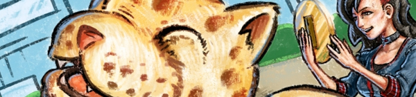
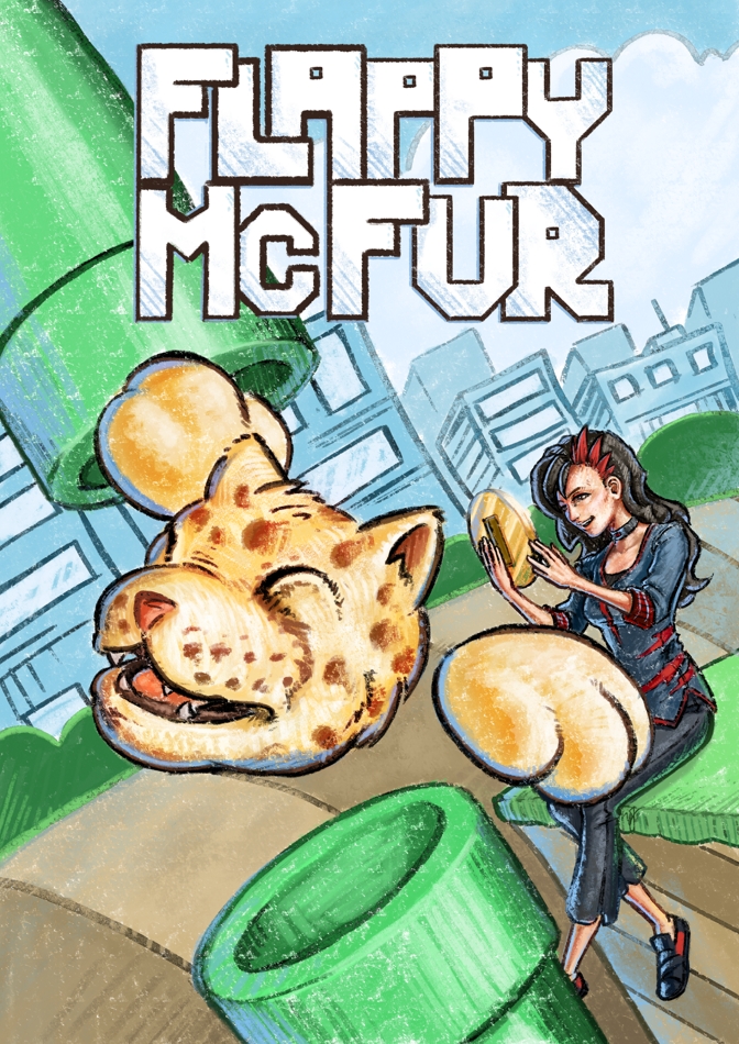
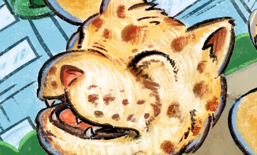
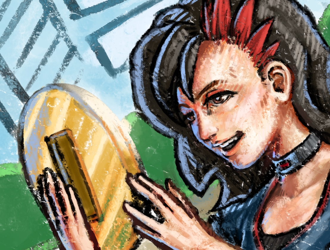
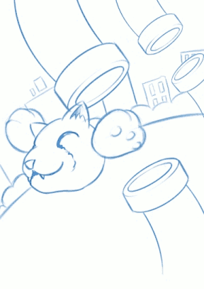
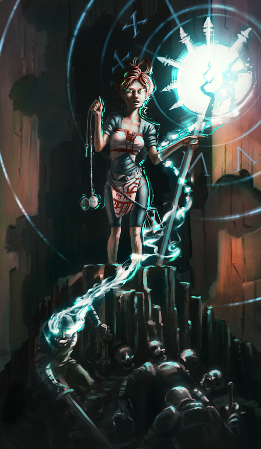
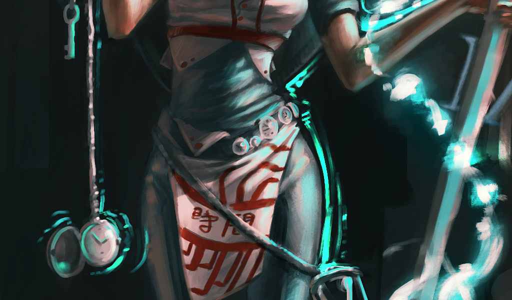
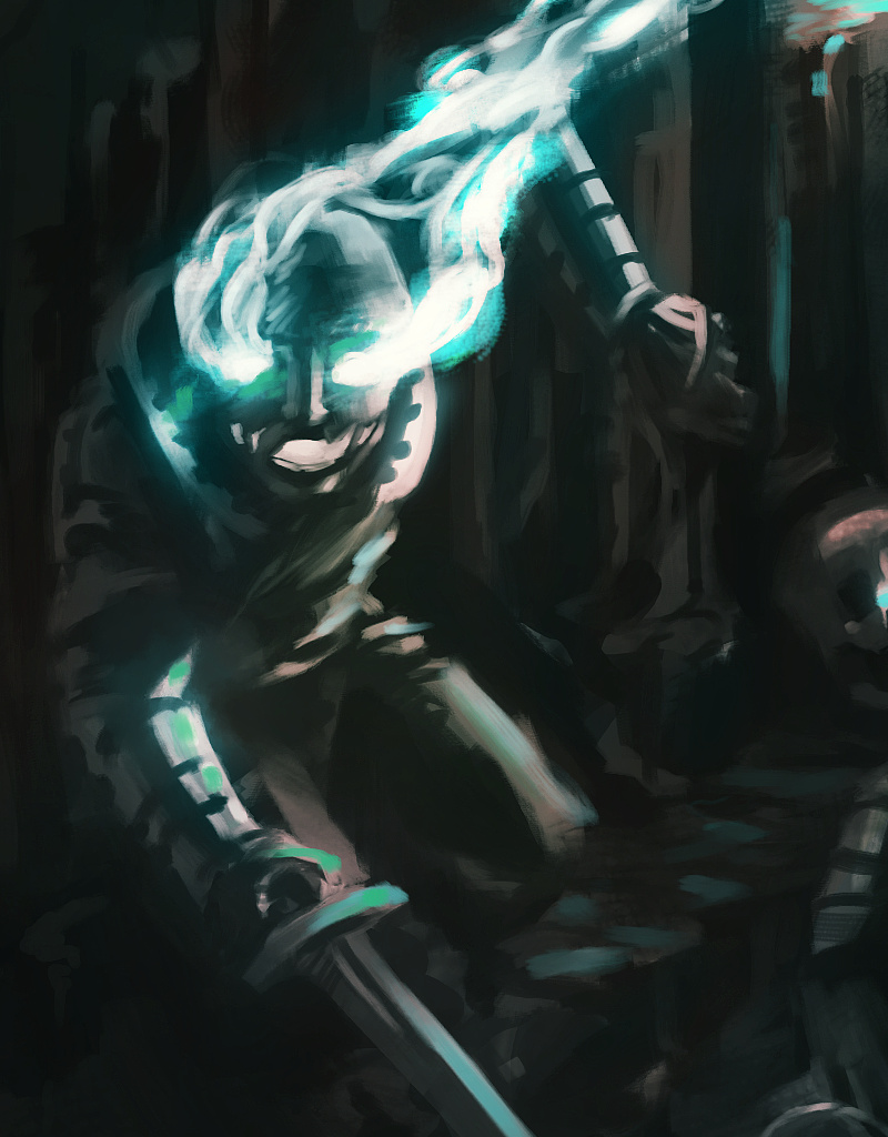
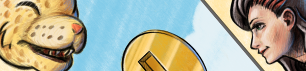
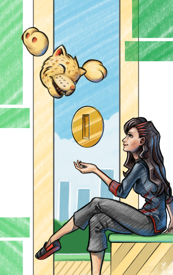
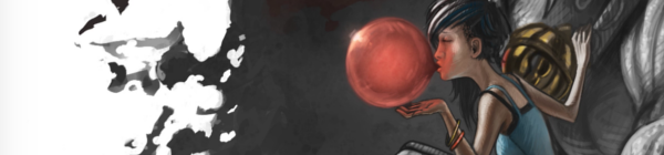
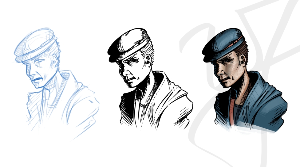
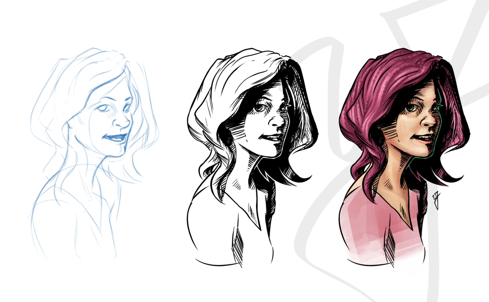
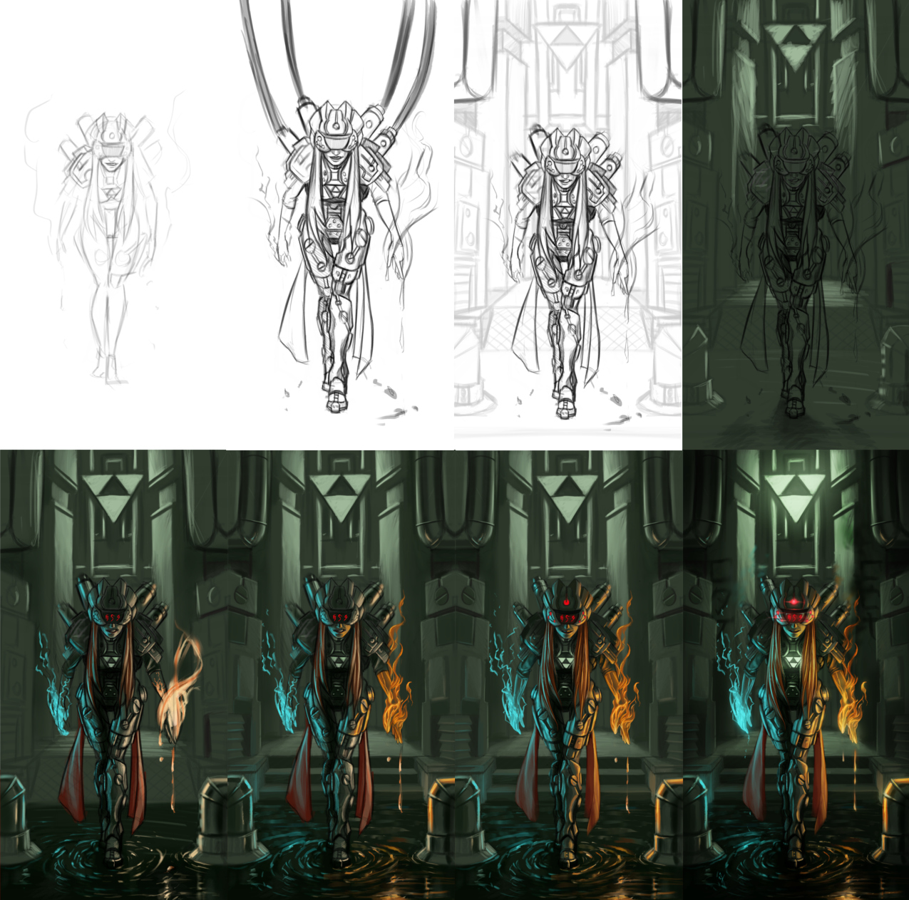
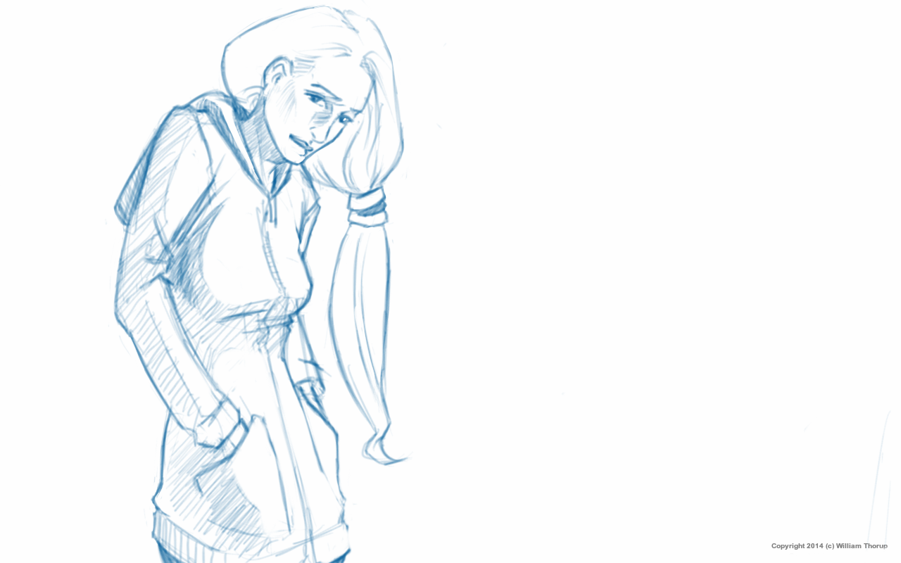
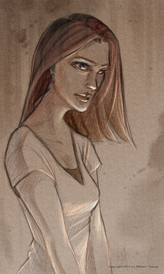
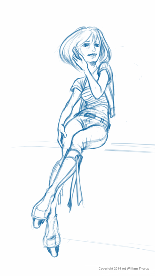
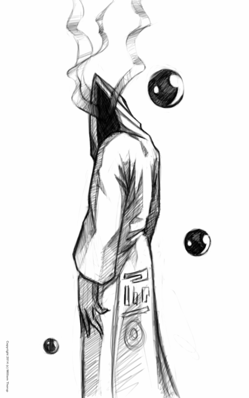
    Another round of highlight worthy sketches for another week. Enjoy! If you wish to stay a while, this week I wanted to talk a bit about persistence and consistence. This topic comes from encountering some emotionally down points when drawing and painting recently, and an article posted by Wacom. A short interview article with an amazing Disney artist, Aaron Blaise, about his “Four Tips for Artists Who Want to Succeed”.


    Sketch30124719_1

    The article touches on two things that I have discussed before, but are so important that, talking about them again will help me reaffirm their importance for myself, and hopefully others. I will try to tie these into my feelings as of late, which I believe many artists, aspiring artists, go through on their, long, artistic journeys.

    Persistence

    This is my new favorite. I have found myself to be stubborn from time to time, more often then I think probably. Thankfully, this is a blessing, more than a curse most time. With that stubbornness comes the drive to continue to learn new things, and to learn them well. This has been very fulfilling in most of my endeavors, including art and programming.


    Brown Portrait

    This stubbornness does not come without it’s down side though. The most noticeable adverse effect that I see is burning out. When I am pushing through a project, and I am churning out good results, then the end of the project rolls around, one of two things usually happen. The feeling that I have done enough, and I can take a brake (the biggest lie!), or, the feeling of zero inspiration. Of just not wanting to do what I was doing anymore.

    These two points are where I think persistence contrast stubbornness in the extreme. When one is persistent, they will continue with something with confidence in a good result. Okay, stubbornness will get us that far as well. Now here is the difference. Moderation. To push through a project is one thing, to push through a project at a steady pace is another. This leads to my other favorite point.

    Consistency

    Ah consistency. For those of us who feel we have a million things we are doing everyday (whether its true or not), consistency is like the Holy Grail. We write to-do lists, we setup reminders on our Google Calender, we try to develop habits, and 90% of the time, we fail. It’s not that we aren’t getting things done, we just are not reaping the benefits of being consistent.

    My personal experience with consistency has always been good, when I am consistent. My abilities, with whatever I am consistently doing, obviously increase. I feel better about what I am doing, and I can’t wait to see what I produce.

    So, what’s the problem with trying to be consistent, and why is it so hard for me to do? And, why do I go overboard with persistence? I have been able to narrow it down to a few things so far.


    Sketch42154448_1Sketch300191945

    Turkey Dinners Always put Me to Sleep

    It not necessarily just the turkey, but instead, how much food I put on my plate. Unfortunately, I am not talking about my dietary habits in this instance. Earlier I mentioned people who have a million different things they are trying to do, I am one of those people, and I don’t like it either. Problem number one. I have always been curious, and I was raised to try things, and fall in love with what I try. Problem number two. There is the complex anxiety of knowing that I wont be able to accomplish everything that I wish to, because there just isn’t time to do it. Just like that Turkey dinner, you may be able to get it all onto your plate, but it doesn’t mean you are going to be able to cram it all down.

    The closest artistic analogy that I can think of to fix this is to reduce your pallet. Pick out the colors that you think will tell the story the best. Now by applying that idea to what I put on my plate for dinner… Maybe I should prioritize the things that will define me best as a human being, and tell my story in the best way possible, to future generations. Easier said than done. How do I know what will tell my story the best? I don’t know. Maybe a bit too deep, but I believe it is something we should all consider on our artistic, or our non-artistic, journeys.


    Take the time to look through some of Aaron’s great instructional videos on his website. I just watched a video about straight and curved lines, nothing new for me, but definitely something I am not consistent with in my line work.

  • Weekly Sketch Review | Happy Monsters

    Weekly Sketch Review | Happy Monsters

    Warm ups. I am trying to do them more often, and often find them boring, and these are the wonderful results of trying to make them interesting.

    merry christmas monstorsummer monster

    While loosening up the shoulder, I decided to take the random scribbles and turn them into fun loving monsters. Don’t you “Lurv” summer too?

  • Comic Inking and Coloring

    Comic Inking and Coloring

    Ah… a blog post. It has been a while, and I should be doing this more. If you are a regular to my blog, I apologize. There is quite a bit of work that I have been doing lately that has been taking much of time. I guess that it is a matter of priorities, and I should make my posts of higher priority.


    About a month ago, I finished coloring work on a comic book project that was poorly executed by the director. By some miracle, the comic made it to Comic Con Fan Experience in Salt Lake City, but only sold a few copies.

    khloe_3_web

    Unfortunately, I am not too proud of the final work, mainly because of the story (or the lack thereof), and won’t be including it in my portfolio. That project did, however, push me a bit further into the realm of inking. Along with a Thor Media internal project, and the want to practice some simple inking and coloring, I have produced three separate portraits. Which I can say that I am proud of.

    sad man

    I used Krita to produce all three images, and it took about a few hours to produce the portraits. The latest version of Krita includes a nice set of tools specifically for inking, and it is a joy to use them.

    the smile_web

    Being involved in that comic book project was a bit of an eye opener for me though. I was able to get a really good idea of how much effort needs to go behind a single issue, which is really good for Thor Media. We have been able to price ourselves correctly, in case we run into others who wish us to help produce a comic book.

    More importantly, that project turned me on to the idea of turning some of my writing into comic book form. I was going through some of newer and older stories recently, and I may pick one or two, and convert them into comic books.

  • Another Zelda Remix – Another Twinrova

    Another Zelda Remix – Another Twinrova

    I haven’t been taken part in a CGHUB.com character forge challenge in a while, and I am glad the Micheal Buhler pointed me to this one when it came around.

    As you may recall, this isn’t the first time that I have tried t remix Twinrova from the Legend of Zelda games. Last time I decided to remix the character for the tron universe, and I feel that it came out okay. This latest version of the challenge had us working towards a sci-fi edge. So, due to the lack of creativity, or because I just like the character, I decided to give Twinrova another try. I used Krita for this piece, and it took about 4 hours from start to finish.


    twinrova_2013_WEBtwinrova_2013_process


    This time I wanted to give Twinrova a darker feel, with a pinch of insanity to her mood. I leaned more towards the illustration side of things instead of character design, and I enjoyed painting the surrounding elements on this one. Making sure I rendered lighting accurately and learn how to render fire more acurrately where some other goals in this painting, and I think the results were good.

    I wish that I could have spent a bit more time on this piece before the challenge was over with, but for the time I had and took, again, I am very pleased with the result.