William Thorup

Illustrator, Motion Graphics Designer, Animator, and VFX Artist

Category: Sketch

  • Weekly Sketch Review | 4-2-13

    Weekly Sketch Review | 4-2-13

    sketches_4_1sketches_4_2sketches_5_1

    This last week was really weird. Topping off stuff with Josh the Whale, and doing rush work for Overstock.com, it has been a busy week. But enough of my excuses for not posting more often.


    But between the confusion and stress, I was able to enter the serene fields of sketch and study. This time around there isn’t much to talk about, just some random stuff. Kind of all over the place. So enjoy the time lapse, and any comments are welcome.

  • Weekly Sketch Review | Lenovo Tab Sketches

    Weekly Sketch Review | Lenovo Tab Sketches

    If you have been following my blog for a while, you know that I have mentioned my Lenovo Thinkpad Tablet a few times. And you know that I have said I would put together a video of me using it, several times now, and I haven’t come clean yet. I know…

    I still want to get around to doing that, but in the mean time, here are a few sketches done on the Lenovo Thinkpad Tablet.


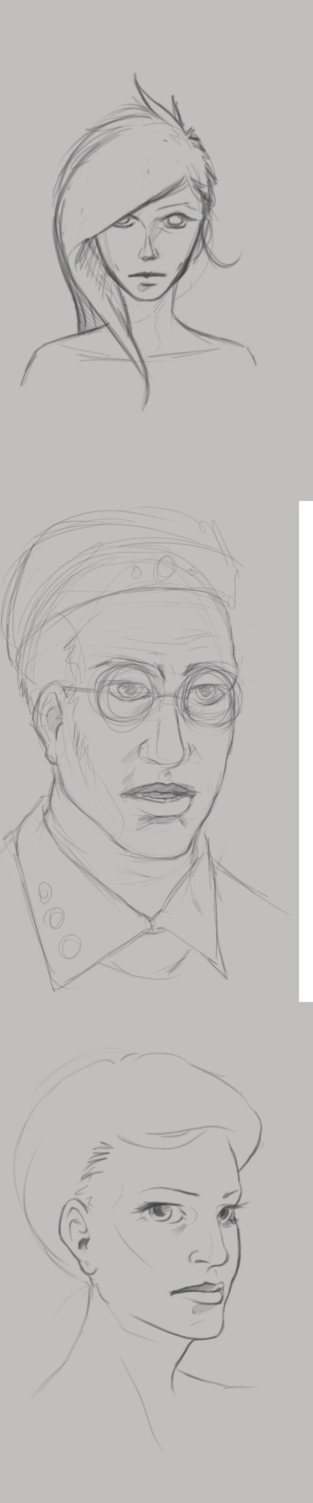
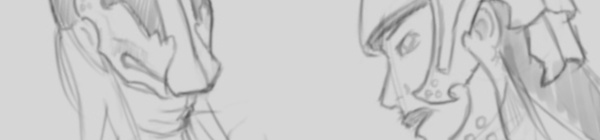
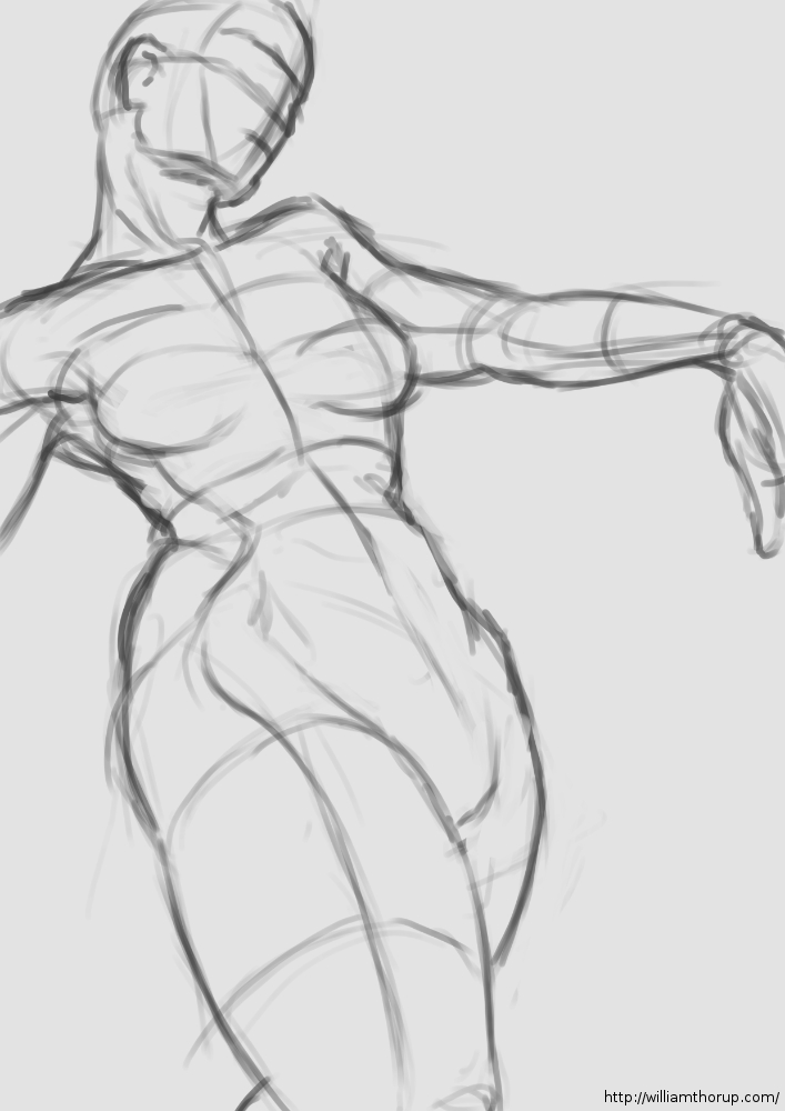
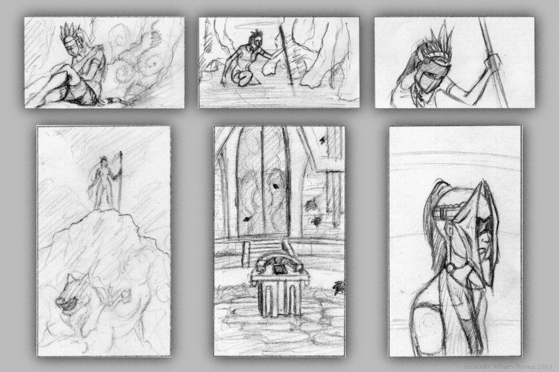
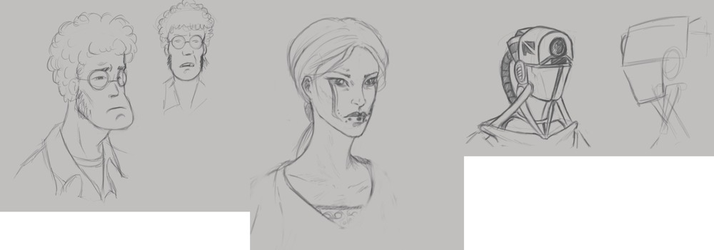
    At the top of this post, I was practicing portriats and some character design. The guy with the glasses, on the left, I really enjoy. He comes off as a computer programmer, that just wants to come to work, do his job, and then leave. Doesn’t care much for the social life, and would rather avoid it all together.

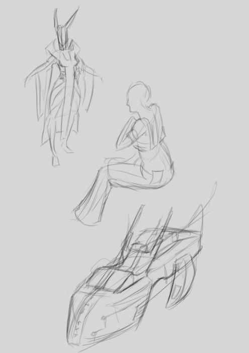
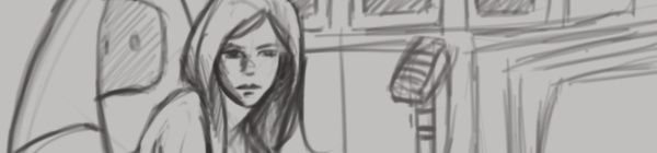
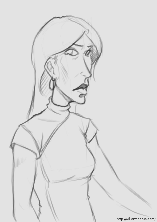
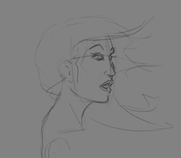
    The woman in the middle. I was really just playing around with the tattoo on the face, and possible character design for a game my brother and I are working on.

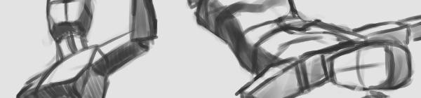
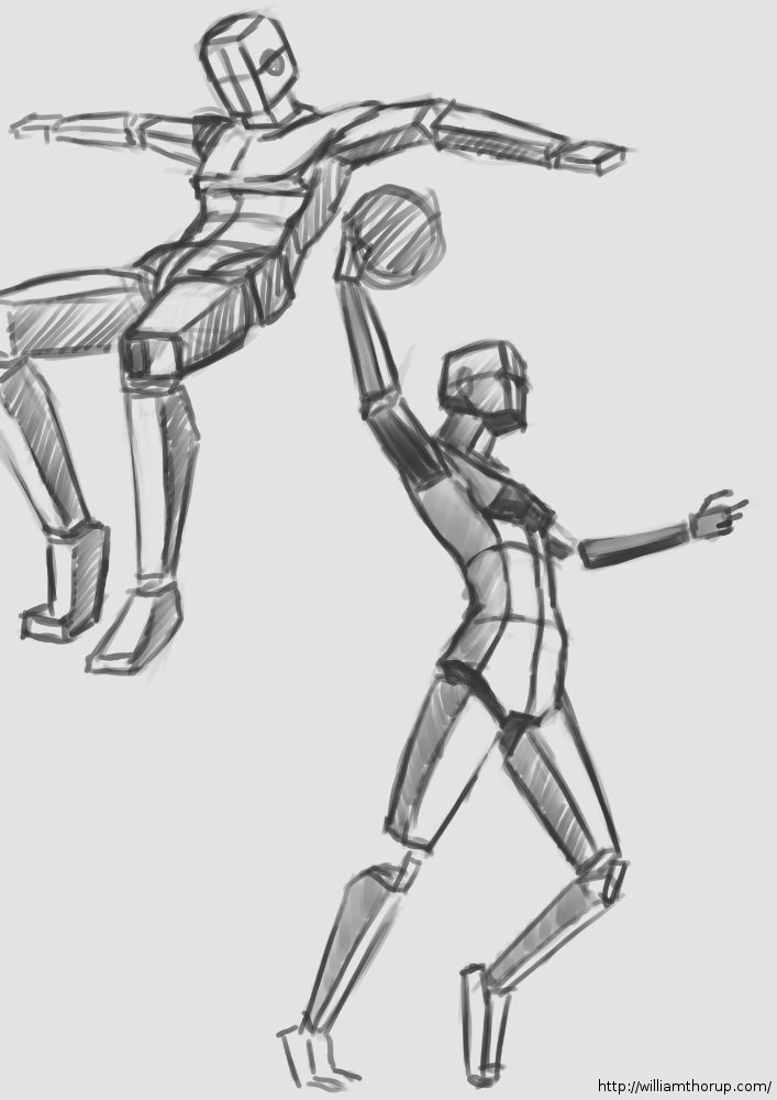
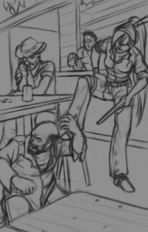
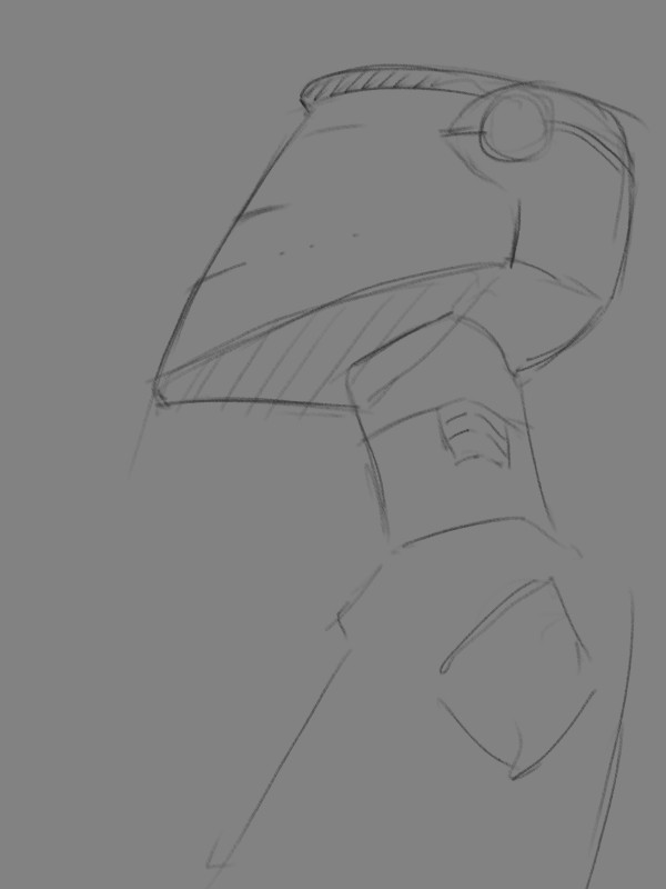
    Then, the one on the right is actually a sketch from Draw Night. I think we were talking about Mass Effect or something, and that sketch is what came out of it. I don’t draw robots very often and I like how the sketch came out.


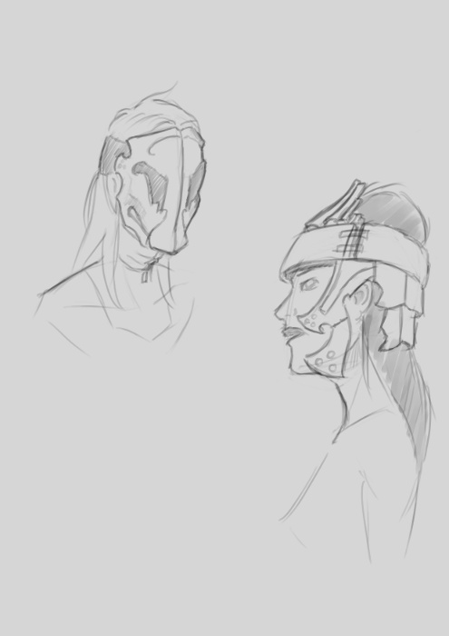
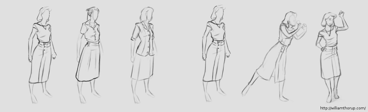
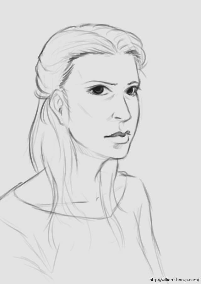
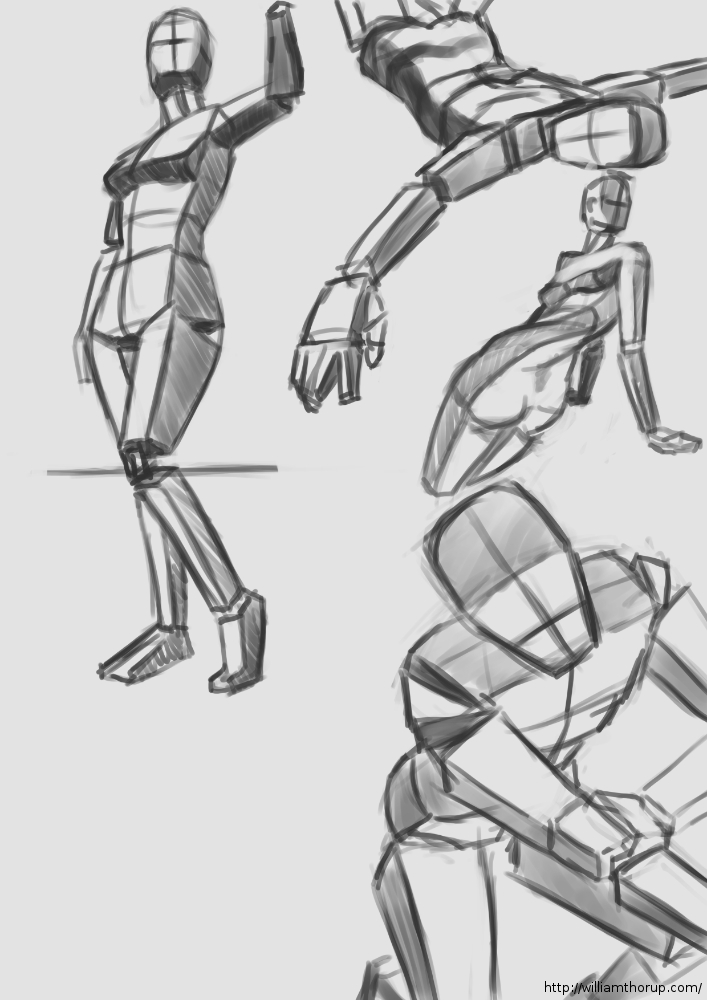
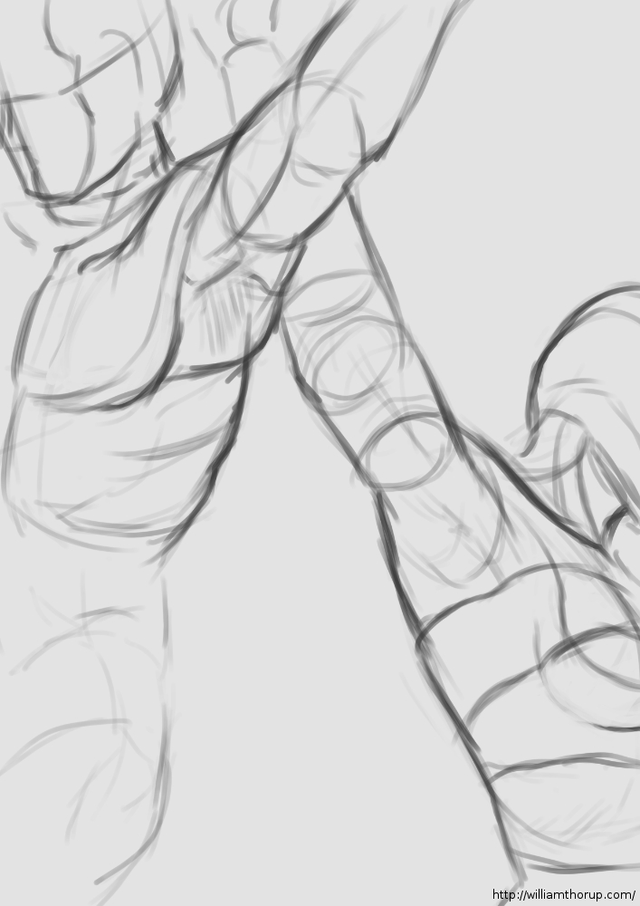
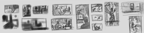
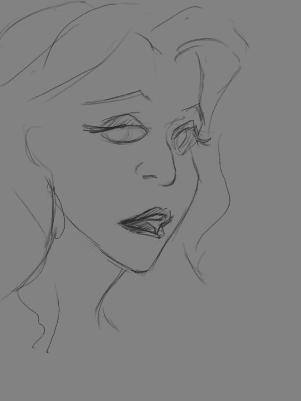
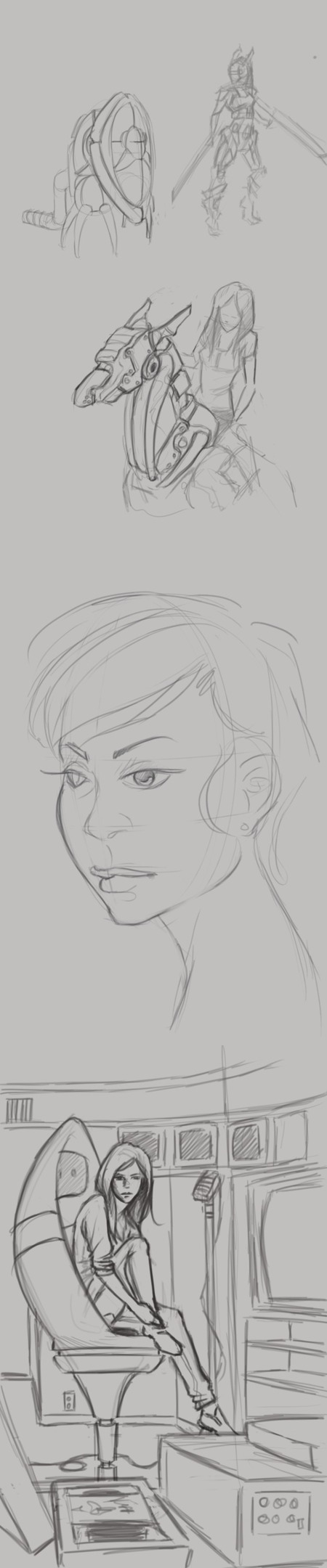
    Now the sketches to the left, I have a few portraits in there. Just playing with styles while studying different head shapes and hairdos. But again, there are a few random robot sketches.

    The sketch in the bottom right is a concept for a future illustration, perhaps. I was thinking about video editing and VHS tapes and thought that might make a decent idea for an illustration.


    2013-03-09_16-14-06-collage

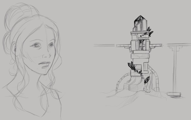
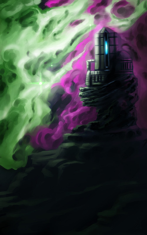
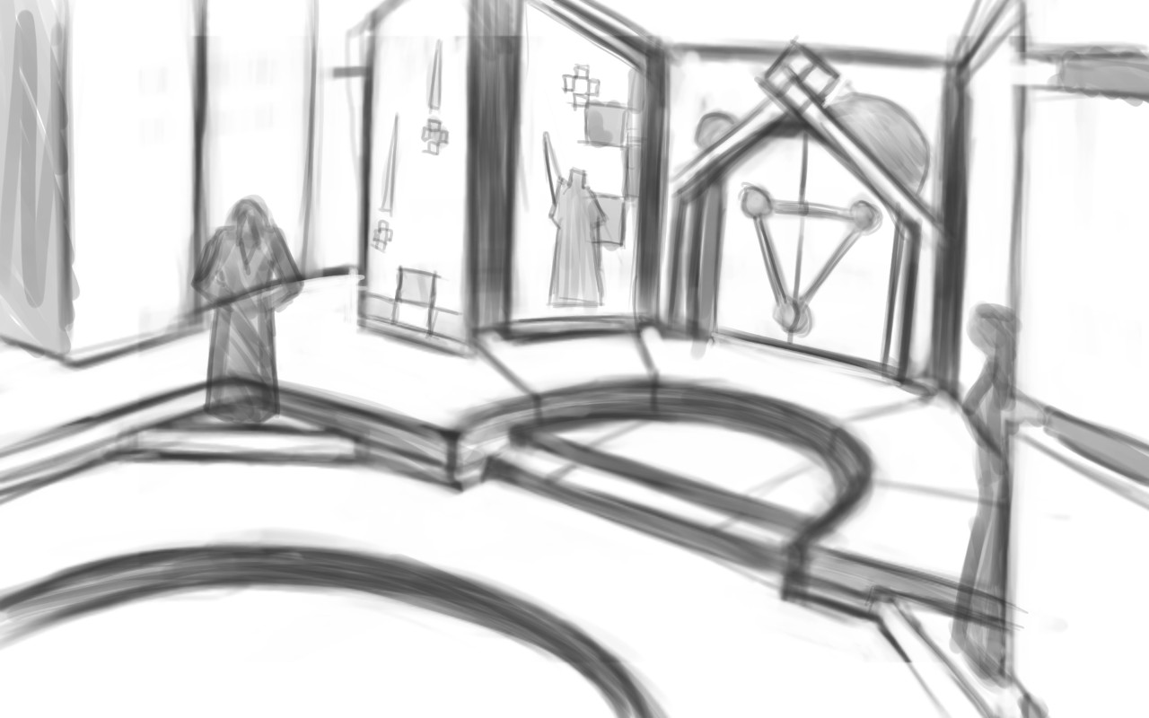
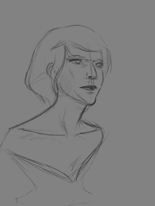
    Another portrait study on the left, but also some architectual design on the right. You might recognize the tower on the right. It was actually the concept for this piece HERE orginaly.

    If your interested in the app I am using, it is Autodesk Sketchbook Pro. It has a huge selection of tools, and it has allot of pressure sensitivity options. Unfortunately this is something that Photoshop Touch lacks, but it is a photo manipulation program, it isn’t really meant for illustration.


    Besides a normal sketch book, the Lenovo Thinkpad Tablet has been one of the most useful artistic tools I have. I am usually carrying it around in my back, and it usually is less of a hassle to deal with than running out of paper or a broken pencil. I can just sit down, turn it on, and I have every color in the rainbow at my disposal, with full pressure sensitivity (something that most tablets don’t have), and the ability to transfer those sketches to my desktop to turn them into more finished works.

    It does have it’s cons though. A normal Sketch book doesn’t have a battery, so you don’t have to worry about charging, and drawing digitally never quite feels like the real thing unfortunately. But with these aside, it does make sketching funner and more inviting, when I can pull up reference for anything through the browser on the same device.

    If your interested in getting a tablet for art, I would suggest the Lenovo tablet or the Samsung Galaxy Note 10.1 tablet. The Samsung tablet is newer and faster, and instead of 512 levels of pressure sensitivity, it has the full 1024, like most drawing tablets. Has a better battery life, and speakers, but is an additional $200 to purchase. So, if you have the extra cash lying around, it is definitely worth the purchase. I’m thinking about getting myself one soon.

  • Weekly Sketch Review | Making up for Lost Time

    Weekly Sketch Review | Making up for Lost Time

    I have been waiting on a job this last week, and we have had a bit of down time with Josh the Whale. So, in the mean time, and considering that I didn’t do a Sketch Review last week, I thought some drawing was in order.


    1940's female_character designs_1

    It is amazing how fast you can get out of the groove of drawing what you like. One week… I say again – One Week of not drawing, I felt like I was playing catch up with myself from from two weeks ago. Its how fast the knife can go dull if you don’t keep sharpening it.

    With that being said, I had no real focus with my sketches this last week. I have had some stories running through my head, so I did some character design. I felt like I was struggling with perspective in my figure drawing, so I did a little of that as well. Anyways, let me walk you through some of these drawings.

    80's girl

    At the beginning of the week I was kind of all over the place. The drawing above, and the one to the right I was doing a bit of character design along with fashion practice (I guess you could put it that way).

    The one above being a female character, in her early 20’s, highly intelligent, not beautiful but cute, and is from the 1940’s. For her apparel, I wanted something that seemed a bit formal, but not over the top, something she would go in the park in. As for personality, I never got that far. But I did a few poses that give you the inkling that she is curious, maybe an explorer or scientist with a thirst for discovery.

    Now the one on the right is more of a study in fashion then character. Though I think her slight expression may give you the impression of someone who is willing to listen, but you have to make the first move to get her to respond. I really enjoyed how this one came out though. I might end up doing a completely rendered version in the near future.


    The middle of my week. A caricature and a hair study.

    characature_welcoming starehair_study_1


    The last part of the week, I spent time practicing perspective with my figure drawing. I believe the style of figure drawing is called “Analytical Figure Drawing”. Basically taking the simplified shapes of the human form and applying them to perspective. I know Andrew Loomis stresses this form of drawing when approaching the human figure, and I can see why.

    analytical figure drawing_1 analytical figure drawing_2

    It not only helps with drawing things in perspective, but because it asks you to start with simple forms this kind of turns it into a practice of sculpture. Because, allot like sculpting, you start with the basic shapes of the figure, and then you start molding or carving away, searching for the correct anatomy and curves in the figure. I could easily take anyone of these sketches and render it into a finished drawing.

    analytical figure drawing_3 analytical figure drawing_4

    This is a technique I would suggest to anyone who is struggling with the male or female figure. And if you need some examples that easily surpass me, HERE and the book by Andrew Loomis “Figure Drawing for All its Worth” are awesome resources. Most of Andrew Loomis’s books are in the public domain, free to download, and one of the best artistic resources out there.

  • Weekly Sketch Review

    Weekly Sketch Review

    No specific title this time around. Been busy setting up work and a few other things, but I have had a bit of time to draw and paint throughout the last week and a half or so.

    And, to keep things simple this week, I decided to just post a simple video of some of the digital sketching I’ve done lateley. These sketches range from anatomical studies, to perspective practice.


    Also, Here is a preview of a long term illustration I am working on. Thanks goes to Ethan Evans for helping with the composition and the overall mood of it. Enjoy.

  • Weekly Sketch Review | Environments

    Weekly Sketch Review | Environments

    observatoryunderground bridgeancient doorway


    I had some time this week to do some environment paintings/drawings for project Nebula.  And it has been great to have a project like this to help motivate me to do these sketch reviews.

    I really enjoy the nebula painting, above and to the left. I like the composition, plus it gets a unique idea across to the viewer. The other two paintings, I don’t know. It was fun to play with a monochromatic blue values. But the painting doesn’t really stick out.


    aftershock

    I have the feeling, when I am painting environments, that I don’t know quite where I am going with it. This isn’t a new feeling, but it tells me a few things.portal room

    I need lots of practice in this area. Been focusing too much on characters over the last while. This project is definitely going to stretch me though.

    It also tells me I need to do more research. Research always comes in handy when broadening your skills and imagination. Whether you are looking at other artist’s paintings, photographs, or going outside. Studying others examples can be the best way to learn. And also add a few things to that bag of tricks of yours.

    Next week’s sketch review will probably be more of the same. I am having a hard time eyeballing perspective, so, I think that I will focus on line drawing, to avoid being distracted by color and lighting.


    I wish I had the mind to record all of these paintings, but here are a few of them, sped up, for your enjoyment.

  • Weekly Sketch Review | Thumbnails

    Weekly Sketch Review | Thumbnails

    One very important thing I learned this week is to do more thumbnails.  Again, this isn’t a new concept to me.  But I am not in that habit at all.  And that is a bad thing.

    sketch_composite_web

    I find as I do thumbnails, it allows me to work out things that I didn’t even realize were problems.  Obviously, this can save a painting and time in the long run.  I guess some of the best lessons are hard to learn.


    old thumbs_layout_2

    In the past I have done thumbnails quite a bit.  For the Templar nation project, I had to put together thumbnails for the director, so he had some idea of what the final product would be, and for composition.  We didn’t do a storyboard for that film, so this thumbnailing was essential to communicate ideas to others.


    old thumbs_layout_1

    Also, some personal projects in the past only got as far as thumbnails.  But it is fun to go through old thumbnails and be inspired to paint or draw something from them.

    So, seeing that doing thumbnails paid off in the past, i decided to take a current project and do some thumb nailing.

    Here are a few icon thumbnails I did for the soon to be released Josh the Whale app. When putting icons together for apps, there are a few things to ask yourself.  Is it simple,  does it still read well regardless of how big or small it is, does it stick out if you place it on a page of other icons?

    josh the whale_icon examples

    These are just a few things to keep an eye out for, and I am sure there are many other questions I could be asking myself.  But the exercise was fun and a bit eye opening.  I am planning on making thumbs a habit, since the next week will require allot of it.


    For next week’s sketch review I will be doing allot of environments.  Project Nebula is about to go into full swing.  Our writer is requesting more visual reference (concept art), based on our initial notes of the story.  A few days ago, I posted some character art HERE, and next week will be dedicated to this.

    Expect more thumbnails and some rough concept art next week, and maybe a few more character paintings.  Until then.

  • Weekly Sketch Review | Faces & Strange clothing

    Weekly Sketch Review | Faces & Strange clothing

    Ahhhh.. A weekly sketch review. Takes me back to junior high.

    To help garner success in my endeavors to magnify my skills, I will do a little “reporting” every week with sketches. With a different subject to explore every week in my drawings or paintings, I will try to become more diverse in my skill set, build on foundational skills, track progression, and just sketch more.

    To kick it off. Here are some sketches, from the recent past, of face and other similar things.

    smirkrobot_bustwindreallybust_1

    I was duplicating some Disney style characters one day this week, and I thought to myself,”Will, you make too many unnecessary lines.  Too many strokes.”  (Yes, I did refer to myself in the third-person).  And after thinking this, I tried reducing the amount of lines and strokes I used in my sketching.  Sometimes really concentrating on where the line should go, and sometimes, drawing loosely for things like hair.  The concept that a only a few lines are all that is needed to get an idea across, is not new to me, but this little exercise brought that back to the forefront.

    It’s interesting to see myself struggling at it for a moment.  Sometimes I had to force myself to draw a single line instead of scratching one out.  Pencil scratches are a bad habit, and something that I will work on eliminating in the future.

    hat_2hat_1

    These two sketches were derived from random lines, and then rendered.   Hoods and heads on my mind.  Trying to keep those creative juices flowing.

    portrait_1

    This sketch is from my Lenovo Thinkpad Tablet, done in Sketchbook Pro.  Practicing African facial features. And I exaggerated the eyes and the lips for extra appeal.

    For some reason drawing in red feels better to me.  Less serious than a dark pencil, and it seems to encourage me to stay loose with my lines.  I started drawing with red and blue pencils when I took some animations classes in collage.  Stuck with me since.

    For next week’s sketch review.  I am going to focus on thumb nailing and placement, in relation to composition. And maybe I will play with some color theory as well.

    I hope to keep these sketch reviews consistent, and as it says in the title, I want to do a post about it every week.  So, stay tuned.

  • Krita | Character Sketch

    Krita | Character Sketch


    I have been seeing allot of stuff done in Krita lately.  Also, I have been reading allot about over at David Revoy’s blog.  And I finally took the time to get into it and learn some things.  And my initial impressions are good.

    The brush engine is fantastic.  It’s fun to just go in and play around with the variety of brushes and different effects.

    One of the things I liked the most about Krita was the little sketch pad they have in the “Edit Brush Settings” dialog.  With the wide variety of tools, it’s good to have something that you throw a line down on, to see how it will look on your canvas, without having to actually put it on your canvas.

     Plus, this is almost a necessity with this program, because this dialog takes up a good portion of the screen, and to go in and out of this dialog would take allot of time if you could only test tools on the canvas.  This also feels great for those who work with real mediums, as artists will often test a stroke, color, or tool on a separate scrap piece before painting or drawing on the actual artwork.

    Shift+left-mouse-buton dragging for brush size is invaluable, and saves allot of time in the long run.  I wish the Gimp had functionality like this.  But I understand why it doesn’t.  This also reduces the interface.

    Another leg-up that Krita has over Gimp is multiple color depths.  Most concept artists, or illustrators will never use over 16 bit, but since I get into the film and 3D stuff every once in a while, it’s comforting to know that I will be able to work with 32 bit images on an open source platform.  Gimp will be getting this functionality soon enough, but for now Krita is the only user friendly way of handling 32 bit images on the open source platform right now.

    The last thing that really stuck out was the right-mouse-button menu.  This brings up a color wheel and color history.  Also, you can save preset brushes to this menu, making it faster to get to the brushes you will be using often on a given piece of art.

    I have only scratched the surface of what this program can do for the concept artist or illustrator.  But I see myself using this program, along with the Gimp, to do my illustration work in the future.

  • Josh the Whale | Level Design and Creation

    Josh the Whale | Level Design and Creation

    Josh the Whale is moving along nicely.  Bryce is figuring out the new engine and we have already put together some proof of concept work.  While he’s figuring out how to get this all put together in an application, I am trudging forward, getting other areas of the game designed and finished.

    This is a time lapse video of the cave entrance where a few pages if the book will take place.  This video is especially long because all the interface  movement would be too distracting if I compressed it down to 4 minutes.  So, if you don’t want to spend 20 minutes watching this video, watch for about 1 minute and then skip ahead 5 minutes, this will give you a good feel for the whole process.

    As you can see, the difference between the concept art and the finished result is dramatic. And I predict that there will be more changes in the future, as we test on different platforms.  This is partly because of my lack of planning, but also because plans change as you continue to consider your market and what ideas you wish to express visually within the story.

    And there are also limits with polygon count amount other things.  I try to avoid thinking that way when doing this kind of work, because even with restrictions you can usually get what you want out of it, if not stubble upon a few good things you wouldn’t have seen without the restrictions.

    The processes that I go through to hash out these designs are simple:


    Brainstorm and Sketches (What colors, what environments, visual style)

    Concept art  (Hardest part, because you are trying to develop a visual style and language that best fits the idea)

    3D’ize  the Ideas (Modeling, Texturing, Rigging, Animating, and other asset creation)

    Troubleshooting (testing to make sure that the colors are sending the right visually messages, the main character sticks out enough, etc.  Often the longest part of the job)


    It’s allot of work, and can be very daunting when you first approach it.  But as the artwork comes, the assets get animated, and those assets are placed into an interactive state, it can be very exciting and encouraging.

    I will continue posting about this app, since it looks like we are still a good month away from a final product.  But I do have other things lined up.

    I am currently putting together a personal project video series, that should carry on for a few months.  I got a few ideas in mind on things I might be able to contribute from my limited experience.  And placing some of that experience into a fun video series will help keep me motivated in my work, and hopefully motivate some of you as well.

  • Concept Art Among Other Things

    Concept Art Among Other Things


    Again, sorry for the lack of posting.  I have been busy with a few things.

    First, Thor Media’s new live wallpaper has been delayed for a couple weeks, so I have been working around that.  Also, I have picked up a smaller VFX job.  Just some small tracking and green screen work, which I will post a little later on.

    But, in between things I have been able to tidy up the script for our up coming game, and work on some concept art.

    I decided to tackle some of the environments first.  There are good reasons to do this from a production stand point, but the main reason why I started painting environments is because I have very little experience in painting imagined environments.  Especially long shots of out door environments.  So, to see where I stand on that skill-wise I did a few paintings of some environments in the game.

    And, to give myself a little critique, I have a long way to go.  I think the lighting in the painting with the sunset is good, but it struggles because there really isn’t anything special about it.  I know when designing for video games, the worlds are very, very small, compared to the real world.  So to liven up these imaginary worlds, they need to have things exaggerated, things that stand out.  In fact from what I know, it is very similar to character design.

    Then the Mountain Slope painting lacks depth.  I was trying to go for a more diffused lighting, but there is obviously much to learn before I can pull it off.  Direct lighting seems to be easier to work with right now.

    I did record one of the paintings, I hope you enjoy.  Let me know what you think, or if you might have some good references for me to look at.  There will be allot of learning in the next couple months on the this project.

     And speaking of learning.  I just got an awesome new art book.  It’s called ” The Art of Journey“.  It includes a ton of the production art.  From doodles to finished concept art.  And what amazes me is that most of the art was done by one person.  It gives me allot of hope in this project we have just started.  I am thinking about using the book as a model for the kind of process I should go through to produce the art for this game.