William Thorup

Illustrator, Motion Graphics Designer, Animator, and VFX Artist

Category: Timelapse Videos

  • Time Lapse Video | Unfinished Art of 2013

    Time Lapse Video | Unfinished Art of 2013

    After the long silence, I return.  Though I am not being silent on purpose, I do regret not being more consistent with my posts.  I have several paintings I need to add to my portfolio and write about, so, stay around for those in the near future.

    As for the screenshots and video below, I wanted to share some of the unfinished work from the previous year, and talk briefly about a book I am putting together of my work over the last few years. Plus, new site layout, not sure if I like it yet…


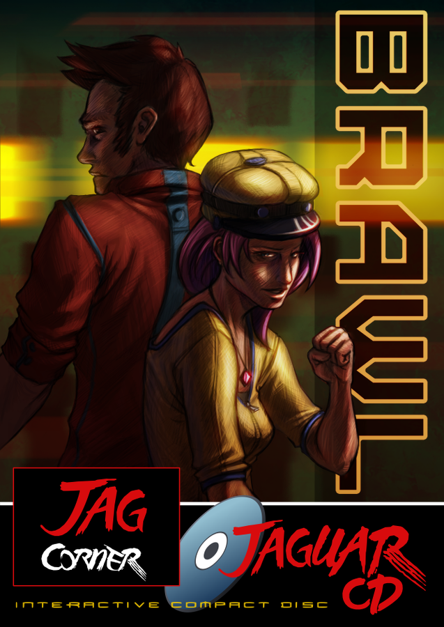
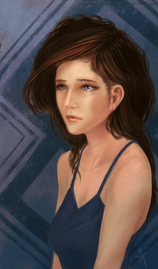
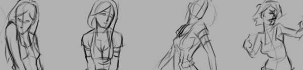
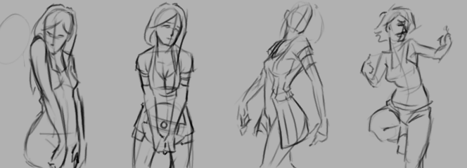
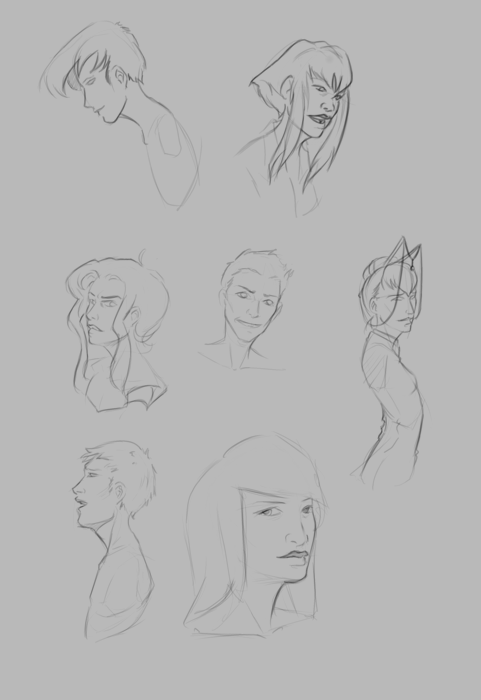
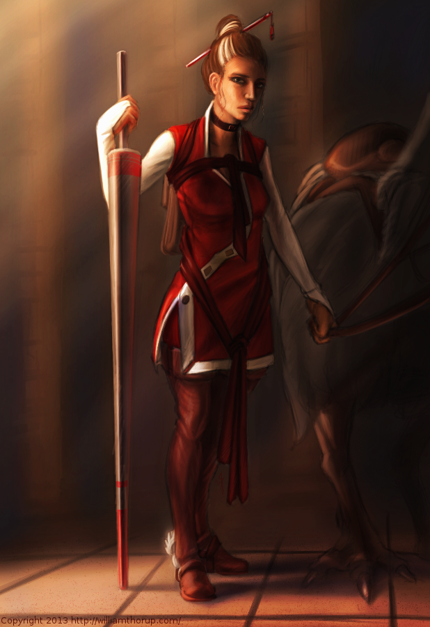
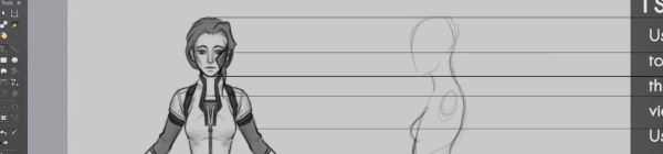
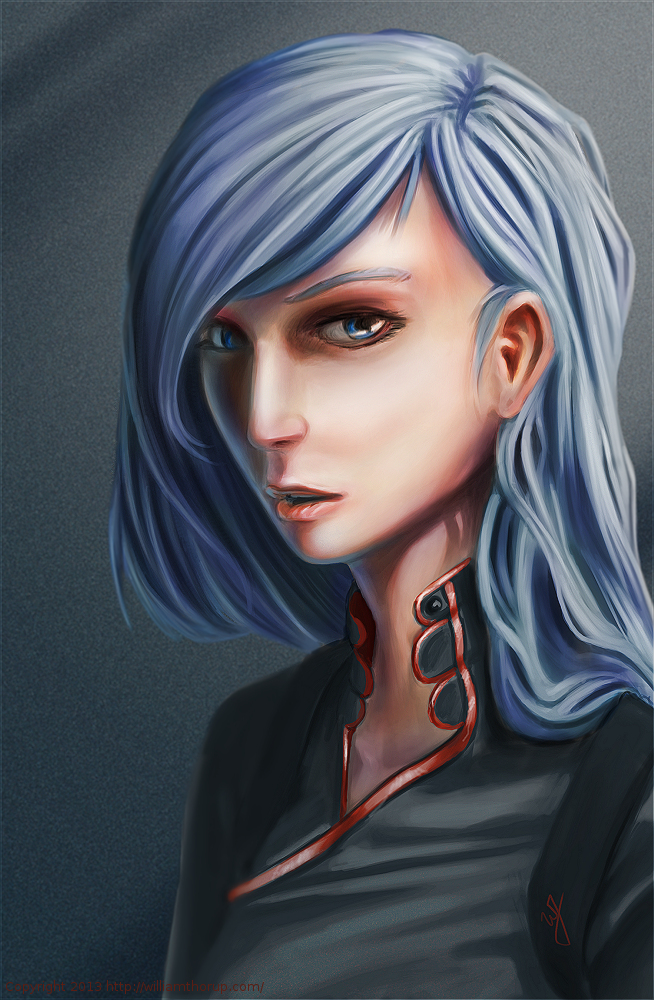
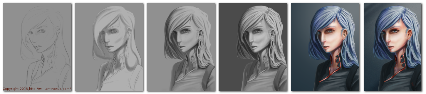
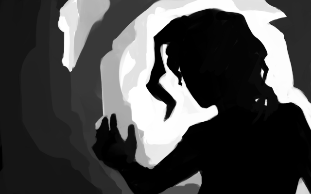
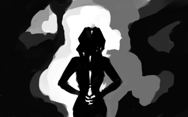
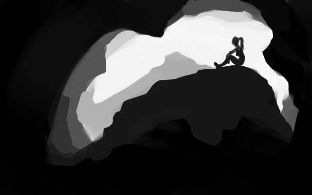
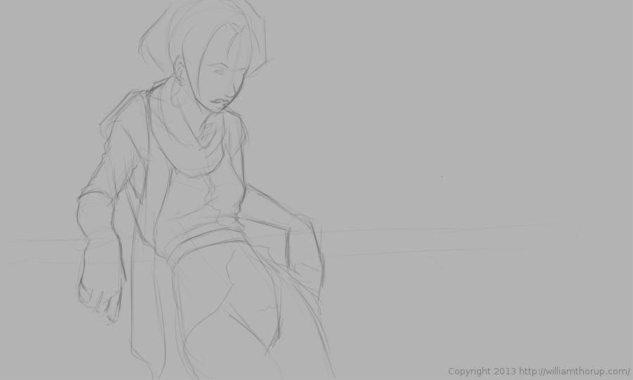
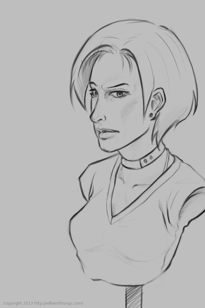
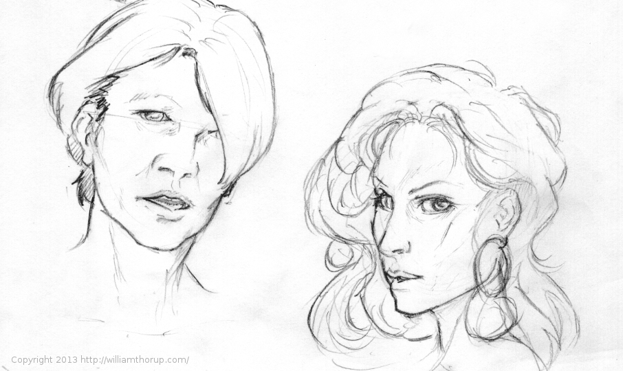
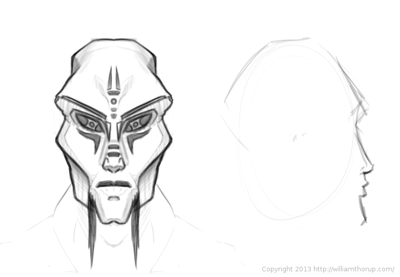
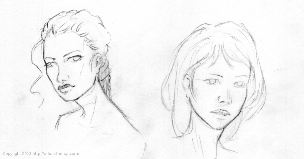
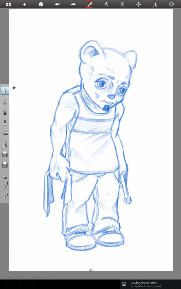
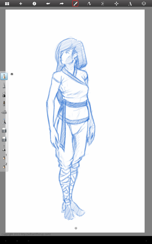
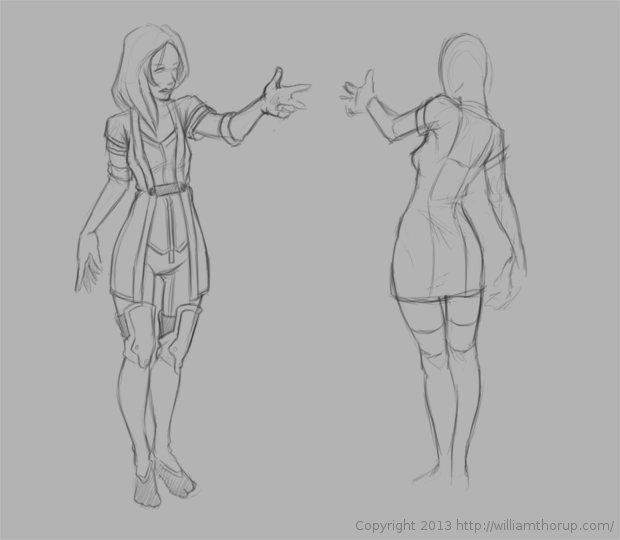
    Whats featured in the video is just a fraction of the work that I never finish. There are tons of paintings and sketches, that I start to take to finished pieces, but never find the time, or I move onto other projects.

    Something interesting though. Recently I have been putting together a book of all my work since I got off my mission (pics below), and I have noticed how much my finished work draws from my unfinished work. Especially anything that has a story to it. I don’t know if it’s because I get too attached to an idea, or what, but my finish work is a culmination of things that never finish. Allot of the games my brother and I have started over the last few years have been doing this, and many illustrations and other paintings are a result of this as well.

    Speaking of this book I am putting together. I am always thinking about possible career roots in the future, and I thought it might be a good idea to collect all my work over the last few years and get it in a nice hard bound book of some sort. The book can be used as a portfolio, but the main motivation is to get a hard copy of my paintings.

    Currently, none of my recent work has been printed. The inherent properties of the digital medium make it a bit more volatile. So, having a hard copy of my work, I believe, will be a good idea.

    illustration_1thor_media_1personal_1

    The book will be 8.5×11 format, full color. Right now I have about 90 pages put together, and, at this point, it looks like the book will break 125 pages. The book will include an Illustration, Thor Media, Ongoing and Personal work, and a sketchbook section. Along with a small index to quickly find pages that feature character design, story boarding, etc… So far this has been a huge project to undertake, but I think it will be well worth the time in the long run.

  • Atari Jaguar | Brawler – BitJag Game | Box Art

    Atari Jaguar | Brawler – BitJag Game | Box Art

    The Jag stuff still goes forward. Project 3 final has a name, “Brawl”, and a start on the box art.


    Brawl_semifinal cover_WEB


    This was an awesome piece to work on. And I first need to thank Michael Buhler for his input on some final decisions on the background and title text. He is an amazing artist and you should check out his portfolio HERE.

    The lighting and color were my favorite parts of this piece, and all the pieces seem to fall in place, when I need them. Something that I should have spent some more time on, before starting this piece, was draw up some concepts for the male character. I like the way he came out, but I think a bit of forethought would have saved me some time in the long run.


    Again, enjoy the time lapse video, and check out the new update video at http://bitjag.com/. There are some updates to concept art on that page as well.

  • Krita Time-Lapse Demonstration | Inking |  Inking with Wolthera van Hovell’s Inking Brush Kit 1.2

    Krita Time-Lapse Demonstration | Inking | Inking with Wolthera van Hovell’s Inking Brush Kit 1.2

    Thought I would pay tribute to some of the people helping to make Krita an awesome program for artists. By tailoring to specific mediums, like ink.


    This time-lapse video highlights a few drawings being inked with Wolthera’s new Inking Brush Kit that you can download HERE. Enjoy the vid.

  • Krita Time-Lapse Painting | Another Portrait

    Krita Time-Lapse Painting | Another Portrait

    There are different kinds of goals in relation to art. One of those goals could be study goals, like, I am going to focus on drawing hands, or learning to render light and shadow correctly. I would talk about a goal that can have a much deeper effect on the viewer, than say the anatomically perfect hands you drew last week.


    skin study portrait_web


    The kind of goal that should apply to just about every painting, drawing or sketch that you produce. This kind of goal can be established with one question, what do you want the viewer to think, feel or do when they see your work.

    Of course, sometimes an artist throws all care to the wind and just creates, and there is nothing wrong with that, but even approaching your art with that attitude is going to come across to your viewer in the final work. How powerful could your art be if you took charge of what your work is conveying to the viewer on an emotional level?

    When I started this painting, it was just going to be a study on rendering light a certain way, this is why the very beginning of this painting isn’t in the video. I wasn’t planning on doing a time-lapse at all. Out of this one goal spawned an important question, what is this imaginary person like, and how can I bring that personality into the painting, and make it recognizable to the viewer?


    A portrait not only contains the physical appearance of a person, but can also portray what kind of person they might be. So, about 20 or 30 minutes into the painting I realized that I had a greater goal in this painting, that was to evoke specific feelings in the viewer. The goal also included really focusing, through the entire process of the painting, to make sure the former goal was reached.

    Ask yourself this, what do I want people to think or feel when they see my work? See what happens when you really focus on the answer to that question while you are painting or drawing.

    Because of the subjective nature of art, I won’t say what I want you to feel when you look at this piece, but, as an artist, my hope is, is that you feel something similar to what I felt while working on this painting, and when it was finished.

    Look forward to some more time lapse videos in the future, and Thanks for watching.

    Krita was primarily used, with Gimp for some post color correction.

  • Weekly Sketch Review | Faces and Characters

    Weekly Sketch Review | Faces and Characters

    I should probably start calling these bi-monthly sketch reviews, considering how much time that has elapsed since the last sketch review. I am drawing quite a bit, it’s just getting around to putting these posts together. It’s more time consuming than I expect.

    flirtting


    faces_1

    I have been working in both Krita and Gimp lately, and I definitely lean towards using Krita for my study. Smoother workflow and all. I mainly use gimp for its more intended purpose of post processing now. Adjusting color curves, sharpening, etc.

    The first few poses that are drawn in the video are actually from an illustration, I did over a year ago, here. I liked the original and I wanted to draw poses, so, I tried fleshing out the character a bit with some different poses.

    The faces in the middle of the video are purely study. Then the last set of drawings are a character concept for one of our Jaguar games.


  • Krita | Character Illustration | Jouster

    Krita | Character Illustration | Jouster

    Some more stuff for our Atari Jaguar project. I have been working on story ideas and concept drawings for our jousting game, and this design came to mind.


    Jouster_web


    If you haven’t already, head over to http://bitjag.com/ and check out the three projects that we have in the works. Not a whole lot of visual concepts yet, but stories are being put together and their general concepts are listed on that site.

    What I enjoyed most a about this painting was the lighting. The composition and the pose could be better, but I think the good lighting helps make up for that. It really brings the viewer’s eyes to key and attractive points in the painting, and overall, it is very comfortable to look at.


    On another note, if you haven’t noticed already, most of my most recent paintings have all been done in Krita. I am in love with the program, the interface and default shortcuts work great with my Cintiq 13 HD, and overall it seems like a much smoother experience than Gimp lately. Gimp has been having some serious issues with my hybrid ATI graphics setup, and so, I mainly use gimp for my graphic design work.

    Don’t get me wrong though. Gimp is a great program, and it has been especially useful lately because of all the web graphics that I have been doing. Krita just provides a workflow that feels smoother and faster to me, and I think that I will be using it for many of my paintings in the future.

  • Quick Tip | Drawing a Character in Profile | Video Tutorial

    Quick Tip | Drawing a Character in Profile | Video Tutorial


    Here is something that I put together a few weeks ago, and just got around to finishing it. This small tutorial covers a couple different methods of creating an accurate representation of a character’s profile, based on a previously draw front view of that character. Enjoy.

  • Krita Time Lapse Painting | The Waker

    Krita Time Lapse Painting | The Waker

    I have been trying to get this painting posted for over a week. Ran into issues with my computer and work has become really busy. But, the excuses can be annoying, so, here it is.

    This painting was very much spontaneous. During a digital sketching session, this face came out, and I decided to push it to a finished rendering.


    the waker_web


    This painting got me a bit worried, since it had been a while since I tried to tackle realistic lighting. Rendering correct lighting has always been a bit intimidating for me, but I seem to have handled it well. I first broke down the steps. So, instead of trying to take on both color and light at the same time, I decided to do a grey scale painting first. Simplifying the process overall, and allowing myself to focus specifically on how light is interacting with the form.

    Digital art really makes coloring an image easy. I pick a color, slap it on a with a different layer in “Overlay” blending mode, and if I ever need to change it, no problem. Just use a Hue/Saturation/Value filter to adjust the color. As you can see in the video (3:40 and 3:52), I did this for her hair and her clothing.


    I love painting skin. The key to making skin look alive, are the areas where light transitions into shadow. Because skin isn’t completely opaque, light will enter the upper layers of the skin, hitting blood underneath, and will bounce back oranges and reds. The is particularly prevalent in the transitional areas between light and dark.

    A good example of this in this painting, is her chin, starting at 4:17 in the video. A few other things to keep in mind when painting skin is to play with other colors on top of the skin with a layer set to an “Overlay” blending mode. Colors like green and yellow can add healthy variety to lighter areas of the skin, while violets and blues can saturate your shadows making them appear more realistic. At 3:39 in the video, you can see I added a light layer of blue to under the jaw line.

    One thing that was unexpected in this painting was her hair. The hair that falls down her neck turned out to be much more complicated than I originally planned at the sketching phase. I had fun spending the time rendering it, and I feel it adds a certain level of detail that the painting wouldn’t have otherwise.


    the Waker_Six step process


    I feel a bit silly mentioning this, but her ear is something that I am proud of. I didn’t spend as much time rendering it than I did other portions of the painting. The structure is very much convincing, but still has the brush strokes that I like to see in my work. One other thing I enjoy about this painting are the facial proportions. I am still far from being a master when it comes to proportions, and that can be clearly seen in my work. But the scale of her mouth compared to her eyes and nose are pleasant, and seem to go well with the piece as a whole.

    These paintings that I do without reference always surprise me ounce they are done. I find it fascinating to think pack on my processes and ask myself why I did something a certain way. It helps me to see what I do well, and what I still need work on.

  • Weekly Sketch Review

    Weekly Sketch Review

    I have been slammed for the last couple of weeks. Things in Thor Media look good business wise, but that means more of a burden on our shoulders. With so few people working in the company full-time, it becomes very difficult to find time to do anything on my blog.


    Compo Sketch_1Compo Sketch_2

    Compo Sketch_3Compo Sketch_4


    Also, I had a very close grandparent pass away, so the family has been dealing with that. But this doesn’t mean I am giving up on the blog, and these recent events have provided sources of inspiration for both work and personal projects.

    I decided to dive into a bit of composition. Practicing on creating a focal point and depth in an image. These kinds of studies are simple, fast to do, and seem to be one of the most effective ways for me to study composition.


    Then during the week, I worked on anatomy and various poses, faces, random ideas for paintings, and costumes/fashion. I covered allot of ground over the last few weeks, and I am thankful to these Weekly Sketch Reviews for that. This has been a great way to motivate myself to draw and paint more.

    I would suggest to any budding artist, get a blog, and try something similar. Its great way to look back on your previous work and see the progress. With me the progress is slow, and sometimes frustration, but gratifying when it is seen.

  • Weekly Sketch Review

    Weekly Sketch Review

    pirate girl

    Armored Empire is in full swing, and other prospects for the company are growing. We have been very busy at Thor Media, we like what the future is looking like. Amidst all the commotion and work, I always seem to find some time to sketch and paint, that is what these posts are for. Keep the train rolling.

    And that is never as easy as it seems. These time lapse videos are encouraging though. I can see progress in my anatomy and gesture drawing, and I am better realizing how important these two things are in obtaining my artistic goals.


    first cintiq sketch

    More faces. Trying to broaden my portrait skills with different ethnicities, and also some more fictional studies. I used Krita’s multibrush option to do the alien head below. By selecting and axis point and setting the mirror direction to horizontal, it is very easy to sketch out faces, and relieves the pressure of making sure the face is not lop sided. I can see how something like this would make things more efficient in a production, but it is something I definitely don’t want to become dependent on.

    All the sketches here are a mix of digital and real. I enjoy switching back and forth. I get to see the differences in how I draw lines, and the differences in the feel of both mediums. There is still a stark contrast between the two, something I believe that will never go away, but I enjoy both, and find that both have their pros and cons.


    6-2-13_2alien head6-2-13_1


    Screenshot_2013-06-08-17-11-34Screenshot_2013-06-08-17-11-55khloe character sheet_1

    I have also been working on some characters and costumes. The animal mechanic below was fun. I don’t work with animals much, I am not sure what kind of animal he is, but I thought I would give it a try. The other images are basic costume and anatomy studies.

    The last couple weeks have been a bit of a roller coaster. I stress out about how much I am practicing, and I am worried that recently acquired skills will disappear. I struggle with this more often than I should, and I know that part of the problem is that I don’t incorporated these skills into my work enough. I spend allot of time in Blender, modeling, texturing, and animating, which I enjoy, but I don’t want to do for the rest of my life. I hope, in the near future, we can find someone that can cover this work at Thor Media, so I can focus more on the 2D artistic sides of things. On the up side though, I seem to be doing thumbnails allot more. For trailers, interface design mock-ups, and other technical stuff. So my pencil still gets used allot.