William Thorup

Illustrator, Motion Graphics Designer, Animator, and VFX Artist

Category: Timelapse Videos

  • Krita 2.6 Illustration | In the Park

    Krita 2.6 Illustration | In the Park

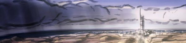
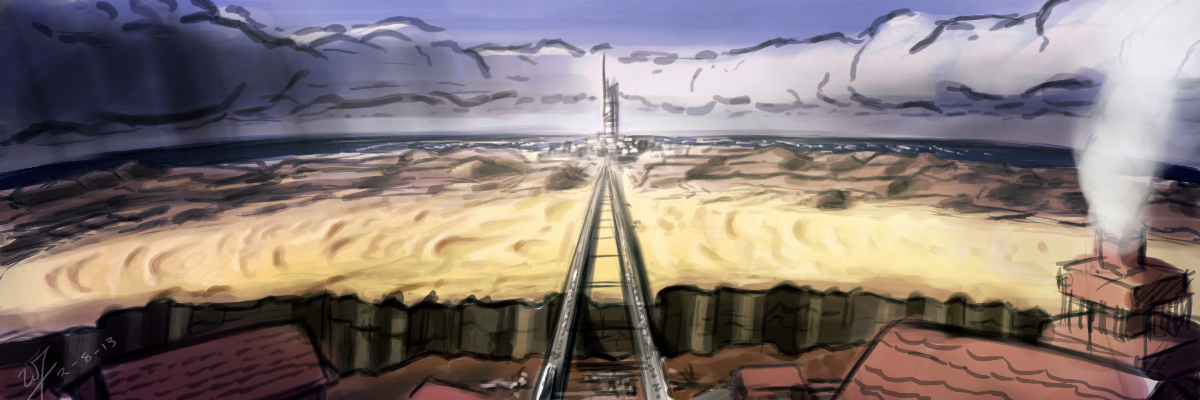
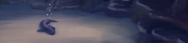
    Jumped back on to the Krita bandwagon the other day, and it was good. It’s fun to be in a new program and learn new keyboard shortcuts and tools. And I love the rotate canvas feature, I sure hope Gimp eventually gets that feature because it invaluable when editing, not just drawing or painting.

    In the Park


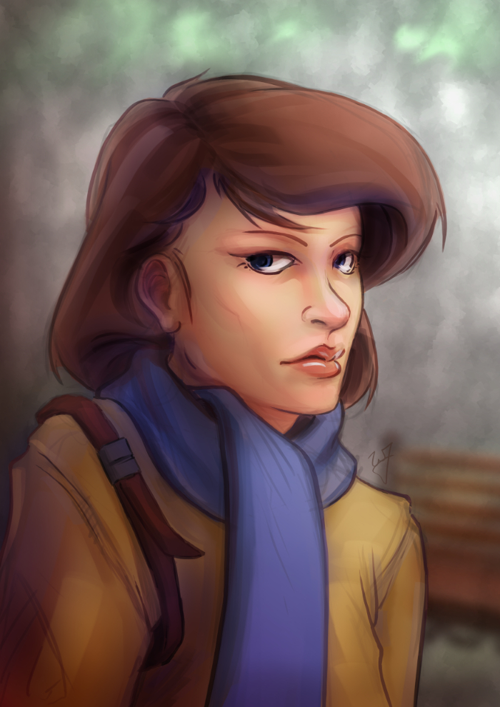
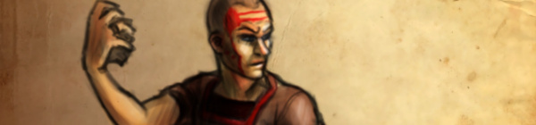
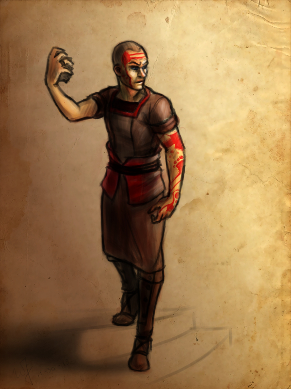
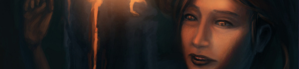
    This piece was really enjoyable. There were some points of doubt and uncertainty, especially when I started coloring, but overall I like the final result. I wanted to do something a bit more cartoon oriented, but keeping my focus on color and composition.

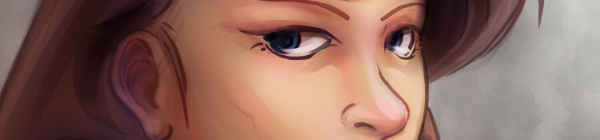
    One thing in particular I kept in the forefront of my mind was the rule of thirds. Not in with the painting as a whole, but with the subject instead. Focusing on the silhouette of the character, you will see that the left and right sides of the subject have 3 major hills or bumps. This, along with the backwards “S” curve in the hair, was used to create symmetry at the focal point (the face) and a softer look towards the face.

    Look at this in contrast with the subjects jacket. Her shoulders, and other lines on the jacket, are sharper. Which makes most viewers follow the blue scarf (a softer shape) up to the face.


    As a side note. If you haven’t had the time to check out my latest tutorial, Using Gradients, I highly suggest it. Good reading. I use this painting in most of the examples, and show how I added depth, color diversity, and a focal point, by using two simple gradients.

  • Project Nebula | Desert Coast City Concept

    Project Nebula | Desert Coast City Concept

    Desert to ocean_web

    I won’t be able to get a weekly sketch review together this week.  I have been swamped with finishing up Josh the Whale, and getting near future projects organized.


    Luckily, with the spare time that I made today, I was able to get something together for the blog, and just break away from the paper work that I have been focusing so much on lately.

    Unable to give any details in copy at the moment, but I had this image in my head since I have had conversations with Ryan Thatcher about the world our next project will take place in.  And, well…  That’s about all I can say without given too much away.

    Enjoy the video, and look forward to some good news in the future.  We will be releasing Josh the Whale soon, and deciding on the next five months or work for Thor Media LLC.

  • Project Nebula | Character Concept

    Project Nebula | Character Concept

    Been hard at it the past few days.  We have a good rough of Josh the Whale finished, just waiting on music before we start the polishing stage.  Really looking forward to topping that project off.

    Also, I have been doing allot of concept work for Project Nebula.  Been working with Ryan to work out world details, and a little bit of character design.

    Speaking of which.  This design is mostly Ryan’s, but I adjusted some of the ideas, seeing where it would take me.  I also took the time to put together a time lapse video, something that I regrettably haven’t done in a while.

    I love to look back on my processes.  Most of the time during painting, it is a blur.  I can’t distinguish one moment from the next.  So recording it, and comparing my technique to previous paintings is fun, as well as enlightening.

  • Krita | Character Sketch

    Krita | Character Sketch


    I have been seeing allot of stuff done in Krita lately.  Also, I have been reading allot about over at David Revoy’s blog.  And I finally took the time to get into it and learn some things.  And my initial impressions are good.

    The brush engine is fantastic.  It’s fun to just go in and play around with the variety of brushes and different effects.

    One of the things I liked the most about Krita was the little sketch pad they have in the “Edit Brush Settings” dialog.  With the wide variety of tools, it’s good to have something that you throw a line down on, to see how it will look on your canvas, without having to actually put it on your canvas.

     Plus, this is almost a necessity with this program, because this dialog takes up a good portion of the screen, and to go in and out of this dialog would take allot of time if you could only test tools on the canvas.  This also feels great for those who work with real mediums, as artists will often test a stroke, color, or tool on a separate scrap piece before painting or drawing on the actual artwork.

    Shift+left-mouse-buton dragging for brush size is invaluable, and saves allot of time in the long run.  I wish the Gimp had functionality like this.  But I understand why it doesn’t.  This also reduces the interface.

    Another leg-up that Krita has over Gimp is multiple color depths.  Most concept artists, or illustrators will never use over 16 bit, but since I get into the film and 3D stuff every once in a while, it’s comforting to know that I will be able to work with 32 bit images on an open source platform.  Gimp will be getting this functionality soon enough, but for now Krita is the only user friendly way of handling 32 bit images on the open source platform right now.

    The last thing that really stuck out was the right-mouse-button menu.  This brings up a color wheel and color history.  Also, you can save preset brushes to this menu, making it faster to get to the brushes you will be using often on a given piece of art.

    I have only scratched the surface of what this program can do for the concept artist or illustrator.  But I see myself using this program, along with the Gimp, to do my illustration work in the future.

  • Josh the Whale | Level Design and Creation

    Josh the Whale | Level Design and Creation

    Josh the Whale is moving along nicely.  Bryce is figuring out the new engine and we have already put together some proof of concept work.  While he’s figuring out how to get this all put together in an application, I am trudging forward, getting other areas of the game designed and finished.

    This is a time lapse video of the cave entrance where a few pages if the book will take place.  This video is especially long because all the interface  movement would be too distracting if I compressed it down to 4 minutes.  So, if you don’t want to spend 20 minutes watching this video, watch for about 1 minute and then skip ahead 5 minutes, this will give you a good feel for the whole process.

    As you can see, the difference between the concept art and the finished result is dramatic. And I predict that there will be more changes in the future, as we test on different platforms.  This is partly because of my lack of planning, but also because plans change as you continue to consider your market and what ideas you wish to express visually within the story.

    And there are also limits with polygon count amount other things.  I try to avoid thinking that way when doing this kind of work, because even with restrictions you can usually get what you want out of it, if not stubble upon a few good things you wouldn’t have seen without the restrictions.

    The processes that I go through to hash out these designs are simple:


    Brainstorm and Sketches (What colors, what environments, visual style)

    Concept art  (Hardest part, because you are trying to develop a visual style and language that best fits the idea)

    3D’ize  the Ideas (Modeling, Texturing, Rigging, Animating, and other asset creation)

    Troubleshooting (testing to make sure that the colors are sending the right visually messages, the main character sticks out enough, etc.  Often the longest part of the job)


    It’s allot of work, and can be very daunting when you first approach it.  But as the artwork comes, the assets get animated, and those assets are placed into an interactive state, it can be very exciting and encouraging.

    I will continue posting about this app, since it looks like we are still a good month away from a final product.  But I do have other things lined up.

    I am currently putting together a personal project video series, that should carry on for a few months.  I got a few ideas in mind on things I might be able to contribute from my limited experience.  And placing some of that experience into a fun video series will help keep me motivated in my work, and hopefully motivate some of you as well.

  • Sea Fire | Personal Illustration

    Sea Fire | Personal Illustration

    Another illustration. Inspired by all of the underwater stuff that I have been doing lately. Plus, I have been thinking of these colors quite a bit lately, since it is similar to the color scheme of my website.

    For anyone that might be interested in what I use to record my desktop, and how I go about editing. I use a simple bash script with ffmpeg to record. Nothing too fancy. The script records at 24 frames a second into an h.264 codec, keeping the file size small. But whats special about this script is that it records for 7 minutes, saves that file, and then starts recording again to a different file. It names the files acording to the date and time they were created. Here is the script.

    while :

    do

    ffmpeg -f x11grab -r 12 -s 1920x1080 -i :0.0 -vcodec libx264 -vpre lossless_slower -threads 2 -vframes 5000 /media/Wills\ External\ Hardrive/Desktop\ Recording/output_`date +'%Y%m%d_%H%M%S'`.avi

    sleep .25

    done

    The problem with recording to video is that if you are recording for an hour or two, and ffmpeg crashes, you lose that entire recording. And there usually isn’t anyway to recover that data. This is a problem I ran into several times, and it ruined a few paintings because I would just get frustrated from losing all that recorded work.  Making a consistent time lapse video impossible.

    But, if you record in shorter segments, for example 7 minutes, then you can never lose more than 7 minutes of work. This takes my mind off of worrying about my recording so I can just focus on painting.

    Right now the script is setup for Linux, but I believe it can be easily adapted for Windows.

  • Josh the Whale | Character Concept

    Josh the Whale | Character Concept

    Thor Media LLC is swinging into full production on their first interactive children’s book app, “Josh the Whale”.  Bryce has picked the engine we will be using, Shiva, and is loving it so far.  And I am jumping into some character and level design, along with adapting the original story to fit the interactive medium.

    Our original client fell through, but, because we were interested in doing an interactive book app, we decided to do our own instead.

    The story that we chose is actually something my brother Aaron wrote when he was in the third grade.  It is a simple story about a whale learning his worth in the world.  We are obviously changing the original version.  Polishing it up, and adding some things to give it more depth.  But the original story will stay intact, and should fit children from 5 to 8 years old.

    The interactive book thing is interesting for a few reasons.  One reason is that an interactive book really isn’t much different from a simple game.  Our story will have several different game types involved, that will help children with reasoning, and exploration skills.
    The other exciting thing about this project is, it will help us adjust to the new engine, and give us the experience to tackle a larger project.  Like our up coming game.

    I will keep posting about this project in the future, and hopefully some more videos.  I am thinking about recording some of my work in Blender, to add to the portfolio, and show how we go about modeling, texturing, and animating our assets.

  • Concept Art Among Other Things

    Concept Art Among Other Things


    Again, sorry for the lack of posting.  I have been busy with a few things.

    First, Thor Media’s new live wallpaper has been delayed for a couple weeks, so I have been working around that.  Also, I have picked up a smaller VFX job.  Just some small tracking and green screen work, which I will post a little later on.

    But, in between things I have been able to tidy up the script for our up coming game, and work on some concept art.

    I decided to tackle some of the environments first.  There are good reasons to do this from a production stand point, but the main reason why I started painting environments is because I have very little experience in painting imagined environments.  Especially long shots of out door environments.  So, to see where I stand on that skill-wise I did a few paintings of some environments in the game.

    And, to give myself a little critique, I have a long way to go.  I think the lighting in the painting with the sunset is good, but it struggles because there really isn’t anything special about it.  I know when designing for video games, the worlds are very, very small, compared to the real world.  So to liven up these imaginary worlds, they need to have things exaggerated, things that stand out.  In fact from what I know, it is very similar to character design.

    Then the Mountain Slope painting lacks depth.  I was trying to go for a more diffused lighting, but there is obviously much to learn before I can pull it off.  Direct lighting seems to be easier to work with right now.

    I did record one of the paintings, I hope you enjoy.  Let me know what you think, or if you might have some good references for me to look at.  There will be allot of learning in the next couple months on the this project.

     And speaking of learning.  I just got an awesome new art book.  It’s called ” The Art of Journey“.  It includes a ton of the production art.  From doodles to finished concept art.  And what amazes me is that most of the art was done by one person.  It gives me allot of hope in this project we have just started.  I am thinking about using the book as a model for the kind of process I should go through to produce the art for this game.


  • Legend of Zelda Redux | Twinrova

    Legend of Zelda Redux | Twinrova

    My competition piece was Twinrova with a “Tron” twist on the character design.

    Well, this is a much more completed version of the digital painting in the competition.  And that is what I get for procrastinating.  But here it is.  Head over to the finals thread and check out the other great entries from other amazing artists.  This, again, was a very humbling experience.


    I had a very hard time keeping myself motivated for this painting.  I originally thought that the idea would come together pretty smooth, but I ran into some difficulties.  One difficulty was making sure that the character would be recognizable, based on the original.

    I had a hard time designing the outfit in such a way that it would keep well to the original, but also have the simplicity of the costumes in Tron. Not to say that the costumes in Tron are overly simple, but that the two worlds designs are drastically different.  And because of this problem, I don’t feel that the original character represents, good enough, in this new design.  I should have spent just a little more time  trying to figure out how to bridge that design gap.

    And another difficulty, that was self imposed, was my overall process.  I wanted to work from a line art base, to a more realistic finished product.  I hadn’t tried this kind of process for a long time, and I felt very insecure about this painting because of it, until about the last hour of painting.  This seems to be a common technique, and I should keep up with it by switching between value and line.

    But as for positives.  I like the composition, pose, color, and depth in the painting.  I tried to simplify the background as much as possible.  Seeing this is a character design competition, I should probably try to bring the viewers focus to the character.

    Also, a few things that I haven’t really done before.  Trying to simulate refraction with glass in the foreground and other areas of the painting.  Another, being the black hi gloss surface of the face plate.

    Overall I am happy with painting, and it seems to show that I am progressing in the areas of composition, anatomy, material rendering, and color theory.  Some progress is better than none, right?

  • Pira Tess, Space Brigand | CGHUB CharacterFORGE 2D Entry

    Pira Tess, Space Brigand | CGHUB CharacterFORGE 2D Entry

    Another CGHUB competition piece, done in the Gimp.  You can check the finals thread here.  Everyone’s pieces should be posted by the end of the day tomorrow.

    I don’t think I will get many votes, simply because of the amount of other great artists on the thread this time around.  But it is good to see the different techniques and styles involved.  I can obviously see where I need to improve.  Its a humbling experience every time I enter one of these kind of things.


    In that respect, it seems that every painting I do, I see allot of personal progress.   Getting my nose into those books, practicing the techniques presented, and analyzing great artists, has been a huge boost to my learning process.  And I am loving every second of it.


    Sorry for the jumping around towards the middle of the video.  When you are getting into details, it is hard to avoid.  But I did go through over 10 hours of footage to improve it the best I could.


    One other thing I would like to mention is one of the artists in particular, mdonze.  This artist made an interesting post about his painting here.  Beside the painting being amazing, in my opinion, he used a process similar to the way a 3D application would render and image out.  I have heard about this process before, but this is the first time that I have actually seen it used for a 2D piece.  And somewhat explained.


    This is something that I am planning on practicing in the future.  I do have an idea of how a computer pushes a 3D scene through passes (specular, ambient occlusion, color, alpha, etc…).  And I think a technique like this will help me use both my 3D experience with my illustration to improve my skill set.