Over the last month or so I have been collecting my digital artwork and sketches into a collection of books. I will do a post specifically about this soon, but going through the process of laying out the last decade of my artwork has been thoughtful process.
Something that became obvious quickly looking at my artistic habits over the years is that I love to do full color, highly rendered illustrations, but there has been a fear, doubt, something holding me back from doing more of that kind of work.
So, in response to that, I have made what you might call a late New Year’s Resolution. Simple to paint more, as opposed to line drawings, and treat it as an education instead of “sell-able artwork”.
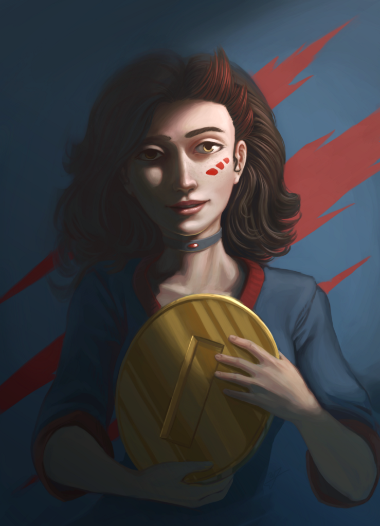
In an effort to satisfy this goal, this portrait of Cutter, from BitJag’s Flappy Bird Clone, Flappy McFur, is the first fruits of that effort. Also, I recently re-coded Flappy McFur from the ground up, so this piece is a way to celebrate the nearing end of that work.
Along with this, I want to setup some criteria to reexamine myself after I finish a piece. So, I’m approaching more time lapse videos for each piece I produce. I want to do a written examination through blog posts, focusing on specific things I learned or practiced, and how I might do things differently if I started over on the same piece. Lets do it.
Things I Learned or Practiced
Defining My Process
I recently watched this video by Marco Bucci talking about painting greyscale and then moving into color after you have the value painting established. The primary idea that Marco presents that this process actually removes some of the benefits that can come to your artwork if you start with color from the start.
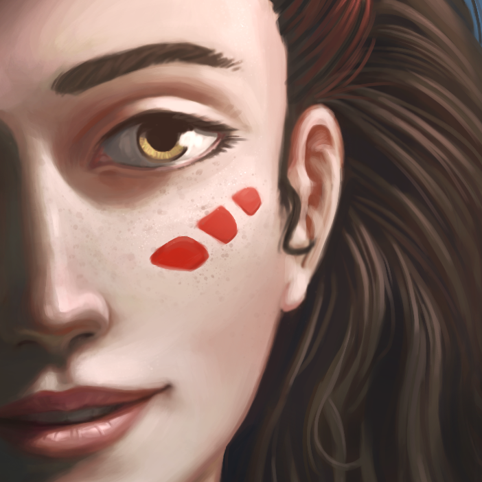
Working in greyscale is something I have done in the past, and I plan on using this approach in the future. But he does make a convincing argument for why you should not do this all of the time. When starting this portrait of Cutter, I paid special attention how I pick colors, and how I could use a variety of colors in skin tones to enrich the piece. Especially for areas in shadow. Using a diversity of color in the shadows, along with ambient reflective color created more richness than I have experienced in my work before.
Start By Anchoring Your Values
If you watch the timelapse, you will see that I do make some dramatic value adjustments using some global color adjustments to brighten the image. I started this picture far too dark. What I learned from this is that when starting a piece, I need to keep in mind that whatever values I start with become the anchors for any new values that I introduce.
This means that when starting a piece I need to determine one thing. If I have any direct lighting, I need to properly determine the mid tone for that light as first value that I add to the canvas. This approach can be applied to ambient lighting and any light in the piece.
This anchor value will help determine the proper contrast between light and shadow that I may be looking for, for any future pieces that I work on.
Work With Reference
Probably the most embarrassing part of the timelapse is how many times I make adjustments to Cutter’s face. I have heard from many experienced artists that spending extra time on the face is natural, and important because that is what people typically focus on first when looking at artwork. I would like to hide behind this reasoning, but I don’t think it completely addresses why I came back to the face to adjust overall placement and shape of the face. What is really sad about it is, even though the end result came out good, I am still not completely happy with it. Why did this happen?
First, proportions were off from the very beginning. And adjusting proportions later in the process is almost always more time consuming when compared to properly establishing proportions earlier in the process. I believe the root of this problem is because I am not practicing from reference enough.
Even though Cutter doesn’t exist in real life, therefore there is not reference to work from for this piece, by practicing more from reference in my studies, my “imaginary” artwork with be better informed. Having an appropriately oriented visual library established in my mind, I can better extract from that well practice to better in form my ideas in my imagination.
Conclusion
Cutter’s portrait is attractive, but took longer than needed to paint, and shows a lack of foundation in my visual library. What are some things I can do to improve?
The obvious solution is practice with reference. This will solve both the problems of appropriate proportions for whatever subject your are painting, and it will help me become more efficient in my painting process. Resulting in saving time, and creating more attractive pieces.


