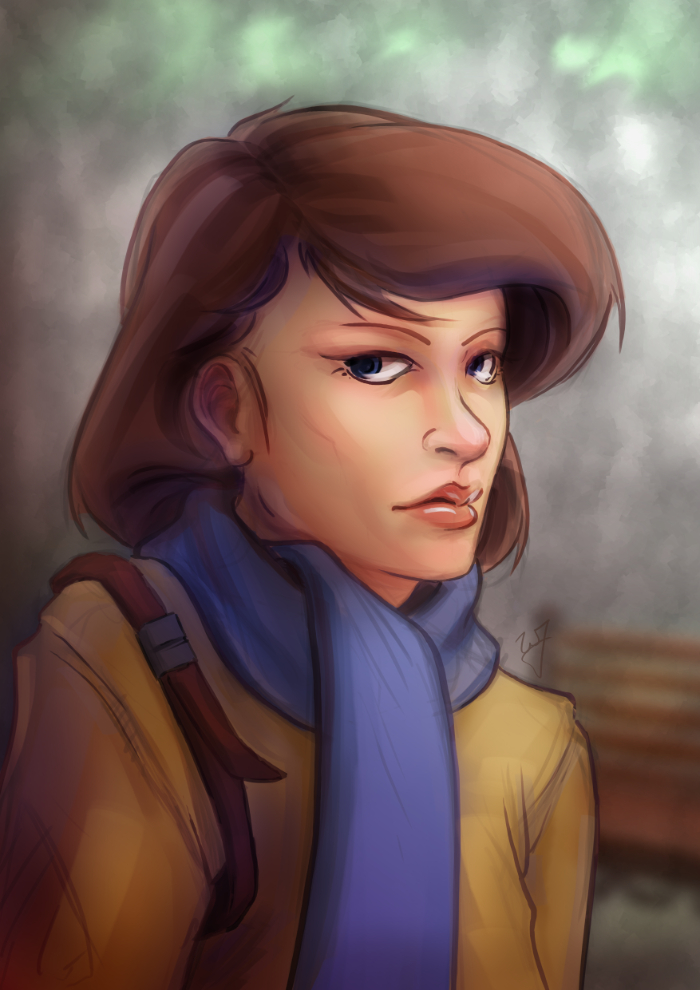
Krita 2.6 Illustration | In the Park
Jumped back on to the Krita bandwagon the other day, and it was good. It’s fun to be in a new program and learn new keyboard shortcuts and tools. And I love the rotate canvas feature, I sure hope Gimp eventually gets that feature because it invaluable when editing, not just drawing or painting.
This piece was really enjoyable. There were some points of doubt and uncertainty, especially when I started coloring, but overall I like the final result. I wanted to do something a bit more cartoon oriented, but keeping my focus on color and composition.
One thing in particular I kept in the forefront of my mind was the rule of thirds. Not in with the painting as a whole, but with the subject instead. Focusing on the silhouette of the character, you will see that the left and right sides of the subject have 3 major hills or bumps. This, along with the backwards “S” curve in the hair, was used to create symmetry at the focal point (the face) and a softer look towards the face.
Look at this in contrast with the subjects jacket. Her shoulders, and other lines on the jacket, are sharper. Which makes most viewers follow the blue scarf (a softer shape) up to the face.
As a side note. If you haven’t had the time to check out my latest tutorial, Using Gradients, I highly suggest it. Good reading. I use this painting in most of the examples, and show how I added depth, color diversity, and a focal point, by using two simple gradients.


Boudewijn Rempt
That was a lot of fun to watch!
William
Thanks! I’m glad you enjoyed it.