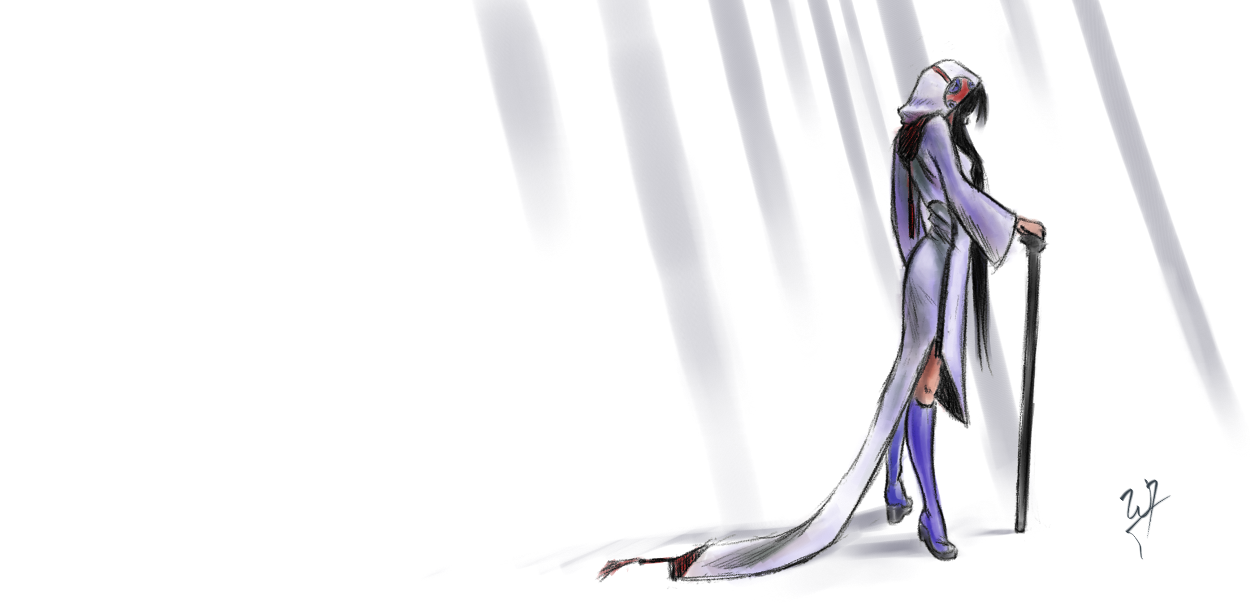
I thought I would whip up another video for you all. This was mainly done in MyPaint, with some touch up work done in the Gimp. I love recording my sessions, and I thought I would record a piece of concept art that certainly breaks away from the usual way I do things.
This one obviously centers more around the outfit, than the character. My goals where, have a simple color scheme and a strong silhouette.
To bring out the shape, I stuck to a line-art. Line-art reads easily, when done right, so for a very short piece (1 hour) I needed to make sure, that who ever looked at this piece, could easily understand the form of the clothing. Another reason for the line-art style is because I haven’t done anything serious, in line-art, for a while.
And for the silhouette part of things, I thought that exaggerating one part of the clothing would add what the character needed for a unique silhouette. Can you imagine someone with this getup walking past you. The long tail of the skirt flowing just above a stone floor, making a very distinct but soft sound as the material brushes against the floor. The very sound would become apart of the character wearing this clothing.
Another detail to the silhouette is the cane. When I knew I was going for a mage, I didn’t want the “traditional” staff, that a mage or wizard would have. So, one of the reasons for the cane was to break away from that tradition.
Again, any comments, critique or questions are welcome!

