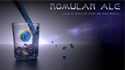
Didn’t have allot of work today, so I took the time to jump into the new Blender cycles engine. This tutorial is what I had mimicked to get this wallpaper you see below.
This took me a good part of an afternoon to finish up. The hardest part was getting the federation logo right. (Lets just say this is something that is ridiculously easy to do with the old render engine, and the cycles engine still has a long way to go in the texturing department. Plus not a whole lot of documentation on the render engine yet). But I am looking forward to getting more acquainted with it in the future. I also used Gimp, for some touch up work, and I used Inkscape for the text.
Anyways, here’s to you Kirk!
And everyone else, enjoy!


Comments
One response to “Romulan Ale!!”
This is great looking will. I am immensely impressed with how realistic the distrotion through the glass is. I really need to learn how to do all this stuff in Blender. The only issue I have is the liquid outside the cup looks and feels a bit unrealistic. You may want to bring the liquid drops a bit closer to the glass making them appear to be splashing out of the glass a bit more. The small text on the right is also a bit hard to read. Either increase the contrast or enlarge the text. Well done brother. Very funny as well.