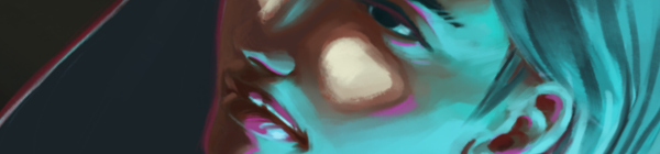
Working with some different brushes in Krita, and pushing myself a bit with some different kind of lighting challenges. This piece was also a bit inspired by the The Art of Loish, a recent Kickstarter art book I received.
I really enjoy Loish’s style, with her use of a stark outline colors to break her subjects away from the rest of the painting. She also shows a clever use of color in general, and again, very appealing all around. Some of the elements in my painting were inspired by these things, in the sense of picking an interesting palette to work with, and a unusual lighting setup to help push those colors a bit.
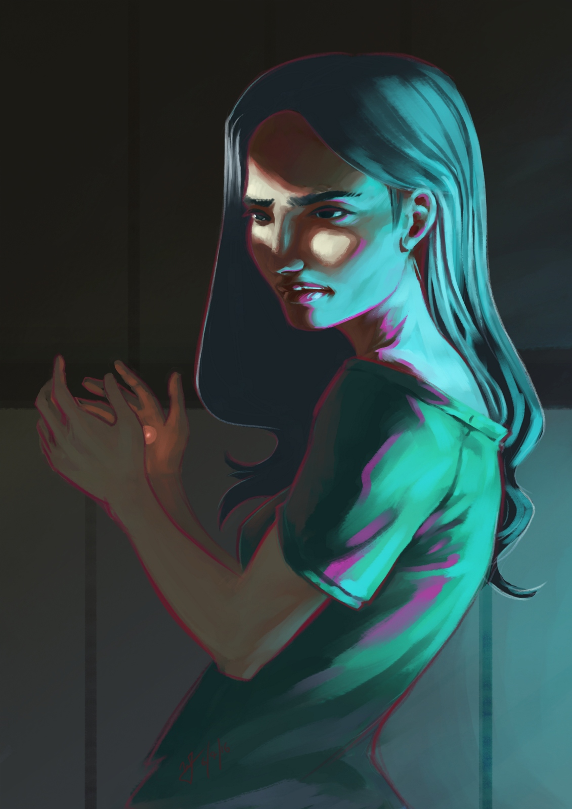
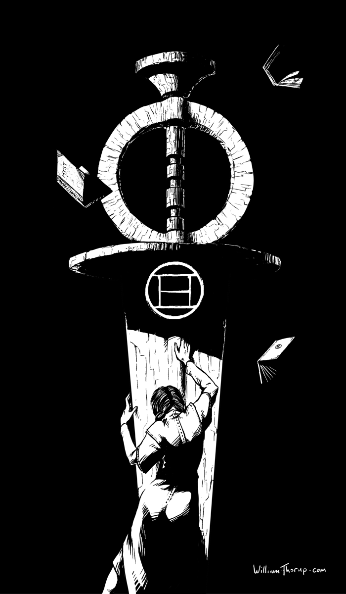
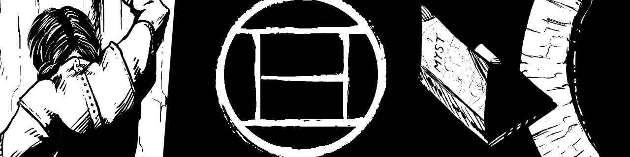
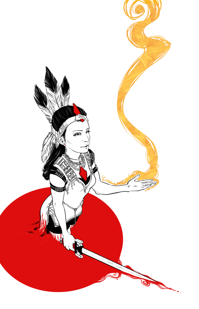
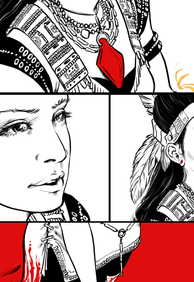
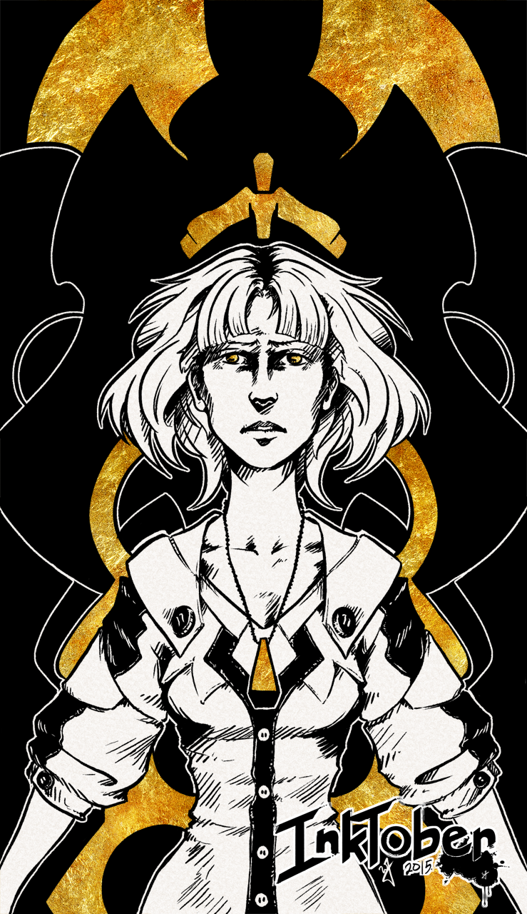
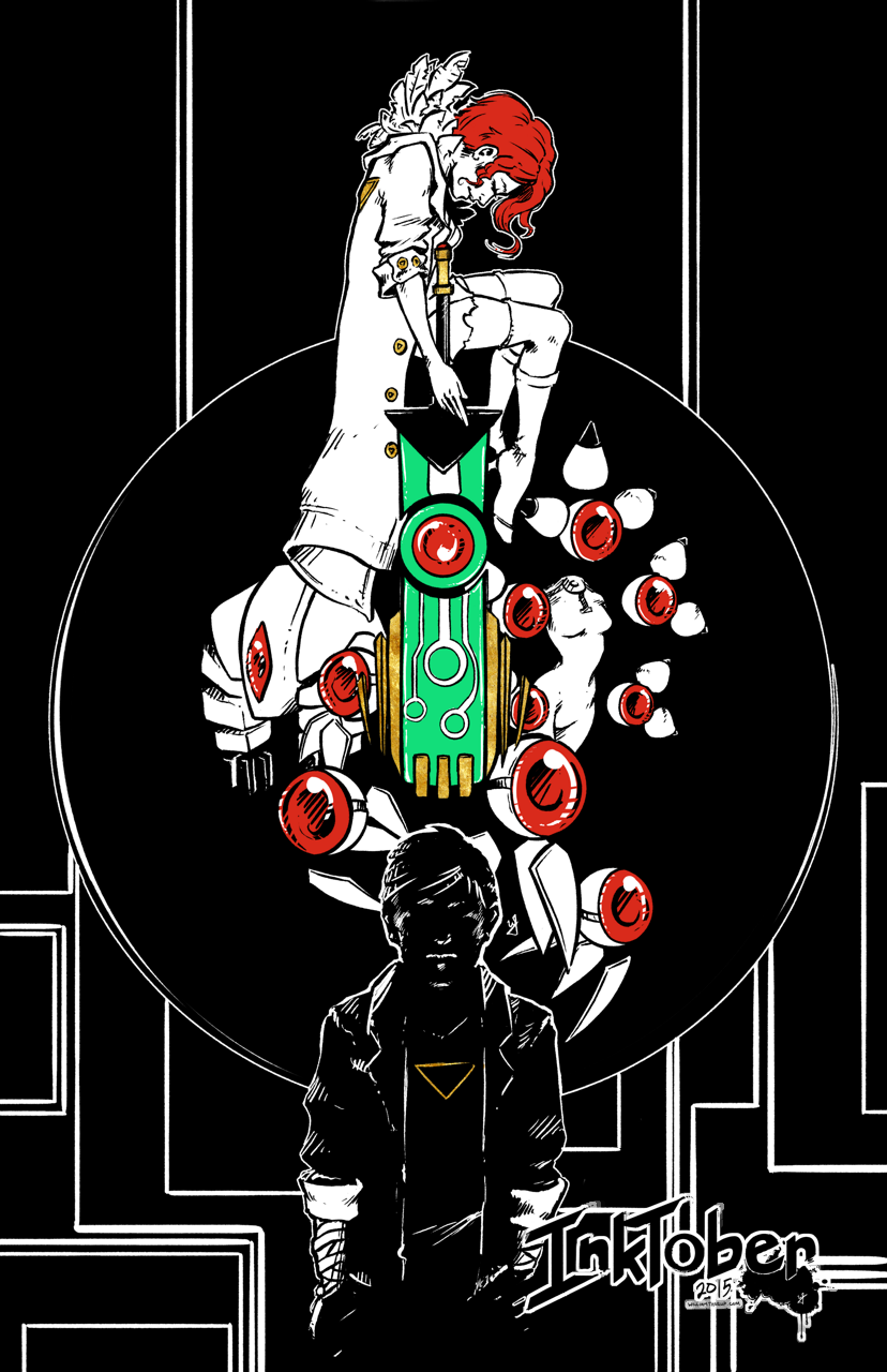
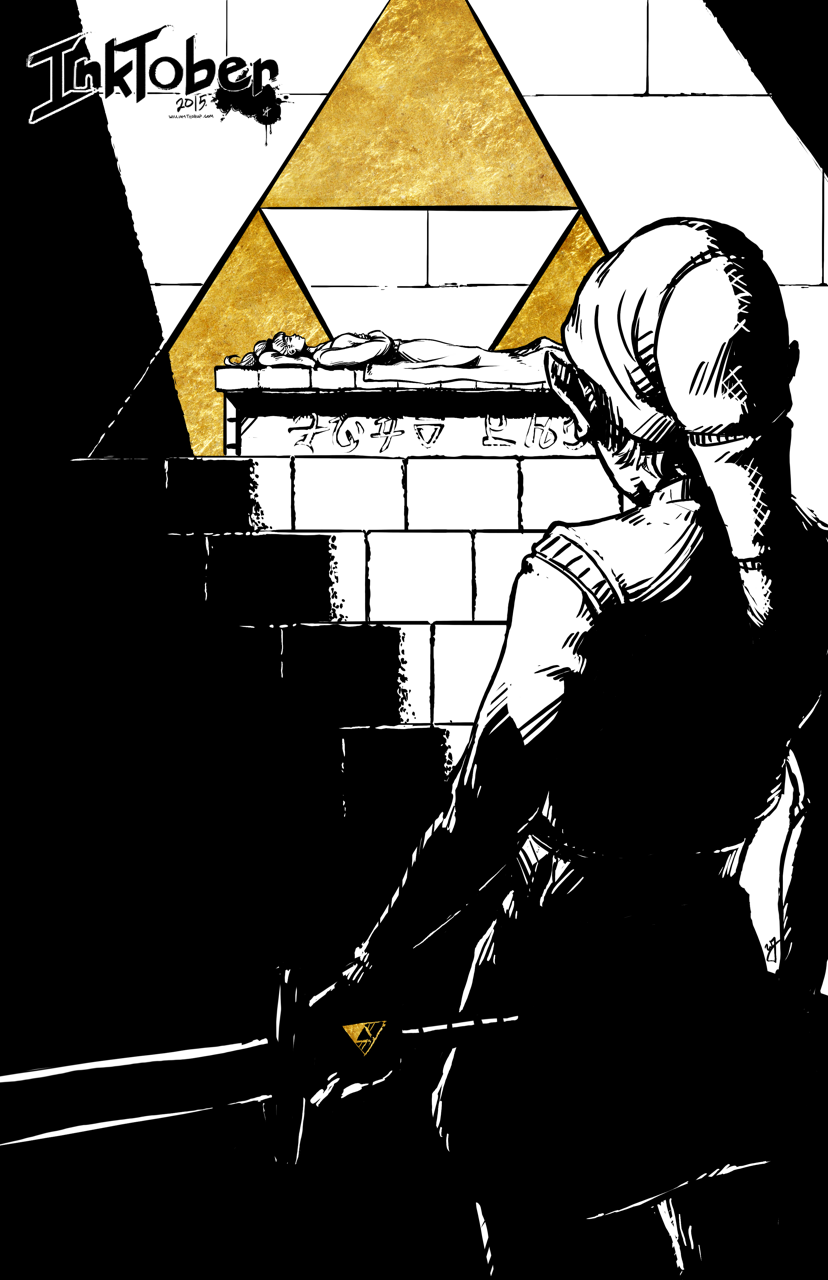
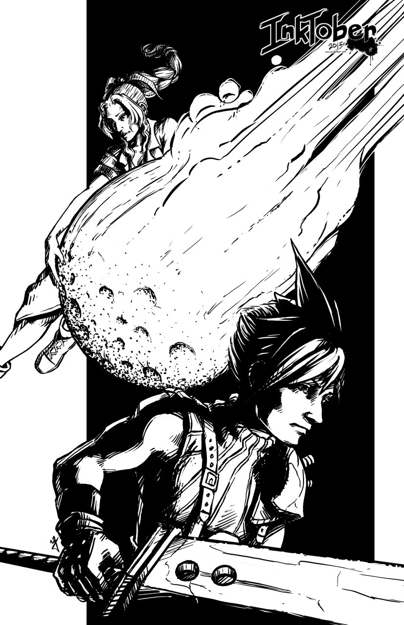
Mysterium, the Myst convention, is making its way to my hometown this year, and they had open submissions for art for their convention book. I caught wind of this just a few days before submissions were due, but I couldn’t miss the chance to show a little Myst fandom.
(SPOILERS AHEAD in the next paragraph, no spoilers after this next paragraph)
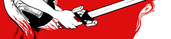
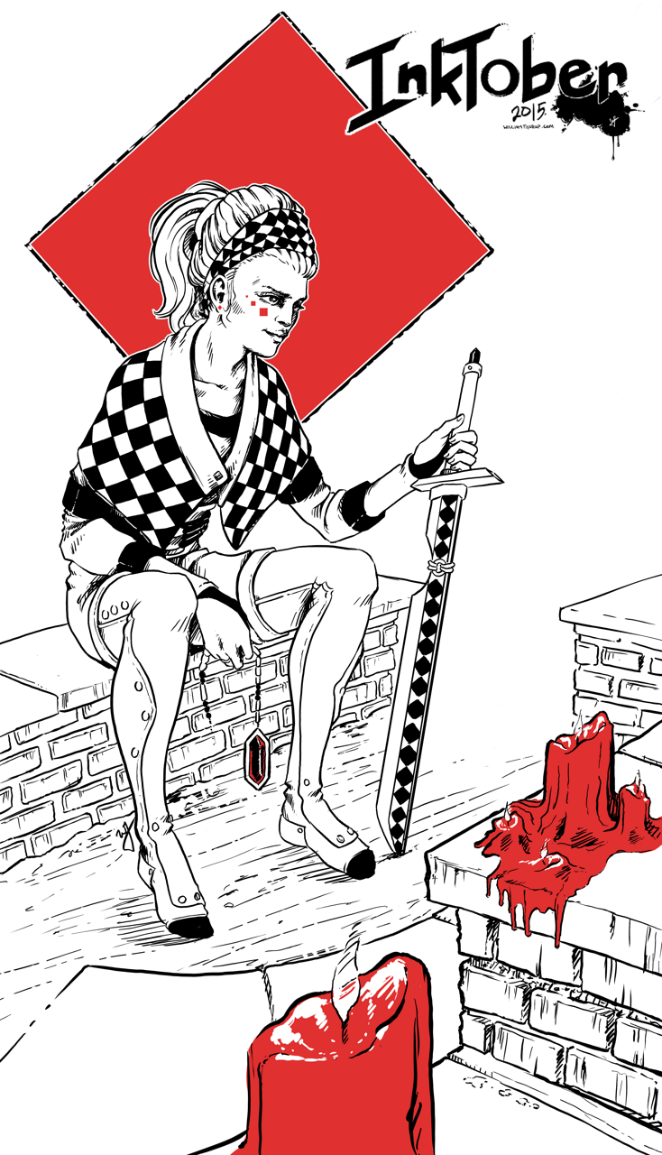
This pieces features Catherine in a state of remorse for the burden of being able to create ages (worlds that are created by writing books, which you can then enter into), but unable to save them. The Moiety Dagger is a symbol of the group that she helped in Riven (Age 5), and despite her efforts, the age still fell apart. Even though she did not write the Riven age, she must feel the burden that any world she creates has the potential to fail, with the loss of life.
I have very fond memories of this game, as I used to watch my oldest sister play it, along with with a few of my other siblings, when I was young. I was always fascinated by the environments, and the immersive sense of foreboding that engulfs the game. As I got older, and was able to solve some of the puzzles, the game became even more immersive for me, and I was hooked. I soon played Riven, and Exile (Myst III) and the experience was further enhanced by better audio better graphics, more acting, and an even more engrossing story.
The story is simply awesome. Taking steam-punk elements and god-like powers of creating worlds and people, with the premise of absolute power corrupts absolutely and what do you do when it does corrupt, is fascinating, and makes for a unique adventure with every game. This includes the three novels as well, well written, and a must read for Myst fans.
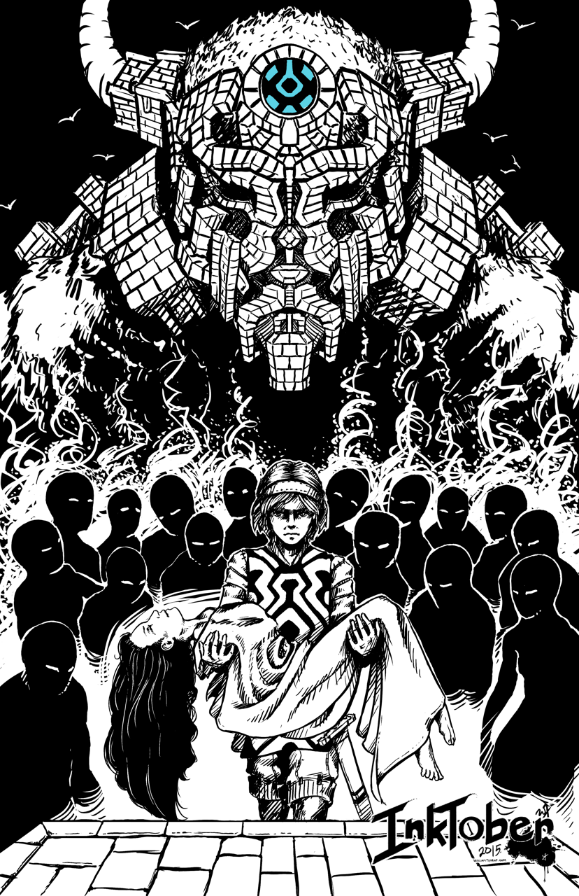
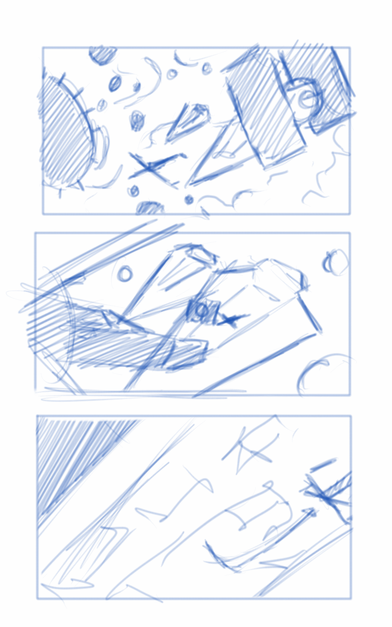
A may do a few more illustrations based on the some of the other thumbnail sketches future.
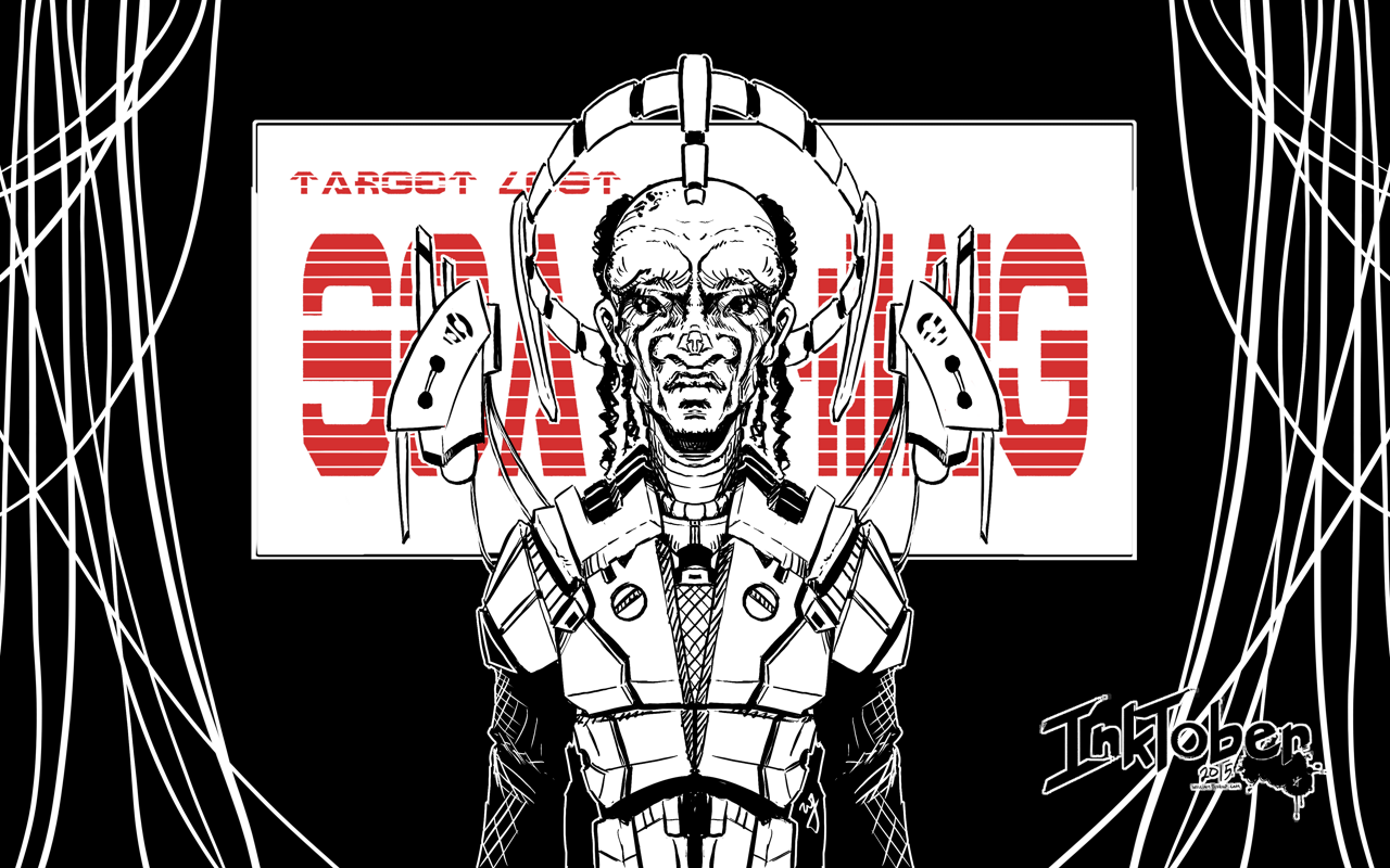
A quick piece that still shows I am still stuck on this ink with one or two colors “style”. I recently got a Cintiq 24HD and it makes painting so much faster than my Intuos 4 or Cintiq 13HD. I still keep those around, in case I am on the move, but they simply don’t mate the 24HD when it comes to comfort.
Because of this new device, I decided to do this piece at double the resolution I usually work with (A4 600dpi), and the amount of detail that I am able to include, along with how natural it feels, is great. I am definitely going to be doing more inking in the future.
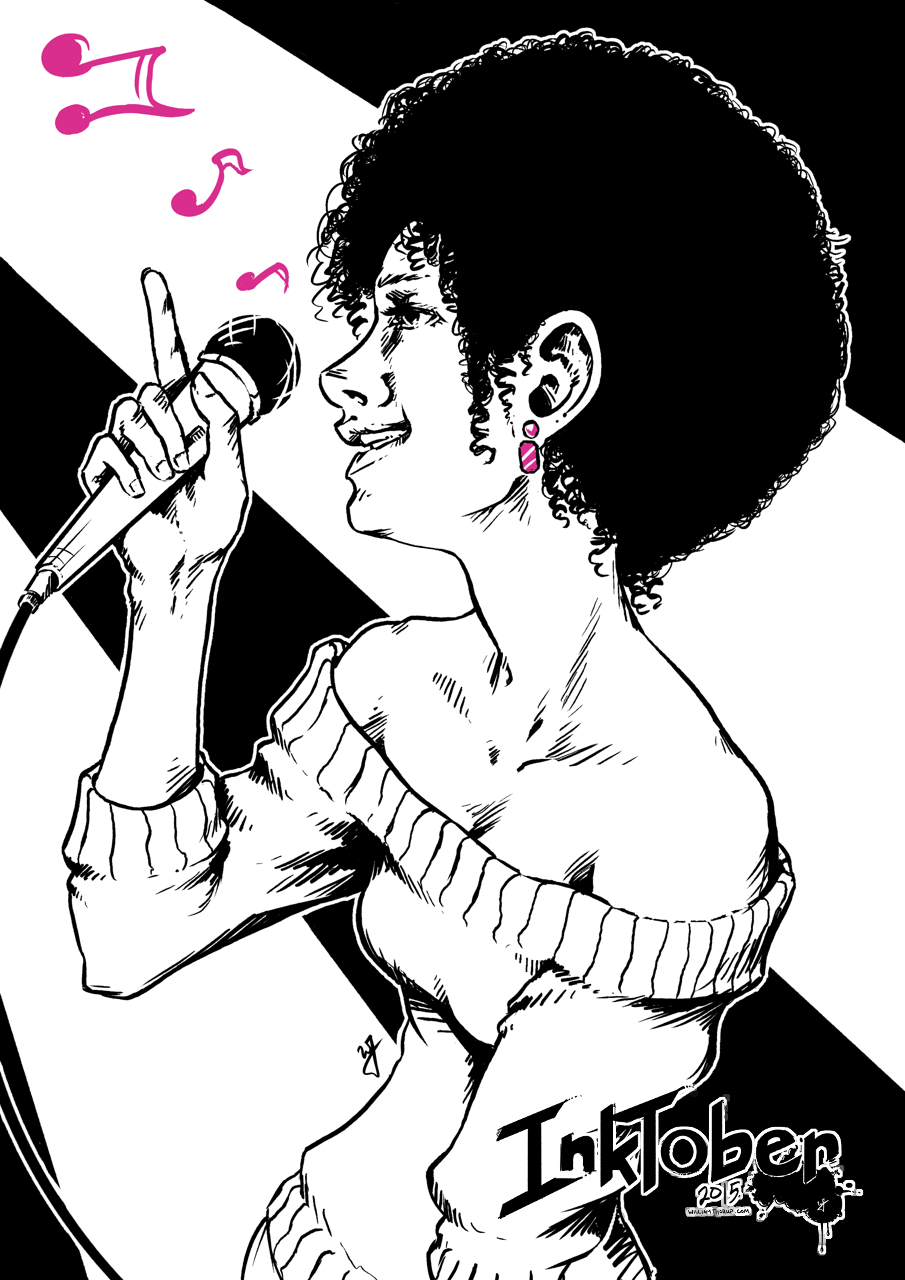
Here we go. Time to give it a try. Inktober. I have been wanting to do this for the last few years, after my friend Michael Buhler first introduced me to the event. Be sure to check out his blog, as he is currently inking away as well. I think I final have myself worked up enough to carry through the end of the month.
Goals
I think that the only way I am going to see this through is if I set a few goals to help generate ideas, but keep it basic to avoid being too ridged. I want to keep it fun as well. For the sake of keeping my blog clean as well, I will be posting everything in this post, and I will also be sharing out to the Facebook Draw Night group, Google+, Deviant Art and to my Instagram.
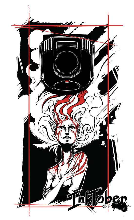
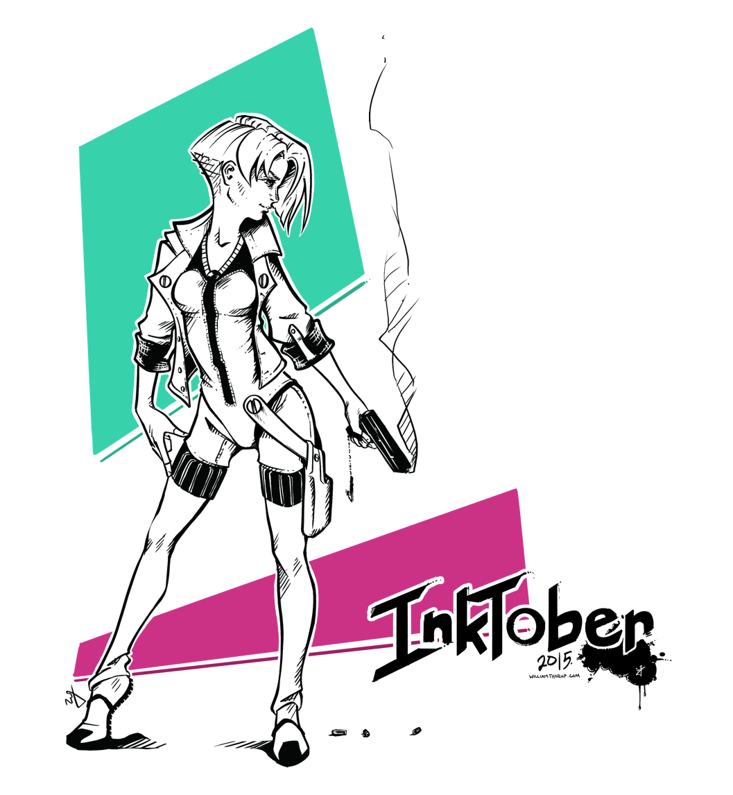
Goal #1 is to produce 10 larger, 11×17 vertical illustrations, for my top 10 video games. I won’t list that here now, don’t want to spoil the surprises to come.
Goal #2 is 21 other small scale pieces. This can include inked sketches, smaller, and quicker to finish.
Quick Link List
A list of what is done, and linked for quick navigation.
This post has been a long time in the making. Some time around the beginning of February of 2015, we approached the James brothers ( a utah local film crew, and artists) who currently involved with a locally made Star Wars Fan film called “Star Wars: Legacy of the Force”, primarily produced by Tye Nelson and directed by Danny James. We asked if they might have something that we could work on in regards to VFX, and they had something big that needed work on.
A quick thank you to Jacob Thorup and Bryce Thorup for letting me work on this at work, and also for providing critique. Micheal and Heather Buhler for their feedback. And finally Tye Nelson and the James brothers for allowing me to work on this project. Thank you!
(Note, my details about what has happened in the production are very slim, I was third-party primarily, and most of my details come from conversations and emails from both the James brothers and Tye Nelson.)
At this point in production of the fan film, everything was shot, and basic edits had been put together. This rough cut also featured a rough intro battle sequence which was strictly CG. You can see a what this looked like through this video at the 00:09 second mark, hosted on the creator’s channel. The producers and directors were not completely satisfied by this product, that was produced by another artists, other than myself. Because of this, the James Brothers offered to have me take a shot at it. I said yes.
In case you don’t wish to spend the time to go through the rest of the article, I put together a quick video that goes through a bit of the development process, along with a break down of the final shot.
Pre-Production
So began a fun, frustration, enlightening, and enjoyable adventure of the most complicated CG shot I have done to date. I used Blender as my primary tool, and I eventually moved into After Effects for my final compositing.
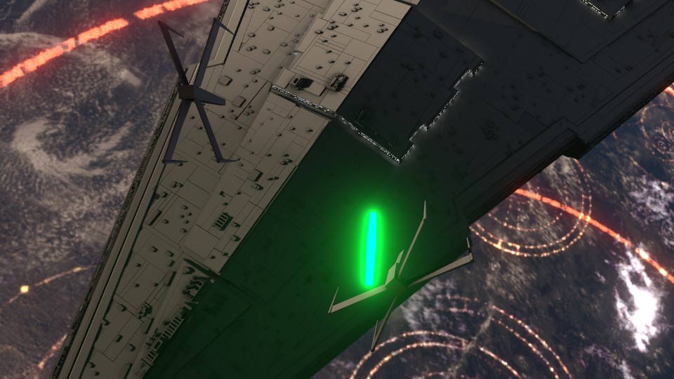
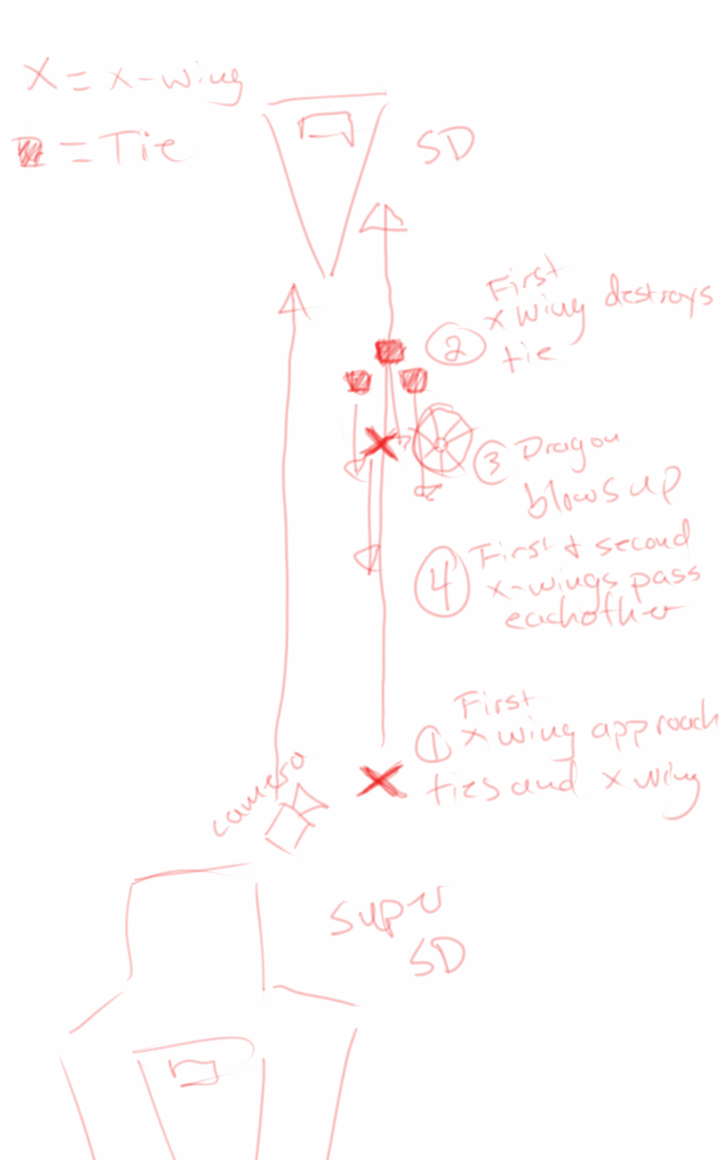
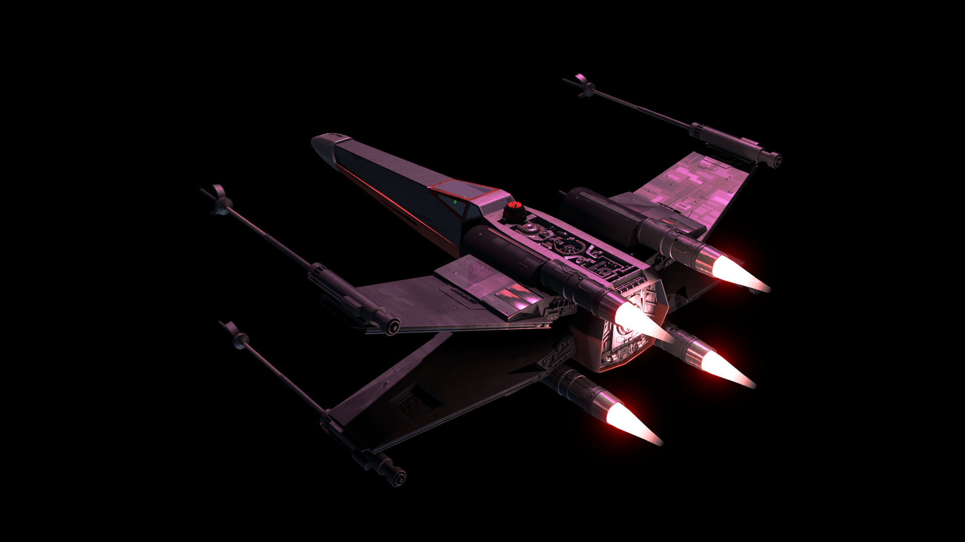
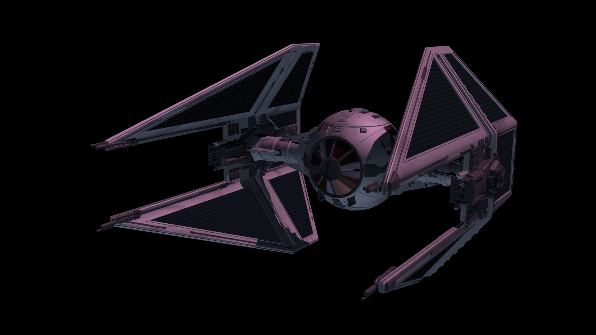
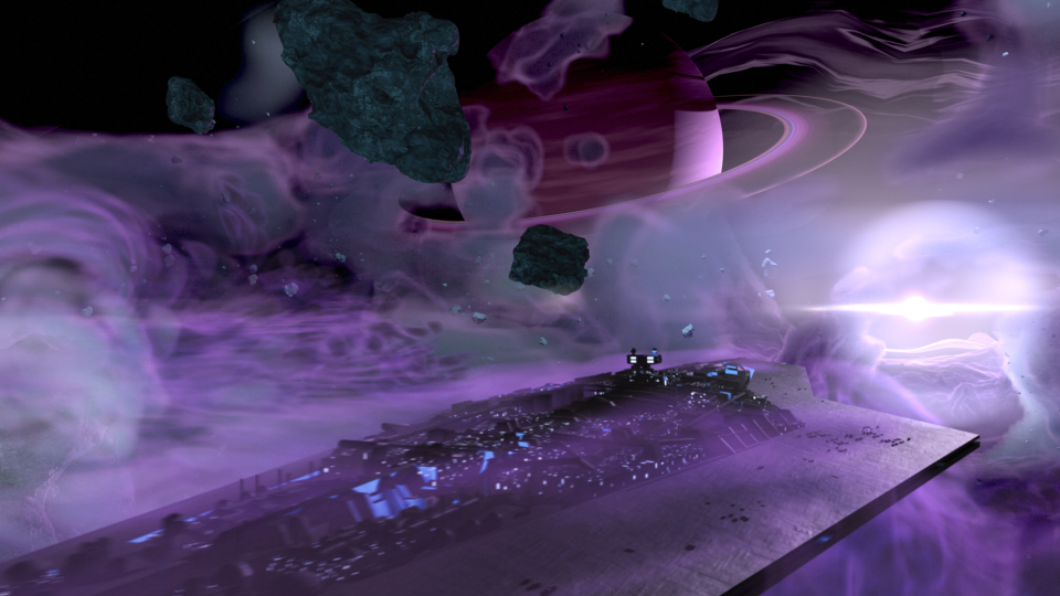
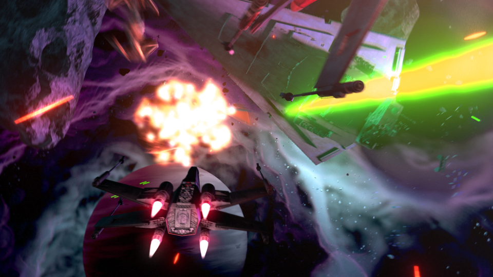
Based on some notes from the James Brothers I began reworking the current sequence to be something a bit more dynamic and interesting. I started off with just a small piece of artwork produced for the Star Wars official card game, and with some ideas of making it look like the fight was taking place just in upper orbit around a planet.
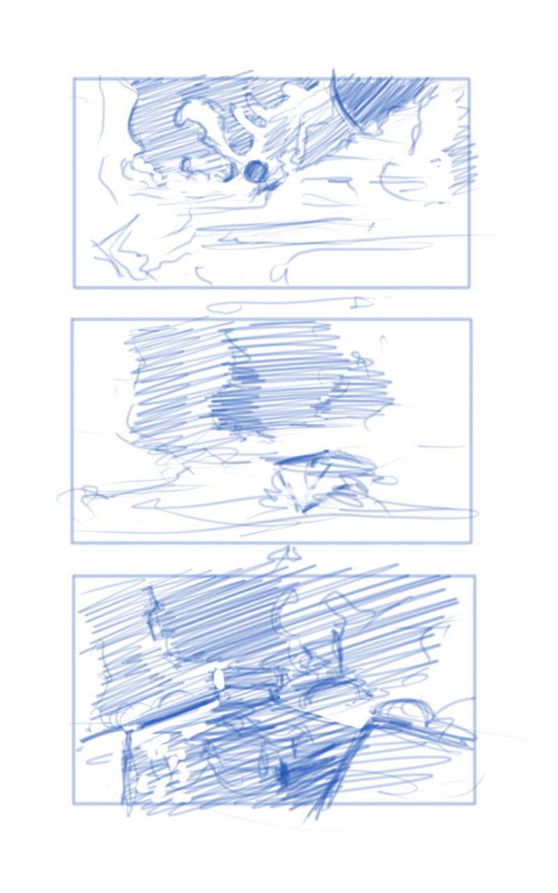
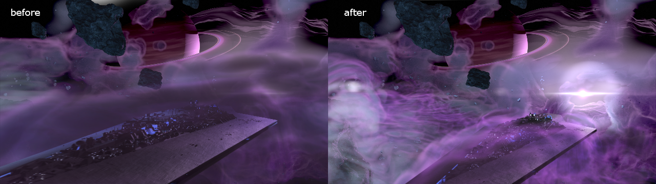
This is where the first animatic came into play. This was largely shooting from the hip, and I put a little too much effort into the background and lighting, which should have been left for later in the process. I enjoyed this idea, but it wasn’t what the producer was looking for at the end of the day. It was ultimately scrapped.
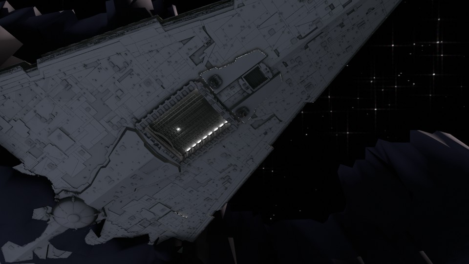
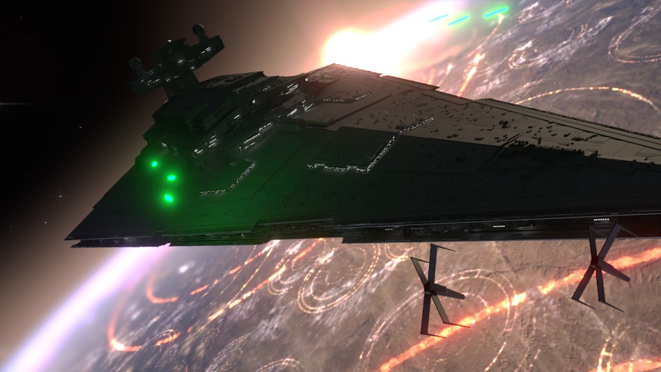
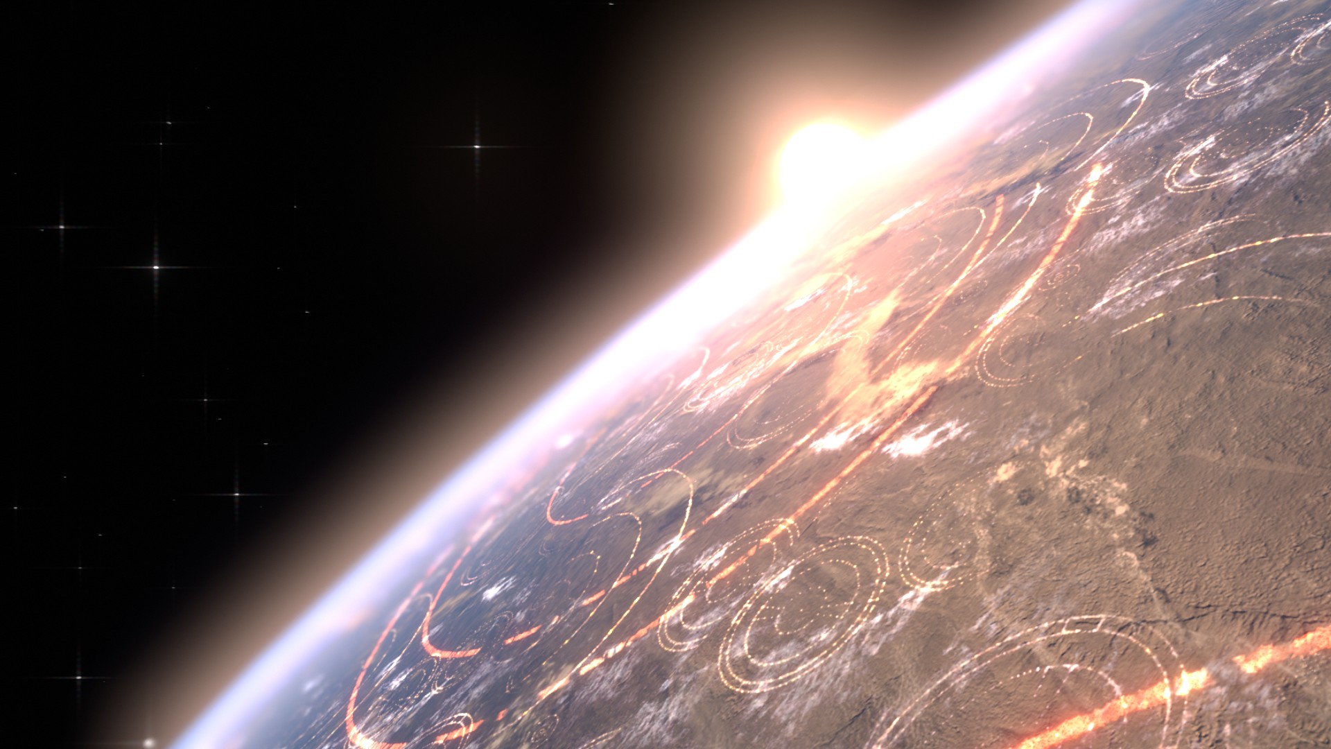
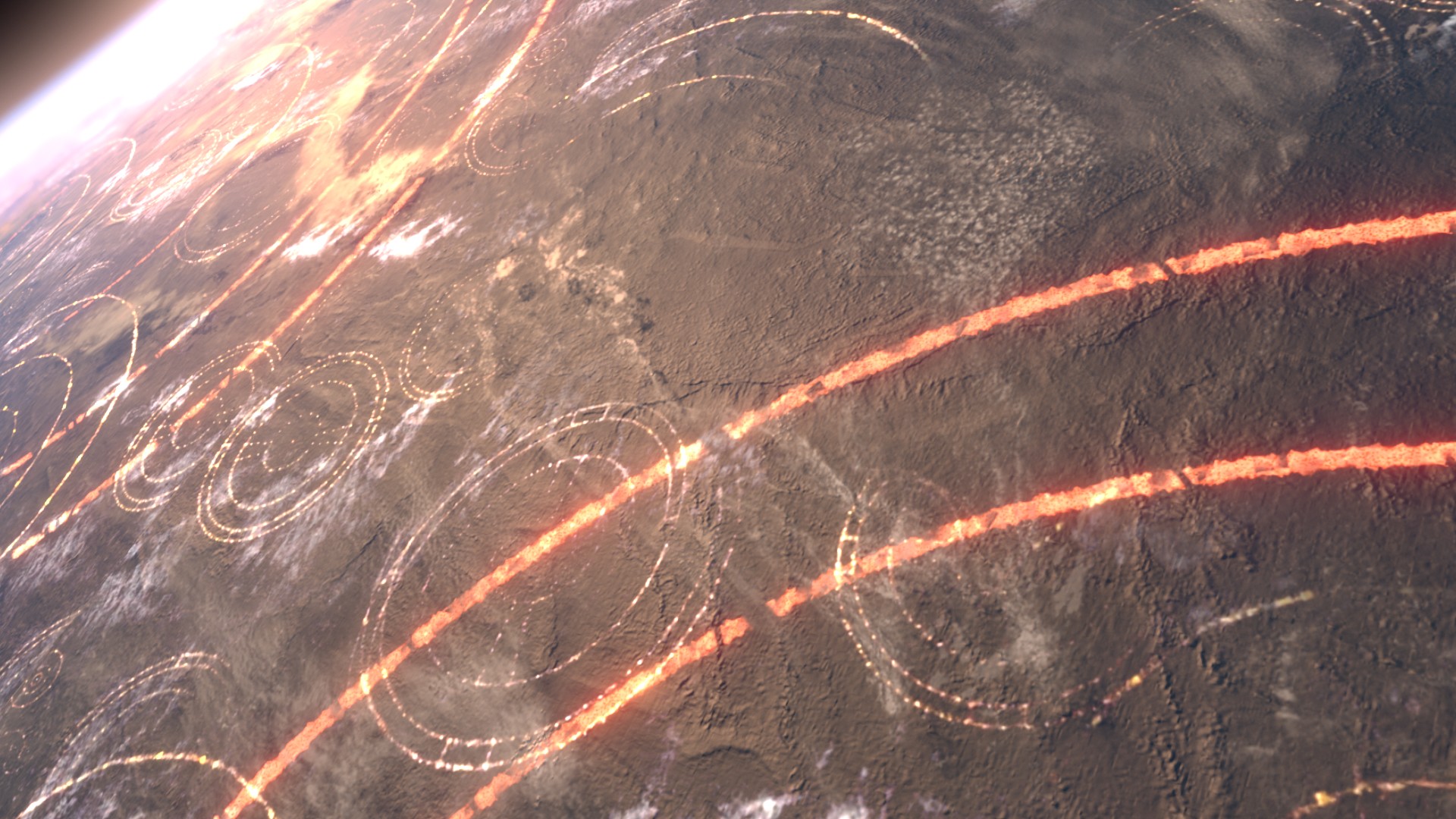
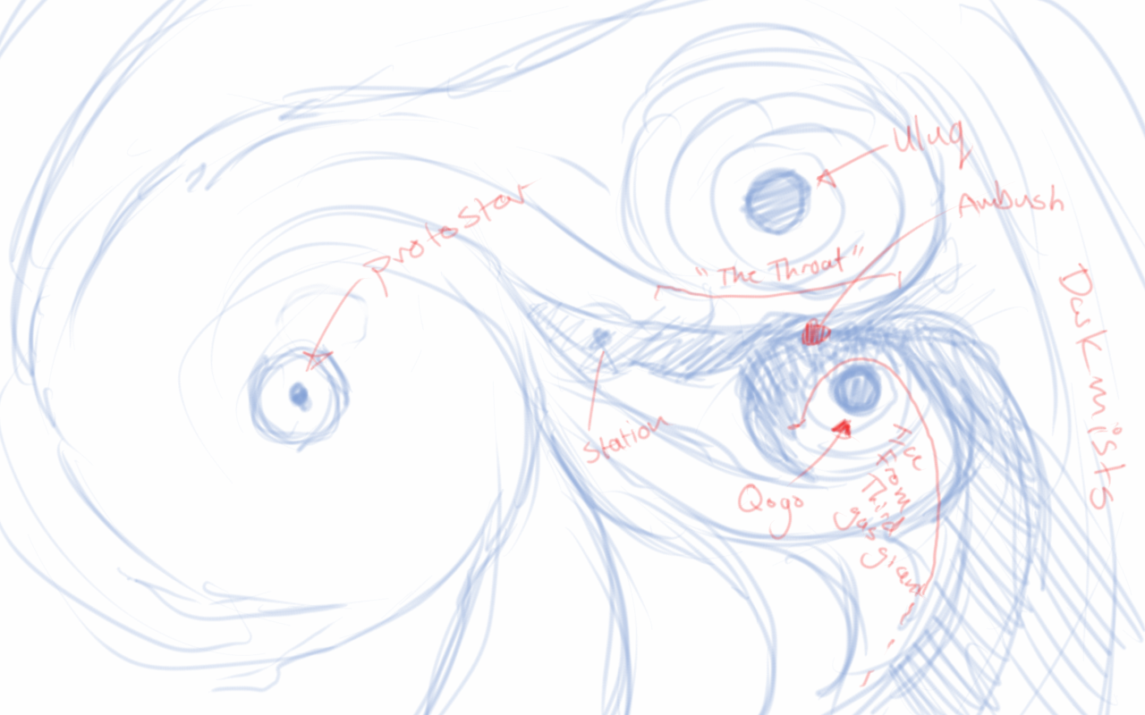
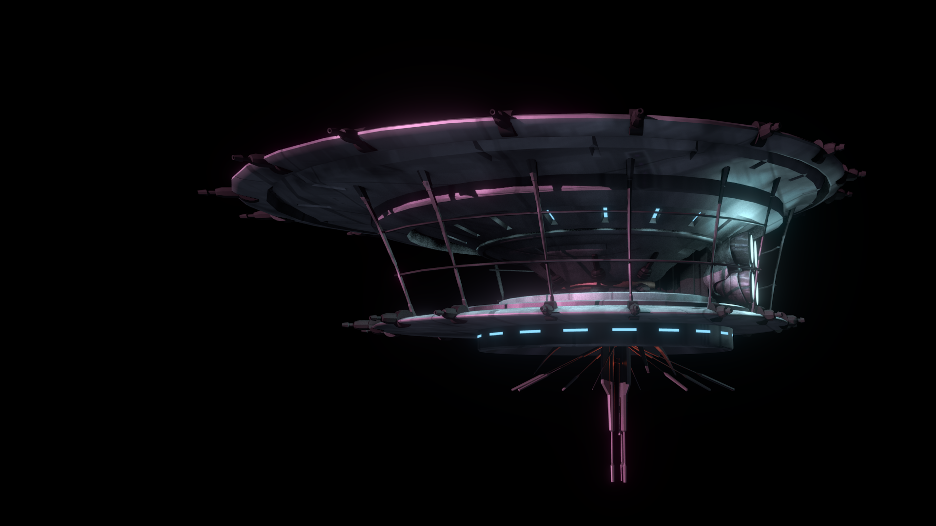
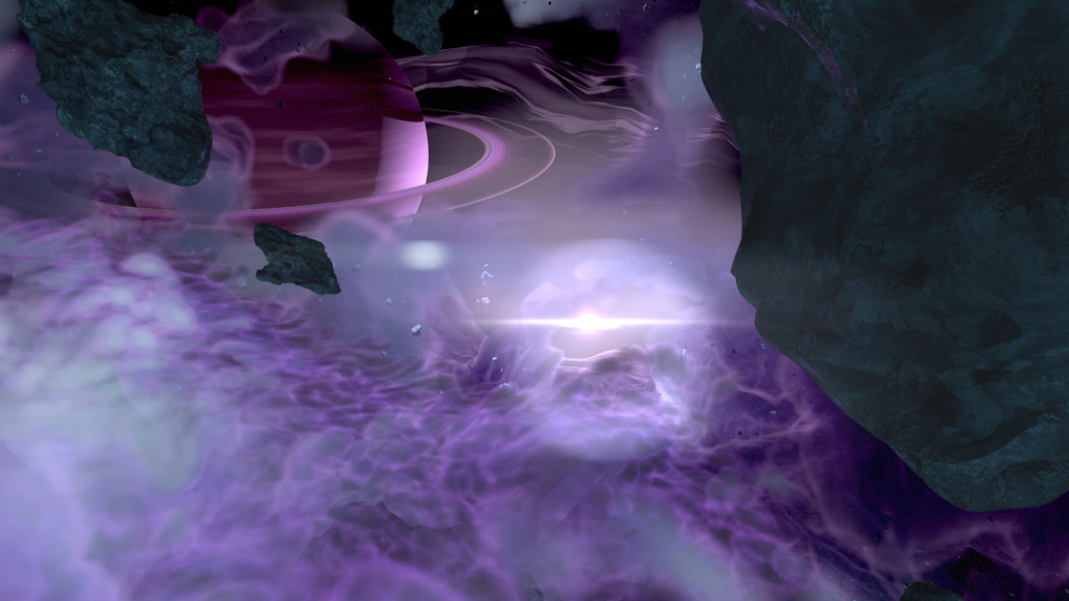
The second animatic took to the original sequence, and basically mimics it for the most part. I decided to adjust the introduction of the Super Star Destroyer, as I thought a rising from the dark mists would feel a bit more ominous, and letting the viewer take in its vast size would help to maintain the brooding force that it is.
The third animatic is much more refined. If I remember correctly, I had been given source material to work with, and I had already begun creating the environment at based on that material. In essence, the environment was created by one gas giant colliding with another, creating a large mass of debris and material between the remaining two gas giants. These all orbited around a proto-star. The source materials paints a darker environment on the page. I deviated from these details to help created a vast sense of scale with the nebula, and how small all the space craft were in relation to it. This required more light, so I made the star brighter than what is described in the book.
After the movement of the main players in the sequence was locked down, and the animation for the main space craft was finished, I set to work on the actual spacecraft themselves.
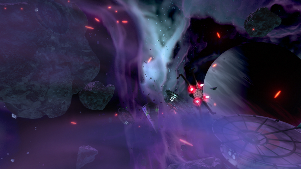
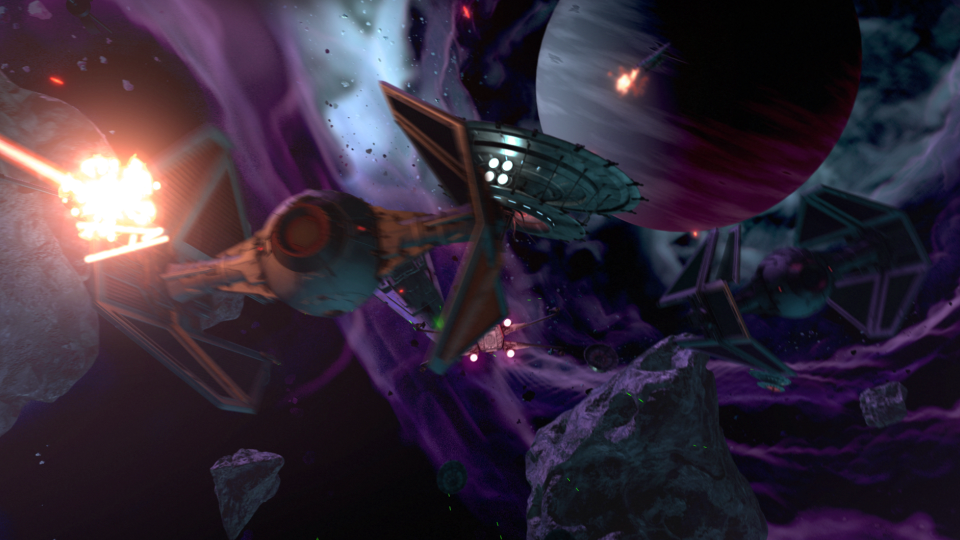
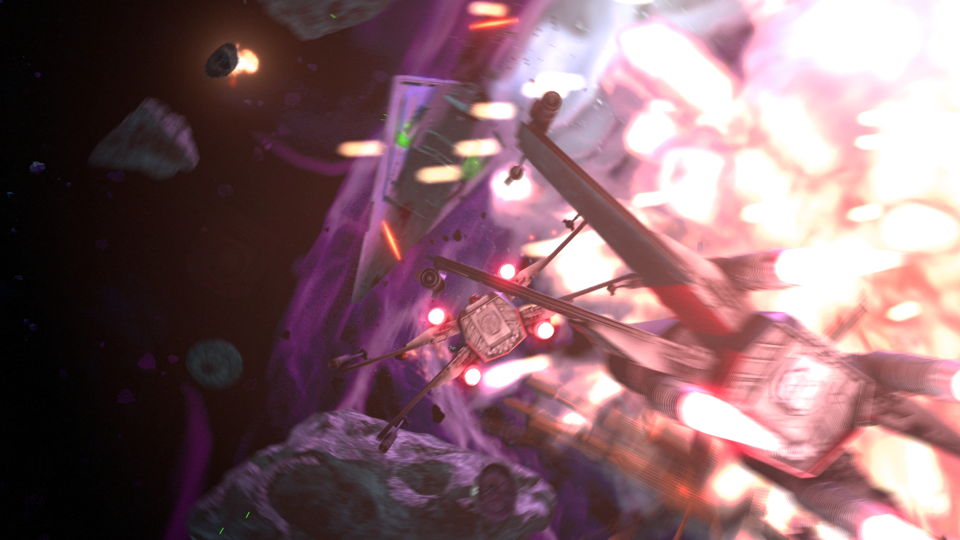
The base models were downloaded from scifi3d.com. This site hosts donated models from a ton of different sci-fi universes, and it had everything I needed for the sequence. After getting the models, I spent a good chunk of time cleaning them up in Blender, texturing, and additional modeling, before bringing them into the final scene to replace the proxy models I used for the animatics.
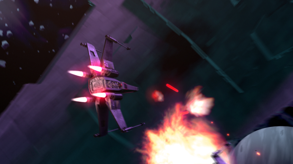
After the models were brought in, simulations for fire/smoke and other debris were done, along with blaster fire. Then came rendering everything out for compositing.
Each render layer was done separately. The x-wings on one layer, the tie fighters on one layer, the planets on one layer, etc… This was to accommodate any possible changes without having to render the whole scene again. The only requirement to this workflow was to make sure that the animation for the camera never changed. This allowed all the separate layers to match move with each other, and if a layer needed changes and rerender, all you needed to do was replace the frames for that single layer in the final composite.
I moved my scene layers over to After Effects to composite there. I was originally planning on compositing completely in Blender, but there was a possibility that I wasn’t going to be able to finish things myself. I needed to move into a program that someone else could use in case I couldn’t finish. This did help speed things up though, as I didn’t have to render motion blur out of Blender (really slow…), as I was able to replace this with a much quicker effect in After Effects called Pixel Motion Blur.
Due to time constraints, and because of the amount of time I had spent on the project, I wasn’t able to add specific post effects like heat distortion. But at this point it is time to move onto other things. Overall the experience was gratifying. I ran into a ton of situations I have not encountered before, and I was able to successfully navigate through them, and learn a host of new things along the way. I have gained a deeper appreciation for the work that goes into a shot like this, and I know why it takes more than one person to pull it off well.
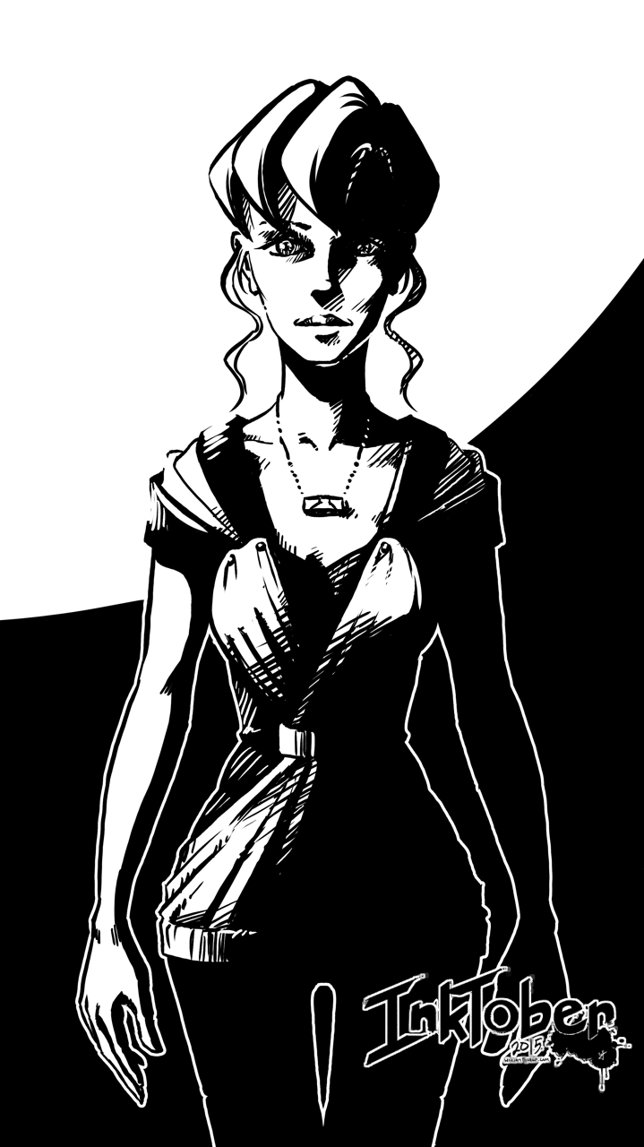
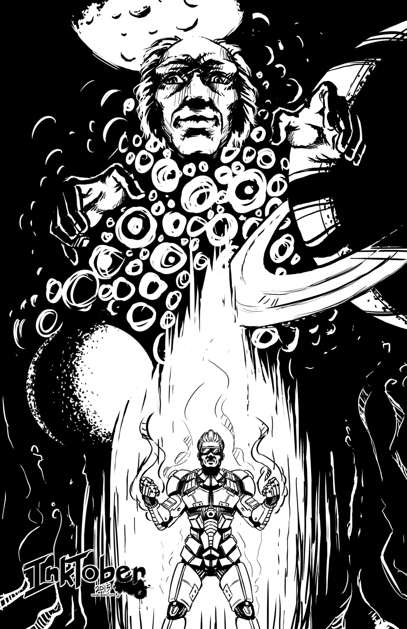
I have been drawing/painting allot, I swear. Just haven’t been finishing much. I start on a piece, and before I know it, I have moved onto another one, and another one, and anot…… You get the idea.
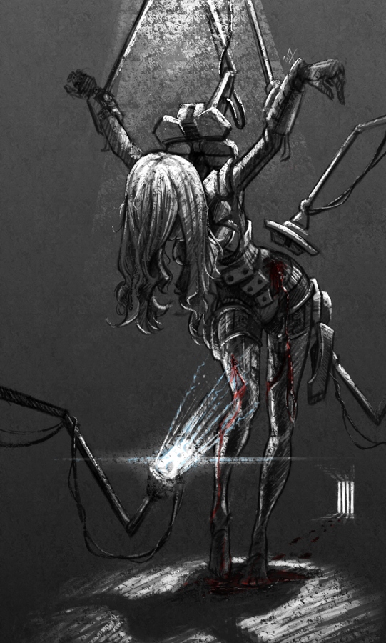
So, I thought I would post something I did manage to finish up (Sorry, forgot to hit the record button, no time lapse this time around). This was a little concept born out of a sketch session, and, because I liked how the composition and concept were coming together, I decided to push it further.
A soldier, after the battle, brought back into her assigned quarters for healing. The robots remove the worn armor, as others tend to the wounds occurred in battle. I imagined a world where children would grow up in relative isolation, bred by a computer to oversee the conquering of worlds. Kept separate from the general population, and all for the progression of man. She is one of the many victims of a human-less world, created by humans.
A sad story, but I found it very inspiring while working through this. Because of the dark, and messy nature of the situation I chose to use a pastel brush in Krita to maintain a rough texture throughout the drawing process. That along with one of the default fill patterns to add a roughness to the whole image.
The whole image took about 3-4 hours, and is quite different from anything else I have done in the past.
Here is another piece for your eyes, a treat. You may be thinking to yourself that this isn’t the kind of work I usually do. You would be right in thinking that, this is definitely off the beaten path for me, and here is why.
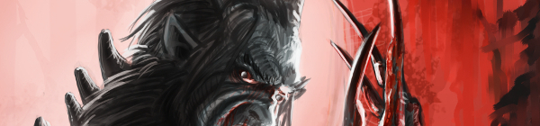
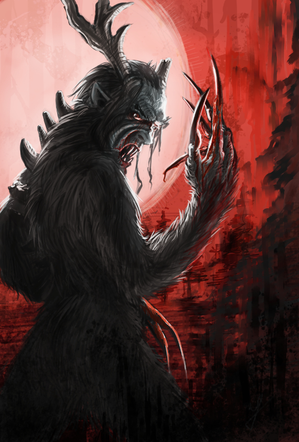
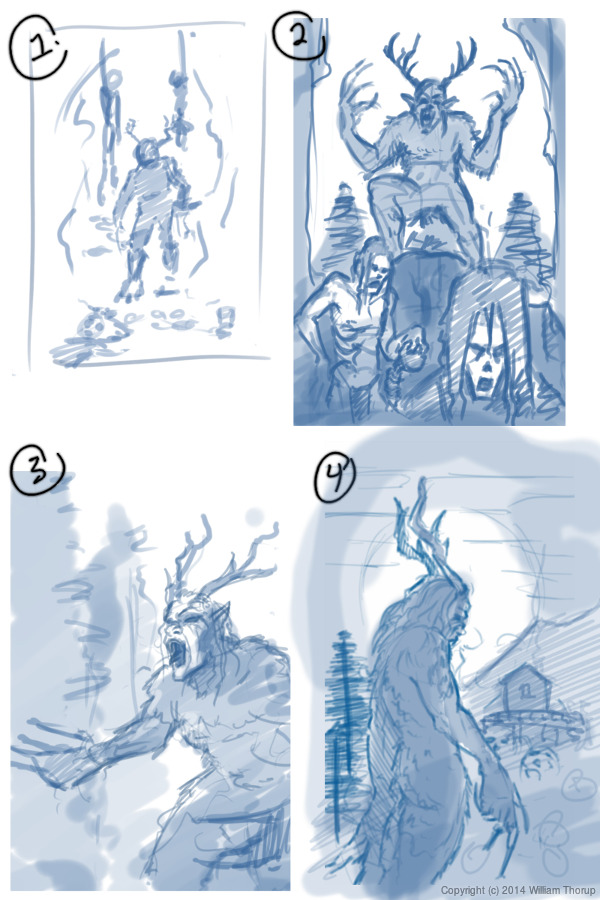
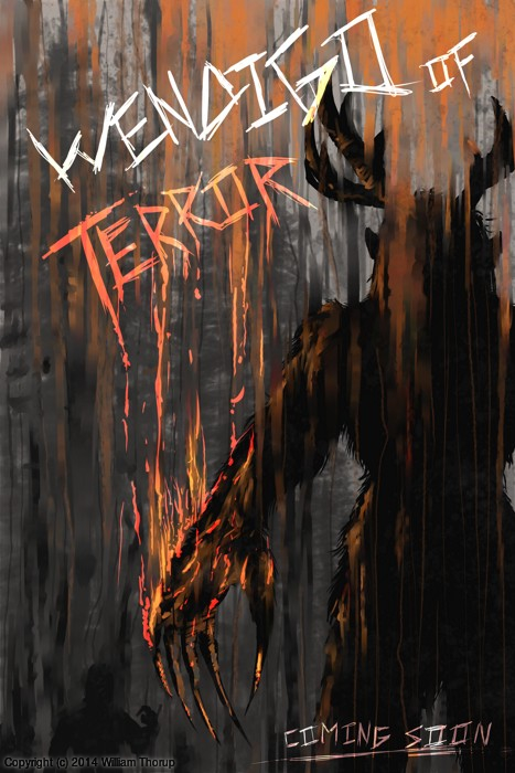
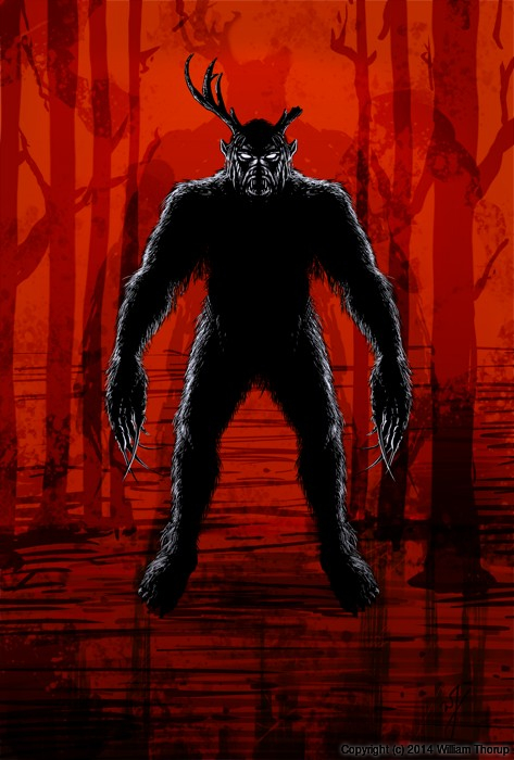
We have been in some minor communication with someone who works at Arrowstorm Entertainment. A movie studio here in Northern Utah that focuses on fantasy and science fiction films. This person asked if I could put together a concept piece for a possible B horror film monster. A Wendigo creature that originates from the Great Lakes area of the United States, and is usually centered around myths that deal with the, pseudo, adverse effects of cannibalism. The content isn’t my favorite, but the job paid good, and it gave me a change to stretch out of my usual bubble.
I did quite a few thumbnails for this piece (20+) and actually did three complete paintings, before we found what the client liked most. The process was very enlightening, and had allot of momentum. Really, the momentum is what made this painting fun. The client was in constant communication with me, and gave feedback when I needed it.
Overall, I spent too much time on the painting though. I was trying to keep my total work hours under 6, but ended up going over 9. This was for a few reasons. First, and foremost, when I was first presented the job, I should have asked a bit more about the production and where it was currently at. This leads to the second problem. The project had hardly been refined, and the story, background, and other details about the creature, where watery. This is why so much time was put into thumbs and other paintings.
I should have stepped back, asked the client to refine their ideas a bit more, and then approach the painting after a bit more forethought was applied.
I am happy with the end result, and the client was as well. I hope to have a bit more work with them in the future, and hopefully work on some of their movie posters and other concept work.
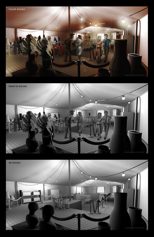
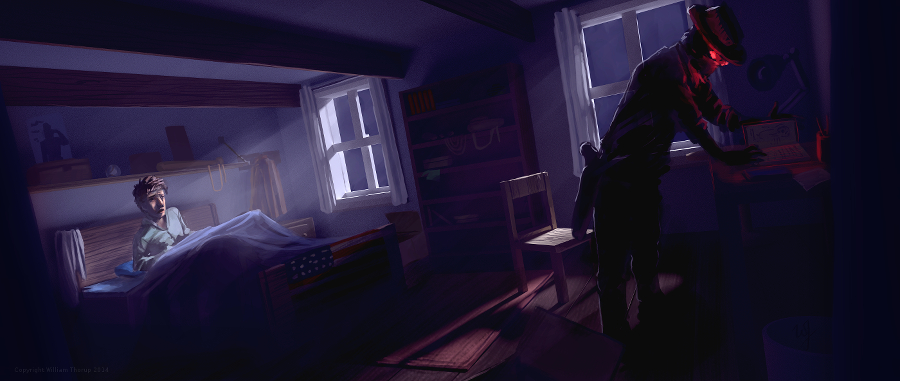
Through Thor Media, I was tasked with producing 3 pieces of concept art for our client, Adaptive Studios. The pieces were based on a semi-final script, with some direction from the director, and director of photography.
[column-group]
[column]
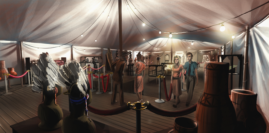
The first piece was strictly an environment piece, based on a possible traveling exhibit around the 1940’s. This pieces primary purpose was to show potential investors that some effort and thought was being put into the production, to show that there was talent to help create the world of the story. So I tried to focus on the details of the objects in the tent, rather than characters, to see if I could just tell a basic story with the objects in the scene. This piece could be used for actual set design during production, but most likely not.
[/column]
[column]
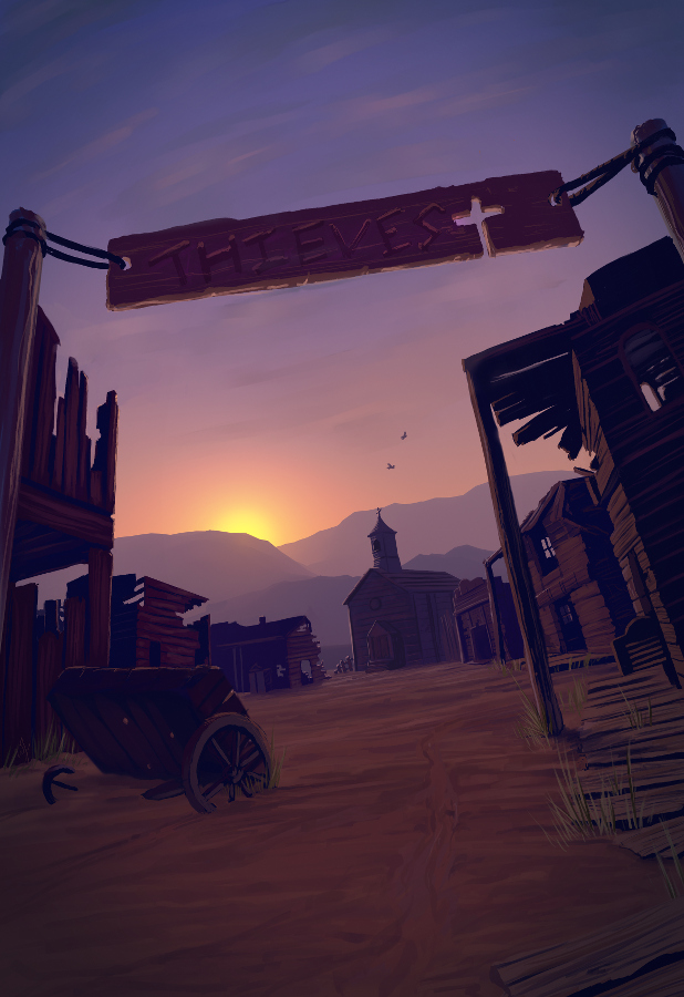
The next painting was done for an area in the script called “Thieves Cross”. And old ghost town in the story where the main characters end up in, searching for clues. The town was originally a settlement for criminals, so, it didn’t have much in the way of development, except for the old chapel. I wanted to make the chapel the center of the image, so I set up my composition to perform this task. I used a dutch angle to add a bit of uneasiness to the scene. Like the painting before, I started with a 3D base done in Blender, and then moved into Krita for the final paint over. I have to say, working in 3D to begin with helps immensely with perspective and laying out the basic composition. It easily shave 1 or 2 hours off of each painting.
[/column]
[/column-group]
[column-group]
[column span=”2″]
[/column]
[column]
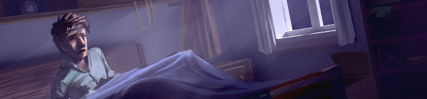
The last painting was almost an illustration. Again, whether or not Art’s room will look anything like the painting in the final film is one thing, so, instead I focused on the mood and lighting of the moment given to me from the script. I feel that I got the composition right on in this painting. Every part of this painting just fell into place. For me, the color, lighting, composition, characters, mood. etc… just works! I love it!
[/column]
[/column-group]
This was an awesome opportunity for me. I am grateful that I had the opportunity to work on some pre-production art work. I love to see written stories come to life visually, and to have some control over how that happens is incredibly gratifying. This work has spurred Thor Media to leverage mine and Michael Buhler’s skills in producing art. We are currently putting together service packages in the areas of Storyboards and Concept art. They got me working on the Thor Media website and a booklet that we can pass out to potential clients. This is something that I have wanted to do for a while, and I hope it turns out well.
There are different kinds of goals in relation to art. One of those goals could be study goals, like, I am going to focus on drawing hands, or learning to render light and shadow correctly. I would talk about a goal that can have a much deeper effect on the viewer, than say the anatomically perfect hands you drew last week.
The kind of goal that should apply to just about every painting, drawing or sketch that you produce. This kind of goal can be established with one question, what do you want the viewer to think, feel or do when they see your work.
Of course, sometimes an artist throws all care to the wind and just creates, and there is nothing wrong with that, but even approaching your art with that attitude is going to come across to your viewer in the final work. How powerful could your art be if you took charge of what your work is conveying to the viewer on an emotional level?
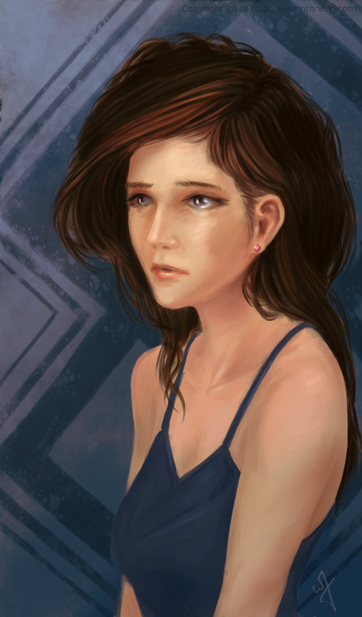
When I started this painting, it was just going to be a study on rendering light a certain way, this is why the very beginning of this painting isn’t in the video. I wasn’t planning on doing a time-lapse at all. Out of this one goal spawned an important question, what is this imaginary person like, and how can I bring that personality into the painting, and make it recognizable to the viewer?
A portrait not only contains the physical appearance of a person, but can also portray what kind of person they might be. So, about 20 or 30 minutes into the painting I realized that I had a greater goal in this painting, that was to evoke specific feelings in the viewer. The goal also included really focusing, through the entire process of the painting, to make sure the former goal was reached.
Ask yourself this, what do I want people to think or feel when they see my work? See what happens when you really focus on the answer to that question while you are painting or drawing.
Because of the subjective nature of art, I won’t say what I want you to feel when you look at this piece, but, as an artist, my hope is, is that you feel something similar to what I felt while working on this painting, and when it was finished.
Look forward to some more time lapse videos in the future, and Thanks for watching.
Krita was primarily used, with Gimp for some post color correction.
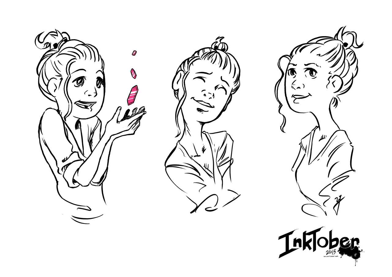
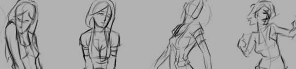
I should probably start calling these bi-monthly sketch reviews, considering how much time that has elapsed since the last sketch review. I am drawing quite a bit, it’s just getting around to putting these posts together. It’s more time consuming than I expect.
I have been working in both Krita and Gimp lately, and I definitely lean towards using Krita for my study. Smoother workflow and all. I mainly use gimp for its more intended purpose of post processing now. Adjusting color curves, sharpening, etc.
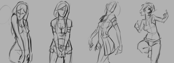
The first few poses that are drawn in the video are actually from an illustration, I did over a year ago, here. I liked the original and I wanted to draw poses, so, I tried fleshing out the character a bit with some different poses.
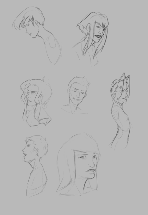
The faces in the middle of the video are purely study. Then the last set of drawings are a character concept for one of our Jaguar games.