William Thorup

Illustrator, Motion Graphics Designer, Animator, and VFX Artist

Tag: concept art

  • Krita | Bringing Balance | IIllustration

    Krita | Bringing Balance | IIllustration

    At the end of my vacation week in San Diego California, I have had plenty of time to paint.  Here is what I have been able to put together this last week.


    Bringing Balance_web


    I recently went to a seminar about cinematography, which talked about composition in film, among other things, and the speaker talked about color schemes a little bit, and he pointed out something very interesting. Apparently Hollywood is really into teal and orange color schemes. He showed examples of posters from Tron, Transformers, Ender’s Game, etc. and his point was really well established. He showed video clips from movies that used this color scheme all over the place, and what’s cool about it, is that it is a very appealing color scheme. People really like it, and I decided to give it a try, with a twist.

    bringing_balance_final_painting_process

    I didn’t stick to that exact color scheme in this piece, but I did have it in mind. What I was leaning towards was something more like what Pascal Blanché produces. I Love his color schemes, to me they come across as a distinct dark sci-fi/fantasy feel that is hard to achieve any other way. So with that style and a more orange and teal/orange color scheme, I think a came up with a good result. It isn’t as refined as Blanché’s technique, but it still produced a good result with my current skill level.

  • Krita | Character Illustration | Jouster

    Krita | Character Illustration | Jouster

    Some more stuff for our Atari Jaguar project. I have been working on story ideas and concept drawings for our jousting game, and this design came to mind.


    Jouster_web


    If you haven’t already, head over to http://bitjag.com/ and check out the three projects that we have in the works. Not a whole lot of visual concepts yet, but stories are being put together and their general concepts are listed on that site.

    What I enjoyed most a about this painting was the lighting. The composition and the pose could be better, but I think the good lighting helps make up for that. It really brings the viewer’s eyes to key and attractive points in the painting, and overall, it is very comfortable to look at.


    On another note, if you haven’t noticed already, most of my most recent paintings have all been done in Krita. I am in love with the program, the interface and default shortcuts work great with my Cintiq 13 HD, and overall it seems like a much smoother experience than Gimp lately. Gimp has been having some serious issues with my hybrid ATI graphics setup, and so, I mainly use gimp for my graphic design work.

    Don’t get me wrong though. Gimp is a great program, and it has been especially useful lately because of all the web graphics that I have been doing. Krita just provides a workflow that feels smoother and faster to me, and I think that I will be using it for many of my paintings in the future.

  • Quick Tip | Drawing a Character in Profile | Video Tutorial

    Quick Tip | Drawing a Character in Profile | Video Tutorial


    Here is something that I put together a few weeks ago, and just got around to finishing it. This small tutorial covers a couple different methods of creating an accurate representation of a character’s profile, based on a previously draw front view of that character. Enjoy.

  • BitJag and JagCorner

    BitJag and JagCorner

    Please excuse my silence over the last few weeks, but I have been involved in some fun projects, and one of those is my brother and I have officially started our Atari Jaguar development.


    JagCorner_logo with bg

    character_battle_sprites_1project_1_level_layout_test_1


    bitjag

    Our dev name is BitJag, and we are using the JagCorner name for our YouTube videos and other media. I have mentioned in previous posts about the project that we have been working on for the Jag, but we have expanded, to three separate projects.

    We often find ourselves way over our heads, when it comes to the scale of projects that we do. So the other two projects, which are nameless right now, are much smaller, but will be used to stretch our abilities considerably. Check out the Projects page at http://BitJag.com/ to see some of the details for those projects.


    We also have our first development journal posted. It isn’t much, but there is some cool footage of an animated sprite character test on the Jaguar console. There is definately more to come. I have been working on some visual design concepts for the battle system, and working on story as well. We will be talking a bit about this stuff in the next dev journal entry, along with some more details about our other two projects.


  • Josh the Whale | Project Review

    Josh the Whale | Project Review

    Josh_the_whale_V3_FEATURE

    icon_128x128android app on google playApp_Store_Badge_EN

    My brothers and I really like video games, and we are trying to get to the point where we can bring our creative visions to life. The process of learning, building,  and refining has been great for us, and it’s not as easy as some may think.

    The project “Josh the Whale” started soon after trying to land another app project for another children’s story book and not getting it. We thought that kids books might be the way to get the attention of local children’s book illustrators and writers, and so we began the search for a story. We wanted a project that we could use, not only to attract clients, but to also use as a template for future projects. We also wanted it to be something that we really cared about in order to motivate ourselves to create a good finished product.


    Play cave Concept_1explore zone


    This is really the reason that we chose Josh the Whale. Originally a short illustrated story that our older brother, Aaron Thorup, wrote when he was in the third grade, we thought that it wasn’t just a good story about self-worth and perseverance, but it also had a good selling point. Whales and underwater stuff seem to go well with children, so, not only were we planning on entering the kids entertainment market, but we also had an attractive theme that should sell.

    So we started. The first step was to get a solid script, based on the original story, written to base all the programming and visual aspects of the game on. The rewritten story, and the script, came together pretty fast, and with Aaron’s approval, I was able to begin on visual concept, and Bryce was able to start working with Shiva 3D (our 3D engine).


    josh concept_web

    Mainly because of a lack of experience on my part, we planned to have a finished product by December. Basically, we did not take into account the learning curve Bryce would have with Shiva 3D. Bryce was picking up the new API, which was quite a bit different from what we were using for our live wallpapers. So, it turned into 6 months instead. We also had other video projects mixed into that schedule, but overall it was just the amount of learning needed that extended the schedule.

    Concept work began, assets were being built, and Bryce began building code to use those assets with. Some specifics of that work can be viewed in previous posts HERE and HERE. Though progress was slow, it was steady, and from the beginning to the end of the project, there were no real stressful moments in the production. Just allot of trial and error in figuring out workflows in relation to the programming and asset creation.

    Only minor changes were made to script and the original sequence of the game during production. In fact, only one scene was taken out of the game for programming reasons. Here is a really basic concept image of that scene. It had to do with the whales jumping out of the water at night, and the player helps Josh jump high enough to touch the moon.

    Page 3_a


    Recording the narration was fun. Bryce and I decided that we wanted to have Aaron do the voice acting for the narration. This was a great choice because Aaron’s voice seemed to fit right inside Josh’s world, and complements the whole feeling of the book very well. This also made the project feel allot more personal to me, turning it into a family project. Jacob helped us out with the recording in a quite room over at my Grandma’s and Grandpa’s home. We used Audacity for the audio, and it all came out beautifully.

    jellyfishpodreunitedtitle

    A little side note about the audio recording, most of the interactive moments of the game were conceptualized when I was preparing a script for lines that needed to be rerecorded or new lines, our second recording session. I felt that the game wasn’t quite balanced enough between the strictly narrative moments and the interactive moments of the game.

    The music was done by April Thorup. She is not a professional composer, but she did a wonderful job on the music. Her playful styling fit into Josh’s world so well, and keeps the app interesting for kids. When we first started to drop the music into the app itself, the feeling of Josh’s world completely changed. Suddenly this small lonely whale had a story to tell, not only by the narrator, but by the music as well.


    When it came to testing the app during the project, we usually just had one of our nieces or nephews take a peek at what we had, and payed attention to their reactions. Because of this “bug testing” we knew from the start that children responded well to the visual style and game play. And, towards the end of the project, we had an official bug testing session, that also brought back good results from children, and assured that we had a solid app structurally.

    The app icon and other graphics were interesting to put together. The original thought was to stick to the same icon template and banner styles that we had used for our previous live wallpapers. As you can see from the images below, they weren’t the most impressive images to look at. But, after sifting through Google’s and Apple’s quality guide lines, we decided to redo all of the graphics for the app, creating a simpler style for the icon and banners.

    old graphics to new graphics


    For the final steps of the project, like marketing, I was put in charge. Gathering information on review websites that tailor to the audience we wanted to reach was important, and putting together a trailer and other material to show the app in action was done as well. This moment was probably the most educational for us as a company, mainly because I had never really done any marketing before, and because we have learned that hiring someone to handle the marketing is probably the best way to make sure that it is executed effectively.

    One of the huge pluses to this whole project though, was the cost. I believe that the cost for a Shiva 3D license was $200, which covered porting the game to bother Android and iOS. Marketing was about $1000, but besides that there was no additional cost to the project besides our time. We used open source software for all asset creation and editing. This includes Blender, Gimp, Audacity, and Inkscape. Software that we have allot of experience with, and are all great programs.


    We have only just released this app, and we have had a really good responses from reviewers, family, friends, and strangers, so far. We are proud of Josh the Whale, and so thankful for everyone that helped make it a reality. It represents our commitment to making products that we can be proud off and that others can enjoy. It represents our first step into the game development realm. And most of all, it shows that even a small whale can do great things, our goal for the future.


    Josh the Whale on our corporate page: http://goo.gl/lWhtT

    Josh the Whale on Google Play: http://goo.gl/RQEXe

    Josh the Whale on iTunes: http://goo.gl/kyTDD

  • New Cintiq 13HD

    New Cintiq 13HD

    sunrise_web

    I am going to brag a little bit, only because this is such an awesome device. But before that, I apologize for the lack of posting. We have officially started our next project, so, I have been doing allot of writing, organizing, and discussions, to make sure we give this project a good start.


    Scuba girl_web

    This Cintiq 13HD has been very fun to work on. Having worked on an Intuos for such a long time, it takes a bit to adjust to working on a display, but it comes with some advantages.

    The first thing that I noticed was how much easier it is to do line work. It is more accurate. The reason for the increase in accuracy is because the disconnect created by drawing on one surface while looking at a different surface, is gone. This makes it more like a traditional medium, which, for some artists, can be very attractive.

    Pro number two, is how portable this thing is. It is the same width and height as my 15.6 HP ENVY 15, and they easily fit side by side in my bag. I take it between work, Draw Night, parent’s house, and my house with out worrying about it at all. It does add a few extra cable to my bag, and is slightly heavier than my medium Intuos 4 tablet.

    Which brings me to my next point. This device is deceivingly light. And, even thought I don’t do this often, I can easily draw with it sitting on my lap. This is the big plus to this device, light and portable.


    monster_web

    Now some down sides. The screen is a bit dim. Most of the time I don’t mind it, just because it is still brighter than most LCD’s. I heard somewhere there is a way to adjust this, but I haven’t been able to find a service manual to adjust brightness. There isn’t anyway to change the brightness with Wacom software unfortunately.

    This one isn’t really a con, seeing it will be resolved soon. Getting it to work in Linux was a bit of a chore. Because of how new the device is, native support won’t be around for a little while. I was able to build the latest driver from source, and then I have had to trouble shoot the Settings GUI so I could map the buttons. A bit frustration at first, but I eventually got everything working right, and it works great in Kubuntu 13.04. It also works great in programs like the Gimp, MyPaint, and Krita.

    The one big downside to this device is the connector for the proprietary cable, and how it connects to the device. It is a bit flimsy, and one good bump would definitely render it useless. With some extra care though, this can be avoided, and shouldn’t be a problem for most people.

    Overall, it has been a joy to use, and for the price point it is a very good device. Great color, great portability, and a great price. I would definitely suggest it to anyone interested in getting a Cintiq, and not wanting to spend more than $1000.

  • Krita | Character Concept | Void

    Krita | Character Concept | Void

    Void_web

    Sorry about no weekly sketch reviews. I have been doing allot of sketching, just haven’t taken the time to put some posts together. Maybe Friday or Saturday perhaps.

    Been busy with things, looking to get Josh the Whale released, other video production projects, etc. In my free time though, I have been doing written and visual concept for mine and Bryce’s Jag game. The visual stuff is easy, it’s the writing part that is kicking me in the butt.

    I would never confess to having any real skill in writing. I am hoping that these side projects, along with company projects, will give me the practice I need to change that.

    So to give you a bit of an introduction to this piece, without diving into undeveloped ideas. This character is one of 6 gods that govern the world and it’s time. She is the very essence of the absence of time. The opposite of existence.


    That is the idea that drove this painting, and that is all that I have so far. Maybe I will post more about these characters in future paintings. Yet again, maybe not. This is just a side project, so we will see how far it goes.

  • A New Focus | Concept Art

    A New Focus | Concept Art

    My brother Bryce and I are putting together a game for the Atari Jaguar, and I have been working on character design, game assets, and getting a story together for the project.

    This piece was spontaneous, coming out a sketch session. It was also very fun to work on. I want to thank my a few of my friends, Ethan, Micheal, and April for the critique. Your help is needed and always appreciated.


    A New Focus_final_web


    One part a really enjoyed was additional programs, on top of the Gimp, to get to the final piece. You will notice that in the video, I just out to Krita and Blender. I used Krita’s mirror functions to come up with a concept for the weapons spinning around the character, and I used Blender to model, place, and light the weapon. I have used similar processes in the past, although this time felt like it was really good decision making on my part. It sped up the overall process of the painting, and I think I achieved a better result than if I had done it all in the Gimp.

    There will definitely be more of about this game in the future. I have already put together some turn based battle mock-ups with sprites, and Bryce has been putting some of these assets to use with actual programs on the Jaguar. It’s awesome to see this stuff actually turn into a playable form.

  • Tutorial | Using Gradients

    Tutorial | Using Gradients

    In the Park

    I have been using allot of gradients in my work lately. Because of this, I thought it might be good to put together a tutorial of how I have used them so far.

    As for what I want to come across to the reader, I want you to learn how to use gradients to create a focal point in your image, diversify and images color, and create a sense of depth.

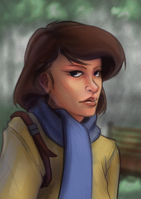
    Also, in order to help bring my points across, I have included a project file that can downloaded by clicking on the buttons below. I will be referring to this file throughout the tutorial.

    Download
    XCF_Download_ButtonPSD_Download_Button
    [expand title=”Download Notes”]

    Note: The Photoshop file should work to the best of my knowledge. The only thing that might not work are specific layer’s blending modes. Here is a list of the layers and the blending modes they should be on:

      • “Gradient Painted” –> Multiply
      • “Gradient Tool” –> Overlay
      • “Subject” –> Normal
      • “Background” –> Normal

    Another option is to download a copy of Gimp, HERE. IF you are using Windows or a Mac, about halfway down is a link that says “Show other Downloads”, click this and you will find versions for those platforms. It’s free, and small, and you will be able to open up the project file without a problem.


    [/expand]

    A bit of disclaimer. I consider myself in the professional work field, but I am not a master at the craft. This tutorial is to share knowledge and a few tips to other artists who may not know what I am about to teach.

    Also, if you don’t know how to use the gradient tool, or blending modes for layers, in your given program, go ahead and do a Google search about these two things. Having a basic knowledge of these two tools is essential for this tutorial.


    I feel Like I’m Cheating

    When I first started doing digital artwork, for some reason I had it in my head that using gradients was kind of shortcut, and it was something that professional artists tend to avoid. Gradients, along with some other tools (dodge and burn tools) almost seemed taboo, and were used by beginners to add shading in a cheap and quick way. I can’t remember were I got these ideas, but I couldn’t have been more wrong.

    The years rolled by, since I started in digital art, and I began watching tutorials, seeing time lapse videos of paintings, and talking with other digital artists. And I began to realize that these tools were not a way to cheat, but instead to speed things up. These artists are professionals, on a deadline, and in order to get a large body of work done quickly and effectively, they would need these tools to speed up their work. This is one of the advantages of digital art, within a production environment.

    I learned that these tools, if used properly, can be used to enhance and speed up your overall workflow, without having to sacrifice quality.


    Adding Depth

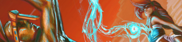
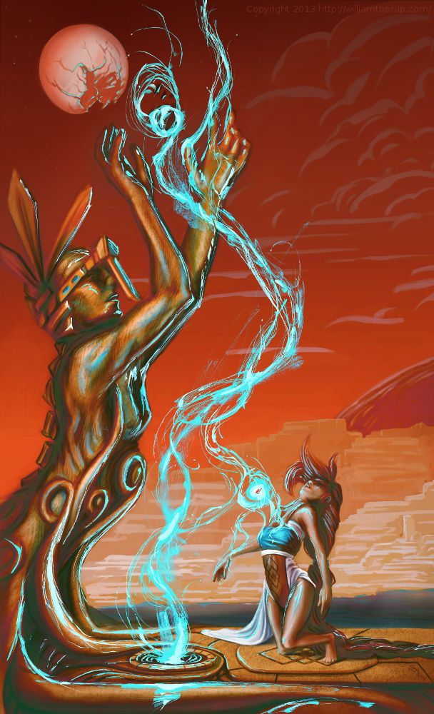
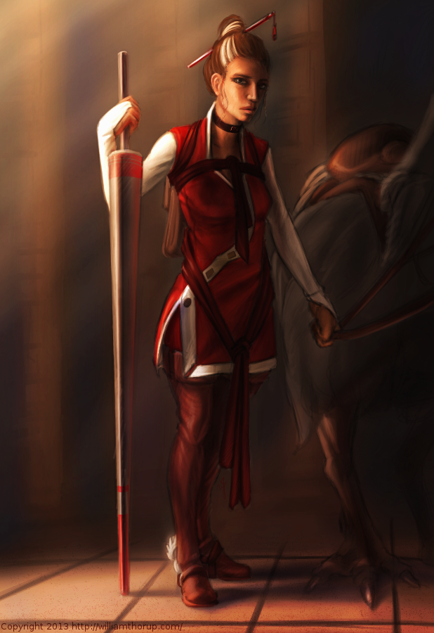
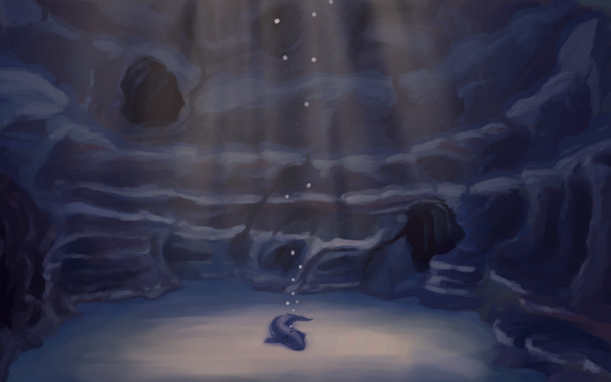
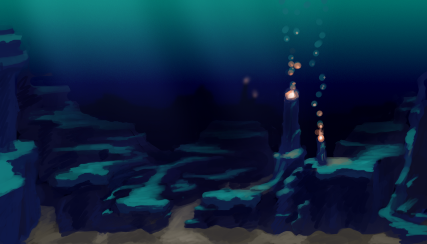
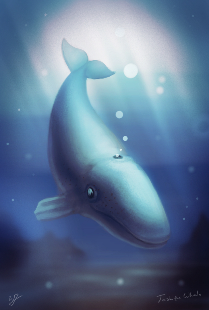
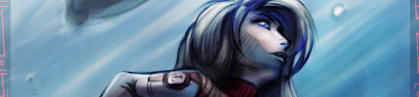
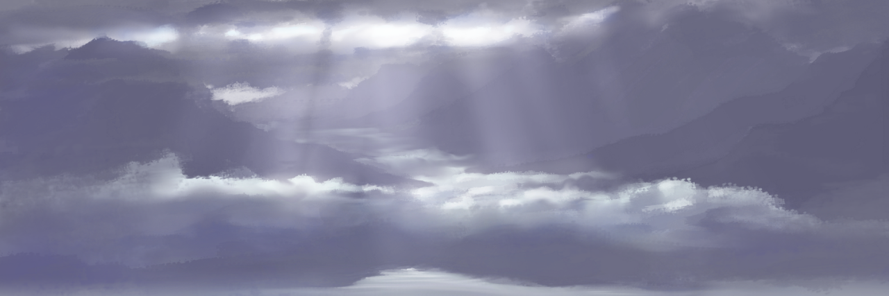
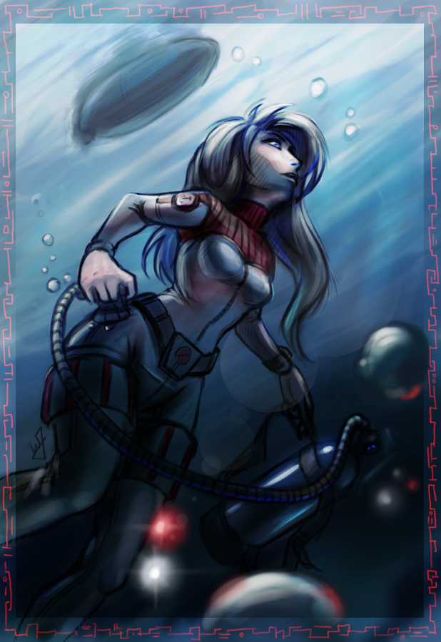
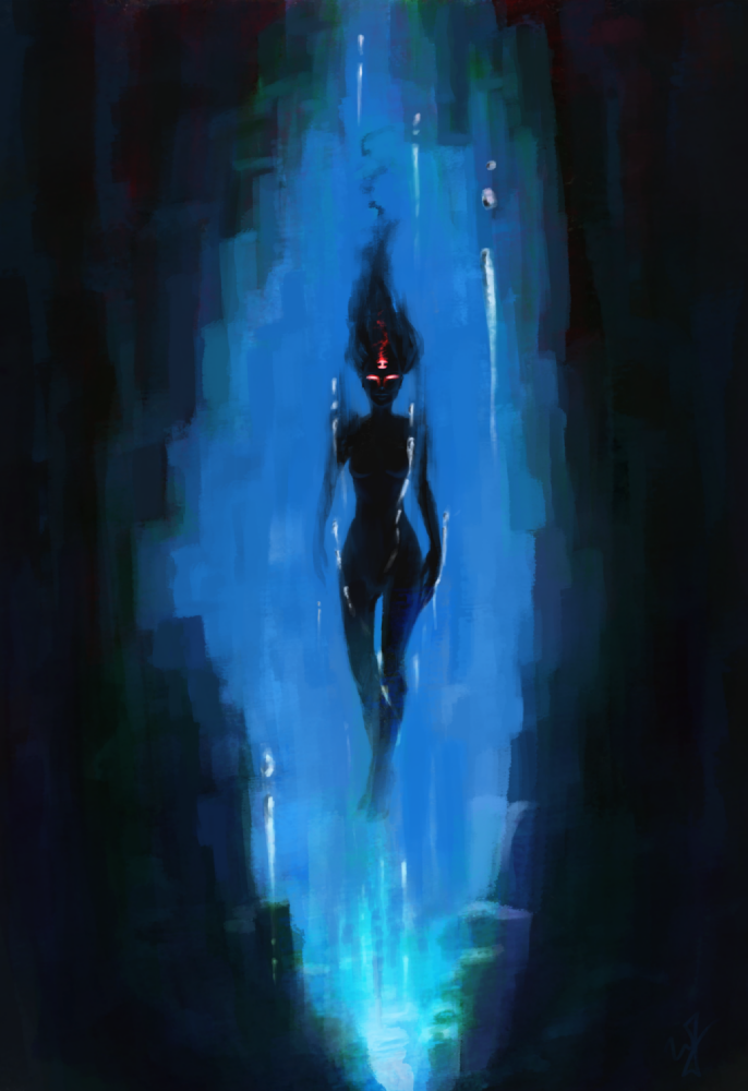
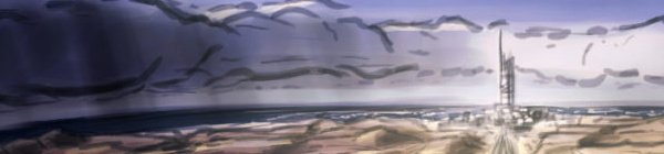
    Here is a recent example of a gradient used to create depth in my work. You can see the original post for this piece HERE, along with a time lapse video.

    example_1

    By creating a gradient, that matches the angle of my light source, I turned this somewhat “flat” looking piece, into something that gives you a sense of depth. Yes, I could have taken the time to go and paint that subtle change from light to dark manually on my character, and then the background. But, because this is a concept piece, the less time spent on it the better. I turned a potential 3 hour long piece, down to 1 and half hours. More time to do other work, with out sacrificing quality, is good in my book.

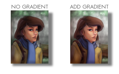
    Also, you might have noticed, the gradient doesn’t go from a black to a white. There are cases when you will use just a black to white gradient, but I found by adding color to the black or white can introduce new colors to the piece.

    Ted_concept_1_webcooper_websarah_web

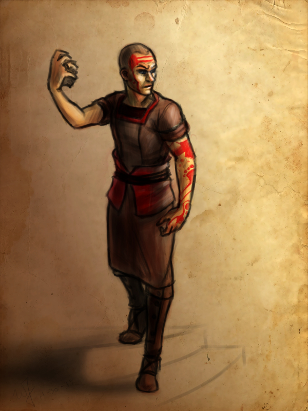
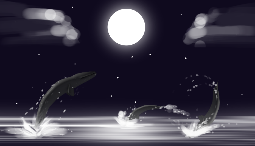
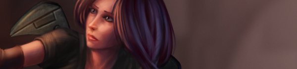
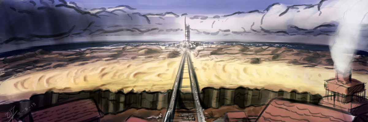
    By the way, I used this same technique in all three of these paintings. But notice how I used a different color for the gradient to match the colors of costume for the character on the left. Also, notice how subtle the change is. Often you don’t need to have your overlayed gradient at full opacity. I usually end up dropping the opacity of my gradient layer down to around %50.

    Try this out. In the project file make sure you have the “Gradient Tool” layer selected, and try adjusting the brightness and contrast. See how this changes the sense of depth in the image.


    Color Diversity

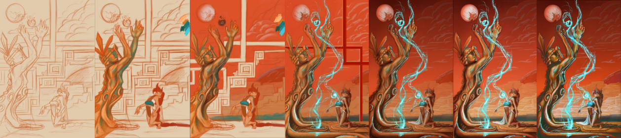
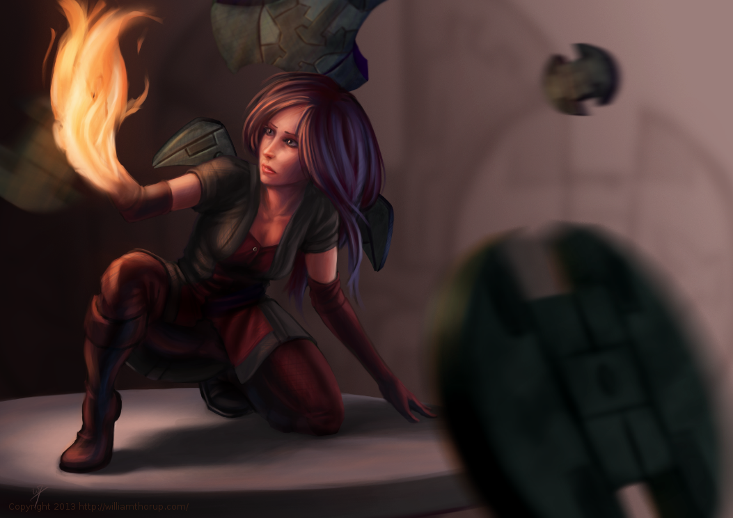
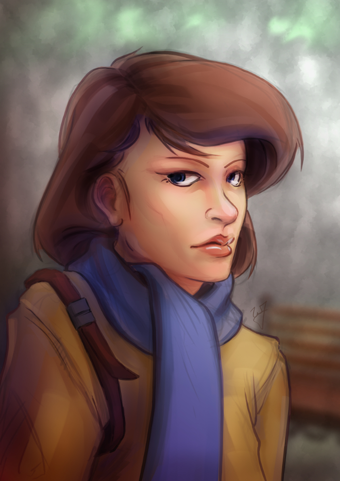
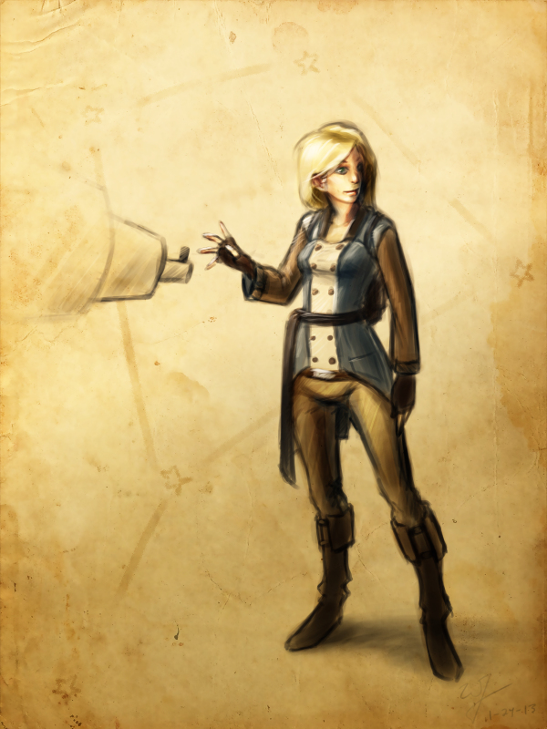
    Adding color to the gradient, while using the “Overlay” blend mode, can add additional colors to your painting. If you examine the project file you downloaded, I did this in that painting. Go ahead and turn the “Gradient Tool”  layer off. A huge change will occur. Not only do we lose the depth, and the focal point in the painting, but the colors don’t seem to work as well.

    example_2

    I am using a tertiary color scheme with this piece. Brown, yellow, and blue, to put it simply. So by changing the black of my gradient to a brown, similar to the subjects hair, I am able to introduce those brown colors to other parts of the painting.

    Especial her right shoulder. Originally, it’s a flat yellow color, nothing that interesting to look at. But, by adding that brown gradient and using the blend mode “Overlay“, it adds body and life to those yellows on the jacket, and ties it to the focal point.

    Try this little experiment in the project file. Select the “Gradient Tool” layer, adjust the hue, along with the saturation, and the brightness and contrast. See how this changes the mood, and overall liveliness of the image.


    In the Park_focal point gif

    Creating a Focal Point

    If you are doing any type of illustration, or a piece with a central idea or subject, focal points are important. And this is where gradients can be very helpful to create a focal point very early in the painting.

    As you can see in the project file, the focal point is the face and the right edge next to it. There are several theories of composition I followed to achieve this, but the most important and the easiest to include at any point during a painting, is the change of values from light to dark, or contrast.

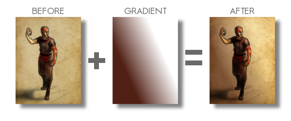
    If you turn off the two top most layers, “Gradient Painted” and “Gradient Tool”. The change from light to dark, or the value contrast, has become flat. Very uninteresting, largely because there isn’t a focal point. But, if you turn those two layers back on, you eye is immediately drawn to the face of the subject.


    Final Notes

    Few things I would like to mention. In the project file, the top layer “Gradient Painted”, isn’t a gradient made with the gradient tool. I just used a large soft brush to add some contrast to the left side of the painting. Sometimes, using the gradient tool will seem too consistent or perfect for your painting. So, depending on what style your going for, painting a large gradient by hand will give you a better effect.

    Also, experiment with blending modes and gradients. Experiment with taking away and adding contrast using this technique. You might stumble on a look or feel that you like, but weren’t expecting.

    With that being said, I hope you enjoyed this tutorial, and I hope it helped in some way. Any questions or comments are welcome.

    I have a timelapse of the painting used in this tutorial HERE. Also, here is a list of time lapse videos and paintings of this technique in action. Sometimes it is better to see a technique in action than trying to talk about it.

  • Project Nebula | Desert Coast City Concept

    Project Nebula | Desert Coast City Concept

    Desert to ocean_web

    I won’t be able to get a weekly sketch review together this week.  I have been swamped with finishing up Josh the Whale, and getting near future projects organized.


    Luckily, with the spare time that I made today, I was able to get something together for the blog, and just break away from the paper work that I have been focusing so much on lately.

    Unable to give any details in copy at the moment, but I had this image in my head since I have had conversations with Ryan Thatcher about the world our next project will take place in.  And, well…  That’s about all I can say without given too much away.

    Enjoy the video, and look forward to some good news in the future.  We will be releasing Josh the Whale soon, and deciding on the next five months or work for Thor Media LLC.