There are different kinds of goals in relation to art. One of those goals could be study goals, like, I am going to focus on drawing hands, or learning to render light and shadow correctly. I would talk about a goal that can have a much deeper effect on the viewer, than say the anatomically perfect hands you drew last week.
The kind of goal that should apply to just about every painting, drawing or sketch that you produce. This kind of goal can be established with one question, what do you want the viewer to think, feel or do when they see your work.
Of course, sometimes an artist throws all care to the wind and just creates, and there is nothing wrong with that, but even approaching your art with that attitude is going to come across to your viewer in the final work. How powerful could your art be if you took charge of what your work is conveying to the viewer on an emotional level?
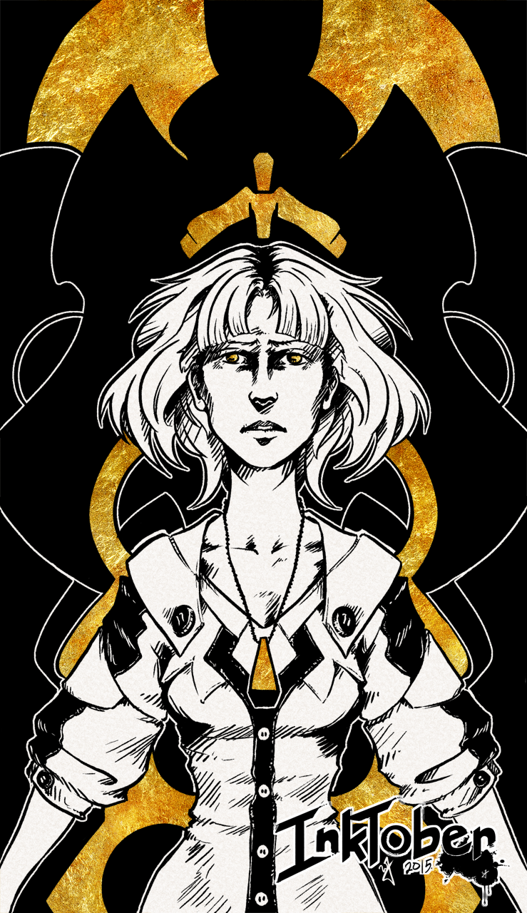
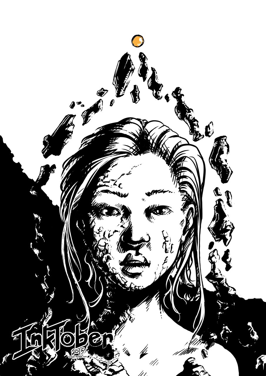
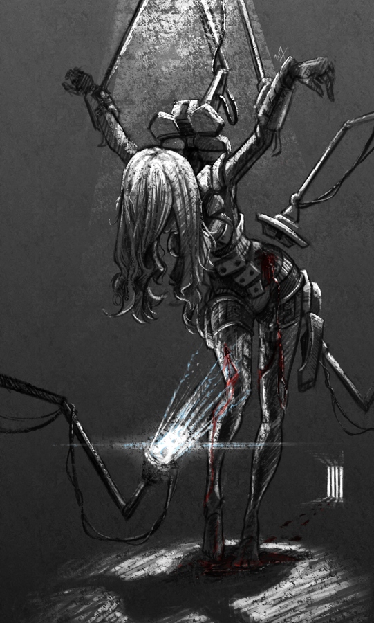
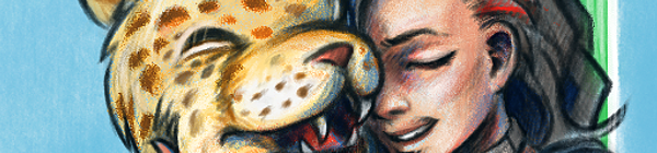
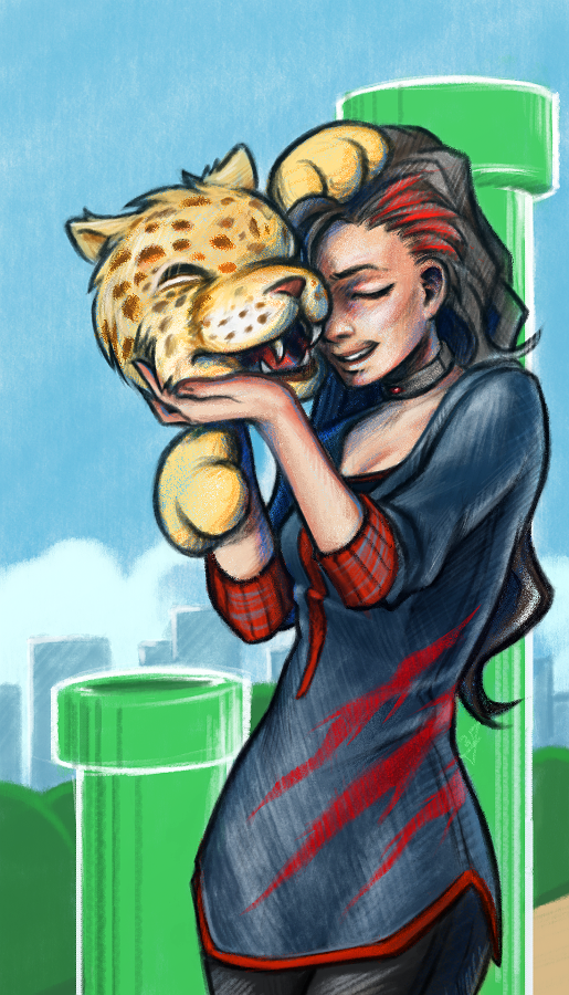
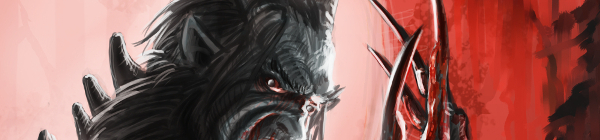
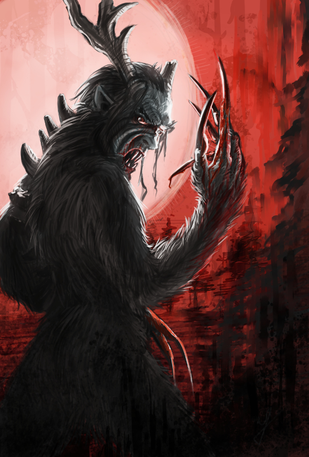
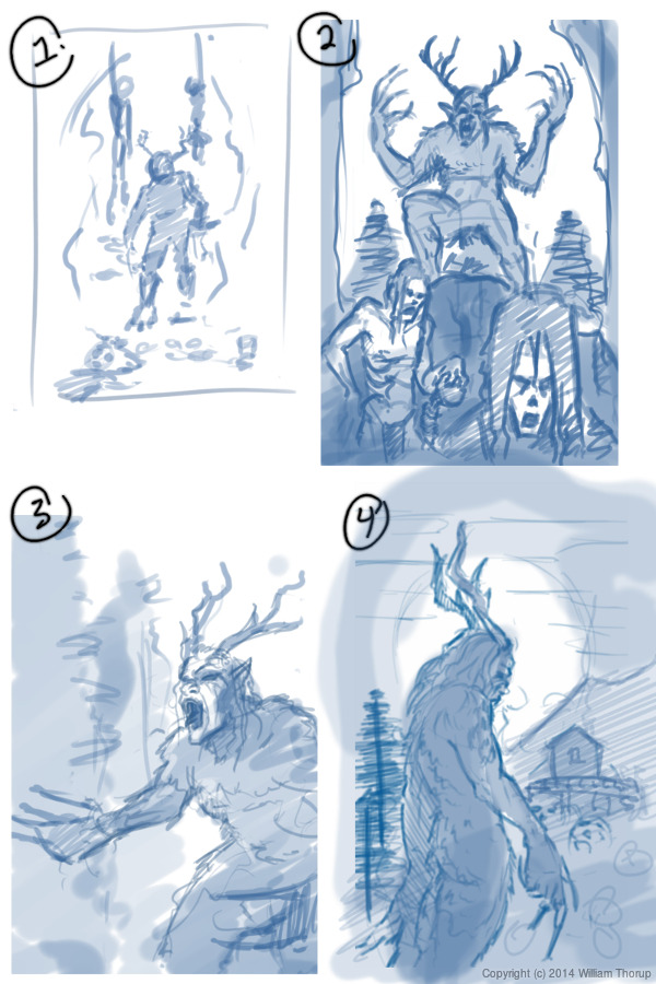
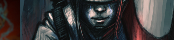
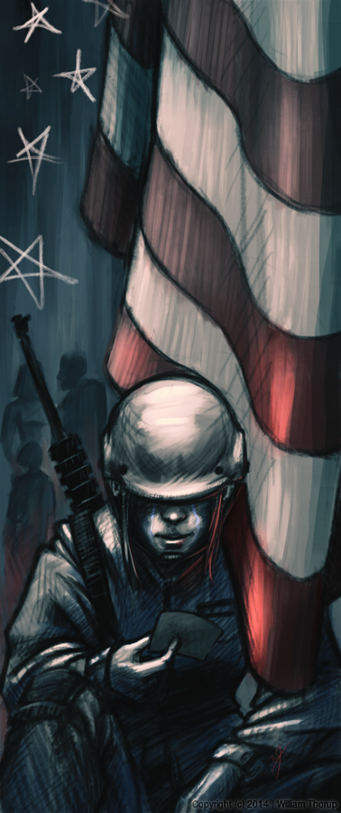
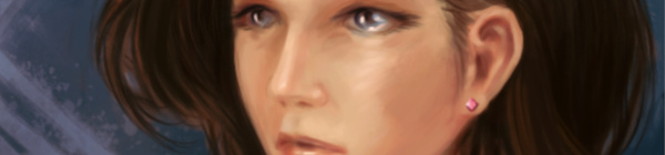
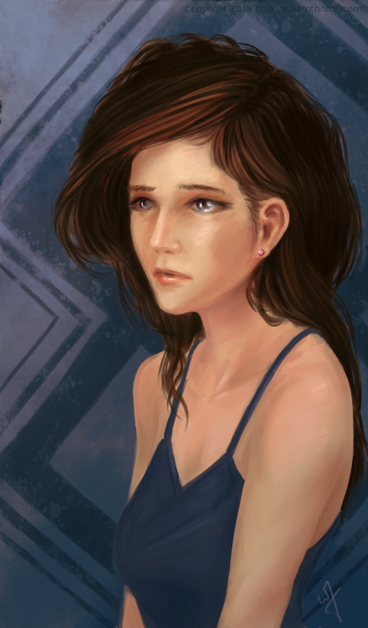
When I started this painting, it was just going to be a study on rendering light a certain way, this is why the very beginning of this painting isn’t in the video. I wasn’t planning on doing a time-lapse at all. Out of this one goal spawned an important question, what is this imaginary person like, and how can I bring that personality into the painting, and make it recognizable to the viewer?
A portrait not only contains the physical appearance of a person, but can also portray what kind of person they might be. So, about 20 or 30 minutes into the painting I realized that I had a greater goal in this painting, that was to evoke specific feelings in the viewer. The goal also included really focusing, through the entire process of the painting, to make sure the former goal was reached.
Ask yourself this, what do I want people to think or feel when they see my work? See what happens when you really focus on the answer to that question while you are painting or drawing.
Because of the subjective nature of art, I won’t say what I want you to feel when you look at this piece, but, as an artist, my hope is, is that you feel something similar to what I felt while working on this painting, and when it was finished.
Look forward to some more time lapse videos in the future, and Thanks for watching.
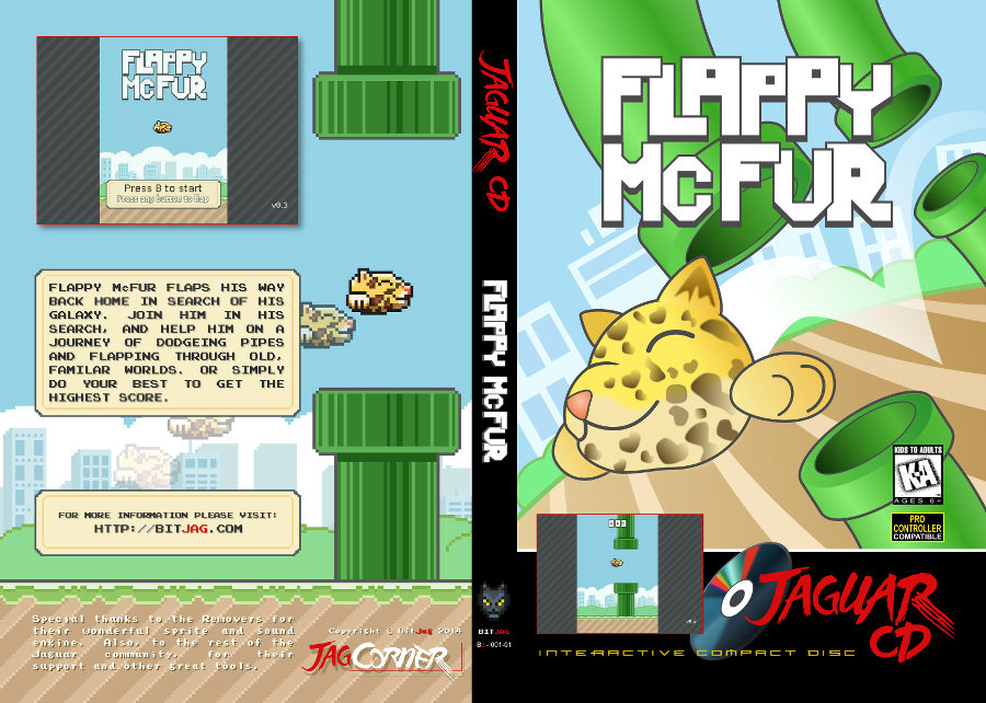
Krita was primarily used, with Gimp for some post color correction.
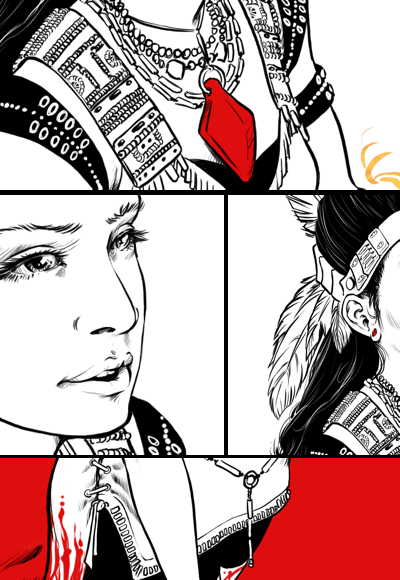
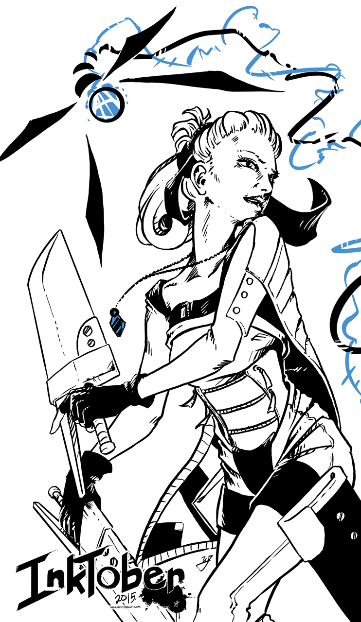
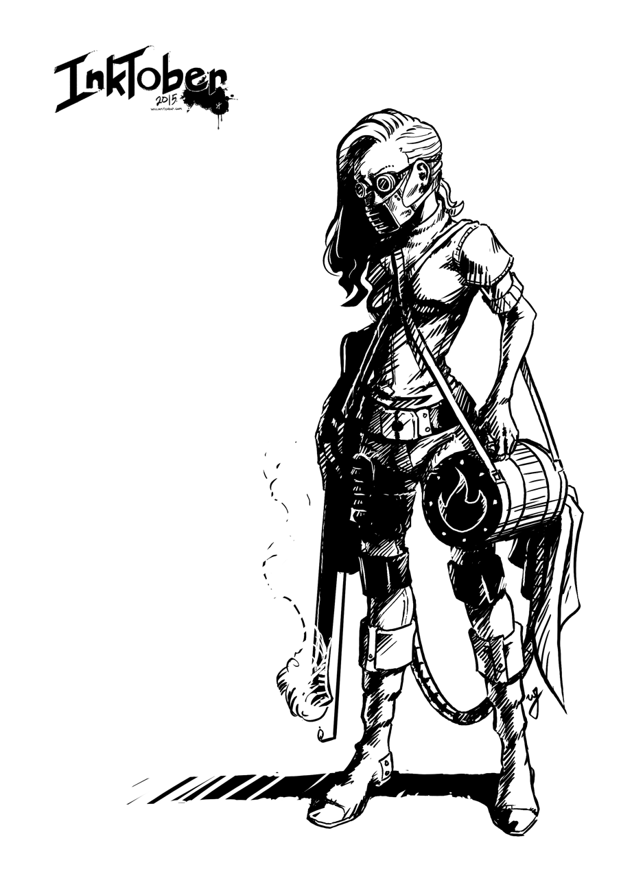
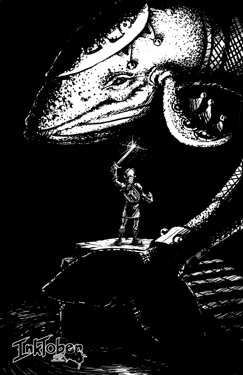
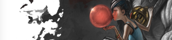
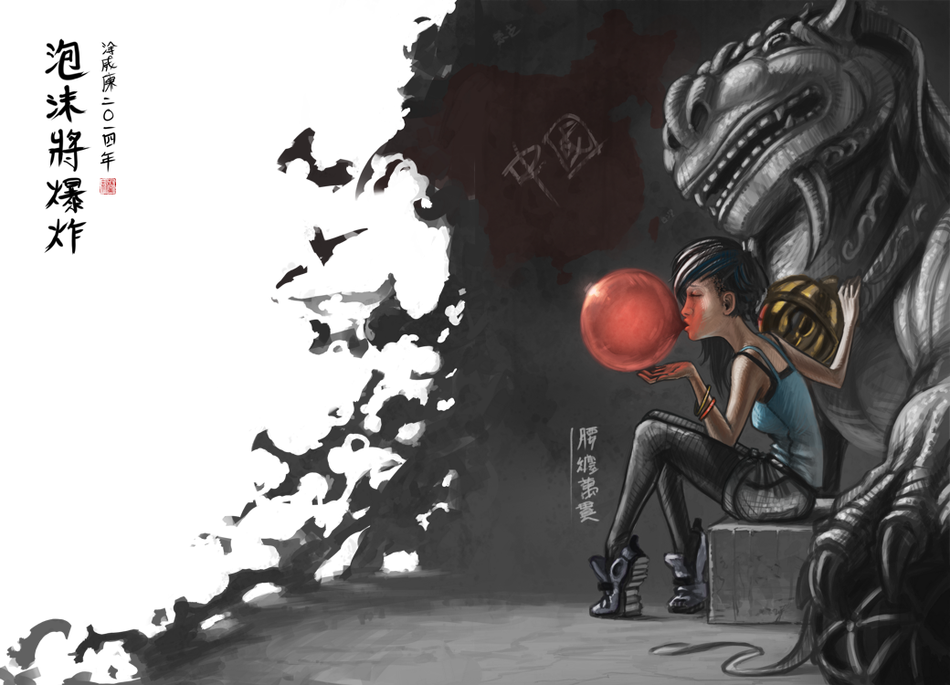
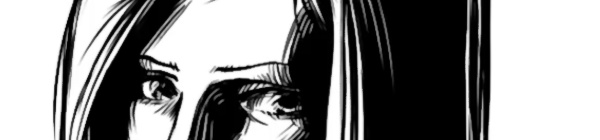
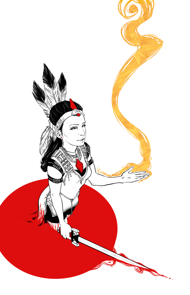 Because of this new device, I decided to do this piece at double the resolution I usually work with (A4 600dpi), and the amount of detail that I am able to include, along with how natural it feels, is great. I am definitely going to be doing more inking in the future.
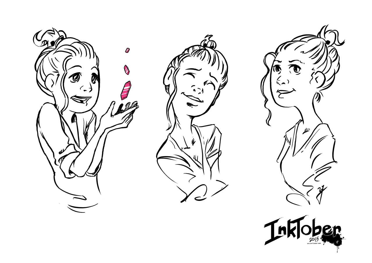
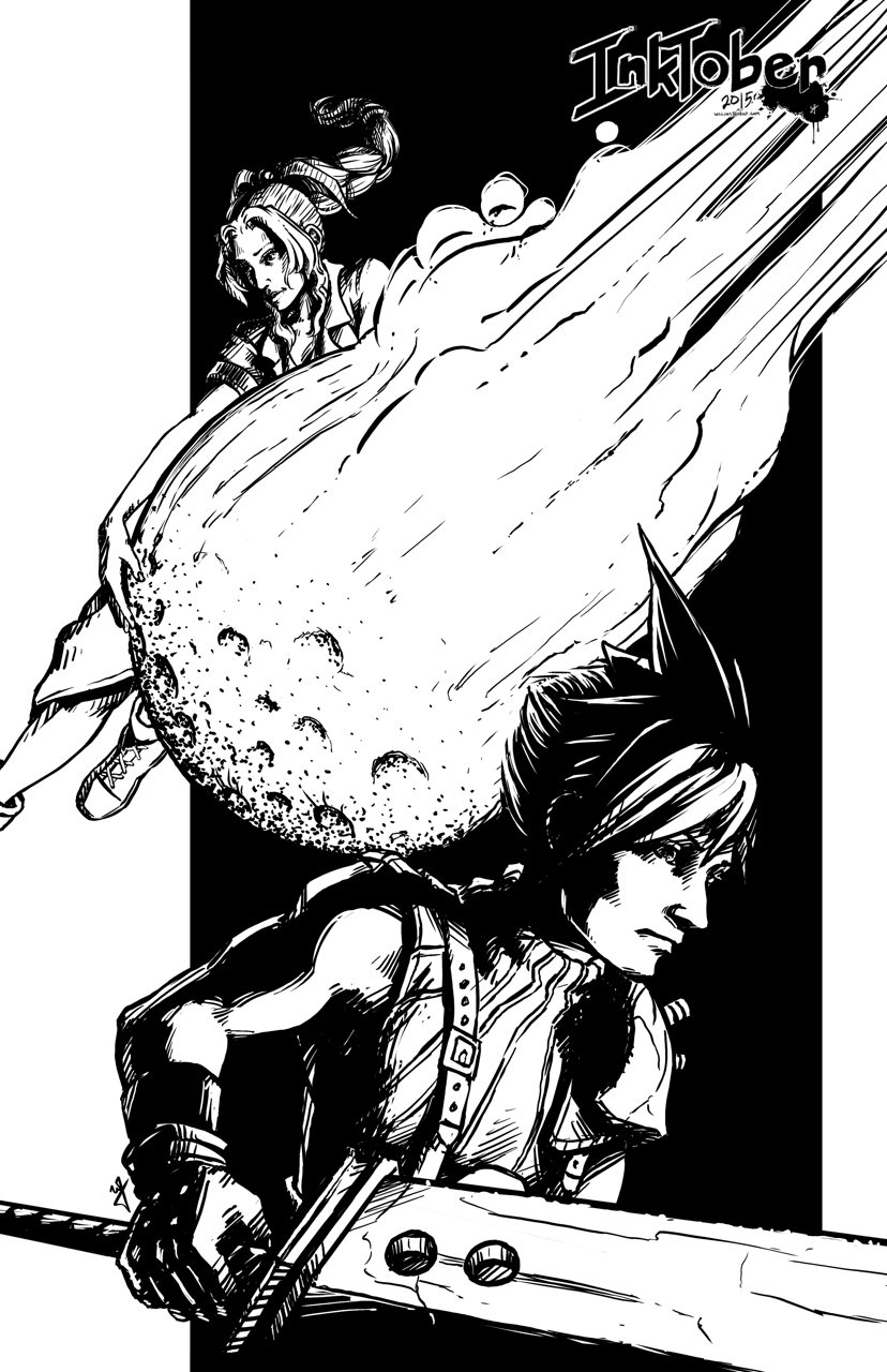