William Thorup

Illustrator, Motion Graphics Designer, Animator, and VFX Artist

Tag: krita

  • Regret in Creation | Myst Fan Art

    Regret in Creation | Myst Fan Art

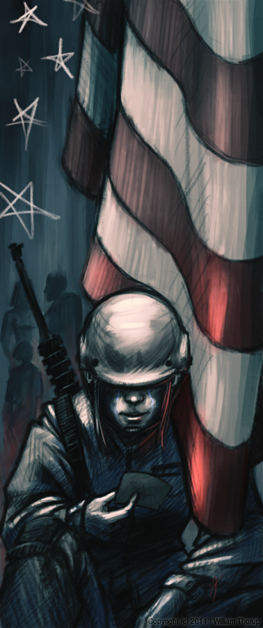
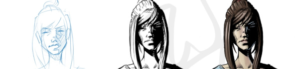
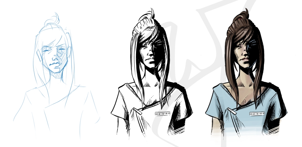
    Mysterium, the Myst convention, is making its way to my hometown this year, and they had open submissions for art for their convention book. I caught wind of this just a few days before submissions were due, but I couldn’t miss the chance to show a little Myst fandom.


    creation_and_regret_web

    (SPOILERS AHEAD in the next paragraph, no spoilers after this next paragraph)
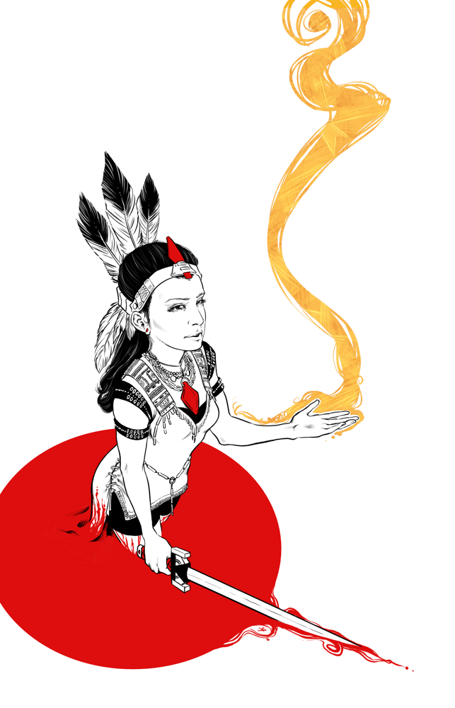
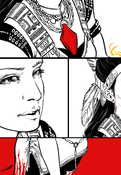
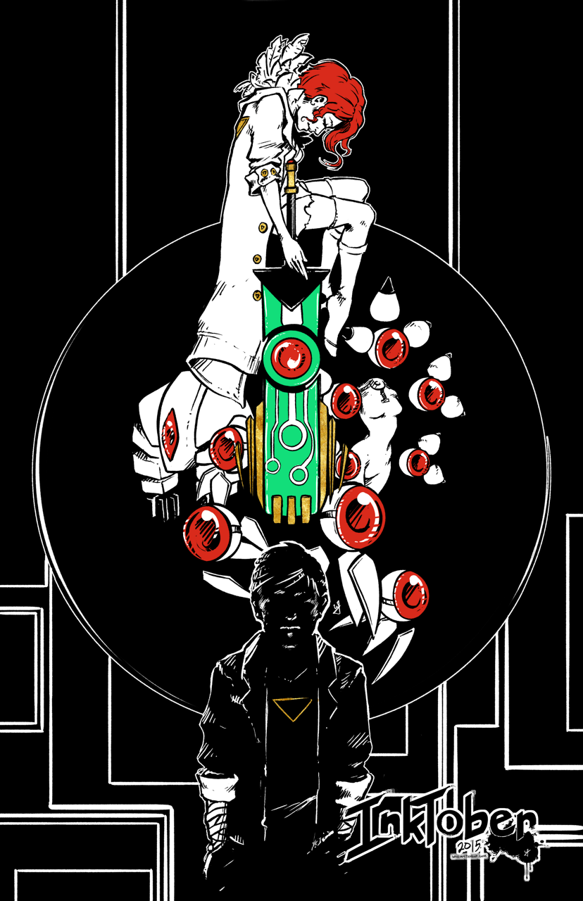
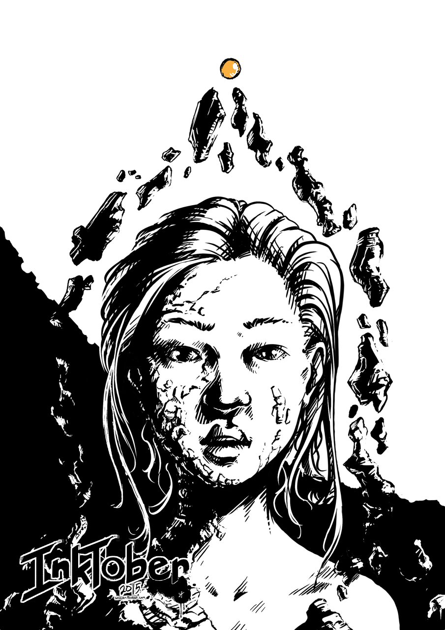
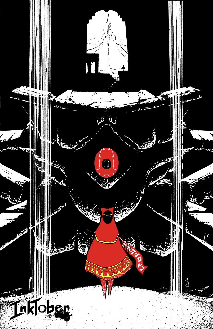
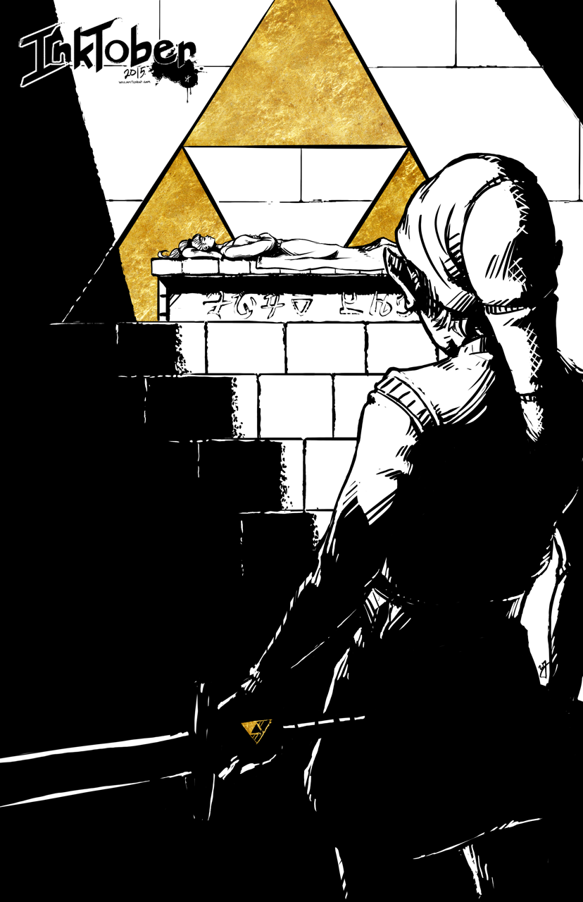
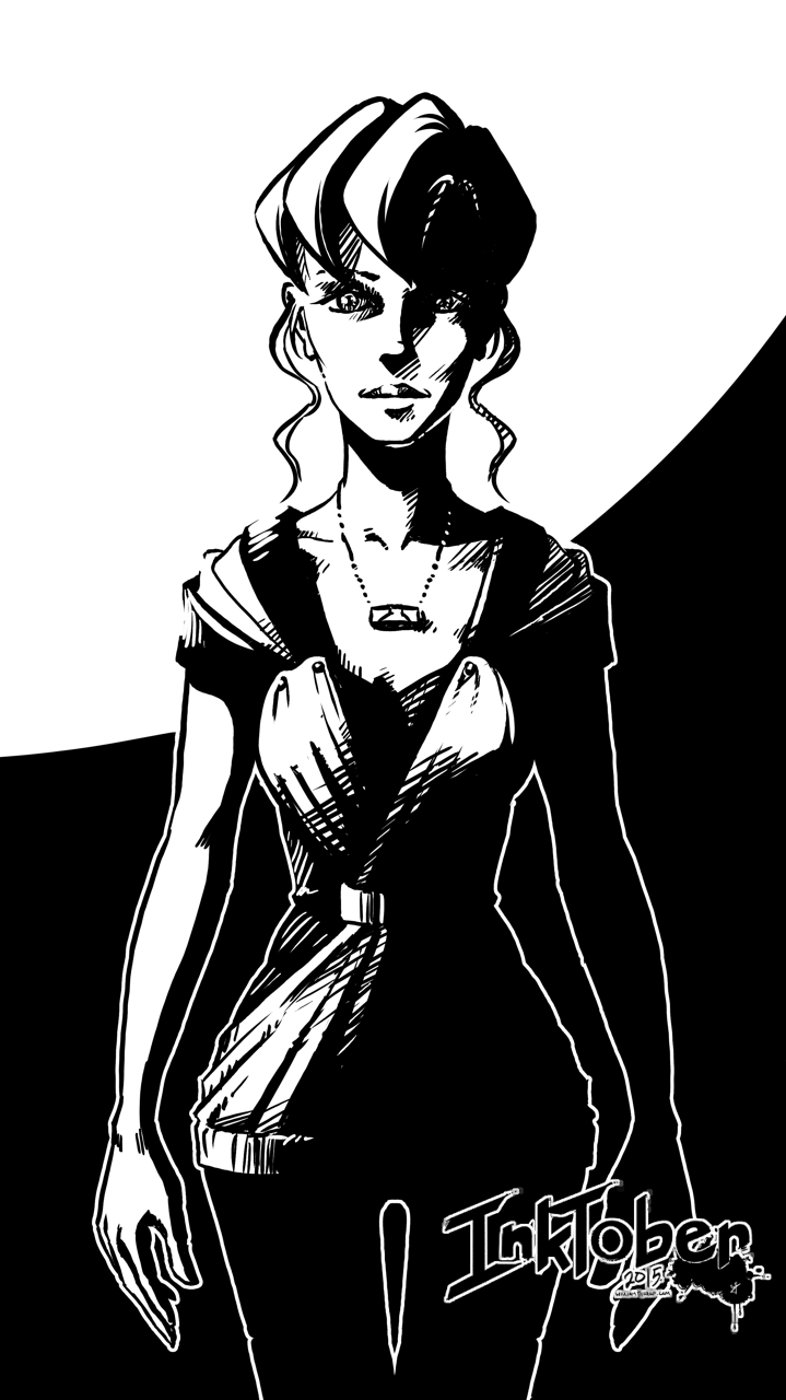
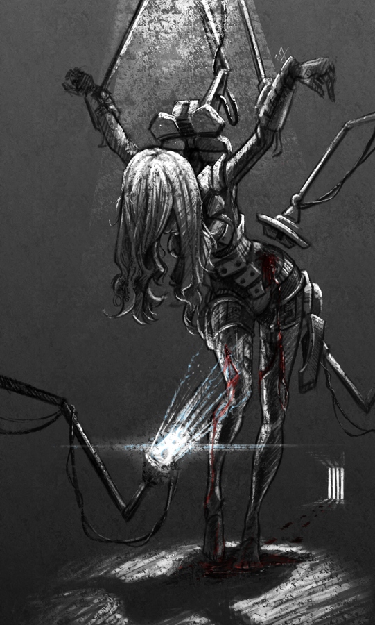
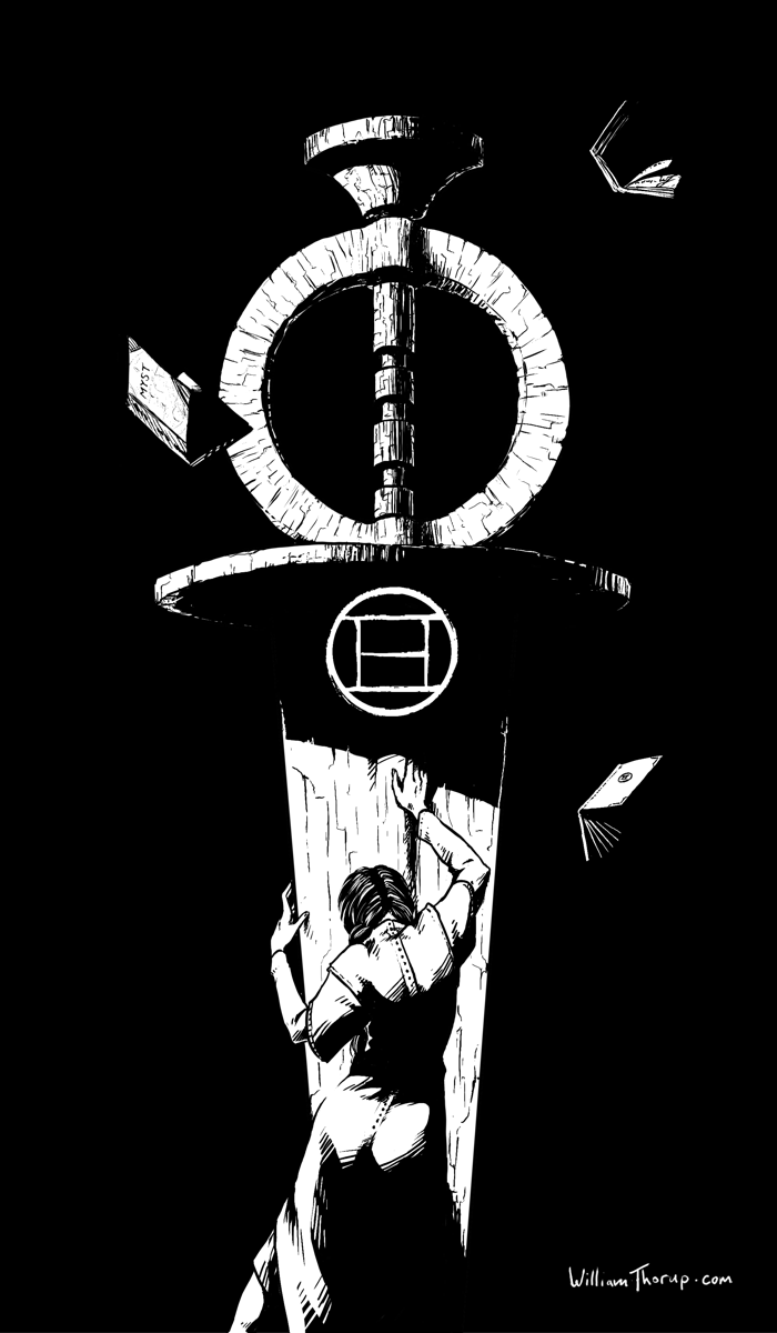
    This pieces features Catherine in a state of remorse for the burden of being able to create ages (worlds that are created by writing books, which you can then enter into), but unable to save them. The Moiety Dagger is a symbol of the group that she helped in Riven (Age 5), and despite her efforts, the age still fell apart. Even though she did not write the Riven age, she must feel the burden that any world she creates has the potential to fail, with the loss of life.

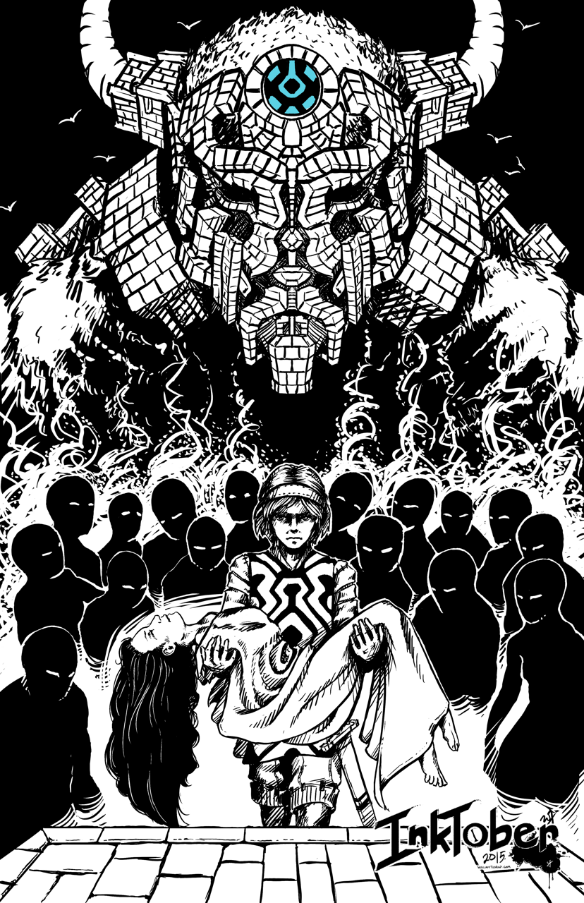
    I have very fond memories of this game, as I used to watch my oldest sister play it, along with with a few of my other siblings, when I was young. I was always fascinated by the environments, and the immersive sense of foreboding that engulfs the game. As I got older, and was able to solve some of the puzzles, the game became even more immersive for me, and I was hooked. I soon played Riven, and Exile (Myst III) and the experience was further enhanced by better audio better graphics, more acting, and an even more engrossing story.


    The story is simply awesome. Taking steam-punk elements and god-like powers of creating worlds and people, with the premise of absolute power corrupts absolutely and what do you do when it does corrupt, is fascinating, and makes for a unique adventure with every game. This includes the three novels as well, well written, and a must read for Myst fans.


    regret_in_creation_close_1


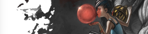
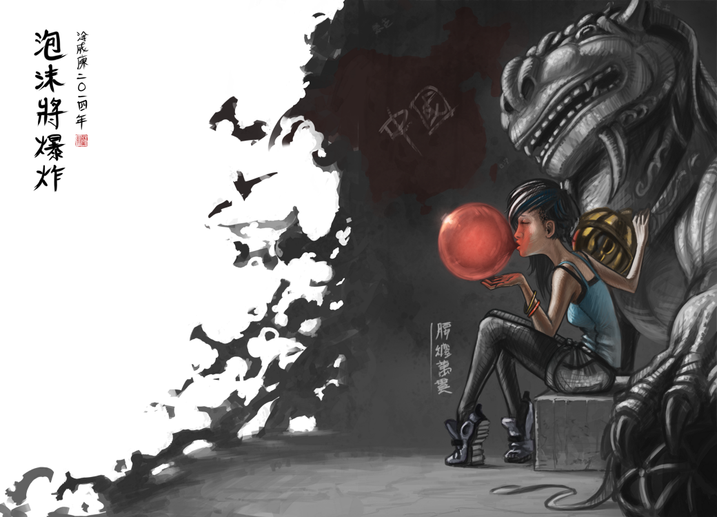
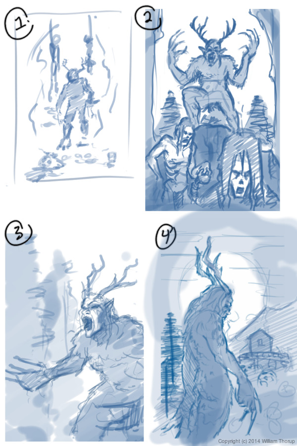
    A may do a few more illustrations based on the some of the other thumbnail sketches future.

  • Ink, Gold, and Blood | With Diety – Illustration

    Ink, Gold, and Blood | With Diety – Illustration

    A quick piece that still shows I am still stuck on this ink with one or two colors “style”. I recently got a Cintiq 24HD and it makes painting so much faster than my Intuos 4 or Cintiq 13HD. I still keep those around, in case I am on the move, but they simply don’t mate the 24HD when it comes to comfort.

    With_Diety_web Because of this new device, I decided to do this piece at double the resolution I usually work with (A4 600dpi), and the amount of detail that I am able to include, along with how natural it feels, is great. I am definitely going to be doing more inking in the future.

    with_diety_close_ups

  • INKTOBER 2015 | Finished

    INKTOBER 2015 | Finished

    Here we go. Time to give it a try. Inktober. I have been wanting to do this for the last few years, after my friend Michael Buhler first introduced me to the event. Be sure to check out his blog, as he is currently inking away as well. I think I final have myself worked up enough to carry through the end of the month.

    Inktober_blog_logo_web

    Goals

    I think that the only way I am going to see this through is if I set a few goals to help generate ideas, but keep it basic to avoid being too ridged. I want to keep it fun as well. For the sake of keeping my blog clean as well, I will be posting everything in this post, and I will also be sharing out to the Facebook Draw Night group, Google+, Deviant Art and to my Instagram.

    Goal #1 is to produce 10 larger, 11×17 vertical illustrations, for my top 10 video games. I won’t list that here now, don’t want to spoil the surprises to come.

    Goal #2 is 21 other small scale pieces. This can include inked sketches, smaller, and quicker to finish.


    Quick Link List

    A list of what is done, and linked for quick navigation.

    11×17 Fanart Illustrations

    Day 4 – Transistor
    Day 11 – Phantom Dust
    Day 16 – Tempest 2000
    Day 17 – Journey
    Day 18 – Adventure of Link
    Day 19 – Shadow of the Colossus
    Day 21 – Ocarina of Time
    Day 29 – Link’s Awakening
    Day 30 – Final Fantasy VII
    Day 31 – Street Fighter 2010


    Day 13 – “Navigator”
    Day 14 – “Hybrid CI”
    Day 15 – “Checkers”
    Day 20 – “Ambassador”
    Day 22 – “Lighter”
    Day 23 – “From the Depths”
    Day 24 – “Suzzie”
    Day 25 – “Time to Fly”
    Day 26 – “Unwavering”
    Day 27 – “Mouse Thief”
    Day 28 – “Minmei”

    Weekly Time Lapse Video

    Week 1 Time Lapse

    Week 2 Time Lapse

    Week 3 Time Lapse


    Day 1

    Play the Beast


    paint_the_beast_inktober_web


    Day 2

    Another Bullet


    bounty hunter_inktober_blog


    Day 3

    On the Throne


    on the throne_blog


    Day 4

    Transistor


    transistor_blog


    Day 5

    Gate Keeper


    gate_keeper_blog


    Day 6

    Forgotten Trophies


    forgotten_trophies_blog


    Day 7

    Fighter


    fighter_blog


    Inktober – Week 1 – Time Lapse


    Day 8

    Push the Button


    dots_blog


    Day 9

    Just a Few Notes


    disco_singer_blog


    Day 10

    Distilled


    distilled_blog


    Day 11

    Phantom Dust


    Phantom_Dust_blog


    Day 12

    Potential Baller


    baller_web


    Day 13

    Navigator


    navigator_blog


    Day 14

    Hybrid CI


    hybrid_CI_blog


    Inktober – Week 2 – Time Lapse


    Day 15

    Checkers


    checkers_blog


    Day 16

    Tempest 2000


    tempest_2000_blog


    Day 17

    Journey


    journey_blog


    Day 18

    Adventure of Link


    adventure of link_blog


    Day 19

    Shadow of the Colossus


    shadow_of_the_collossus_blog


    Day 20

    Ambassador


    ambassador_blog


    Day 21

    Ocarina of Time


    Ocarina of Time_blog


    Inktober – Week 3 – Time Lapse


    Day 22

    Lighter


    lighter_blog


    Day 23

    From the Depths


    from the depths_blog


    Day 24

    Suzzies


    suzzie_blog


    Day 25

    Time to Fly


    Its_time_to_fly_blog


    Day 26

    Unwavering


    unwavering_blog


    Day 27

    Mouse Thief


    mouse theif_blog


    Day 28

    Minmei


    minmei_blog


    Day 29

    Link’s Awakening


    08_links akwakening_blog


    Day 30

    Final Fantasy VII


    final fantasy 7_blog


    Day 31

    Street Fighter 2010


    Street Fighter 2010_blog


  • Battle Recovery | Pastels and Contrast

    Battle Recovery | Pastels and Contrast

    I have been drawing/painting allot, I swear. Just haven’t been finishing much. I start on a piece, and before I know it, I have moved onto another one, and another one, and anot…… You get the idea.

    So, I thought I would post something I did manage to finish up (Sorry, forgot to hit the record button, no time lapse this time around). This was a little concept born out of a sketch session, and, because I liked how the composition and concept were coming together, I decided to push it further.

    A soldier, after the battle, brought back into her assigned quarters for healing. The robots remove the worn armor, as others tend to the wounds occurred in battle. I imagined a world where children would grow up in relative isolation, bred by a computer to oversee the conquering of worlds. Kept separate from the general population, and all for the progression of man. She is one of the many victims of a human-less world, created by humans.

    A sad story, but I found it very inspiring while working through this. Because of the dark, and messy nature of the situation I chose to use a pastel brush in Krita to maintain a rough texture throughout the drawing process. That along with one of the default fill patterns to add a roughness to the whole image.

    The whole image took about 3-4 hours, and is quite different from anything else I have done in the past.

  • Atari Jaguar | McFur and Friend 1

    Atari Jaguar | McFur and Friend 1

    So, during my long hiatus from posting, many projects, many new pieces of art, have been brought into existence, through the sacrifice of time. By myself and others. Unfortunately, this includes the time that is spent putting together videos and posting on my blog. If you are consistent to my blog, or my YouTube Channel, thank you, and sorry for not being more consistent. But enough of the excuses, lets get on to the good stuff.

    bird_and_girl_web_3

    This time around more Jaguar projects, and this will be the first of a few posts. As you already know, my brother and I are involved in homebrew development for the Atari Jaguar. One of the projects we are working on is a Flappy Bird clone called Flappy McFur. There is more information on the project page, if your interested. In a nutshell, we are about halfway through development, and I am in the process of getting some art together for packaging and inserts, while my brother closes in on our end goals for the game. This is the first piece of official artwork for Flappy McFur.

    Before I get started though, just a thank you to everyone in the Thor Media office for feedback on the piece. It is always great to get feedback on my work, when I am too blind to see the mistakes.

    Because of the light nature of the game, certain design choices for maintaining a consistency across the artwork became apparent. First, match the saturation of game. Simple enough, yellows, greens, and reds are saturated, while everything else not so much (I guess that leaves my blues…) Which medium to use was a simple choice for me as well, colored pencils. I love working in colored pencil, probably the first medium I truly dove into and experimented with. Because of it’s affinity to the the look of crayons, but still maintaining the ability to create the detail I want in my drawings, I feel that it will match the mood of the game well. Also, Krita simulates pencils pretty darn well, and it feels almost as good as the real thing.


    With these few design choices, I believe the next 3 or 4 pieces will maintain a consistent feel.

    Speaking of the next pieces. I want to go with a cute and sometimes funny theme for each. Where McFur and his friend are in a playful mood. We might be incorporating McFur’s friend in the game some how. I like her design so far, but it may need a few tweaks for the game. I am hoping to put together a small comic for the game manual as well, but we we’ll see what happens there. Stay nearby, I will have a few more of theses over the next few weeks.

  • Loaded | Illustration

    Loaded | Illustration

    I have been meaning to write about this one for a while. I put this one together about a month ago, and it has been posted in my portfolio and other galleries. No time lapse video, but I was able to put together a small snapshot video with the different revisions I had saved. Also, before we continue, I have to thank Michael Buhler for his input on color, lighting, anatomy, and proportions.

    bubble and lion_web

    There were a few things I wanted to focus on for this one. First, color was priority. I wanted to keep my color pallet very specific. At first, I was trying to go for something a bit more abstract, overall blue line art with pinks and reds. I was struggling to get it to work, so, I decided to revert to something a bit more comfortable, and realistic. And, I decided to focus on the overall message I wish to portray in the piece, making sure that the composition, pose, lighting and color, all tell the story well.

    From a skill building perspective, I focused on rendering various materials. There is the bubble, obviously, but also the rock, clothing, hair, and skin were focused on to create the subtle differences each material has. While still maintaining my current style, I believe that I pulled this off fairly well, but there is still room for improvement.


    As for the story I was trying to tell. I wanted to make a something political, focused on China’s booming economy, and how every bubble eventually pops. The characters on the left basically say that, and the characters on the right hand side of the piece are a Chinese idiom for someone who is loaded. The use a bubble gum not only covers the idea of a bubble growing, and establish anticipation with the inevitable pop, but gum tends to be something that is sweet and enjoyable. All good things must come to an end, right? The girl is dressed in very casual, and somewhat immodest clothing, to represent the adoption of many western trends. But as things are with transitions like this, she still holds on to whats familiar in traditional Chinese culture, shown by her gripping the lion towering over her.

  • Wendigo of Terror | Illustration/Concept Art

    Wendigo of Terror | Illustration/Concept Art

    Here is another piece for your eyes, a treat. You may be thinking to yourself that this isn’t the kind of work I usually do. You would be right in thinking that, this is definitely off the beaten path for me, and here is why.


    wendigo_colored_web


    Wedingo_Terror_thumbs_webwendigo_of_terror_poster_ideawendigo_2_tone_front_flattened


    We have been in some minor communication with someone who works at Arrowstorm Entertainment. A movie studio here in Northern Utah that focuses on fantasy and science fiction films. This person asked if I could put together a concept piece for a possible B horror film monster. A Wendigo creature that originates from the Great Lakes area of the United States, and is usually centered around myths that deal with the, pseudo, adverse effects of cannibalism. The content isn’t my favorite, but the job paid good, and it gave me a change to stretch out of my usual bubble.

    I did quite a few thumbnails for this piece (20+) and actually did three complete paintings, before we found what the client liked most. The process was very enlightening, and had allot of momentum. Really, the momentum is what made this painting fun. The client was in constant communication with me, and gave feedback when I needed it.

    Overall, I spent too much time on the painting though. I was trying to keep my total work hours under 6, but ended up going over 9. This was for a few reasons. First, and foremost, when I was first presented the job, I should have asked a bit more about the production and where it was currently at. This leads to the second problem. The project had hardly been refined, and the story, background, and other details about the creature, where watery. This is why so much time was put into thumbs and other paintings.


    I should have stepped back, asked the client to refine their ideas a bit more, and then approach the painting after a bit more forethought was applied.

    I am happy with the end result, and the client was as well. I hope to have a bit more work with them in the future, and hopefully work on some of their movie posters and other concept work.

  • For Liberty | Illustration and Time Lapse

    For Liberty | Illustration and Time Lapse

    A small gift to the men and women who serve for the cause of our liberties, rights, and freedoms. I also would like to thank all those around the world who fight for these causes, whether you fight for the United States or not. Every human being deserves these blessings in their lives, and today, we remember the price that must sometimes be paid for those blessings.

    for_liberty_web

    This painting took about 4 hours to complete. The entire painting was done in Krita.

    I focused on the color pallet for this painting. I wanted something a bit abstract, but not so abstract as to distract the viewer of the story being told. I wanted a sad and somber tone to the image, so, I stuck to cool colors. Primarily blue, greens, and grays. Red and white were my highlight colors. Then, I controlled my satruation in specific areas, in order to bring focus to the parts of the painting I wanted the viewer to see first. I feel overall the composition is good, maybe a bit crowded, but still attractive.

  • Atari Jaguar | Flappy Mcfur Pre-Release Box & CD Art

    Atari Jaguar | Flappy Mcfur Pre-Release Box & CD Art

    My brother and I have been working hard on the Atari Jaguar stuff, and new ideas, art, writting, and code, trickles into each and every project everyday. Flappy Mcfur is the first fruits of our efforts.


    flappy_mcfur_cd_lable_web

    Obviously a Flappy Bird clone for the Atari Jaguar, this program really was just a training ground for me in C programming. It was fun getting the basic assets together, and code the various aspects of game. From menus, to score keeping, and movement of Flappy McFur. Speaking of movement, it is very rudementary, and the next version will have movement more akin to Flappy Bird.

    flappy_mcfur_dvdcase_insert_front_web
    flappy_mcfur_dvdcase_insert_back_web

    The box art and CD art were both put together in Inkscape, with screenshots from the actual game. Currently we are not sure if we will actually be making and selling physical versions of the game, but I though it might be nice to give people who download it, the opportunity to put together something nice for it if they wish.

    The Pre-Release trailer was a blast to put together. I wanted something that would build up, and then let the viewer drop, realizing it isn’t anything too amazing. I really like the way the fly around with the console came out. I haven’t used lattices in 3D animation for a long time, and they poved really effective for bending the flowing text around the various contours of the Jaguar console and controller. The footage of gameplay was captured using the Virtual Jagauar emulator, and it plays almost exactly how it does on the actual Jaguar hardware. It’s such a simple game, why wouldn’t it? Also, this video, and the next one, were both completely done in Blender, with 2D assets in the Gimp.


    On another small note, Bryce noticed that out YouTube subscription counter, on the JagCorner channel, was almost to 64, and he came up with the idea for a little video to celebrate the 64th subscriber and the 64-bit glory of the Atari Jaguar. Check it out, and subscribe to our channel to keep up with other video content we will be producing in the future.


  • Comic Inking and Coloring

    Comic Inking and Coloring

    Ah… a blog post. It has been a while, and I should be doing this more. If you are a regular to my blog, I apologize. There is quite a bit of work that I have been doing lately that has been taking much of time. I guess that it is a matter of priorities, and I should make my posts of higher priority.


    About a month ago, I finished coloring work on a comic book project that was poorly executed by the director. By some miracle, the comic made it to Comic Con Fan Experience in Salt Lake City, but only sold a few copies.

    khloe_3_web

    Unfortunately, I am not too proud of the final work, mainly because of the story (or the lack thereof), and won’t be including it in my portfolio. That project did, however, push me a bit further into the realm of inking. Along with a Thor Media internal project, and the want to practice some simple inking and coloring, I have produced three separate portraits. Which I can say that I am proud of.

    sad man

    I used Krita to produce all three images, and it took about a few hours to produce the portraits. The latest version of Krita includes a nice set of tools specifically for inking, and it is a joy to use them.

    the smile_web

    Being involved in that comic book project was a bit of an eye opener for me though. I was able to get a really good idea of how much effort needs to go behind a single issue, which is really good for Thor Media. We have been able to price ourselves correctly, in case we run into others who wish us to help produce a comic book.

    More importantly, that project turned me on to the idea of turning some of my writing into comic book form. I was going through some of newer and older stories recently, and I may pick one or two, and convert them into comic books.