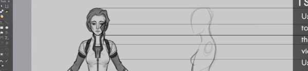
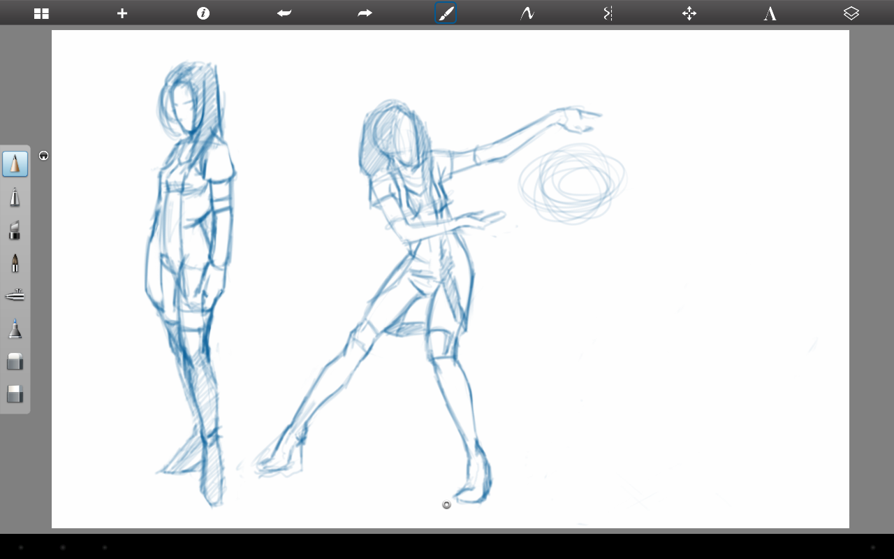
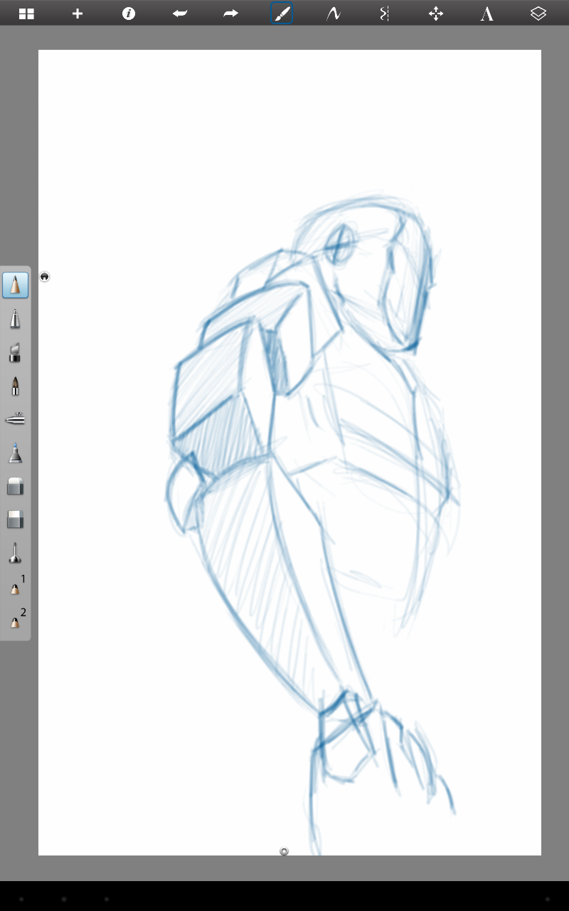
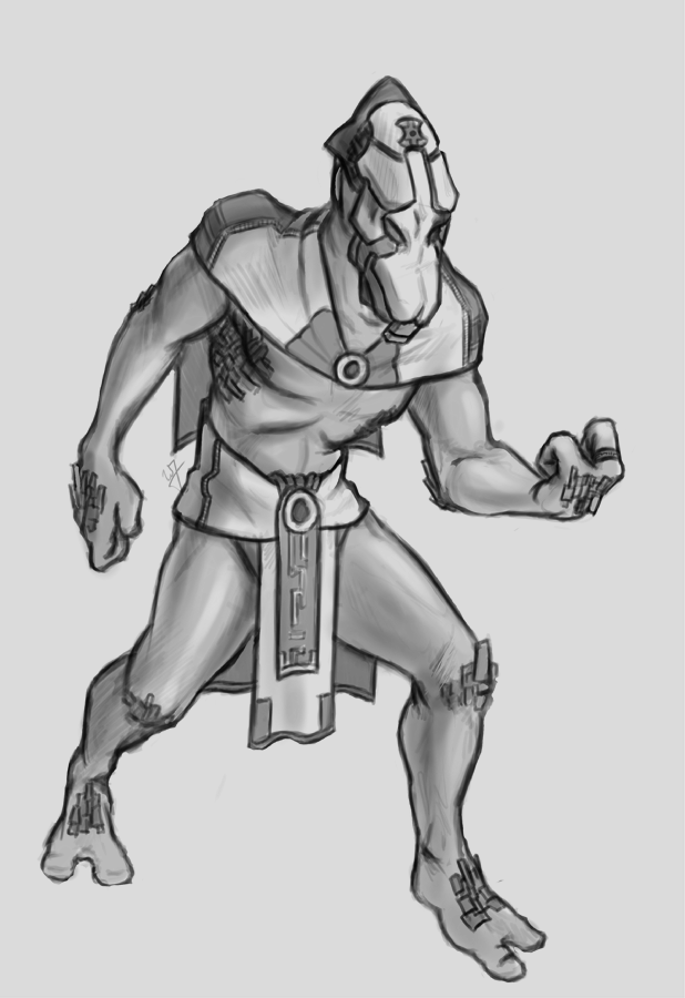
Here is something that I put together a few weeks ago, and just got around to finishing it. This small tutorial covers a couple different methods of creating an accurate representation of a character’s profile, based on a previously draw front view of that character. Enjoy.
Tag: sketch
-
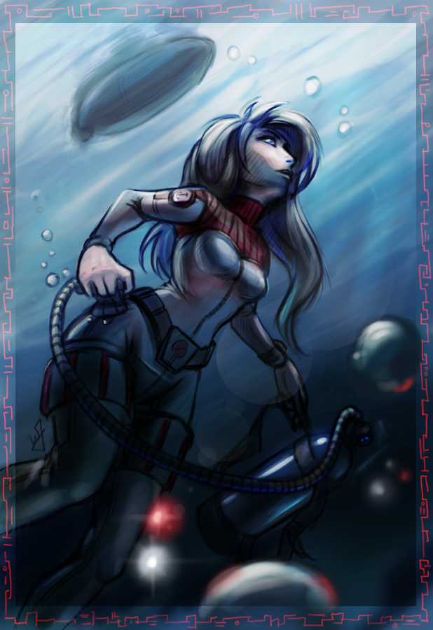
Krita Time Lapse Painting | The Waker
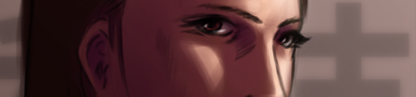
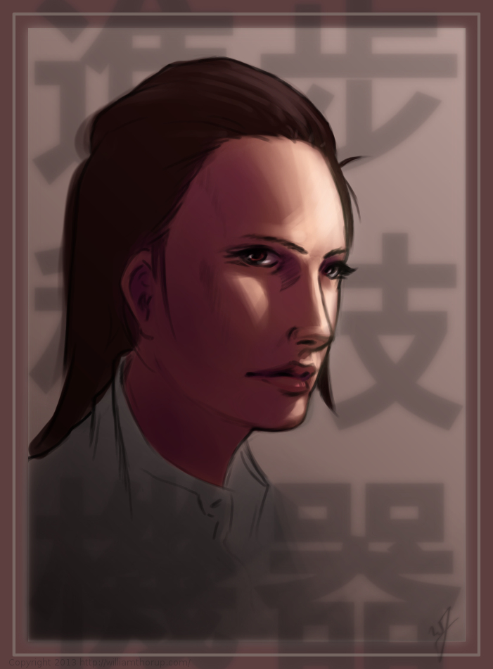
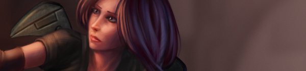
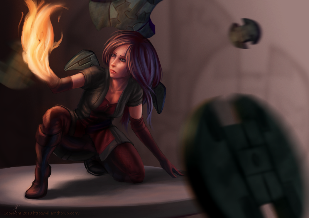
I have been trying to get this painting posted for over a week. Ran into issues with my computer and work has become really busy. But, the excuses can be annoying, so, here it is.
This painting was very much spontaneous. During a digital sketching session, this face came out, and I decided to push it to a finished rendering.
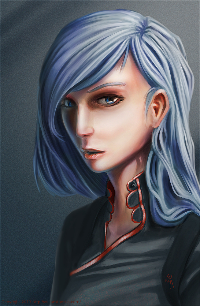
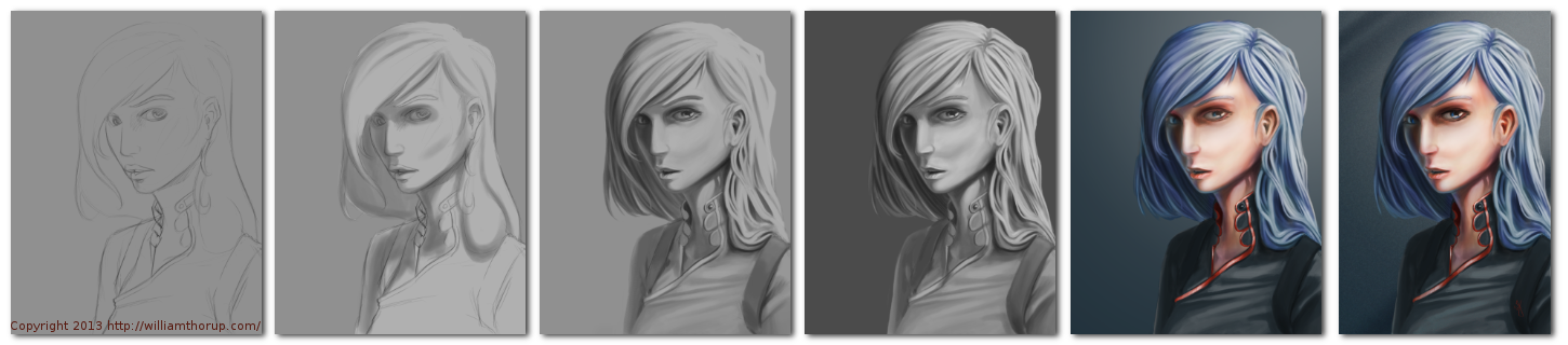
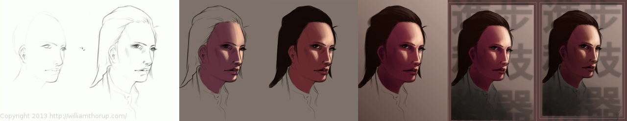
This painting got me a bit worried, since it had been a while since I tried to tackle realistic lighting. Rendering correct lighting has always been a bit intimidating for me, but I seem to have handled it well. I first broke down the steps. So, instead of trying to take on both color and light at the same time, I decided to do a grey scale painting first. Simplifying the process overall, and allowing myself to focus specifically on how light is interacting with the form.
Digital art really makes coloring an image easy. I pick a color, slap it on a with a different layer in “Overlay” blending mode, and if I ever need to change it, no problem. Just use a Hue/Saturation/Value filter to adjust the color. As you can see in the video (3:40 and 3:52), I did this for her hair and her clothing.
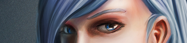
I love painting skin. The key to making skin look alive, are the areas where light transitions into shadow. Because skin isn’t completely opaque, light will enter the upper layers of the skin, hitting blood underneath, and will bounce back oranges and reds. The is particularly prevalent in the transitional areas between light and dark.
A good example of this in this painting, is her chin, starting at 4:17 in the video. A few other things to keep in mind when painting skin is to play with other colors on top of the skin with a layer set to an “Overlay” blending mode. Colors like green and yellow can add healthy variety to lighter areas of the skin, while violets and blues can saturate your shadows making them appear more realistic. At 3:39 in the video, you can see I added a light layer of blue to under the jaw line.
One thing that was unexpected in this painting was her hair. The hair that falls down her neck turned out to be much more complicated than I originally planned at the sketching phase. I had fun spending the time rendering it, and I feel it adds a certain level of detail that the painting wouldn’t have otherwise.
I feel a bit silly mentioning this, but her ear is something that I am proud of. I didn’t spend as much time rendering it than I did other portions of the painting. The structure is very much convincing, but still has the brush strokes that I like to see in my work. One other thing I enjoy about this painting are the facial proportions. I am still far from being a master when it comes to proportions, and that can be clearly seen in my work. But the scale of her mouth compared to her eyes and nose are pleasant, and seem to go well with the piece as a whole.
These paintings that I do without reference always surprise me ounce they are done. I find it fascinating to think pack on my processes and ask myself why I did something a certain way. It helps me to see what I do well, and what I still need work on.
-

Weekly Sketch Review
I have been able to do some casual sketching here and there, and I would like to just share a few sketches that I have done over the last few weeks. No real focus, but I am sure you will enjoy them anyways. These where all done through Sketchbook Pro on my Lenovo Thinkpad tablet.
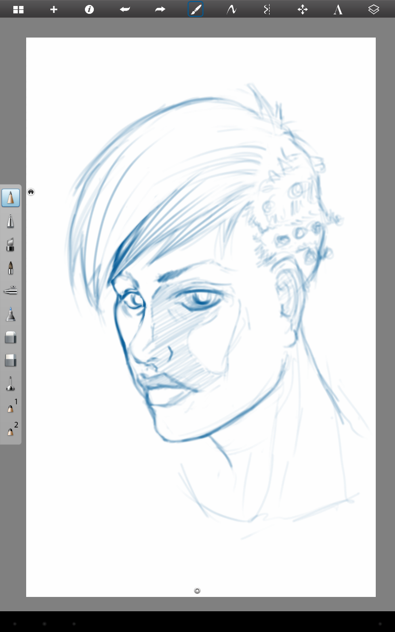
The portrait sketch above isn’t completely mine. At Draw Night, Michael, Ethan and I began talking about how difficult it is to draw the eye, furthest from the viewer, in a 3/4 portrait. I handed my tablet over to Mike, so he could adjust my handiwork. Thanks Mike!
-
New Cintiq 13HD
I am going to brag a little bit, only because this is such an awesome device. But before that, I apologize for the lack of posting. We have officially started our next project, so, I have been doing allot of writing, organizing, and discussions, to make sure we give this project a good start.
This Cintiq 13HD has been very fun to work on. Having worked on an Intuos for such a long time, it takes a bit to adjust to working on a display, but it comes with some advantages.
The first thing that I noticed was how much easier it is to do line work. It is more accurate. The reason for the increase in accuracy is because the disconnect created by drawing on one surface while looking at a different surface, is gone. This makes it more like a traditional medium, which, for some artists, can be very attractive.
Pro number two, is how portable this thing is. It is the same width and height as my 15.6 HP ENVY 15, and they easily fit side by side in my bag. I take it between work, Draw Night, parent’s house, and my house with out worrying about it at all. It does add a few extra cable to my bag, and is slightly heavier than my medium Intuos 4 tablet.
Which brings me to my next point. This device is deceivingly light. And, even thought I don’t do this often, I can easily draw with it sitting on my lap. This is the big plus to this device, light and portable.
Now some down sides. The screen is a bit dim. Most of the time I don’t mind it, just because it is still brighter than most LCD’s. I heard somewhere there is a way to adjust this, but I haven’t been able to find a service manual to adjust brightness. There isn’t anyway to change the brightness with Wacom software unfortunately.
This one isn’t really a con, seeing it will be resolved soon. Getting it to work in Linux was a bit of a chore. Because of how new the device is, native support won’t be around for a little while. I was able to build the latest driver from source, and then I have had to trouble shoot the Settings GUI so I could map the buttons. A bit frustration at first, but I eventually got everything working right, and it works great in Kubuntu 13.04. It also works great in programs like the Gimp, MyPaint, and Krita.
The one big downside to this device is the connector for the proprietary cable, and how it connects to the device. It is a bit flimsy, and one good bump would definitely render it useless. With some extra care though, this can be avoided, and shouldn’t be a problem for most people.
Overall, it has been a joy to use, and for the price point it is a very good device. Great color, great portability, and a great price. I would definitely suggest it to anyone interested in getting a Cintiq, and not wanting to spend more than $1000.
-
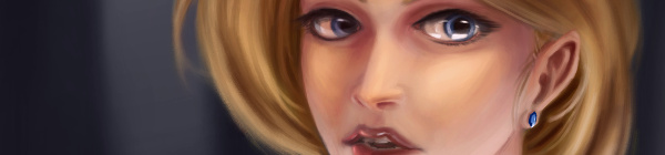
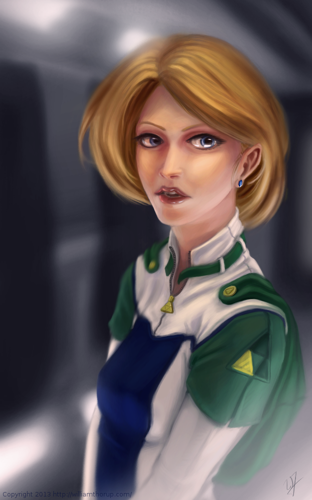
Gimp 2.8 Time Lapse | Quick Portrait | The Scientist
This one might count as a weekly sketch review, since it was really just a study in lighting. This face was actually from a sketch session of many faces I started a couple weeks ago. I decided to go back and pick one of those faces and push it a bit further.
I think that I have been using Krita a bit too much. The shortcuts, like the shift+drag to adjust brush size, have spoiled me. I keep thinking that they should include the option in the Gimp. But I also understand that Krita is more geared for an artist like me, while Gimp is more built for photography. Both programs have their good and bad qualities, and I still enjoy using both programs.
A little about this painting though. I have been studying a bit about photography and lighting for portraits, and I wanted to try my hand at a Rembrandt lighting. Using this kind of light seems to create allot of depth in the subjects face. I wanted her to feel more ominous by dropping the bounced light, creating a starker contrast between the right and left sides of the face.
I like her somewhat “I’m better than you.” expression, adds to the character. The background says things like “Science” and “Progress”. Her character kind of reminded me of something that you might see in a Final Fantasy game. Overall, I believe the portrait does it job. Enjoy the video!
-
A New Focus | Concept Art
My brother Bryce and I are putting together a game for the Atari Jaguar, and I have been working on character design, game assets, and getting a story together for the project.
This piece was spontaneous, coming out a sketch session. It was also very fun to work on. I want to thank my a few of my friends, Ethan, Micheal, and April for the critique. Your help is needed and always appreciated.
One part a really enjoyed was additional programs, on top of the Gimp, to get to the final piece. You will notice that in the video, I just out to Krita and Blender. I used Krita’s mirror functions to come up with a concept for the weapons spinning around the character, and I used Blender to model, place, and light the weapon. I have used similar processes in the past, although this time felt like it was really good decision making on my part. It sped up the overall process of the painting, and I think I achieved a better result than if I had done it all in the Gimp.
There will definitely be more of about this game in the future. I have already put together some turn based battle mock-ups with sprites, and Bryce has been putting some of these assets to use with actual programs on the Jaguar. It’s awesome to see this stuff actually turn into a playable form.
-
Krita & Gimp Illustration | Zelda
I don’t do allot of fan art, in fact, this piece originally didn’t start out as fan art. I was watching an episode of from the first season of Robotech, and sketching at the same time on my Lenovo tablet, when I did the initial sketch. (The costume is somewhat Robotech inspired). The one you see at the beginning of the time lapse video. It wasn’t until after I started refining the sketch in Krita, did I decide to turn it into fan art.
Don’t get me wrong, I think fan art is awesome, and an awesome way to express you appreciation for something (Isn’t that what art is kind of about?). And I wish I would take more time to do some fan art. But I tend to avoid it, because I have the feeling that I won’t be able to do it justice. So, I put off most of the fan art I would like to do for a later day and time.
This time around, though, I feel I did a fairly good job, and feel comfortable in posting and receive feedback for this piece of fan art.
But enough of that, lets go over some stuff that I think is worth talking about, and might be a bit educational. I am just going to start at the beginning of the video and mention a few interesting things I noticed in my process.
First, a bit of an explanation on content and style. This is a re-imagining of the character Princess Zelda, from the Legend of Zelda video game series. When I decided that this was going to be a fan art piece, I wanted to stick to the poofy hair and a somewhat military uniform as seen with many of the characters in the first season of Robotech, but with a bit of Zelda seasoning. There are actually only a handful of things that tie this piece into the Zelda universe.
The most obvious things are probably the colors. The blue rupee, green hood and shoulders, and the golden triforce all point to the Legend of Zelda. But there is also the character herself. Zelda is often portrayed as someone beautiful, with a sense of innocence, which is something I stuck to here. But the costume was chosen to depict the strong side of her character as well. A less obvious sign of her character is that her mouth is open, as if she were speaking to you. Zelda is often used in the Zelda series as a mentor character, and if she lived in a more futuristic or sci-fi world, I see her playing more of the mentor character than royalty.
There are a few other things I could mention, content wise, but for the sake of keeping things short, I will let you jump on the Zelda Wiki to figure some of the other imagery out.
As for my processes. Most of my planning was done in the line art. At this point I didn’t have a really good sense of the lighting, until I sat back and thought about it later, but I had a good idea of what I wanted the subject to look like.
I decided to skip doing a value painting, and go straight into color and value. I try to avoid this nowadays, and stick to a value painting before I ever jump into color, but in this case, I wanted to try something new.
I wanted to try to create a simple color palette to lay the foundation for my colors and values. I don’t include this step in the video, but it is something that I learned from a post by Nasan Hardcastle. A great digital artist, that I suggest that you all follow. But having a simple palette like this can help keep your colors and values organized in the foundation of the painting.
Something unique in this painting, that I have never done before, is the light setup. If you include ambient light, I have a total of 4 different light sources in this painting. This was one of my stretch goals for this painting, to use that many light sources without loosing the form of the subject, and adding appeal to the painting overall.
But not all was fine with this painting. I messed up on the proportion of the nose, and had to readjust that half way through. Not too difficult, but I feel it’s something that I shouldn’t have to deal with and definitely need to practice more on. Also, another proportion problem was the width of the head, which I eventually had to fix.
But with the good and bad of this painting aside, there is one tip I would like to share. Color Grading. One of the huge advantages to digital art.
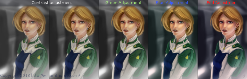
I have never been good with color, this is probably because I don’t have a solid base in traditional painting. But, “color curves” an “levels” make up with this shortcoming with ease. Using some reference images that I wanted to match color with, I did several stages of color correction, as depicted above, using both “color curves” and “levels“, and selection the specific color channel I wanted to modify.
These two options can also be used to quickly change the feel of a painting. A good way to explain this is how a sepia toned image and a black and white image create very different feelings, even though content may be the same. This is pretty basic stuff, especially if your into photography, but it is fun to take an image you created from scratch and see how it transfers to these different color schemes.
I have a few more paintings coming down the line, we should be starting a new app project soon, and a Weekly Sketch Review is just around the corner. Stay tuned.
-

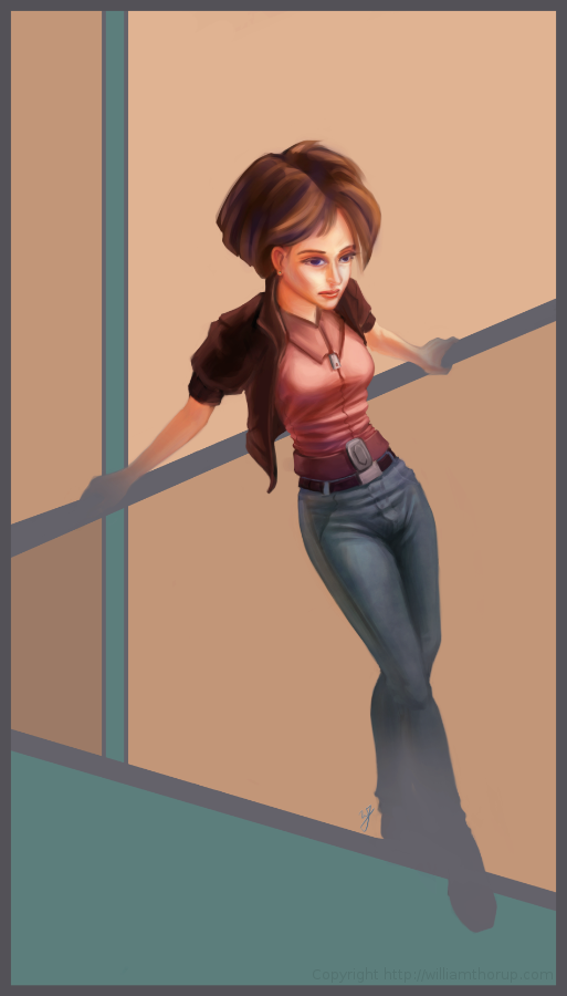
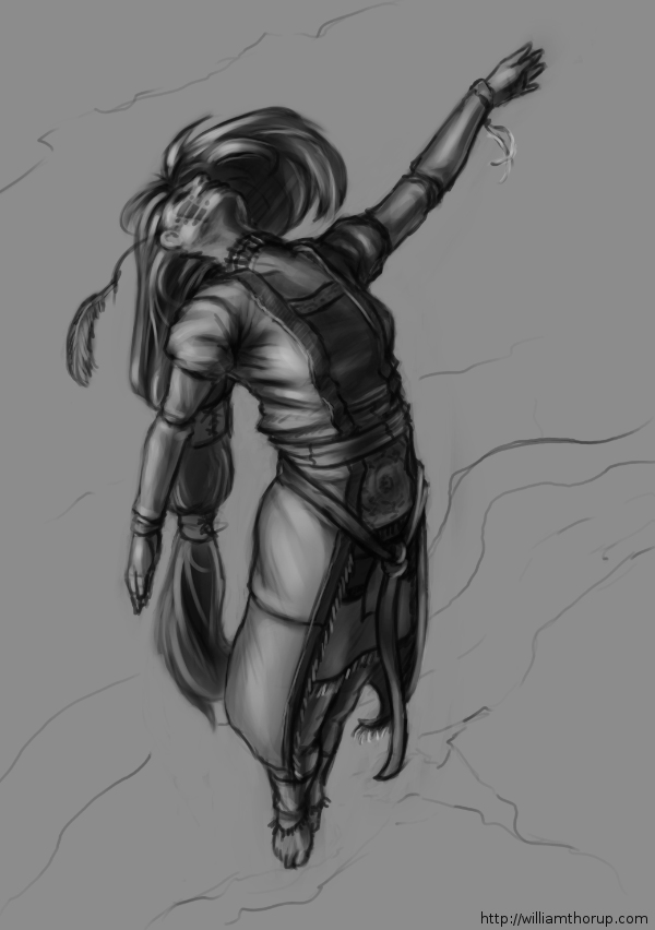
Illustration | On the Rail
The last few weeks I have been trying to reach outside of my box a little. Been reading allot about visual style, and developing a visual style as an artist.
The 16-bit portrait I did earlier, and this piece have been practice in what I am reading. and it has been fun so far.
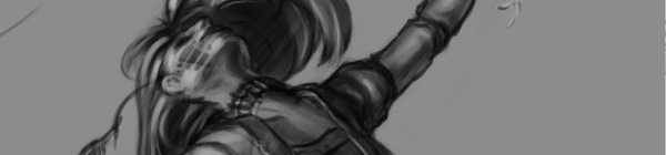
I was just sketching when this one came out to me. I liked the pose, and the silhouette that it makes was really strong. I decided to carry it to a finished piece. The outfit she is wearing is really random, and for me, kind of weird. Feels a bit western. But, in the end, I think it feels good with the rest of the image, and it definitely helps the silhouette as well. I stuck with a split-complementary color scheme to keep things simple. and wanted to focus on basic skin tones to present a warm feeling in the painting overall.
As for what I struggled with in this painting. The background was killing me. At first I was leaning towards a style that fit the character. Something that fits the perspective and shaded similar the woman. Going over this in my head, I couldn’t really think of an environment that would work with the subject to create a stronger piece. So, in the end, I decided to do something abstract, and focus on composition and color. Something that would strengthen the main subject, but at the same time wouldn’t be distracting.
Again, overall, it was and interesting piece to work on. Definitely not in my usually ball field, but it was good to stretch a little. Its also good to feel like shading is becoming second nature. I am doing better with drawing hands, but still have a long way to go. I struggled with the face a bit, so we’ll seem more faces in my Weekly Sketch Reviews for sure. Speaking of, one of those should pop up soon.
-
Draw Night | Value Painting Tips
We had a good draw night yesterday evening. Good to see friends and draw a few things as well.
During the few hours I was there, I worked on a sketch that I had started the day before, that I enjoyed, and I thought I would push it into a value painting. And, as I was recording my desktop, I thought that it would be good to not only have the time lapse, but also include a few tips and things that go through my mind while I paint. For my benefit and for yours.
The video is fairly short and to the point, and I hope it helps. And if it doesn’t help, I also recorded myself through the webcam. So, at least you can laugh at me, as I get ridiculously close the screen and perform all sorts of weird expressions.
If you are interested in joining us for draw night and live in the greater Salt Lake City Utah area, drop by our Facebook page and let us know. The location sometimes changes, so keeping tabs on the Facebook page will keep you up to date on the location.
-
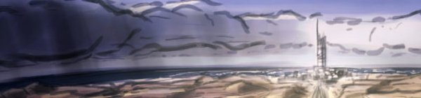
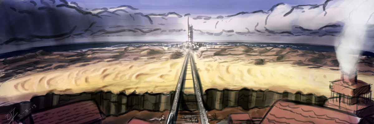
Project Nebula | Desert Coast City Concept
I won’t be able to get a weekly sketch review together this week. I have been swamped with finishing up Josh the Whale, and getting near future projects organized.
Luckily, with the spare time that I made today, I was able to get something together for the blog, and just break away from the paper work that I have been focusing so much on lately.
Unable to give any details in copy at the moment, but I had this image in my head since I have had conversations with Ryan Thatcher about the world our next project will take place in. And, well… That’s about all I can say without given too much away.
Enjoy the video, and look forward to some good news in the future. We will be releasing Josh the Whale soon, and deciding on the next five months or work for Thor Media LLC.