William Thorup

Illustrator, Motion Graphics Designer, Animator, and VFX Artist

Tag: sketch

  • Weekly Sketch Review | Environments

    Weekly Sketch Review | Environments

    observatoryunderground bridgeancient doorway


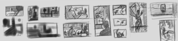
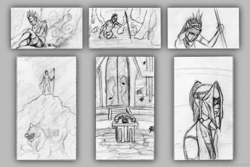
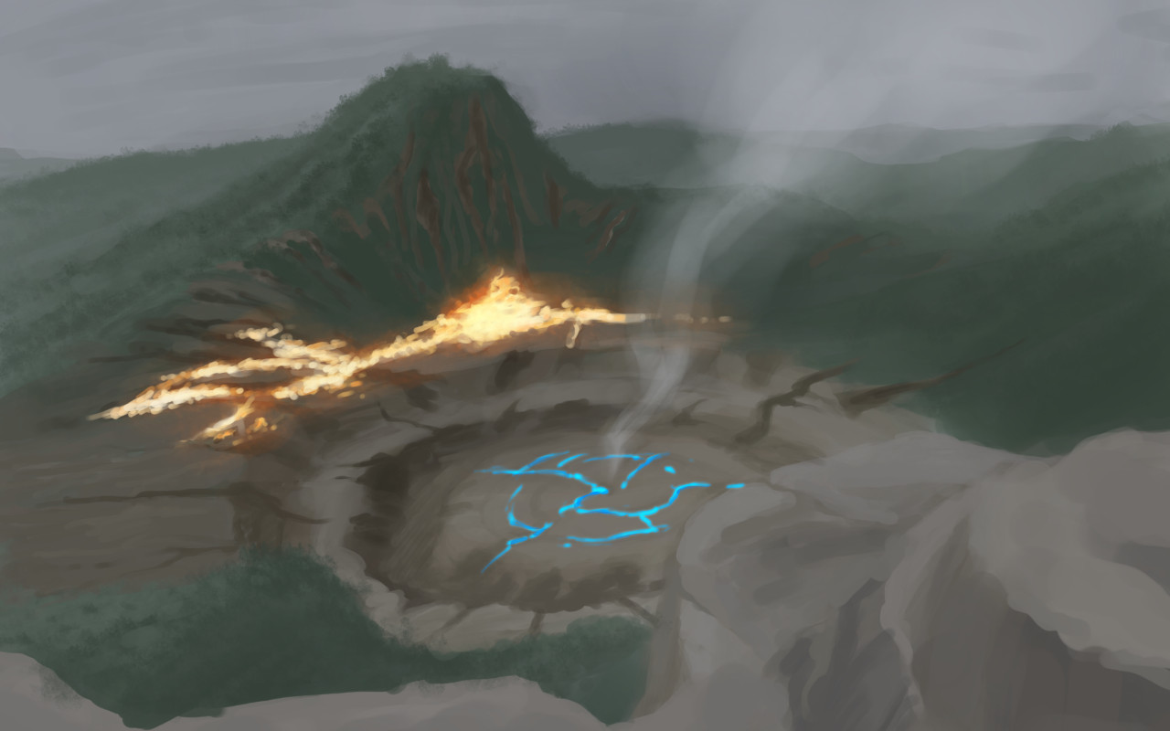
    I had some time this week to do some environment paintings/drawings for project Nebula.  And it has been great to have a project like this to help motivate me to do these sketch reviews.

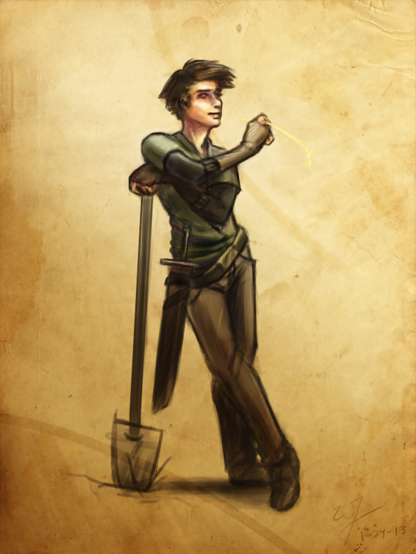
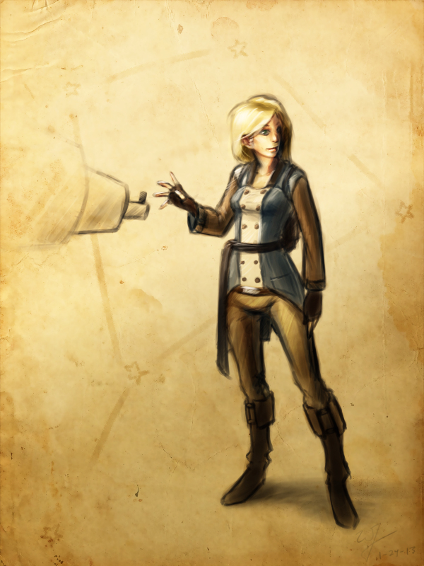
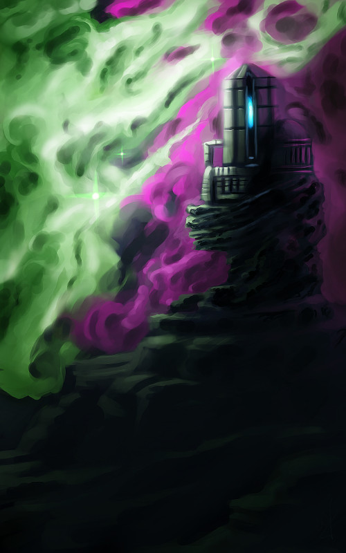
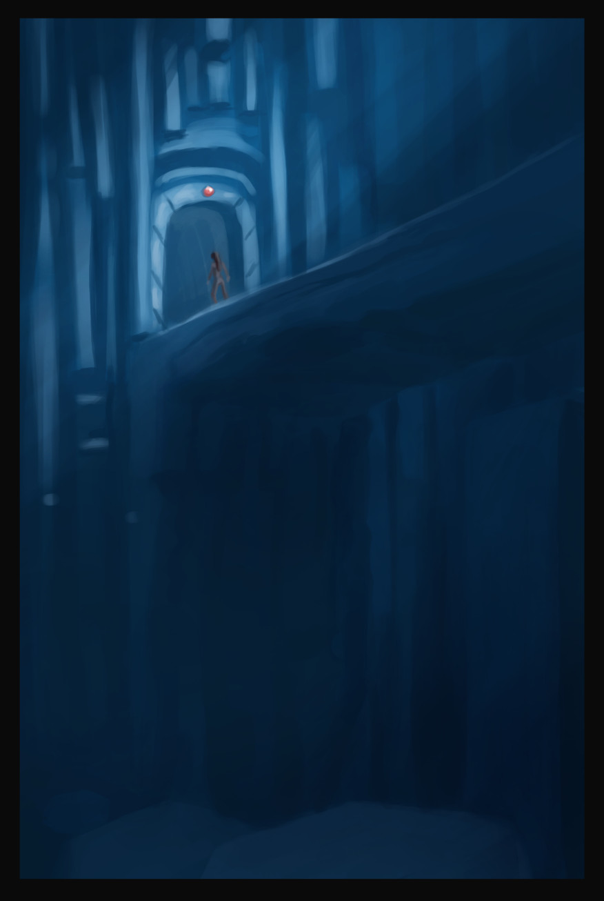
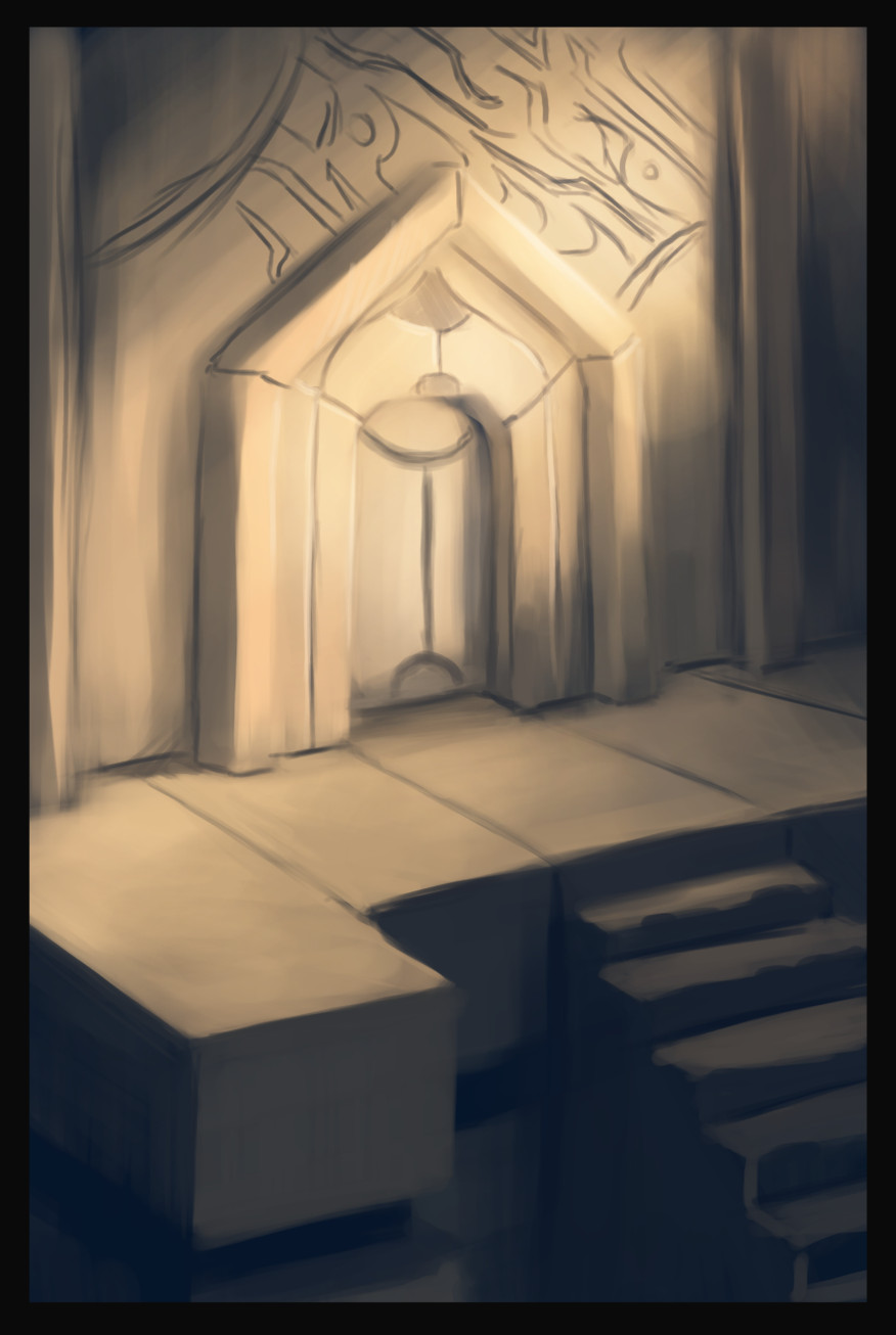
    I really enjoy the nebula painting, above and to the left. I like the composition, plus it gets a unique idea across to the viewer. The other two paintings, I don’t know. It was fun to play with a monochromatic blue values. But the painting doesn’t really stick out.


    aftershock

    I have the feeling, when I am painting environments, that I don’t know quite where I am going with it. This isn’t a new feeling, but it tells me a few things.portal room

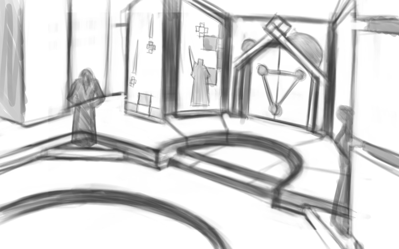
    I need lots of practice in this area. Been focusing too much on characters over the last while. This project is definitely going to stretch me though.

    It also tells me I need to do more research. Research always comes in handy when broadening your skills and imagination. Whether you are looking at other artist’s paintings, photographs, or going outside. Studying others examples can be the best way to learn. And also add a few things to that bag of tricks of yours.

    Next week’s sketch review will probably be more of the same. I am having a hard time eyeballing perspective, so, I think that I will focus on line drawing, to avoid being distracted by color and lighting.


    I wish I had the mind to record all of these paintings, but here are a few of them, sped up, for your enjoyment.

  • Weekly Sketch Review | Thumbnails

    Weekly Sketch Review | Thumbnails

    One very important thing I learned this week is to do more thumbnails.  Again, this isn’t a new concept to me.  But I am not in that habit at all.  And that is a bad thing.

    sketch_composite_web

    I find as I do thumbnails, it allows me to work out things that I didn’t even realize were problems.  Obviously, this can save a painting and time in the long run.  I guess some of the best lessons are hard to learn.


    old thumbs_layout_2

    In the past I have done thumbnails quite a bit.  For the Templar nation project, I had to put together thumbnails for the director, so he had some idea of what the final product would be, and for composition.  We didn’t do a storyboard for that film, so this thumbnailing was essential to communicate ideas to others.


    old thumbs_layout_1

    Also, some personal projects in the past only got as far as thumbnails.  But it is fun to go through old thumbnails and be inspired to paint or draw something from them.

    So, seeing that doing thumbnails paid off in the past, i decided to take a current project and do some thumb nailing.

    Here are a few icon thumbnails I did for the soon to be released Josh the Whale app. When putting icons together for apps, there are a few things to ask yourself.  Is it simple,  does it still read well regardless of how big or small it is, does it stick out if you place it on a page of other icons?

    josh the whale_icon examples

    These are just a few things to keep an eye out for, and I am sure there are many other questions I could be asking myself.  But the exercise was fun and a bit eye opening.  I am planning on making thumbs a habit, since the next week will require allot of it.


    For next week’s sketch review I will be doing allot of environments.  Project Nebula is about to go into full swing.  Our writer is requesting more visual reference (concept art), based on our initial notes of the story.  A few days ago, I posted some character art HERE, and next week will be dedicated to this.

    Expect more thumbnails and some rough concept art next week, and maybe a few more character paintings.  Until then.

  • Project Nebula | Concept Art

    Project Nebula | Concept Art

    The discussions, and what not, continue with project Nebula.  This is the next app project coming out of Thor Media LLC.

    After doing a Google hangout this morning, I decided to spend the rest of the day doing some well rendered character designs.  This by no means is a representation of the final characters or look of the project, but just to get a few ideas out.  A launch platform of sorts.

    cooper_websarah_web

    We have a new person on board to help us with the writing and dialogue,  Sterling.  Good to have him aboard, and to help bare some of the weight for a project this big.   We are excited to have him on and we are excited for this project.  It is a bit lofty, but we believe that we are introducing somethings that haven’t been seen on the Android market yet, which will help gain attention, and hopefully bring in some income.

    Look forward to some more concept art, other details on project Nebula, and also a weekly sketch review this weekend.

  • Weekly Sketch Review | Faces & Strange clothing

    Weekly Sketch Review | Faces & Strange clothing

    Ahhhh.. A weekly sketch review. Takes me back to junior high.

    To help garner success in my endeavors to magnify my skills, I will do a little “reporting” every week with sketches. With a different subject to explore every week in my drawings or paintings, I will try to become more diverse in my skill set, build on foundational skills, track progression, and just sketch more.

    To kick it off. Here are some sketches, from the recent past, of face and other similar things.

    smirkrobot_bustwindreallybust_1

    I was duplicating some Disney style characters one day this week, and I thought to myself,”Will, you make too many unnecessary lines.  Too many strokes.”  (Yes, I did refer to myself in the third-person).  And after thinking this, I tried reducing the amount of lines and strokes I used in my sketching.  Sometimes really concentrating on where the line should go, and sometimes, drawing loosely for things like hair.  The concept that a only a few lines are all that is needed to get an idea across, is not new to me, but this little exercise brought that back to the forefront.

    It’s interesting to see myself struggling at it for a moment.  Sometimes I had to force myself to draw a single line instead of scratching one out.  Pencil scratches are a bad habit, and something that I will work on eliminating in the future.

    hat_2hat_1

    These two sketches were derived from random lines, and then rendered.   Hoods and heads on my mind.  Trying to keep those creative juices flowing.

    portrait_1

    This sketch is from my Lenovo Thinkpad Tablet, done in Sketchbook Pro.  Practicing African facial features. And I exaggerated the eyes and the lips for extra appeal.

    For some reason drawing in red feels better to me.  Less serious than a dark pencil, and it seems to encourage me to stay loose with my lines.  I started drawing with red and blue pencils when I took some animations classes in collage.  Stuck with me since.

    For next week’s sketch review.  I am going to focus on thumb nailing and placement, in relation to composition. And maybe I will play with some color theory as well.

    I hope to keep these sketch reviews consistent, and as it says in the title, I want to do a post about it every week.  So, stay tuned.