William Thorup

Illustrator, Motion Graphics Designer, Animator, and VFX Artist

Tag: the price of survival

  • Marketing Materials | 2017 – 2018 Graphic Design for Lance Conrad

    Marketing Materials | 2017 – 2018 Graphic Design for Lance Conrad

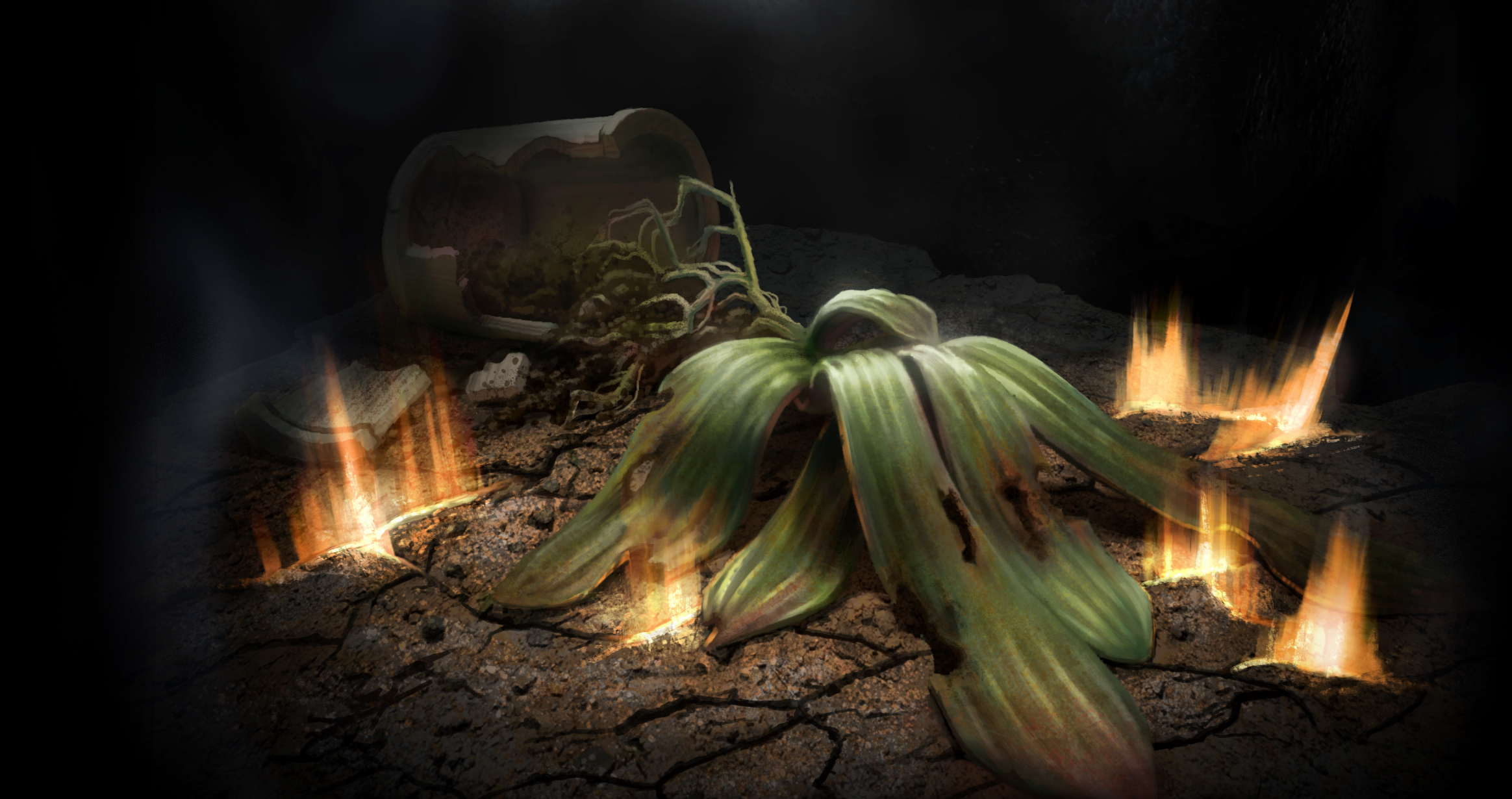
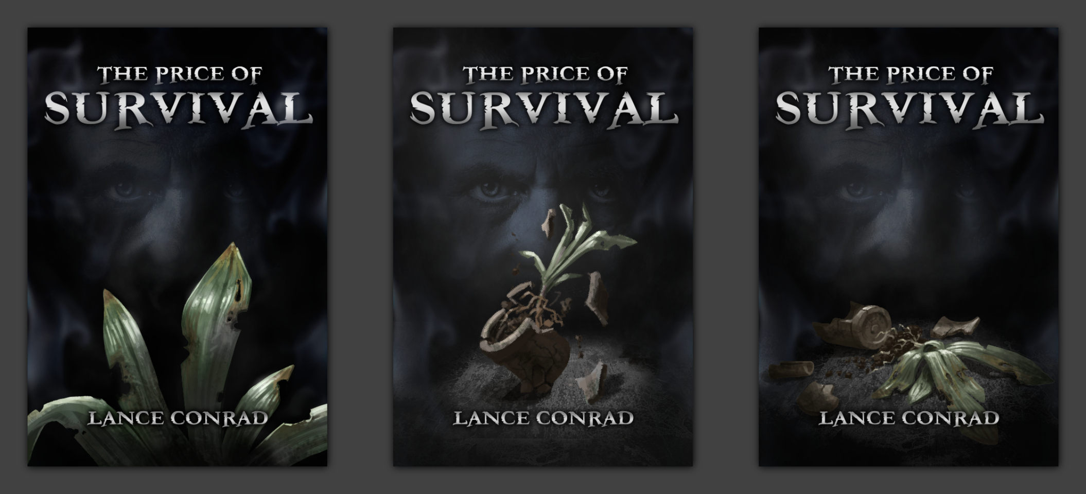
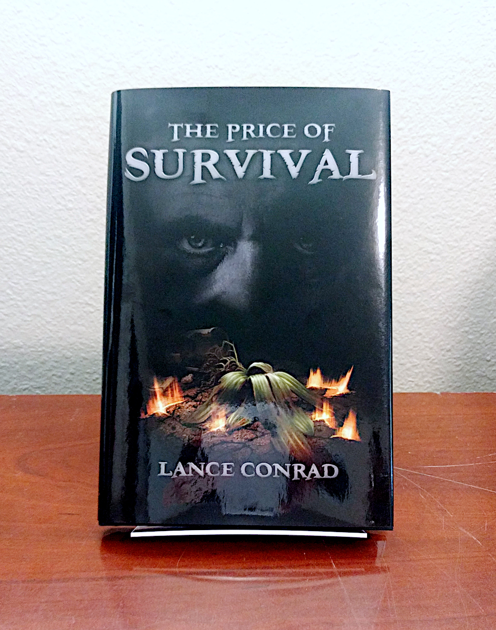
    Over the last half year or so I have been doing little odd marketing graphic design jobs for Lance Conrad. Below are short breakdowns of these jobs.

    The first of these projects was creating materials for Lance to use to inform his consumer base about his appearance at the 2017 Salt Lake City Comic-Con. Specifically a digital/real flyer to hand out as he did his presentations at schools and other events that he involves himself in. Along with digital campaigns on social media and email mailing lists.

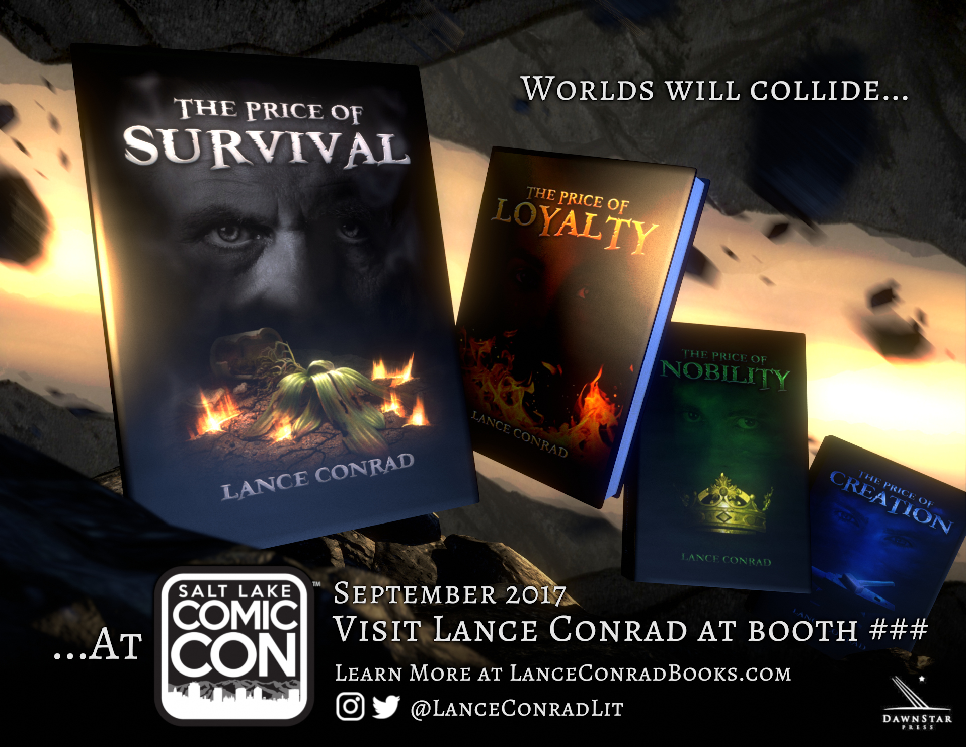
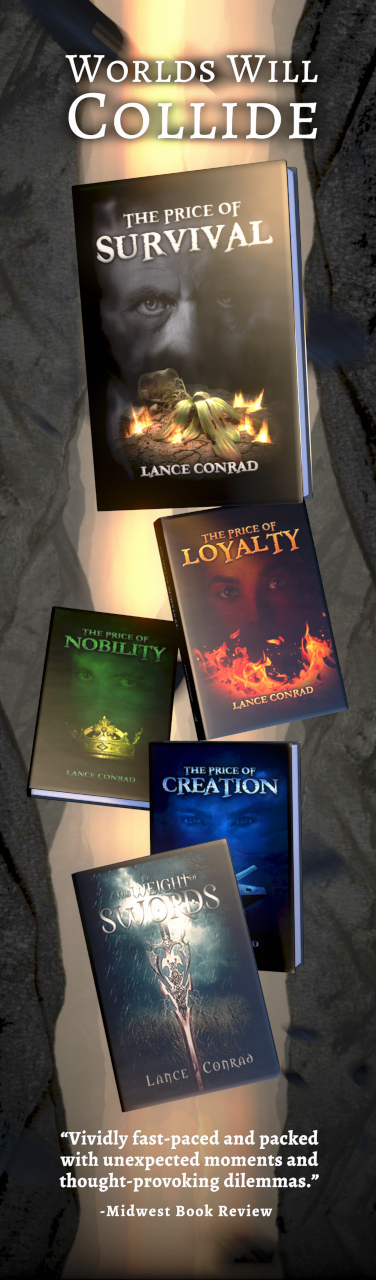
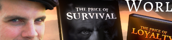
    When discussing the copy to be used on the flyer, we sought to distill the essence of his books, or find a through line that all the books could relate to, for a slogan or a basis that copy outside of information text could be derived from. What we eventually settled on was “Worlds Colliding”. This theme ended up informing not only the copy but also the visuals as well.

    I decided to take a literal approach, and changed the theme to “Worlds will collide..”. Making it more urgent and dangerous. Using a mixture of stock photos of some mountains and some 3D rocks, I modeled the books and did the whole design, layout and final composite in Blender. No 2D application was involved here. Making literally two worlds colliding in the background, the viewer is stuck in the last moments of twilight. The last moment of what one knew of existence, just before the sky falls and the light is snuffed out.

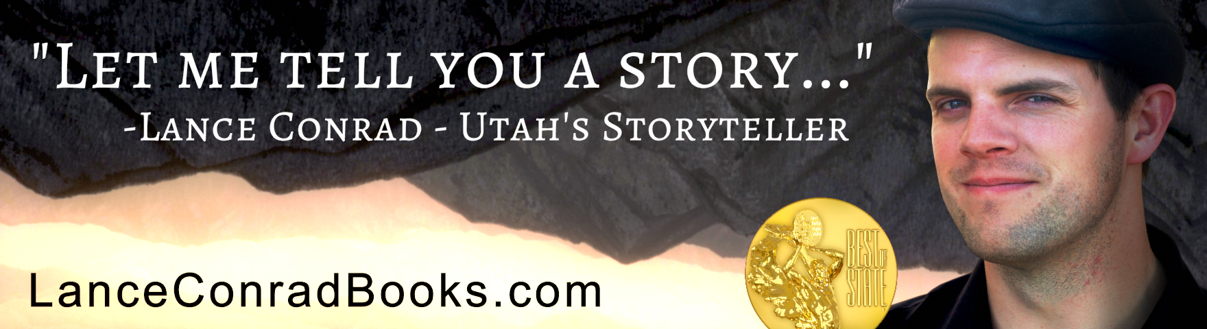
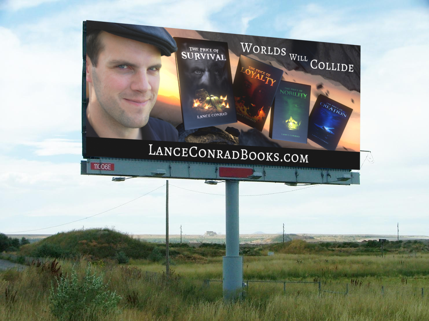
    Later on, we took this same visual motif and applied it to some digital signage for use in Utah. Specifically roadside billboards. The only change/addition was Lance’s face, which crowded things a bit for the book advertisement, but was good fill for the Best of State advertisement. Unfortunately, we couldn’t predict exactly when these advertisement would show up on actual billboards, but I did put together a mock-up inside of a preexisting photo of a random billboard below. This was to help pre-visualize the ads before they were sent to whoever controls the ad space for billboards.

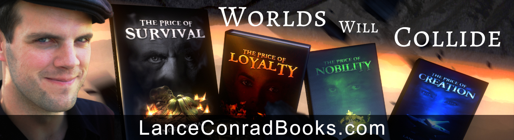
    The last piece of marketing materials based off of this “Worlds Colliding” theme was a bookmark. Lance uses these as free giveaways at his at school presentations and conventions. This is something he has done before, so communicating what he wanted here was simple, and with some small adjustments to previous project files I was able to export these as finals directly out of Blender as well.

  • Book Cover Illustration| The Price of Survival

    Book Cover Illustration| The Price of Survival

    Lance Conrad is a talented, popular and highly motivated author that I have come know and consider a friend through my work at Thor Media. He has written several books that fit neatly into young adult fiction, and he recently commissioned me to work on the fourth book in his “The Price of…” series.

    Be sure to take the time to look at his other books for comparison, and consider adding his work to your library or to the library of someone you know who might be interested in his work.

    Final Book Cover
    Title Text Was Rendered Out Of Blender
    Plant Illustration & Final Image Composite Was Done In Krita

    The Prompt

    This project could be considered a rescue in that he had already commissioned another artist to work on the cover. I don’t want to go into detail on this initial cover and instead just say that it didn’t meet the quality of the covers for previous books Lance had published. The quality of the initial artist made it unacceptable for me and some of Lance’s other friends in the close circle that were reviewing his book. We didn’t want the quality of his writing to be held back by a poor book cover. I am glad we caught this before the book was sent off to the printers.

    The approach to the finished cover was relatively simple since another artist had already laid out what Lance didn’t want the book cover to look like. Along with the common visual composition used for all the books in the series, a face/pair of eyes along with a key item/element used in the story, getting started was easy enough. The basic prompt was to have an older man, who visually looked like they had seen allot, for the background, on black, with a potted plant that had been damaged by war/explosions.

    Small Thumbnail Paintings Of Possible Covers
    Final Product

    Production

    Again, it was fairly easy to narrow down exactly what would work for Lance with just a few new thumbnails of possible covers. Then, after he picked which one he liked most, I took the chosen thumbnail and put several hours of rendering for the final image. Afterwards I followed the layout for his previous books to keep this book consistent with the rest of the books in the series, and then prepped the final file to the printers specifications.

    Wrap Up

    Both Lance and I were happy with the final result. This cover matches well with previous books in the series, considering the really quick turn around time of a about a week, it is attractive and mysterious enough to get people to pick it up and take a gander.

    This is my first book cover illustration outside of my own publications, and the opportunity to collaborate with a talented author to create the outfit that his writing will be dressed in to make a good first impression is an important task for both the writer and artist. I feel that this project helped stress the importance of a healthy collaborative relationship between artists in order to avoid creating content that would be potential embarrassing if not harmful to any of the artists involved.