The motion graphics work for Thor Media continues. This time, a complete 3D piece (done in Blender) with some minor character design and animation, with allot of motion graphics design. Join me on the “silicon slopes” and lets talk about the thorough process this piece went through.
Before I get deep into this one, I must credit Brek Bulton with the initial concept of the video, and for bringing the job to Thor Media. He wanted to show a skier progressing through a day trip on the slopes. This was to be the backdrop of the for the heavy legal verbiage used for the voice of the video, while highlighting the contemporary nature of the client’s service with the idea of the “silicon slopes”.
With the scripting we were fortunate that Brek was handling that as well. After a few meetings hashing out the details, and pulling back to fit in the client’s budget, we got a near final script. I say near because the script was technically not locked down until the near finish of the project.
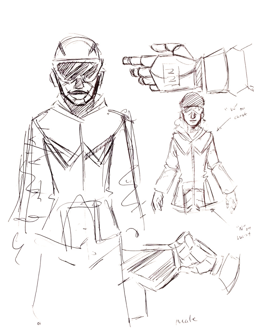
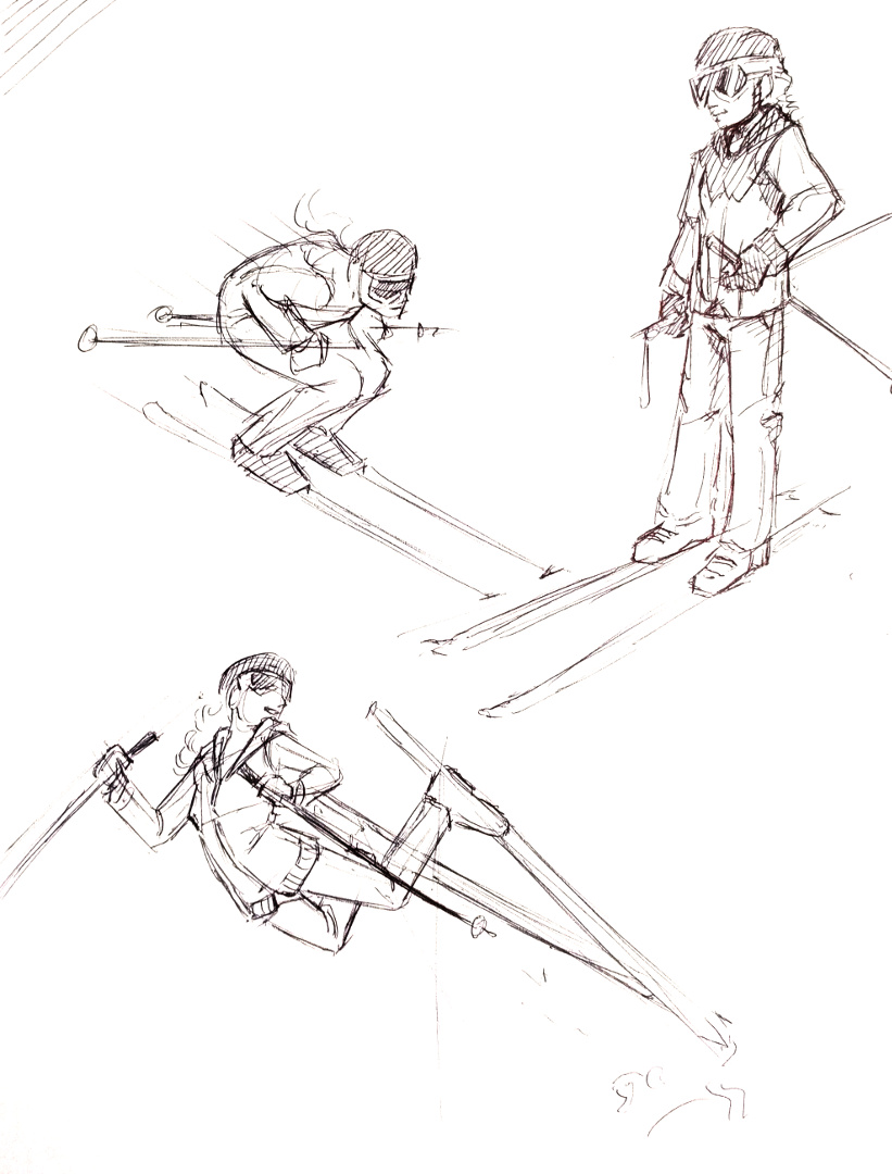
After the a final version of the script was in place, we had to make a bit of extra effort to convince the client of the concept, and present a visual motif that they would be happy with. This is where motif and character design came in. Because of the budget, I had to come up with a simple but attractive character design to minimize animation work. Inspired by allot of current motion graphics character animation (see Kurzgesagt), South Park, and Google’s paper design, I found a solution. I decided to stick to a 2.5 dimension paper cutout feel, which created a great sense of depth and interest in the image, while minimizing animation work (primarily 2 axis to animate instead of 3).
With a start on the visual design, I put together two shots to show how the video could look along with a temporary voice over. A long story short, the visual concept was accepted, and now it was time to approach the rest of the video.
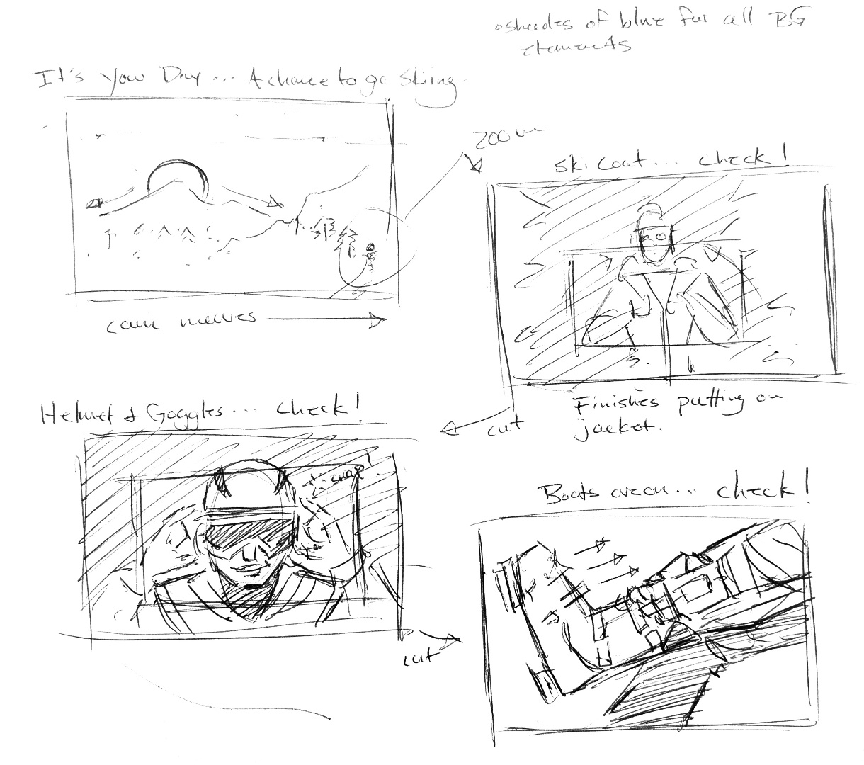
At this point, problems began to crop up when it came to finalizing the script. So, in an effort to keep the good momentum on the project, while accommodating an indecisive client, I decided that an animated storyboard would be needed to check the changing script against planned visuals to help the client to make final decisions in the script. This decision turned out to save everyone allot of time and allowed for flexibility in the visuals, almost right up to the end of production.
After some minor back and forth on some of the text and visuals in the video, and putting together a small vanity logo for the client to use in another video content, the final video was finished. Even though the project went a bit longer than expected, the final product came out well, and the client was very happy with the final result.
Finally! A project that got me into Krita’s new 2D animation tool set. What an incredibly valuable tool have in the bag. Lets talk about growing trees made of chalk.
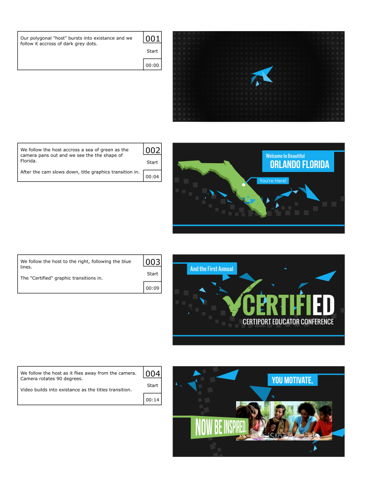
This is the 3rd year I have done the Certified Conference introduction video, and it is always a joy to work on them. First, credit where credit is due. Neil Bryce is the man who got us this work. He has been a could colleague and friend over the last few years, and through him, Thor Media and myself have had the opportunity to work on a bunch of great projects.
With these conference videos we have taken the “hand drawn” approach for certain elements before. What makes the approach different in this on is that this is the first time where we didn’t use masks or other automated methods to simulate hand drawn effects. With Krita’s new 2D animation tools, I was able to approach the animating of elements that would naturally be hand drawn from a more traditional approach.
I have always had a keen interest in traditional 2D animation, I even took a class in college to help satisfy my interest in the subject. Since that class, I have had a few opportunities pop their heads above the water a few times, but the opportunity to develop those 2D animation skills further have always seemed to allude me. Usually due to budget constraints. 2D animation is a very time consuming thing, and to invest in someone like me who doesn’t have allot of experience, or, the project skill-wise is a bit out of my skill set, it has been a hard thing for me to approach on a serious project. Till now…
Because of the simple concept (Neil Bryce’s concept) I felt that this could be the project to dust some of those old skills off, and give them a go. I am glad I decided to take the risk. Everything, except the obviously 3D elements (rendered and composited in Blender), were hand drawn 2D animated elements. This includes all the text transitions, leaf transitions, along with the introduction of the seed being blown in by the wind with the growing tree.
I am really proud of this piece, and the client really loved the way it turned out, and came back with only some minor revisions to the animation and colors. Nailed it! I also discovered that animating text this way, as opposed to using a mask, feels much more natural, and ends up taking about the same amount of time as other masking methods. The only issue is, is if the text needs to change. In this case, you have to start from frame 1 with the traditionally animated method. I just have to make sure the project script is locked down before working on these elements in the future.
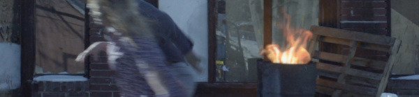
A small job, but a fun one nonetheless. Another video production studio here in the valley, called Mighty Clever, needed some help for a commercial they were doing for America First Credit Union (AFCU). I believe they have been doing commercials for AFCU for the last couple years at least, and they have this fun zombie theme going on. They just needed help for one shot, here it is below.
You may not even notice what was done on the shot, and if so, that means I did my job right?
There are two things done for this shot. The first is the large sign above the store entrance. In the original shot, the sign didn’t have anything on it. This required a planar track with a simple composite. The last element added to the shot is the fire in the barrel. This was a fire simulation was done in Blender, and then composited into the shot, along with the sign, in Blender. The light emitting from the fire required some reconstruction of the set, and this was composited onto the original shot to make the additions a bit more convincing.
Since we finished this shot, we have had the opportunity to help out with a few more internal AFCU videos that required more planar tracking, but this video covers the way I approached those videos, and it would be a bit unnecessary to show them here.
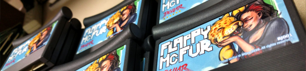
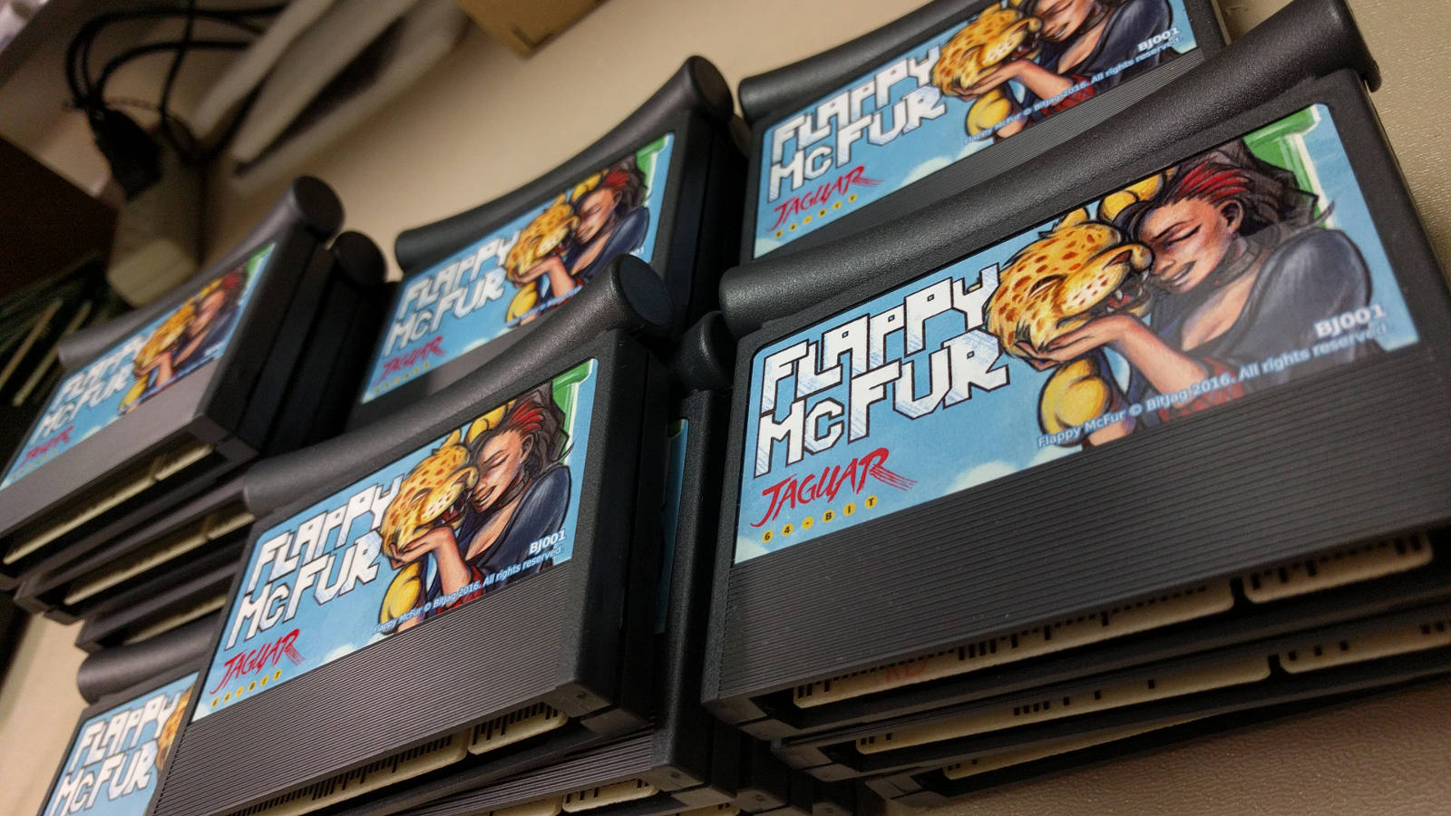
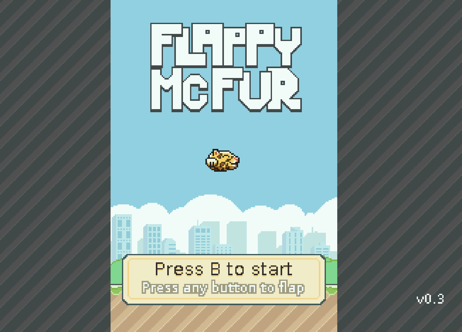
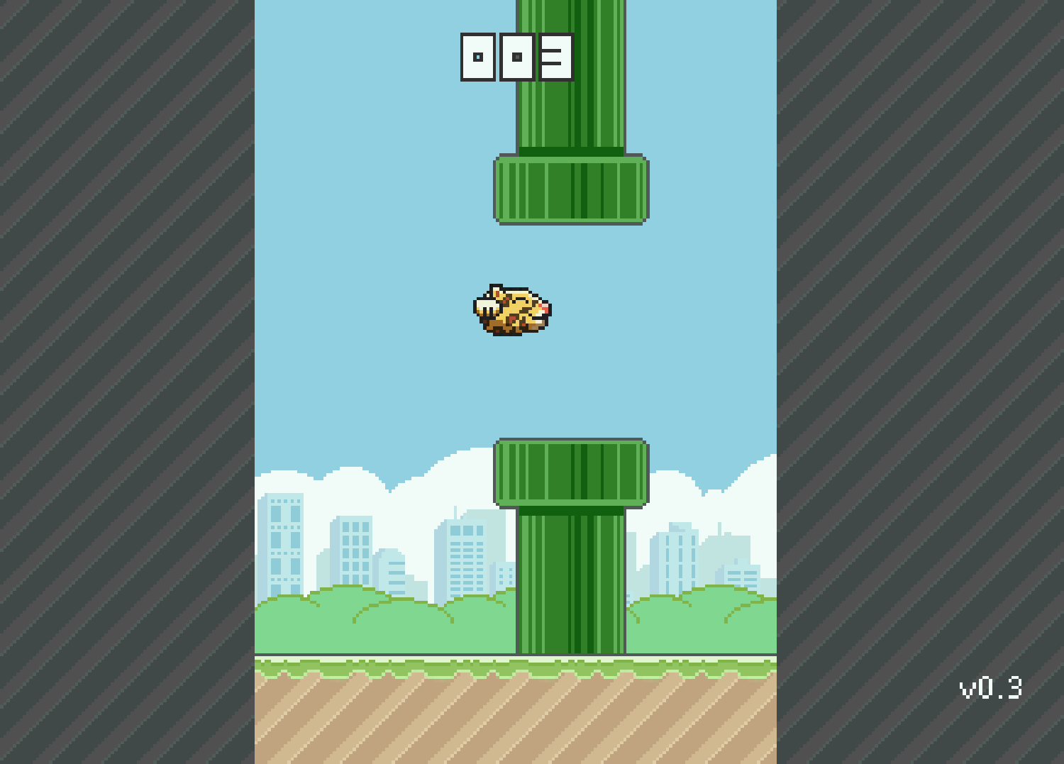
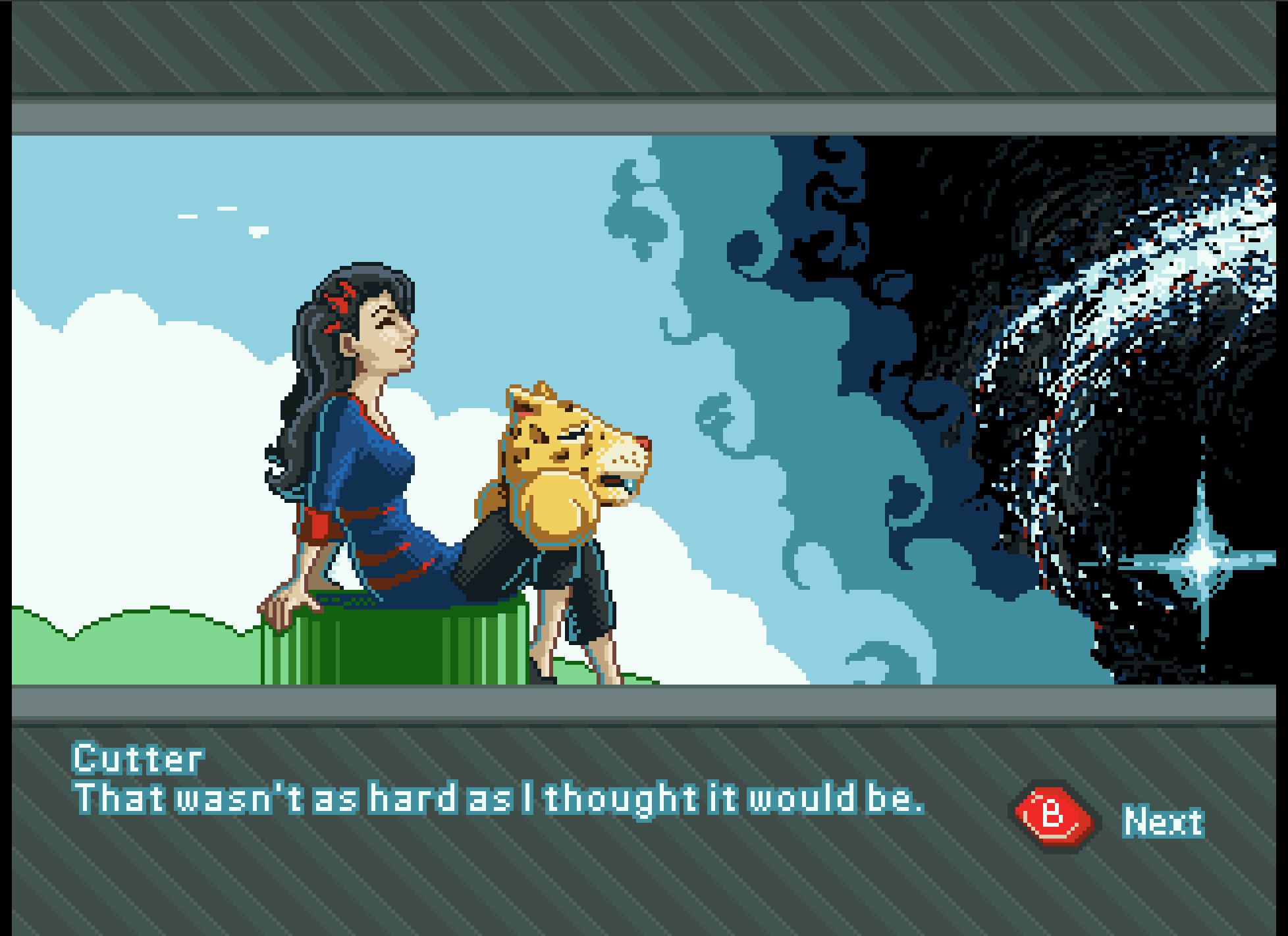
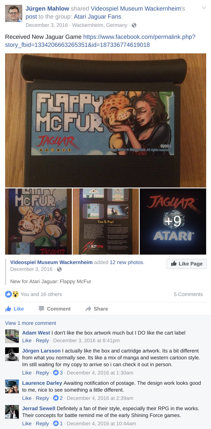
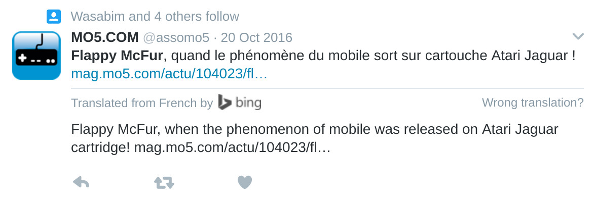
Three years of learning. Three years of programming. Three years of drawing. And it all should have taken three weeks. Flappy McFur is finally in the hands of the masses, or at least the 80 or so individuals that were actually interested.
The beginning
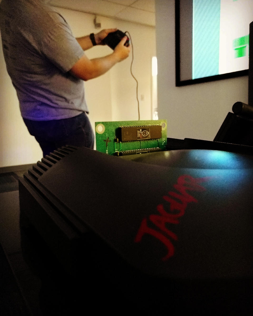
Atari Jaguar programming has been something that my brother and I have been interested for years, and ever since returning from my church mission from Taiwan, I have made it a primary goal.
With the formation, branding, and online presence establishment, all that was left was for me to learn a bit of programming, and start making games. To help facilitate the programming learning curve, we took on a request from Paul Westphal to put together a demo specifically for his booth at the Portland Retro Gaming Convention.
Programming at this time wasn’t completely foreign to me, but C programming was. So this little demo was a great opportunity to start my C coding adventure, and it led well into Flappy McFur.
Development
Version 0.3 was the first fruit of my efforts, and the fruits were bearable. The gameplay was there, but it was far from enjoyable. McFur moved around more like a horizontally locked fly than a disembodied Jaguar head falling in style. But, the core gameplay was there, and this little demo was well received by those out there who look out for anything new for the Jag.
After the demo though, there was polish. I planned out menu systems, with a simple achievement system. Worked out four different play modes that changed the speed of the game and how the pipes behaved. With Bryce’s help, a simple text engine was implemented to facilitate menus, and he also implemented the save code system. All of this along with an end game made Flappy McFur a much more noticeable product and a more enjoyable experience overall, with a bit of depth to the gameplay.
Development also included some play testing. Usually I would setup our Jag-In-A-Box at family parties, Draw Nights with friends, or just let all the nieces and nephews have a go at it. It was interesting to see how some people caught into the gameplay really well, while others found it impossible. It made balancing the difficulty a bit of a challenge, this is one reason why the additional play modes were added. To try and accommodate a wide spectrum if players.
Even though the game overall is fairly simple, there was a massive learning curve for me to overcome. Overcoming that learning curve has had its payoff though, and I feel much more prepared to takle our next project.
Art
Sprites and Palettes
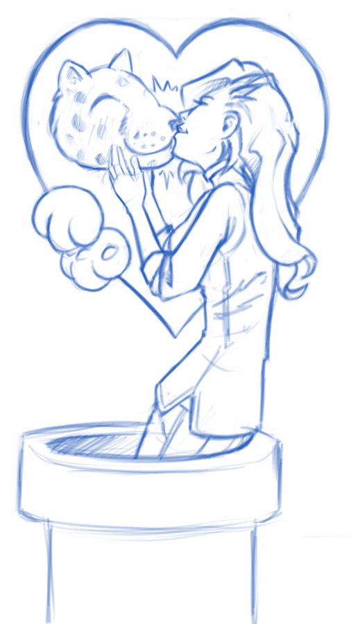
Though few, painting sprites for this game was a highlight if the whole experience. Working with reduced color palettes and putting together simple animations like rotations of objects and the achievements, to more complicated animations like Cutter’s run cycle, all were a joy and remind me how much I love animation in general.
We used the Gimp primarily for sprite work. I have been using the Gimp for nearly two decades now, and it is great support for paletted graphics with a more than adequate tool set. I did use Krita for Cutter’s run cycle animation because they had recently implemented a basic 2D animation tool set in Krita, but with the lack of palettes graphics support, I still needed ti pump those graphics through Gimp to prep them for Jag. Krita is supposed to have palettes graphics support in the near future, and I am looking forward to using Krita exclusively in my pipeline.
With all that in mind, when I actually started putting together Flappy McFur, I was a bit lazy in figuring out how to do 8-bit paletted graphics. So, for a long time, I was dealing with performance issues, especially when music was implemented. It wasn’t until late in development that most of the graphics were converted to 8-bit paletted sprites for 16-bit sprites. This was a good switch though as it allowed us to do fade transitions easily.
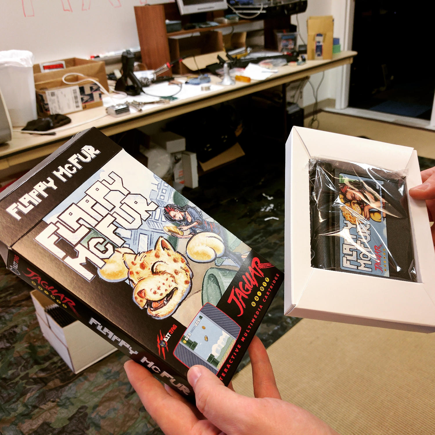
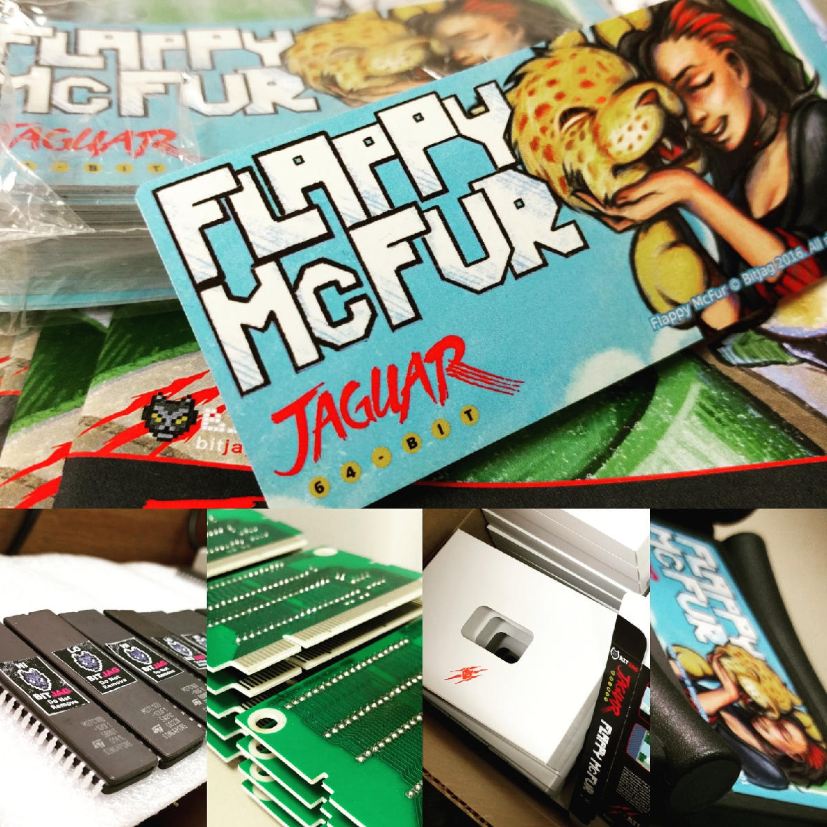
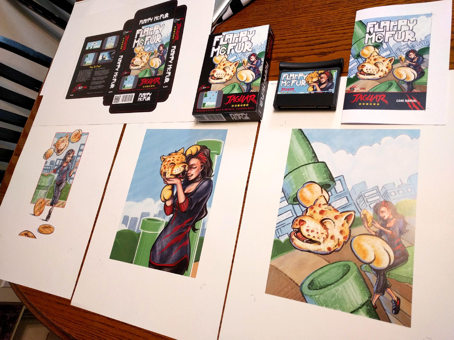
Box and Manual Art
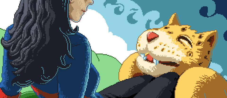
I initially wanted to do more artwork for the game, but the 3 primary illustrations ended up working really well for our needs.
The first illustration was used to establish the character relationship and heavily influenced the game in both tone and narrative. The colored pencil and crayon look of the artwork was intentional as well. It gave it an elementary, non serious feeling throughout, inviting everyone to come and pick up the controller and play.
Video Content
I tried to keep any video advertisement minimal since the beginning. Primarily because if how time consume it is, but also because of the uncertainty of actually releasing the game.
When we decided to actually finish up the game and release, effort was spent to get a good video for advertising the game, and a good gameplay video. At the end of the day, I am not too sure how much these videos helped at the end if the day, but they were nice to have, and will be good to have for history’s sake.
The release and marketing
Newsletter
In and effort to reward our mailing list subscribers, we made sure that everyone that had signed up knew about the game first, we also provided a small discount for them as well. The discount was taken advantage of by a handful of our subscribers, and is something that we will definitely do in the future.
Press Release
It was fun to actually learn how to put a press release together for news websites. I distributed to a handful of people, with little response. Again, this was good to get familiar with, and it serves a good historical purpose. You can read the press release here.
Before people actually had the game in their hands, many of the comments were about the pixel art, and general support for the release. Responses to gameplay have been… mixed, maybe. Its hard to tell if people don’t want to say anything bad about it, or they are just a bit frustrated about its’ difficulty. Either way, below are a few reactions for the AtariAge forum thread.
My wife and I enjoyed spending the evening playing Flappy McFur a couple nights ago. It’s certainly addictive. I found myself getting the controller back less and less. My wife and I probably haven’t played Jaguar together in 10+ years. She buys me Jaguar games as gifts and watches me open them. Maybe she’ll watch me play a bit. It was nice to actually play together. Thanks for the effort you put in to it!
Through a few chance connections and some fun back and forth, I have a little bit of projection mapping VFX under my belt now. Th University of Utah’s athletic department a few years back invested in a floor projection solution for the Huntsman center, and they like to use it as much as they can. With the 2016 basketball season, I was able to add some of my work to the roster.
A little bit of credit needs to go around though. First my brother Jacob, for the awesome networking he does for Thor Media. Without him, we wouldn’t even have these opportunities to work on these high visibility projects. Next, Kory Mortensen. He is one of the excellent video guys on staff at the U, and through him we were able to get this job. Thanks Kory!
I don’t have allot to say about the project except that we were given quite a bit of freedom on the creative. This was in part due to the previous content that another company was producing for the court was now becoming a bit too repetitive fore the marketing direction. Another part was this turned out to be kind of a tryout for future work with the U.
After some great collaboration with the U’s marketing director we knocked this one out of the park. I am looking forward to working on more content for U, and it always feels great to get this amount of exposure for Thor Media and myself.
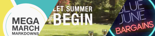
Over the last few months Overstock.com has given me the opportunity to work on a few 15 second broadcast motion graphic spots/commercials for Overstock.com. These covered three separate sales that aired on national television between March and July of 2015.
I first want to thank the branding team at Overstock.com for their help in putting this together with me. They usually have me come into their office to work, in order to speed things up. These spots are as good as they are because of their input and critique. Thanks guys!
Mega March Markdown | 15sec broadcast commercial – Based heavily on the in-house design teams playbook, with addtional consulting from Trevor Rimmasch. Thanks Trev!
Most of the work done on these was in After Effects, due to time constraints (all of these were put together withing 2-3 days!). I would have rather had done these in Blender, as I would have had more options available to me. Overall the experience was good working on these commercials, and the highlight was to see some of the designers faces light up when they first say their work animated in a final commercial.
Generic Summer Sale Spot | 15sec broadcast commercial – Again, based on an in-house Play Book. The title card is one of the first photo maps I have done. Cutting out pieces of a photo and placing them within 3D space to give the illusion of parallax and depth.
Something that made these so different from previous work I have done, is the inclusion of a “Play Book” or “Style Guide” put together by their in-house designers and artists, for their web departments. These guides are awesome in that they reduce the amount of questions needed to be answered when approaching the commercial, and debate is brought to a minimum as well. If there is a question about what something should look like, color to use, typeface, etc… no guess work, just look at the Play Book. A huge help when working as a team on something.
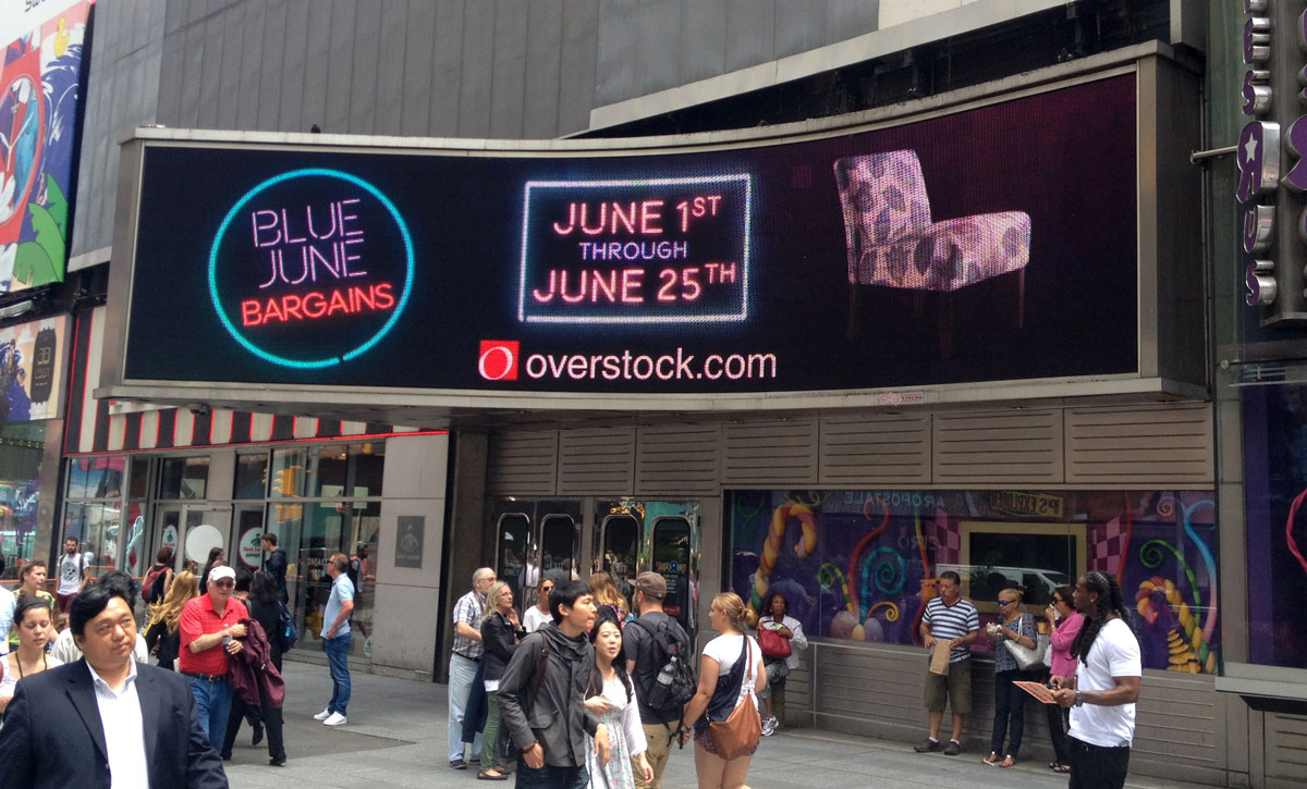
Once in a Blue June Sale | 15sec broadcast commercial – There wasn’t much of a Play Book for this one, but it was still based on the designs of an in-house designer, with additional input by Aaron Syrett and Trevor Rimmasch.
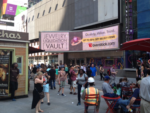
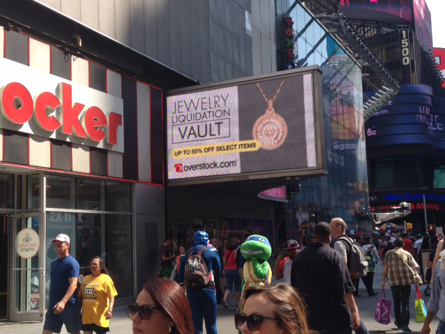
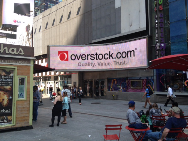
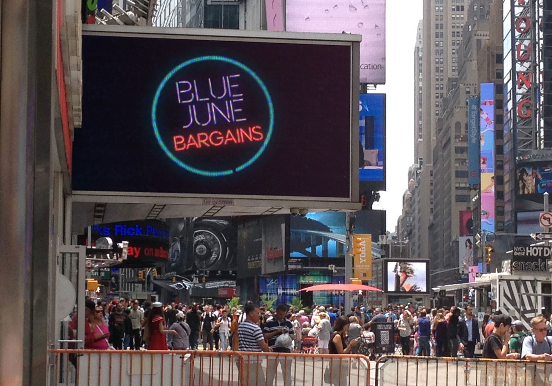
And to top it all off, I also had to edit down the Once in a Blue June spot, and an additional Jewelry Sale Spot, for the Geoffrey Tron at Time’s Square in New York City. It is an awesome feeling knowing that some of my work is getting exposure in Time’s Square.
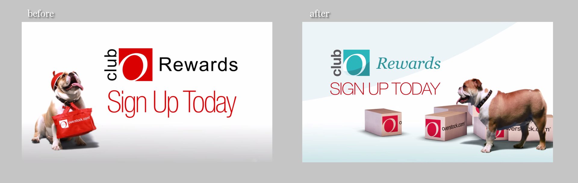
Club O, the membership/rewards program portion of Overstock.com, did a rebrand. Different colors and designs, and they asked if we would take the old version of their Club O introduction video and revise it to fit the new branding.
At first glance, this seemed like something fairly easy to pull off, but once we began discussing more about what they wanted, what the new script entailed, and additional shots of the dog were needed, turned out to be allot more work than expected.
It was interesting to revisit green screen keys we did over two years ago. There were quite a few things I didn’t quite understand about keying, and it is amazing that we were able to get the key as good as we did back then. Time was spent cleaning up these old keys, and also keying additional shots of the dog. This was made more difficult since they didn’t want to have any shots of the dog with the red cap. Shots without the red cap were limited, as at the time it seemed like the cap was the way to go. So, there just wasn’t a whole lot of the capless dog to chose from.
Most of the video was composited in After Effects. The 3D percentages were originally done in After Effects, but because of file path issues with Elements 3D working between a Windows and Mac machine, I ended up doing the percentages in Blender. Another portion done in Blender were the shipping boxes. This was a last minute addition suggested by Trevor Rimmasch. The boxes help fill and anchor some of the shots, as well as create a consistent visual thread throughout the video.
Some of the issues when approaching an older project and “re branding” it that the foundation of the original is based off of key components. Such as music, colors, and script. The original expectation when I was asked to do this was that there was going to be some timing adjustments, along with some color changes. As we dug into it though, because some of the key components changed, it was almost more economical to start from scratch. The end product could have been rethought and something better could have been produced, and it felt like some of the elements were just bandages to keep the video together (the shipping boxes).
As it stands, it is a good video, and certainly nothing that I am ashamed of. But the lesson learned was when you change key components of a production, like color, music, and script, exception to make major changes throughout.
Neil Bryce of Bryce Media has been keeping me busy the past while with jobs here and there. Bryce is an awesome person to work with, and is always concerned with getting things right, if you are in the Salt Lake City area, I highly suggest getting in touch with him, definitely someone you want to know if you are involved with video in the Salt Lake area.
This vanity logo for Bolt Construction had a really quick turn around (about a day) and the creative is simple but effective. This video features a stone wall background with wood shingles in the upper third, but a few more versions were rendered out without the background, with a blue background, and one without movement.
The background assets used were from a website that hosts public domain photography, vectors, and other graphics, called Pixabay. Definitely a site you want to add to your bookmarks in case you need some quick assets on a budget. There is no guarantee that all the content is public domain, as there are no actor/actress release forms. But images without people should be fairly safe.
For those who are interested, here is a screen capture of the my Blender compositor. A fairly easy setup. Background, logo, a couple of particle effects, and lighting.
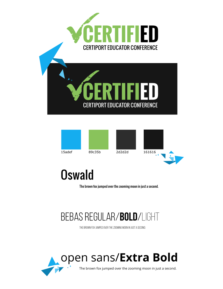
With only about a week and half, Neil Bryce asked me to get a creative together based solely based on a website and a few suggestions on what it should feel like. Not much to go on. With this in mind, and with that much freedom, I decided to put a bit more effort in this one by prepping a storyboard. Allowing the client to get a clear picture of what I had in mind, in order to make the most out of the coming week. (If you have 4k, be sure to change the YouTube settings.)
Very simple creative based primarily off the website for the conference. The first day I put a simple style guide together along with a storyboard for the video. The storyboard was quickly accepted by the client, and I was able to move into picking out music that I could mock something up to.
The music was the first and only bump in the road during the week long production. They had chosen one song, and I had begun to mock something up, and about 3 days into production, we all decided that the song needed to change. This forced us to have to re-time things, and make some other small adjustments to movement. Other than that though, the video flew together, and result that everyone was happy with was born. I am not sure if the 4k version was actually used at the conference, but it is still pretty awesome to see it playing on a 4k monitor.
Putting together a storyboard was the best part of the project. Because the creative was wide open for whatever, I had allot of freedom in what the final result would look like. It is an awesome feeling when people just trust you as an artist to make something cool.
The storyboards and style guide below were assembled in Inkscape for the sake of speed and clarity.
I used Blender to put the entire video together, and final encoding with FFMpeg. Because of the simplicity of the content, editing in 4k and rendering out previews was smooth. Compositing was simple, with everything essentially on one layer. But there was a final glow added to the music drop on the end, this was done in the Blender Video Sequence Editor before the final render.
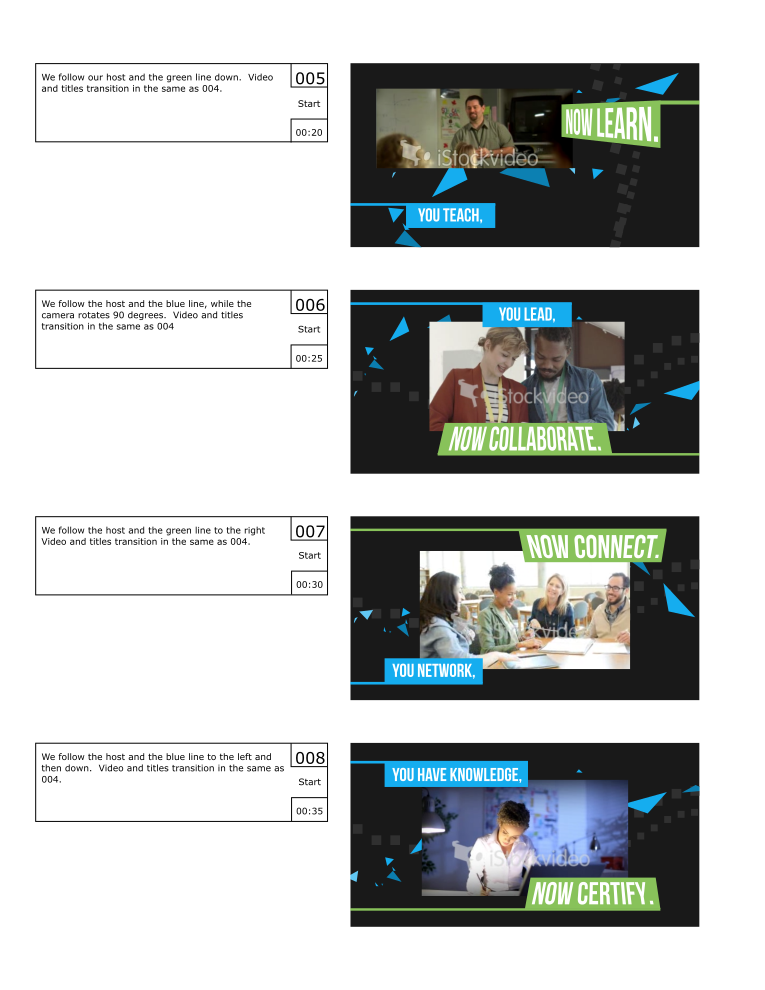
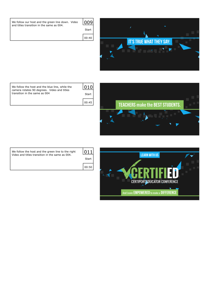
The blue polygon, or what I like to call the “host”, was a simple particle system, with a blend texture applied to the particle size to make the particles come in and out of existence smoothly. The host was added to help create a consistency to the video, or a thread that binds it all together, but to also add energy and urgency to the video with the seemingly erratic movement and the natural corners of the polygon.
Here is another piece for your eyes, a treat. You may be thinking to yourself that this isn’t the kind of work I usually do. You would be right in thinking that, this is definitely off the beaten path for me, and here is why.
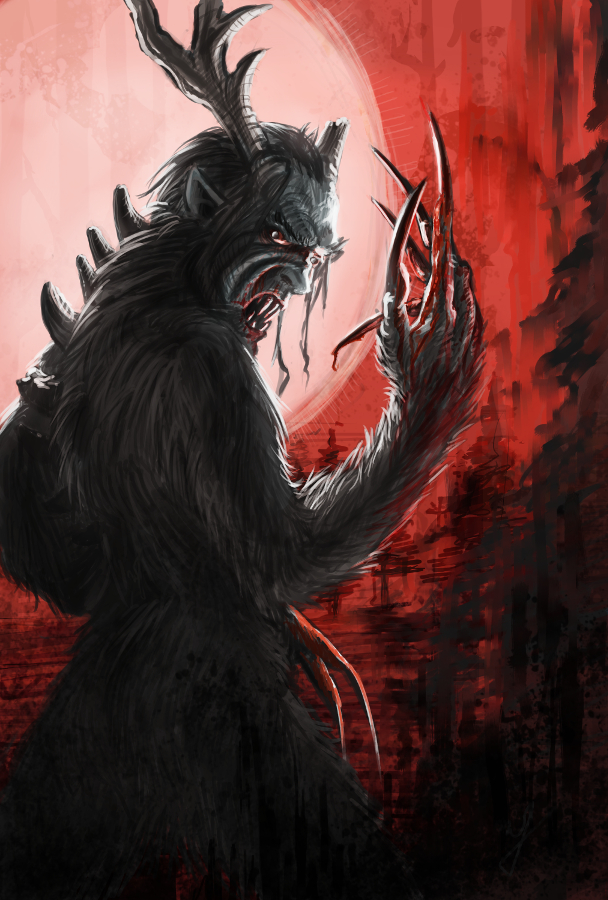
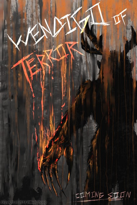
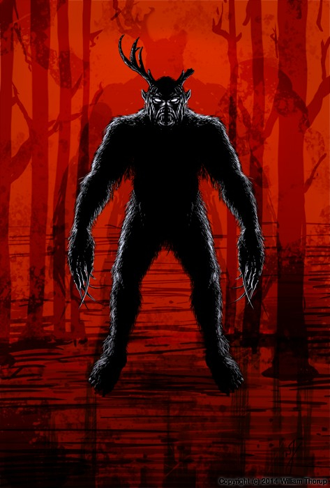
We have been in some minor communication with someone who works at Arrowstorm Entertainment. A movie studio here in Northern Utah that focuses on fantasy and science fiction films. This person asked if I could put together a concept piece for a possible B horror film monster. A Wendigo creature that originates from the Great Lakes area of the United States, and is usually centered around myths that deal with the, pseudo, adverse effects of cannibalism. The content isn’t my favorite, but the job paid good, and it gave me a change to stretch out of my usual bubble.
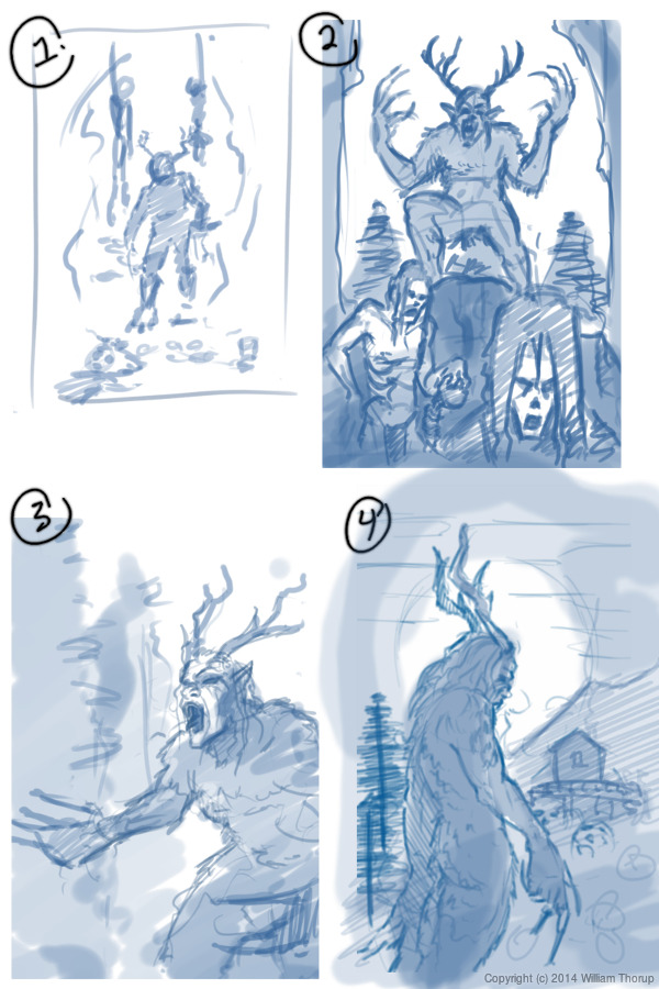
I did quite a few thumbnails for this piece (20+) and actually did three complete paintings, before we found what the client liked most. The process was very enlightening, and had allot of momentum. Really, the momentum is what made this painting fun. The client was in constant communication with me, and gave feedback when I needed it.
Overall, I spent too much time on the painting though. I was trying to keep my total work hours under 6, but ended up going over 9. This was for a few reasons. First, and foremost, when I was first presented the job, I should have asked a bit more about the production and where it was currently at. This leads to the second problem. The project had hardly been refined, and the story, background, and other details about the creature, where watery. This is why so much time was put into thumbs and other paintings.
I should have stepped back, asked the client to refine their ideas a bit more, and then approach the painting after a bit more forethought was applied.
I am happy with the end result, and the client was as well. I hope to have a bit more work with them in the future, and hopefully work on some of their movie posters and other concept work.