William Thorup

Illustrator, Motion Graphics Designer, Animator, and VFX Artist

Tag: thorup

  • For Liberty | Illustration and Time Lapse

    For Liberty | Illustration and Time Lapse

    A small gift to the men and women who serve for the cause of our liberties, rights, and freedoms. I also would like to thank all those around the world who fight for these causes, whether you fight for the United States or not. Every human being deserves these blessings in their lives, and today, we remember the price that must sometimes be paid for those blessings.

    for_liberty_web

    This painting took about 4 hours to complete. The entire painting was done in Krita.

    I focused on the color pallet for this painting. I wanted something a bit abstract, but not so abstract as to distract the viewer of the story being told. I wanted a sad and somber tone to the image, so, I stuck to cool colors. Primarily blue, greens, and grays. Red and white were my highlight colors. Then, I controlled my satruation in specific areas, in order to bring focus to the parts of the painting I wanted the viewer to see first. I feel overall the composition is good, maybe a bit crowded, but still attractive.

  • Atari Jaguar | Flappy Mcfur Pre-Release Box & CD Art

    Atari Jaguar | Flappy Mcfur Pre-Release Box & CD Art

    My brother and I have been working hard on the Atari Jaguar stuff, and new ideas, art, writting, and code, trickles into each and every project everyday. Flappy Mcfur is the first fruits of our efforts.


    flappy_mcfur_cd_lable_web

    Obviously a Flappy Bird clone for the Atari Jaguar, this program really was just a training ground for me in C programming. It was fun getting the basic assets together, and code the various aspects of game. From menus, to score keeping, and movement of Flappy McFur. Speaking of movement, it is very rudementary, and the next version will have movement more akin to Flappy Bird.

    flappy_mcfur_dvdcase_insert_front_web
    flappy_mcfur_dvdcase_insert_back_web

    The box art and CD art were both put together in Inkscape, with screenshots from the actual game. Currently we are not sure if we will actually be making and selling physical versions of the game, but I though it might be nice to give people who download it, the opportunity to put together something nice for it if they wish.

    The Pre-Release trailer was a blast to put together. I wanted something that would build up, and then let the viewer drop, realizing it isn’t anything too amazing. I really like the way the fly around with the console came out. I haven’t used lattices in 3D animation for a long time, and they poved really effective for bending the flowing text around the various contours of the Jaguar console and controller. The footage of gameplay was captured using the Virtual Jagauar emulator, and it plays almost exactly how it does on the actual Jaguar hardware. It’s such a simple game, why wouldn’t it? Also, this video, and the next one, were both completely done in Blender, with 2D assets in the Gimp.


    On another small note, Bryce noticed that out YouTube subscription counter, on the JagCorner channel, was almost to 64, and he came up with the idea for a little video to celebrate the 64th subscriber and the 64-bit glory of the Atari Jaguar. Check it out, and subscribe to our channel to keep up with other video content we will be producing in the future.


  • Comic Inking and Coloring

    Comic Inking and Coloring

    Ah… a blog post. It has been a while, and I should be doing this more. If you are a regular to my blog, I apologize. There is quite a bit of work that I have been doing lately that has been taking much of time. I guess that it is a matter of priorities, and I should make my posts of higher priority.


    About a month ago, I finished coloring work on a comic book project that was poorly executed by the director. By some miracle, the comic made it to Comic Con Fan Experience in Salt Lake City, but only sold a few copies.

    khloe_3_web

    Unfortunately, I am not too proud of the final work, mainly because of the story (or the lack thereof), and won’t be including it in my portfolio. That project did, however, push me a bit further into the realm of inking. Along with a Thor Media internal project, and the want to practice some simple inking and coloring, I have produced three separate portraits. Which I can say that I am proud of.

    sad man

    I used Krita to produce all three images, and it took about a few hours to produce the portraits. The latest version of Krita includes a nice set of tools specifically for inking, and it is a joy to use them.

    the smile_web

    Being involved in that comic book project was a bit of an eye opener for me though. I was able to get a really good idea of how much effort needs to go behind a single issue, which is really good for Thor Media. We have been able to price ourselves correctly, in case we run into others who wish us to help produce a comic book.

    More importantly, that project turned me on to the idea of turning some of my writing into comic book form. I was going through some of newer and older stories recently, and I may pick one or two, and convert them into comic books.

  • Iron Door Film | Concept Art

    Iron Door Film | Concept Art

    Through Thor Media, I was tasked with producing 3 pieces of concept art for our client, Adaptive Studios. The pieces were based on a semi-final script, with some direction from the director, and director of photography.

    traveling exhibit_web

    [column-group]
    [column]

    The first piece was strictly an environment piece, based on a possible traveling exhibit around the 1940’s. This pieces primary purpose was to show potential investors that some effort and thought was being put into the production, to show that there was talent to help create the world of the story. So I tried to focus on the details of the objects in the tent, rather than characters, to see if I could just tell a basic story with the objects in the scene. This piece could be used for actual set design during production, but most likely not.

    Thieves cross_concept_web

    [/column]
    [column]

    The next painting was done for an area in the script called “Thieves Cross”. And old ghost town in the story where the main characters end up in, searching for clues. The town was originally a settlement for criminals, so, it didn’t have much in the way of development, except for the old chapel. I wanted to make the chapel the center of the image, so I set up my composition to perform this task. I used a dutch angle to add a bit of uneasiness to the scene. Like the painting before, I started with a 3D base done in Blender, and then moved into Krita for the final paint over. I have to say, working in 3D to begin with helps immensely with perspective and laying out the basic composition. It easily shave 1 or 2 hours off of each painting.

    [/column]
    [/column-group]

    [column-group]
    [column span=”2″]

    Art and the Specter_web

    [/column]
    [column]

    The last painting was almost an illustration. Again, whether or not Art’s room will look anything like the painting in the final film is one thing, so, instead I focused on the mood and lighting of the moment given to me from the script. I feel that I got the composition right on in this painting. Every part of this painting just fell into place. For me, the color, lighting, composition, characters, mood. etc… just works! I love it!

    [/column]
    [/column-group]

    This was an awesome opportunity for me. I am grateful that I had the opportunity to work on some pre-production art work. I love to see written stories come to life visually, and to have some control over how that happens is incredibly gratifying. This work has spurred Thor Media to leverage mine and Michael Buhler’s skills in producing art. We are currently putting together service packages in the areas of Storyboards and Concept art. They got me working on the Thor Media website and a booklet that we can pass out to potential clients. This is something that I have wanted to do for a while, and I hope it turns out well.

  • Atari Jaguar | JagCorner Review | Iron Soldier

    Atari Jaguar | JagCorner Review | Iron Soldier

    Another JagCorner video to talk about. We have kind of been all over the place with the kind of YouTube videos we would like to do. We know we will continue to do the BitJag Development Journals, and we are pretty sure we are going to keep doing the JagVirgin episodes as well.


    I guess the reason why we are jumping all over the place is because we are trying to counteract all the negative coverage of the Atari Jaguar. Lets just say, this console doesn’t get the highest score on most gamer’s Hi-Score lists, but it’s unfortunate that there is so much negative for a system that has so much positive. I guess one of my personal goals with doing these JagCorner videos is to promote the great things about the system.

    Moving on, what I really wanted to talk about was the opening skit for this review video. I am taking these videos as an opportunity to build a portfolio and push my visual effects skills, and I was glad to see that this shows well in this video.

    iron_soldier_fx_shot_final_0653

    iron_soldier_fx_shot_final_0805

    Jacob and Bryce helped me come up with and execute the concept and it came together almost flawlessly. Everything was done in Blender. Modeling, Texturing, Rigging, Animation, Camera Tracking, Compositing, Editing, and Rendering of the entire video included. I love the Blender tool set, and it never seems to fail me.

    The hardest part about this video was the camera tracking. There were no purposely place tracking points in the shot, and the one section I had trouble with was when I stepped out of TV Specialists back door and then the camera swings to the left, revealing the Iron Soldier. I had to manually track 20 or so frames to get the camera swing, simply because all the information in the show was too blurred to track. Other than that, the track was fairly easy, with just a few minor slides and jitters in the final result, almost noticeable. At the end of the day, the entire production was 30 man hours. I wanted to spend more time, but we set a goal to have it released by Thanksgiving.

    iron_soldier_end_card_scale_example

    The end card is a bit special. To achieve a more nastalgic feel, I rendered it out at 320×180 (a 16:9 resolution) and then scaled it up to 1920×1080 with no filter. This maintains the jagged edges on the polygons making it still feel like a low resolution, up-scaled to a high resolution.

    Overall, the result was almost exactly how we imagined it, and I love it when that happens.

  • Atari Jaguar | 20 Years – Do the Math | Anniversary Video

    Atari Jaguar | 20 Years – Do the Math | Anniversary Video

    Isn’t it amazing? A console that was so commercially unsuccessful, is still very much alive and kicking today. This console did much worse than the Sega Saturn commercially, and for a console that is under the great Atari name, this is surprising, and was quite surprising back then as well.


    For those of you who aren’t familiar with the Atari Jaguar, click on the name to go to the wiki, or continue reading for a quick run-down of what this console generally is for many fans.

    Without going into much detail, lets just say that the Jaguar’s history is rough. It was released in November 1993, with much anticipation. At first it did well, but unfortunate set backs began to determine it’s future, early on in it’s life. There are many reasons for it’s commercial failure, but I really only one focus on one for now.

    The leading consoles of the time had something that the Jaguar couldn’t really get a handle on. A mascot, a title franchise, a symbol, to help sell the console. While Nintendo had Super Mario, and the Legend of Zelda, and Sega had Sonic the Hedgehog, Atari really didn’t have much in the way of recognizable characters or symbols or something that the player could relate to on a more personal level. Besides their logo and maybe Pacman, they didn’t have much. (Ironically there was never a Pacman game on the Jaguar.) The arcade generation was beginning to close around this time, and titles like Tempest, Centipede, Space Invaders, and Pacman didn’t appeal to a larger audience as a whole. Players wanted story, worlds, and most importantly, characters.

    Sure, Atari tried to create mascots with Bubsy and Trevor McFur, but these characters lacked appeal, not to mention, the games they were in, weren’t that much fun to play. So, as consoles with more appealing franchises took the market, the Jaguar slowly sank into the background, and eventually disappeared with the advent of the Playstation and Nintendo 64. The third party developers moved on from the console, and, in 1996, Atari was sold off. Also, official support for the Jaguar ceased.


    Willy-Wonka-Meme-oh-youre-a-retro-gamer-please-tell-me-how-great-the-nintendo-64-is_thumb

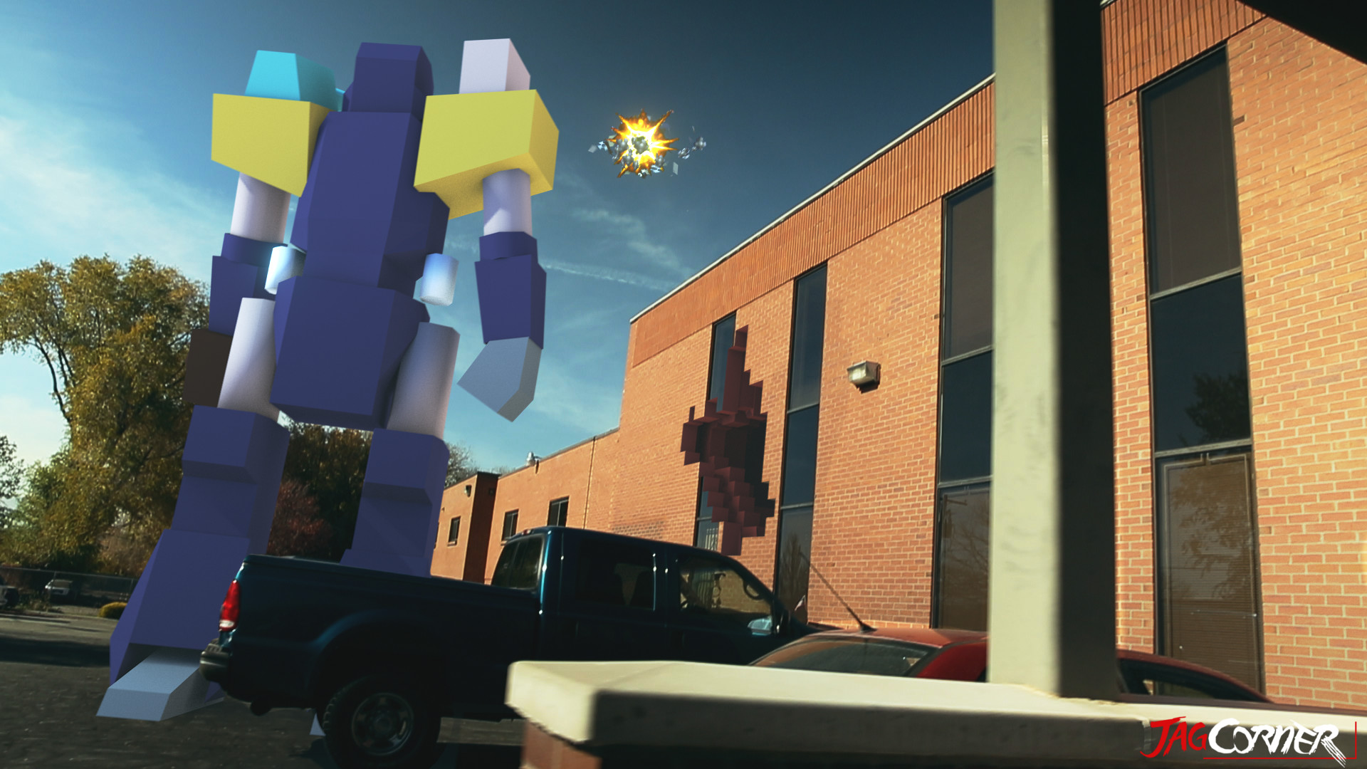
    With all of it’s faults, the Atari Jaguar was still revolutionary for its time. It was one of the first consoles to push out games that were entirely 3D. Titles such as Iron Soldier, Hover Strike, Battle Morph, all showed that the Jaguar was leagues ahead of it’s competitor’s. And while Nintendo, Sega, and Sony didn’t really have any sort of online capabilities until 1999, the Jaguar had support for online and locally networked games. Which included the only console port of Doom that had multiplayer support. As for those who grew up in the arcades, this system had amazing reincarnations of arcade classics, such as Tempest and Defender. And for the people who grew up with Atari, those who played the games, or programmed for the systems, who went to the arcades, the Atari Jaguar represents a culmination of everything that made Atari what it was.

    This brings me back to why the Jaguar is still going strong. The last system that Atari ever made, and the embodiment of everything that Atari was. For someone who grew up with Atari this means allot, and is one of the pinnacle reasons why my brother and I want to make games for the Jaguar. Not because we want to make games, but because we want to make games for a console that represents our childhoods. Proving that a console’s success isn’t based solely on sales. That a community of dedicated gamers and programmers can bring value to a system, and hopefully the bi-products of that dedication is good games.

    download

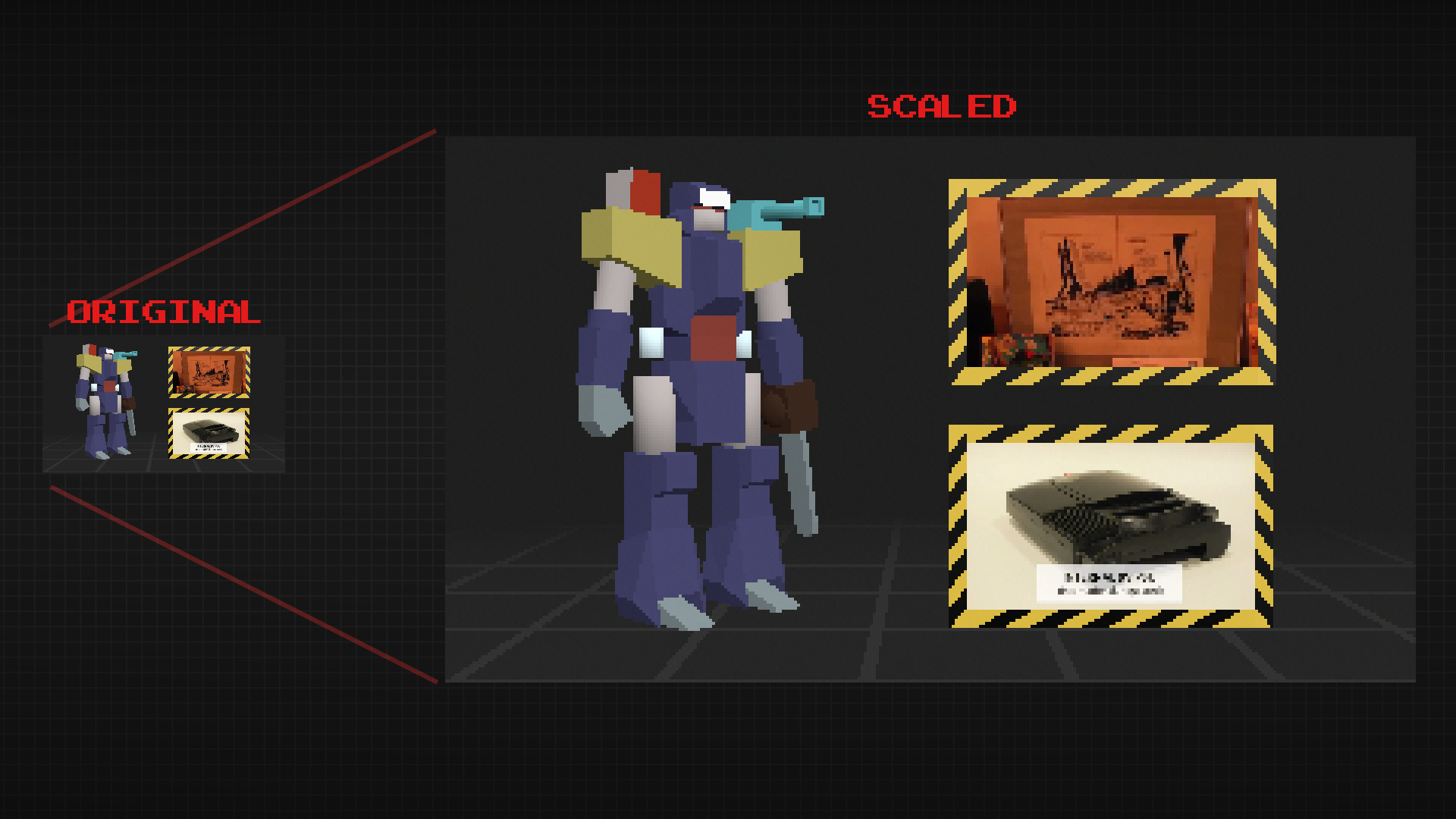
    In May of 1999, the hardware, and development code was released into the public domain. Allowing developers to make and release games without having to worry about licensing. This is the catalyst that allowed the community to grow. This along with that dedication to the Jaguar is what allowed for many titles that were initially canceled, to be restarted, and eventually release later on. That dedication, is what kept developers together, and has given us great titles like Downfall (produced by Reboot), and Elansar (produced by Orion), Games that were released 17 years after the console’s “death”. Very few consoles can tout that they have this strong of a community, many years after official support has ceased. It is a testament to the consoles quality, and the quality of people who support it.


    43223733


    I am not sure where the Atari Jaguar will be in another 20 years, but I am enjoying the great success it is seeing today. BitJag hopes to contribute to this success, and we hope to see many more people flock to this console, and many more games in the future. Here’s to 20 years of the Atari Jaguar.

  • Krita Time-Lapse Demonstration | Inking |  Inking with Wolthera van Hovell’s Inking Brush Kit 1.2

    Krita Time-Lapse Demonstration | Inking | Inking with Wolthera van Hovell’s Inking Brush Kit 1.2

    Thought I would pay tribute to some of the people helping to make Krita an awesome program for artists. By tailoring to specific mediums, like ink.


    This time-lapse video highlights a few drawings being inked with Wolthera’s new Inking Brush Kit that you can download HERE. Enjoy the vid.

  • Krita Time-Lapse Painting | Another Portrait

    Krita Time-Lapse Painting | Another Portrait

    There are different kinds of goals in relation to art. One of those goals could be study goals, like, I am going to focus on drawing hands, or learning to render light and shadow correctly. I would talk about a goal that can have a much deeper effect on the viewer, than say the anatomically perfect hands you drew last week.


    skin study portrait_web


    The kind of goal that should apply to just about every painting, drawing or sketch that you produce. This kind of goal can be established with one question, what do you want the viewer to think, feel or do when they see your work.

    Of course, sometimes an artist throws all care to the wind and just creates, and there is nothing wrong with that, but even approaching your art with that attitude is going to come across to your viewer in the final work. How powerful could your art be if you took charge of what your work is conveying to the viewer on an emotional level?

    When I started this painting, it was just going to be a study on rendering light a certain way, this is why the very beginning of this painting isn’t in the video. I wasn’t planning on doing a time-lapse at all. Out of this one goal spawned an important question, what is this imaginary person like, and how can I bring that personality into the painting, and make it recognizable to the viewer?


    A portrait not only contains the physical appearance of a person, but can also portray what kind of person they might be. So, about 20 or 30 minutes into the painting I realized that I had a greater goal in this painting, that was to evoke specific feelings in the viewer. The goal also included really focusing, through the entire process of the painting, to make sure the former goal was reached.

    Ask yourself this, what do I want people to think or feel when they see my work? See what happens when you really focus on the answer to that question while you are painting or drawing.

    Because of the subjective nature of art, I won’t say what I want you to feel when you look at this piece, but, as an artist, my hope is, is that you feel something similar to what I felt while working on this painting, and when it was finished.

    Look forward to some more time lapse videos in the future, and Thanks for watching.

    Krita was primarily used, with Gimp for some post color correction.

  • Weekly Sketch Review | Faces and Characters

    Weekly Sketch Review | Faces and Characters

    I should probably start calling these bi-monthly sketch reviews, considering how much time that has elapsed since the last sketch review. I am drawing quite a bit, it’s just getting around to putting these posts together. It’s more time consuming than I expect.

    flirtting


    faces_1

    I have been working in both Krita and Gimp lately, and I definitely lean towards using Krita for my study. Smoother workflow and all. I mainly use gimp for its more intended purpose of post processing now. Adjusting color curves, sharpening, etc.

    The first few poses that are drawn in the video are actually from an illustration, I did over a year ago, here. I liked the original and I wanted to draw poses, so, I tried fleshing out the character a bit with some different poses.

    The faces in the middle of the video are purely study. Then the last set of drawings are a character concept for one of our Jaguar games.


  • Krita | Character Illustration | Jouster

    Krita | Character Illustration | Jouster

    Some more stuff for our Atari Jaguar project. I have been working on story ideas and concept drawings for our jousting game, and this design came to mind.


    Jouster_web


    If you haven’t already, head over to http://bitjag.com/ and check out the three projects that we have in the works. Not a whole lot of visual concepts yet, but stories are being put together and their general concepts are listed on that site.

    What I enjoyed most a about this painting was the lighting. The composition and the pose could be better, but I think the good lighting helps make up for that. It really brings the viewer’s eyes to key and attractive points in the painting, and overall, it is very comfortable to look at.


    On another note, if you haven’t noticed already, most of my most recent paintings have all been done in Krita. I am in love with the program, the interface and default shortcuts work great with my Cintiq 13 HD, and overall it seems like a much smoother experience than Gimp lately. Gimp has been having some serious issues with my hybrid ATI graphics setup, and so, I mainly use gimp for my graphic design work.

    Don’t get me wrong though. Gimp is a great program, and it has been especially useful lately because of all the web graphics that I have been doing. Krita just provides a workflow that feels smoother and faster to me, and I think that I will be using it for many of my paintings in the future.