William Thorup

Illustrator, Motion Graphics Designer, Animator, and VFX Artist

Tag: time lapse video

  • Loaded | Illustration

    Loaded | Illustration

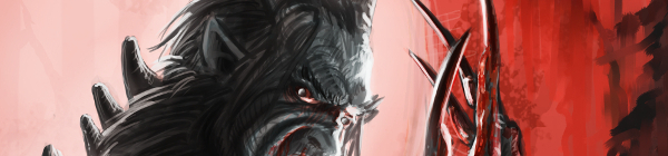
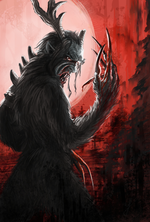
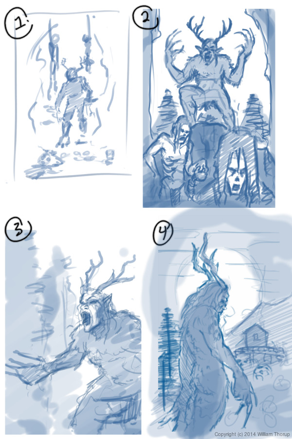
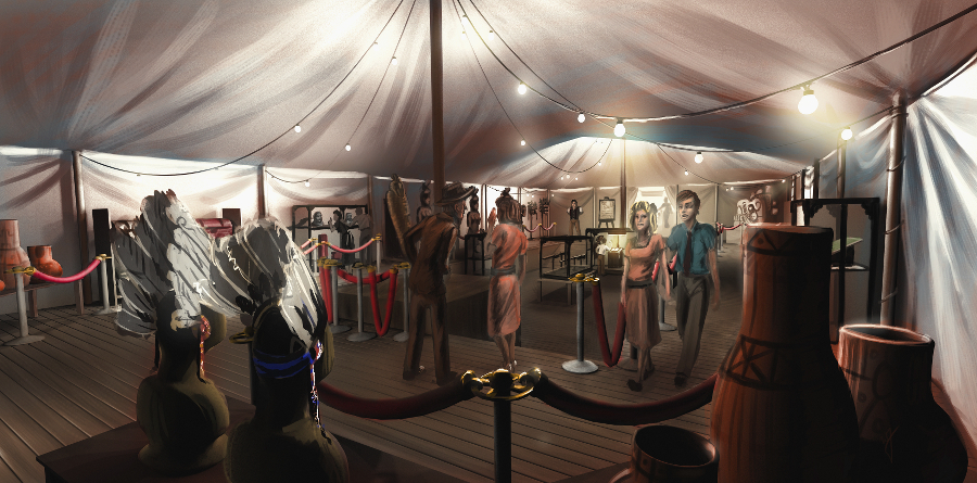
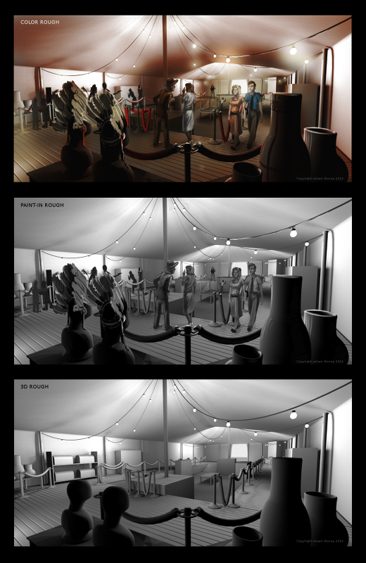
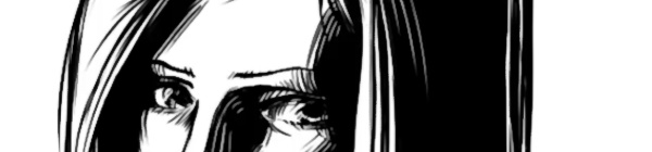
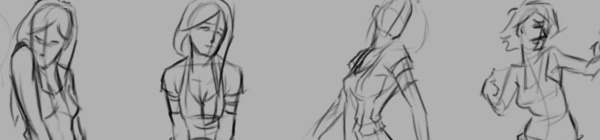
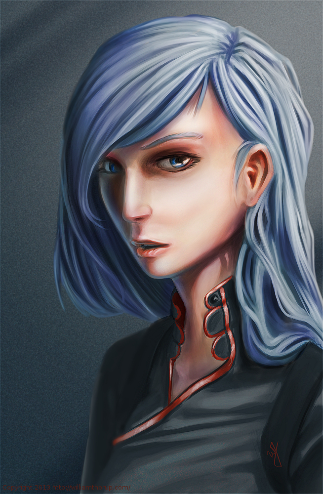
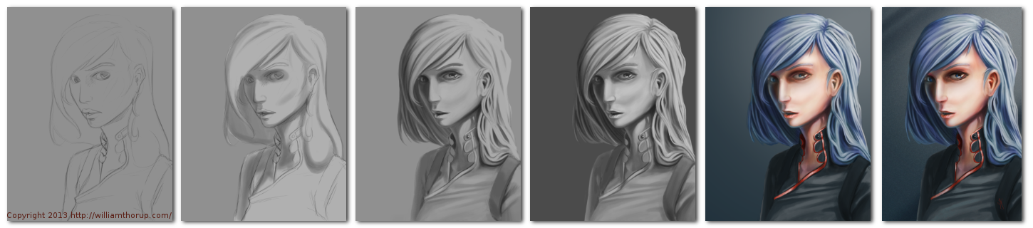
    I have been meaning to write about this one for a while. I put this one together about a month ago, and it has been posted in my portfolio and other galleries. No time lapse video, but I was able to put together a small snapshot video with the different revisions I had saved. Also, before we continue, I have to thank Michael Buhler for his input on color, lighting, anatomy, and proportions.

    bubble and lion_web

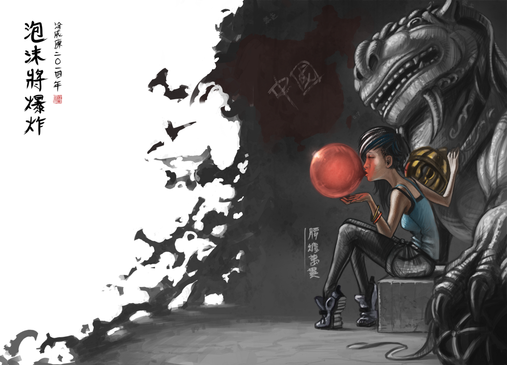
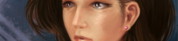
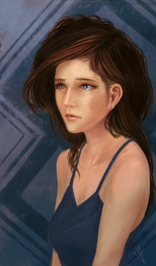
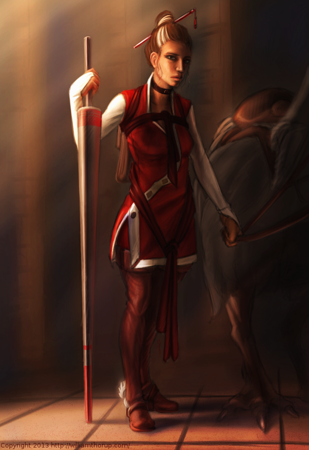
    There were a few things I wanted to focus on for this one. First, color was priority. I wanted to keep my color pallet very specific. At first, I was trying to go for something a bit more abstract, overall blue line art with pinks and reds. I was struggling to get it to work, so, I decided to revert to something a bit more comfortable, and realistic. And, I decided to focus on the overall message I wish to portray in the piece, making sure that the composition, pose, lighting and color, all tell the story well.

    From a skill building perspective, I focused on rendering various materials. There is the bubble, obviously, but also the rock, clothing, hair, and skin were focused on to create the subtle differences each material has. While still maintaining my current style, I believe that I pulled this off fairly well, but there is still room for improvement.


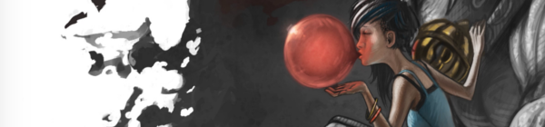
    As for the story I was trying to tell. I wanted to make a something political, focused on China’s booming economy, and how every bubble eventually pops. The characters on the left basically say that, and the characters on the right hand side of the piece are a Chinese idiom for someone who is loaded. The use a bubble gum not only covers the idea of a bubble growing, and establish anticipation with the inevitable pop, but gum tends to be something that is sweet and enjoyable. All good things must come to an end, right? The girl is dressed in very casual, and somewhat immodest clothing, to represent the adoption of many western trends. But as things are with transitions like this, she still holds on to whats familiar in traditional Chinese culture, shown by her gripping the lion towering over her.

  • Wendigo of Terror | Illustration/Concept Art

    Wendigo of Terror | Illustration/Concept Art

    Here is another piece for your eyes, a treat. You may be thinking to yourself that this isn’t the kind of work I usually do. You would be right in thinking that, this is definitely off the beaten path for me, and here is why.


    wendigo_colored_web


    Wedingo_Terror_thumbs_webwendigo_of_terror_poster_ideawendigo_2_tone_front_flattened


    We have been in some minor communication with someone who works at Arrowstorm Entertainment. A movie studio here in Northern Utah that focuses on fantasy and science fiction films. This person asked if I could put together a concept piece for a possible B horror film monster. A Wendigo creature that originates from the Great Lakes area of the United States, and is usually centered around myths that deal with the, pseudo, adverse effects of cannibalism. The content isn’t my favorite, but the job paid good, and it gave me a change to stretch out of my usual bubble.

    I did quite a few thumbnails for this piece (20+) and actually did three complete paintings, before we found what the client liked most. The process was very enlightening, and had allot of momentum. Really, the momentum is what made this painting fun. The client was in constant communication with me, and gave feedback when I needed it.

    Overall, I spent too much time on the painting though. I was trying to keep my total work hours under 6, but ended up going over 9. This was for a few reasons. First, and foremost, when I was first presented the job, I should have asked a bit more about the production and where it was currently at. This leads to the second problem. The project had hardly been refined, and the story, background, and other details about the creature, where watery. This is why so much time was put into thumbs and other paintings.


    I should have stepped back, asked the client to refine their ideas a bit more, and then approach the painting after a bit more forethought was applied.

    I am happy with the end result, and the client was as well. I hope to have a bit more work with them in the future, and hopefully work on some of their movie posters and other concept work.

  • For Liberty | Illustration and Time Lapse

    For Liberty | Illustration and Time Lapse

    A small gift to the men and women who serve for the cause of our liberties, rights, and freedoms. I also would like to thank all those around the world who fight for these causes, whether you fight for the United States or not. Every human being deserves these blessings in their lives, and today, we remember the price that must sometimes be paid for those blessings.

    for_liberty_web

    This painting took about 4 hours to complete. The entire painting was done in Krita.

    I focused on the color pallet for this painting. I wanted something a bit abstract, but not so abstract as to distract the viewer of the story being told. I wanted a sad and somber tone to the image, so, I stuck to cool colors. Primarily blue, greens, and grays. Red and white were my highlight colors. Then, I controlled my satruation in specific areas, in order to bring focus to the parts of the painting I wanted the viewer to see first. I feel overall the composition is good, maybe a bit crowded, but still attractive.

  • Iron Door Film | Concept Art

    Iron Door Film | Concept Art

    Through Thor Media, I was tasked with producing 3 pieces of concept art for our client, Adaptive Studios. The pieces were based on a semi-final script, with some direction from the director, and director of photography.

    traveling exhibit_web

    [column-group]
    [column]

    The first piece was strictly an environment piece, based on a possible traveling exhibit around the 1940’s. This pieces primary purpose was to show potential investors that some effort and thought was being put into the production, to show that there was talent to help create the world of the story. So I tried to focus on the details of the objects in the tent, rather than characters, to see if I could just tell a basic story with the objects in the scene. This piece could be used for actual set design during production, but most likely not.

    Thieves cross_concept_web

    [/column]
    [column]

    The next painting was done for an area in the script called “Thieves Cross”. And old ghost town in the story where the main characters end up in, searching for clues. The town was originally a settlement for criminals, so, it didn’t have much in the way of development, except for the old chapel. I wanted to make the chapel the center of the image, so I set up my composition to perform this task. I used a dutch angle to add a bit of uneasiness to the scene. Like the painting before, I started with a 3D base done in Blender, and then moved into Krita for the final paint over. I have to say, working in 3D to begin with helps immensely with perspective and laying out the basic composition. It easily shave 1 or 2 hours off of each painting.

    [/column]
    [/column-group]

    [column-group]
    [column span=”2″]

    Art and the Specter_web

    [/column]
    [column]

    The last painting was almost an illustration. Again, whether or not Art’s room will look anything like the painting in the final film is one thing, so, instead I focused on the mood and lighting of the moment given to me from the script. I feel that I got the composition right on in this painting. Every part of this painting just fell into place. For me, the color, lighting, composition, characters, mood. etc… just works! I love it!

    [/column]
    [/column-group]

    This was an awesome opportunity for me. I am grateful that I had the opportunity to work on some pre-production art work. I love to see written stories come to life visually, and to have some control over how that happens is incredibly gratifying. This work has spurred Thor Media to leverage mine and Michael Buhler’s skills in producing art. We are currently putting together service packages in the areas of Storyboards and Concept art. They got me working on the Thor Media website and a booklet that we can pass out to potential clients. This is something that I have wanted to do for a while, and I hope it turns out well.

  • Krita Time-Lapse Demonstration | Inking |  Inking with Wolthera van Hovell’s Inking Brush Kit 1.2

    Krita Time-Lapse Demonstration | Inking | Inking with Wolthera van Hovell’s Inking Brush Kit 1.2

    Thought I would pay tribute to some of the people helping to make Krita an awesome program for artists. By tailoring to specific mediums, like ink.


    This time-lapse video highlights a few drawings being inked with Wolthera’s new Inking Brush Kit that you can download HERE. Enjoy the vid.

  • Krita Time-Lapse Painting | Another Portrait

    Krita Time-Lapse Painting | Another Portrait

    There are different kinds of goals in relation to art. One of those goals could be study goals, like, I am going to focus on drawing hands, or learning to render light and shadow correctly. I would talk about a goal that can have a much deeper effect on the viewer, than say the anatomically perfect hands you drew last week.


    skin study portrait_web


    The kind of goal that should apply to just about every painting, drawing or sketch that you produce. This kind of goal can be established with one question, what do you want the viewer to think, feel or do when they see your work.

    Of course, sometimes an artist throws all care to the wind and just creates, and there is nothing wrong with that, but even approaching your art with that attitude is going to come across to your viewer in the final work. How powerful could your art be if you took charge of what your work is conveying to the viewer on an emotional level?

    When I started this painting, it was just going to be a study on rendering light a certain way, this is why the very beginning of this painting isn’t in the video. I wasn’t planning on doing a time-lapse at all. Out of this one goal spawned an important question, what is this imaginary person like, and how can I bring that personality into the painting, and make it recognizable to the viewer?


    A portrait not only contains the physical appearance of a person, but can also portray what kind of person they might be. So, about 20 or 30 minutes into the painting I realized that I had a greater goal in this painting, that was to evoke specific feelings in the viewer. The goal also included really focusing, through the entire process of the painting, to make sure the former goal was reached.

    Ask yourself this, what do I want people to think or feel when they see my work? See what happens when you really focus on the answer to that question while you are painting or drawing.

    Because of the subjective nature of art, I won’t say what I want you to feel when you look at this piece, but, as an artist, my hope is, is that you feel something similar to what I felt while working on this painting, and when it was finished.

    Look forward to some more time lapse videos in the future, and Thanks for watching.

    Krita was primarily used, with Gimp for some post color correction.

  • Weekly Sketch Review | Faces and Characters

    Weekly Sketch Review | Faces and Characters

    I should probably start calling these bi-monthly sketch reviews, considering how much time that has elapsed since the last sketch review. I am drawing quite a bit, it’s just getting around to putting these posts together. It’s more time consuming than I expect.

    flirtting


    faces_1

    I have been working in both Krita and Gimp lately, and I definitely lean towards using Krita for my study. Smoother workflow and all. I mainly use gimp for its more intended purpose of post processing now. Adjusting color curves, sharpening, etc.

    The first few poses that are drawn in the video are actually from an illustration, I did over a year ago, here. I liked the original and I wanted to draw poses, so, I tried fleshing out the character a bit with some different poses.

    The faces in the middle of the video are purely study. Then the last set of drawings are a character concept for one of our Jaguar games.


  • Krita | Character Illustration | Jouster

    Krita | Character Illustration | Jouster

    Some more stuff for our Atari Jaguar project. I have been working on story ideas and concept drawings for our jousting game, and this design came to mind.


    Jouster_web


    If you haven’t already, head over to http://bitjag.com/ and check out the three projects that we have in the works. Not a whole lot of visual concepts yet, but stories are being put together and their general concepts are listed on that site.

    What I enjoyed most a about this painting was the lighting. The composition and the pose could be better, but I think the good lighting helps make up for that. It really brings the viewer’s eyes to key and attractive points in the painting, and overall, it is very comfortable to look at.


    On another note, if you haven’t noticed already, most of my most recent paintings have all been done in Krita. I am in love with the program, the interface and default shortcuts work great with my Cintiq 13 HD, and overall it seems like a much smoother experience than Gimp lately. Gimp has been having some serious issues with my hybrid ATI graphics setup, and so, I mainly use gimp for my graphic design work.

    Don’t get me wrong though. Gimp is a great program, and it has been especially useful lately because of all the web graphics that I have been doing. Krita just provides a workflow that feels smoother and faster to me, and I think that I will be using it for many of my paintings in the future.

  • Quick Tip | Drawing a Character in Profile | Video Tutorial

    Quick Tip | Drawing a Character in Profile | Video Tutorial


    Here is something that I put together a few weeks ago, and just got around to finishing it. This small tutorial covers a couple different methods of creating an accurate representation of a character’s profile, based on a previously draw front view of that character. Enjoy.

  • Krita Time Lapse Painting | The Waker

    Krita Time Lapse Painting | The Waker

    I have been trying to get this painting posted for over a week. Ran into issues with my computer and work has become really busy. But, the excuses can be annoying, so, here it is.

    This painting was very much spontaneous. During a digital sketching session, this face came out, and I decided to push it to a finished rendering.


    the waker_web


    This painting got me a bit worried, since it had been a while since I tried to tackle realistic lighting. Rendering correct lighting has always been a bit intimidating for me, but I seem to have handled it well. I first broke down the steps. So, instead of trying to take on both color and light at the same time, I decided to do a grey scale painting first. Simplifying the process overall, and allowing myself to focus specifically on how light is interacting with the form.

    Digital art really makes coloring an image easy. I pick a color, slap it on a with a different layer in “Overlay” blending mode, and if I ever need to change it, no problem. Just use a Hue/Saturation/Value filter to adjust the color. As you can see in the video (3:40 and 3:52), I did this for her hair and her clothing.


    I love painting skin. The key to making skin look alive, are the areas where light transitions into shadow. Because skin isn’t completely opaque, light will enter the upper layers of the skin, hitting blood underneath, and will bounce back oranges and reds. The is particularly prevalent in the transitional areas between light and dark.

    A good example of this in this painting, is her chin, starting at 4:17 in the video. A few other things to keep in mind when painting skin is to play with other colors on top of the skin with a layer set to an “Overlay” blending mode. Colors like green and yellow can add healthy variety to lighter areas of the skin, while violets and blues can saturate your shadows making them appear more realistic. At 3:39 in the video, you can see I added a light layer of blue to under the jaw line.

    One thing that was unexpected in this painting was her hair. The hair that falls down her neck turned out to be much more complicated than I originally planned at the sketching phase. I had fun spending the time rendering it, and I feel it adds a certain level of detail that the painting wouldn’t have otherwise.


    the Waker_Six step process


    I feel a bit silly mentioning this, but her ear is something that I am proud of. I didn’t spend as much time rendering it than I did other portions of the painting. The structure is very much convincing, but still has the brush strokes that I like to see in my work. One other thing I enjoy about this painting are the facial proportions. I am still far from being a master when it comes to proportions, and that can be clearly seen in my work. But the scale of her mouth compared to her eyes and nose are pleasant, and seem to go well with the piece as a whole.

    These paintings that I do without reference always surprise me ounce they are done. I find it fascinating to think pack on my processes and ask myself why I did something a certain way. It helps me to see what I do well, and what I still need work on.