William Thorup

Illustrator, Motion Graphics Designer, Animator, and VFX Artist

Tag: video

  • Star Wars: Legacy of the Force – Fan film – Happan Ambush CG Sequence

    Star Wars: Legacy of the Force – Fan film – Happan Ambush CG Sequence

    This post has been a long time in the making. Some time around the beginning of February of 2015, we approached the James brothers ( a utah local film crew, and artists) who currently involved with a locally made Star Wars Fan film called “Star Wars: Legacy of the Force”, primarily produced by Tye Nelson and directed by Danny James. We asked if they might have something that we could work on in regards to VFX, and they had something big that needed work on.

    A quick thank you to Jacob Thorup and Bryce Thorup for letting me work on this at work, and also for providing critique. Micheal and Heather Buhler for their feedback. And finally Tye Nelson and the James brothers for allowing me to work on this project. Thank you!

    (Note, my details about what has happened in the production are very slim, I was third-party primarily, and most of my details come from conversations and emails from both the James brothers and Tye Nelson.)

    Be sure to watch the whole film at legacyoftheforcefanfilm.com

    The Proposal

    At this point in production of the fan film, everything was shot, and basic edits had been put together. This rough cut also featured a rough intro battle sequence which was strictly CG. You can see a what this looked like through this video at the 00:09 second mark, hosted on the creator’s channel. The producers and directors were not completely satisfied by this product, that was produced by another artists, other than myself. Because of this, the James Brothers offered to have me take a shot at it. I said yes.

    In case you don’t wish to spend the time to go through the rest of the article, I put together a quick video that goes through a bit of the development process, along with a break down of the final shot.

    Pre-Production

    So began a fun, frustration, enlightening, and enjoyable adventure of the most complicated CG shot I have done to date. I used Blender as my primary tool, and I eventually moved into After Effects for my final compositing.

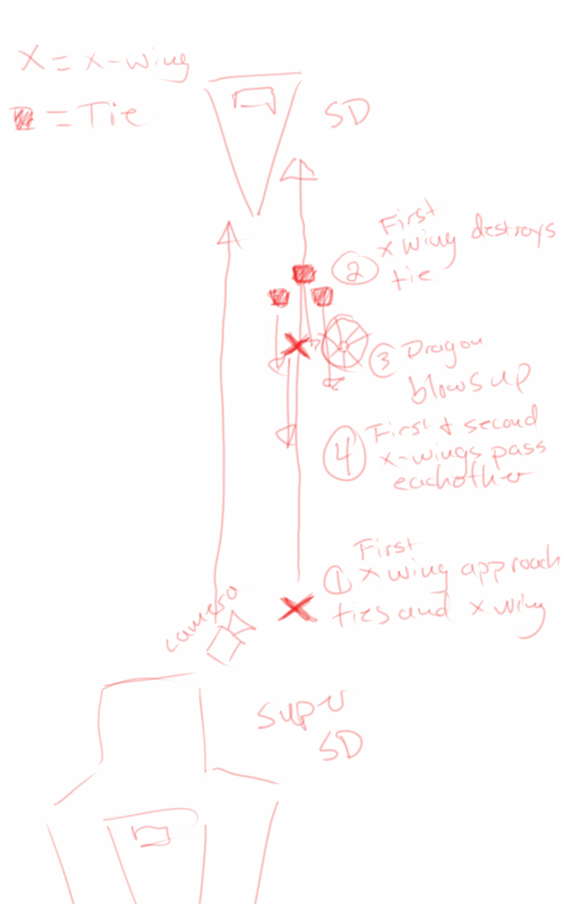
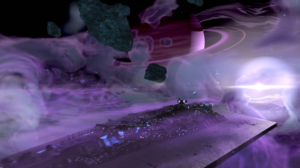
    Based on some notes from the James Brothers I began reworking the current sequence to be something a bit more dynamic and interesting. I started off with just a small piece of artwork produced for the Star Wars official card game, and with some ideas of making it look like the fight was taking place just in upper orbit around a planet.


    animatic_1_1animatic_1_2animatic_1_3animatic_1_4animatic_1_5


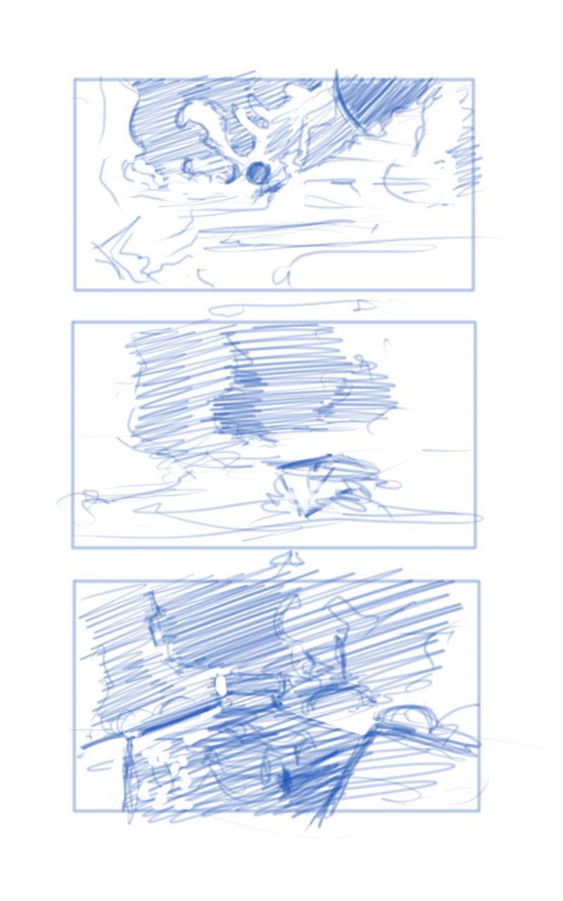
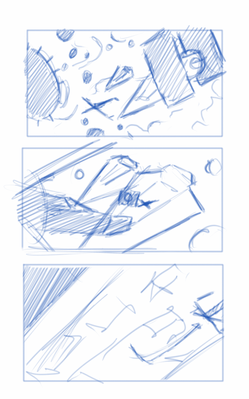
    This is where the first animatic came into play. This was largely shooting from the hip, and I put a little too much effort into the background and lighting, which should have been left for later in the process. I enjoyed this idea, but it wasn’t what the producer was looking for at the end of the day. It was ultimately scrapped.

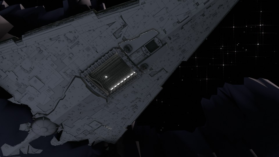
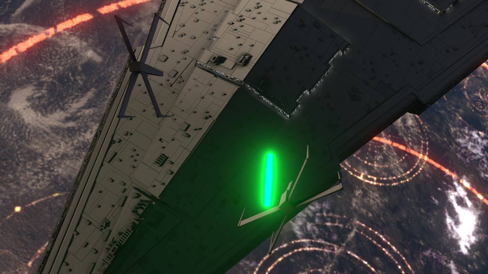
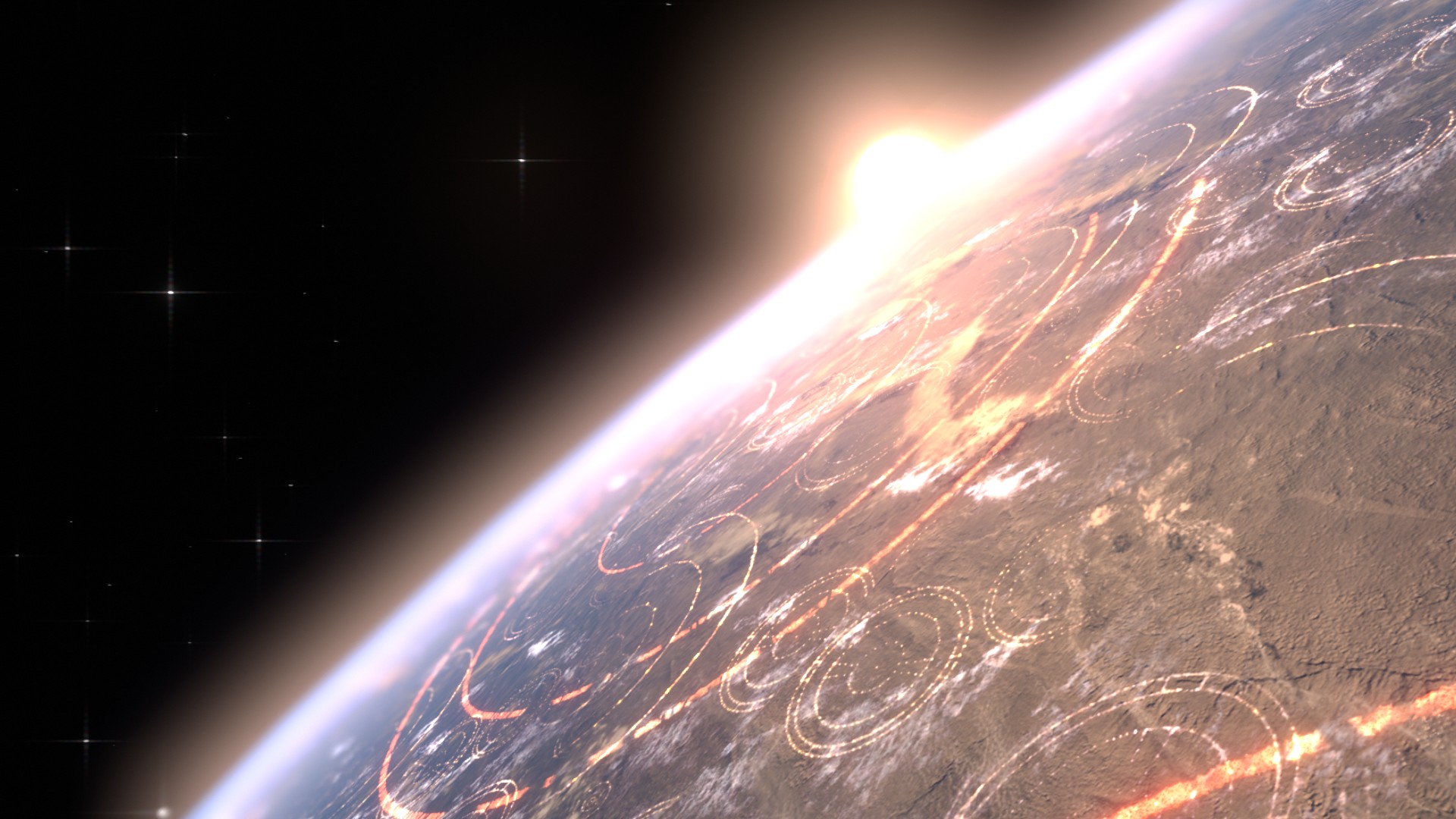
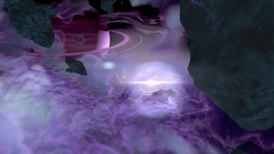
    The second animatic took to the original sequence, and basically mimics it for the most part. I decided to adjust the introduction of the Super Star Destroyer, as I thought a rising from the dark mists would feel a bit more ominous, and letting the viewer take in its vast size would help to maintain the brooding force that it is.


    conceptart_1conceptart_2conceptart_3conceptart_4conceptart_5


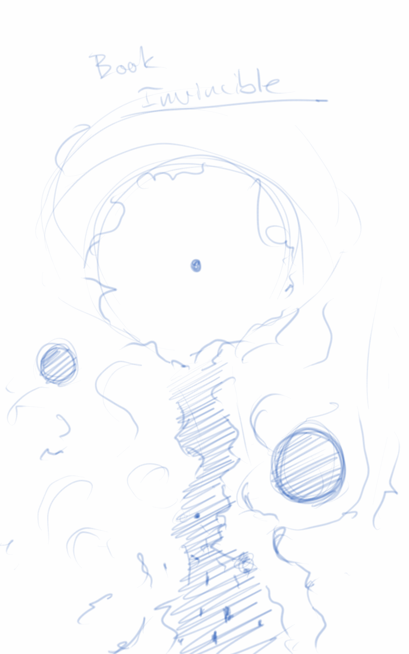
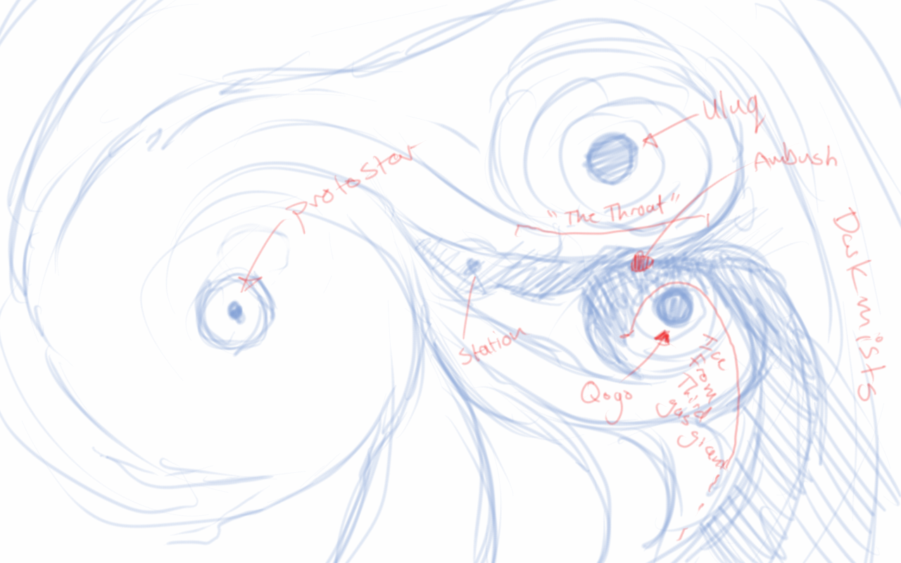
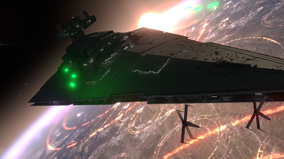
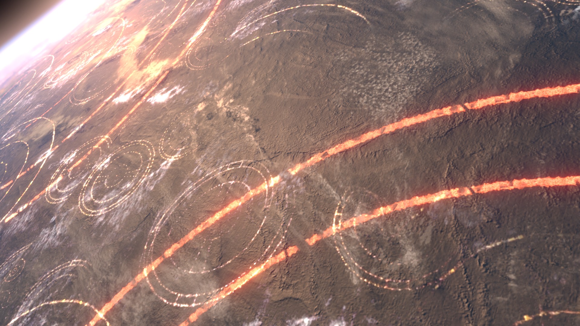
    The third animatic is much more refined. If I remember correctly, I had been given source material to work with, and I had already begun creating the environment at based on that material. In essence, the environment was created by one gas giant colliding with another, creating a large mass of debris and material between the remaining two gas giants. These all orbited around a proto-star. The source materials paints a darker environment on the page. I deviated from these details to help created a vast sense of scale with the nebula, and how small all the space craft were in relation to it. This required more light, so I made the star brighter than what is described in the book.

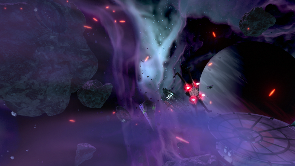
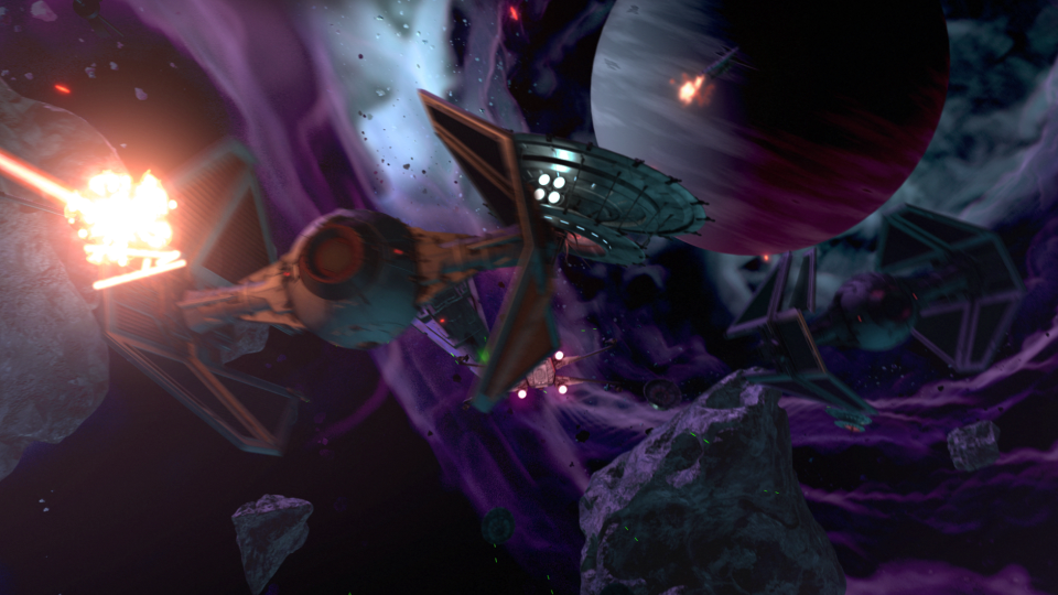
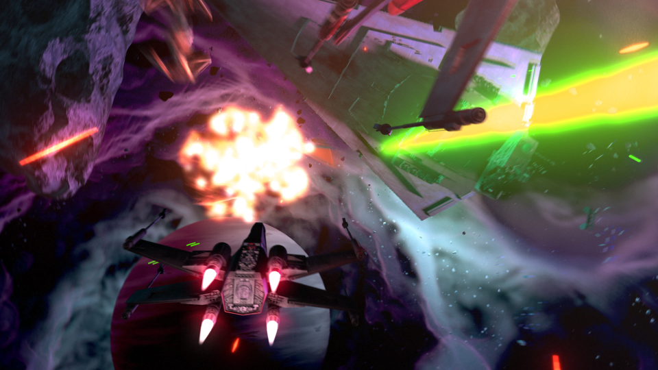
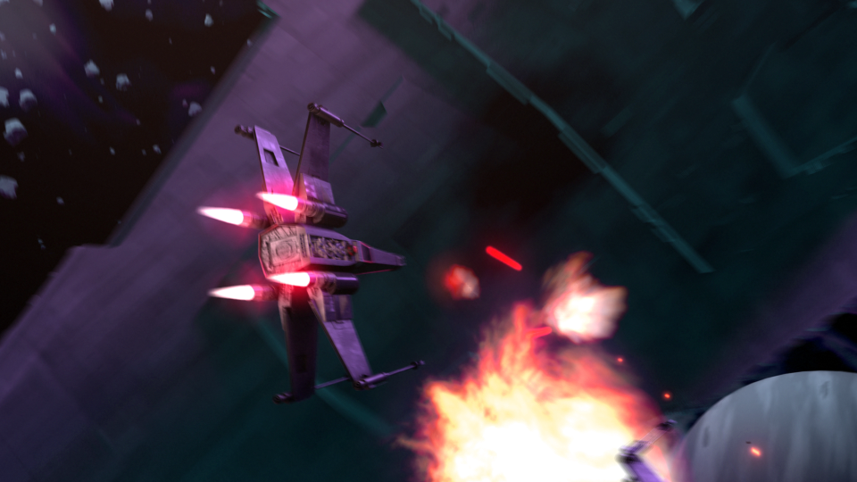
    After the movement of the main players in the sequence was locked down, and the animation for the main space craft was finished, I set to work on the actual spacecraft themselves.

    The base models were downloaded from scifi3d.com. This site hosts donated models from a ton of different sci-fi universes, and it had everything I needed for the sequence. After getting the models, I spent a good chunk of time cleaning them up in Blender, texturing, and additional modeling, before bringing them into the final scene to replace the proxy models I used for the animatics.


    x-wing_5-15-15_2x-wing_5-15-15tie_5-15-15_1hapan_5-15-15


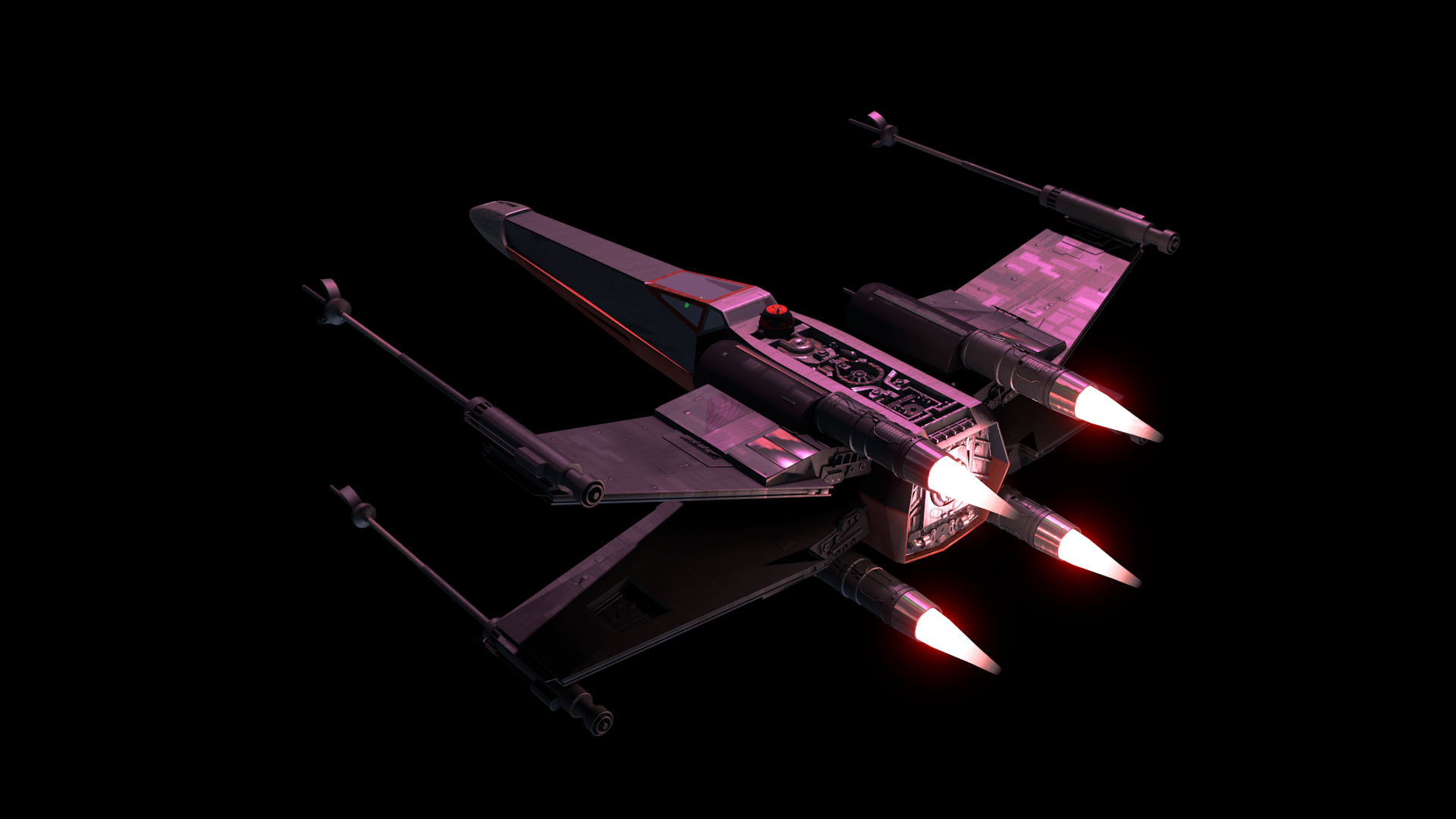
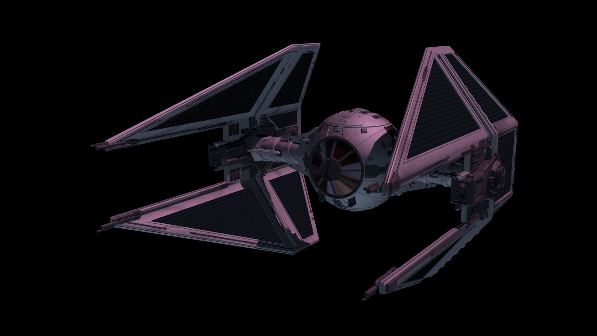
    After the models were brought in, simulations for fire/smoke and other debris were done, along with blaster fire. Then came rendering everything out for compositing.

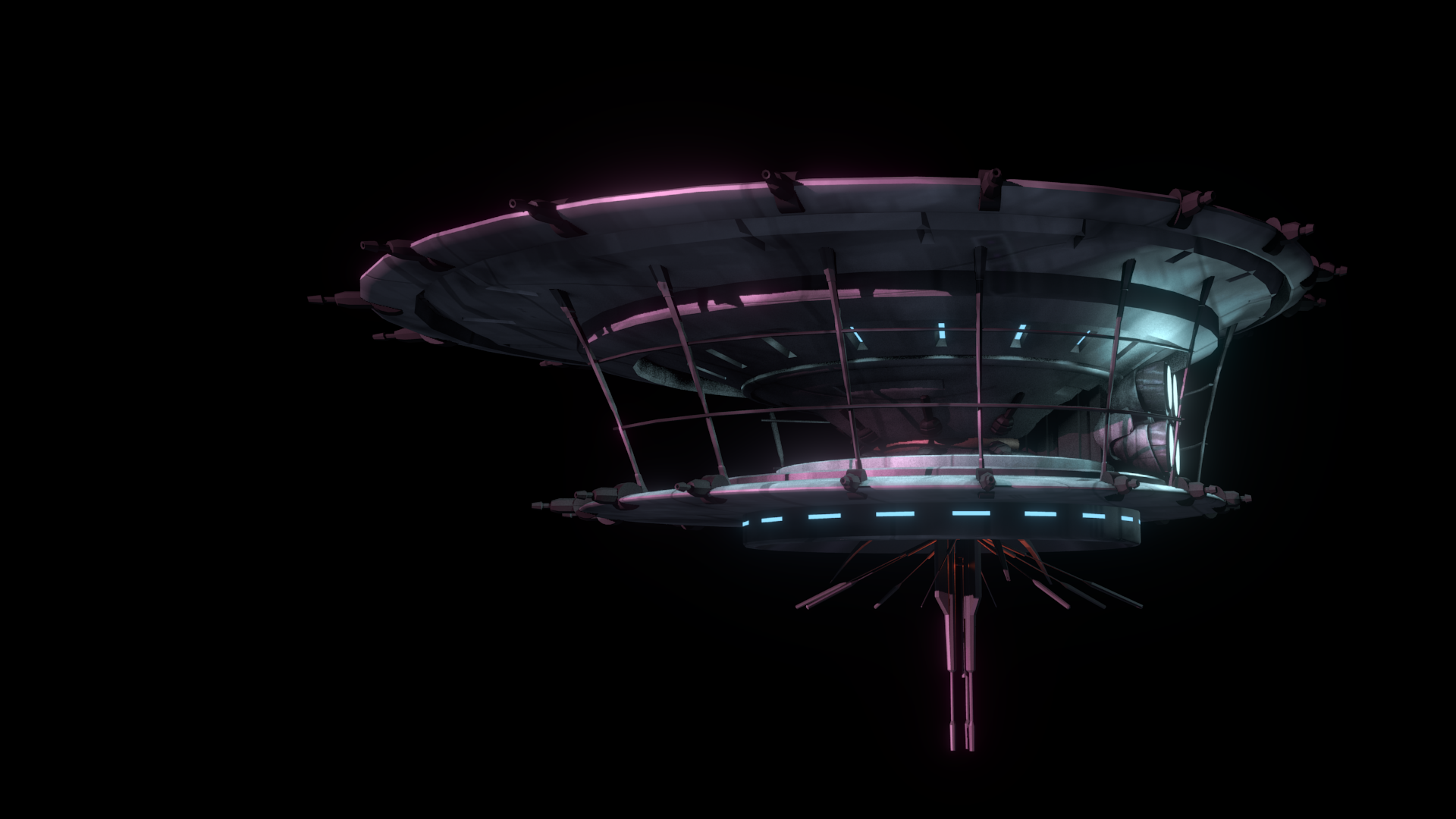
    Each render layer was done separately. The x-wings on one layer, the tie fighters on one layer, the planets on one layer, etc… This was to accommodate any possible changes without having to render the whole scene again. The only requirement to this workflow was to make sure that the animation for the camera never changed. This allowed all the separate layers to match move with each other, and if a layer needed changes and rerender, all you needed to do was replace the frames for that single layer in the final composite.


    ambush_final_0ambush_final_1ambush_final_2ambush_final_3ambush_final_4ambush_final_5ambush_final_6


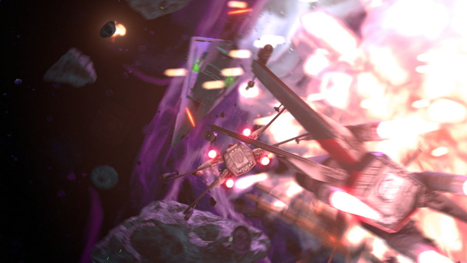
    I moved my scene layers over to After Effects to composite there. I was originally planning on compositing completely in Blender, but there was a possibility that I wasn’t going to be able to finish things myself. I needed to move into a program that someone else could use in case I couldn’t finish. This did help speed things up though, as I didn’t have to render motion blur out of Blender (really slow…), as I was able to replace this with a much quicker effect in After Effects called Pixel Motion Blur.


    SSD_before_after


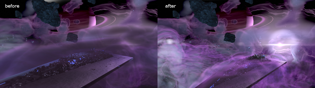
    Due to time constraints, and because of the amount of time I had spent on the project, I wasn’t able to add specific post effects like heat distortion. But at this point it is time to move onto other things. Overall the experience was gratifying. I ran into a ton of situations I have not encountered before, and I was able to successfully navigate through them, and learn a host of new things along the way. I have gained a deeper appreciation for the work that goes into a shot like this, and I know why it takes more than one person to pull it off well.

  • Play Books & Times Square with Overstock.com

    Play Books & Times Square with Overstock.com

    Over the last few months Overstock.com has given me the opportunity to work on a few 15 second broadcast motion graphic spots/commercials for Overstock.com. These covered three separate sales that aired on national television between March and July of 2015.

    I first want to thank the branding team at Overstock.com for their help in putting this together with me. They usually have me come into their office to work, in order to speed things up. These spots are as good as they are because of their input and critique. Thanks guys!

    Mega March Markdown | 15sec broadcast commercial – Based heavily on the in-house design teams playbook, with addtional consulting from Trevor Rimmasch. Thanks Trev!

    Most of the work done on these was in After Effects, due to time constraints (all of these were put together withing 2-3 days!). I would have rather had done these in Blender, as I would have had more options available to me. Overall the experience was good working on these commercials, and the highlight was to see some of the designers faces light up when they first say their work animated in a final commercial.

    Generic Summer Sale Spot | 15sec broadcast commercial – Again, based on an in-house Play Book. The title card is one of the first photo maps I have done. Cutting out pieces of a photo and placing them within 3D space to give the illusion of parallax and depth.

    Something that made these so different from previous work I have done, is the inclusion of a “Play Book” or “Style Guide” put together by their in-house designers and artists, for their web departments. These guides are awesome in that they reduce the amount of questions needed to be answered when approaching the commercial, and debate is brought to a minimum as well. If there is a question about what something should look like, color to use, typeface, etc… no guess work, just look at the Play Book. A huge help when working as a team on something.

    Once in a Blue June Sale | 15sec broadcast commercial – There wasn’t much of a Play Book for this one, but it was still based on the designs of an in-house designer, with additional input by Aaron Syrett and Trevor Rimmasch.

    jewelry_sale_gtron_1jewelry_sale_gtron_3jewelry_sale_gtron_2blue_june_gtron_2blue_june_gtron_1

    And to top it all off, I also had to edit down the Once in a Blue June spot, and an additional Jewelry Sale Spot, for the Geoffrey Tron at Time’s Square in New York City. It is an awesome feeling knowing that some of my work is getting exposure in Time’s Square.

  • Club O Remix

    Club O Remix

    Club O, the membership/rewards program portion of Overstock.com, did a rebrand. Different colors and designs, and they asked if we would take the old version of their Club O introduction video and revise it to fit the new branding.

    At first glance, this seemed like something fairly easy to pull off, but once we began discussing more about what they wanted, what the new script entailed, and additional shots of the dog were needed, turned out to be allot more work than expected.

    It was interesting to revisit green screen keys we did over two years ago. There were quite a few things I didn’t quite understand about keying, and it is amazing that we were able to get the key as good as we did back then. Time was spent cleaning up these old keys, and also keying additional shots of the dog. This was made more difficult since they didn’t want to have any shots of the dog with the red cap. Shots without the red cap were limited, as at the time it seemed like the cap was the way to go. So, there just wasn’t a whole lot of the capless dog to chose from.

    Most of the video was composited in After Effects. The 3D percentages were originally done in After Effects, but because of file path issues with Elements 3D working between a Windows and Mac machine, I ended up doing the percentages in Blender. Another portion done in Blender were the shipping boxes. This was a last minute addition suggested by Trevor Rimmasch. The boxes help fill and anchor some of the shots, as well as create a consistent visual thread throughout the video.

    club_O_before_after

    Some of the issues when approaching an older project and “re branding” it that the foundation of the original is based off of key components. Such as music, colors, and script. The original expectation when I was asked to do this was that there was going to be some timing adjustments, along with some color changes. As we dug into it though, because some of the key components changed, it was almost more economical to start from scratch. The end product could have been rethought and something better could have been produced, and it felt like some of the elements were just bandages to keep the video together (the shipping boxes).

    As it stands, it is a good video, and certainly nothing that I am ashamed of. But the lesson learned was when you change key components of a production, like color, music, and script, exception to make major changes throughout.

  • Charged Vanity | Bolt Construction Logo

    Charged Vanity | Bolt Construction Logo

    Neil Bryce of Bryce Media has been keeping me busy the past while with jobs here and there. Bryce is an awesome person to work with, and is always concerned with getting things right, if you are in the Salt Lake City area, I highly suggest getting in touch with him, definitely someone you want to know if you are involved with video in the Salt Lake area.

    This vanity logo for Bolt Construction had a really quick turn around (about a day) and the creative is simple but effective. This video features a stone wall background with wood shingles in the upper third, but a few more versions were rendered out without the background, with a blue background, and one without movement.

    The background assets used were from a website that hosts public domain photography, vectors, and other graphics, called Pixabay. Definitely a site you want to add to your bookmarks in case you need some quick assets on a budget. There is no guarantee that all the content is public domain, as there are no actor/actress release forms. But images without people should be fairly safe.


    For those who are interested, here is a screen capture of the my Blender compositor. A fairly easy setup. Background, logo, a couple of particle effects, and lighting.

    vBC_vanity_logo_blend_composite

  • Exploding Polygons | Certified Educators Conference Intro Video

    Exploding Polygons | Certified Educators Conference Intro Video

    With only about a week and half, Neil Bryce asked me to get a creative together based solely based on a website and a few suggestions on what it should feel like. Not much to go on. With this in mind, and with that much freedom, I decided to put a bit more effort in this one by prepping a storyboard. Allowing the client to get a clear picture of what I had in mind, in order to make the most out of the coming week. (If you have 4k, be sure to change the YouTube settings.)

    Very simple creative based primarily off the website for the conference. The first day I put a simple style guide together along with a storyboard for the video. The storyboard was quickly accepted by the client, and I was able to move into picking out music that I could mock something up to.

    The music was the first and only bump in the road during the week long production. They had chosen one song, and I had begun to mock something up, and about 3 days into production, we all decided that the song needed to change. This forced us to have to re-time things, and make some other small adjustments to movement. Other than that though, the video flew together, and result that everyone was happy with was born. I am not sure if the 4k version was actually used at the conference, but it is still pretty awesome to see it playing on a 4k monitor.

    Putting together a storyboard was the best part of the project. Because the creative was wide open for whatever, I had allot of freedom in what the final result would look like. It is an awesome feeling when people just trust you as an artist to make something cool.

    CED_stylesheetCED_storyboard_1CED_storyboard_2CED_storyboard_3

    The storyboards and style guide below were assembled in Inkscape for the sake of speed and clarity.

    I used Blender to put the entire video together, and final encoding with FFMpeg. Because of the simplicity of the content, editing in 4k and rendering out previews was smooth. Compositing was simple, with everything essentially on one layer. But there was a final glow added to the music drop on the end, this was done in the Blender Video Sequence Editor before the final render.

    The blue polygon, or what I like to call the “host”, was a simple particle system, with a blend texture applied to the particle size to make the particles come in and out of existence smoothly. The host was added to help create a consistency to the video, or a thread that binds it all together, but to also add energy and urgency to the video with the seemingly erratic movement and the natural corners of the polygon.

  • Atari Jaguar | McFur and Friend 1

    Atari Jaguar | McFur and Friend 1

    So, during my long hiatus from posting, many projects, many new pieces of art, have been brought into existence, through the sacrifice of time. By myself and others. Unfortunately, this includes the time that is spent putting together videos and posting on my blog. If you are consistent to my blog, or my YouTube Channel, thank you, and sorry for not being more consistent. But enough of the excuses, lets get on to the good stuff.

    bird_and_girl_web_3

    This time around more Jaguar projects, and this will be the first of a few posts. As you already know, my brother and I are involved in homebrew development for the Atari Jaguar. One of the projects we are working on is a Flappy Bird clone called Flappy McFur. There is more information on the project page, if your interested. In a nutshell, we are about halfway through development, and I am in the process of getting some art together for packaging and inserts, while my brother closes in on our end goals for the game. This is the first piece of official artwork for Flappy McFur.

    Before I get started though, just a thank you to everyone in the Thor Media office for feedback on the piece. It is always great to get feedback on my work, when I am too blind to see the mistakes.

    Because of the light nature of the game, certain design choices for maintaining a consistency across the artwork became apparent. First, match the saturation of game. Simple enough, yellows, greens, and reds are saturated, while everything else not so much (I guess that leaves my blues…) Which medium to use was a simple choice for me as well, colored pencils. I love working in colored pencil, probably the first medium I truly dove into and experimented with. Because of it’s affinity to the the look of crayons, but still maintaining the ability to create the detail I want in my drawings, I feel that it will match the mood of the game well. Also, Krita simulates pencils pretty darn well, and it feels almost as good as the real thing.


    With these few design choices, I believe the next 3 or 4 pieces will maintain a consistent feel.

    Speaking of the next pieces. I want to go with a cute and sometimes funny theme for each. Where McFur and his friend are in a playful mood. We might be incorporating McFur’s friend in the game some how. I like her design so far, but it may need a few tweaks for the game. I am hoping to put together a small comic for the game manual as well, but we we’ll see what happens there. Stay nearby, I will have a few more of theses over the next few weeks.

  • Wendigo of Terror | Illustration/Concept Art

    Wendigo of Terror | Illustration/Concept Art

    Here is another piece for your eyes, a treat. You may be thinking to yourself that this isn’t the kind of work I usually do. You would be right in thinking that, this is definitely off the beaten path for me, and here is why.


    wendigo_colored_web


    Wedingo_Terror_thumbs_webwendigo_of_terror_poster_ideawendigo_2_tone_front_flattened


    We have been in some minor communication with someone who works at Arrowstorm Entertainment. A movie studio here in Northern Utah that focuses on fantasy and science fiction films. This person asked if I could put together a concept piece for a possible B horror film monster. A Wendigo creature that originates from the Great Lakes area of the United States, and is usually centered around myths that deal with the, pseudo, adverse effects of cannibalism. The content isn’t my favorite, but the job paid good, and it gave me a change to stretch out of my usual bubble.

    I did quite a few thumbnails for this piece (20+) and actually did three complete paintings, before we found what the client liked most. The process was very enlightening, and had allot of momentum. Really, the momentum is what made this painting fun. The client was in constant communication with me, and gave feedback when I needed it.

    Overall, I spent too much time on the painting though. I was trying to keep my total work hours under 6, but ended up going over 9. This was for a few reasons. First, and foremost, when I was first presented the job, I should have asked a bit more about the production and where it was currently at. This leads to the second problem. The project had hardly been refined, and the story, background, and other details about the creature, where watery. This is why so much time was put into thumbs and other paintings.


    I should have stepped back, asked the client to refine their ideas a bit more, and then approach the painting after a bit more forethought was applied.

    I am happy with the end result, and the client was as well. I hope to have a bit more work with them in the future, and hopefully work on some of their movie posters and other concept work.

  • For Liberty | Illustration and Time Lapse

    For Liberty | Illustration and Time Lapse

    A small gift to the men and women who serve for the cause of our liberties, rights, and freedoms. I also would like to thank all those around the world who fight for these causes, whether you fight for the United States or not. Every human being deserves these blessings in their lives, and today, we remember the price that must sometimes be paid for those blessings.

    for_liberty_web

    This painting took about 4 hours to complete. The entire painting was done in Krita.

    I focused on the color pallet for this painting. I wanted something a bit abstract, but not so abstract as to distract the viewer of the story being told. I wanted a sad and somber tone to the image, so, I stuck to cool colors. Primarily blue, greens, and grays. Red and white were my highlight colors. Then, I controlled my satruation in specific areas, in order to bring focus to the parts of the painting I wanted the viewer to see first. I feel overall the composition is good, maybe a bit crowded, but still attractive.

  • Atari Jaguar | Flappy Mcfur Pre-Release Box & CD Art

    Atari Jaguar | Flappy Mcfur Pre-Release Box & CD Art

    My brother and I have been working hard on the Atari Jaguar stuff, and new ideas, art, writting, and code, trickles into each and every project everyday. Flappy Mcfur is the first fruits of our efforts.


    flappy_mcfur_cd_lable_web

    Obviously a Flappy Bird clone for the Atari Jaguar, this program really was just a training ground for me in C programming. It was fun getting the basic assets together, and code the various aspects of game. From menus, to score keeping, and movement of Flappy McFur. Speaking of movement, it is very rudementary, and the next version will have movement more akin to Flappy Bird.

    flappy_mcfur_dvdcase_insert_front_web
    flappy_mcfur_dvdcase_insert_back_web

    The box art and CD art were both put together in Inkscape, with screenshots from the actual game. Currently we are not sure if we will actually be making and selling physical versions of the game, but I though it might be nice to give people who download it, the opportunity to put together something nice for it if they wish.

    The Pre-Release trailer was a blast to put together. I wanted something that would build up, and then let the viewer drop, realizing it isn’t anything too amazing. I really like the way the fly around with the console came out. I haven’t used lattices in 3D animation for a long time, and they poved really effective for bending the flowing text around the various contours of the Jaguar console and controller. The footage of gameplay was captured using the Virtual Jagauar emulator, and it plays almost exactly how it does on the actual Jaguar hardware. It’s such a simple game, why wouldn’t it? Also, this video, and the next one, were both completely done in Blender, with 2D assets in the Gimp.


    On another small note, Bryce noticed that out YouTube subscription counter, on the JagCorner channel, was almost to 64, and he came up with the idea for a little video to celebrate the 64th subscriber and the 64-bit glory of the Atari Jaguar. Check it out, and subscribe to our channel to keep up with other video content we will be producing in the future.


  • Iron Door Film | Concept Art

    Iron Door Film | Concept Art

    Through Thor Media, I was tasked with producing 3 pieces of concept art for our client, Adaptive Studios. The pieces were based on a semi-final script, with some direction from the director, and director of photography.

    traveling exhibit_web

    [column-group]
    [column]

    The first piece was strictly an environment piece, based on a possible traveling exhibit around the 1940’s. This pieces primary purpose was to show potential investors that some effort and thought was being put into the production, to show that there was talent to help create the world of the story. So I tried to focus on the details of the objects in the tent, rather than characters, to see if I could just tell a basic story with the objects in the scene. This piece could be used for actual set design during production, but most likely not.

    Thieves cross_concept_web

    [/column]
    [column]

    The next painting was done for an area in the script called “Thieves Cross”. And old ghost town in the story where the main characters end up in, searching for clues. The town was originally a settlement for criminals, so, it didn’t have much in the way of development, except for the old chapel. I wanted to make the chapel the center of the image, so I set up my composition to perform this task. I used a dutch angle to add a bit of uneasiness to the scene. Like the painting before, I started with a 3D base done in Blender, and then moved into Krita for the final paint over. I have to say, working in 3D to begin with helps immensely with perspective and laying out the basic composition. It easily shave 1 or 2 hours off of each painting.

    [/column]
    [/column-group]

    [column-group]
    [column span=”2″]

    Art and the Specter_web

    [/column]
    [column]

    The last painting was almost an illustration. Again, whether or not Art’s room will look anything like the painting in the final film is one thing, so, instead I focused on the mood and lighting of the moment given to me from the script. I feel that I got the composition right on in this painting. Every part of this painting just fell into place. For me, the color, lighting, composition, characters, mood. etc… just works! I love it!

    [/column]
    [/column-group]

    This was an awesome opportunity for me. I am grateful that I had the opportunity to work on some pre-production art work. I love to see written stories come to life visually, and to have some control over how that happens is incredibly gratifying. This work has spurred Thor Media to leverage mine and Michael Buhler’s skills in producing art. We are currently putting together service packages in the areas of Storyboards and Concept art. They got me working on the Thor Media website and a booklet that we can pass out to potential clients. This is something that I have wanted to do for a while, and I hope it turns out well.