Been hard at it the past few days. We have a good rough of Josh the Whale finished, just waiting on music before we start the polishing stage. Really looking forward to topping that project off.
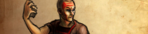
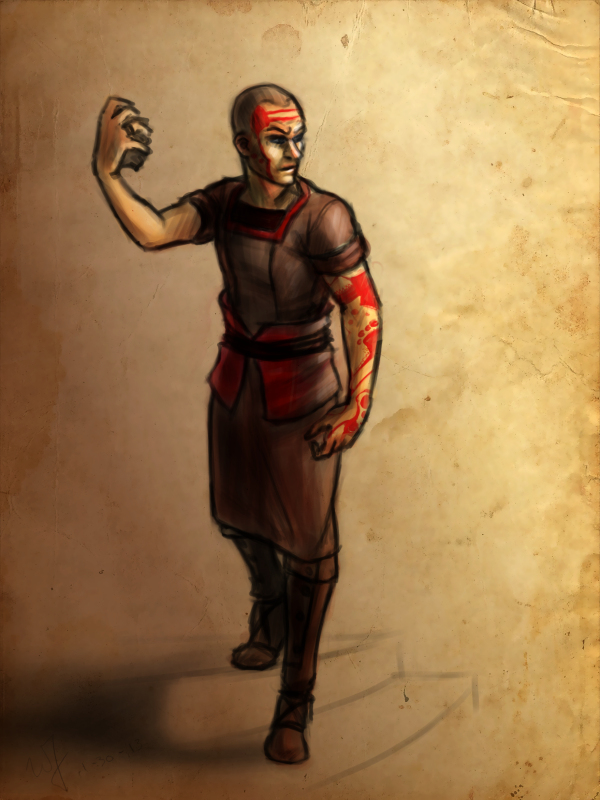
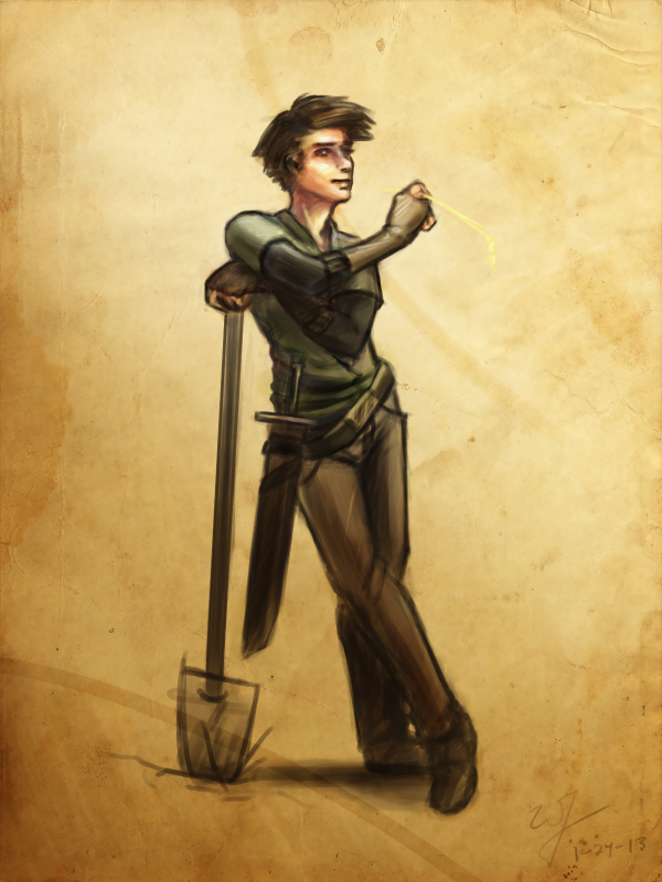
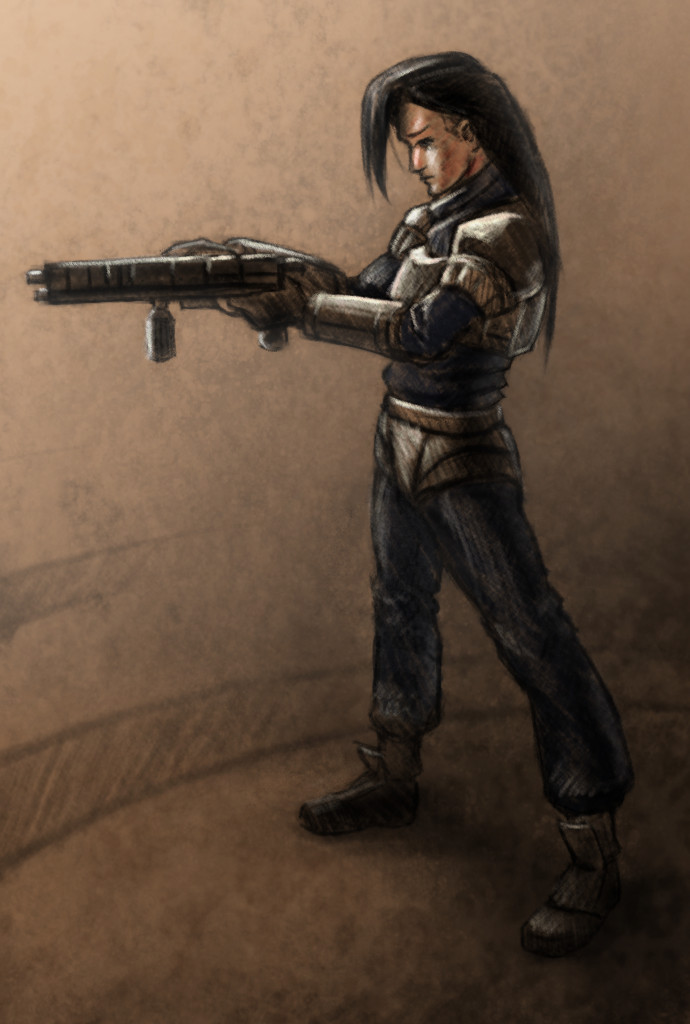
Also, I have been doing allot of concept work for Project Nebula. Been working with Ryan to work out world details, and a little bit of character design.
Speaking of which. This design is mostly Ryan’s, but I adjusted some of the ideas, seeing where it would take me. I also took the time to put together a time lapse video, something that I regrettably haven’t done in a while.
I love to look back on my processes. Most of the time during painting, it is a blur. I can’t distinguish one moment from the next. So recording it, and comparing my technique to previous paintings is fun, as well as enlightening.
One very important thing I learned this week is to do more thumbnails. Again, this isn’t a new concept to me. But I am not in that habit at all. And that is a bad thing.
I find as I do thumbnails, it allows me to work out things that I didn’t even realize were problems. Obviously, this can save a painting and time in the long run. I guess some of the best lessons are hard to learn.
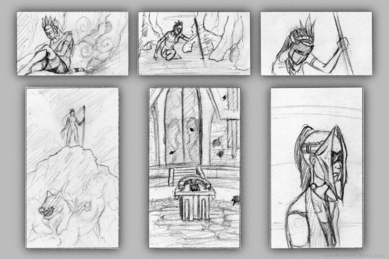
In the past I have done thumbnails quite a bit. For the Templar nation project, I had to put together thumbnails for the director, so he had some idea of what the final product would be, and for composition. We didn’t do a storyboard for that film, so this thumbnailing was essential to communicate ideas to others.
Also, some personal projects in the past only got as far as thumbnails. But it is fun to go through old thumbnails and be inspired to paint or draw something from them.
So, seeing that doing thumbnails paid off in the past, i decided to take a current project and do some thumb nailing.
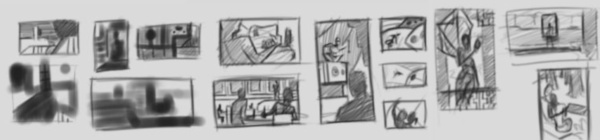
Here are a few icon thumbnails I did for the soon to be released Josh the Whale app. When putting icons together for apps, there are a few things to ask yourself. Is it simple, does it still read well regardless of how big or small it is, does it stick out if you place it on a page of other icons?
These are just a few things to keep an eye out for, and I am sure there are many other questions I could be asking myself. But the exercise was fun and a bit eye opening. I am planning on making thumbs a habit, since the next week will require allot of it.
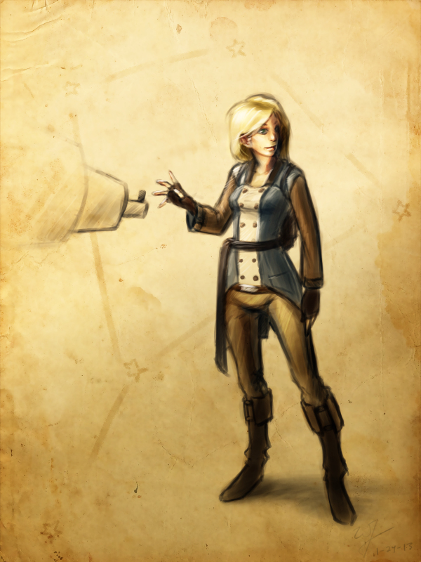
For next week’s sketch review I will be doing allot of environments. Project Nebula is about to go into full swing. Our writer is requesting more visual reference (concept art), based on our initial notes of the story. A few days ago, I posted some character art HERE, and next week will be dedicated to this.
Expect more thumbnails and some rough concept art next week, and maybe a few more character paintings. Until then.
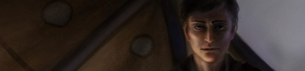
The discussions, and what not, continue with project Nebula. This is the next app project coming out of Thor Media LLC.
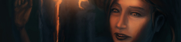
After doing a Google hangout this morning, I decided to spend the rest of the day doing some well rendered character designs. This by no means is a representation of the final characters or look of the project, but just to get a few ideas out. A launch platform of sorts.
We have a new person on board to help us with the writing and dialogue, Sterling. Good to have him aboard, and to help bare some of the weight for a project this big. We are excited to have him on and we are excited for this project. It is a bit lofty, but we believe that we are introducing somethings that haven’t been seen on the Android market yet, which will help gain attention, and hopefully bring in some income.
Look forward to some more concept art, other details on project Nebula, and also a weekly sketch review this weekend.
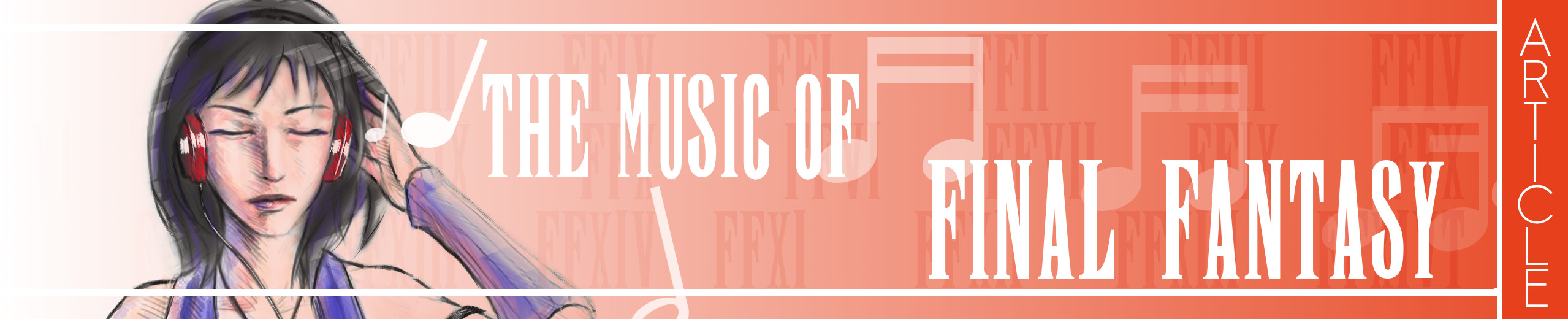
Click HERE to start reading an article I put together as tribute to some of the great music in Final Fantasy.
This article was written for a contest at 1up.com, HERE. Check it out, there are some other really good posts there, definitely worth reading. It’s great to see how many people this music inspires.
When I started writting the article, I knew I would want to do a few illustrations for it as well. Seeing that this blog and portfolio was created to represent my art. Here are a few things that I learned during this process.
I should have set some better goals. I though about the music allot, and what I wanted to talk about, but I sacrificed not setting goals with the illustrations. When I was done with my first draft, I tried to go through the article and think of what scenes or characters would best represent that part of the article. The problem with this thinking was, I had no idea how many illustrations I wanted to do. In turn, I had no idea how long it would take to get them finished, and what style I should do them in.
So I rushed the last couple days, finding out that I do better work when I am rushed, at least. And I ended up settling on two different styles for the illustrations. A vector monochromatic and full color pencil mediums. I won’t post the vector illustrations here, but you can see them on page one, by clicking HERE. Overall I though that they came out good, and do contribute to the article overall.
These three color pencil pieces were done in Gimp, I was surprised at how close I could get it to look like the real medium. I looks like color pencil but enhanced by the pure colors brought by digital.
Overall, the experience was good, and I am planning on doing some other project articles with illustrations in the future. Anyone here like Myst?
Again, enjoy the article, and let me know what you think.
The holidays hit and time was placed elsewhere for about a week. My brother and I have kept busy with “Josh the Whale”, and are making good progress on that front. We are looking at a release date around January 15th. Been having fun modeling, texturing, and animating whales, but I am looking forward to finishing it, and moving on to another project.
Speaking of which. We are working with a talented story teller, Ryan Thatcher, and getting a RPG/Action Adventure game together. We have developed some good ideas for story, and for game play mechanics, and are very excited to get more involved in that project.
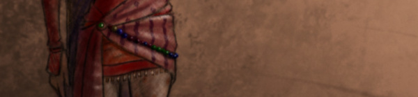
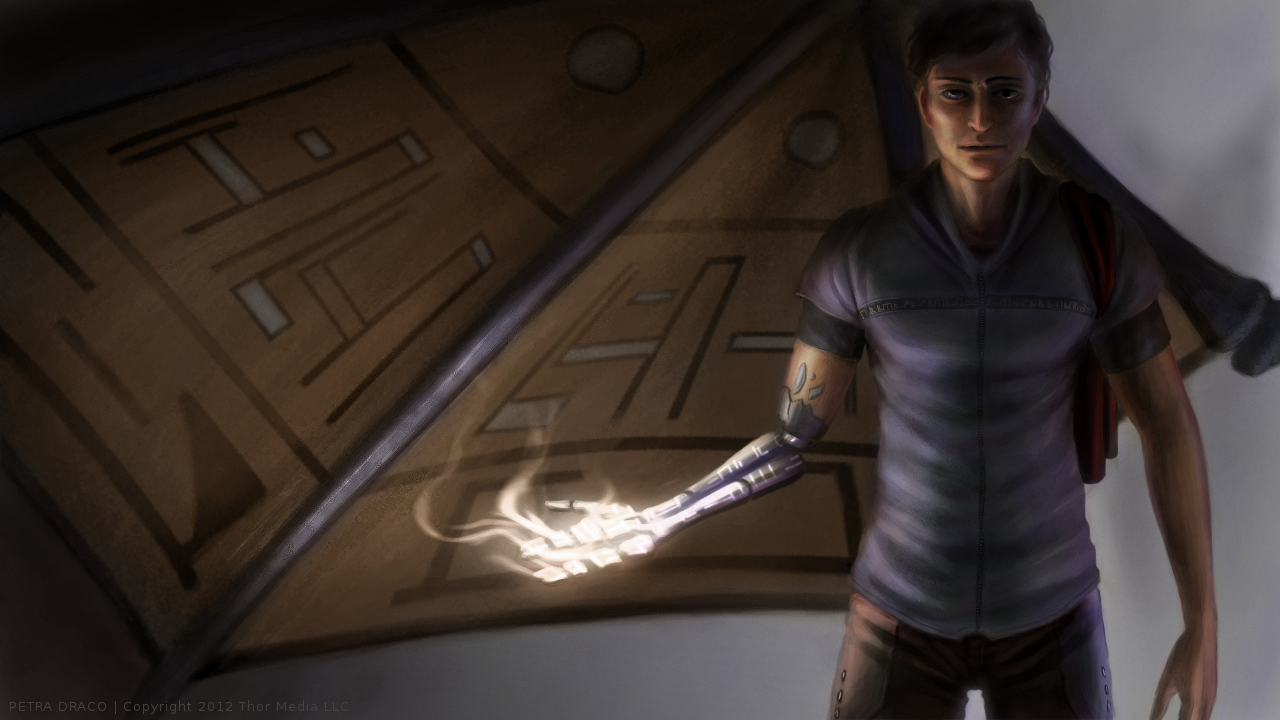
But in my free time, I have been looking at other planned projects, both personal and work related, in search of some room to develop concepts or just produce some art for those ideas. That is where this illustration came from. This a project that Thor Media has put on stand still for the moment, but still in the concept stage. I can’t talk too much about the project, since allot of the details aren’t concrete yet, but sharing a little of that development, visually, can’t hurt. Sorry, no video this time around, but If you haven’t taken the time to see some of my other time lapse videos, I encourage you to watch and comment on my YouTube Channel.
Josh the Whale is still moving along, and while we have been journeying down this path, we are picking up on a few things.
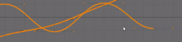
One of these things is how to handle assets between Blender and Shiva 3D, our current game engine. And one particular asset of interest is animation.
When you import animation into Shiva 3D it automatically interpolates the IPO curves as linear. This is a problem because you lose all of your ease-ins and ease-outs. Making any animation you do feel very robotic.
One way you can avoid this is by key framing the nice curves (bezier curves), in Blender, to every frame of your animation. This would obviously be close to impossible to do manually for every frame, but Blender has a very nice option for this. It is an option called “Sample Key frames” under the “Key” menu in the IPO curve editor.
This short video will demonstrate my current method, using this option, to preserve beautiful motion, between Blender and Shiva 3D.
I have been seeing allot of stuff done in Krita lately. Also, I have been reading allot about over at David Revoy’s blog. And I finally took the time to get into it and learn some things. And my initial impressions are good.
The brush engine is fantastic. It’s fun to just go in and play around with the variety of brushes and different effects.
One of the things I liked the most about Krita was the little sketch pad they have in the “Edit Brush Settings” dialog. With the wide variety of tools, it’s good to have something that you throw a line down on, to see how it will look on your canvas, without having to actually put it on your canvas.
Plus, this is almost a necessity with this program, because this dialog takes up a good portion of the screen, and to go in and out of this dialog would take allot of time if you could only test tools on the canvas. This also feels great for those who work with real mediums, as artists will often test a stroke, color, or tool on a separate scrap piece before painting or drawing on the actual artwork.
Shift+left-mouse-buton dragging for brush size is invaluable, and saves allot of time in the long run. I wish the Gimp had functionality like this. But I understand why it doesn’t. This also reduces the interface.
Another leg-up that Krita has over Gimp is multiple color depths. Most concept artists, or illustrators will never use over 16 bit, but since I get into the film and 3D stuff every once in a while, it’s comforting to know that I will be able to work with 32 bit images on an open source platform. Gimp will be getting this functionality soon enough, but for now Krita is the only user friendly way of handling 32 bit images on the open source platform right now.
The last thing that really stuck out was the right-mouse-button menu. This brings up a color wheel and color history. Also, you can save preset brushes to this menu, making it faster to get to the brushes you will be using often on a given piece of art.
I have only scratched the surface of what this program can do for the concept artist or illustrator. But I see myself using this program, along with the Gimp, to do my illustration work in the future.
Josh the Whale is moving along nicely. Bryce is figuring out the new engine and we have already put together some proof of concept work. While he’s figuring out how to get this all put together in an application, I am trudging forward, getting other areas of the game designed and finished.
This is a time lapse video of the cave entrance where a few pages if the book will take place. This video is especially long because all the interface movement would be too distracting if I compressed it down to 4 minutes. So, if you don’t want to spend 20 minutes watching this video, watch for about 1 minute and then skip ahead 5 minutes, this will give you a good feel for the whole process.
As you can see, the difference between the concept art and the finished result is dramatic. And I predict that there will be more changes in the future, as we test on different platforms. This is partly because of my lack of planning, but also because plans change as you continue to consider your market and what ideas you wish to express visually within the story.
And there are also limits with polygon count amount other things. I try to avoid thinking that way when doing this kind of work, because even with restrictions you can usually get what you want out of it, if not stubble upon a few good things you wouldn’t have seen without the restrictions.
The processes that I go through to hash out these designs are simple:
Brainstorm and Sketches (What colors, what environments, visual style)
Concept art (Hardest part, because you are trying to develop a visual style and language that best fits the idea)
3D’ize the Ideas (Modeling, Texturing, Rigging, Animating, and other asset creation)
Troubleshooting (testing to make sure that the colors are sending the right visually messages, the main character sticks out enough, etc. Often the longest part of the job)
It’s allot of work, and can be very daunting when you first approach it. But as the artwork comes, the assets get animated, and those assets are placed into an interactive state, it can be very exciting and encouraging.
I will continue posting about this app, since it looks like we are still a good month away from a final product. But I do have other things lined up.
I am currently putting together a personal project video series, that should carry on for a few months. I got a few ideas in mind on things I might be able to contribute from my limited experience. And placing some of that experience into a fun video series will help keep me motivated in my work, and hopefully motivate some of you as well.
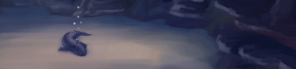
Another illustration. Inspired by all of the underwater stuff that I have been doing lately. Plus, I have been thinking of these colors quite a bit lately, since it is similar to the color scheme of my website.
For anyone that might be interested in what I use to record my desktop, and how I go about editing. I use a simple bash script with ffmpeg to record. Nothing too fancy. The script records at 24 frames a second into an h.264 codec, keeping the file size small. But whats special about this script is that it records for 7 minutes, saves that file, and then starts recording again to a different file. It names the files acording to the date and time they were created. Here is the script.
The problem with recording to video is that if you are recording for an hour or two, and ffmpeg crashes, you lose that entire recording. And there usually isn’t anyway to recover that data. This is a problem I ran into several times, and it ruined a few paintings because I would just get frustrated from losing all that recorded work. Making a consistent time lapse video impossible.
But, if you record in shorter segments, for example 7 minutes, then you can never lose more than 7 minutes of work. This takes my mind off of worrying about my recording so I can just focus on painting.
Right now the script is setup for Linux, but I believe it can be easily adapted for Windows.