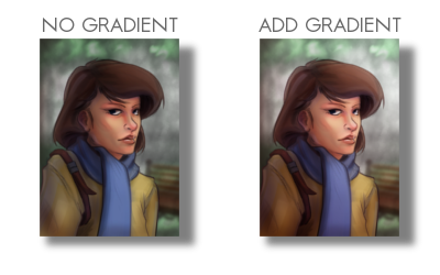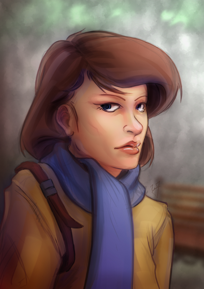
I have been using allot of gradients in my work lately. Because of this, I thought it might be good to put together a tutorial of how I have used them so far.
As for what I want to come across to the reader, I want you to learn how to use gradients to create a focal point in your image, diversify and images color, and create a sense of depth.
Also, in order to help bring my points across, I have included a project file that can downloaded by clicking on the buttons below. I will be referring to this file throughout the tutorial.
Download
![]()
![]()
[expand title=”Download Notes”]
Note: The Photoshop file should work to the best of my knowledge. The only thing that might not work are specific layer’s blending modes. Here is a list of the layers and the blending modes they should be on:
- “Gradient Painted” –> Multiply
- “Gradient Tool” –> Overlay
- “Subject” –> Normal
- “Background” –> Normal
Another option is to download a copy of Gimp, HERE. IF you are using Windows or a Mac, about halfway down is a link that says “Show other Downloads”, click this and you will find versions for those platforms. It’s free, and small, and you will be able to open up the project file without a problem.
[/expand]
A bit of disclaimer. I consider myself in the professional work field, but I am not a master at the craft. This tutorial is to share knowledge and a few tips to other artists who may not know what I am about to teach.
Also, if you don’t know how to use the gradient tool, or blending modes for layers, in your given program, go ahead and do a Google search about these two things. Having a basic knowledge of these two tools is essential for this tutorial.
I feel Like I’m Cheating
When I first started doing digital artwork, for some reason I had it in my head that using gradients was kind of shortcut, and it was something that professional artists tend to avoid. Gradients, along with some other tools (dodge and burn tools) almost seemed taboo, and were used by beginners to add shading in a cheap and quick way. I can’t remember were I got these ideas, but I couldn’t have been more wrong.
The years rolled by, since I started in digital art, and I began watching tutorials, seeing time lapse videos of paintings, and talking with other digital artists. And I began to realize that these tools were not a way to cheat, but instead to speed things up. These artists are professionals, on a deadline, and in order to get a large body of work done quickly and effectively, they would need these tools to speed up their work. This is one of the advantages of digital art, within a production environment.
I learned that these tools, if used properly, can be used to enhance and speed up your overall workflow, without having to sacrifice quality.
Adding Depth
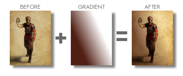
Here is a recent example of a gradient used to create depth in my work. You can see the original post for this piece HERE, along with a time lapse video.
By creating a gradient, that matches the angle of my light source, I turned this somewhat “flat” looking piece, into something that gives you a sense of depth. Yes, I could have taken the time to go and paint that subtle change from light to dark manually on my character, and then the background. But, because this is a concept piece, the less time spent on it the better. I turned a potential 3 hour long piece, down to 1 and half hours. More time to do other work, with out sacrificing quality, is good in my book.
Also, you might have noticed, the gradient doesn’t go from a black to a white. There are cases when you will use just a black to white gradient, but I found by adding color to the black or white can introduce new colors to the piece.
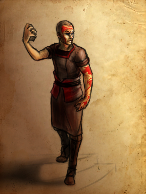
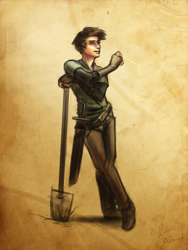
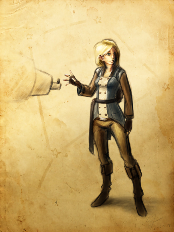
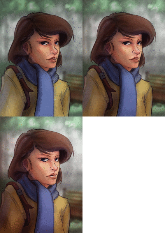
By the way, I used this same technique in all three of these paintings. But notice how I used a different color for the gradient to match the colors of costume for the character on the left. Also, notice how subtle the change is. Often you don’t need to have your overlayed gradient at full opacity. I usually end up dropping the opacity of my gradient layer down to around %50.
Try this out. In the project file make sure you have the “Gradient Tool” layer selected, and try adjusting the brightness and contrast. See how this changes the sense of depth in the image.
Color Diversity
Adding color to the gradient, while using the “Overlay” blend mode, can add additional colors to your painting. If you examine the project file you downloaded, I did this in that painting. Go ahead and turn the “Gradient Tool” layer off. A huge change will occur. Not only do we lose the depth, and the focal point in the painting, but the colors don’t seem to work as well.
I am using a tertiary color scheme with this piece. Brown, yellow, and blue, to put it simply. So by changing the black of my gradient to a brown, similar to the subjects hair, I am able to introduce those brown colors to other parts of the painting.
Especial her right shoulder. Originally, it’s a flat yellow color, nothing that interesting to look at. But, by adding that brown gradient and using the blend mode “Overlay“, it adds body and life to those yellows on the jacket, and ties it to the focal point.
Try this little experiment in the project file. Select the “Gradient Tool” layer, adjust the hue, along with the saturation, and the brightness and contrast. See how this changes the mood, and overall liveliness of the image.
Creating a Focal Point
If you are doing any type of illustration, or a piece with a central idea or subject, focal points are important. And this is where gradients can be very helpful to create a focal point very early in the painting.
As you can see in the project file, the focal point is the face and the right edge next to it. There are several theories of composition I followed to achieve this, but the most important and the easiest to include at any point during a painting, is the change of values from light to dark, or contrast.
If you turn off the two top most layers, “Gradient Painted” and “Gradient Tool”. The change from light to dark, or the value contrast, has become flat. Very uninteresting, largely because there isn’t a focal point. But, if you turn those two layers back on, you eye is immediately drawn to the face of the subject.
Final Notes
Few things I would like to mention. In the project file, the top layer “Gradient Painted”, isn’t a gradient made with the gradient tool. I just used a large soft brush to add some contrast to the left side of the painting. Sometimes, using the gradient tool will seem too consistent or perfect for your painting. So, depending on what style your going for, painting a large gradient by hand will give you a better effect.
Also, experiment with blending modes and gradients. Experiment with taking away and adding contrast using this technique. You might stumble on a look or feel that you like, but weren’t expecting.
With that being said, I hope you enjoyed this tutorial, and I hope it helped in some way. Any questions or comments are welcome.
I have a timelapse of the painting used in this tutorial HERE. Also, here is a list of time lapse videos and paintings of this technique in action. Sometimes it is better to see a technique in action than trying to talk about it.

