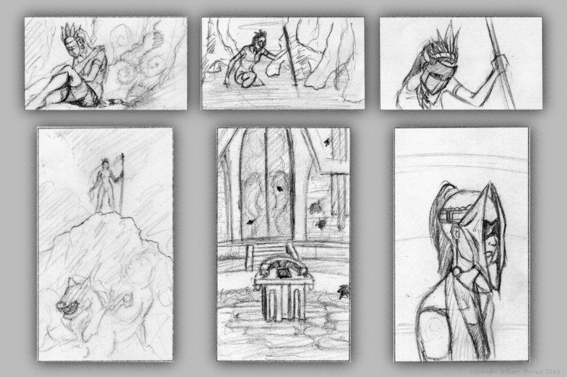
One very important thing I learned this week is to do more thumbnails. Again, this isn’t a new concept to me. But I am not in that habit at all. And that is a bad thing.
I find as I do thumbnails, it allows me to work out things that I didn’t even realize were problems. Obviously, this can save a painting and time in the long run. I guess some of the best lessons are hard to learn.
In the past I have done thumbnails quite a bit. For the Templar nation project, I had to put together thumbnails for the director, so he had some idea of what the final product would be, and for composition. We didn’t do a storyboard for that film, so this thumbnailing was essential to communicate ideas to others.
Also, some personal projects in the past only got as far as thumbnails. But it is fun to go through old thumbnails and be inspired to paint or draw something from them.
So, seeing that doing thumbnails paid off in the past, i decided to take a current project and do some thumb nailing.
Here are a few icon thumbnails I did for the soon to be released Josh the Whale app. When putting icons together for apps, there are a few things to ask yourself. Is it simple, does it still read well regardless of how big or small it is, does it stick out if you place it on a page of other icons?
These are just a few things to keep an eye out for, and I am sure there are many other questions I could be asking myself. But the exercise was fun and a bit eye opening. I am planning on making thumbs a habit, since the next week will require allot of it.
For next week’s sketch review I will be doing allot of environments. Project Nebula is about to go into full swing. Our writer is requesting more visual reference (concept art), based on our initial notes of the story. A few days ago, I posted some character art HERE, and next week will be dedicated to this.
Expect more thumbnails and some rough concept art next week, and maybe a few more character paintings. Until then.


Comments
2 responses to “Weekly Sketch Review | Thumbnails”
So do you do thumbnails for environments that are exclusive of any characters? I’ve found when drawing an environment digitally I build up on it in the full picture, although environments/backgrounds are the hardest thing for me to do in digital art.
I find if I am trying to create a certain mood in an environment painting, I will do thumbnails. Often the feelings or emotions you are trying to convey through any type of painting, is done through the composition.
So, If I want to create a place that is scarier than most places I will try to create triangles throughout my painting. actual triangles in the environments or just how things are laid out. And doing thumbnails before you jump into a painting, can help work out problems that you might run into if you jump straight into a painting without thinking about it’s composition.