The motion graphics work for Thor Media continues. This time, a complete 3D piece (done in Blender) with some minor character design and animation, with allot of motion graphics design. Join me on the “silicon slopes” and lets talk about the thorough process this piece went through.
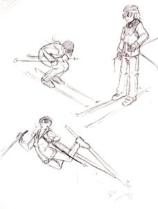
Before I get deep into this one, I must credit Brek Bulton with the initial concept of the video, and for bringing the job to Thor Media. He wanted to show a skier progressing through a day trip on the slopes. This was to be the backdrop of the for the heavy legal verbiage used for the voice of the video, while highlighting the contemporary nature of the client’s service with the idea of the “silicon slopes”.


With the scripting we were fortunate that Brek was handling that as well. After a few meetings hashing out the details, and pulling back to fit in the client’s budget, we got a near final script. I say near because the script was technically not locked down until the near finish of the project.
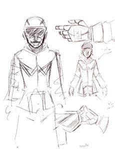
After the a final version of the script was in place, we had to make a bit of extra effort to convince the client of the concept, and present a visual motif that they would be happy with. This is where motif and character design came in. Because of the budget, I had to come up with a simple but attractive character design to minimize animation work. Inspired by allot of current motion graphics character animation (see Kurzgesagt), South Park, and Google’s paper design, I found a solution. I decided to stick to a 2.5 dimension paper cutout feel, which created a great sense of depth and interest in the image, while minimizing animation work (primarily 2 axis to animate instead of 3).
With a start on the visual design, I put together two shots to show how the video could look along with a temporary voice over. A long story short, the visual concept was accepted, and now it was time to approach the rest of the video.
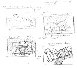
At this point, problems began to crop up when it came to finalizing the script. So, in an effort to keep the good momentum on the project, while accommodating an indecisive client, I decided that an animated storyboard would be needed to check the changing script against planned visuals to help the client to make final decisions in the script. This decision turned out to save everyone allot of time and allowed for flexibility in the visuals, almost right up to the end of production.
After some minor back and forth on some of the text and visuals in the video, and putting together a small vanity logo for the client to use in another video content, the final video was finished. Even though the project went a bit longer than expected, the final product came out well, and the client was very happy with the final result.
