William Thorup

Illustrator, Motion Graphics Designer, Animator, and VFX Artist

Category: Animation

  • Josh the Whale | Official Trailer

    Josh the Whale | Official Trailer

    Thor Media is coming up on the release of there latest project Josh the Whale. And during the last few days, I have been working on the official trailer for the app. Here it is.


    josh surface composite_yourname

    It has been fun getting the last touches together for this app. One thing that has been especially interesting for me is the music. We have my sister in law putting together the music for the app, and even though she doesn’t compose professionally, she has done a fantastic job so far. Her music fits the moods that we are trying to get across in the app very well.  The trailer itself came together really easy.


    josh surface video edit

    Most of the assets were already prepared. All the underwater scenery was practically done, because we used it in the initial concepts for the game. I had to do another animation for Josh, and do some simple compositing in the Blender video sequence editor. The only part that I had to put allot of time into was the beginning. I struggled with compositing distant water, before discovering how easy it is to add it in by using the z-buffer to create a fade between the distant water and the foreground water. Everything else was a cinch.


    If you want to check out some beta screen shots of the app in action, head over to the official page HERE. We should be releasing the app in a few weeks or so, on both Android and iOS.

  • Templar Nation | Wrap Up

    Templar Nation | Wrap Up


    This post has been waiting in the cellar for a long time to come out.  And I am glad to finally be able to talk about this production.
    I have posted about Templar Nation a few times before.  But here is a run down of the project if you don’t want to spend the time reading earlier posts.
    Around December 2011 Thor Media LLC was approached by Joseph James Films to handle the CG and some camera work for their next movie.  Called Templar Nation.  A film that runs in the same vein as Indiana Jones with a mix of Nation Treasure.
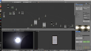
    Our company was, and still is, new to producing good CG.  In this case environments.  But we jumped on the ball and started to learn about 
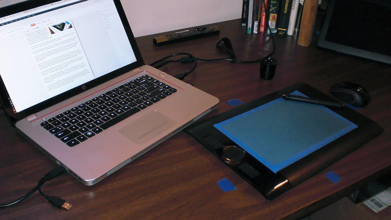
motion tracking/mach moving and proper green screen practices.  Its funny how these thing work out.

    (Unfortunately, because of bad planning, we had too small of a green screen studio to work with.)

    Right when we needed the ability to do 3D tracking, Blender had just been making updates in that direction.  Which is something that I am really thankful for, as I have gained quite a liking to the process of match moving.
    The film went into full production about mid-January, and finished filming two weeks later.  Jacob, Bryce, and I was responsible for recording information for match moving, and making sure that the green screen and match moving work was done right, on set.  We ran into a slew of problems with this, which I will get into later.

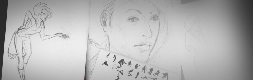
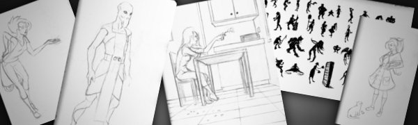
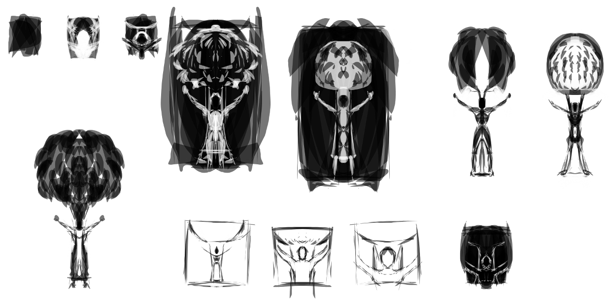
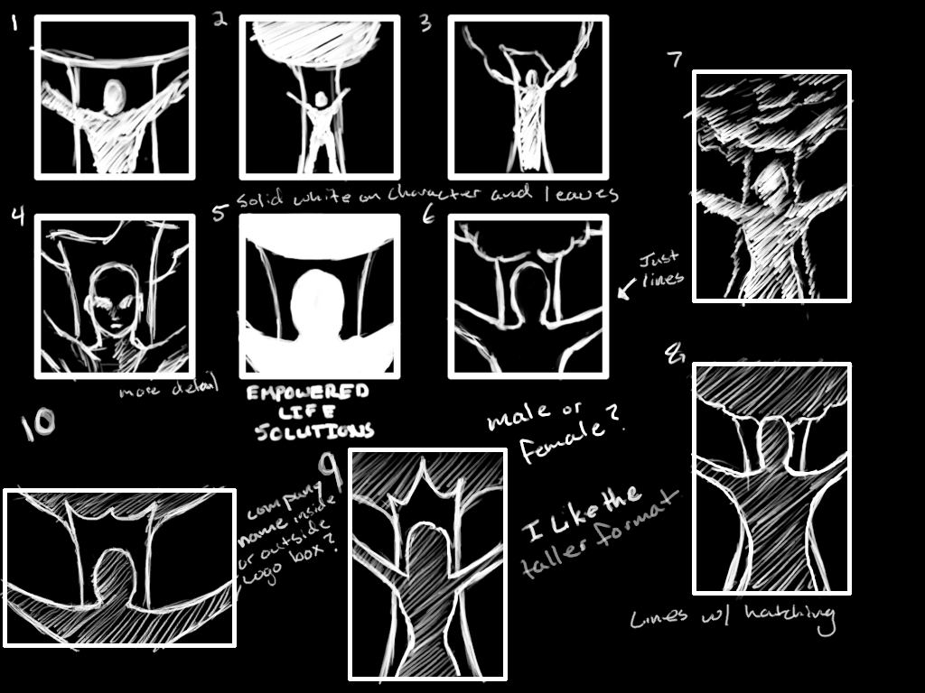
    (I got to do some character design!)

    Bryce, Jacob, and I were very much involved with post-production, as you might have already guessed.   But due to lack of budget Bryce and I had to stop working on post production work.  This was due to poor pre-production, since most of the design work for CG sets, props, etc., was done in post production.  Reducing the amount of time we could actually work on tracking and compostiting.

    But regardless of us being involved with pre-production, Jacob continued on, and a final product will be sold to another studio in the near future.


    But before I get into the the great things that came out of the project, I would like to talk about some of the road bumps we had during production.
    The first thing I learned was, pre-production is a must.  Not just for getting a script together, finding locations, finding actors, finding sponsors, etc.  But also for CG work.  Something we did not have the time or money for, was a storyboard for the CG scenes.  Storyboards are essential for CG sequences for various reasons.
     First, it will save time in the long run. There is a big difference between going onto a green screen set with a physical picture in your hand of what the shot will look like, and going on set with no idea of what the final shot will look like.  The actors and director will obviously have a better idea of what the characters are interacting with.  Lighting the scene is actually doable because you have an idea of what the final shot will look like.  It is hard to grasp correct lighting when all that you are looking at are green walls.
    Another good reason for doing a CG storyboard is that it can help the artist or designer image what should be in the shot.  For example.  The artist is thinking about adding a balcony to the side of a CG building in a outdoor party scene.  If the artist doesn’t know what the shots are, how can he/she know if they will need to design and create a balcony for the building.  If you are going to have a balcony in the back ground, should certain details be added to it, like a group of people having a conversation on the balcony.

    My point is, is without a storyboard there will be no way to consider certain details that cannot be thought of during shooting.  It saves time, money, and headaches for all those involved.
    This really was the one thing that made the production very difficult for most of those involved.  And because of it, this has become one of my requirements before becoming heavily involved in a large production again.
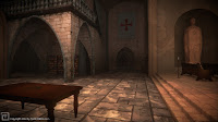
    As you have probably already seen, we worked on everything from full CG environments to props.  So overall it was a great learning process that provided some things that we can show off.

    Now there are a whole bunch of things I could continue rambling on about this production, but I won’t.  I am willing to answer any questions you many have, in the comments.

    To close this whole thing up in my mind, I would like to thank Bryce and Jacob with all of their help on the CG end of things.  And besides listening to me complain allot, Jacob did the bulk of composting, while Bryce helped me with allot of the design work on the 3D environments.

    Without their help we wouldn’t have been able to get out what we did.

    We hope, if the movie sells, they will want Thor Media to do another pass on the CG.  Because of budget and time, there were allot of sacrifices made to quality.  And it would be great for our portfolio, to go through and polish what we have.  I’m crossing my fingers.

  • Wedding Montages

    Wedding Montages

    This is something I don’t get to do very often.  My sister and my new brother in law got married about 2 months ago, and my sister asked me to put together a few photo montages for the reception.  So instead of a bunch of boring photos, fading in and out, I decided to take the time and do something a little more fancy in Blender.

    I want to thank Sarah for the ideas for her bridal and engagement photo’s montage.

    The timing is a little wierd for some of the pictures.  I was asked to do this last minute.   That explains why they aren’t a high resolution as well.  Also, there is not music to these videos because they had music playing on a seperate system, during the reception.
     

    I have learned from a few of my brother’s sad experience that I should probably stear clear of weddings.  But because of how layed back my sister was about how the videos needed to turn out, this was actually a fun little project.

    It’s good to be able to do something that isn’t so serious every ounce and a while.

  • Solar Power Live Wallpaper

    Solar Power Live Wallpaper


    Here it is, as promised.  Solar Power live wallpaper.  This is the most recent app from Thor Media LLC.  And I have to say, it really is awesome.
    Anyone who is into astronomy or sci-fi is going to love this.


    Basically, it is a star that you have complete control of.  You can fly around it, change the colors, tap and unleash a few flares to destroy the surrounding populated planets, add some orbiting asteroides, etc…
     
    We have a big update that is going to improve changing the settings, and make it so it never goes over 40mb of ram.  It is really cool and I hope you will take the time to enjoy it, if you have an Android device.

    And like usual, I would like to give thanks to our programmer, Bryce Thorup.  He is very talented, and without him, we would be no where with this stuff.  I would also like to thank Eric, kathleen, Lance, Jacob, and julie.  For there input and any additional work that they put in.  All of their great input helped create this, fun, visual masterpiece to our Android devices.
    My involvement inclued, modeling, texturing, animation, camera placement (composition), functionality design, and overall art director.  The programs that I used to create assets were Blender and the Gimp.  This one has been a while in the making, but it was well worth it.


  • What Have I Been Doing In Blender Lately?

    What Have I Been Doing In Blender Lately?

    Blender is still in my main pipeline, and it is doing good.

    This last week I have been doing a commercial for one of Thor Media‘s new apps.  Solar Power, which was released last week.  I suggest that you go pick up a copy, it’s awesome.  I will be doing a post about it soon enough, if you wish to wait for some details on it.

    Here are a few screens of the composite.  Guaranteed to make your brain overload.


    Lots O’ Fun.

    As you see in the picture, the compositing is a little… Involved.  And I have to say, for this kind of work, Blender is capable, but not the most efficient.  A program, like Adobe After Effects would be more ideal for this kind of situation.  But, it seems that every time I use the compositor in Blender.  I learn something new.  So I stick with it, on most of my projects.

    This one is actually kind of a mess.  Simply because I don’t have it optimized for the sequence editor.  This isn’t a big issue, it just makes it a little messy, and a bit harder to do small adjustments.  But everything from keying the green screen to color correction is done is a single run, which is a huge plus for Blender.  Not having to jump between a bunch of separate programs is a blessing, in that there is only one interface and set of controls needed to be learned.

    I will probably do another post show it separated out into different scenes and optimized for the sequence editor.  And, of course, I will post the final commercial when it is finished.

  • Lucky Paper Lantern | Live Wallpaper

    Lucky Paper Lantern | Live Wallpaper


    Another wonderful app by Thor Media LLC.  Lucky Paper Lantern.

    Again, I would like to thank Bryce, Eric, Kathleen, Julie and Jacob, for all of their input in making this a visually and functionally fantastic live wallpaper.  Make sure to check this one out.

    There is a free version of Lucky Paper Lantern you can download here.  But I suggest you go for the full version here.  Not only is it worth the $0.99 we are asking, but you are supporting what we are doing.


    Here is the current description:

    “”
    Get your own, 3D, lucky paper lantern for the background of your Android device! This app is for anyone who likes anything about Japan, Korea, Singapore or China. Or if you like to show off how beautiful your phone is with wonderfully designed paper lanterns. Watch as your lantern swings back and forth, gently, in the wind.

    Choose your design, color, and message to create a unique oriental feel for your Android devices background. With many options, including:


    • 6 different paper lantern designs (More coming soon).
    • 20 different Chinese character combinations. With the option to have it change randomly whenever you return to your home screen. (More choices coming soon).
    • Choose any color lantern you want. Also, the option to have the lantern change colors randomly, every time you return to your home screen.
    • Several different backgrounds with Asia oriented settings. (Old Japanese Village street, Bamboo Forest). Including other abstract backgrounds. (More choices coming soon)
    • Adjust the way the background scrolls with your homescreen. Let it take its time to rotate around the lamp or have it match the speed of your normal home screen swipes. It also has a lock option.


    Updates Coming Soon-


    More animal lantern designs! (Zodiac animals and pandas!)More choices for what is written on the lampLight flicker optionAccelerometer control – Let the tilt of your phone determine the movement of the lamp.Dust particlesAdd a moth.

    “”

    So, pick up your lantern.  A green lantern, or a more traditional red lantern, perhaps.

    Are goal, is to make visually and functionally outstanding apps for the Android Platform.  We will not release anything unless we know it stands out.  So, we thank those who have already supported us in our endeavor, and encourage those who haven’t had to check out our great stuff, to do so.  You won’t regret it.

    Thank You!

    A small note on how I was involved and what I produced.  I was considered the Art Director on this project.  I came up with the original concept, and did the designing, will input from the above mentioned people.  I was the modeler, texturer, and previsualizer.

    All of the models and texture mapping was done in Blender.  Texturing was done in Gimp.  I also did a previs video for this wallpaper.  Check it out!

  • Now, What Do You Use To Sketch?

    Now, What Do You Use To Sketch?

    Its always good to think about how we do things. Giving a little self-assessment can help us grow faster than we were before, and help us do our work more effectively, especially on how to sketch. So I thought I would present you all with my sketching structure. What I use and how I sketch currently. I will cover both my digital and real mediums. And I will provide a short list of things to consider when buying art supplies, and how to prepare to sketch.

    I hope I can spur up some thought, on your end, that might help or encourage the way you do things.  And, sorry to disappoint, but this is not about how I sketch, or my process of sketching.  But what I will be talking about will get you started, and help you get settled in a way of sketching.

    This is certainly not one of my usual, shorter posts, so take it in small chunks, and absorb it the best you can.  I tried to be as to the point, as much as possible, without leaving out things that I think might help others in their sketching processes.

    When it comes to drawing a sketch, my habits and process are constantly changing. This is my nature, as I am trying to improve my methods and discover new tricks and tips. Also, what I use and how I sketch are often influenced by what I am currently studying.

    For example. If you are focusing on gesture drawing, you might not need much more than a 8″ x 10″ sketchbook and a pencil. The pencil doesn’t really need an eraser in this case. Since you are probably trying to capture a gesture in a few seconds or less, and being outside, drawing people, there is usually no time to erase.

    But in contrast. If you are doing charcoal/graphite portraits, you will most likely have both a small and large format sketchbook, blending stub, several different pencils or charcoal sticks, kneed eraser, etc…

    And there will be times where all you need is an Etch a Sketch.

    What I am getting at, is this post is just to show how I go about sketching, currently. And my methods change constantly. Gotta stay fresh.

    • When I was Your Age…

    When I started seriously drawing and sketching, about 13 or 14 years ago, all I had was print paper and a pencil. I really had no comprehension of what kind of tools were available to artists, and really just found what I could around the house. This habit has stuck with me.

    Having loose sheets for sketching is not always the best way. Simply because you might lose that sketch and it isn’t the most convenient outside. But I have found that paper protectors, a binder and a little bit of effort will keep you from losing your sketches. I have always liked the feeling of loose sheets, it makes the sketch feel like something that could be framed, if need be. It also makes storage easier. The other reason I prefer this method is because you don’t have rings or the binding of a book to hinder the movement of your hand or arm.  A problem that I am plagued with when using smaller sketchbooks.

    Some things to keep in mind when drawing on loose sheets.

    1. No commitment.  The sketch is loose, and you don’t have to risk ruining a sketchbook removing a sketch you don’t want.
    2. Make sure that the paper you are using is acid free.  Most print paper should be, but I have been surprised too many times not to give this warning.
    3. A clean surface to draw on.  I just bought a piece of sturdy particle board, which I happen to use to attach small water color projects to, as well.  Now I don’t have to worry about the tably I am drawing on, being dirty, I brought my own table!
    4. Stick to standard paper sizes, like 8.5″x11″.  Going any bigger can be difficult to store and protect.  They do make binders and paper protector sizes for bigger and smaller formats, but these will tend to be harder to find and a bit more expensive.

    • My Basics

    The picture, to the right, is my basic setup. For when I have some time set apart for sketching. This includes a 18″x24″ sketchpad, a red lead pencil and a few other tools.  I will talk more about my tools in a moment.

    The reason I use a larger sketchpad is to practice using my shoulder more than my wrist. I have found, when I use a smaller sketch books, it is harder to use your shoulder. Simply because there is less room to make the larger movements of the shoulder.

    I also use a 24″x36″ sketchpad for detailed portraits in charcoal and graphite.  This is something that most classes will require you to have.  And it does feel cool to be drawing that big anyways.  It is always a good investment, if your planning on taking smaller sketches and making them bigger, or you are drawing from life.

    As for brand or what kind of paper you want in a sketchbook. I don’t know too much about those things. Only that there are differences in pricing.  I usually pick a mid priced sketchbook, because it seems if you invest a little bit more you get a better product.

    A fine tooth paper has worked for just about everything that I have done. But it will take a far more experienced person to explain the differences and the uses of the different paper weights available. Anyone who is reading this, if you have references or advice on this matter, please let us know.

    A few things to keep in mind when you are buying a sketchbook/pad:

    1. Think of scale and detail. Obviously you will want your drawing to be a certain size. But also keep in mind, that the larger the paper the more detail you can include in your drawing. A smaller sketchbook only allows for so much detail.
    2. Pick your binding. There are hardcover, tape bound, and ring bound sketchbooks.
      1.  Hardcover is the most permanent, and will keep the pages from rubbing together. Protecting any graphite sketches you might have. But, depending on the size of the sketch book, it might be hard to get the pages to lay flat, if the binding is really tight or the book is too thick.
      2. Tape bound is similar to hardcover, but it often allows you to remove your sketches more easily.  Good for classes and if you need to present or store your sketches separately.
      3. Ring bound sketch books make the sketching experience more enjoyable.  Simply because the pages always lay flat, and your hand will never run into anything, on the top or side of the page, that is distracting.  But the pages do have some room to slide around.  If you have any unfixed graphite sketches, they will get smeared and basically ruined.
    3. Think about how you are going to store you sketchbooks after they are used.  If your going to throw away all your hard work, don’t worry about it, but larger sketchpads can be difficult to protect.  Buying a similar size portfolio case is a good option but not always the best.  I have found the plastic storage containers are better (And cheaper).  They are ridged and mostly waterproof.  Truly protecting your larger sketchbooks.

    Hereis a simple list of some sketchbooks and their differences.

    • Tools for the Job

    There are hundreds, if not thousands, of different tools an artist can buy. So the question you have to ask yourself. What do I want to do? If you are planning on sketching, a few different pencils and pens will usually do the job.  Refer to the picture to get a look at my arsenal.

    Not very complicated huh.  In most cases, it doesn’t need to be.  I always tell myself when I am at the store looking at art supplies, it isn’t the tool, but the person who is using the tool that makes the difference.  This goes for just about any medium in any situation.  Now, I know that this little piece of advice doesn’t necessarily go for larger more serious projects and the materials you will use for them.  But for sketching, no need to get too expensive.  Its just practice.

    A small note about the red pencil in the picture.  If you have taken a 2D animation course, or read about the process of making 2D animation, you will know that they use different color pencils for various things.  It basically breaks the animation process down into visual steps.  To me, starting my sketches in red, tella me that this is not a final drawing, and changes can be made.  It also helps me not to worry about mistakes.

    Normal lead is stark.  If you lay down a line on a white piece of paper, that line will scream at you until you add some more lines.  One of the ways I avoid that feeling is by using a red pencil for my initial sketches.  Less intimidating than normal graphite.

    Another important tool for maintaining your artwork is a fixative.  This comes in an aerosol can, and is usually for charcoal, graphite, color pencil and pastel work.  You can also use hairspray to do the same thing.  But there are some things to take into consideration before you use hairspray.  Here will explain.

    • Digital Sketching | The future?

    Real mediums will never go our of style.  But if you have a little more money to spend, I highly suggest what I will talk about next.

    Portable devices are getting better, fast.  There have already been a few Windows slates that do very well at sketching.  But the one draw back that keeps most people from pursuing this kind of sketch book is the price tag.  Most, if not all of these tablets, are over $1000.  Placing these tablets a little too far out of an artist’s modest budget.

    Even the iPad is still above the mark that many artists are willing to pay, mainly because of the cost of extra accessories to get it to a point where you can use it to sketch on.

    But recently, through the mercy of Android.  The clouds have parted and the price has dropped.  And, currently, there is one 10.1″ tablet that is ideal for sketching.  The Lenovo Thinkpad 10.1″ tablet.

    I won’t get into a whole lot of details on this tablet.  But it does have pressure sensitivity, and with the Android Ice Cream Sandwich update, its pretty darn responsive as well.   And for a price tag under $300, it is hard to find anything out there comparable.  I’ll post more about this, and other future tablets, another time.

    With this tablet I have pretty much replaced my smaller sketch books.  For sketching and even for starting out a larger project it does very well for me.  I have examples here.  I don’t have a hard copy of my sketches, and sometimes battery life is a problem, but if you keep a good backup of your digital stuff, and keep the system off when you really don’t need it, these problems are nullified.

    One more thing that puts this on the top for me.  I am usually carrying this tablet around for work.  So whenever I have a little bit of free time, I have no excuse but to draw. I also use it to do preliminary sketches when I am sitting and discussing things with clients.

    Then there is sketching with a tablet digitizer.  I currently have a Wacom Intuos 4 8″x5″.  And I usually use this for sketches that I will be taking to a final product.  But there are times that I do sit down and sketch with it.  Something that I should probably do more often, since it is my primary medium right now.

    These can be pricey, depending on what brand you buy.  Wacom is top dog when it comes to these types of devices, but there are a few other companies the produce comparable tablets for less.  If you are doing any type of digital painting, a drawing tablet is a must.  And if you start getting really serious about it,  you will most likely end up with a Wacom Tablet.

    Here is an example of one of my sketches on this drawing tablet.

    And for anyone who is interested in what software I use.  Adobe Photoshop, Adobe Illustrator, Inkscape, The Gimp, Mypaint, Alchemy, Krita and Blender.    Any one of these programs can be used for sketching, to one extent or another.  I tend to lean towards all of the open source packages, because it makes me feel better inside, helping out those communities.  But the Adobe products have many things that open source is catching up to.  If you going to be sketching digitally  though, there is no reason to drop a few hundred dollars into a professional package.  Its just practice, right?

    • Conclusion

    Sketching is such an organic process.  Both how and what you sketch with can, and probably should, change constantly.  If you are an aspiring artist, strive to be a sketch artist.  This will often be the basis of everything you produce.  And I hope that something in this article could help you something.  I know that just by writing this, I learned a few things about myself.  To teach is to learn.

    If you have any questions and comments, feel free to leave them.  I am not the most authoritative voice out there, but I will do the best I can to respond.

  • Commercial | Empowered Life Solutions | Logo and Bumper

    Commercial | Empowered Life Solutions | Logo and Bumper

    This one has been one a while in the making.  And I am very happy to post about it.
    Thor Media was approached by Josh Lee.  Someone who we have done work for before.  Specifically some CG work for a short film based on the book “Alliance” by Gerald Lund (I posted about it here).  And Josh asked if we could put together a logo and a bumper for Empowered Life Solutions LLC.

    It was slow going, because of different scheduling difficulties.  But, so far, this has been one of the best work situations I have been in.  And learned allot on how to deal with timing and other issues that may arise with a client.
    Here are some of the process sketches and other ideas that we played with. Also a shot of website with the new logo.

  • iCuff | Internet commercial

    iCuff | Internet commercial

    This is a project that I started over six months ago, and just haven’t gotten around to posting yet.  I thought now would be a good time because of how long it has been since I have posted any 3D work.
    A little about this commercial.  Except for a little texture work in the Gimp, and the storyboard, this is 100% Blender.  I need to thank my brother Jacob for the advice, critique and the job.  I really enjoyed doing the manual match move of the watch coming off of her wrist, and the overall simplicity of the commercial.
    I am doing more 3D work, then I lead you all to believe.  It’s just the projects that I do VFX work for, are technically not finished yet.  This makes me unable to post that content until the final work is released.
    So I promise some somewhat impressive visuals in the future.  Things like full 3D environments with live action,  explosions, etc…

  • NxLeveL Commercials

    NxLeveL Commercials

    This is one of three commercials that we did for NxLeveL, and one of the three storyboards.
    I did the storyboarding for this project.  Jacob Thorup compiled it into an animatic to get our timing right. I also had to remake the graphics for the company, and do new animations and other renderings.  I also designed and created the  the product fly ins at the end of each commercial. 
    The final editing and compositing of the commercial was done by Jacob Thorup