William Thorup

Illustrator, Motion Graphics Designer, Animator, and VFX Artist

Category: VFX

  • Legends Boxing 30 Second Commercial

    Legends Boxing 30 Second Commercial

    Working with Bryce Media, I was brought on as an on-set VFX consultant and as the post-production VFX/Motion Graphics artist for a 30 second web spot for Legends Boxing.

    The Prompt

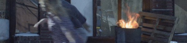
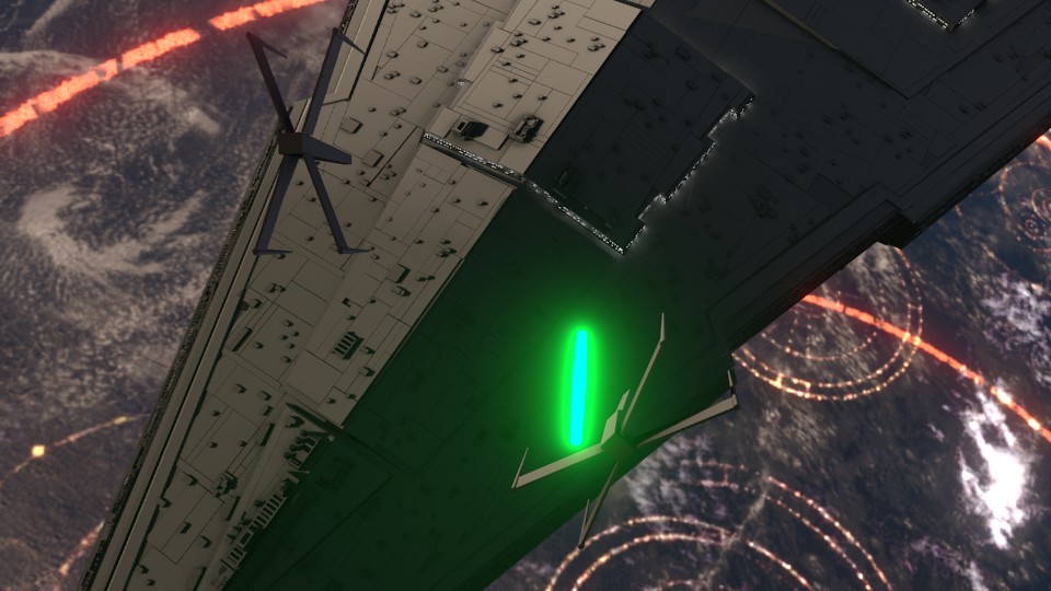
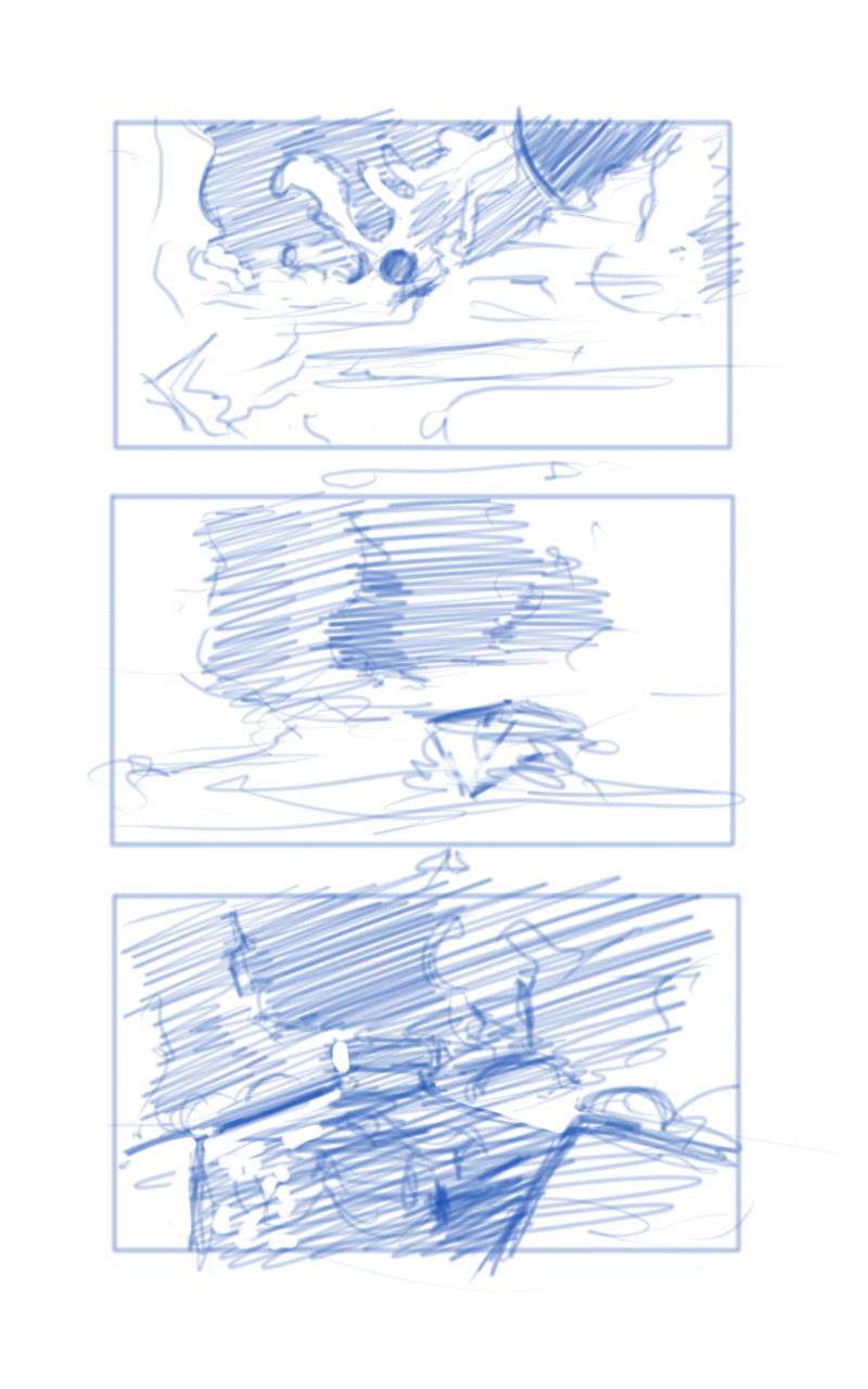
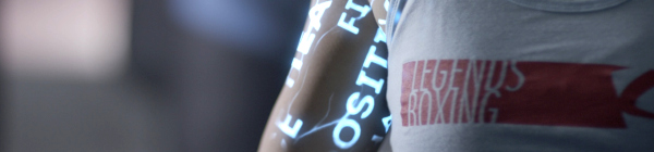
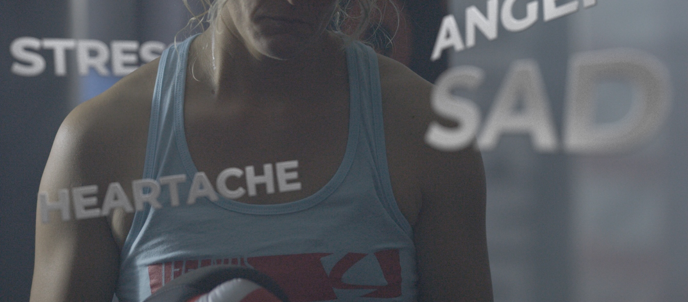
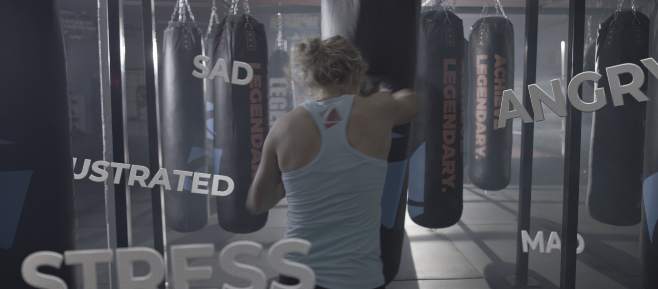
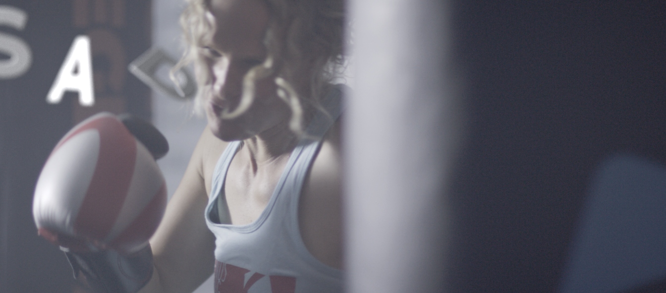
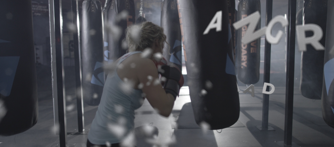
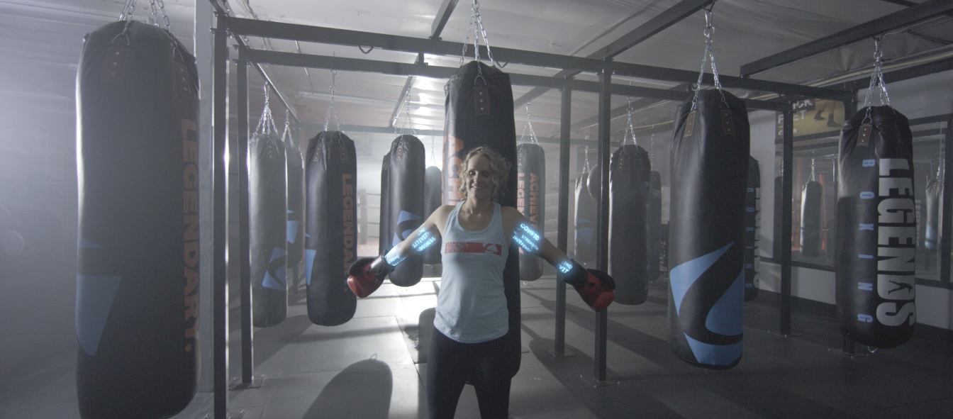
    The primary goal of the spot was to show how Legends Boxing can be used as a tool for empowerment. With this prompt Neil Bryce and one of the owners of Legend Boxing scripted a 30 second spot featuring a woman between 35 and 40 reviewing the daily struggles that she and many other face. 3D text/graphics would be incorporated inside the real space of several shots, words representing these negative feelings. Throughout the spot, this woman would be punching a punching bag, and at the same time destroying these negative words floating around her. The spot continues, the words finally all destroyed, the woman “resolves” these negative emotions, with a visible sense of relief. Graphically, positive words are illuminated on her arms and travel upwards.

    On-Set Production

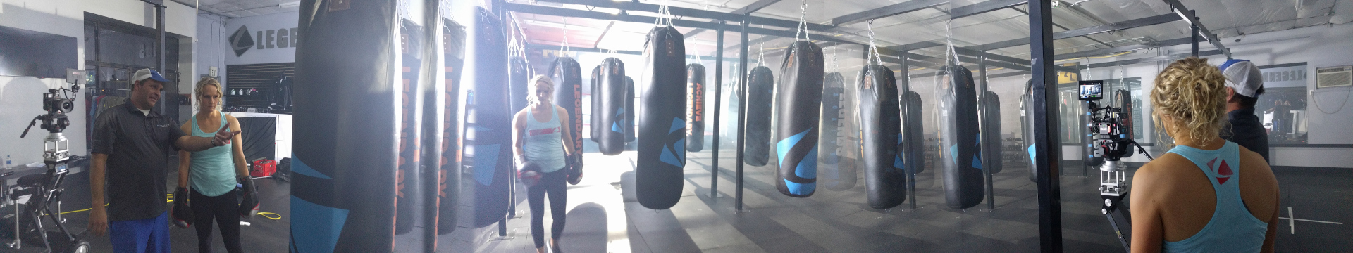
    On-set, Neil and I decided to simplify our shots as much as possible in order to fit the available budget of the job. Our primary tool for this was to stick to lock-off or on rail shots in order to eliminate any 3D camera tracking that would be needed otherwise.

    Beyond these suggestions, I stayed on-set to act as director of photography and help setup lighting and shots for Neil. Just a second pair of eyes to get ensure attractive and usable shots.

    Post-Prodcution

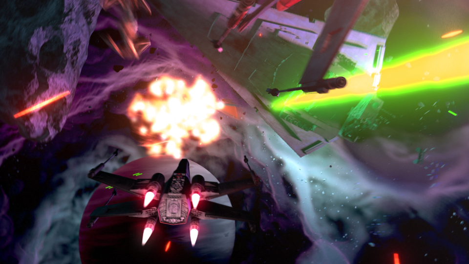
    All post VFX work was done in blender. Most shots were locked off, so it was just a matter of matching focal lengths, and figuring out approximate height of the camera and other distances for masking our punching bags and other objects in the scene. Then, just placing animating and exploding text where appropriate.

    The tricky shots were the arms and the blue glowing words on the woman’s arms. I had to create 3D maquettes for the arms, and then manually rotoscope the maquettes to match the movement of her arms. Besides a single 2D track to get the basic movement of the arms, this needed to be an entirely manual object track.

    The maquettes where rigged and modeled as closely as possible to the real arms, but 2d masks for the silhouettes of her arms were still needed to restrict the textured glowing letters to the positive space of the woman’s arms. After masking and animating the maquettes was finished, I was able to add and composite anything on the the arms of the woman. At this point I did a 2D animation of the veins and words that would appear on the arms, and then applied this has a texture on the 3D maquette.

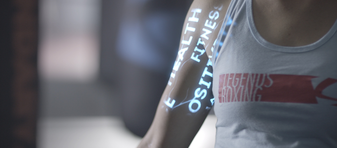
    The composite on top of the real footage was simple to approach. Blurring and film grain in Blender’s compositor was added. With one special case of the last close up shot, near the clavicle where her shirt covers some of the text, I needed an additional mask to blur and diffuse the light of the text to simulate it passing through the cloth of the shirt.

    All graphics went through about 3 revisions to get to their final product.

    Wrap Up & Telly Award

    The entire production of the spot has about a month turn around, and I believe was re-edit several times to multiple social media posts for the company

    Me and Bryce Media were both happy with the final result of this spot. We decided to put this in for a Telly Award and won Bronze in General Online Commercials.

  • MojiLife M3 Product Reveal Video

    MojiLife M3 Product Reveal Video

    It’s not everyday I get to do a from-scratch product render. Also, taking that product and producing a short intro/promo video to make it as sexy as possible isn’t par-the-course for me either.

    Product Preview Render Before Animation Work Started

    This small projects had a very short deadline. Everything was created and finalized in less than a week for a MojiLife conference. I wasn’t at the conference myself to see the video in action, but I was told it was used as the reveal video for their new product, and the video received a good reaction.

    Most of the time was spent on modeling the product itself, with lighting, animation and rendering done in just a couple days. Because of time constraints I wasn’t able to spend as much time as I wanted on materials and textures for the objects, but for a projected full motion video, it is convincing enough.

    I used Blender’s Cycles rendering engine for the final render. I tend to avoid Cycles because of render times primarily. But because of the run time of the video and the simplicity of the scene and its contents, the render times for this specific project were bearable. Also, because Cycles simulates light more realistically than Blender’s internal renderer, this helped make up for the mediocre materials due to time constraints.

    I don’t get modelling work like this very often. Most of the time I am going from 2D vector designs and animating in a 2.5D scene in Blender. More akin to what you would see in Adobe After Effects, but with more options for lighting and geometry manipulation. The opportunity to have to mimic a real life object in both form and material/texture in order to provide an affordable alternative to shooting live is a fun challenge, and I felt I pulled it off well for the client in this case.

  • 3D Motion Graphics | Franchise Business Law Group Company Video

    3D Motion Graphics | Franchise Business Law Group Company Video

    Thor Media was commissioned to produce a company introduction and services video for Franchise Business Law Group. A business that helps other businesses with legal protection and future planning for franchises.

    Prompt

    The commission was for a two minute motion graphics video. Something particularly emphasized by the client was to have a handmade feel, as opposed to a high technology feel. In their copy online they emphasize a customized or tailored solution for their clients. By bringing that out with symbols of creating or making things with one’s hands with everyday materials that people interact would help establish the idea of customized or tailored solutions.

    Production

    Upfront, time was spend working out the Audio/Video script. This usually takes a few revisions to get something that everyone agrees on. The voice over script usually needs to go through the client’s legal department or a copy editor for final approval. Then, the video portion of the script is always a bit ambiguous for the client, since they aren’t used to the idea of some explaining motion and other visual ideas with text. This portion of the script typically serves as a starting point for the artist, and help rangle in the visuals in the case the client tries to push the artists into ideas that exit the scope of the Audio/Video script.

    Because of the amount of effort that would be needed in regards to object modelling and texturing for props and other animated objects, we decided to approach our final product with an animation to begin with. This helped establish camera shots, compositions, lighting, and objects. Along with generally testing out ideas and overall tone and mood without the full investment into a final product. With a heavier production workload these kinds of animatic tests facilitate conversations between the client and artists to check their ideas long before bad ideas manifest themselves after a considerable amount of work done.

    As the animatic created and checked ideas and conversation are had on what the final product might look like, I was busy building and rigging animations for buildings and objects, made out of paper, that would self-assemble.

    Learning how to rig a completed model of a building, and then deconstruct in such a way to not make permanent changes, and give me controls that would easily animate and adjust animation when need was fun puzzle to work out. I was able to do this all in Blender without the need of additional plugins. Below are two examples of me working out the all important rig, but also the overall look of the paper and possible lighting styles for the final video.

    As the final vision for the video is finalized, through conversation and test renders, I began the longer process of building the set for the video, along with all the objects needed to fill that set. Couches, desks, writing utensils, books, shelves, lights, etc… Many of these objects were sourced from online repositories, but often they still need work done on them in order to get them fit the scene as a whole.

    After objects and the space have been laid out and built, lighting and rendering the space is next. The idea of a small business space was picked to match their target customer, and I chose an afternoon or evening time frame to create the base for the lighting coming through the windows. A natural light, I believed, would fit well with natural/customized/tailored fit, as opposed to a structured clean cut feel that pure white or artificial lighting would create.

    Wrap Up

    The client at one point felt that the push too hard to a naturalistic look might be a bit too much. We decided to include some technological elements into the motion graphics, while maintaining our connection to the paper motif for flat motion graphics, and the marker board with a hand drawn feel for later in the video. This ended up creating a good relatable balance for the viewer, since most people exist in both the physical and the digital life in various parts of their lives.

    The client felt final video turned out really well. The are some obvious deviations from the original animatic to the final video. The biggest was the inclusion of text cards to visually represent questions and other important text information. I personally like these because they help reinforce that paper feel used throughout the video, it gave us another use for the brand colors, and it made some really good visual breaks between different sections of the script.

  • Workman Nydegger | Silocon Slopes

    Workman Nydegger | Silocon Slopes

    The motion graphics work for Thor Media continues. This time, a complete 3D piece (done in Blender) with some minor character design and animation, with allot of motion graphics design. Join me on the “silicon slopes” and lets talk about the thorough process this piece went through.

    Before I get deep into this one, I must credit Brek Bulton with the initial concept of the video, and for bringing the job to Thor Media. He wanted to show a skier progressing through a day trip on the slopes. This was to be the backdrop of the for the heavy legal verbiage used for the voice of the video, while highlighting the contemporary nature of the client’s service with the idea of the “silicon slopes”.

    With the scripting we were fortunate that Brek was handling that as well. After a few meetings hashing out the details, and pulling back to fit in the client’s budget, we got a near final script. I say near because the script was technically not locked down until the near finish of the project.

    After the a final version of the script was in place, we had to make a bit of extra effort to convince the client of the concept, and present a visual motif that they would be happy with. This is where motif and character design came in. Because of the budget, I had to come up with a simple but attractive character design to minimize animation work. Inspired by allot of current motion graphics character animation (see Kurzgesagt), South Park, and Google’s paper design, I found a solution. I decided to stick to a 2.5 dimension paper cutout feel, which created a great sense of depth and interest in the image, while minimizing animation work (primarily 2 axis to animate instead of 3).

    With a start on the visual design, I put together two shots to show how the video could look along with a temporary voice over. A long story short, the visual concept was accepted, and now it was time to approach the rest of the video.

    At this point, problems began to crop up when it came to finalizing the script. So, in an effort to keep the good momentum on the project, while accommodating an indecisive client, I decided that an animated storyboard would be needed to check the changing script against planned visuals to help the client to make final decisions in the script. This decision turned out to save everyone allot of time and allowed for flexibility in the visuals, almost right up to the end of production.

    After some minor back and forth on some of the text and visuals in the video, and putting together a small vanity logo for the client to use in another video content, the final video was finished. Even though the project went a bit longer than expected, the final product came out well, and the client was very happy with the final result.

  • Chalk Trees | Certified Conference 2017 Intro Video

    Chalk Trees | Certified Conference 2017 Intro Video

    Finally! A project that got me into Krita’s new 2D animation tool set. What an incredibly valuable tool have in the bag. Lets talk about growing trees made of chalk.

    This is the 3rd year I have done the Certified Conference introduction video, and it is always a joy to work on them. First, credit where credit is due. Neil Bryce is the man who got us this work. He has been a could colleague and friend over the last few years, and through him, Thor Media and myself have had the opportunity to work on a bunch of great projects.

    With these conference videos we have taken the “hand drawn” approach for certain elements before. What makes the approach different in this on is that this is the first time where we didn’t use masks or other automated methods to simulate hand drawn effects. With Krita’s new 2D animation tools, I was able to approach the animating of elements that would naturally be hand drawn from a more traditional approach.

    I have always had a keen interest in traditional 2D animation, I even took a class in college to help satisfy my interest in the subject. Since that class, I have had a few opportunities pop their heads above the water a few times, but the opportunity to develop those 2D animation skills further have always seemed to allude me. Usually due to budget constraints. 2D animation is a very time consuming thing, and to invest in someone like me who doesn’t have allot of experience, or, the project skill-wise is a bit out of my skill set, it has been a hard thing for me to approach on a serious project. Till now…

    Because of the simple concept (Neil Bryce’s concept) I felt that this could be the project to dust some of those old skills off, and give them a go. I am glad I decided to take the risk. Everything, except the obviously 3D elements (rendered and composited in Blender), were hand drawn 2D animated elements. This includes all the text transitions, leaf transitions, along with the introduction of the seed being blown in by the wind with the growing tree.

    I am really proud of this piece, and the client really loved the way it turned out, and came back with only some minor revisions to the animation and colors. Nailed it! I also discovered that animating text this way, as opposed to using a mask, feels much more natural, and ends up taking about the same amount of time as other masking methods. The only issue is, is if the text needs to change. In this case, you have to start from frame 1 with the traditionally animated method. I just have to make sure the project script is locked down before working on these elements in the future.

  • Zombies! Run! | VFX for AFCU Commercial

    Zombies! Run! | VFX for AFCU Commercial

    A small job, but a fun one nonetheless. Another video production studio here in the valley, called Mighty Clever, needed some help for a commercial they were doing for America First Credit Union (AFCU). I believe they have been doing commercials for AFCU for the last couple years at least, and they have this fun zombie theme going on. They just needed help for one shot, here it is below.

    You may not even notice what was done on the shot, and if so, that means I did my job right?

    There are two things done for this shot. The first is the large sign above the store entrance. In the original shot, the sign didn’t have anything on it. This required a planar track with a simple composite. The last element added to the shot is the fire in the barrel. This was a fire simulation was done in Blender, and then composited into the shot, along with the sign, in Blender. The light emitting from the fire required some reconstruction of the set, and this was composited onto the original shot to make the additions a bit more convincing.

    Since we finished this shot, we have had the opportunity to help out with a few more internal AFCU videos that required more planar tracking, but this video covers the way I approached those videos, and it would be a bit unnecessary to show them here.

  • Red Stone and Light | 3D Floor Projection for University of Utah

    Red Stone and Light | 3D Floor Projection for University of Utah

    Through a few chance connections and some fun back and forth, I have a little bit of projection mapping VFX under my belt now. Th University of Utah’s athletic department a few years back invested in a floor projection solution for the Huntsman center, and they like to use it as much as they can. With the 2016 basketball season, I was able to add some of my work to the roster.

    A little bit of credit needs to go around though. First my brother Jacob, for the awesome networking he does for Thor Media. Without him, we wouldn’t even have these opportunities to work on these high visibility projects. Next, Kory Mortensen. He is one of the excellent video guys on staff at the U, and through him we were able to get this job. Thanks Kory!

    I don’t have allot to say about the project except that we were given quite a bit of freedom on the creative. This was in part due to the previous content that another company was producing for the court was now becoming a bit too repetitive fore the marketing direction. Another part was this turned out to be kind of a tryout for future work with the U.

    After some great collaboration with the U’s marketing director we knocked this one out of the park. I am looking forward to working on more content for U, and it always feels great to get this amount of exposure for Thor Media and myself.

  • Star Wars: Legacy of the Force – Fan film – Happan Ambush CG Sequence

    Star Wars: Legacy of the Force – Fan film – Happan Ambush CG Sequence

    This post has been a long time in the making. Some time around the beginning of February of 2015, we approached the James brothers ( a utah local film crew, and artists) who currently involved with a locally made Star Wars Fan film called “Star Wars: Legacy of the Force”, primarily produced by Tye Nelson and directed by Danny James. We asked if they might have something that we could work on in regards to VFX, and they had something big that needed work on.

    A quick thank you to Jacob Thorup and Bryce Thorup for letting me work on this at work, and also for providing critique. Micheal and Heather Buhler for their feedback. And finally Tye Nelson and the James brothers for allowing me to work on this project. Thank you!

    (Note, my details about what has happened in the production are very slim, I was third-party primarily, and most of my details come from conversations and emails from both the James brothers and Tye Nelson.)

    Be sure to watch the whole film at legacyoftheforcefanfilm.com

    The Proposal

    At this point in production of the fan film, everything was shot, and basic edits had been put together. This rough cut also featured a rough intro battle sequence which was strictly CG. You can see a what this looked like through this video at the 00:09 second mark, hosted on the creator’s channel. The producers and directors were not completely satisfied by this product, that was produced by another artists, other than myself. Because of this, the James Brothers offered to have me take a shot at it. I said yes.

    In case you don’t wish to spend the time to go through the rest of the article, I put together a quick video that goes through a bit of the development process, along with a break down of the final shot.

    Pre-Production

    So began a fun, frustration, enlightening, and enjoyable adventure of the most complicated CG shot I have done to date. I used Blender as my primary tool, and I eventually moved into After Effects for my final compositing.

    Based on some notes from the James Brothers I began reworking the current sequence to be something a bit more dynamic and interesting. I started off with just a small piece of artwork produced for the Star Wars official card game, and with some ideas of making it look like the fight was taking place just in upper orbit around a planet.


    animatic_1_1animatic_1_2animatic_1_3animatic_1_4animatic_1_5


    This is where the first animatic came into play. This was largely shooting from the hip, and I put a little too much effort into the background and lighting, which should have been left for later in the process. I enjoyed this idea, but it wasn’t what the producer was looking for at the end of the day. It was ultimately scrapped.

    The second animatic took to the original sequence, and basically mimics it for the most part. I decided to adjust the introduction of the Super Star Destroyer, as I thought a rising from the dark mists would feel a bit more ominous, and letting the viewer take in its vast size would help to maintain the brooding force that it is.


    conceptart_1conceptart_2conceptart_3conceptart_4conceptart_5


    The third animatic is much more refined. If I remember correctly, I had been given source material to work with, and I had already begun creating the environment at based on that material. In essence, the environment was created by one gas giant colliding with another, creating a large mass of debris and material between the remaining two gas giants. These all orbited around a proto-star. The source materials paints a darker environment on the page. I deviated from these details to help created a vast sense of scale with the nebula, and how small all the space craft were in relation to it. This required more light, so I made the star brighter than what is described in the book.

    After the movement of the main players in the sequence was locked down, and the animation for the main space craft was finished, I set to work on the actual spacecraft themselves.

    The base models were downloaded from scifi3d.com. This site hosts donated models from a ton of different sci-fi universes, and it had everything I needed for the sequence. After getting the models, I spent a good chunk of time cleaning them up in Blender, texturing, and additional modeling, before bringing them into the final scene to replace the proxy models I used for the animatics.


    x-wing_5-15-15_2x-wing_5-15-15tie_5-15-15_1hapan_5-15-15


    After the models were brought in, simulations for fire/smoke and other debris were done, along with blaster fire. Then came rendering everything out for compositing.

    Each render layer was done separately. The x-wings on one layer, the tie fighters on one layer, the planets on one layer, etc… This was to accommodate any possible changes without having to render the whole scene again. The only requirement to this workflow was to make sure that the animation for the camera never changed. This allowed all the separate layers to match move with each other, and if a layer needed changes and rerender, all you needed to do was replace the frames for that single layer in the final composite.


    ambush_final_0ambush_final_1ambush_final_2ambush_final_3ambush_final_4ambush_final_5ambush_final_6


    I moved my scene layers over to After Effects to composite there. I was originally planning on compositing completely in Blender, but there was a possibility that I wasn’t going to be able to finish things myself. I needed to move into a program that someone else could use in case I couldn’t finish. This did help speed things up though, as I didn’t have to render motion blur out of Blender (really slow…), as I was able to replace this with a much quicker effect in After Effects called Pixel Motion Blur.


    SSD_before_after


    Due to time constraints, and because of the amount of time I had spent on the project, I wasn’t able to add specific post effects like heat distortion. But at this point it is time to move onto other things. Overall the experience was gratifying. I ran into a ton of situations I have not encountered before, and I was able to successfully navigate through them, and learn a host of new things along the way. I have gained a deeper appreciation for the work that goes into a shot like this, and I know why it takes more than one person to pull it off well.

  • Play Books & Times Square with Overstock.com

    Play Books & Times Square with Overstock.com

    Over the last few months Overstock.com has given me the opportunity to work on a few 15 second broadcast motion graphic spots/commercials for Overstock.com. These covered three separate sales that aired on national television between March and July of 2015.

    I first want to thank the branding team at Overstock.com for their help in putting this together with me. They usually have me come into their office to work, in order to speed things up. These spots are as good as they are because of their input and critique. Thanks guys!

    Mega March Markdown | 15sec broadcast commercial – Based heavily on the in-house design teams playbook, with addtional consulting from Trevor Rimmasch. Thanks Trev!

    Most of the work done on these was in After Effects, due to time constraints (all of these were put together withing 2-3 days!). I would have rather had done these in Blender, as I would have had more options available to me. Overall the experience was good working on these commercials, and the highlight was to see some of the designers faces light up when they first say their work animated in a final commercial.

    Generic Summer Sale Spot | 15sec broadcast commercial – Again, based on an in-house Play Book. The title card is one of the first photo maps I have done. Cutting out pieces of a photo and placing them within 3D space to give the illusion of parallax and depth.

    Something that made these so different from previous work I have done, is the inclusion of a “Play Book” or “Style Guide” put together by their in-house designers and artists, for their web departments. These guides are awesome in that they reduce the amount of questions needed to be answered when approaching the commercial, and debate is brought to a minimum as well. If there is a question about what something should look like, color to use, typeface, etc… no guess work, just look at the Play Book. A huge help when working as a team on something.

    Once in a Blue June Sale | 15sec broadcast commercial – There wasn’t much of a Play Book for this one, but it was still based on the designs of an in-house designer, with additional input by Aaron Syrett and Trevor Rimmasch.

    jewelry_sale_gtron_1jewelry_sale_gtron_3jewelry_sale_gtron_2blue_june_gtron_2blue_june_gtron_1

    And to top it all off, I also had to edit down the Once in a Blue June spot, and an additional Jewelry Sale Spot, for the Geoffrey Tron at Time’s Square in New York City. It is an awesome feeling knowing that some of my work is getting exposure in Time’s Square.

  • Club O Remix

    Club O Remix

    Club O, the membership/rewards program portion of Overstock.com, did a rebrand. Different colors and designs, and they asked if we would take the old version of their Club O introduction video and revise it to fit the new branding.

    At first glance, this seemed like something fairly easy to pull off, but once we began discussing more about what they wanted, what the new script entailed, and additional shots of the dog were needed, turned out to be allot more work than expected.

    It was interesting to revisit green screen keys we did over two years ago. There were quite a few things I didn’t quite understand about keying, and it is amazing that we were able to get the key as good as we did back then. Time was spent cleaning up these old keys, and also keying additional shots of the dog. This was made more difficult since they didn’t want to have any shots of the dog with the red cap. Shots without the red cap were limited, as at the time it seemed like the cap was the way to go. So, there just wasn’t a whole lot of the capless dog to chose from.

    Most of the video was composited in After Effects. The 3D percentages were originally done in After Effects, but because of file path issues with Elements 3D working between a Windows and Mac machine, I ended up doing the percentages in Blender. Another portion done in Blender were the shipping boxes. This was a last minute addition suggested by Trevor Rimmasch. The boxes help fill and anchor some of the shots, as well as create a consistent visual thread throughout the video.

    club_O_before_after

    Some of the issues when approaching an older project and “re branding” it that the foundation of the original is based off of key components. Such as music, colors, and script. The original expectation when I was asked to do this was that there was going to be some timing adjustments, along with some color changes. As we dug into it though, because some of the key components changed, it was almost more economical to start from scratch. The end product could have been rethought and something better could have been produced, and it felt like some of the elements were just bandages to keep the video together (the shipping boxes).

    As it stands, it is a good video, and certainly nothing that I am ashamed of. But the lesson learned was when you change key components of a production, like color, music, and script, exception to make major changes throughout.