Thor Media was commissioned to produce a company introduction and services video for Franchise Business Law Group. A business that helps other businesses with legal protection and future planning for franchises.
Prompt
The commission was for a two minute motion graphics video. Something particularly emphasized by the client was to have a handmade feel, as opposed to a high technology feel. In their copy online they emphasize a customized or tailored solution for their clients. By bringing that out with symbols of creating or making things with one’s hands with everyday materials that people interact would help establish the idea of customized or tailored solutions.
Production
Upfront, time was spend working out the Audio/Video script. This usually takes a few revisions to get something that everyone agrees on. The voice over script usually needs to go through the client’s legal department or a copy editor for final approval. Then, the video portion of the script is always a bit ambiguous for the client, since they aren’t used to the idea of some explaining motion and other visual ideas with text. This portion of the script typically serves as a starting point for the artist, and help rangle in the visuals in the case the client tries to push the artists into ideas that exit the scope of the Audio/Video script.
Because of the amount of effort that would be needed in regards to object modelling and texturing for props and other animated objects, we decided to approach our final product with an animation to begin with. This helped establish camera shots, compositions, lighting, and objects. Along with generally testing out ideas and overall tone and mood without the full investment into a final product. With a heavier production workload these kinds of animatic tests facilitate conversations between the client and artists to check their ideas long before bad ideas manifest themselves after a considerable amount of work done.
As the animatic created and checked ideas and conversation are had on what the final product might look like, I was busy building and rigging animations for buildings and objects, made out of paper, that would self-assemble.
Learning how to rig a completed model of a building, and then deconstruct in such a way to not make permanent changes, and give me controls that would easily animate and adjust animation when need was fun puzzle to work out. I was able to do this all in Blender without the need of additional plugins. Below are two examples of me working out the all important rig, but also the overall look of the paper and possible lighting styles for the final video.
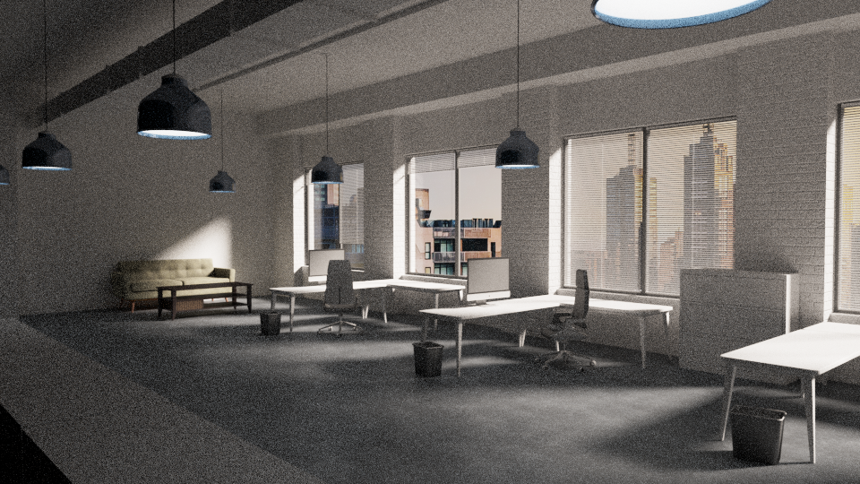
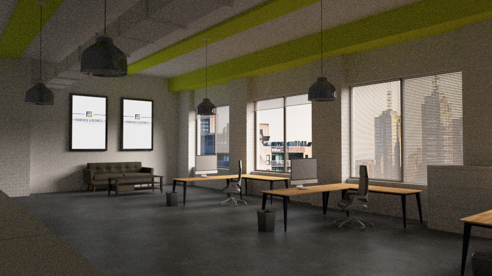
As the final vision for the video is finalized, through conversation and test renders, I began the longer process of building the set for the video, along with all the objects needed to fill that set. Couches, desks, writing utensils, books, shelves, lights, etc… Many of these objects were sourced from online repositories, but often they still need work done on them in order to get them fit the scene as a whole.
After objects and the space have been laid out and built, lighting and rendering the space is next. The idea of a small business space was picked to match their target customer, and I chose an afternoon or evening time frame to create the base for the lighting coming through the windows. A natural light, I believed, would fit well with natural/customized/tailored fit, as opposed to a structured clean cut feel that pure white or artificial lighting would create.
Wrap Up
The client at one point felt that the push too hard to a naturalistic look might be a bit too much. We decided to include some technological elements into the motion graphics, while maintaining our connection to the paper motif for flat motion graphics, and the marker board with a hand drawn feel for later in the video. This ended up creating a good relatable balance for the viewer, since most people exist in both the physical and the digital life in various parts of their lives.
The client felt final video turned out really well. The are some obvious deviations from the original animatic to the final video. The biggest was the inclusion of text cards to visually represent questions and other important text information. I personally like these because they help reinforce that paper feel used throughout the video, it gave us another use for the brand colors, and it made some really good visual breaks between different sections of the script.


