Over the last half year or so I have been doing little odd marketing graphic design jobs for Lance Conrad. Below are short breakdowns of these jobs.
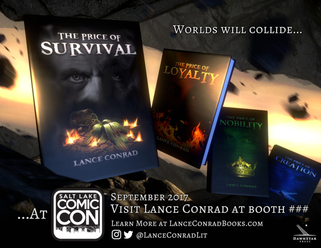
The first of these projects was creating materials for Lance to use to inform his consumer base about his appearance at the 2017 Salt Lake City Comic-Con. Specifically a digital/real flyer to hand out as he did his presentations at schools and other events that he involves himself in. Along with digital campaigns on social media and email mailing lists.
When discussing the copy to be used on the flyer, we sought to distill the essence of his books, or find a through line that all the books could relate to, for a slogan or a basis that copy outside of information text could be derived from. What we eventually settled on was “Worlds Colliding”. This theme ended up informing not only the copy but also the visuals as well.
I decided to take a literal approach, and changed the theme to “Worlds will collide..”. Making it more urgent and dangerous. Using a mixture of stock photos of some mountains and some 3D rocks, I modeled the books and did the whole design, layout and final composite in Blender. No 2D application was involved here. Making literally two worlds colliding in the background, the viewer is stuck in the last moments of twilight. The last moment of what one knew of existence, just before the sky falls and the light is snuffed out.
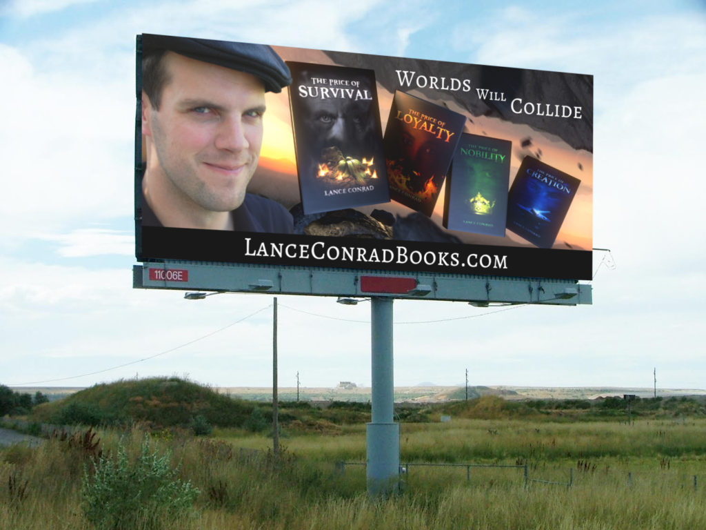
Later on, we took this same visual motif and applied it to some digital signage for use in Utah. Specifically roadside billboards. The only change/addition was Lance’s face, which crowded things a bit for the book advertisement, but was good fill for the Best of State advertisement. Unfortunately, we couldn’t predict exactly when these advertisement would show up on actual billboards, but I did put together a mock-up inside of a preexisting photo of a random billboard below. This was to help pre-visualize the ads before they were sent to whoever controls the ad space for billboards.
The last piece of marketing materials based off of this “Worlds Colliding” theme was a bookmark. Lance uses these as free giveaways at his at school presentations and conventions. This is something he has done before, so communicating what he wanted here was simple, and with some small adjustments to previous project files I was able to export these as finals directly out of Blender as well.


