The motion graphics work for Thor Media continues. This time, a complete 3D piece (done in Blender) with some minor character design and animation, with allot of motion graphics design. Join me on the “silicon slopes” and lets talk about the thorough process this piece went through.
Before I get deep into this one, I must credit Brek Bulton with the initial concept of the video, and for bringing the job to Thor Media. He wanted to show a skier progressing through a day trip on the slopes. This was to be the backdrop of the for the heavy legal verbiage used for the voice of the video, while highlighting the contemporary nature of the client’s service with the idea of the “silicon slopes”.
With the scripting we were fortunate that Brek was handling that as well. After a few meetings hashing out the details, and pulling back to fit in the client’s budget, we got a near final script. I say near because the script was technically not locked down until the near finish of the project.
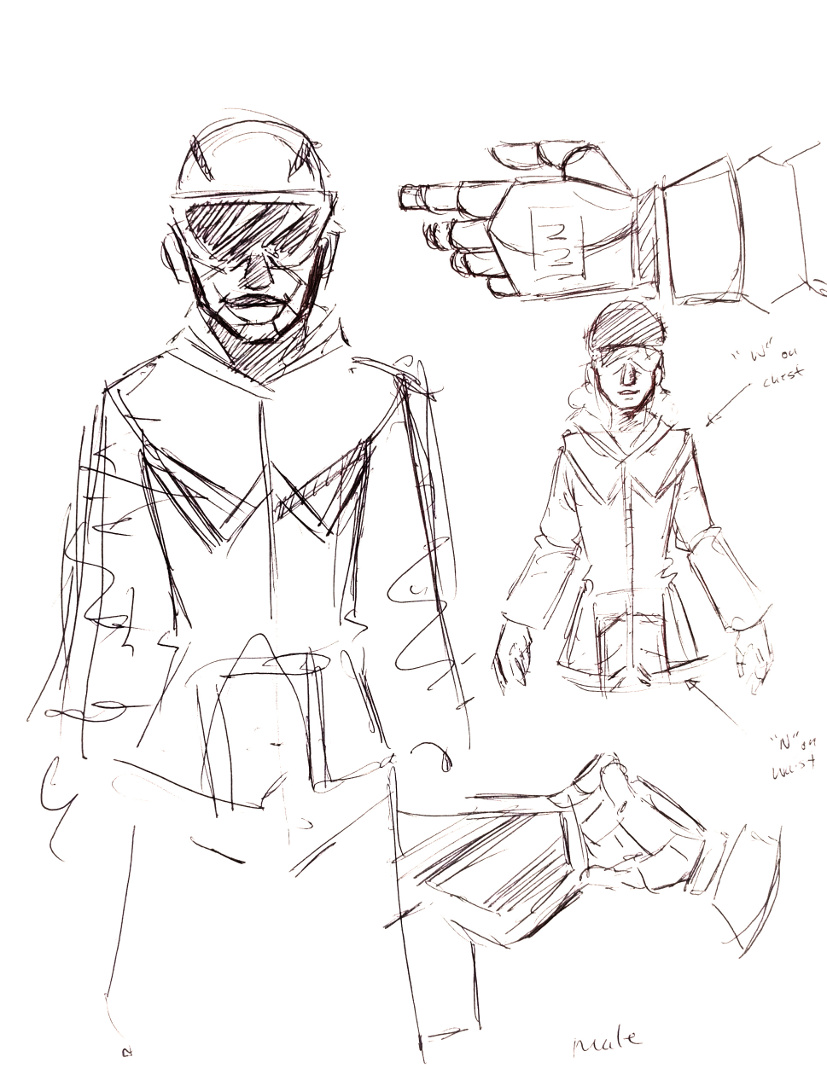
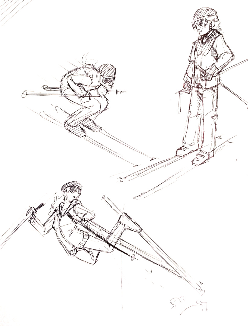
After the a final version of the script was in place, we had to make a bit of extra effort to convince the client of the concept, and present a visual motif that they would be happy with. This is where motif and character design came in. Because of the budget, I had to come up with a simple but attractive character design to minimize animation work. Inspired by allot of current motion graphics character animation (see Kurzgesagt), South Park, and Google’s paper design, I found a solution. I decided to stick to a 2.5 dimension paper cutout feel, which created a great sense of depth and interest in the image, while minimizing animation work (primarily 2 axis to animate instead of 3).
With a start on the visual design, I put together two shots to show how the video could look along with a temporary voice over. A long story short, the visual concept was accepted, and now it was time to approach the rest of the video.
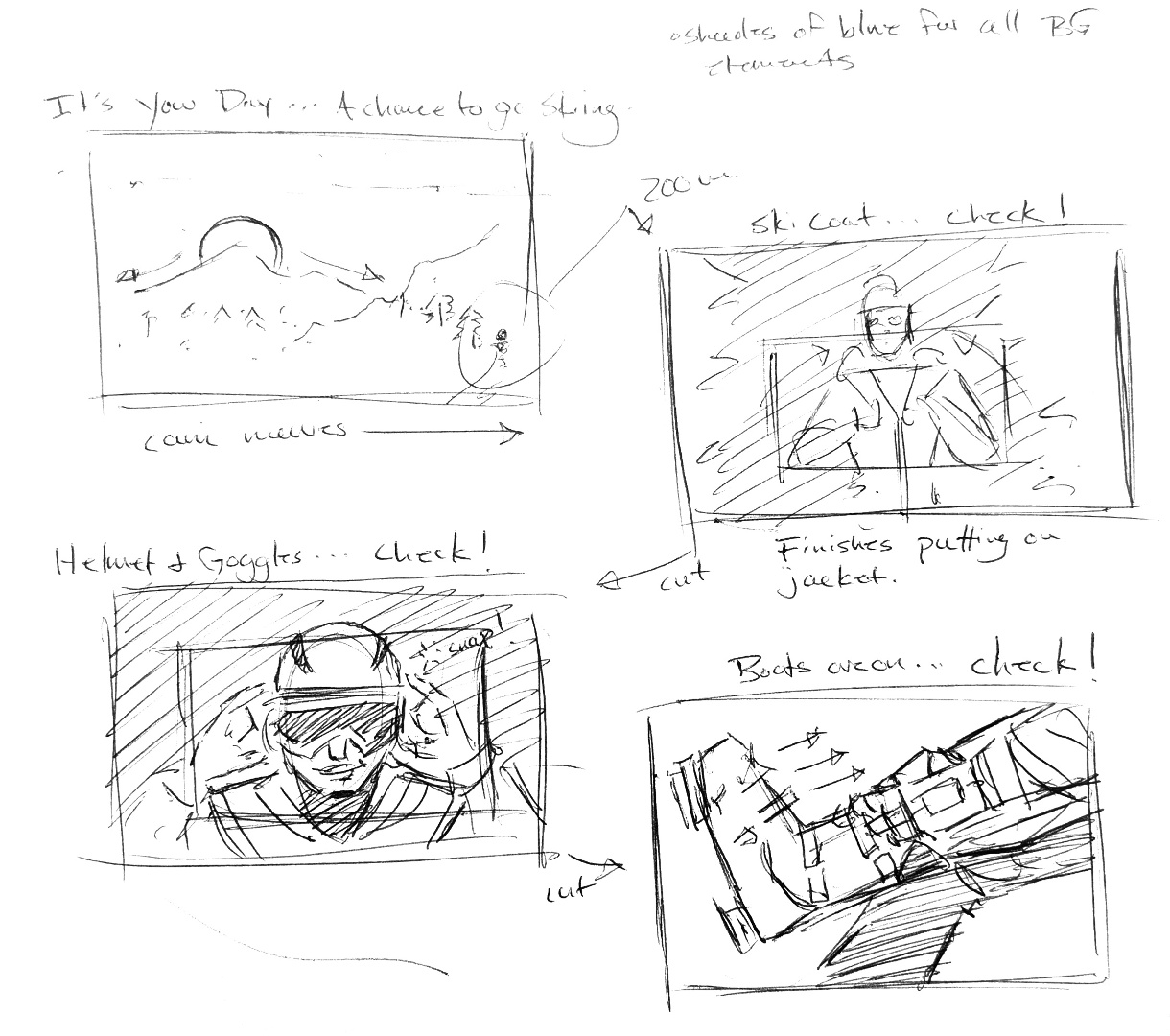
At this point, problems began to crop up when it came to finalizing the script. So, in an effort to keep the good momentum on the project, while accommodating an indecisive client, I decided that an animated storyboard would be needed to check the changing script against planned visuals to help the client to make final decisions in the script. This decision turned out to save everyone allot of time and allowed for flexibility in the visuals, almost right up to the end of production.
After some minor back and forth on some of the text and visuals in the video, and putting together a small vanity logo for the client to use in another video content, the final video was finished. Even though the project went a bit longer than expected, the final product came out well, and the client was very happy with the final result.
Finally! A project that got me into Krita’s new 2D animation tool set. What an incredibly valuable tool have in the bag. Lets talk about growing trees made of chalk.
This is the 3rd year I have done the Certified Conference introduction video, and it is always a joy to work on them. First, credit where credit is due. Neil Bryce is the man who got us this work. He has been a could colleague and friend over the last few years, and through him, Thor Media and myself have had the opportunity to work on a bunch of great projects.
With these conference videos we have taken the “hand drawn” approach for certain elements before. What makes the approach different in this on is that this is the first time where we didn’t use masks or other automated methods to simulate hand drawn effects. With Krita’s new 2D animation tools, I was able to approach the animating of elements that would naturally be hand drawn from a more traditional approach.
I have always had a keen interest in traditional 2D animation, I even took a class in college to help satisfy my interest in the subject. Since that class, I have had a few opportunities pop their heads above the water a few times, but the opportunity to develop those 2D animation skills further have always seemed to allude me. Usually due to budget constraints. 2D animation is a very time consuming thing, and to invest in someone like me who doesn’t have allot of experience, or, the project skill-wise is a bit out of my skill set, it has been a hard thing for me to approach on a serious project. Till now…
Because of the simple concept (Neil Bryce’s concept) I felt that this could be the project to dust some of those old skills off, and give them a go. I am glad I decided to take the risk. Everything, except the obviously 3D elements (rendered and composited in Blender), were hand drawn 2D animated elements. This includes all the text transitions, leaf transitions, along with the introduction of the seed being blown in by the wind with the growing tree.
I am really proud of this piece, and the client really loved the way it turned out, and came back with only some minor revisions to the animation and colors. Nailed it! I also discovered that animating text this way, as opposed to using a mask, feels much more natural, and ends up taking about the same amount of time as other masking methods. The only issue is, is if the text needs to change. In this case, you have to start from frame 1 with the traditionally animated method. I just have to make sure the project script is locked down before working on these elements in the future.
A small job, but a fun one nonetheless. Another video production studio here in the valley, called Mighty Clever, needed some help for a commercial they were doing for America First Credit Union (AFCU). I believe they have been doing commercials for AFCU for the last couple years at least, and they have this fun zombie theme going on. They just needed help for one shot, here it is below.
You may not even notice what was done on the shot, and if so, that means I did my job right?
There are two things done for this shot. The first is the large sign above the store entrance. In the original shot, the sign didn’t have anything on it. This required a planar track with a simple composite. The last element added to the shot is the fire in the barrel. This was a fire simulation was done in Blender, and then composited into the shot, along with the sign, in Blender. The light emitting from the fire required some reconstruction of the set, and this was composited onto the original shot to make the additions a bit more convincing.
Since we finished this shot, we have had the opportunity to help out with a few more internal AFCU videos that required more planar tracking, but this video covers the way I approached those videos, and it would be a bit unnecessary to show them here.
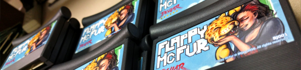
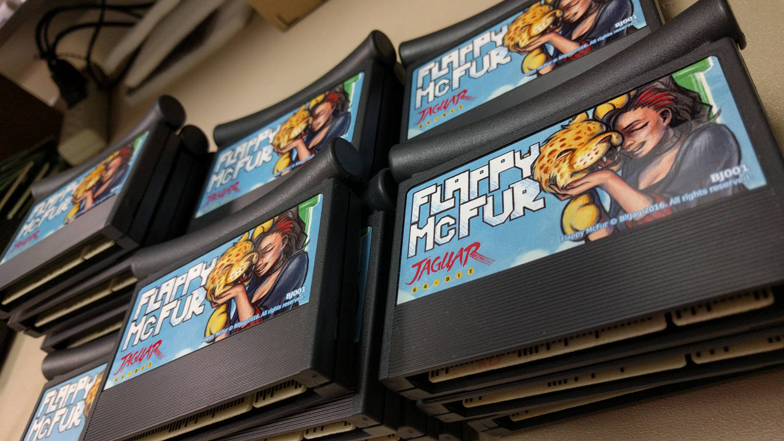
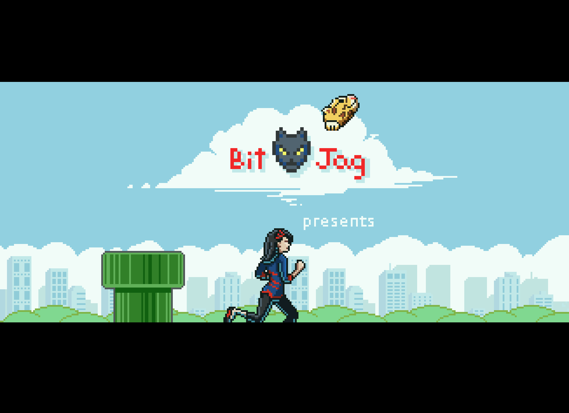
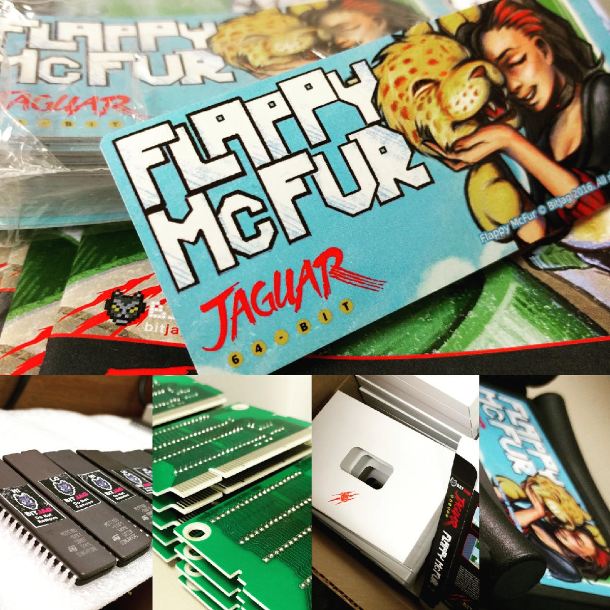
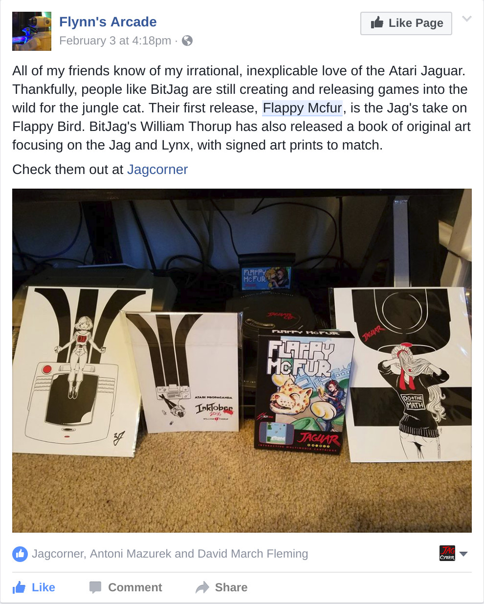
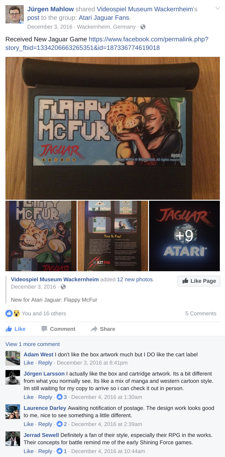
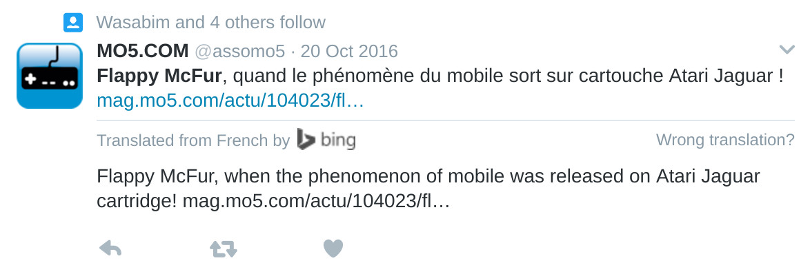
Three years of learning. Three years of programming. Three years of drawing. And it all should have taken three weeks. Flappy McFur is finally in the hands of the masses, or at least the 80 or so individuals that were actually interested.
The beginning
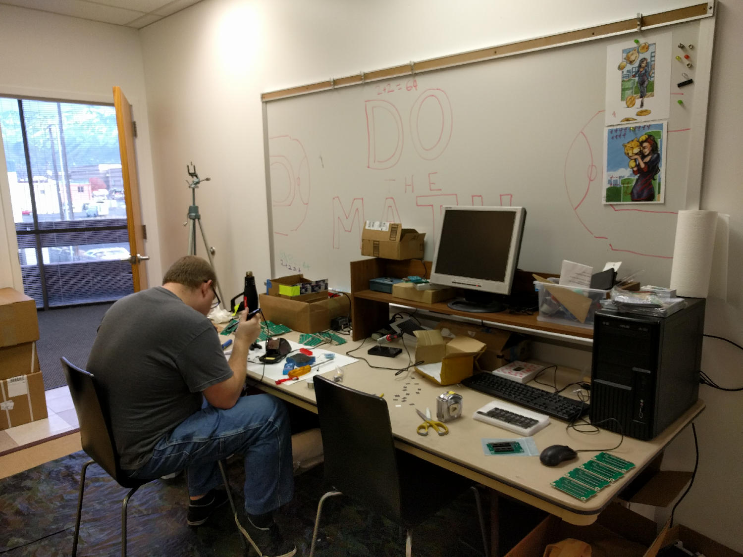
Atari Jaguar programming has been something that my brother and I have been interested for years, and ever since returning from my church mission from Taiwan, I have made it a primary goal.
With the formation, branding, and online presence establishment, all that was left was for me to learn a bit of programming, and start making games. To help facilitate the programming learning curve, we took on a request from Paul Westphal to put together a demo specifically for his booth at the Portland Retro Gaming Convention.
Programming at this time wasn’t completely foreign to me, but C programming was. So this little demo was a great opportunity to start my C coding adventure, and it led well into Flappy McFur.
Development
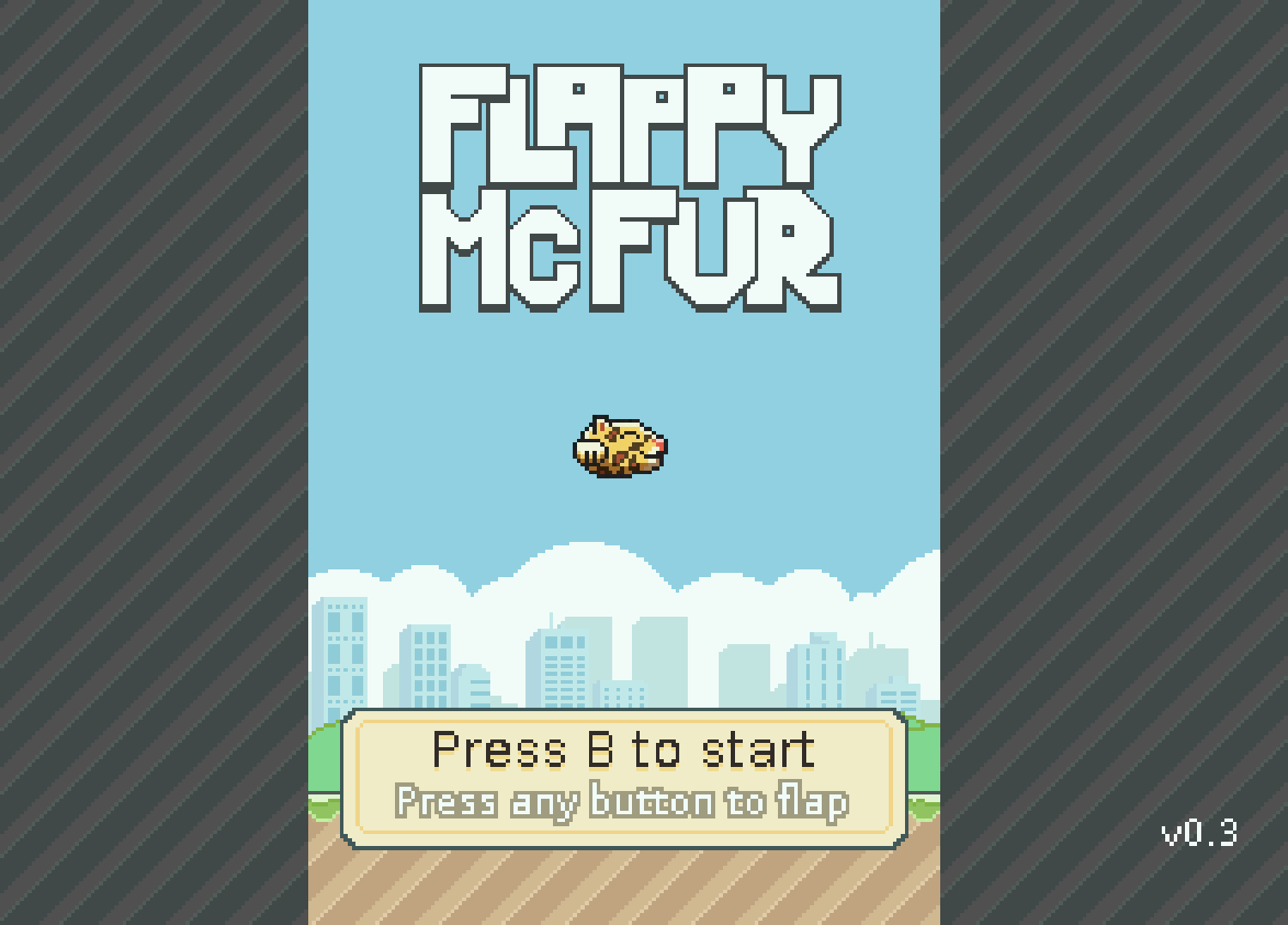
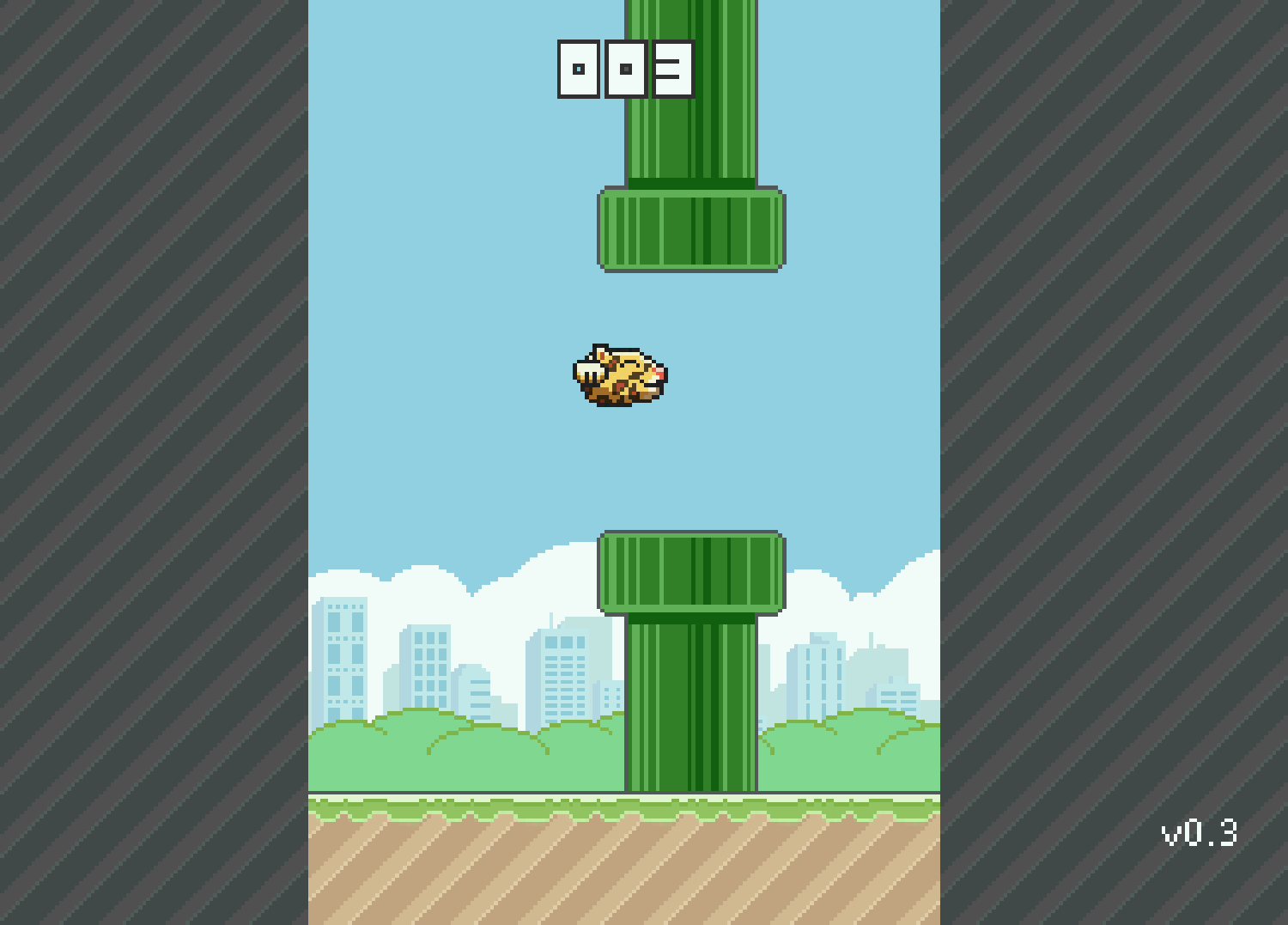
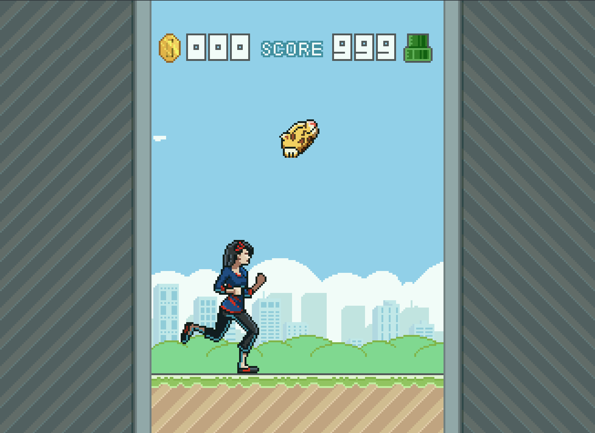
Version 0.3 was the first fruit of my efforts, and the fruits were bearable. The gameplay was there, but it was far from enjoyable. McFur moved around more like a horizontally locked fly than a disembodied Jaguar head falling in style. But, the core gameplay was there, and this little demo was well received by those out there who look out for anything new for the Jag.
After the demo though, there was polish. I planned out menu systems, with a simple achievement system. Worked out four different play modes that changed the speed of the game and how the pipes behaved. With Bryce’s help, a simple text engine was implemented to facilitate menus, and he also implemented the save code system. All of this along with an end game made Flappy McFur a much more noticeable product and a more enjoyable experience overall, with a bit of depth to the gameplay.
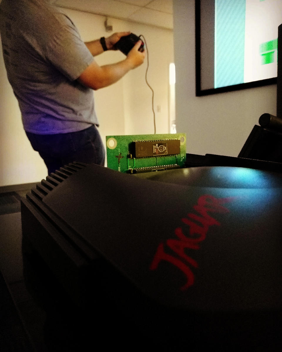
Development also included some play testing. Usually I would setup our Jag-In-A-Box at family parties, Draw Nights with friends, or just let all the nieces and nephews have a go at it. It was interesting to see how some people caught into the gameplay really well, while others found it impossible. It made balancing the difficulty a bit of a challenge, this is one reason why the additional play modes were added. To try and accommodate a wide spectrum if players.
Even though the game overall is fairly simple, there was a massive learning curve for me to overcome. Overcoming that learning curve has had its payoff though, and I feel much more prepared to takle our next project.
Art
Sprites and Palettes
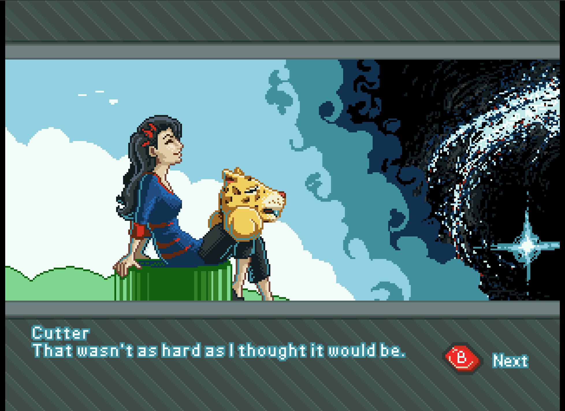
Though few, painting sprites for this game was a highlight if the whole experience. Working with reduced color palettes and putting together simple animations like rotations of objects and the achievements, to more complicated animations like Cutter’s run cycle, all were a joy and remind me how much I love animation in general.
We used the Gimp primarily for sprite work. I have been using the Gimp for nearly two decades now, and it is great support for paletted graphics with a more than adequate tool set. I did use Krita for Cutter’s run cycle animation because they had recently implemented a basic 2D animation tool set in Krita, but with the lack of palettes graphics support, I still needed ti pump those graphics through Gimp to prep them for Jag. Krita is supposed to have palettes graphics support in the near future, and I am looking forward to using Krita exclusively in my pipeline.
With all that in mind, when I actually started putting together Flappy McFur, I was a bit lazy in figuring out how to do 8-bit paletted graphics. So, for a long time, I was dealing with performance issues, especially when music was implemented. It wasn’t until late in development that most of the graphics were converted to 8-bit paletted sprites for 16-bit sprites. This was a good switch though as it allowed us to do fade transitions easily.
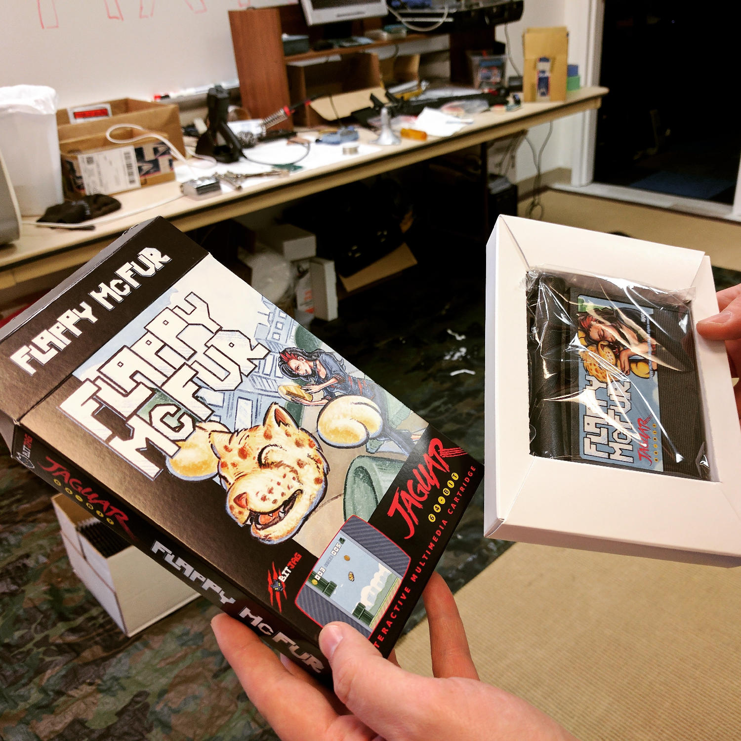
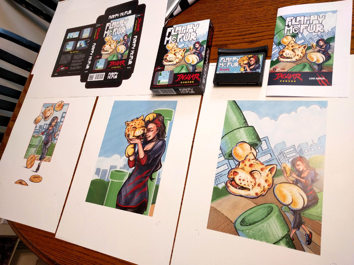
Box and Manual Art
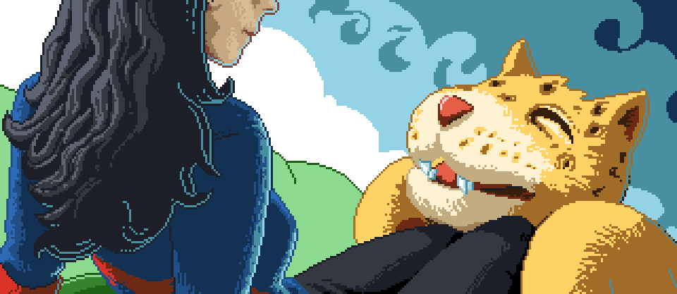
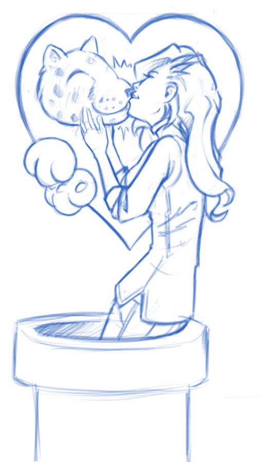
I initially wanted to do more artwork for the game, but the 3 primary illustrations ended up working really well for our needs.
The first illustration was used to establish the character relationship and heavily influenced the game in both tone and narrative. The colored pencil and crayon look of the artwork was intentional as well. It gave it an elementary, non serious feeling throughout, inviting everyone to come and pick up the controller and play.
Video Content
I tried to keep any video advertisement minimal since the beginning. Primarily because if how time consume it is, but also because of the uncertainty of actually releasing the game.
When we decided to actually finish up the game and release, effort was spent to get a good video for advertising the game, and a good gameplay video. At the end of the day, I am not too sure how much these videos helped at the end if the day, but they were nice to have, and will be good to have for history’s sake.
The release and marketing
Newsletter
In and effort to reward our mailing list subscribers, we made sure that everyone that had signed up knew about the game first, we also provided a small discount for them as well. The discount was taken advantage of by a handful of our subscribers, and is something that we will definitely do in the future.
Press Release
It was fun to actually learn how to put a press release together for news websites. I distributed to a handful of people, with little response. Again, this was good to get familiar with, and it serves a good historical purpose. You can read the press release here.
Before people actually had the game in their hands, many of the comments were about the pixel art, and general support for the release. Responses to gameplay have been… mixed, maybe. Its hard to tell if people don’t want to say anything bad about it, or they are just a bit frustrated about its’ difficulty. Either way, below are a few reactions for the AtariAge forum thread.
My wife and I enjoyed spending the evening playing Flappy McFur a couple nights ago. It’s certainly addictive. I found myself getting the controller back less and less. My wife and I probably haven’t played Jaguar together in 10+ years. She buys me Jaguar games as gifts and watches me open them. Maybe she’ll watch me play a bit. It was nice to actually play together. Thanks for the effort you put in to it!
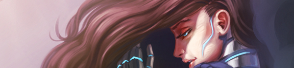
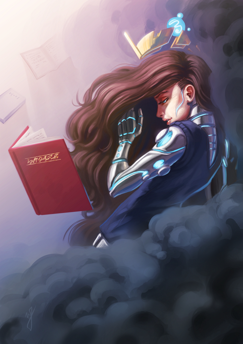
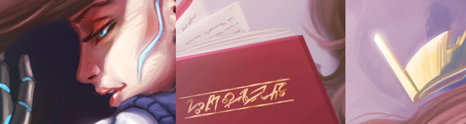
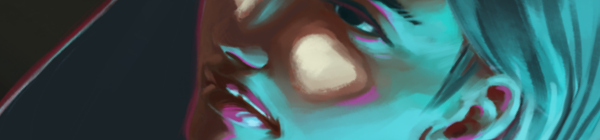
I wanted to finish one more piece before Inktober begins. I started this one over two months ago for one of the Krita forum challenges, “Futuristic Princess”. I got the sketch done at that point, but couldn’t find the motivation to finish it at the time.
After reviewing some of my sketches and unfinished work, I decided to finish this one over the past couple days. The color scheme has been floating around in my head since I started the sketch, and I really like how it came out in the end. The depth in the clouds was fun, and also playing around with the metal materials of the characters arm and back.
I am glad that I was able to finish this one before Inktober, and I plan on submitting this for the Krita Kickstarter art book. I just need to figure out what black and white piece I want to submit along with this piece.
Working with some different brushes in Krita, and pushing myself a bit with some different kind of lighting challenges. This piece was also a bit inspired by the The Art of Loish, a recent Kickstarter art book I received.
I really enjoy Loish’s style, with her use of a stark outline colors to break her subjects away from the rest of the painting. She also shows a clever use of color in general, and again, very appealing all around. Some of the elements in my painting were inspired by these things, in the sense of picking an interesting palette to work with, and a unusual lighting setup to help push those colors a bit.
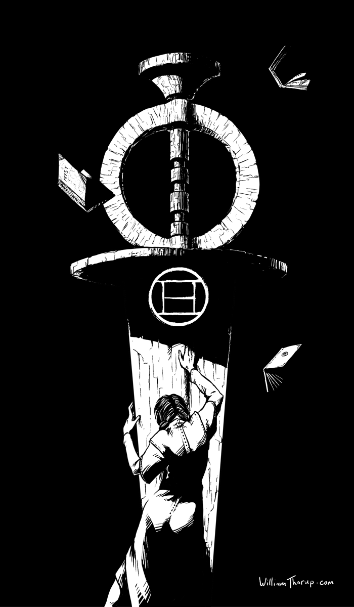
Mysterium, the Myst convention, is making its way to my hometown this year, and they had open submissions for art for their convention book. I caught wind of this just a few days before submissions were due, but I couldn’t miss the chance to show a little Myst fandom.
(SPOILERS AHEAD in the next paragraph, no spoilers after this next paragraph)
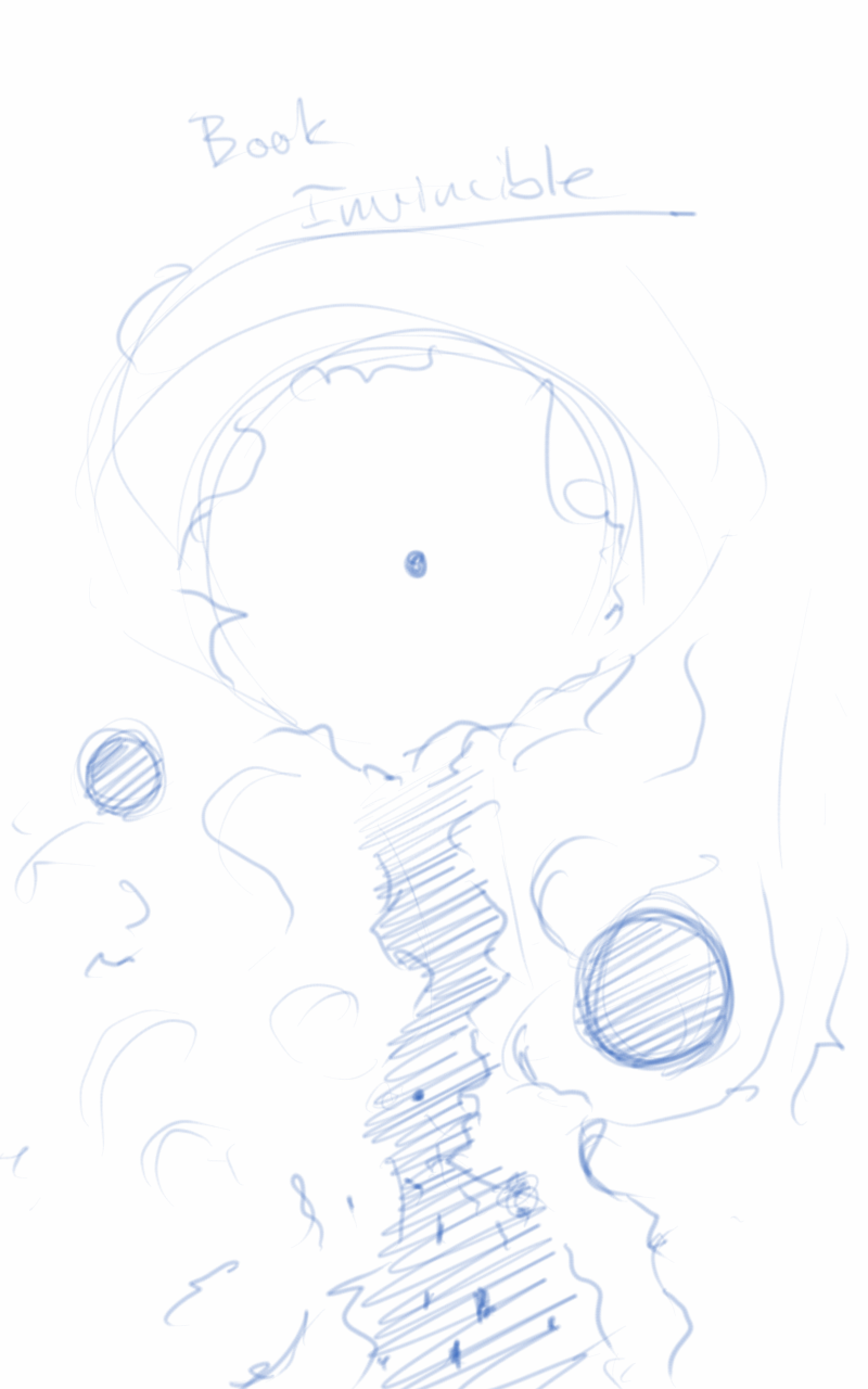
This pieces features Catherine in a state of remorse for the burden of being able to create ages (worlds that are created by writing books, which you can then enter into), but unable to save them. The Moiety Dagger is a symbol of the group that she helped in Riven (Age 5), and despite her efforts, the age still fell apart. Even though she did not write the Riven age, she must feel the burden that any world she creates has the potential to fail, with the loss of life.
I have very fond memories of this game, as I used to watch my oldest sister play it, along with with a few of my other siblings, when I was young. I was always fascinated by the environments, and the immersive sense of foreboding that engulfs the game. As I got older, and was able to solve some of the puzzles, the game became even more immersive for me, and I was hooked. I soon played Riven, and Exile (Myst III) and the experience was further enhanced by better audio better graphics, more acting, and an even more engrossing story.
The story is simply awesome. Taking steam-punk elements and god-like powers of creating worlds and people, with the premise of absolute power corrupts absolutely and what do you do when it does corrupt, is fascinating, and makes for a unique adventure with every game. This includes the three novels as well, well written, and a must read for Myst fans.
A may do a few more illustrations based on the some of the other thumbnail sketches future.
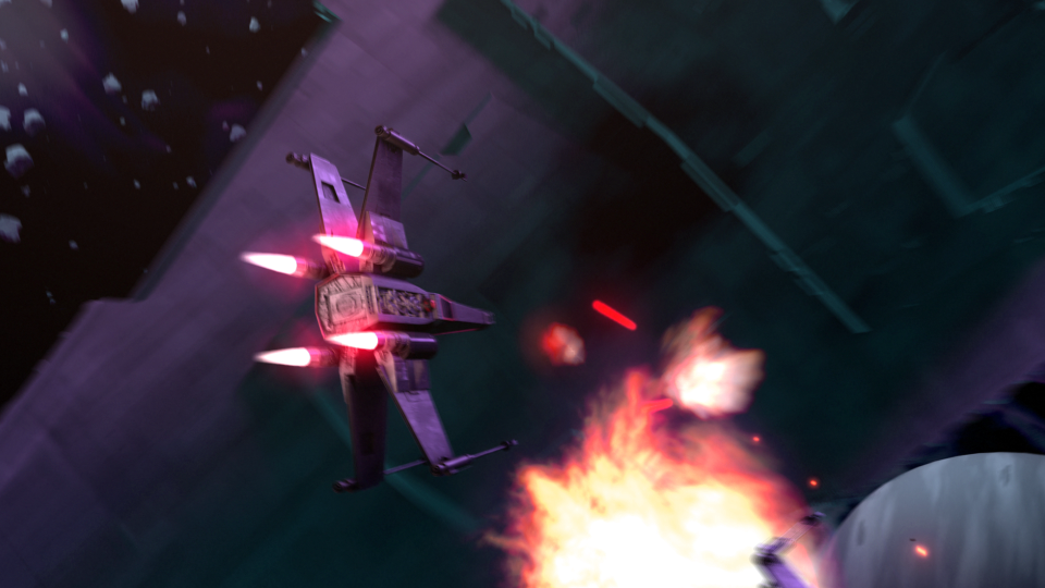
This post has been a long time in the making. Some time around the beginning of February of 2015, we approached the James brothers ( a utah local film crew, and artists) who currently involved with a locally made Star Wars Fan film called “Star Wars: Legacy of the Force”, primarily produced by Tye Nelson and directed by Danny James. We asked if they might have something that we could work on in regards to VFX, and they had something big that needed work on.
A quick thank you to Jacob Thorup and Bryce Thorup for letting me work on this at work, and also for providing critique. Micheal and Heather Buhler for their feedback. And finally Tye Nelson and the James brothers for allowing me to work on this project. Thank you!
(Note, my details about what has happened in the production are very slim, I was third-party primarily, and most of my details come from conversations and emails from both the James brothers and Tye Nelson.)
At this point in production of the fan film, everything was shot, and basic edits had been put together. This rough cut also featured a rough intro battle sequence which was strictly CG. You can see a what this looked like through this video at the 00:09 second mark, hosted on the creator’s channel. The producers and directors were not completely satisfied by this product, that was produced by another artists, other than myself. Because of this, the James Brothers offered to have me take a shot at it. I said yes.
In case you don’t wish to spend the time to go through the rest of the article, I put together a quick video that goes through a bit of the development process, along with a break down of the final shot.
Pre-Production
So began a fun, frustration, enlightening, and enjoyable adventure of the most complicated CG shot I have done to date. I used Blender as my primary tool, and I eventually moved into After Effects for my final compositing.
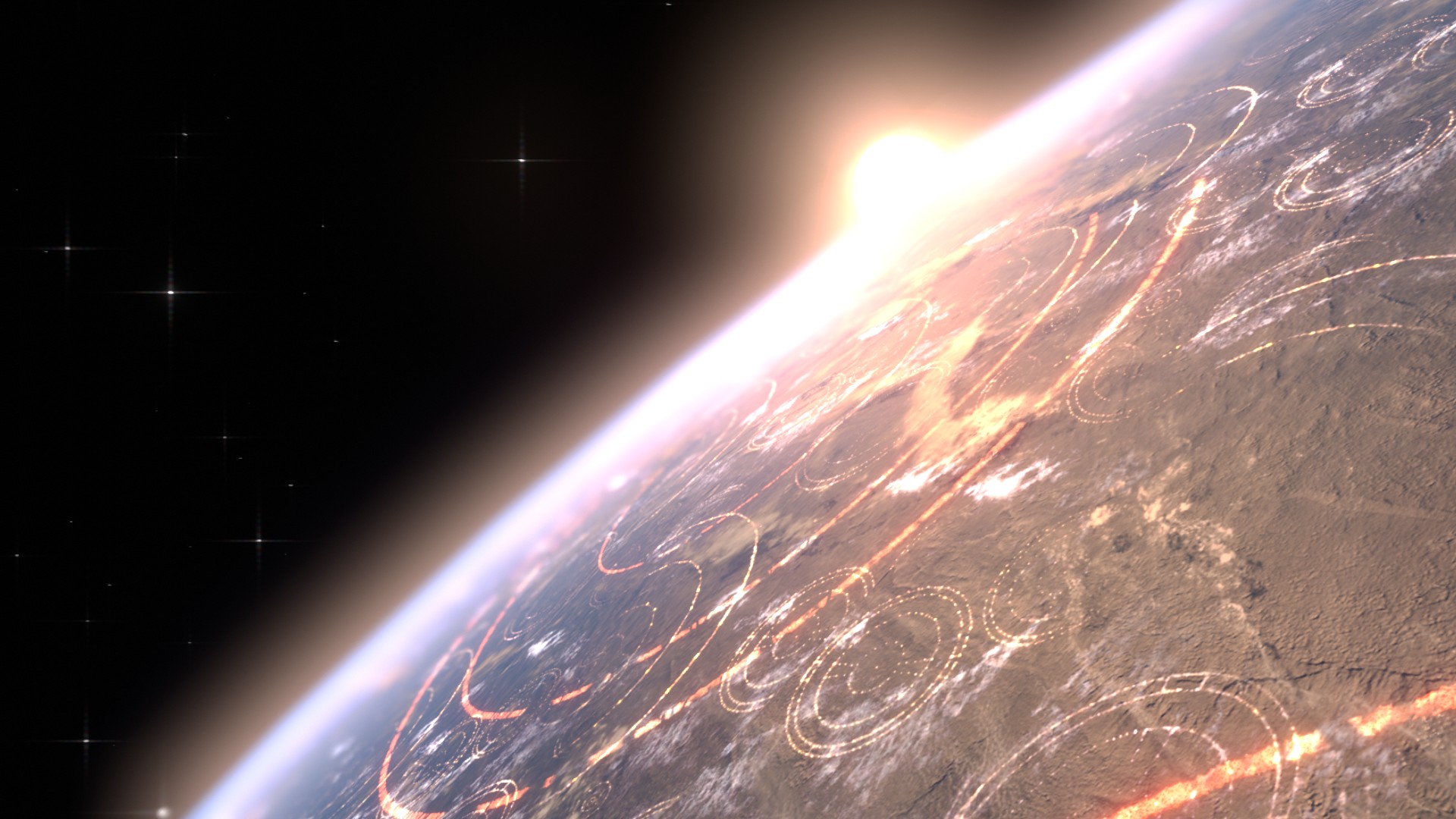
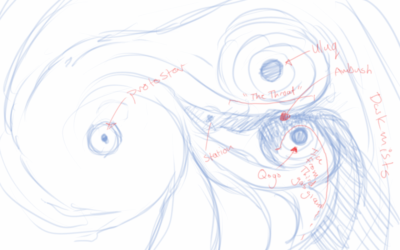
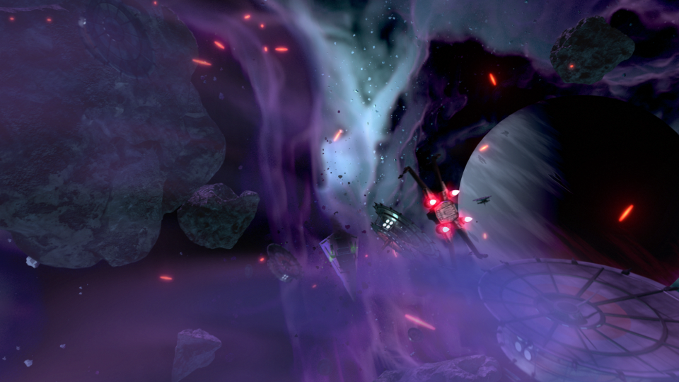
Based on some notes from the James Brothers I began reworking the current sequence to be something a bit more dynamic and interesting. I started off with just a small piece of artwork produced for the Star Wars official card game, and with some ideas of making it look like the fight was taking place just in upper orbit around a planet.
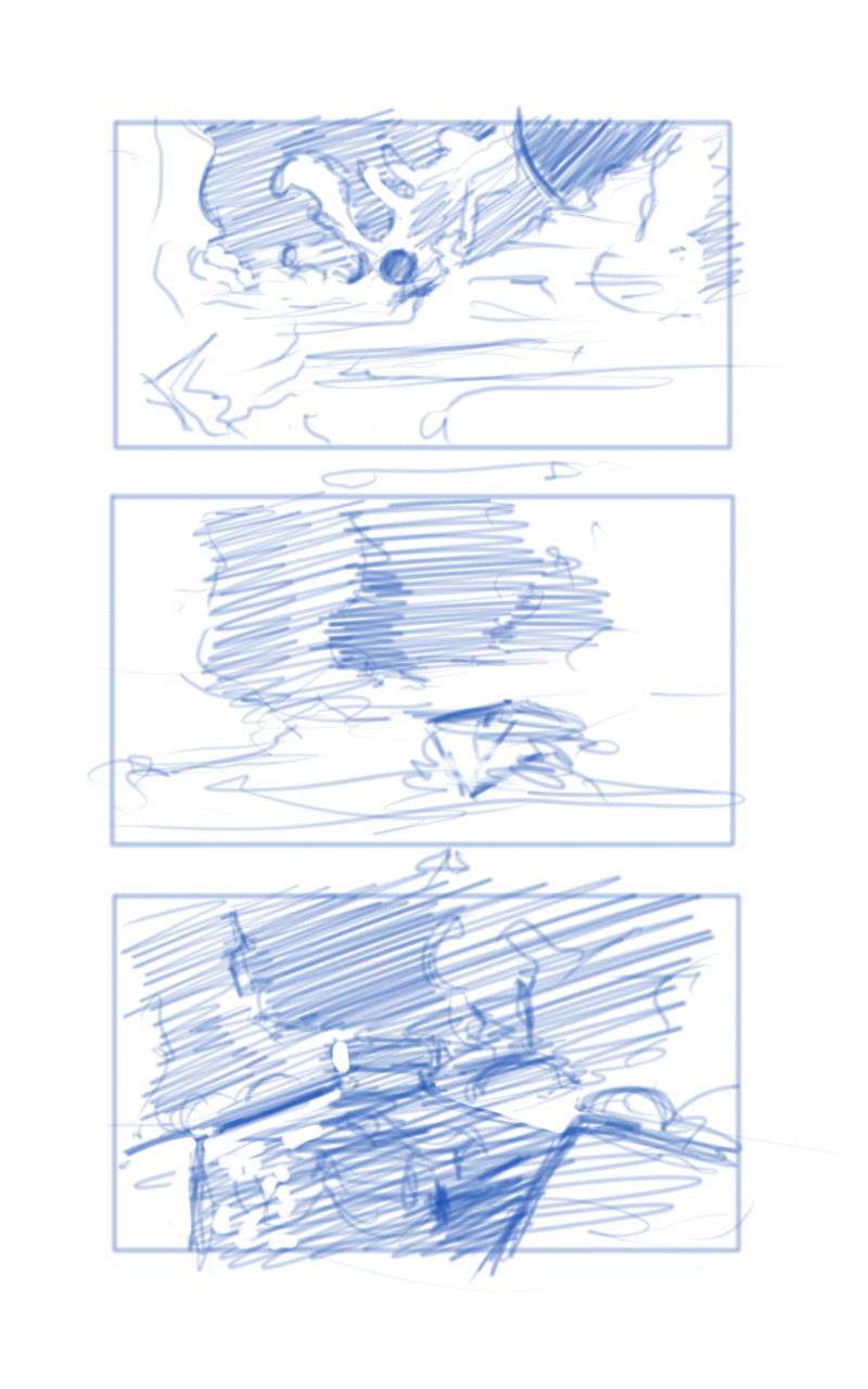
This is where the first animatic came into play. This was largely shooting from the hip, and I put a little too much effort into the background and lighting, which should have been left for later in the process. I enjoyed this idea, but it wasn’t what the producer was looking for at the end of the day. It was ultimately scrapped.
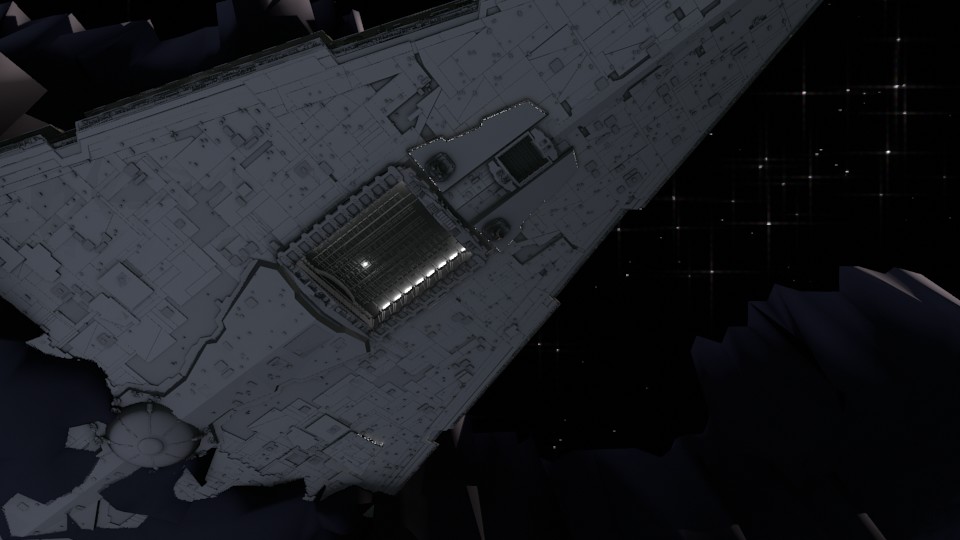
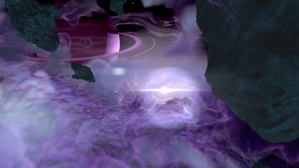
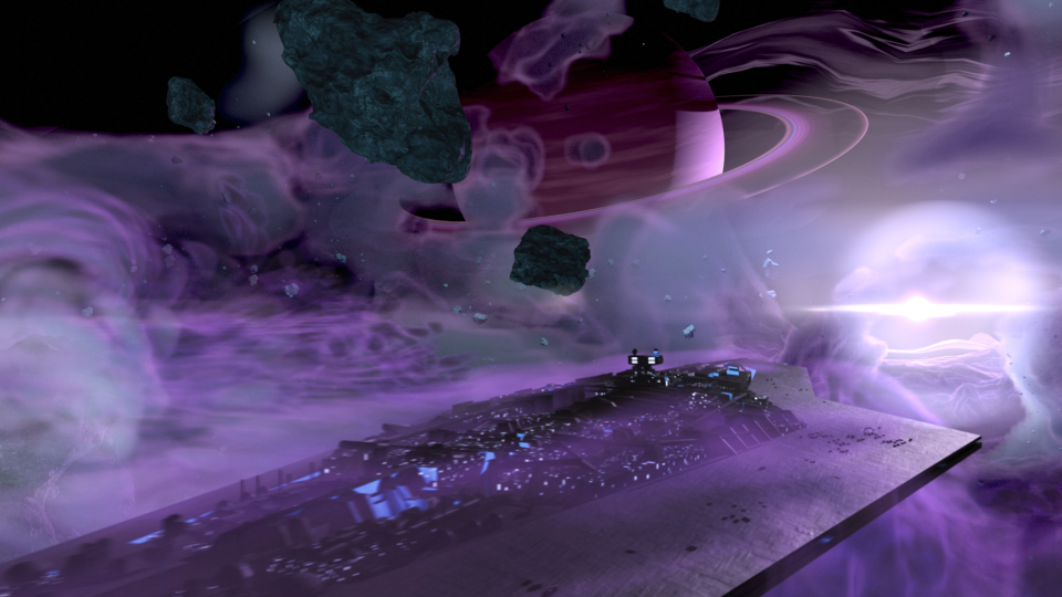
The second animatic took to the original sequence, and basically mimics it for the most part. I decided to adjust the introduction of the Super Star Destroyer, as I thought a rising from the dark mists would feel a bit more ominous, and letting the viewer take in its vast size would help to maintain the brooding force that it is.
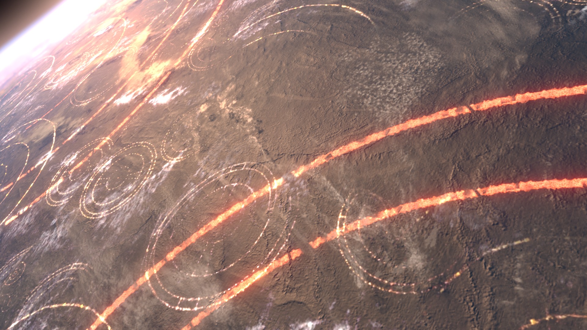
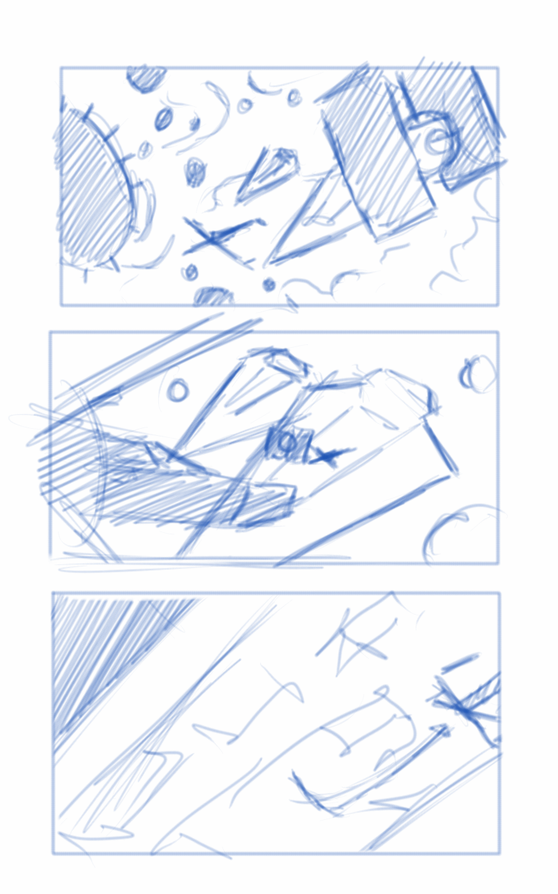
The third animatic is much more refined. If I remember correctly, I had been given source material to work with, and I had already begun creating the environment at based on that material. In essence, the environment was created by one gas giant colliding with another, creating a large mass of debris and material between the remaining two gas giants. These all orbited around a proto-star. The source materials paints a darker environment on the page. I deviated from these details to help created a vast sense of scale with the nebula, and how small all the space craft were in relation to it. This required more light, so I made the star brighter than what is described in the book.
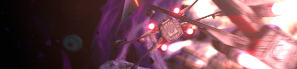
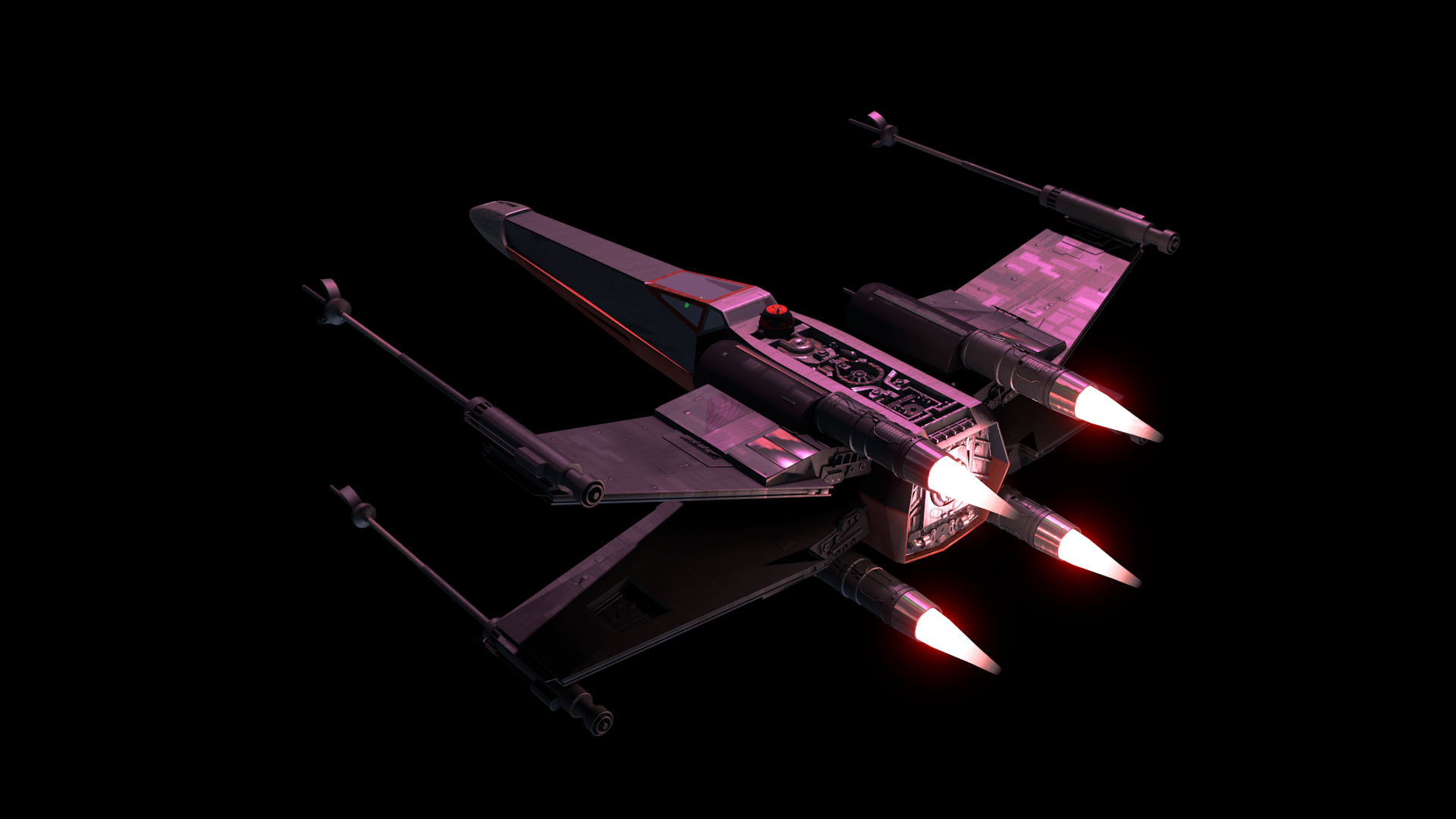
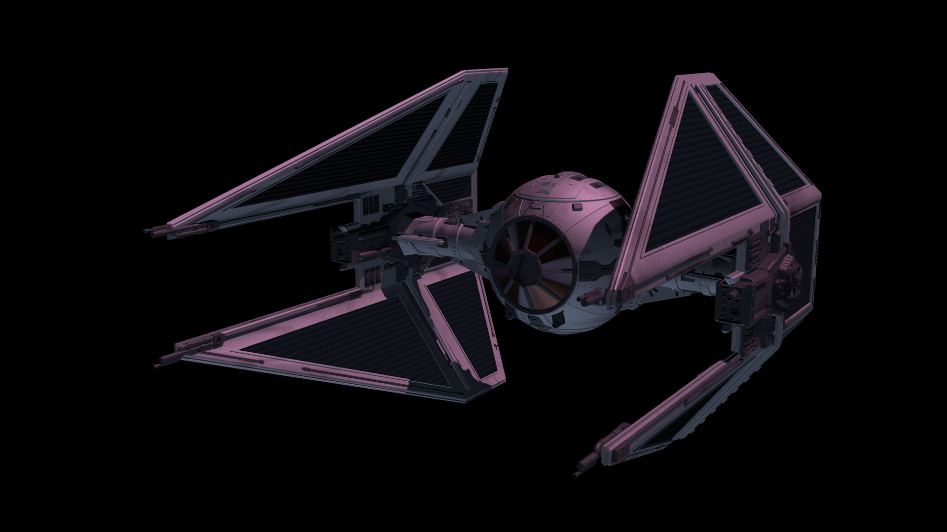
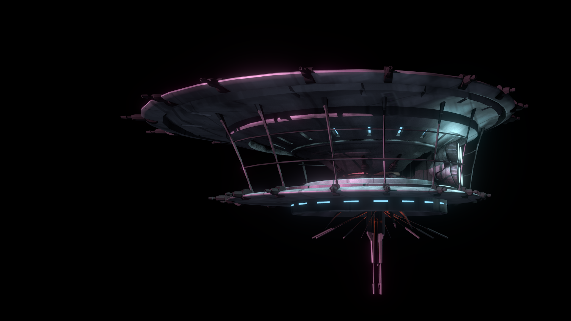
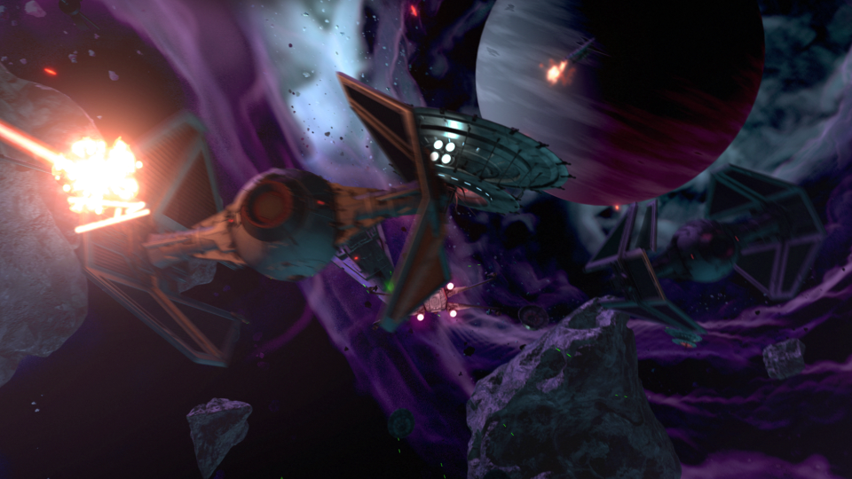
After the movement of the main players in the sequence was locked down, and the animation for the main space craft was finished, I set to work on the actual spacecraft themselves.
The base models were downloaded from scifi3d.com. This site hosts donated models from a ton of different sci-fi universes, and it had everything I needed for the sequence. After getting the models, I spent a good chunk of time cleaning them up in Blender, texturing, and additional modeling, before bringing them into the final scene to replace the proxy models I used for the animatics.
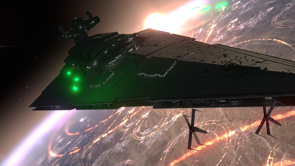
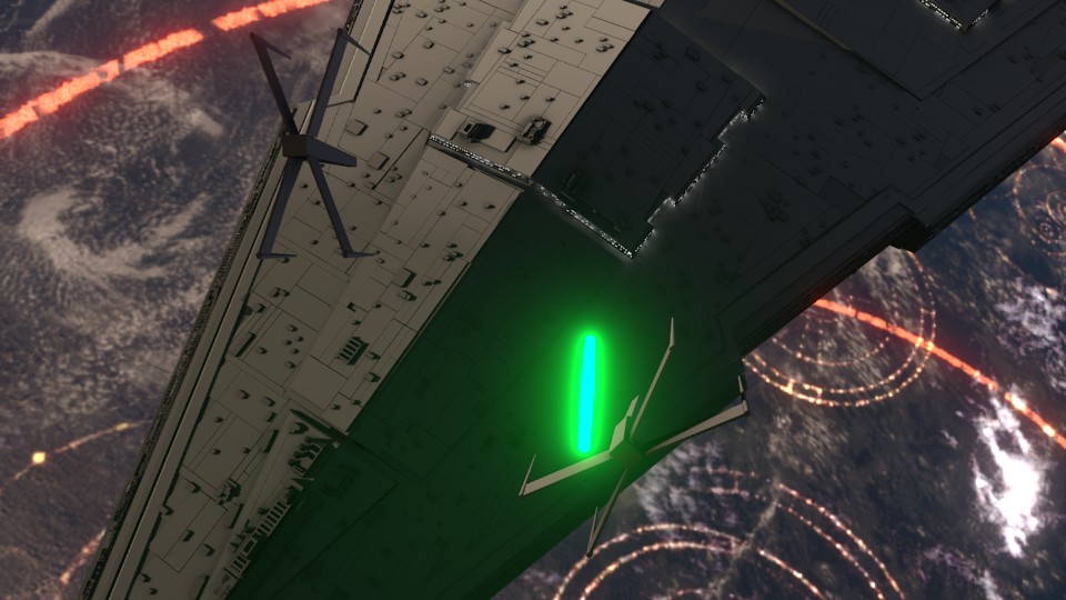
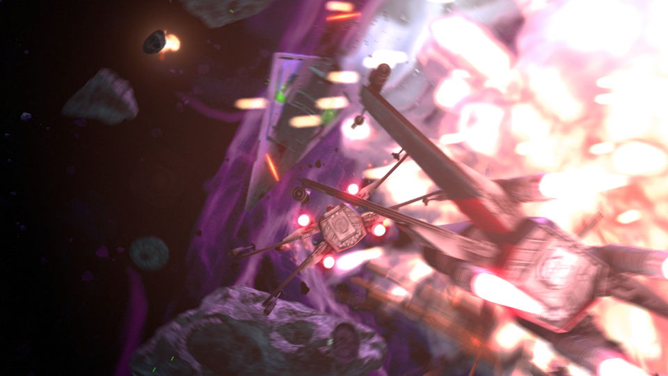
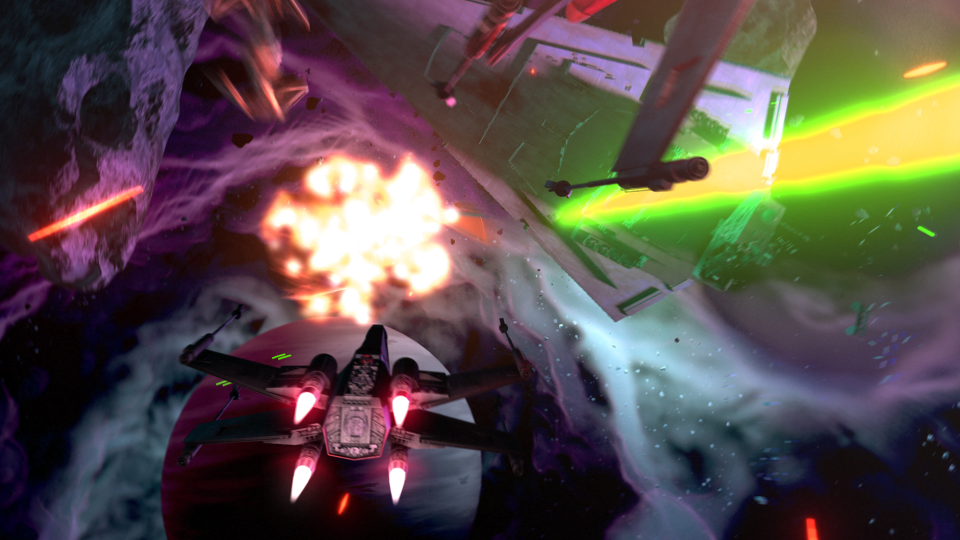
After the models were brought in, simulations for fire/smoke and other debris were done, along with blaster fire. Then came rendering everything out for compositing.
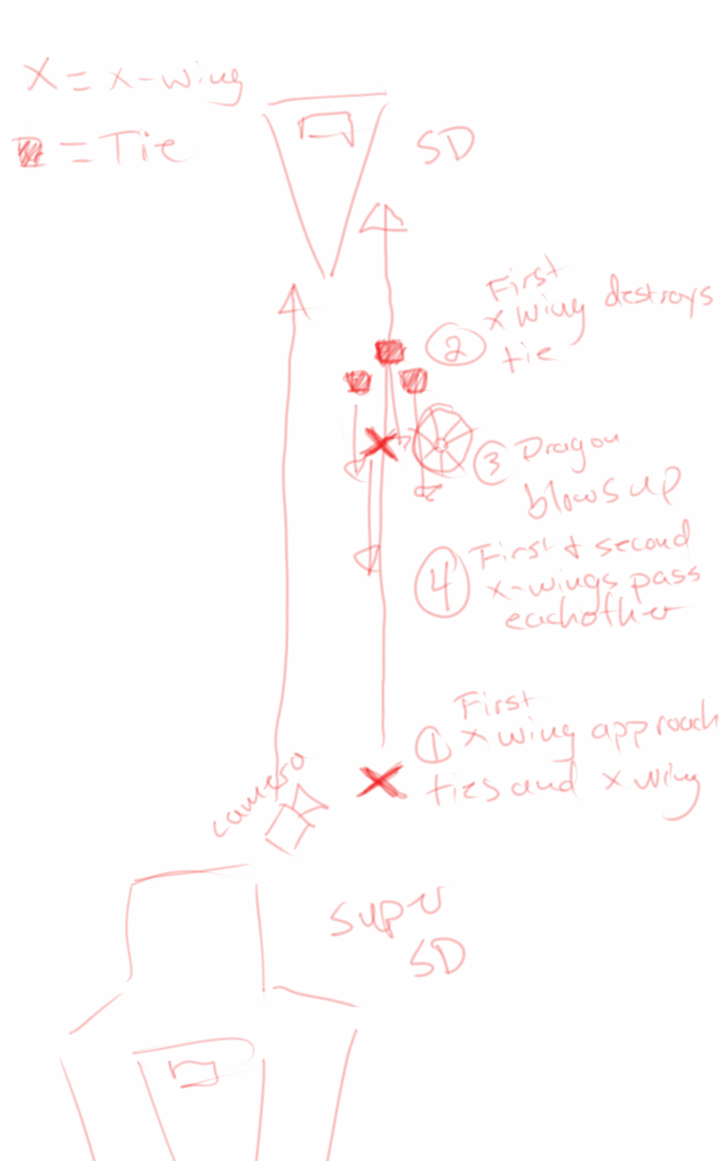
Each render layer was done separately. The x-wings on one layer, the tie fighters on one layer, the planets on one layer, etc… This was to accommodate any possible changes without having to render the whole scene again. The only requirement to this workflow was to make sure that the animation for the camera never changed. This allowed all the separate layers to match move with each other, and if a layer needed changes and rerender, all you needed to do was replace the frames for that single layer in the final composite.
I moved my scene layers over to After Effects to composite there. I was originally planning on compositing completely in Blender, but there was a possibility that I wasn’t going to be able to finish things myself. I needed to move into a program that someone else could use in case I couldn’t finish. This did help speed things up though, as I didn’t have to render motion blur out of Blender (really slow…), as I was able to replace this with a much quicker effect in After Effects called Pixel Motion Blur.
Due to time constraints, and because of the amount of time I had spent on the project, I wasn’t able to add specific post effects like heat distortion. But at this point it is time to move onto other things. Overall the experience was gratifying. I ran into a ton of situations I have not encountered before, and I was able to successfully navigate through them, and learn a host of new things along the way. I have gained a deeper appreciation for the work that goes into a shot like this, and I know why it takes more than one person to pull it off well.
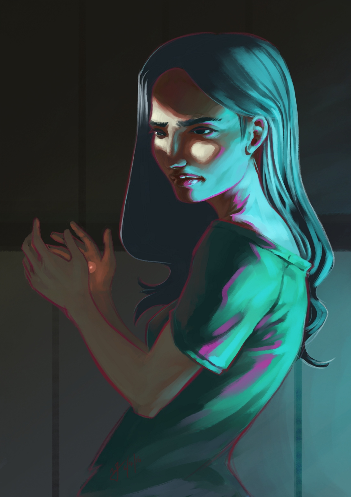
I have been drawing/painting allot, I swear. Just haven’t been finishing much. I start on a piece, and before I know it, I have moved onto another one, and another one, and anot…… You get the idea.
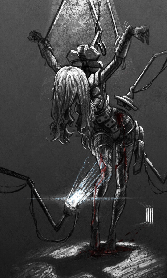
So, I thought I would post something I did manage to finish up (Sorry, forgot to hit the record button, no time lapse this time around). This was a little concept born out of a sketch session, and, because I liked how the composition and concept were coming together, I decided to push it further.
A soldier, after the battle, brought back into her assigned quarters for healing. The robots remove the worn armor, as others tend to the wounds occurred in battle. I imagined a world where children would grow up in relative isolation, bred by a computer to oversee the conquering of worlds. Kept separate from the general population, and all for the progression of man. She is one of the many victims of a human-less world, created by humans.
A sad story, but I found it very inspiring while working through this. Because of the dark, and messy nature of the situation I chose to use a pastel brush in Krita to maintain a rough texture throughout the drawing process. That along with one of the default fill patterns to add a roughness to the whole image.
The whole image took about 3-4 hours, and is quite different from anything else I have done in the past.
Over the last few months Overstock.com has given me the opportunity to work on a few 15 second broadcast motion graphic spots/commercials for Overstock.com. These covered three separate sales that aired on national television between March and July of 2015.
I first want to thank the branding team at Overstock.com for their help in putting this together with me. They usually have me come into their office to work, in order to speed things up. These spots are as good as they are because of their input and critique. Thanks guys!
Mega March Markdown | 15sec broadcast commercial – Based heavily on the in-house design teams playbook, with addtional consulting from Trevor Rimmasch. Thanks Trev!
Most of the work done on these was in After Effects, due to time constraints (all of these were put together withing 2-3 days!). I would have rather had done these in Blender, as I would have had more options available to me. Overall the experience was good working on these commercials, and the highlight was to see some of the designers faces light up when they first say their work animated in a final commercial.
Generic Summer Sale Spot | 15sec broadcast commercial – Again, based on an in-house Play Book. The title card is one of the first photo maps I have done. Cutting out pieces of a photo and placing them within 3D space to give the illusion of parallax and depth.
Something that made these so different from previous work I have done, is the inclusion of a “Play Book” or “Style Guide” put together by their in-house designers and artists, for their web departments. These guides are awesome in that they reduce the amount of questions needed to be answered when approaching the commercial, and debate is brought to a minimum as well. If there is a question about what something should look like, color to use, typeface, etc… no guess work, just look at the Play Book. A huge help when working as a team on something.
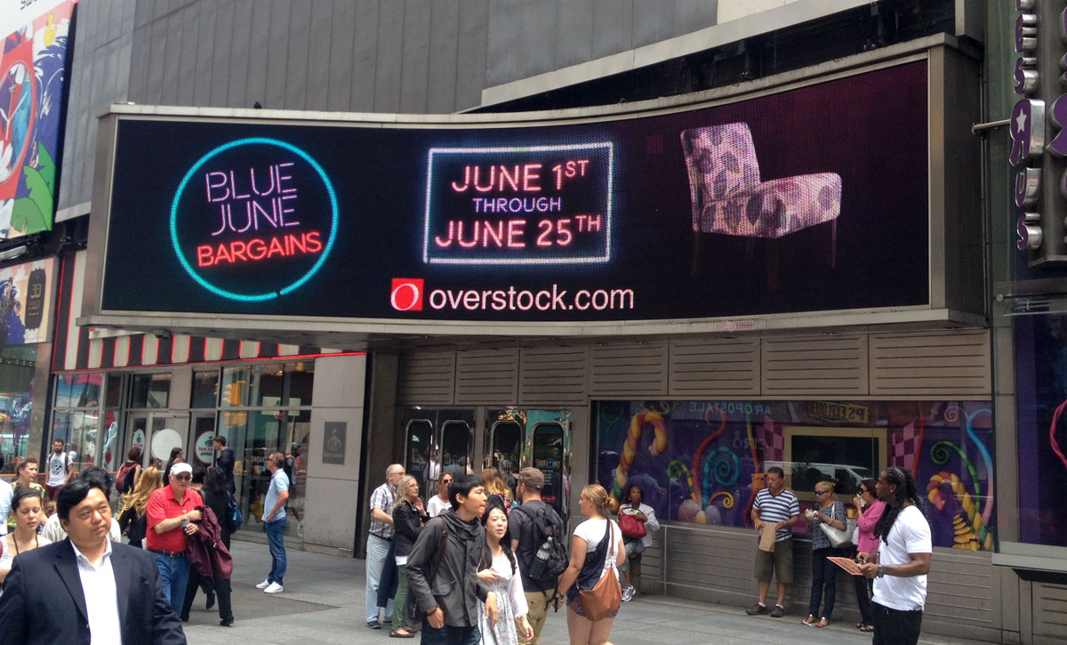
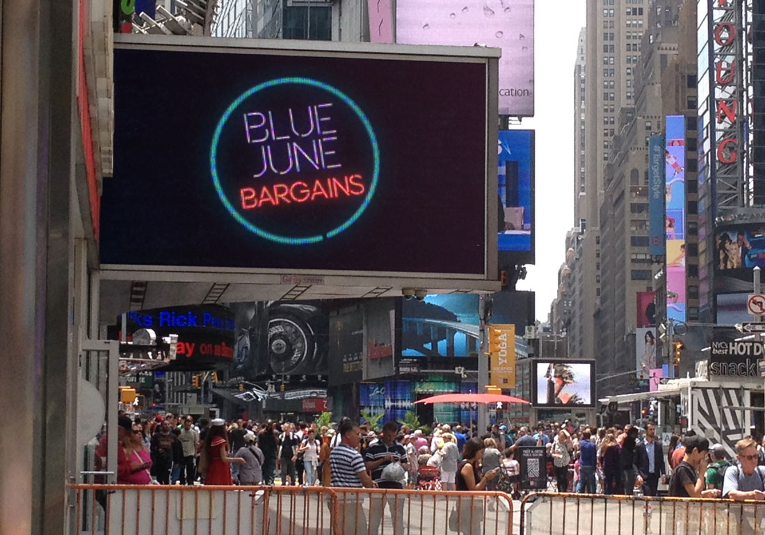
Once in a Blue June Sale | 15sec broadcast commercial – There wasn’t much of a Play Book for this one, but it was still based on the designs of an in-house designer, with additional input by Aaron Syrett and Trevor Rimmasch.
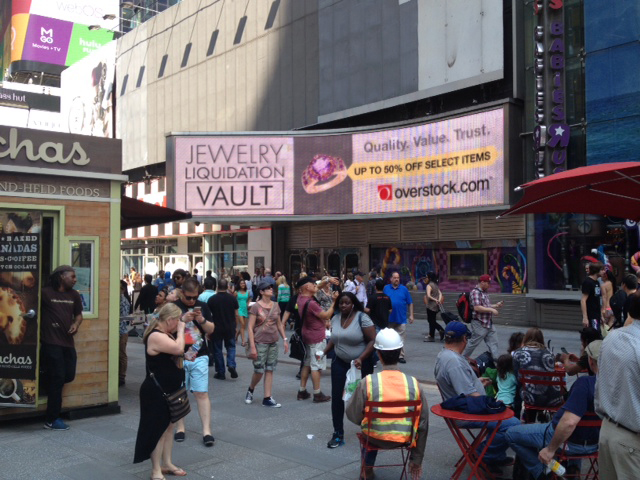
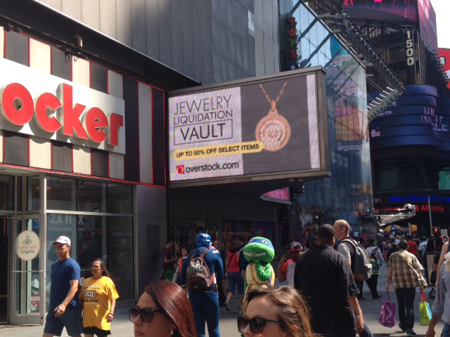
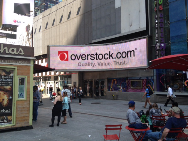
And to top it all off, I also had to edit down the Once in a Blue June spot, and an additional Jewelry Sale Spot, for the Geoffrey Tron at Time’s Square in New York City. It is an awesome feeling knowing that some of my work is getting exposure in Time’s Square.