William Thorup

Illustrator, Motion Graphics Designer, Animator, and VFX Artist

Category: Sketch

  • Family Gaming with Atari | Traditional Art Commission

    Family Gaming with Atari | Traditional Art Commission

    Traditional art commissions are always memorable, growing experiences. With the bit of extra attention that my Inktober 2016 | Atari Propaganda artwork has been bringing, I have had several people reach out about art commissions. This one in particular is one that I would like to write about because it was such a positive experience for both me and the client.

    Subject Matter

    First, the Atari theme has been such an amazing experience for me this year. Taking time to think about these consoles that I have quite a bit of nastolgia for, putting them to abstract and realistic situations, with only female subjects is incredibly gratifying. It has provided me with an opportunity to stretch myself with the ink medium, composition, drawing people, research (80’s and early 90′ clothing specifically) and applying that research. But I have to admit, this year for Inktober was much harder than last, and with commissions on top of that, I really got a feel for how hard I can push myself at this point in time.

    …the process of drawing, mounting, framing, and shipping the final work was a great experience.

    Being Willing to Start Over

    I actually lost money on this commission. This is definitely something that happens from time to time. In this case, I didn’t do enough in the planning and thumbnail stage of the piece. So, when I approached the first version, I felt my technique was good, and the overall composition was good as well, I didn’t get the likenesses of the subjects to a point that I was comfortable with. Because this is ink we’re talking about, that means starting from scratch. So I started over, essentially doubling my time on the piece.

    Making sure you have enough time to work (2 weeks minimum) on a piece like this, along with studying your subjects thoroughly, will help ensure that this doesn’t happen again. Regardless, even with the do-over, the process of drawing, mounting, framing, and shipping the final work was a great experience.

    …this project will feel like a head stone for it all.

    Schedule Affects Everything

    This is my main takeaway from this experience. Because I am still working at Thor Media, finding time to actually sit down for a solid block of time is difficult. With this one, I ended up telling Thor Media I wasn’t going to come in for a couple of days, and then I turned off my phone. In the future I would like to avoid this, and, like what I mentioned before, two weeks should be a minimum for a project like this. I am certainly going to stick with this requirement.

    A Landmark

    With all the Atari stuff that I have involved myself with lately, like Inktober and releasing/selling Flappy McFur, this project will feel like a head stone for it all. I have other projects coming up, but this one was so positive and memorable, I will always consider it a hallmark for this period of my career. The client was happy about the final result as well. Here is what he said in the STatariART group on Facebook:

    Friends,
    For Christmas, my wife commissioned William Thorup to do a custom drawing of my family: he did a brilliant job and captured my daughter and me playing 2600! Absolutely lovely piece, perfect in detail, and totally captures the 80s feel. Mr. Thorup definitely gets it.
    Atari Never Die!
    -The Last Atarian

  • Tales of a Jaguar Head | Flappy McFur Atari Jaguar Homebrew

    Tales of a Jaguar Head | Flappy McFur Atari Jaguar Homebrew

    Three years of learning. Three years of programming. Three years of drawing. And it all should have taken three weeks. Flappy McFur is finally in the hands of the masses, or at least the 80 or so individuals that were actually interested.

    The beginning

    Atari Jaguar programming has been something that my brother and I have been interested for years, and ever since returning from my church mission from Taiwan, I have made it a primary goal.

    With the formation, branding, and online presence establishment, all that was left was for me to learn a bit of programming, and start making games. To help facilitate the programming learning curve, we took on a request from Paul Westphal to put together a demo specifically for his booth at the Portland Retro Gaming Convention.

    Programming at this time wasn’t completely foreign to me, but C programming was. So this little demo was a great opportunity to start my C coding adventure, and it led well into Flappy McFur.

    Development

    Version 0.3 was the first fruit of my efforts, and the fruits were bearable. The gameplay was there, but it was far from enjoyable. McFur moved around more like a horizontally locked fly than a disembodied Jaguar head falling in style. But, the core gameplay was there, and this little demo was well received by those out there who look out for anything new for the Jag.

    After the demo though, there was polish. I planned out menu systems, with a simple achievement system. Worked out four different play modes that changed the speed of the game and how the pipes behaved. With Bryce’s help, a simple text engine was implemented to facilitate menus, and he also implemented the save code system. All of this along with an end game made Flappy McFur a much more noticeable product and a more enjoyable experience overall, with a bit of depth to the gameplay.

    Development also included some play testing. Usually I would setup our Jag-In-A-Box at family parties, Draw Nights with friends, or just let all the nieces and nephews have a go at it. It was interesting to see how some people caught into the gameplay really well, while others found it impossible. It made balancing the difficulty a bit of a challenge, this is one reason why the additional play modes were added. To try and accommodate a wide spectrum if players.

    Even though the game overall is fairly simple, there was a massive learning curve for me to overcome. Overcoming that learning curve has had its payoff though, and I feel much more prepared to takle our next project.

    Art

    Sprites and Palettes

    Though few, painting sprites for this game was a highlight if the whole experience. Working with reduced color palettes and putting together simple animations like rotations of objects and the achievements, to more complicated animations like Cutter’s run cycle, all were a joy and remind me how much I love animation in general.

    We used the Gimp primarily for sprite work. I have been using the Gimp for nearly two decades now, and it is great support for paletted graphics with a more than adequate tool set. I did use Krita for Cutter’s run cycle animation because they had recently implemented a basic 2D animation tool set in Krita, but with the lack of palettes graphics support, I still needed ti pump those graphics through Gimp to prep them for Jag. Krita is supposed to have palettes graphics support in the near future, and I am looking forward to using Krita exclusively in my pipeline.

    With all that in mind, when I actually started putting together Flappy McFur, I was a bit lazy in figuring out how to do 8-bit paletted graphics. So, for a long time, I was dealing with performance issues, especially when music was implemented. It wasn’t until late in development that most of the graphics were converted to 8-bit paletted sprites for 16-bit sprites. This was a good switch though as it allowed us to do fade transitions easily.

    Box and Manual Art

    I initially wanted to do more artwork for the game, but the 3 primary illustrations ended up working really well for our needs.

    The first illustration was used to establish the character relationship and heavily influenced the game in both tone and narrative. The colored pencil and crayon look of the artwork was intentional as well. It gave it an elementary, non serious feeling throughout, inviting everyone to come and pick up the controller and play.

    Video Content

    I tried to keep any video advertisement minimal since the beginning. Primarily because if how time consume it is, but also because of the uncertainty of actually releasing the game.

    When we decided to actually finish up the game and release, effort was spent to get a good video for advertising the game, and a good gameplay video. At the end of the day, I am not too sure how much these videos helped at the end if the day, but they were nice to have, and will be good to have for history’s sake.

    The release and marketing

    Newsletter

    In and effort to reward our mailing list subscribers, we made sure that everyone that had signed up knew about the game first, we also provided a small discount for them as well. The discount was taken advantage of by a handful of our subscribers, and is something that we will definitely do in the future.

    Press Release

    It was fun to actually learn how to put a press release together for news websites. I distributed to a handful of people, with little response. Again, this was good to get familiar with, and it serves a good historical purpose. You can read the press release here.

    AtariAge post

    We had a great response from the AtariAge community. With part of the press release and other details about the project, including videos, we began selling the moment the announcement hit the forum. AtariAge Forum Thread – http://atariage.com/forums/topic/258180-flappy-mcfur-homebrew-now-available-to-order/

    Before people actually had the game in their hands, many of the comments were about the pixel art, and general support for the release. Responses to gameplay have been… mixed, maybe. Its hard to tell if people don’t want to say anything bad about it, or they are just a bit frustrated about its’ difficulty. Either way, below are a few reactions for the AtariAge forum thread.

    Hyper_Eye

    My wife and I enjoyed spending the evening playing Flappy McFur a couple nights ago. It’s certainly addictive. I found myself getting the controller back less and less. My wife and I probably haven’t played Jaguar together in 10+ years. She buys me Jaguar games as gifts and watches me open them. Maybe she’ll watch me play a bit. It was nice to actually play together. Thanks for the effort you put in to it!

    Swansea_Mariner

    Wow this game is hard, I just can’t get past pipe no. 9! I really like the dogger mode.

    Saturn

    Thank you (all) for this wonderful addition to the Jaguar library. Hope to see more.

    Reviews

    By way of reviews, we did have one website review and one YouTube review. Both favored the game. Thank you for the reviews! Links below.

    A small mention on the Retro New Roundup – https://youtu.be/FfeYMKsktFM?t=3m22s

    A more full written review on a more official news website – http://thegg.net/retro/atari-jaguar-gets-a-brand-new-homebrew-game-called-flappy-mcfur/

    A fairly thorough video review done by crusherbad64 – https://www.youtube.com/watch?v=5lo5AHXrhCU

    A nice little mention of Flappy McFur on a French Jaguar fan blog – http://jagfan.canalblog.com/archives/2016/11/03/34517203.html

    Other Social Media Posts

    Links

    Flappy McFur BitJag Project Page – http://bitjag.com/project_5.html

  • Inktober 2016 | Atari Propaganda

    Inktober 2016 | Atari Propaganda

    Another month of Ink. With the theme of “Atari Propaganda”, I am focusing on creating ads featuring Atari video games, and young people (particularly young women) enjoying those video games. I will post each piece as I finish them here. Further down the page are also links to time lapse videos for each piece.

    Goals

    • First, the nostalgia factor. I want to create work that any Atari fan can relate to. Featuring product from the 80’s and 90’s, with ad design reminiscent of the era as well.
    • Design each illustration with women in mind. Explore the question, “What if video game ads of the late 80’s, early 90’s, focused on both the male and female demographics, as opposed to just the male?”.
    • Produce a piece of artwork for each day of the month of October.
    • Compile Inktober’s work into a published book, available for sale. This book will include the final artwork along with process images, and will be between 60-80 pages.
    • I want to incorporate the artistic principle of negative space into my work.

    Gallery & Time Lapse Videos


    Project Wrap up

    Book Announcement


  • Books and Machines | Illustration

    Books and Machines | Illustration

    I wanted to finish one more piece before Inktober begins. I started this one over two months ago for one of the Krita forum challenges, “Futuristic Princess”. I got the sketch done at that point, but couldn’t find the motivation to finish it at the time.

    machines_and_books_web

    books_and_machines_close_ups

    After reviewing some of my sketches and unfinished work, I decided to finish this one over the past couple days. The color scheme has been floating around in my head since I started the sketch, and I really like how it came out in the end. The depth in the clouds was fun, and also playing around with the metal materials of the characters arm and back.

    I am glad that I was able to finish this one before Inktober, and I plan on submitting this for the Krita Kickstarter art book. I just need to figure out what black and white piece I want to submit along with this piece.

  • Bidding for a Kickstarter Job | Illustrations & Article

    Bidding for a Kickstarter Job | Illustrations & Article

    Working with Kickstarter, and people who wish to start a campaign, can be difficult. What rewards are you going to provide, how do you get people to take interest in the campaign, how does everyone get there rewards at the end of the day, and how does everyone who worked on on the campaign get paid. The questions go on.

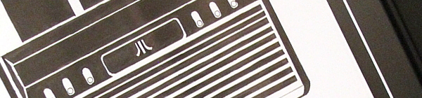
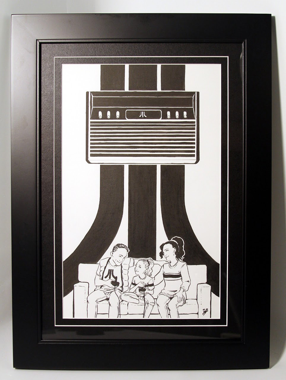
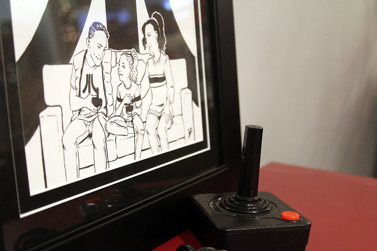
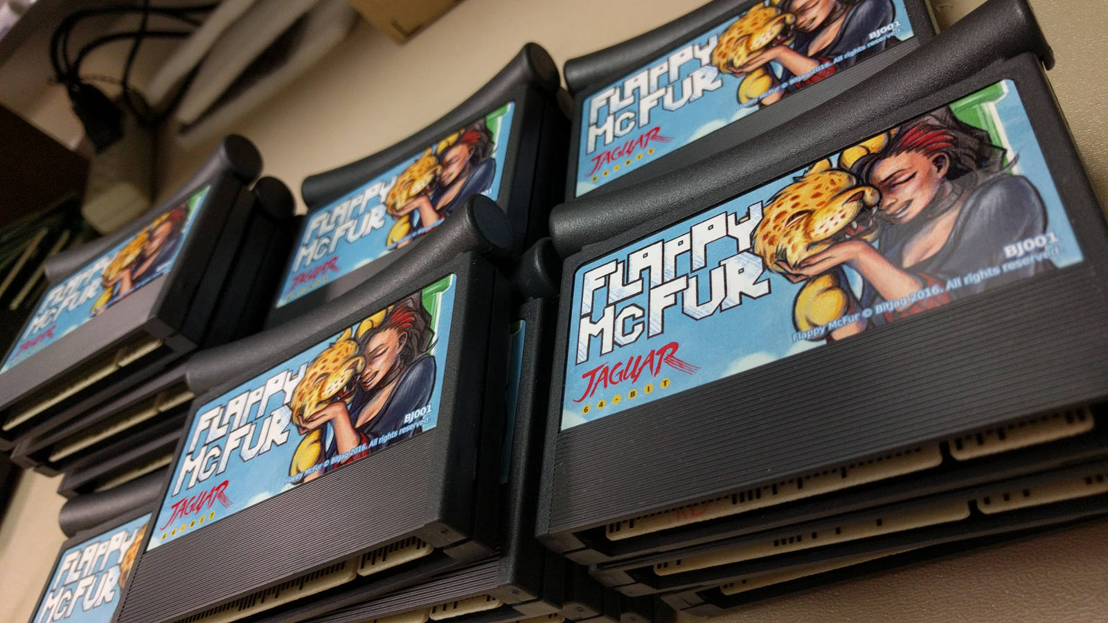
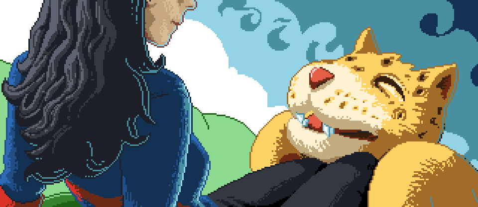
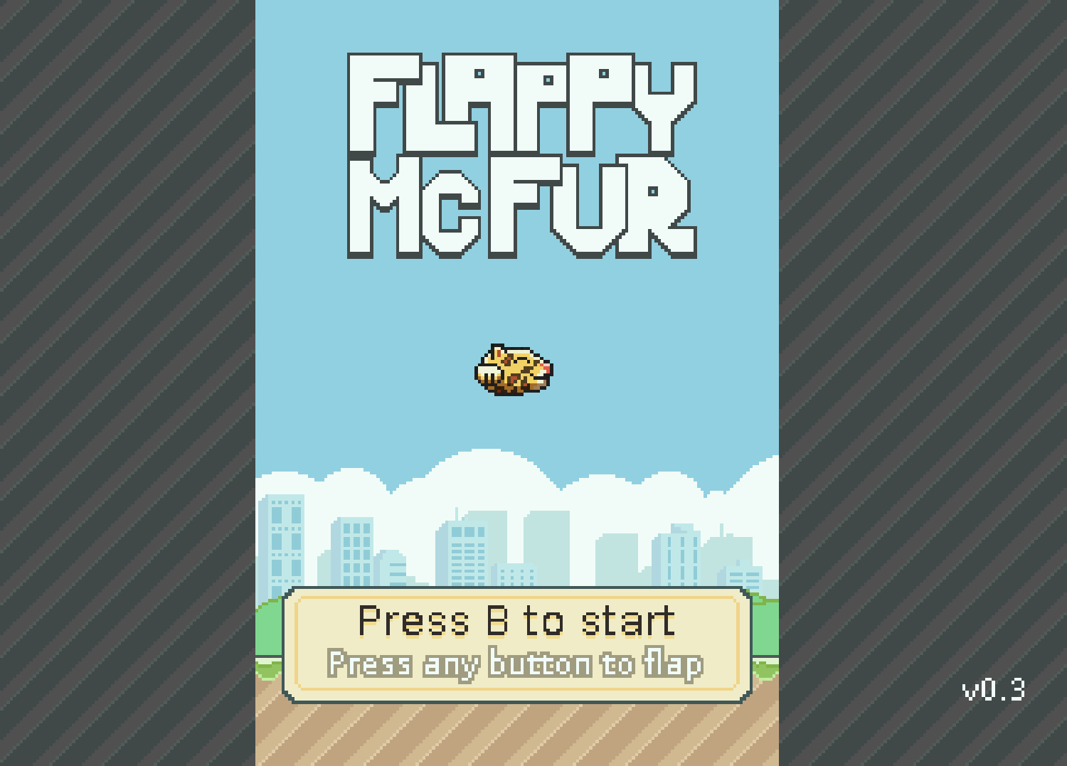
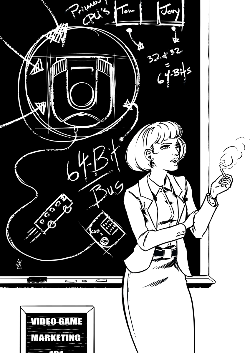
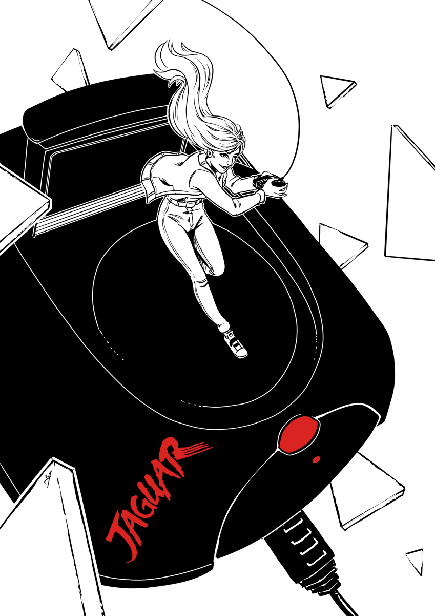
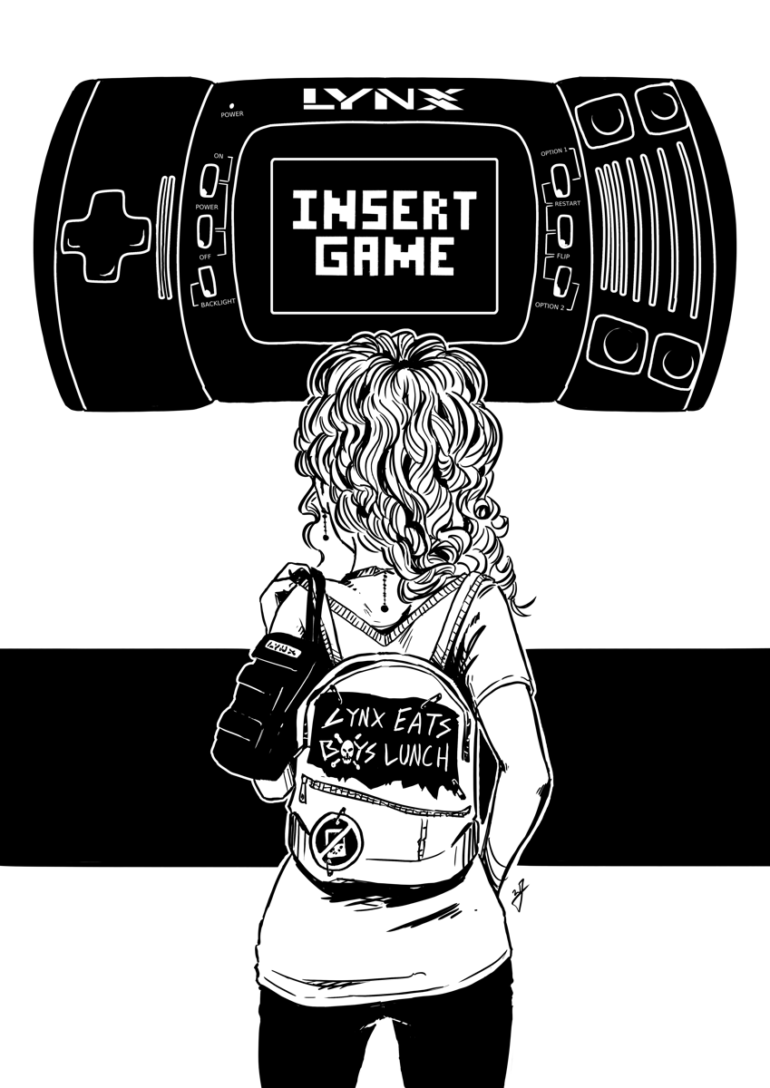
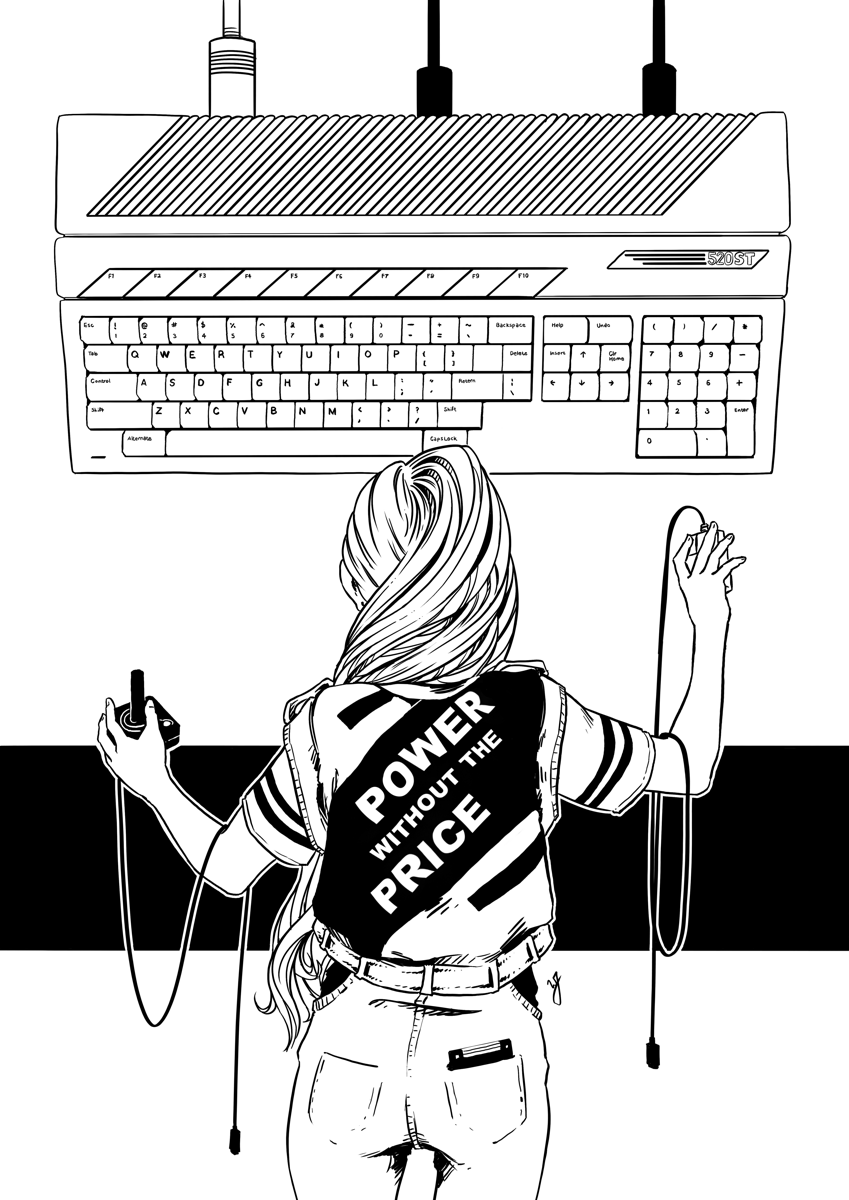
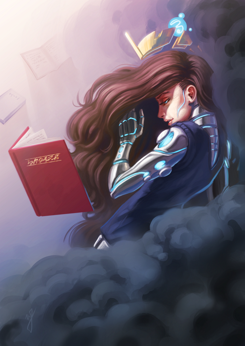
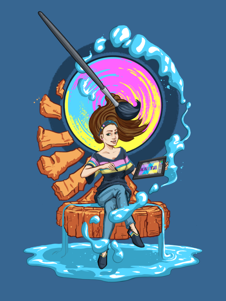
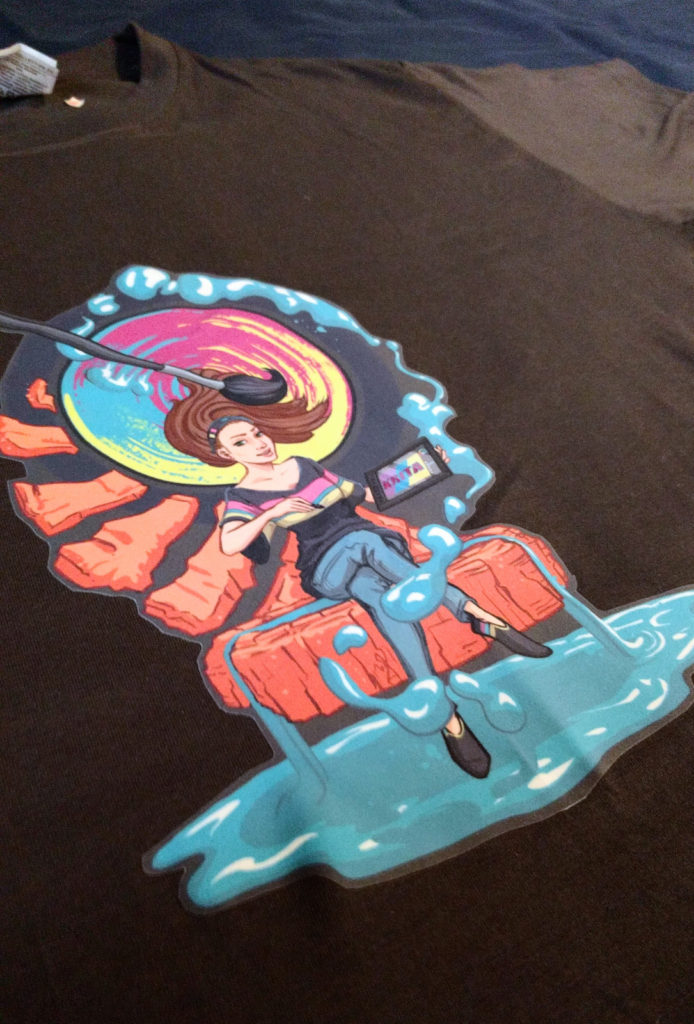
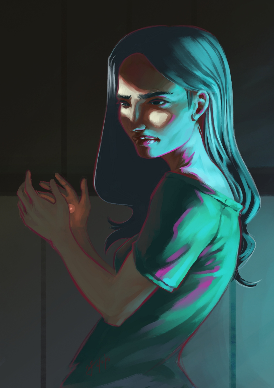
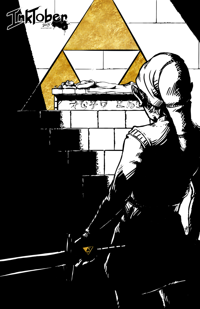
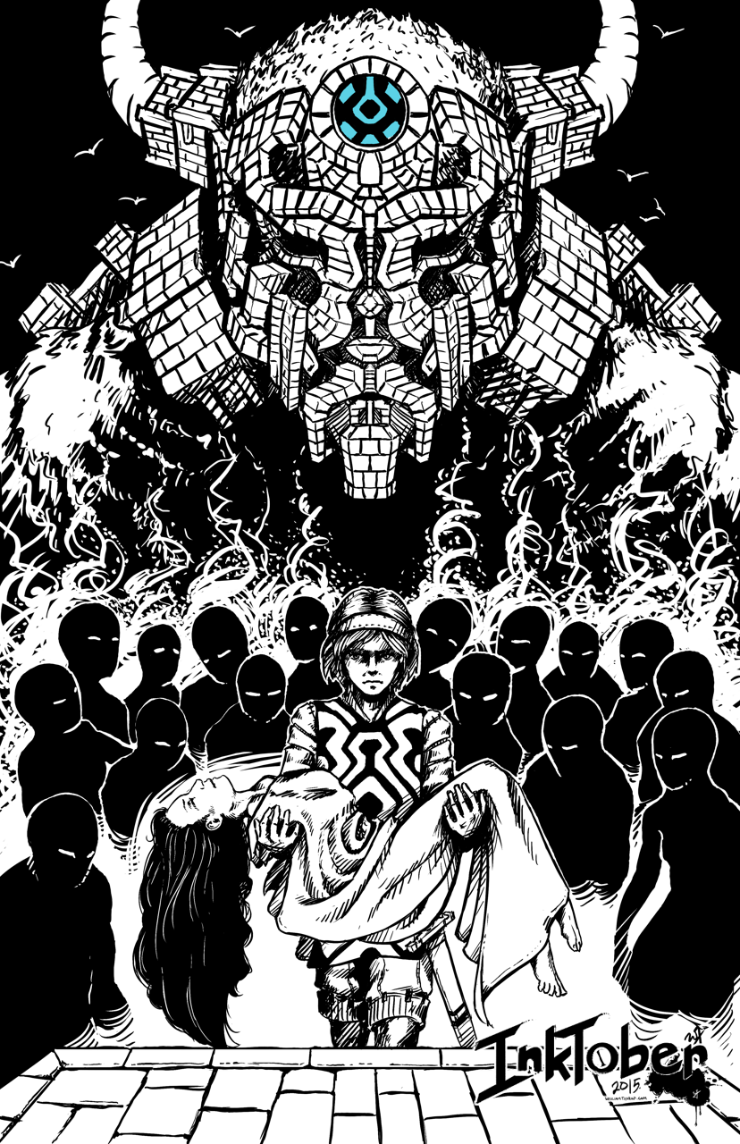
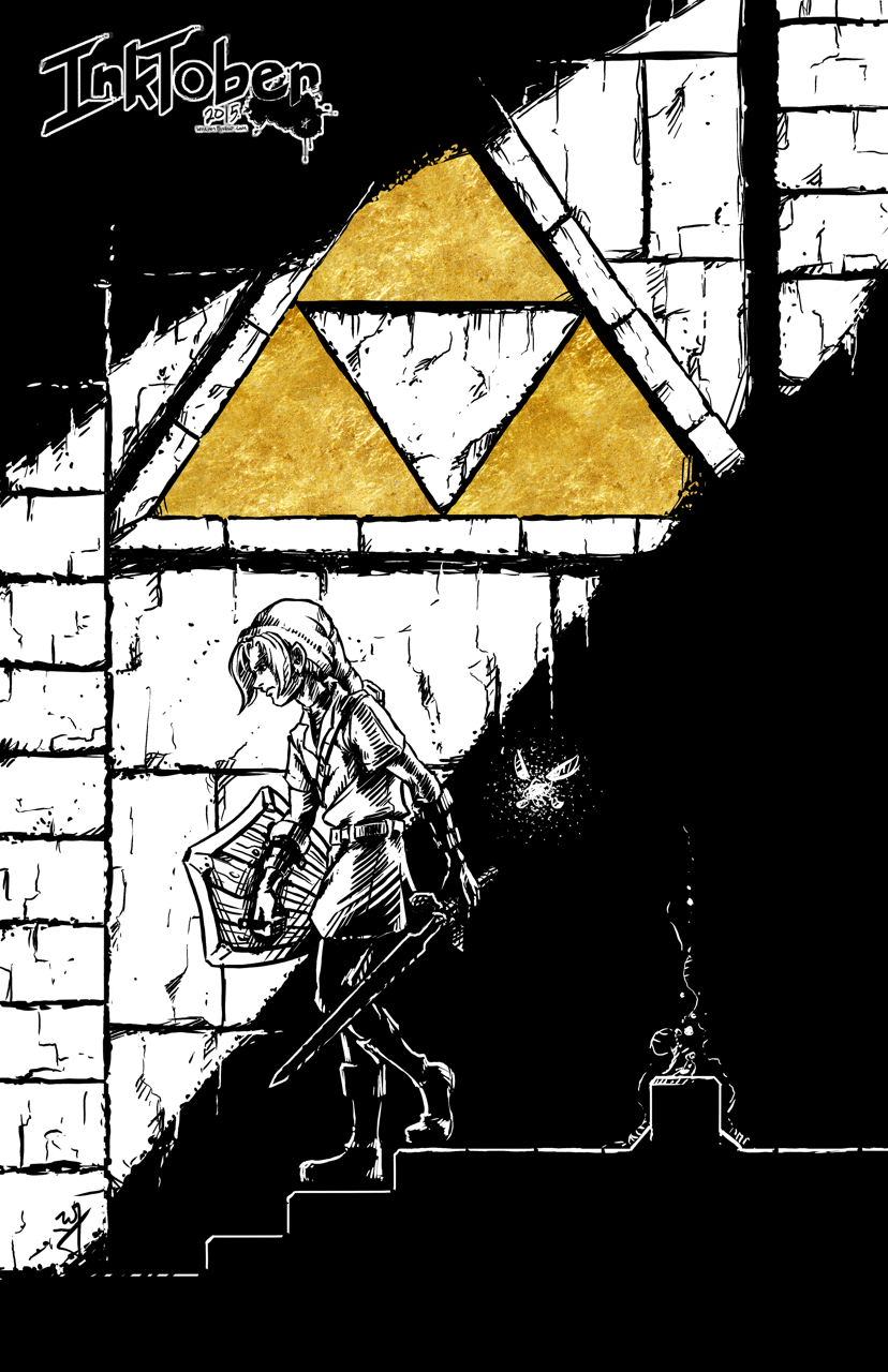
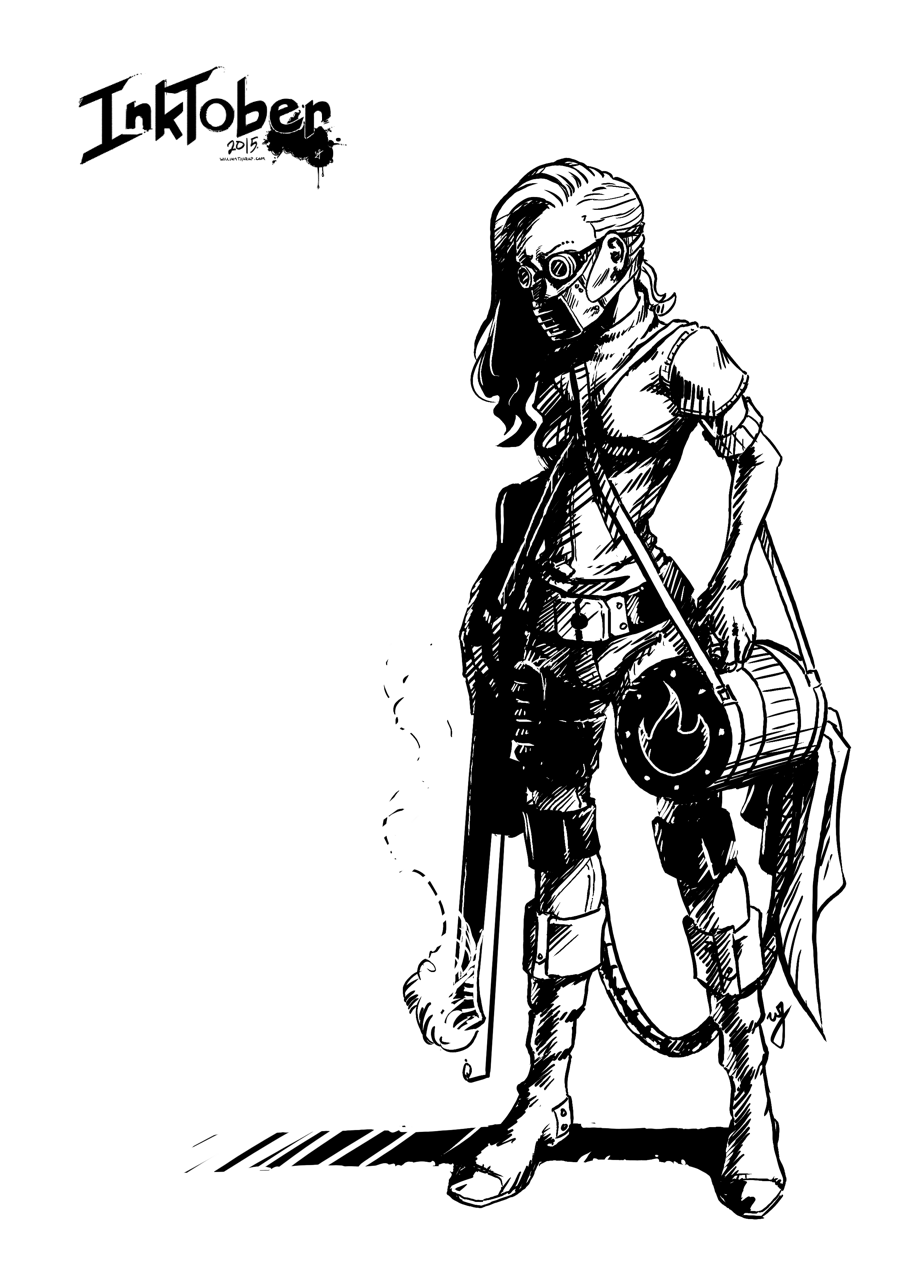
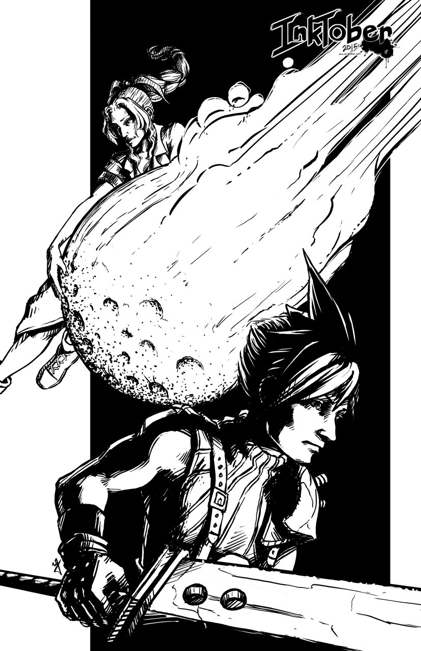
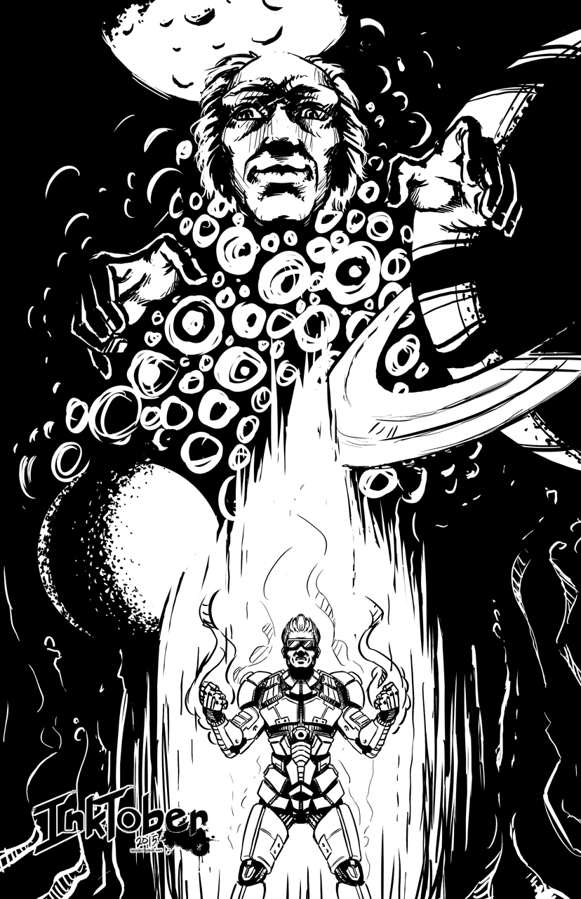
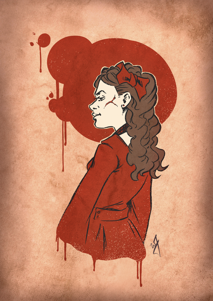
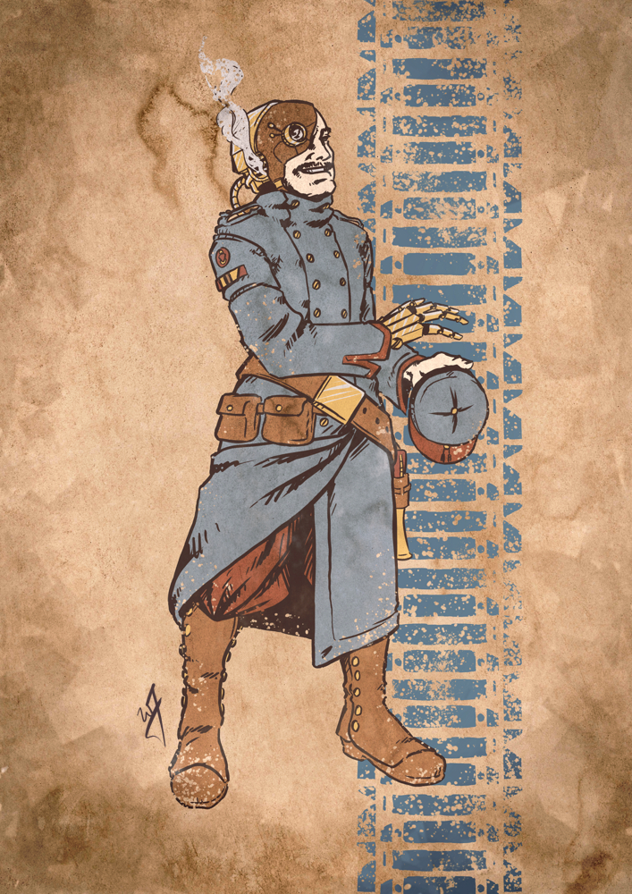
    I had the opportunity to vie for the position as an illustrator for an upcoming Kickstarter campaign (unfortunately I can’t share more details, because I am under a non-disclosure). I didn’t get the job unfortunately, but I would like to share my experience so others who are looking to do this kind of work may have a bit of wisdom before diving in.


    no_blood_required_1_web

    Protecting Your Work

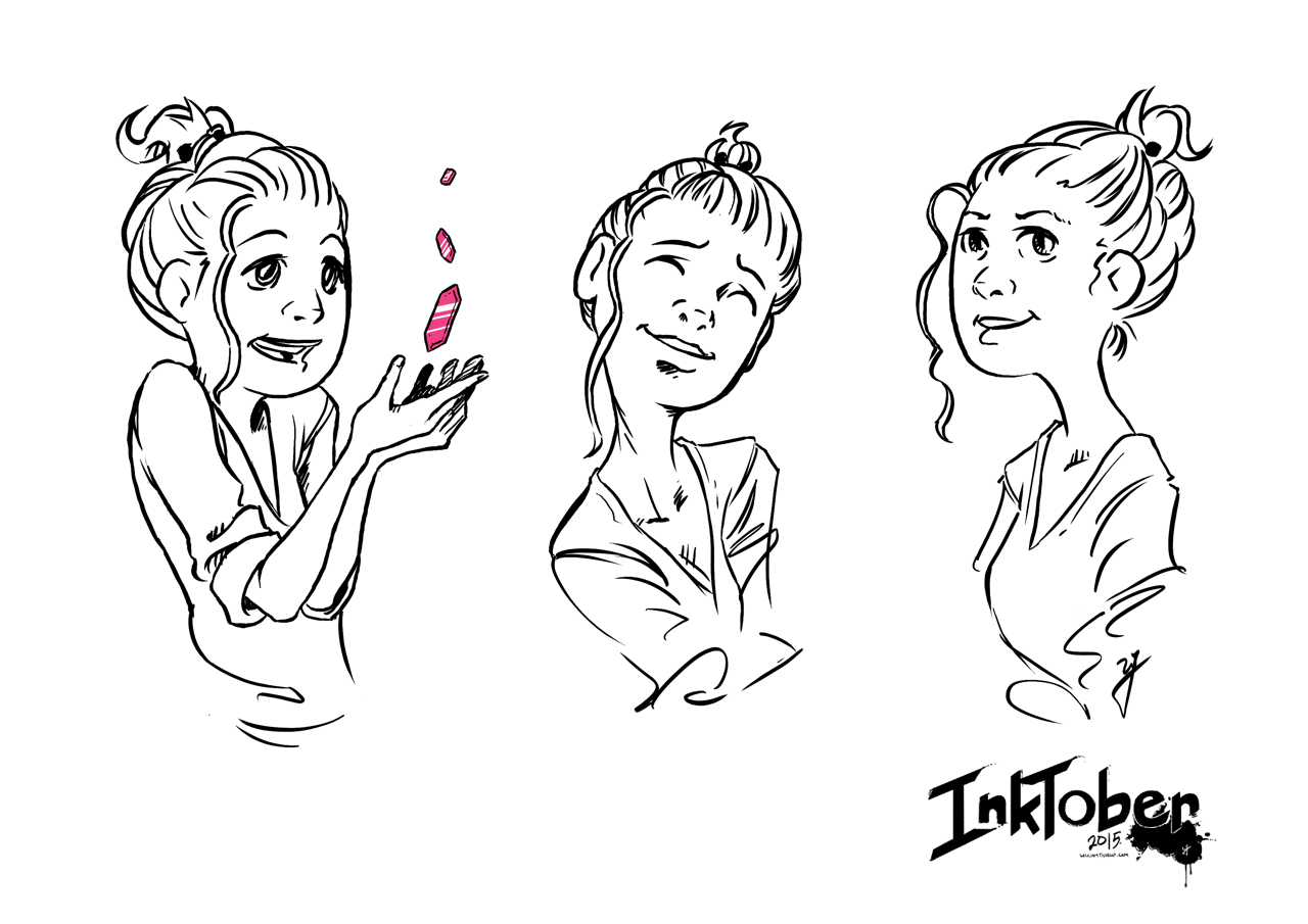
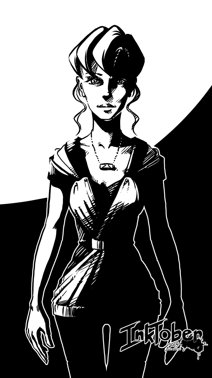
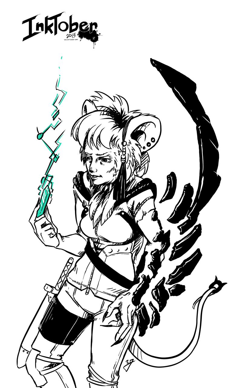
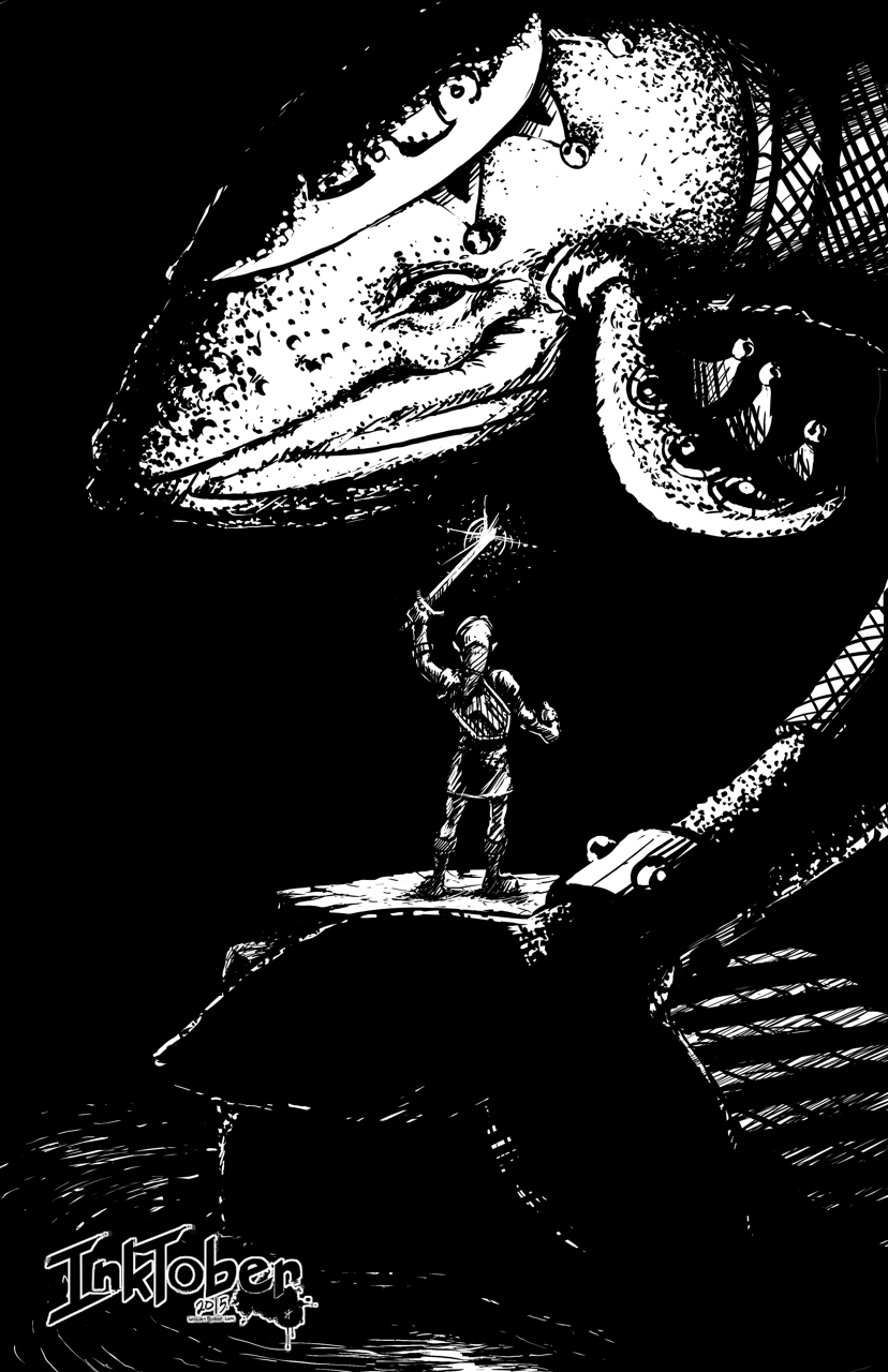
    The creator of the product, after showing me the specifics about the product, was very open with me about how he was shopping for artists to work on his project. He asked that I, along with others, would need to submit some examples of the art he was looking for.

    Naturally, when the campaign creator stars seeing all of these different character concepts will begin to hone down on the look he is going for. This is a great thing to do as a producer, but it does raise a few concerns for the artist. What if I don’t get the job, but the campaign organizer obviously uses your ideas, but with another artist, or, blatantly copies your works. What should you do to prevent and discourage this?

    “This will ensure that your work remains your own until you say otherwise.”

    First, rights to use your artwork can only be laid out with properly signed paperwork. Without paperwork they do not own anything about your artwork until you sign over the intellectual property of your artwork, or, you license the use of your artwork to them for a specific purpose. Communicate early on when working with a campaign organizer, that paperwork is required before they can use your artwork for anything, and preferably before you start moving forward with any art creation. This includes should include before prototypes of the product can be made with your work on it and marketing material that may include your artwork.

    What do you do to protect your work before paperwork. Add a watermark to your image that you send to them. It should include your name (or business name), the year, and a copyright symbol. And if there won’t be paper work for a while, I would add a message to the watermark that says “For Preview Purposes Only”. This will ensure that your work remains your own until you say otherwise, and discourage others from stealing your work. It sends a message that you are serious about your doing, that your work has value, and you are looking for an honest relationship.

    Working with other Artists on a Campaign

    It was pretty obvious that the campaign organizer I was working with had done very little planning for the Kickstarter campaign, or for a future business that may spawn from the Kickstarter. This isn’t necessarily a bad thing, and doesn’t mean they don’t know how. In fact, I am very thankful that this was the case, as it was an opportunity for both me and this individual to really explore what we wanted from the Kickstarter and beyond.

    With that in mind, here are a few questions to ask the Kickstarter Campaign owner/creator in order to better know where they might stand.

    • What is your campaign goal?
    • Who else will be gaining from the campaign funds directly? (partners, spouse advisory, close friends, etc…)
    • How will you be fulfilling campaign backer rewards?
    • After the campaign is funded and backer rewards are fulfilled, what are you planning on doing to do with your new product?

    There are more questions that can be asked, but these few will help you quickly determine how far along the planning is. Confusing answers or no answers to these questions could be a red flag for you, try to find someone you trust to talk about these answers with, to help determine how much of a risk your taking on if you do get the job.

    The Value of Art In Relation to Mechanics

    In the book illustration world, the artist along with the writer almost always receive a percentage of sales from the publisher. The percentage varies, and in this story the exact percentage doesn’t matter much. What matters is that the business world, publishers, artists, and writers alike all understand that art holds an importance in selling a product, both in marketing and in the user experience of the product. I included this concept in what I expected to receive monetarily for my work.

    “You work is not just a pretty picture, but can and should work with and improve the overall user experience.”

    At this point, I had already submitted my sample artwork, and they loved it. After this great feedback, they requested my costs. I sent them a base production cost along with an expected royalty based off of net sales of the Kickstarter product, out side of the Kickstarter campaign (future sales through distribution channels other than Kickstarter). The response I received was disappointing.

    The point of contention was the royalty. At first, the reasoning for them not wanting to give a royalty was because they considered me an non-established artist, and that asking for a royalty was inappropriate on my part. For anyone who might be wondering if valid train of though, it usually isn’t. They continued to try and talk me out of it, with the partially valid idea that I don’t bring much value to the Kickstarter, because I don’t have a large social media following. In the end I learned that this is what they were really looking for in the end, someone with an online following.

    This part of the story taught me three things. First, by sticking to my guns about the royalty, I was able to draw out what the campaign organizer was looking for, someone with an online following. This was definitely a part of the bill I couldn’t fill, and it was clear to both of us that I wouldn’t work out for his plans.

    A Kickstarter includes backer rewards that will include your artwork on other giveaways other than the product itself. This could be signed prints, your signature on on the product, unique artwork for specific backers, etc. Just remember if your artwork is going to be prominent on the product, it will probably be prominent elsewhere, and there isn’t any reason why you shouldn’t get a kickback for that.

    The third thing I learned, after counseling with other business professionals, research, and just my gut feeling, is that the value of my work can, and probably should, extend beyond just the cost of production. You work is not just a pretty picture, but can and should work with and improve the overall user experience. Not to mention it’s use in marketing materials to help sell the product. Anyone who doesn’t understand this on some level, is someone I don’t want to work with.

    tanks_and_steam_1_web

    Pricing Yourself

    What you should charge your client is always a difficult question to answer. Keep in mind I am talking about the base production cost to produce the art, or the time it takes to actually draw your pictures. When pricing yourself out, here are a few tips.

    “Getting a good sense of this information allows you to ask informative questions, and formulate an informative decision…”

    Research was a great starting point. Now you won’t find much about making artwork for a Kickstarter, but, there is standard pricing for illustration work. Everything from book covers, to card games, to children’s books. Getting a good sense of this information allows you to ask informative questions, and formulate an informative decision on how much your worth. My biggest help when finding an answer to this was getting on forums, and talking with people you who might have expectations for pricing out art, and other artists. Don’t be afraid to shoot a message to other artists that have been pricing themselves out for years.

    As for technically how I came up with a number. Doing the sample pieces actually helped out allot. Because I had done the few example pieces, I learned what the campaign organizer was looking for in a final piece, and how long it took me to create it. At this point it was a matter of counting how many paintings I needed to do for the project, multiplying that by my hourly rate, and then adding a bit on top to account for revisions, and variable research time. Don’t forget your research time.

    If the client doesn’t like your honestly calculated numbers, you have a few options. Standing your ground is what I would suggest. It tells yourself and the client that your work has value, and that you want to establish an honest relationship. This is a situation good for everyone.

    The other option is to lower your price. If you lower your prices, after calculating a number that is truly fair according to what you know, and you get the job, you will now be working with the knowlege that you aren’t being paid what you are worth. This will effect your work, most likely negatively. Your establishing, consciously or sub-consciously for both you and the client, that you aren’t actually worth the money that you think you are worth. This situation is not good for anyone or the project itself.

    Client’s will sometimes come back with comments like,”Well, this other artist is only asking for half of what you want.” If you believe that you are giving what the client wants, then this isn’t a competition with other artists, and they are saying this to drive your price down. Also, at this point things become very subjective, if they can afford every artist that has submitted artwork, they will end up picking the artist they like best. Comments like this also usually mean they like your artwork, but they don’t like the price. If they like your work, they should like your price, unless they simply don’t have the budget to afford you. In that case they should find someone else, or scale back the amount of work they need done if possible, in order to afford your work.

    no_blood_required_4

    If You Don’t Get the Job, What Do You Do?

    Ah… The best part. Dealing with rejection. My best piece of advice is to explore the experience. That is the primary reason why I am writing this article. It is an opportunity to reflect on what you learned, what future expectations should be, share what you learned with others, and a take a chance to enjoy the process.

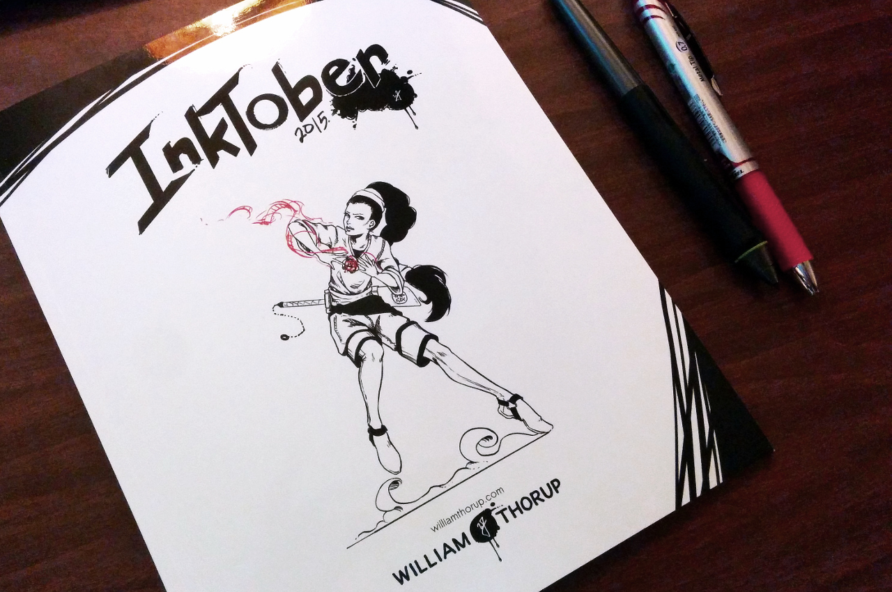
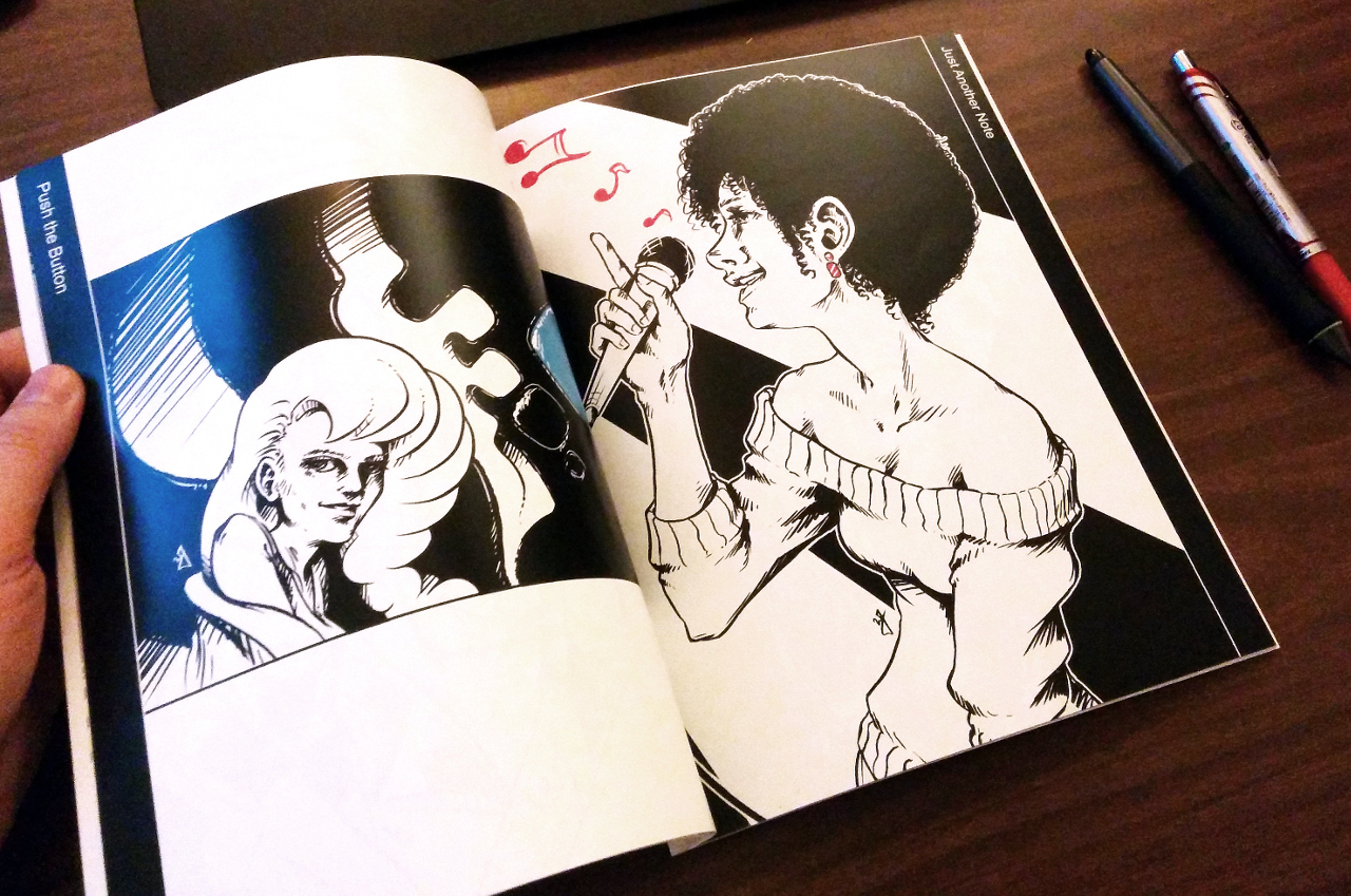
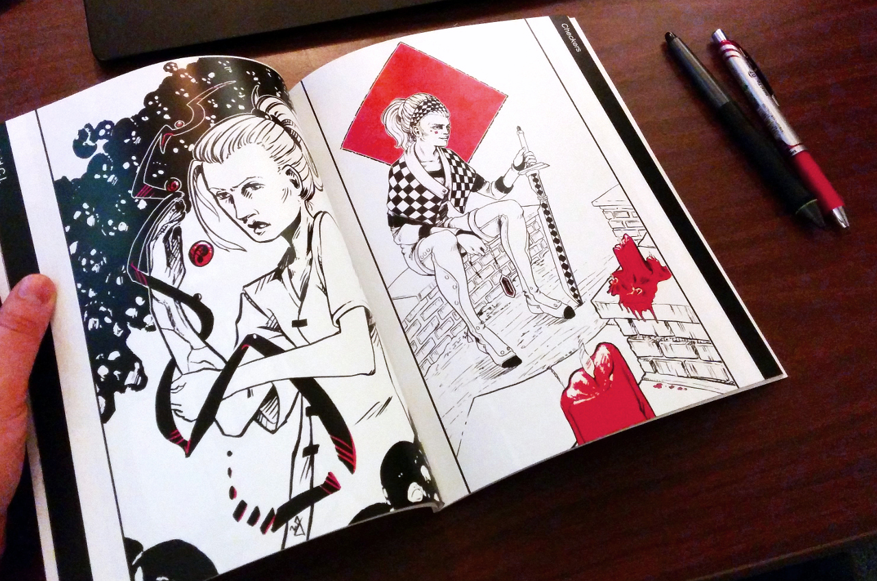
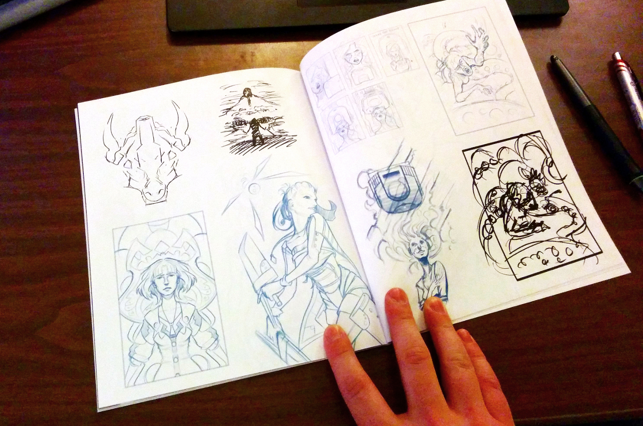
    The work you might have done for free doesn’t have to go to waste. Include it in a portfolio targeted at similar Kickstarter projects, and go find more work. With your new found experience the next fish should be easier to catch.

    Conclusion

    Overall the experience was great for me, and I believe it was good for the campaign organizer as well. It helped me better appreciate the value of my work, how to communicate that value to others, and what to look out for when it comes to forming partnerships for specific type of project. I hope that this helps someone out, let me know if you have any questions or comments.

  • Flow | Krita Kickstarter T-Shirt Challenge

    Flow | Krita Kickstarter T-Shirt Challenge

    The people who support Krita pulled off another amazing Kickstarter this year. And in a way, they are allowing everyone to contribute on an artistic level as well. This is where my next illustration comes in.


    This year, along with new features for the next version of Krita, the group behind Krita is producing a book filled with art from various artists that use Krita. They are taking submissions currently, but this is for a future post. This post is about the T-Shirt design challenge on the Krita forum. This is something that I could not simply pass up.

    With this much freedom I wasn’t sure how to start.

    The topic was “Flow”, and nothing else. With this much freedom I wasn’t sure how to start. So taking to the great library that is Google, I started doing searches for the word “Flow”. Synonyms, images, music, etc… all to draw inspiration from. I eventually started thinking about my home here in Utah, and challenged myself to think of the things that are generally attractive that could relate to “Flow”. This led me to the most unlikely of places when someone things of the word “Flow. Southern Utah, a dry desert, and almost the exact antithesis of the word “Flow”.

    The reason why I was brought to this place was the color of the rocks. For those of you who aren’t familiar with Southern Utah, the rock can be very red in places. This went well with some of the other notes I had written down at this point for the painting, which included the colors from Krita’s logo. The red of the rocks of Southern Utah would provide a good and attractive contrast to the blue floating paint I already had in mind before I had put pencil to paper.

    …I realized that message wasn’t in the detail of the rock, but instead in the very nature of the rocks

    But this was the catalysis to a greater idea, and one that I think is what brought the painting together in it’s last stages. If you watch the time lapse video, you will see this in action, but I first draw the rocks with detail, and symmetrically. This looked “Okay” but it didn’t seem to fit, but soon after spending a while drawing detail into these rocks, I realized


    that message wasn’t in the detail of the rock, but instead in the very nature of the rocks. The juxtaposition of the rock against the flowing nature of paint was the key, as I discovered a way to include the rocks in a more harmonious way than before. By focusing on the silhouette and the visual movement of the rock, instead of the rocks themselves.

    So now the flow of the paint, and the flow of the rock, mirror each other, matching the “S” curve of the woman, and just tying everything together in a neat little package.

    At the time of writing this, voting has opened for challenge, and even if I don’t get the most votes, I am still very proud of the piece, and the troubleshooting opportunity that it presented.
  • Time to Work | Illustration

    Time to Work | Illustration

    Working with some different brushes in Krita, and pushing myself a bit with some different kind of lighting challenges. This piece was also a bit inspired by the The Art of Loish, a recent Kickstarter art book I received.

    6-9-16_time_to_work_web

    I really enjoy Loish’s style, with her use of a stark outline colors to break her subjects away from the rest of the painting. She also shows a clever use of color in general, and again, very appealing all around. Some of the elements in my painting were inspired by these things, in the sense of picking an interesting palette to work with, and a unusual lighting setup to help push those colors a bit.

  • Regret in Creation | Myst Fan Art

    Regret in Creation | Myst Fan Art

    Mysterium, the Myst convention, is making its way to my hometown this year, and they had open submissions for art for their convention book. I caught wind of this just a few days before submissions were due, but I couldn’t miss the chance to show a little Myst fandom.


    creation_and_regret_web

    (SPOILERS AHEAD in the next paragraph, no spoilers after this next paragraph)
    This pieces features Catherine in a state of remorse for the burden of being able to create ages (worlds that are created by writing books, which you can then enter into), but unable to save them. The Moiety Dagger is a symbol of the group that she helped in Riven (Age 5), and despite her efforts, the age still fell apart. Even though she did not write the Riven age, she must feel the burden that any world she creates has the potential to fail, with the loss of life.

    I have very fond memories of this game, as I used to watch my oldest sister play it, along with with a few of my other siblings, when I was young. I was always fascinated by the environments, and the immersive sense of foreboding that engulfs the game. As I got older, and was able to solve some of the puzzles, the game became even more immersive for me, and I was hooked. I soon played Riven, and Exile (Myst III) and the experience was further enhanced by better audio better graphics, more acting, and an even more engrossing story.


    The story is simply awesome. Taking steam-punk elements and god-like powers of creating worlds and people, with the premise of absolute power corrupts absolutely and what do you do when it does corrupt, is fascinating, and makes for a unique adventure with every game. This includes the three novels as well, well written, and a must read for Myst fans.


    regret_in_creation_close_1


    A may do a few more illustrations based on the some of the other thumbnail sketches future.

  • Inktober 2015 Book | First Published Collection

    Inktober 2015 Book | First Published Collection

    Already a month away from Inktober, and I haven’t been too involved in the social media department at all. There is good reason for that though. During this month, I have been working on assembling my Inktober work into a printable book format. My first publicly published collection of my artwork.

    inktober_book_preview_1inktober_book_preview_2inktober_book_preview_3inktober_book_preview_4

    As many of you already know, I work primarily digitally. My paintings, sketches, inks, everything, all digital. This obviously has it’s benefits, but it also has some big cons that come with the convenience. The first and the most nagging for me is the fact that I don’t have a physical copy of my artwork for preservation, and for sharing with others. I have done prints before with a normal inkjet/toner printer, or through a printer like Inkleys, Walmart, or Costco. These options work, but these printers don’t really tailor to the visual artist, and, as a result, prints come out lackluster, and in some case, I don’t have the option to compile multiple images into book format. It also feels like a “You get what you pay for.” situation.

    I set out to find a on-demand printer who tailors to printing pictures/artwork. After looking at popular self publishing websites, like Lulu and Amazon, I discovered that most on-demand printers are tailored to writers, with some options for artists. I then stumbled onto Blurb.

    I decided to take my chance with them, as their store included a ton of content that other independent artists have produced, and after reading quite a few positive comments about their services and final printing results. The shear number of tools available to the would-be self-publisher are abundant, with their own custom software (BookWright), In Design, or Scribus, all viable options for prepping your content. This was important to me as well because I work exclusively in open source software with my art. I used Krita for my art, Inkscape for logos, Blender for my video content, and Scribus for my book layout. Looking up specs for the book size you want is easy, along with a useful “Help” section, putting together my final book was time consuming but easy. The only downside to this experience were the limited size options for books. They don’t provide a “custom” option for size, but they cover the basic sizes well, with my book having a final size of 8″x10″ (I wished I had a taller format book to work with, as most of my work was 11×17).

    Speaking of the final book, it was better than I expected. The print came out beautifully in the softcover format. The cover was a lamminated gloss, while the inside has a slight gloss. The blacks and other colors came out great.

    My book is finally up for sale at Blurb and I will encourage your support by asking to purchase a physical or digital copy. If you purchase by December 11th with the promo code GIFTS30, you will get a 30% discount, which is awesome!

    Softcover – $36.00 (USD)

    Hardcover (Printed Cover) – $55.00 (USD)

    Linen Hardcover (Printed Dust Jacket) – $58.00 (USD)

    PDF (DRM Free!) – $6.99 (USD)

    The book contains all 31 pieces from Inktober, bueatifully printed, along with a 15 pages of sketches and thumbnails that help illustrate my process to the final inking. Please let me know what you think of the final collection, as I am hoping to publish a few more books in the near future of some of my current work, and any feedback will be valuable. Also, if you haven’t seen my work for Inktober yet, you can view it all for free in here, or on Instagram.

    A special thanks for Michael Buhler, Sarah Bailey, Trevor Rimmasch, and Isaac Christiansen for their knowledge and help polishing the final book.

  • INKTOBER 2015 | Finished

    INKTOBER 2015 | Finished

    Here we go. Time to give it a try. Inktober. I have been wanting to do this for the last few years, after my friend Michael Buhler first introduced me to the event. Be sure to check out his blog, as he is currently inking away as well. I think I final have myself worked up enough to carry through the end of the month.

    Inktober_blog_logo_web

    Goals

    I think that the only way I am going to see this through is if I set a few goals to help generate ideas, but keep it basic to avoid being too ridged. I want to keep it fun as well. For the sake of keeping my blog clean as well, I will be posting everything in this post, and I will also be sharing out to the Facebook Draw Night group, Google+, Deviant Art and to my Instagram.

    Goal #1 is to produce 10 larger, 11×17 vertical illustrations, for my top 10 video games. I won’t list that here now, don’t want to spoil the surprises to come.

    Goal #2 is 21 other small scale pieces. This can include inked sketches, smaller, and quicker to finish.


    Quick Link List

    A list of what is done, and linked for quick navigation.

    11×17 Fanart Illustrations

    Day 4 – Transistor
    Day 11 – Phantom Dust
    Day 16 – Tempest 2000
    Day 17 – Journey
    Day 18 – Adventure of Link
    Day 19 – Shadow of the Colossus
    Day 21 – Ocarina of Time
    Day 29 – Link’s Awakening
    Day 30 – Final Fantasy VII
    Day 31 – Street Fighter 2010


    Day 13 – “Navigator”
    Day 14 – “Hybrid CI”
    Day 15 – “Checkers”
    Day 20 – “Ambassador”
    Day 22 – “Lighter”
    Day 23 – “From the Depths”
    Day 24 – “Suzzie”
    Day 25 – “Time to Fly”
    Day 26 – “Unwavering”
    Day 27 – “Mouse Thief”
    Day 28 – “Minmei”

    Weekly Time Lapse Video

    Week 1 Time Lapse

    Week 2 Time Lapse

    Week 3 Time Lapse


    Day 1

    Play the Beast


    paint_the_beast_inktober_web


    Day 2

    Another Bullet


    bounty hunter_inktober_blog


    Day 3

    On the Throne


    on the throne_blog


    Day 4

    Transistor


    transistor_blog


    Day 5

    Gate Keeper


    gate_keeper_blog


    Day 6

    Forgotten Trophies


    forgotten_trophies_blog


    Day 7

    Fighter


    fighter_blog


    Inktober – Week 1 – Time Lapse


    Day 8

    Push the Button


    dots_blog


    Day 9

    Just a Few Notes


    disco_singer_blog


    Day 10

    Distilled


    distilled_blog


    Day 11

    Phantom Dust


    Phantom_Dust_blog


    Day 12

    Potential Baller


    baller_web


    Day 13

    Navigator


    navigator_blog


    Day 14

    Hybrid CI


    hybrid_CI_blog


    Inktober – Week 2 – Time Lapse


    Day 15

    Checkers


    checkers_blog


    Day 16

    Tempest 2000


    tempest_2000_blog


    Day 17

    Journey


    journey_blog


    Day 18

    Adventure of Link


    adventure of link_blog


    Day 19

    Shadow of the Colossus


    shadow_of_the_collossus_blog


    Day 20

    Ambassador


    ambassador_blog


    Day 21

    Ocarina of Time


    Ocarina of Time_blog


    Inktober – Week 3 – Time Lapse


    Day 22

    Lighter


    lighter_blog


    Day 23

    From the Depths


    from the depths_blog


    Day 24

    Suzzies


    suzzie_blog


    Day 25

    Time to Fly


    Its_time_to_fly_blog


    Day 26

    Unwavering


    unwavering_blog


    Day 27

    Mouse Thief


    mouse theif_blog


    Day 28

    Minmei


    minmei_blog


    Day 29

    Link’s Awakening


    08_links akwakening_blog


    Day 30

    Final Fantasy VII


    final fantasy 7_blog


    Day 31

    Street Fighter 2010


    Street Fighter 2010_blog